Launch Recite Me assistive technology
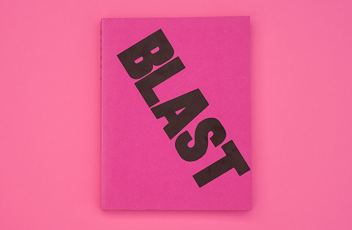
A bright pink book lies flat against a matching pink background. The word “BLAST” is printed across the cover in bold, black, diagonal lettering.

Experimental and expressive independent magazines from 1914 - 2016

—
Date
27 July 2016

Independence often gives publishers a chance to do something experimental and innovative with writing, design and structure, where more mainstream outlets are restricted. To coincide with the launch of the second The Stack Awards this week, Stack founder Steven Watson picks out some of the most notable independent magazines from over the years, which used their editorial freedom to be expressive, opinionated and original.

A bright pink book lies flat against a matching pink background. The word “BLAST” is printed across the cover in bold, black, diagonal lettering.
Above
Left

Blast

Right

Blast

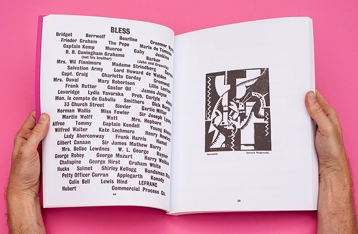
Two hands hold open a book against a bright pink background. The left page features a list of names under the heading “BLESS”, while the right page shows a black and white abstract illustration.
Above

Blast

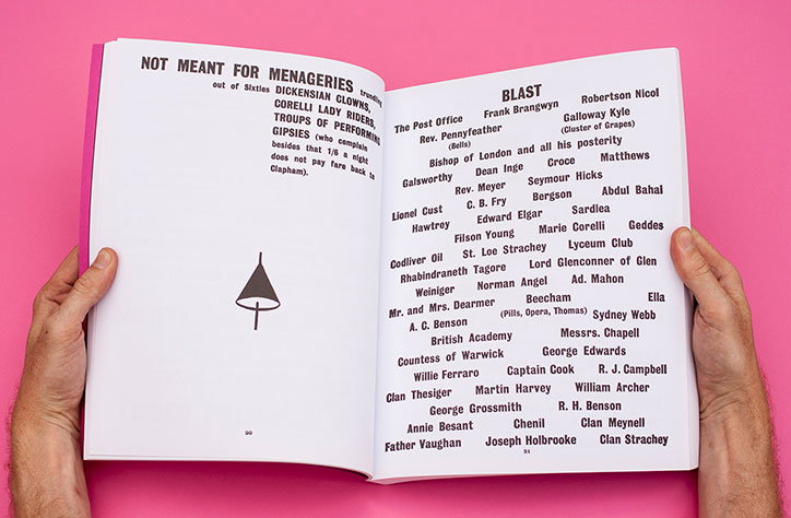
A person holds open a book against a bright pink background. The left page reads “NOT MEANT FOR MENAGERIES” above a list of performers and a simple line drawing of a cone. The right page is titled “BLAST” and contains a dense list of names and organisations.
Above
Left

Blast

Right

Blast

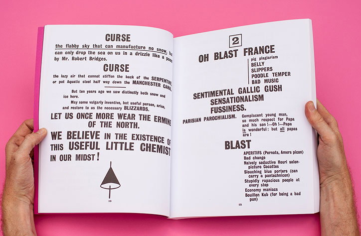
Two hands hold open a book against a bright pink background. The pages feature bold, black typography with headlines including “CURSE”, “OH BLAST FRANCE” and “BLAST”.
Above

Blast

Blast (1914)

I saw an original copy of Blast in an exhibition at the Tate Modern about ten years ago and had to get my hands on one of the reproductions by Thames & Hudson. First published by Wyndham Lewis in July 1914, the month before the outbreak of the First World War, it’s the work of an angry young man railing against the stuffiness and tradition he saw around him at the time.

Combining mocking humour with real revolutionary intent, the text blasts and blesses its subjects, and Wyndham worked with a jobbing printer in Harlesden to set it all in a mix of type more commonly used for posters and billboards, giving it a visual impact that still hasn’t faded.
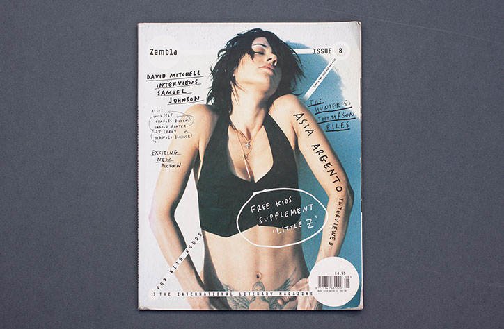
The cover of Zembla magazine, issue 8, featuring a person with short dark hair wearing a black top. Text across the cover includes “David Mitchell interviews Samuel Johnson” and “Asia Argento interviewed”.
Above
Left

Zembla

Right

Zembla

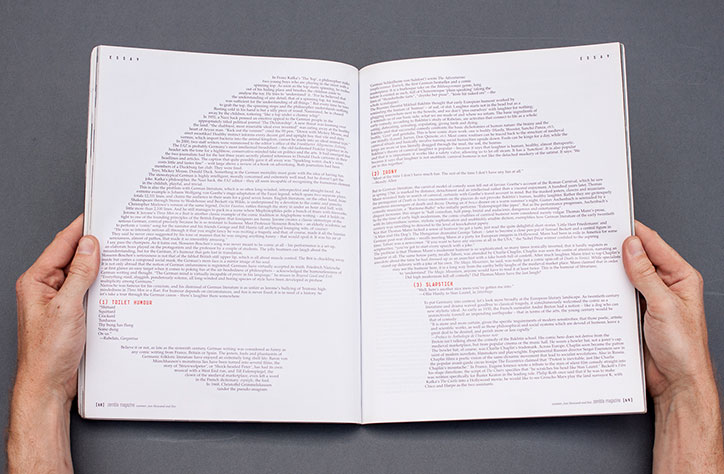
An open book lies flat on a grey surface, with two hands holding the edges of the pages. The spreads are filled with dense columns of text under the heading “Essay”.
Above

Zembla

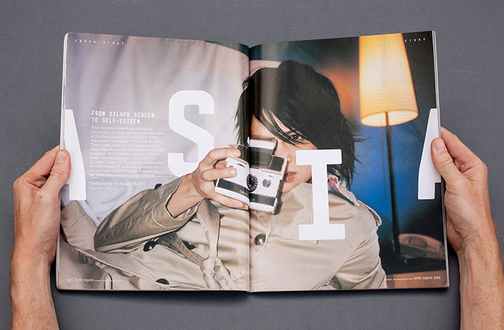
A person holds open a magazine to a double-page spread. A person in a beige trench coat holds a camera to their eye, partially obscured by large white letters that spell “ASIA”. To the left, a headline reads “FROM SILVER SCREEN TO SELF-ESTEEM”.
Above
Left

Zembla

Right

Zembla

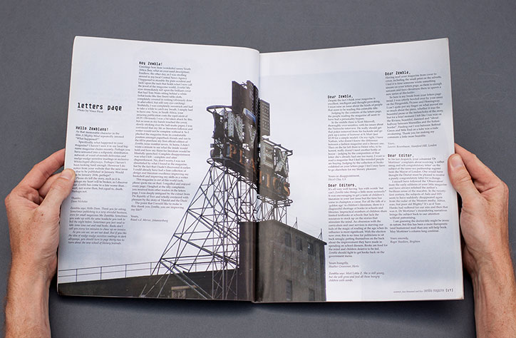
An open magazine lies flat on a grey surface, held by two hands at the edges. The “letters page” features columns of text and a central photograph of a person sitting in a chair.
Above

Zembla

Zembla (2005)

The first independent magazine I fell in love with was Zembla, a literary magazine edited by Dan Crowe (who later went on to set up Port and Avaunt) and art directed by Vince Frost.

There’s more wayward typography here, but it was the freshness of the editorial that drew me in with its completely original approach to literary publishing. There were far fewer independent magazines around ten years ago than there are today, and I loved the sense that Zembla was making things up as it went along, mixing celebrity with exciting new fiction to produce a really thrilling read.
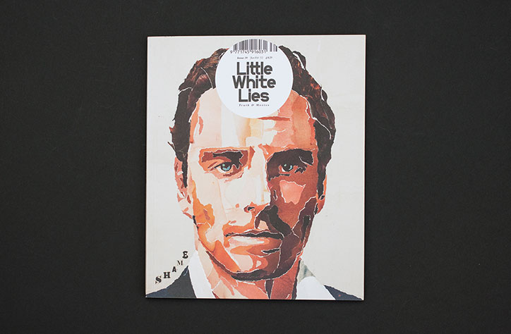
An illustration of a person’s face rendered in a painterly style with blocks of red, orange and white. A circular white sticker is placed over the forehead, reading “Little White Lies”.
Above
Left

Little White Lies

Right

Little White Lies

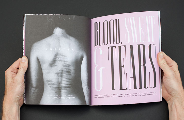
A person holds open a magazine to a double-page spread. The left page shows a black and white photo of a person’s bare back with the word “CHAPTER” centered above them. The right page is pink with the title “BLOOD, SWEAT & TEARS” in large, bold typography.
Above

Little White Lies

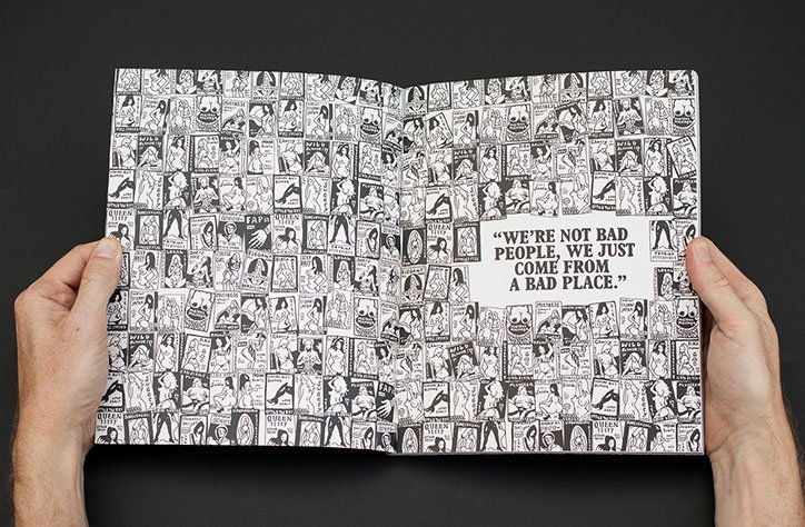
A person holds open a black and white booklet filled with a grid of small, repeating illustrations of figures. A white rectangular slip of paper laid over the right page reads “We’re not bad people, we just come from a bad place.”
Above
Left

Little White Lies

Right

Little White Lies

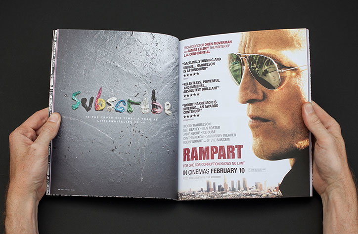
A person holds open a magazine to a double-page spread. The left page features the word “Subscribe” in a cursive script, while the right page is a film advertisement for “Rampart” showing a close-up of a person wearing sunglasses.
Above

Little White Lies

Little White Lies (2012)

I wrote for Little White Lies from its fourth or fifth issue, and by the time this one came out (issue 39) I was working with the team in the offices at The Church of London.

This issue was built around the film Shame, about a sex addict, and I remember creative director Paul Willoughby disappearing off into the basement with a pile of vintage porn magazines to create the cover portrait of Michael Fassbender from ripped up pages. They did all sorts of other stuff with this issue, like scoring the chapter numbers onto the backs of the editorial team and making a subscription ad out of condoms, and that absolute immersion in the subject is what I loved so much about working with them.
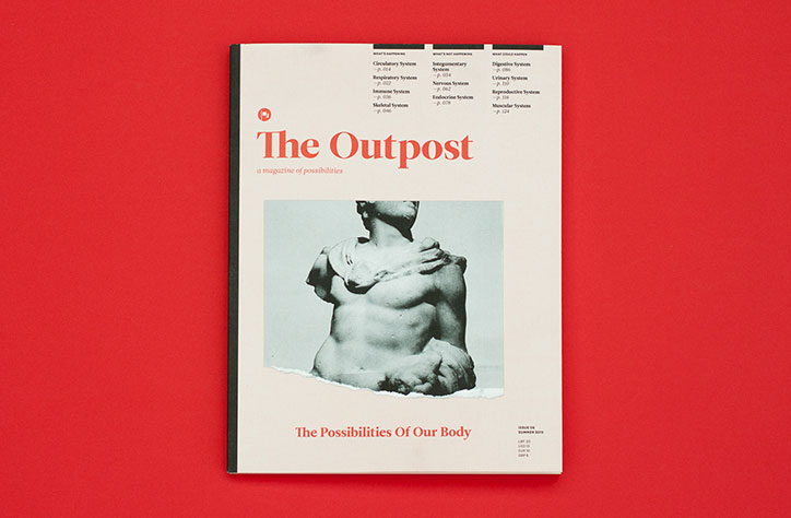
The front cover of The Outpost magazine, titled “The Possibilities Of Our Body”. A black and white photograph shows a torso of a classical sculpture partially submerged in water.
Above
Left

The Outpost

Right

The Outpost

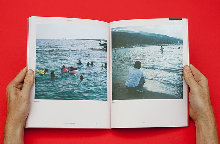
Two hands hold open a book against a bright red background. The open pages show two photographs of people swimming and relaxing at a beach.
Above

The Outpost

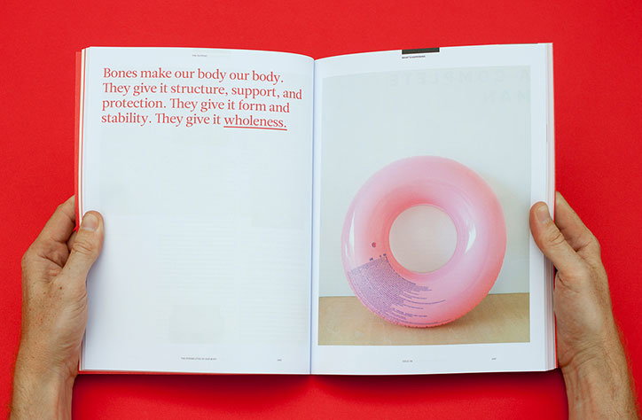
An open magazine held by two hands against a bright red background. The left page features red text that reads “Bones make our body our body. They give it structure, support, and protection. They give it form and stability. They give it wholeness.” The right page shows a photograph of a translucent pink inflatable ring.
Above
Left

The Outpost

Right

The Outpost

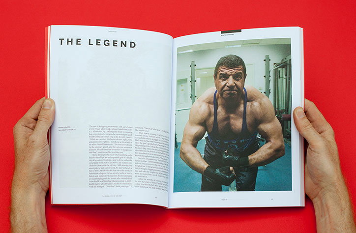
An open magazine displays a spread titled “THE LEGEND”. On the right, a photograph shows a muscular person in a blue gym vest and black gloves, leaning forward in a gym.
Above

The Outpost

The Outpost (2015)

This was our winner of the Subscribers’ Choice category at last year’s Stack Awards – the magazine that subscribers voted as the best one we sent out in 2014-15. The Outpost is dedicated to documenting the challenges facing the Middle East and North Africa, but it insists on an optimistic point of view, always seeking to show the opportunities as well as the threats.

The result is a totally original perspective on the Arab world and I think that’s what our subscribers responded to so strongly – people want to be surprised, and independent magazines have the power to do that.
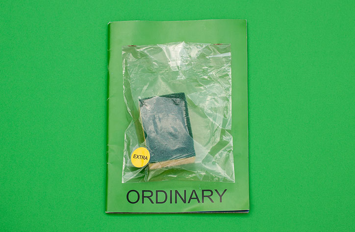
A green booklet lies flat against a matching green background. A small, dark blue sponge is sealed in a clear plastic bag on the cover, marked with a yellow “EXTRA” sticker. The word “ORDINARY” is printed in black capitals at the bottom.
Above
Left

Ordinary

Right

Ordinary

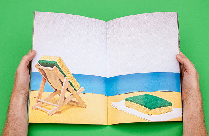
Two hands hold open a magazine against a bright green background. The spread shows a beach scene where two yellow and green sponges act as people, one reclining on a miniature wooden deckchair and another lying on a white towel.
Above

Ordinary

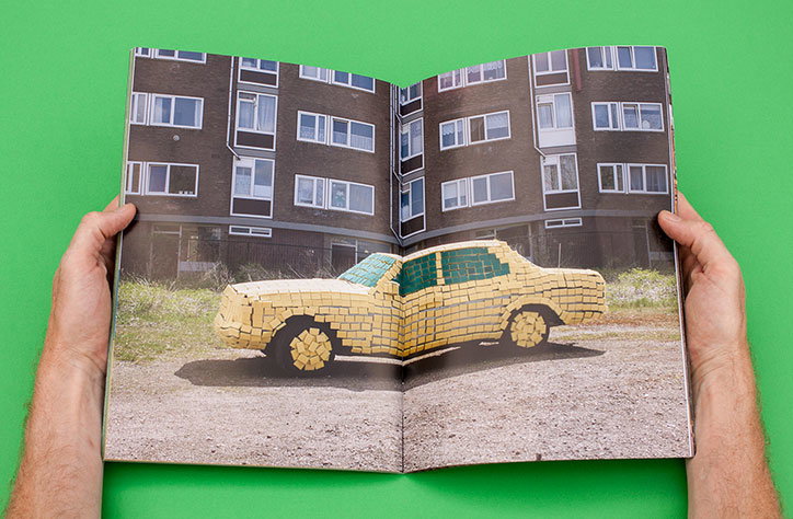
Two hands hold open a magazine against a bright green background. The spread shows a life-sized car made of yellow bricks parked in front of a grey apartment block.
Above
Left

Ordinary

Right

Ordinary

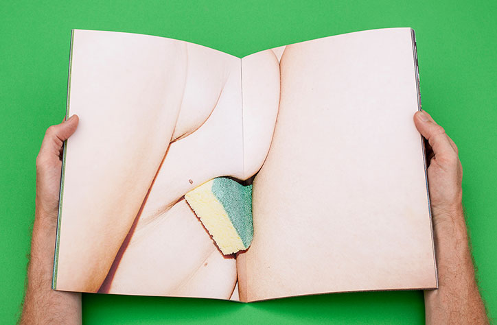
A person holds open a book against a bright green background. The pages show a close-up photograph of a body part with a yellow and green scrubbing sponge tucked into a fold of skin.
Above

Ordinary

Ordinary (2016)

One of the most strikingly original magazines I’ve seen this year is Ordinary, a photography magazine published in Amsterdam that asks artists to create images using everyday objects. The first issue was dedicated to plastic cutlery and the second was made using kitchen sponges, and each time the magazine comes with a cover mount containing that issue’s object, so the reader can create their own art.

There’s a brilliant mischievousness to it, but it’s not played for laughs. Instead, the magazine strips back distractions in order to emphasise the extraordinariness of the images. The format is A4, the font is Arial, the colour settings are the InDesign presets, and the only text is on the front and back covers. The only thing to look at inside the magazine is the photography itself, and it’s the humour and inventiveness of the images that stays in the mind.

Share Article

About the Author

Steven Watson

—

Steven Watson started Stack in 2008 as a way of making it easier for people to read something new. He has spent the last 18 years surrounded by independent magazines, and he loves speaking and writing about them, and helping independent publishers to reach more readers.


It's Nice That Newsletters

Fancy a bit of It's Nice That in your inbox? Sign up to our newsletters and we'll keep you in the loop with everything good going on in the creative world.