Saint Urbain’s identity for dating app Cerca makes courting cool and casual
Closeness is what Saint Urbain’s visual world for Cerca is all about, from compact wordmarks, cuddly animations and candid photography.
Cerca is the Spanish word for ‘near’ – and it means everything for the new dating app of the same name. Built to create meaningful connections through anonymous and limited likes, it subverts the high-volume swiping that other apps offer and so avoids dating app fatigue. But there was one issue. Cerca didn’t have a visual identity as strong as its mission to bring people together, that’s until now, thanks to the New York-based creative agency Saint Urbain.
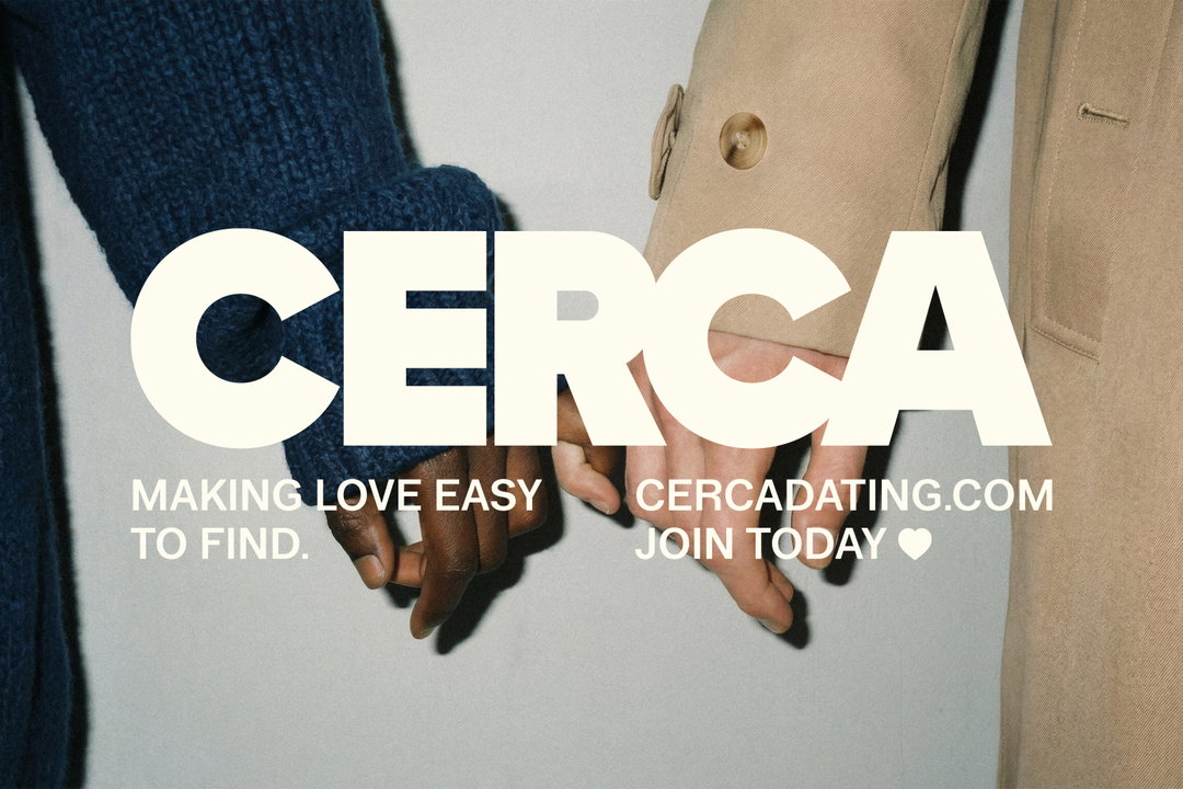
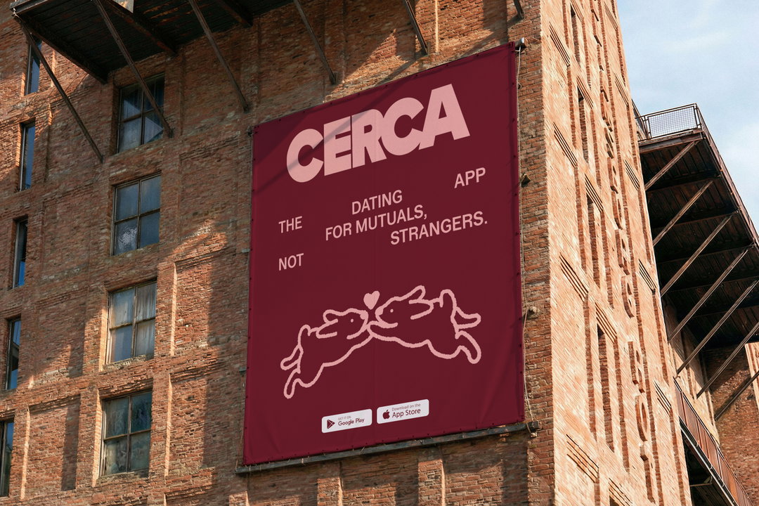
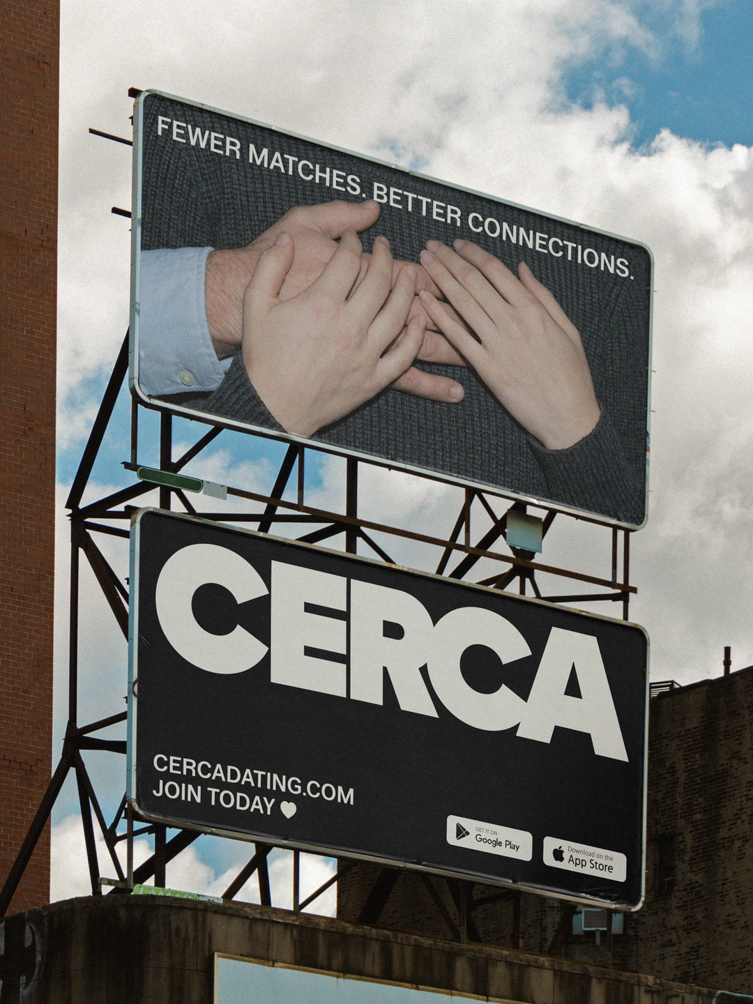
The challenge the studio faced was to build a system that felt bold enough to live in public space alongside its own users, but one that still felt human and relatable. Dating isn’t just a physical thing anymore, it’s something that happens on phones, but Saint Urbain sought to create an emotional resonance that didn’t dissipate between digital platforms and real life meet-ups. “We found that most dating brands rely on softness or irony to feel approachable, Cerca didn’t need any of that,” says Alex Ostroff, founder and creative director of Saint Urbain. So the agency decided to express the main tenets of healthy dating: trust, context and accountability, through bold typography, animation and photography that feels down to earth.
GallerySaint Urbain: Cerca (Copyright © Saint Urbain, 2026)
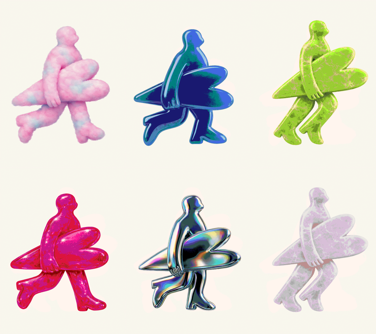
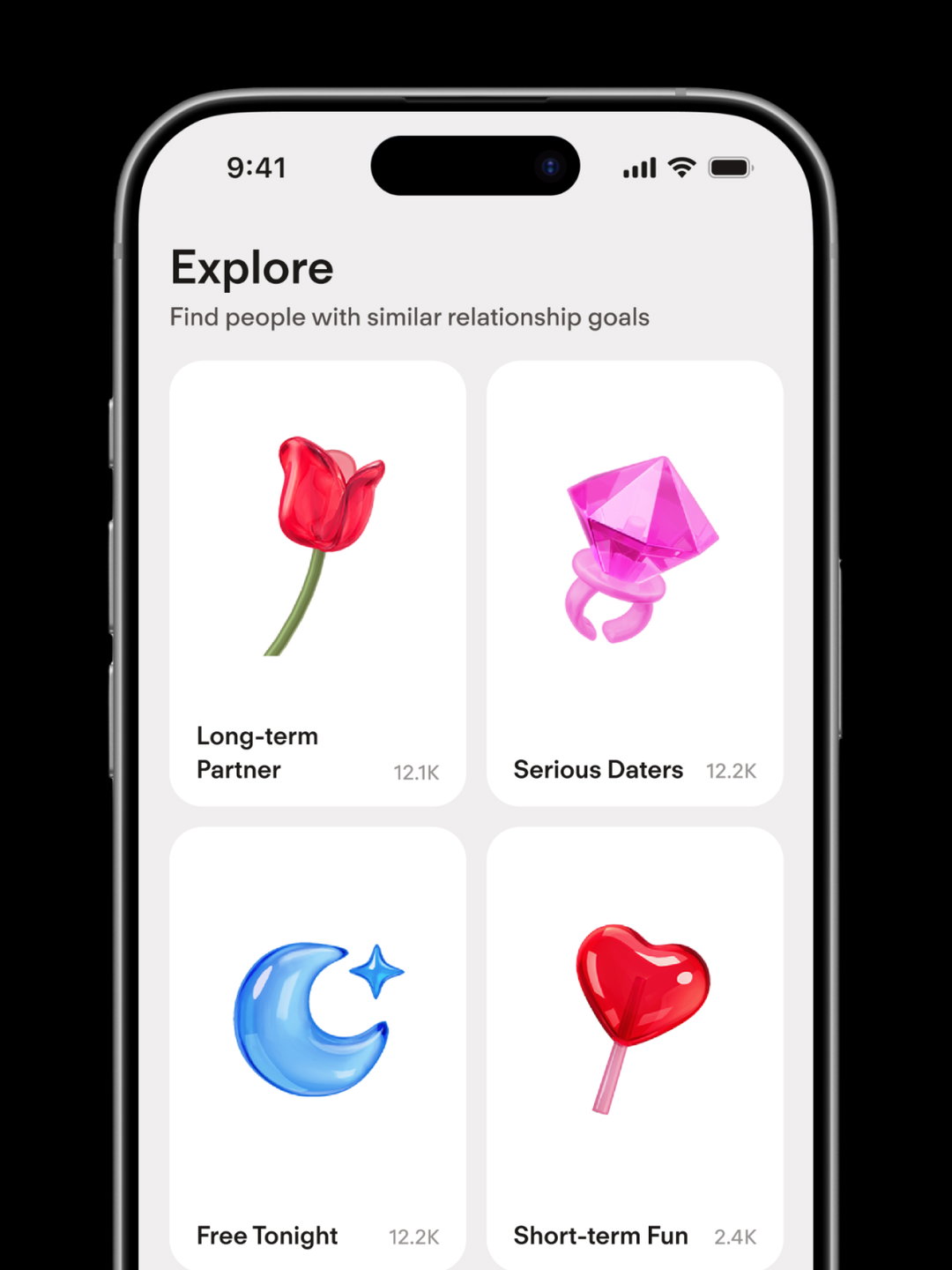
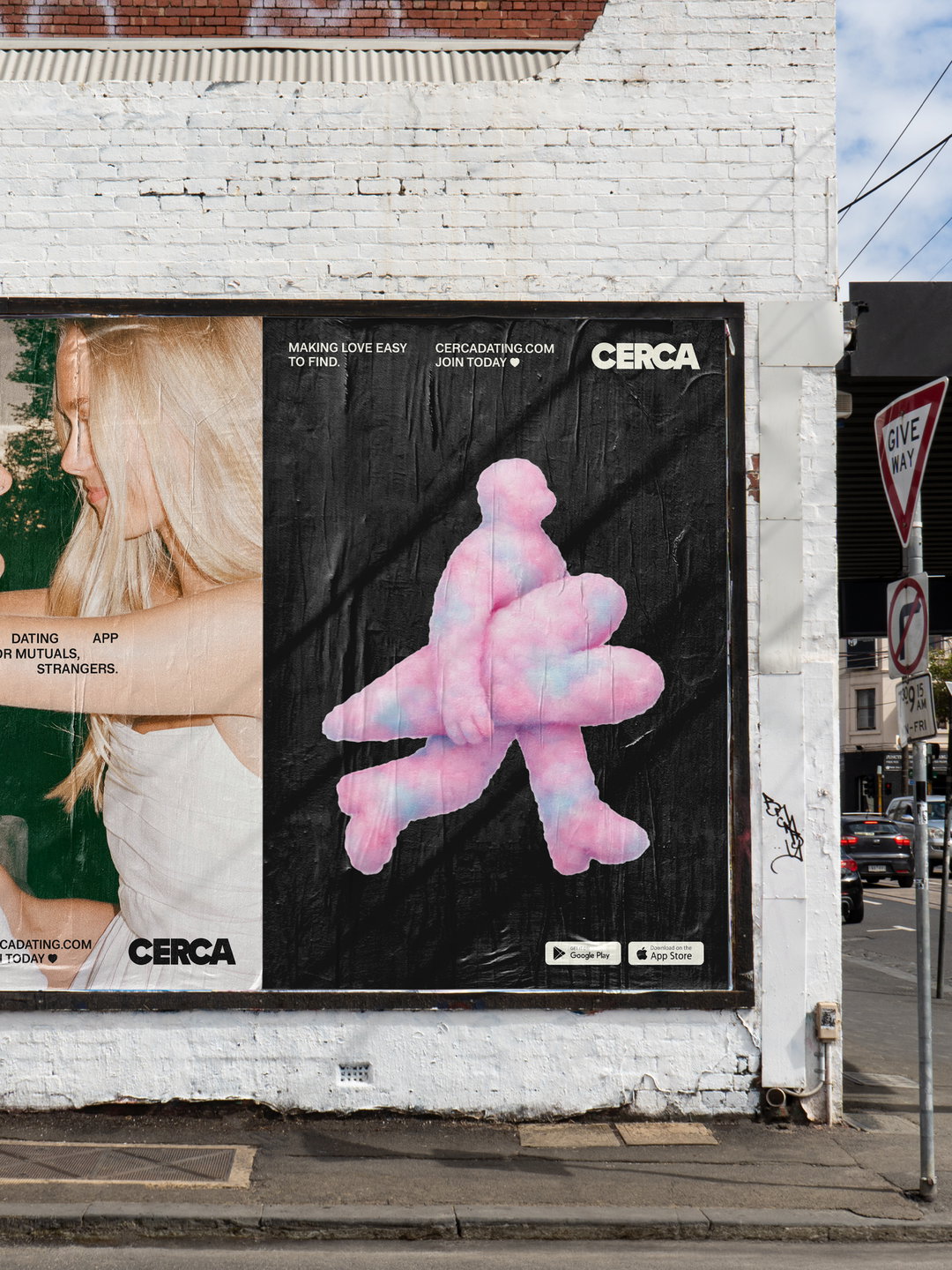
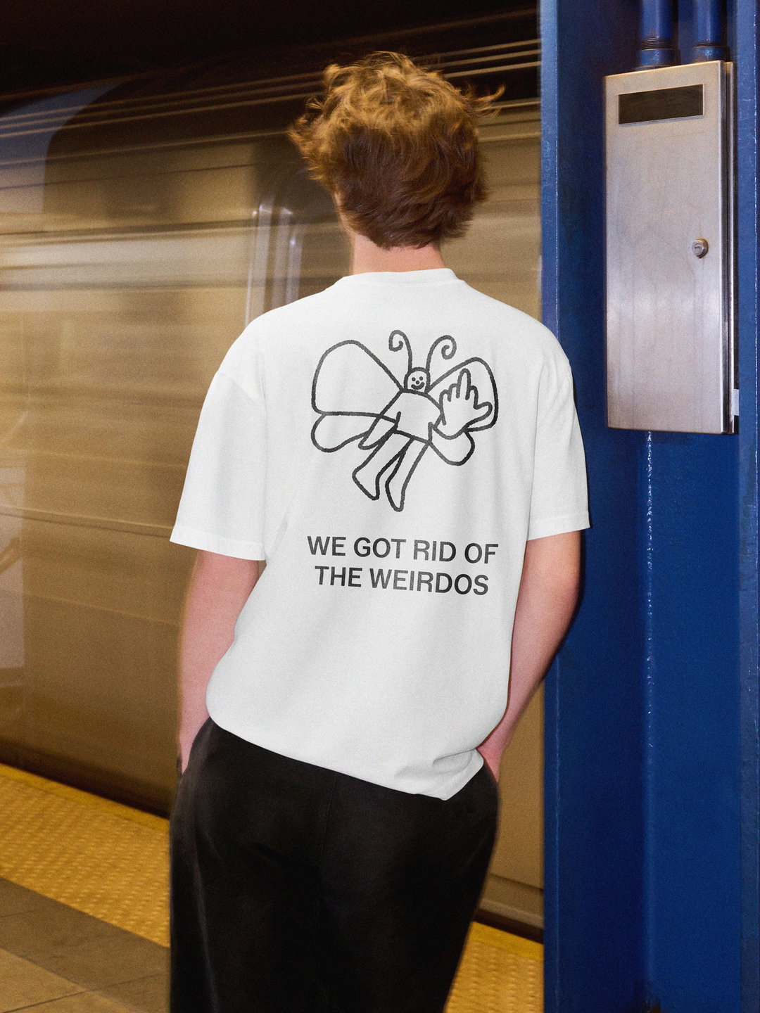
Just because the likes on Cerca are anonymous doesn’t mean the visual identity had to be too. When one uses Cerca, they’re more likely to connect with people they tangentially know, which has fed into Saint Urbain’s taglines ‘making love easy to find’ and ‘fewer matches, better connections’. Visually, the branding mirrors that – expressive and human, a world full of mutuals rather than strangers. Saint Urbain were careful to not turn those ideas into messaging about safety or the morality of using dating apps, opting for lighter visuals: rabbits, figures made of pink clouds and drawings that allow people to paste themselves onto the characters.
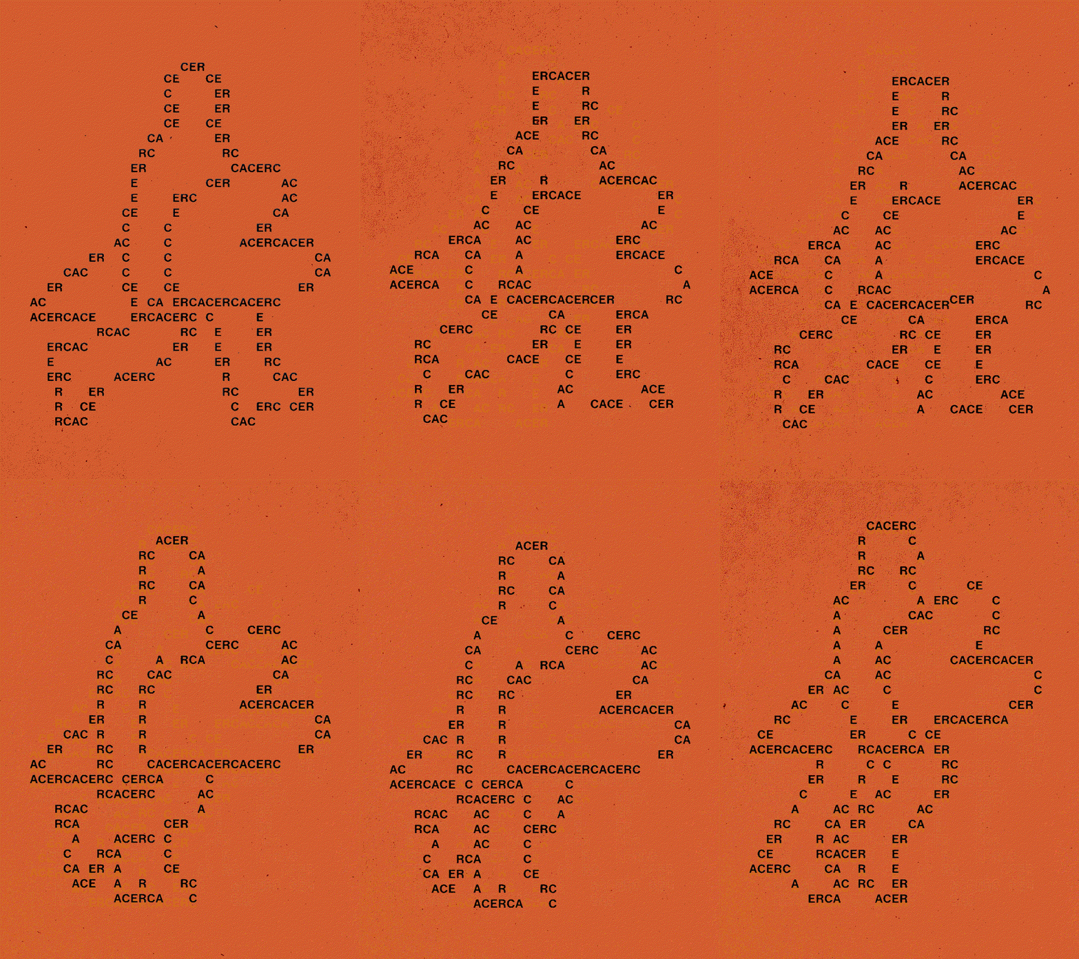
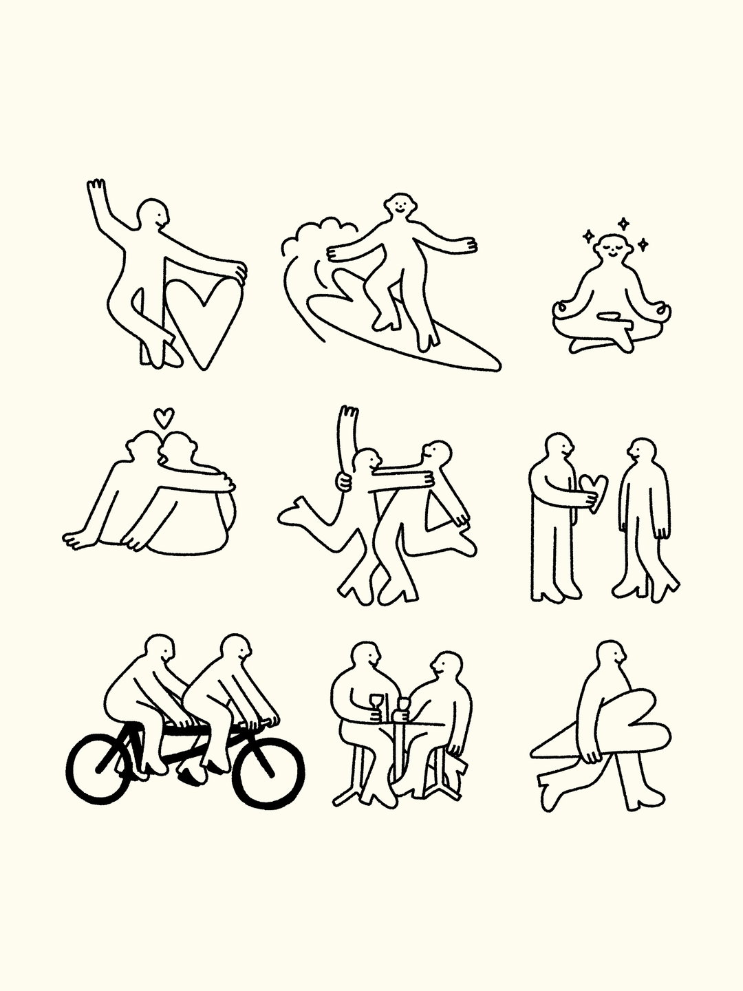
“The illustrated characters and animals are intentionally silly, loose and very human. They represent the personalities you actually meet through mutuals,” says Alex. Saint Urbain developed Heart Boy, a flexible motion graphic that could exist as chrome, clouds, fur, bubbles, grass or galaxies. The agency also makes great use of text-based animation to create motion out of the word ‘cerca’, baking the ethos across the whole project. “Each version represents a different social circle or micro-community. Within every small group of mutual friends, there’s its own universe, its own vibe,” says Alex.
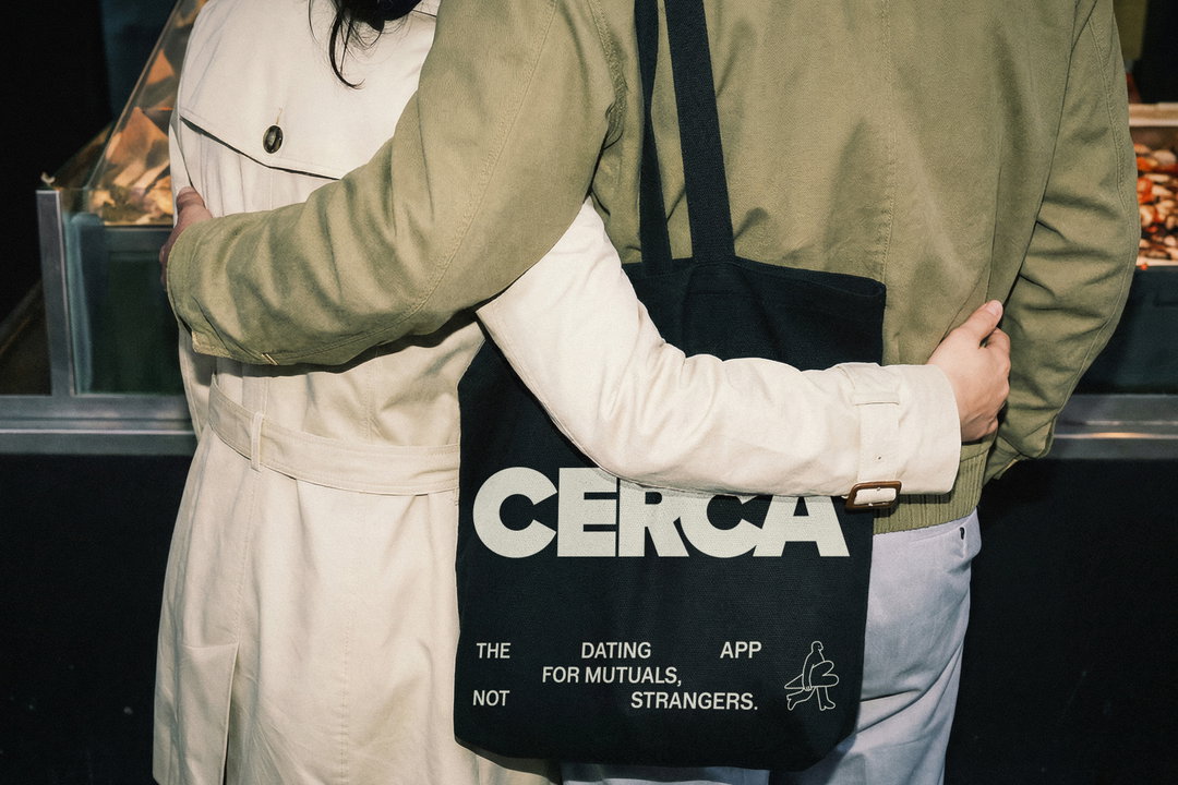
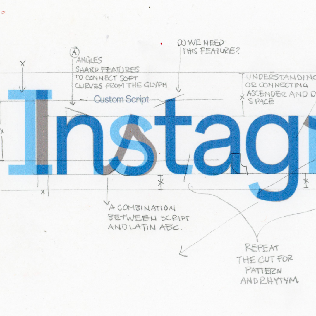
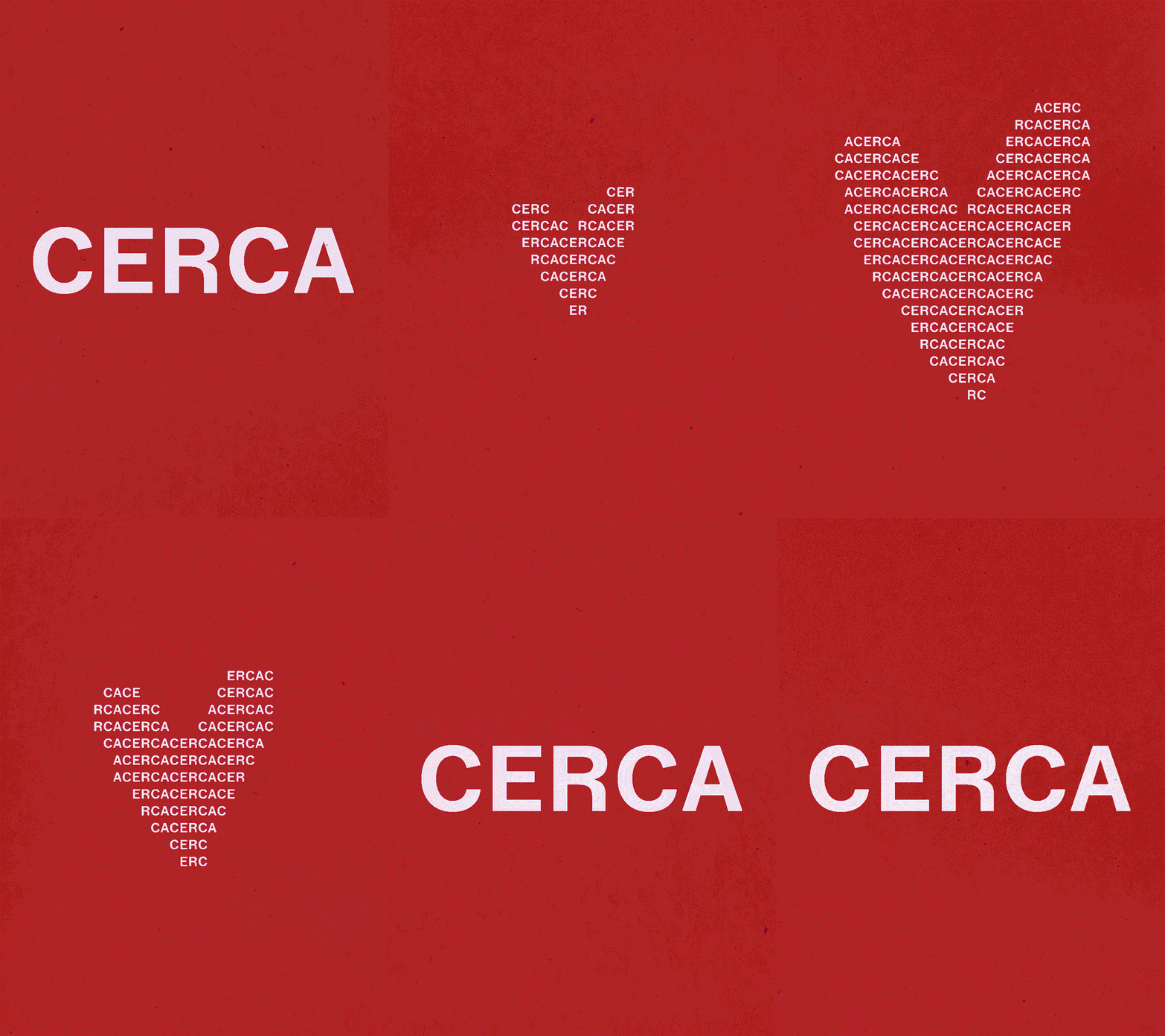
As for the typeface, it’s inspired by 60s and 70s geometry, and Saint Urbain prioritised a clean and readable wordmark that could still emit a warmth, as opposed to the coldness of “tech typography”. That’s why the spacing on the wordmark is so tight – Alex tells us: “it literally represents the word’s meaning”.
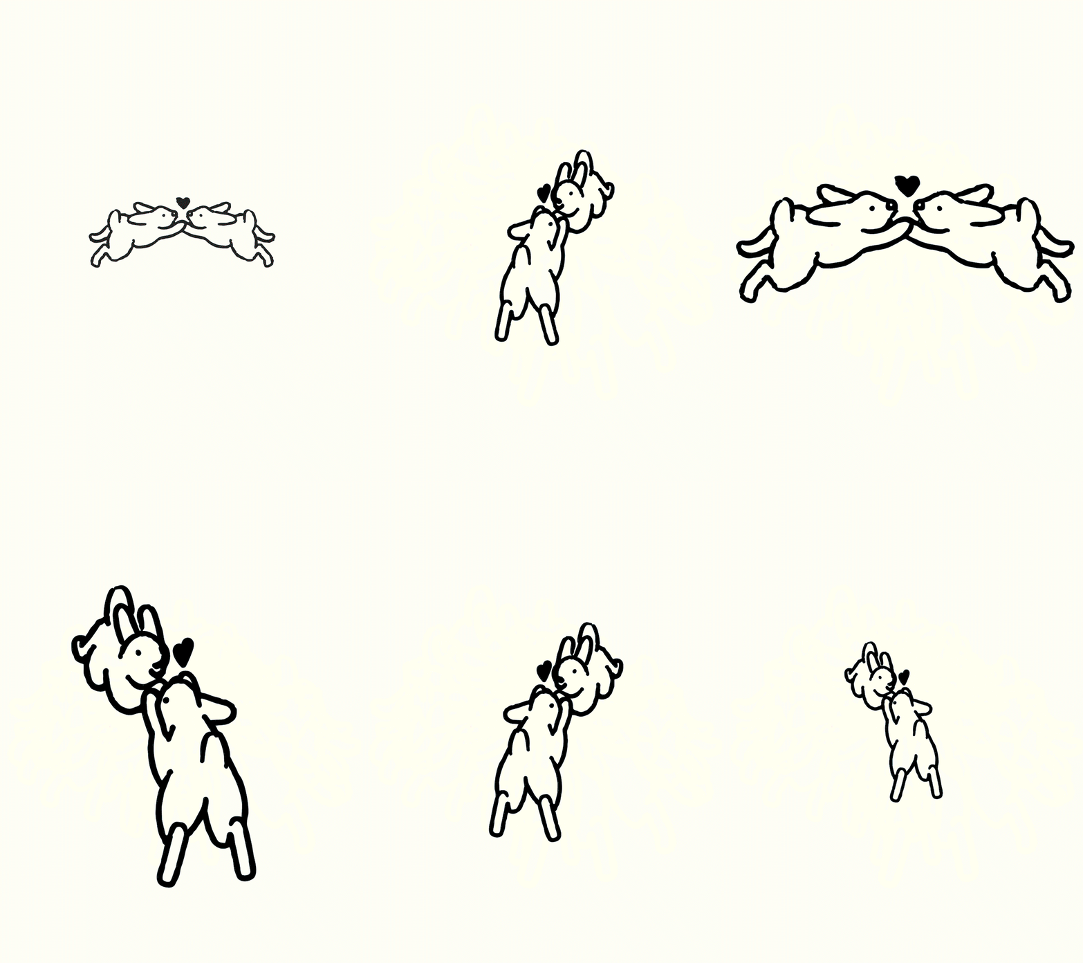
Some of the branded motion pieces subtly lean into a 80s-inspired “computer love” feeling – Kraftwerk was playing in the background during a lot of Saint Urbain’s work sessions and the influence stuck. “We liked the idea of leaning into something slightly vintage, because there’s a real nostalgia to how people used to meet. At bars, at dinner parties, through mutual friends. The way our parents might have been set up,” says Alex. “That sense of nostalgic warmth guided many of the motion decisions. The animations are meant to feel playful and human, not overly polished or tech-forward.” The goal was simple with Saint Urbain: not taking dating too seriously. That’s why you can see geese with their necks tangled together and bunnies floating through space whilst holding hands. Love is serious business – but it can also be silly.
GallerySaint Urbain: Cerca (Copyright © Saint Urbain, 2026)

Hero Header
Saint Urbain: Cerca (Copyright © Saint Urbain, 2026)
Share Article
Further Info
About the Author
—
Paul M (He/Him) is a Junior Writer at It’s Nice That since May 2025. He has a strong interest in graphic design, digital kitsch, multimedia painting, collage, nostalgia, analogue technology and all matters of strange stuff. pcm@itsnicethat.com
To submit your work to be featured on the site, see our Submissions Guide.