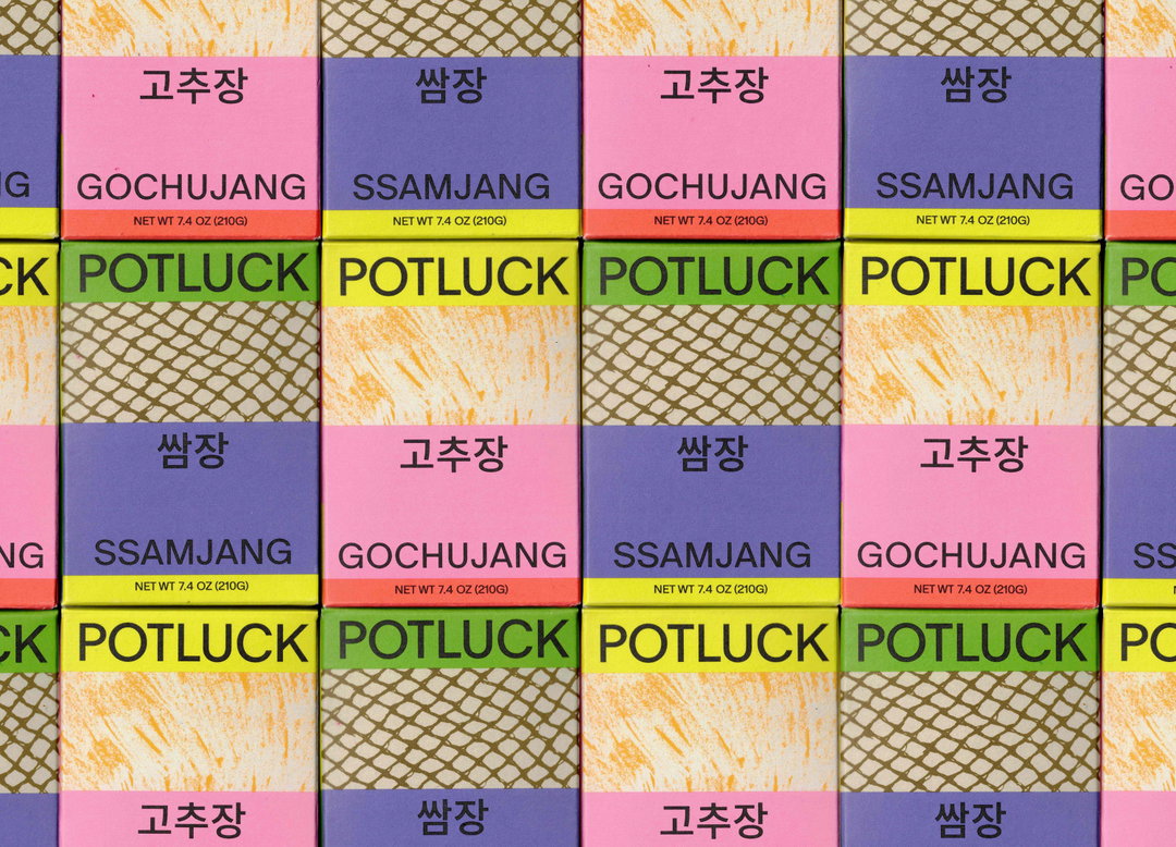
Regrets Only’s colourful patchwork identity for Potluck reflects the ethos of small-batch cooking
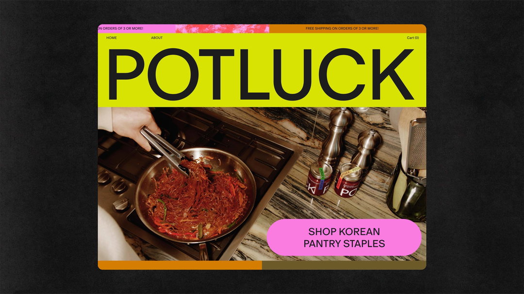
The studio’s new identity for Korean pantry staples brand “speaks to home cooking and family gatherings”, pulling up new seats at the table for hand-crafted Korean cuisine.
It’s an exciting time for Studio Regrets Only, as founder Caleb Halter tells us: “we never really know who will call, and feel really lucky to have a lot of different projects in a lot of different fields at the moment”. Since we last caught up in 2021, the studio has expanded into a new space, with exciting new identity projects landing on their desks, one of which being their recent, brightly coloured branding for Potluck, the all-natural Korean pantry staples line.
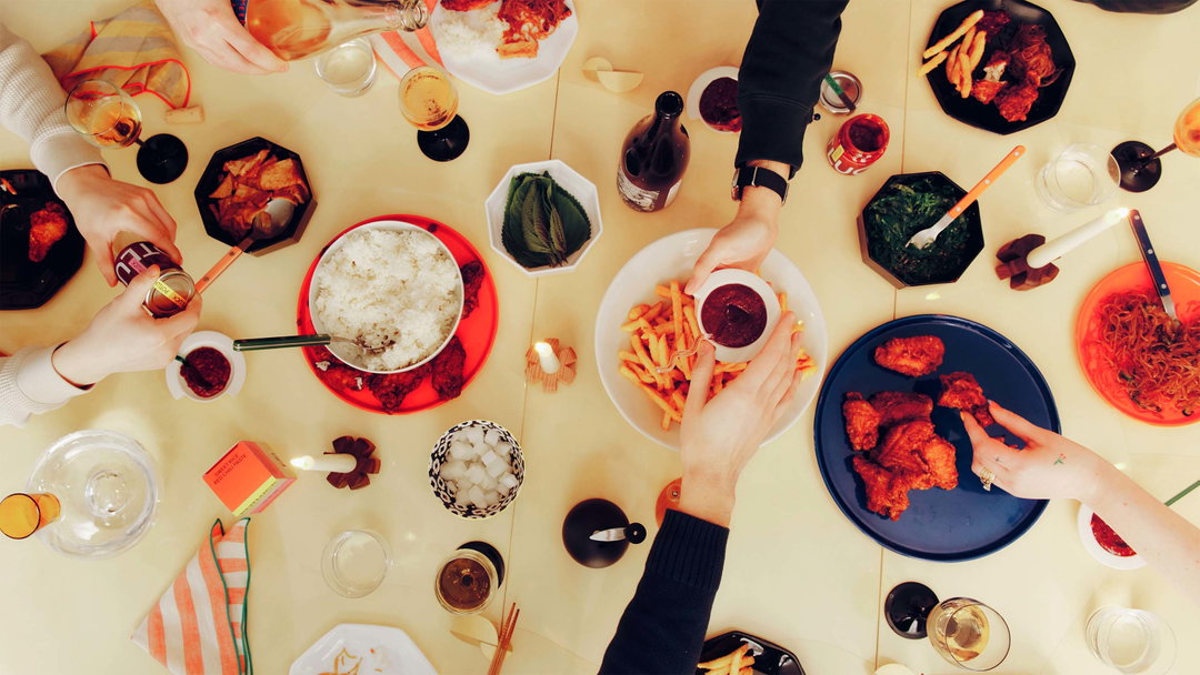
Founded by Jen Arsenault, Potluck is an invitation for those who have grown up with Korean food to return to their home-cooked comforts, while also being a warm welcome for curious first time triers and amateur home cooks. The Korean food brand has a personal story that “speaks to home cooking and family gatherings”, says Caleb, which inspired the studios approach to focus on the meaning of small batch cooking and the preservation of traditional flavours, all whilst making the brands appearance playful enough to attract newcomers to pull up a chair at the dinner table.
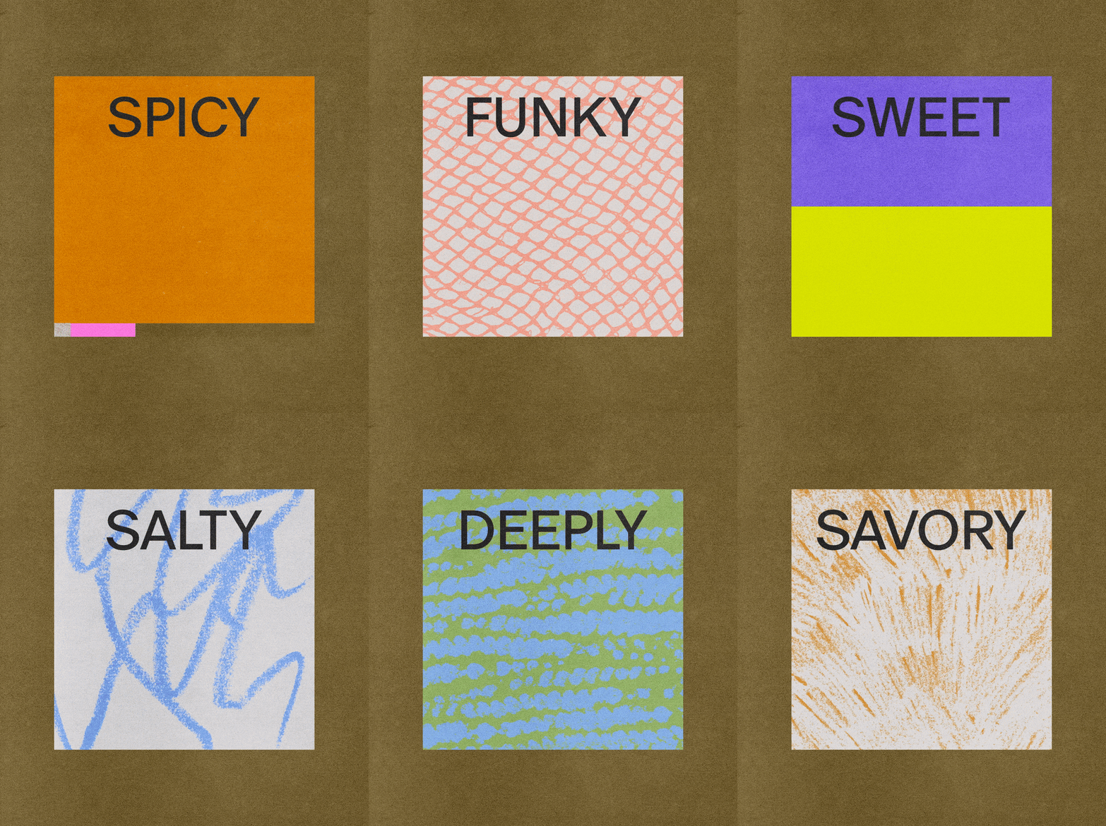
Regrets Only: Potluck (Copyright © Regrets Only, 2024)
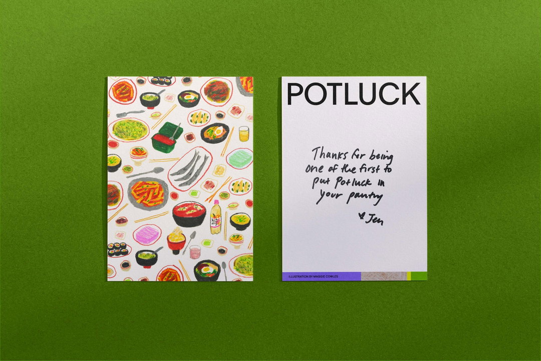
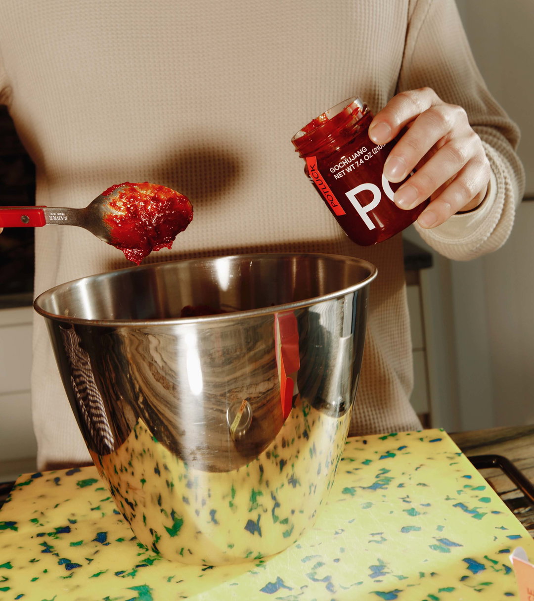
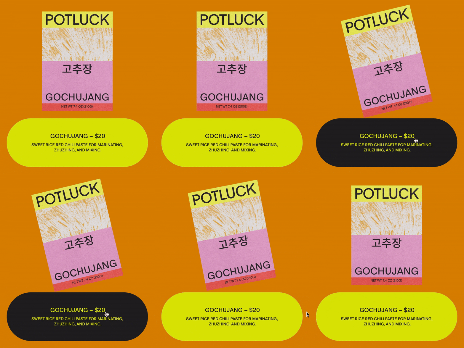
With Potluck’s products made from scratch and in small amounts, Regrets Only knew from the get go that the brand's visual identity needed to feel “equally handmade and intentional”, says Caleb. This influenced what became a very analogue approach to the design, and the team set about creating textures and patterns using foods for printmaking. A potato-printing-like experiment created “abstract textures that felt like flavour profiles for the products”, with the use of charcoal, crayons and watercolours. These hand-made marks would eventually dress the colourful boxes of Jen’s homemade gochujang and ssamjang.
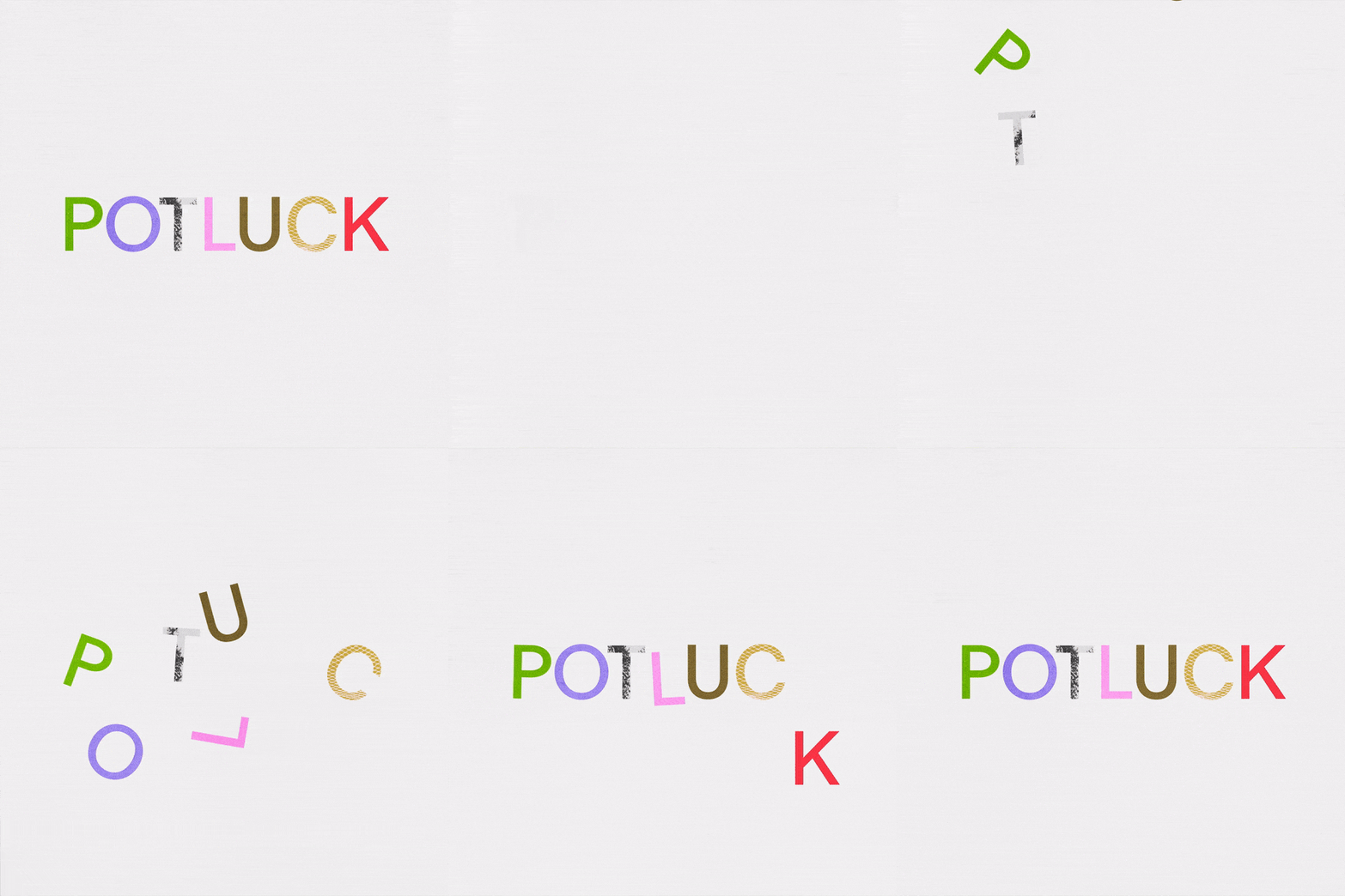
A huge point of inspiration for the project’s visuals was drawn from bojagi: traditional Korean wrapping cloths and how “as an artform it’s about stitching together discrete pieces of fabric to create beautiful, varied, and complex compositions”, says Caleb. Overlapping with the meaning of the word potluck, the colourful patchworks of pattern that the studio brought together across packaging, motion and web gather everything together in “a beautiful metaphor for the brand”; a mix and match, modular system creates new patchworks each time the colourful boxes are stacked up on shop shelves. All of this attention to detail connects the brand’s identity with the kind of playfulness and experimentation that is “true of the act of cooking at its best”.
“Central to Korean cooking is ‘son-mat’ or ‘hand taste’, which is the idea of the unique taste food has from an individual's touch, care, and experience,” Caleb tells us. This idea, that everything tastes slightly different depending on the hands making it, is echoed in all components of the identities handcrafted look and feel, marking Potluck as the antithesis of mass-produced tastes. Instead, the identity embodies “a gathering of ingredients, dishes and people, to create a unique and more flavourful whole”.
GalleryRegrets Only: Potluck (Copyright © Regrets Only, 2024)
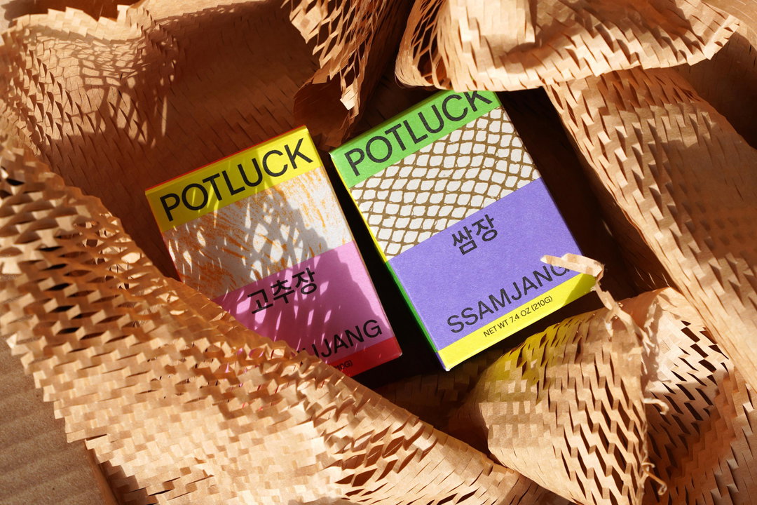

Hero Header
Regrets Only: Potluck (Copyright © Regrets Only, 2024)
Share Article
About the Author
—
Ellis Tree (she/her) is a staff writer at It’s Nice That. She joined as a junior writer in April 2024 after graduating from Kingston School of Art with a degree in Graphic Design. Across her research, writing and visual work she has a particular interest in printmaking, self-publishing and expanded approaches to photography. ert@itsnicethat.com
To submit your work to be featured on the site, see our Submissions Guide.