Studio Lotta Nieminen’s sophisticated brand identity for Erly leans on exquisite colour combinations and a confident logo
To draw up a mark for the skincare brands personalised products, the studio stuck to soft and simple visual cues around “mixing and tailoring”.
When we last caught up with the illustrator and designer Lotta Nieminen, we’d dropped in for a visit at her Manhattan studio way back in 2015 (10 whole years ago!). Then, Lotta’s practice sat very much in between illustration and graphic design, with the designer delving into her diverse skillsets to play a part in both worlds. However, since 2015, aside from working on a children’s book series for Phaidon, the designer has shifted away from illustration to focus on running her own graphic design practice: Studio Lotta Nieminen.
Working alongside designer Emma Tahvanainen and a network of creatives that they bring in based on the needs of each project, Lotta has been developing visual identities for furniture brands and names in the fashion and beauty space over the last decade, offering up a full service in building brand systems: art direction, editorial design, design for print and digital and of course, illustration.
One brand in the beauty space that the studio have crossed paths with is Erly – a clean skincare label that reached out to the studio earlier this year for a design language that would reach across print and web. Founded by best friend duo Jamie Chandlee and Dr. Hallie McDonald to address the growing concern about the influence of the skincare and beauty industry on their daughters, the brands product range positions itself as a pared-down set of essentials that can be personalised for all skin types and ages.
(Studio) Lotta Nieminen: ERLY (Copyright © (Studio) Lotta Nieminen, 2025)
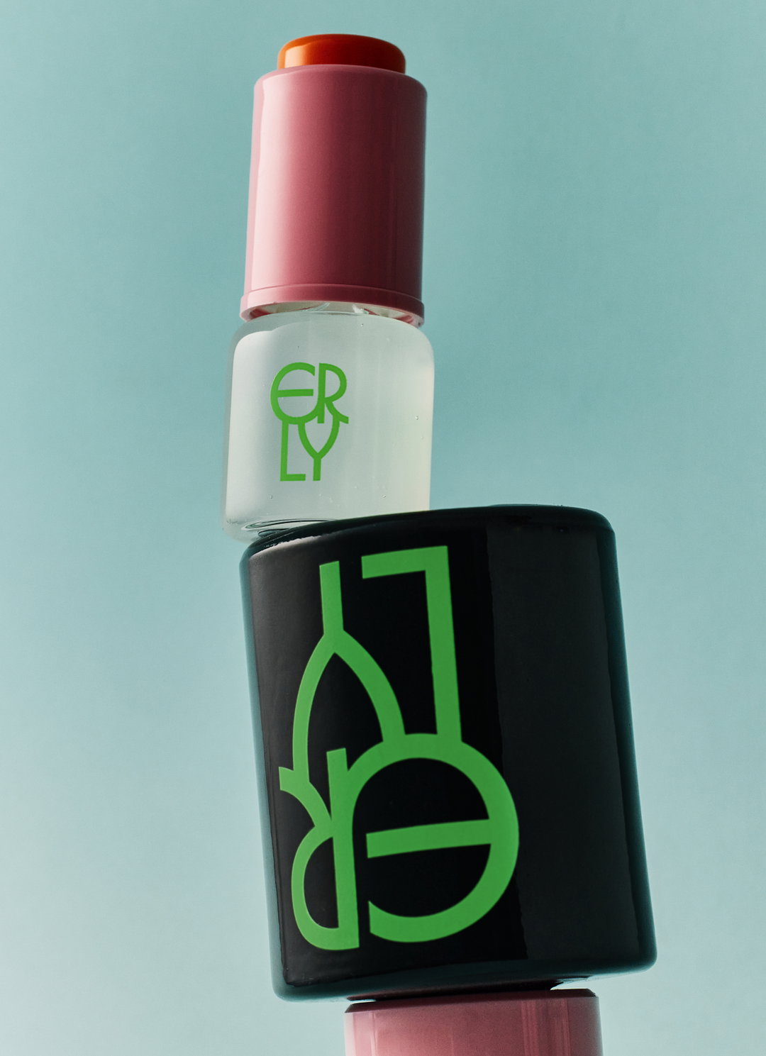
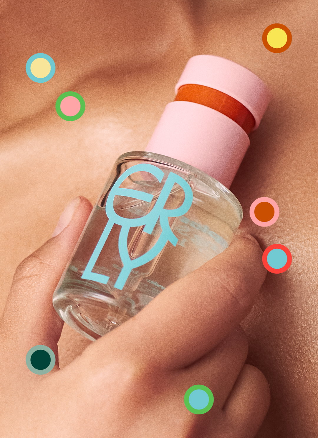
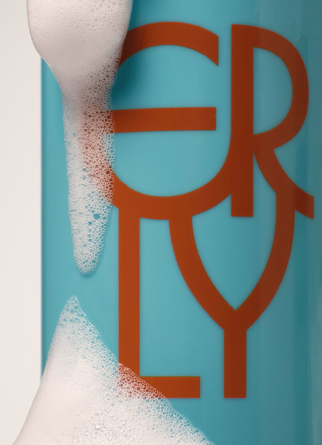
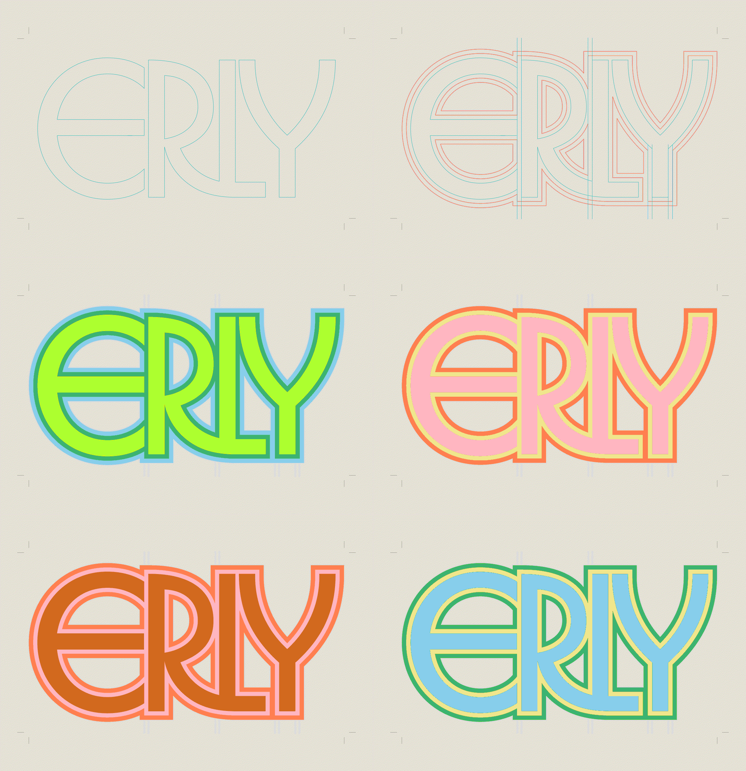
From very early on in the project it was this idea of “mixing and tailoring” that informed the entire visual direction of the brand identity for Lotta, all of which started to take shape around a singular sketch of the logo. Set in Herbus, a typeface deigned by Eliott Grunewald, the brand mark for Erly was designed to “mirror the gentle, circular motion of blending droplets into moisturiser – the letters softening and merging in a way that evokes compounding”, Lotta tells us. “I wanted to find something with that sort of circular movement, and found Herbus worked perfectly to convey that sense of motion.”
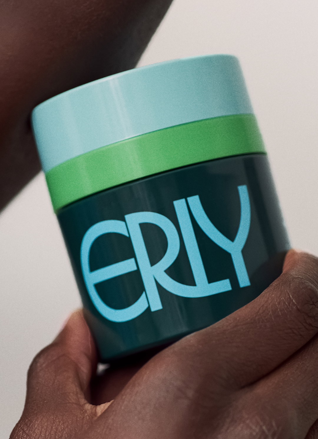
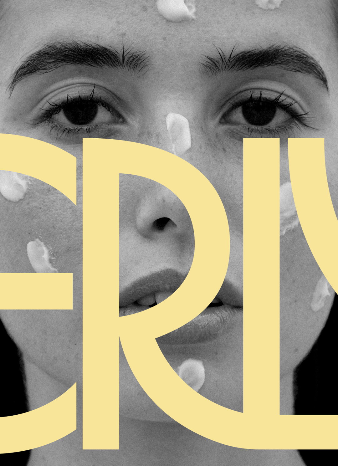
The purposefully stacked letterforms flow seamlessly into one another, and this mark became the distinct stamp of the playful and sophisticated brand personality. When you find a composition that beautiful it’s hard not to make it centre stage, so that’s why the logo sits at a scale larger than the products boxes, wrapping around their edges in the brands packaging system. Lotta and the team spun this harmonious composition into multiple variations and scales, some stacked, some horizontal, some with layers of colour that outlined the letterforms to “subtly reinforce the theme of personalisation woven throughout the brand”, the designer says.
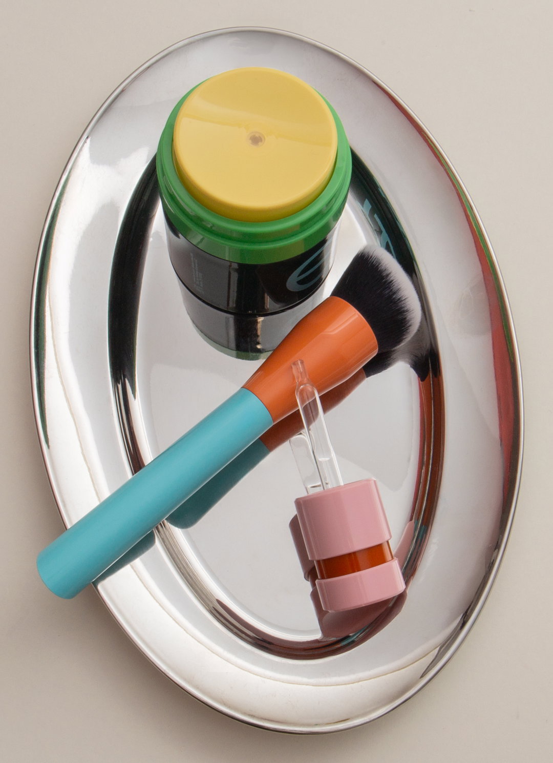
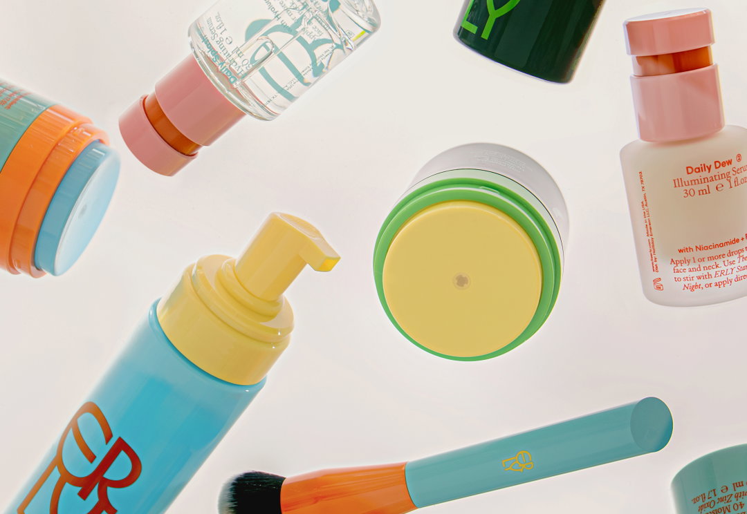
Colour was also a large focus of the brief for Lotta and something that stirred her decision making throughout, a fixation which is clear to see in the studios approach to packaging. The range’s sophisticated, muted tones have been expertly paired with playful neon hues that bounce off of one another – “like the earthy rust that balances the brighter pink on the serum cap”, Lotta says. “Relying on colour and a confidently scaled logo gave the packaging a sense of both confidence and playfulness.”

(Studio) Lotta Nieminen: ERLY (Copyright © (Studio) Lotta Nieminen, 2025)
The studio’s deliberately understated typographic approach formed what Lotta refers to as “an adaptable toolkit that meant the brand would feel cohesive across digital executions”. Like the packaging, the skincare brand’s web experience opens with the logo at a very large scale, with a playful colour-changing effect on mouseover. Beyond this clever piece of motion, the brand’s digital presence “relies primarily on photography, type, and a more controlled use of colour, allowing the brand personality to come through without overwhelming the interface”, she says.
Designed for both young and old, the intention behind the identity was to strike a balance between “playfulness and refinement”, something that would be adaptable enough to allow the brand to shift and change when new products arrive. “I wanted it to feel like something you’d be happy to keep on your bathroom shelf, something that sparks delight and encourages a daily ritual,” Lotta ends. “My goal is always to create systems that are recognisable and distinct, yet open enough to allow for play, evolution and growth over time.”
(Studio) Lotta Nieminen: ERLY (Copyright © Mark Zhelezoglo, 2025)
(Studio) Lotta Nieminen: ERLY (Copyright © Isabella Bejarano, 2025)
(Studio) Lotta Nieminen: ERLY (Copyright © Mark Zhelezoglo, 2025)
(Studio) Lotta Nieminen: ERLY (Copyright © Mark Zhelezoglo, 2025)
(Studio) Lotta Nieminen: ERLY (Copyright © Isabella Bejarano, 2025).

(Studio) Lotta Nieminen: ERLY (Copyright © Nicolas Robertson, 2025)
(Studio) Lotta Nieminen: ERLY (Copyright © Isabella Bejarano, 2025)
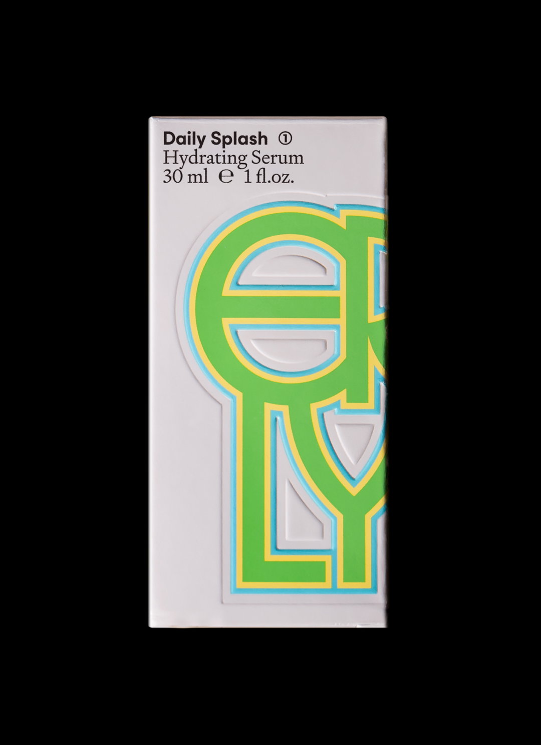
(Studio) Lotta Nieminen: ERLY (Copyright © (Studio) Lotta Nieminen, 2025)
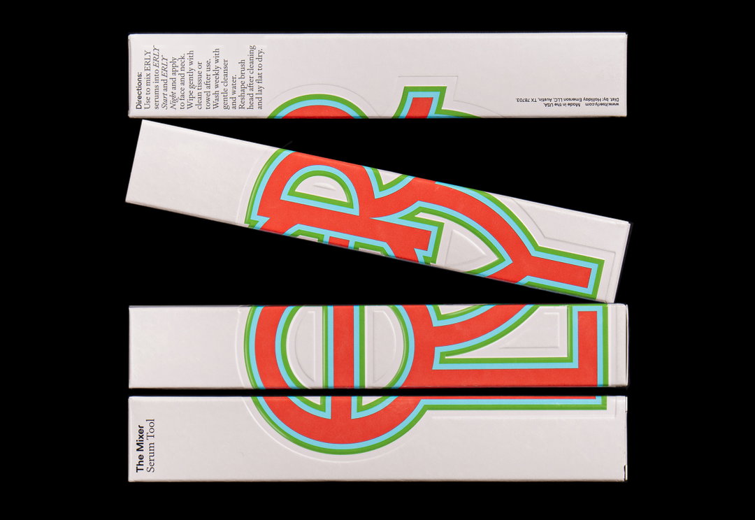
(Studio) Lotta Nieminen: ERLY (Copyright © (Studio) Lotta Nieminen, 2025)
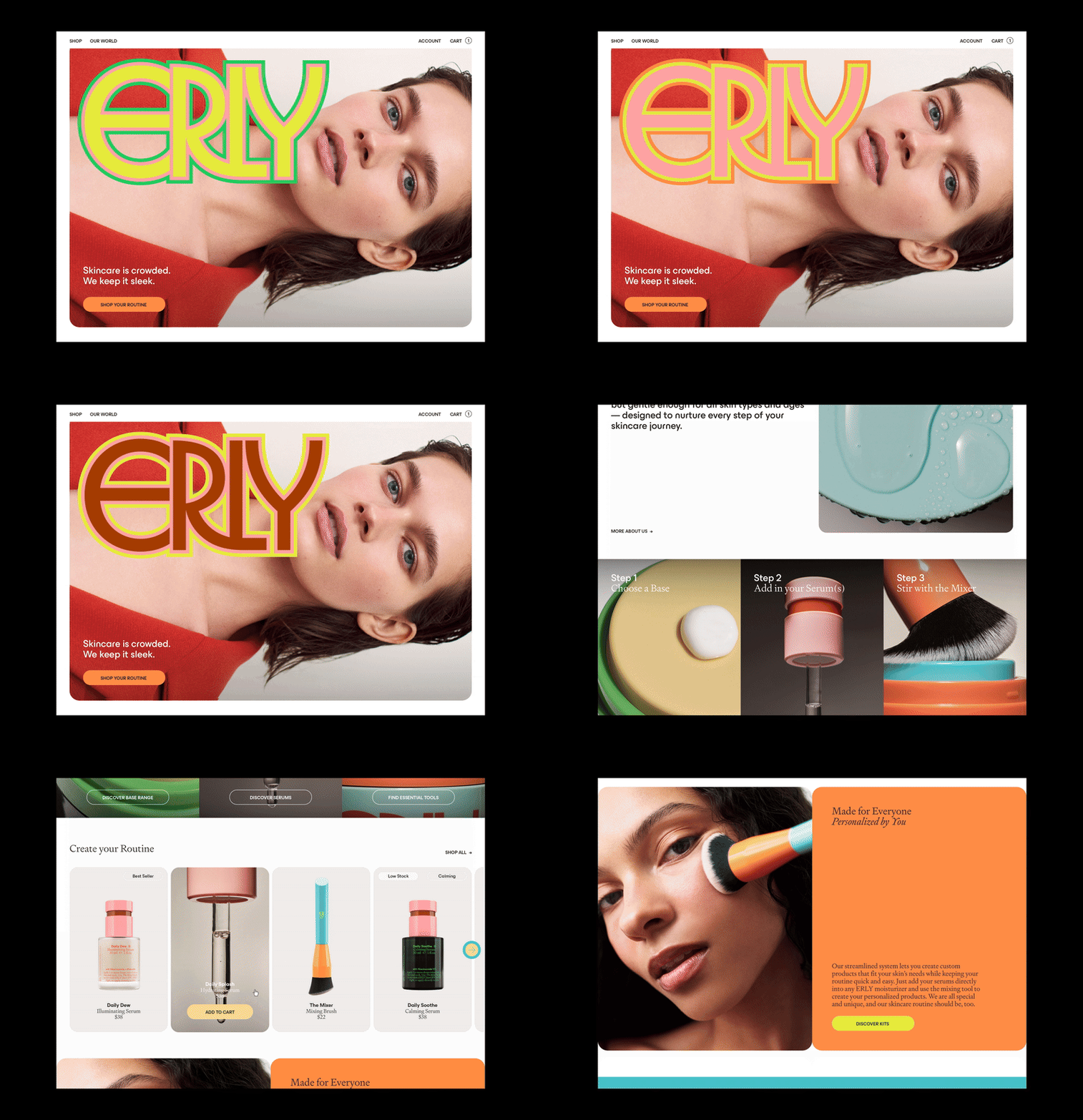
(Studio) Lotta Nieminen: ERLY (Copyright © (Studio) Lotta Nieminen, 2025)
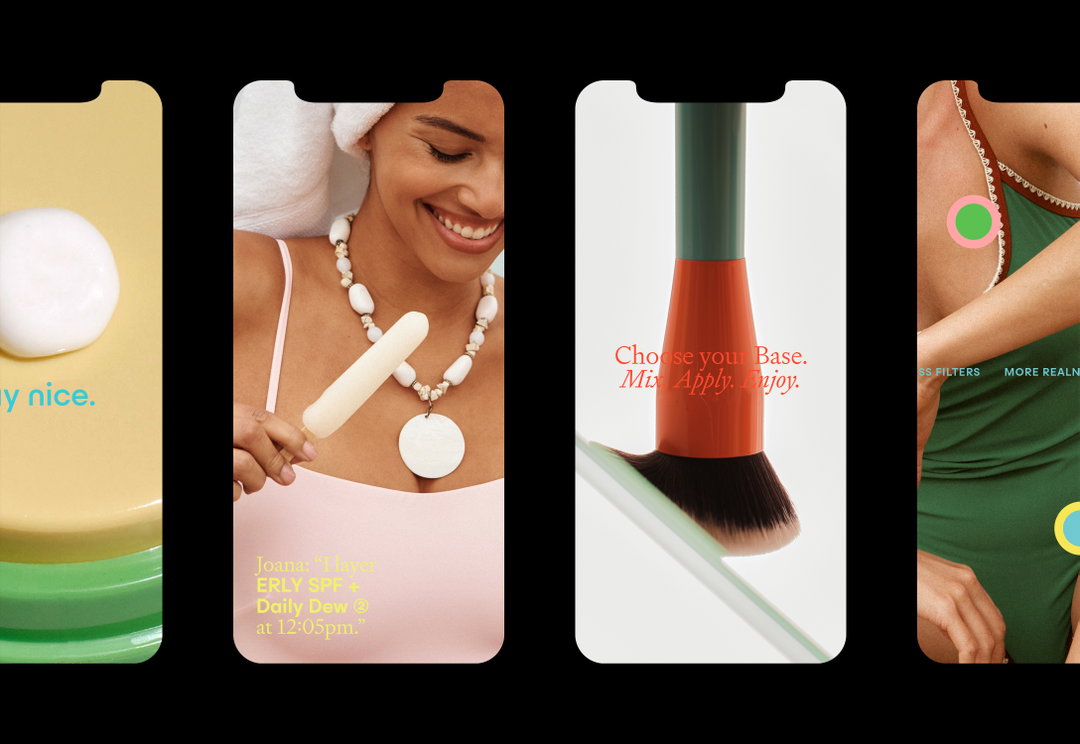
(Studio) Lotta Nieminen: ERLY (Copyright © (Studio) Lotta Nieminen, 2025)
(Studio) Lotta Nieminen: ERLY (Copyright © (Studio) Lotta Nieminen, 2025)
Hero Header
(Studio) Lotta Nieminen: ERLY (Copyright © (Studio) Lotta Nieminen, 2025)
Share Article
Further Info
About the Author
—
Ellis Tree (she/her) is a staff writer at It’s Nice That. She joined as a junior writer in April 2024 after graduating from Kingston School of Art with a degree in Graphic Design. Across her research, writing and visual work she has a particular interest in printmaking, self-publishing and expanded approaches to photography. ert@itsnicethat.com
To submit your work to be featured on the site, see our Submissions Guide.