




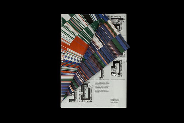
Poster Tribune offers a second life to one beloved but short-lived design object
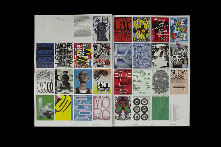
A minimalist newspaper reporting on the trends of graphic, and specifically poster, design is perhaps the most Swiss publication It’s Nice That has ever come across. Published periodically, the ode to all things typographic and grid-based, Poster Tribune was started in 2011 by Thuy-An Hoang and Xavier Erni and this year, received an update to its design by Dennis Moya.
“Posters can be equally considered as artistic creations, communication tools and witnesses to social, commercial and artistic trends from specific periods,” explain Thuy-An and Xavier on motivations bending initiating the project. “They have been created to promote an event temporarily and after being displayed in the streets they usually disappear. Poster Tribune considers that some posters deserve a second life.”
With each issue devoted to a specific topic, the publication has featured the work of designers from across the globe, sometimes thematically grouping their designs by location such as Prague or New York but at other times around intention, as in their hijacking issue. “The choice of designers is always made considering this theme,” they explain, “We brainstorm and make a list of interesting projects connected to the topic before inviting the designers of those projects to be published.”
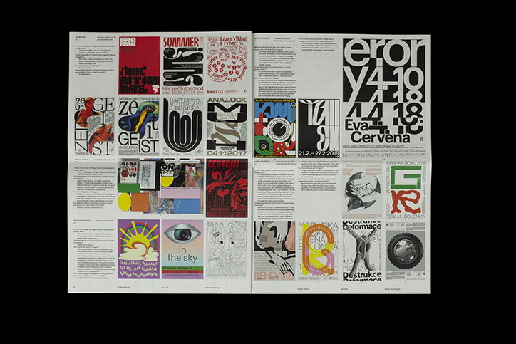
Poster Tribune
When working on their eighth issue last year, Thuy-An and Xavier found themselves “a bit bored by the project”. In need of “a new energy and motivation”, they invited Dennis to rethink the publication’s presentation. “We asked him if he wanted to create with us a new formula for Poster Tribune. We were very glad that he accepted and we decided to team up for the next steps of the newspaper.”
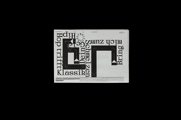
The trio has now produced two issues under this new formula. Whereas the previous layout of Poster Tribune paid homage to the traditions of newspaper design, this contemporary adaptation provides clarity through minimalism. “It’s not easy to design a publication about graphic design, to create a layout that has to include images with another layout in it. We think it’s best not to bring too much ‘design’ into this scenario,” they tell It’s Nice That. “Basically, the simpler the better: one font, one weight, one size, a four column grid and that’s it,” the trio continues, joking that, “It might sound a little Swiss.”
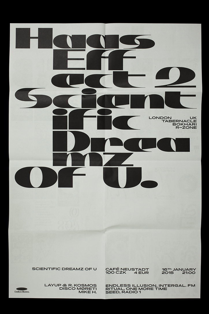
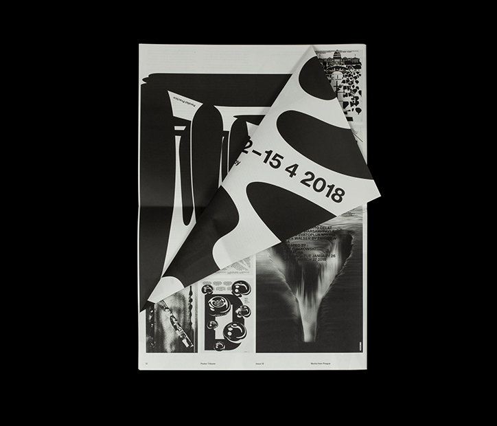
Poster Tribune’s most recent issue, published earlier this year, features the work of graphic designers exclusively based in Prague. A city which has emerged as one of the most vivid and productive when it comes to graphic design in recent years, the issue hones in on this fact. “It is delicate nowadays to speak about territorial styles of graphic design in a time when design schools welcome students hailing from all corners of the world, and when international designs featured on the internet can influence just about anyone on a daily basis. Nevertheless, when viewing these beautifully executed posters, you can feel the clear legacy of Czech graphic design,” reads the description of issue ten, with Thuy-An and Xavier adding, “Most designers from Prague share a passion for typography and you can feel it in this issue.”
An astute observation and overview of a bubbling contemporary design scene, the issue also features three posters designed by Parallel Practice, Jan Horcik and Jiri Mocek – three prominent names within the city’s creative world.
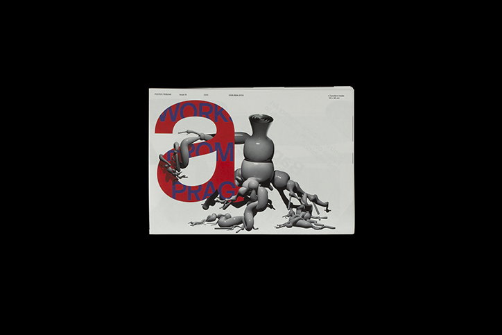
Poster Tribune
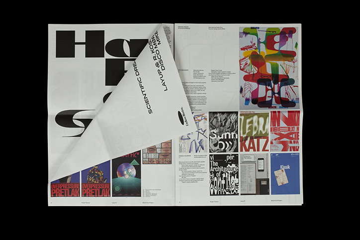
Poster Tribune
Poster Tribune
Poster Tribune
Poster Tribune
Poster Tribune
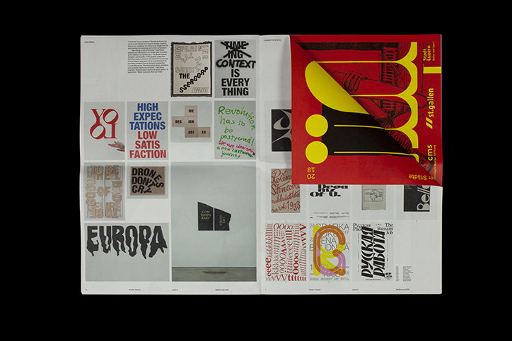
Poster Tribune
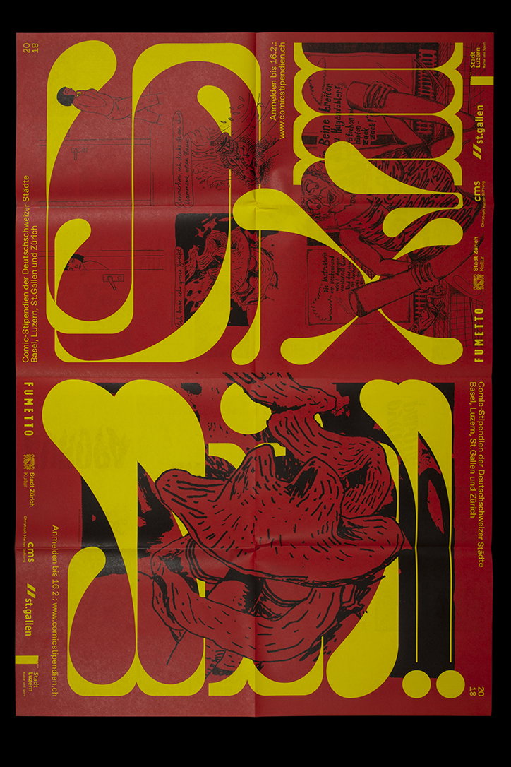
Poster Tribune
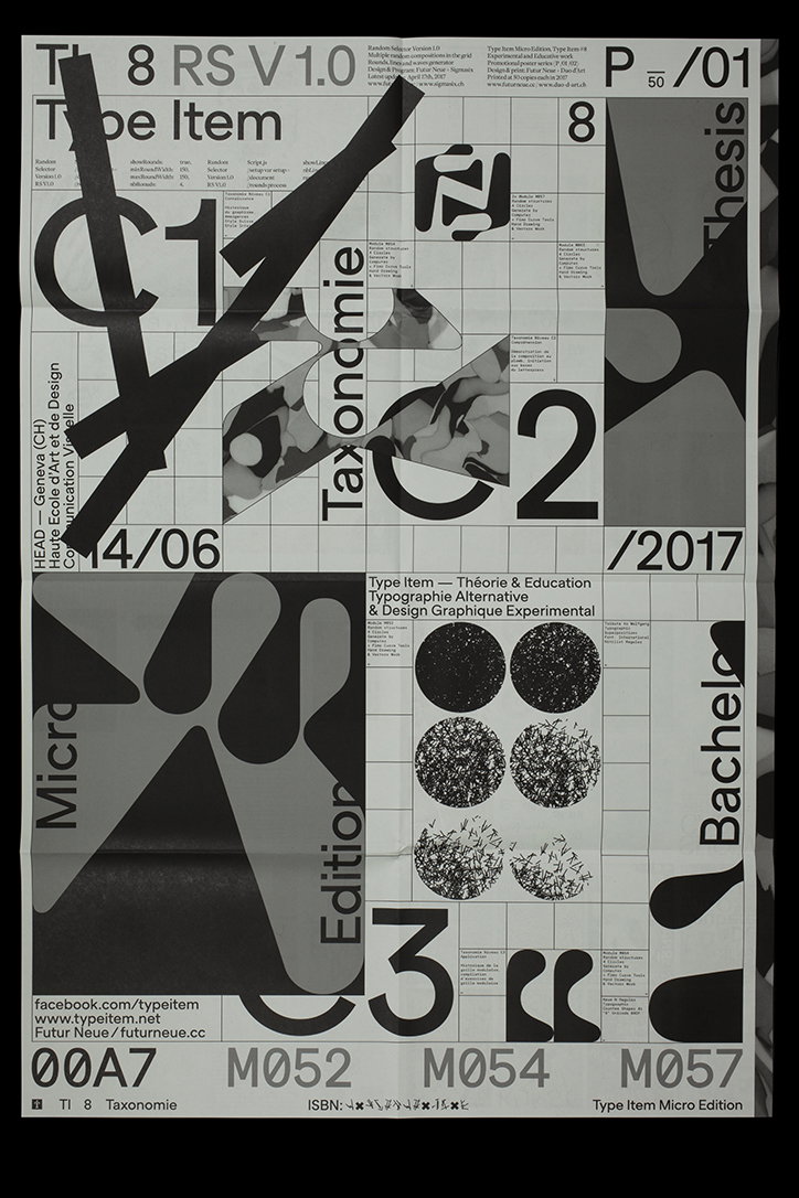
Poster Tribune
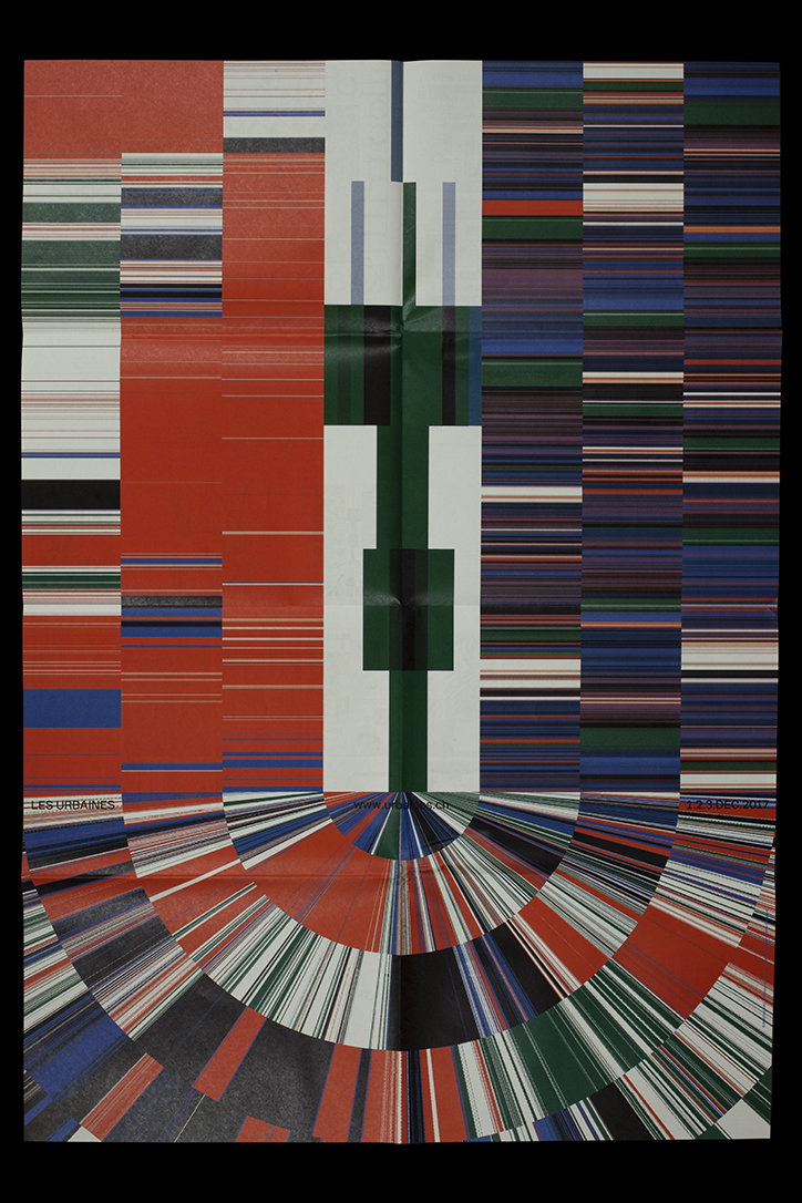
Poster Tribune
Share Article
Further Info
About the Author
—
Ruby is Senior Creative at It's Nice That, overseeing our visual output across platforms and projects. Before that, she was associate editor on the editorial team, after joining in September 2017 following graduation from Central Saint Martins.