PAC, the performing arts centre at ground zero, debuts its branding
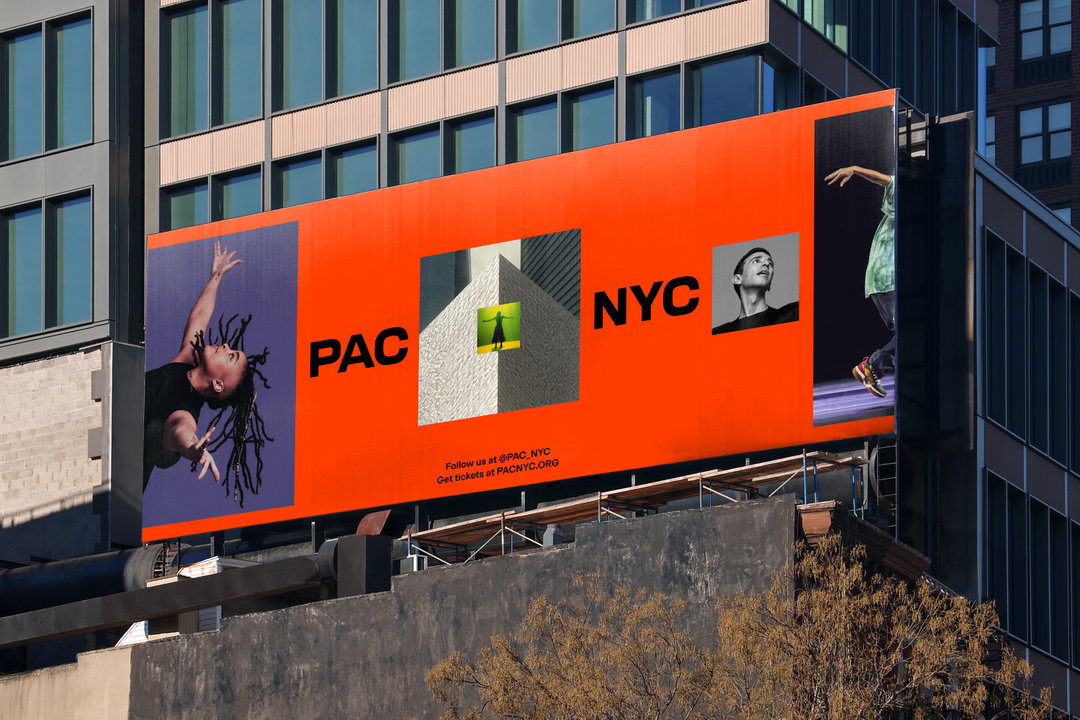
“We needed to radiate mass appeal,” says Porto Rocha, the graphic design studio tasked with encouraging visitors to the World Trade Centre site.
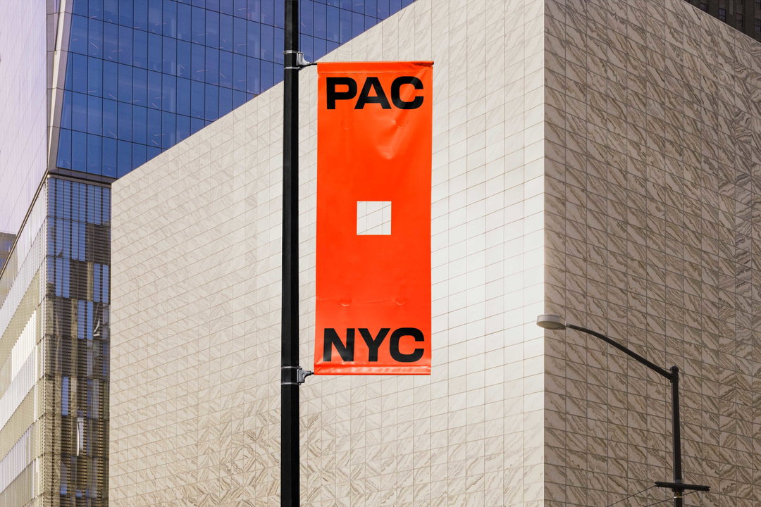
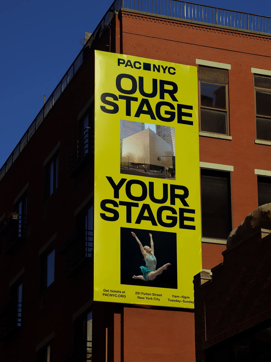
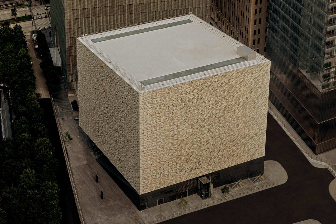
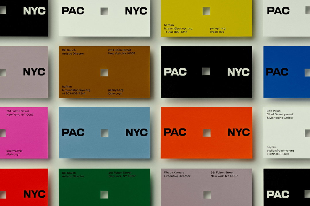
The Perelman Performing Arts Center building is windowless; a 129,000-square cube in terracotta and white. Its branding, on the other hand, has colour in spades; searing orange, pink and yellow break through the system at multiple points. While the PAC building, a cultural space at ground zero, could afford, and needed to be simple, enclosed, reverent almost, the branding had to “radiate mass appeal”.
“Balancing the historical exclusion of the [performing arts] category with a symbolic site many hadn’t visited since 9/11 were real barriers to a warm welcome,” says Porto Rocha, the design studio behind the work. After the studio received the brief in 2022, it set out to balance reverence for the location with the vision for cultural “renewal” Michael Bloomberg had for the World Trade Centre.
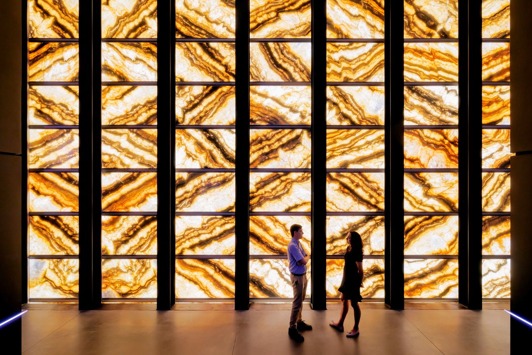
Architecture, not branding, is typically the first discipline to respond to challenges like this. Porto Rocha had to come up with a visual counter for a building that had been 22 years of development – a perfectly symmetrical structure with 5,000 marble tiles that glows on the inside. “Over many site visits across the building’s construction — before, during, and after completion — we intimately connected with its architecture,” says Joseph. “This presented both a well of inspiration and tension that we mined to create the brand identity. The grand marble cube exterior sat atop steps you need to climb to enter was as inspiring as it was intimidating.”
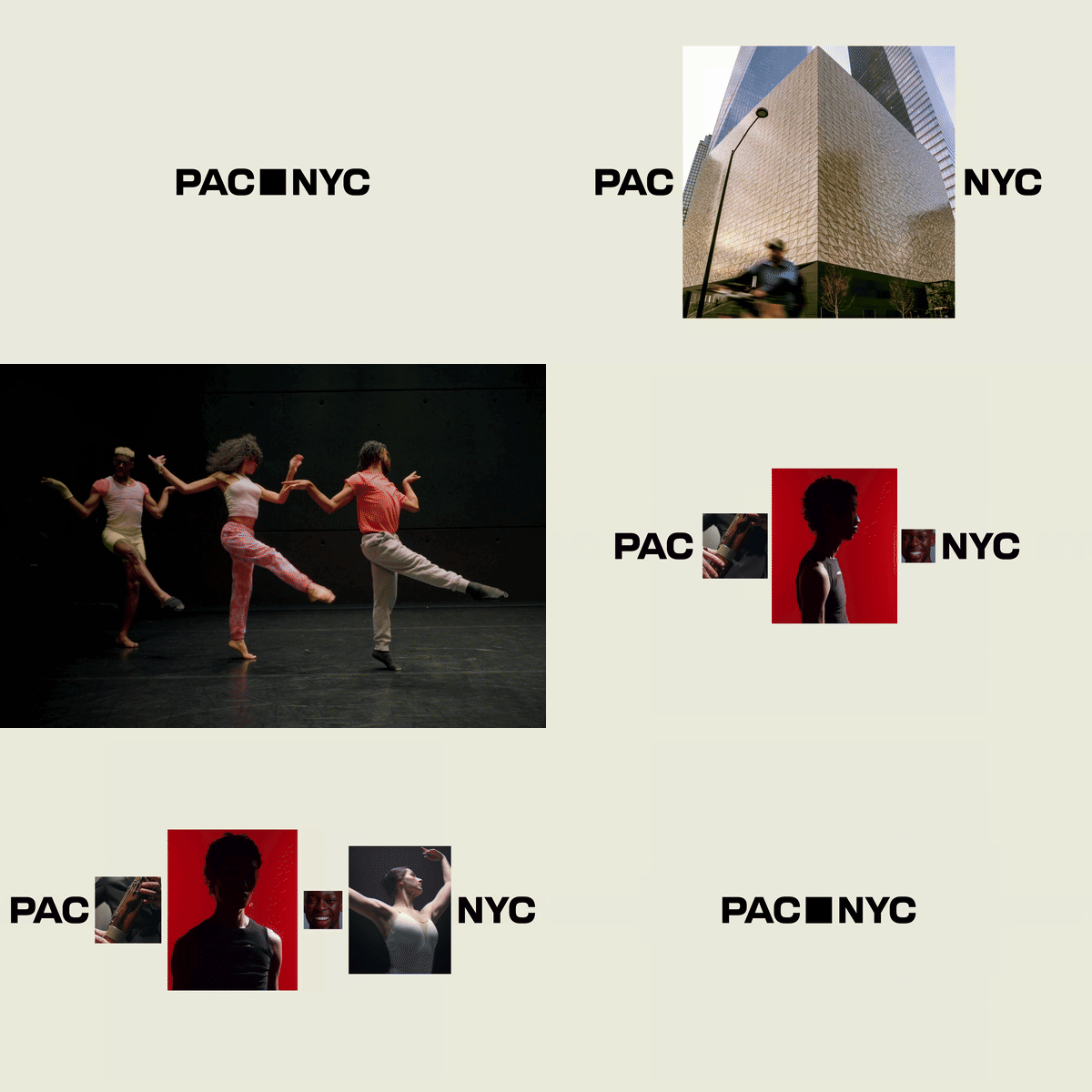
Porto Rocha: Perelman Performing Arts Center (Copyright © Porto Rocha, 2024)
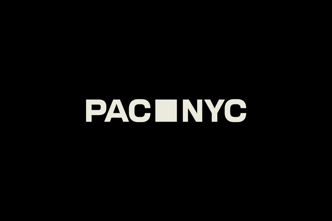
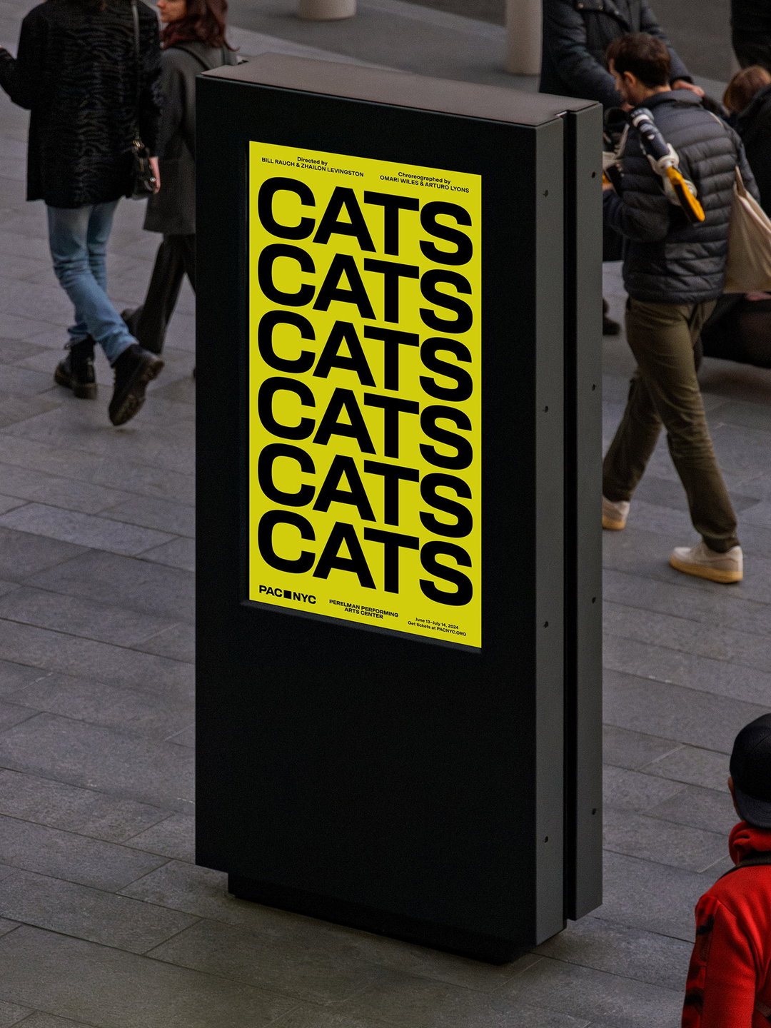
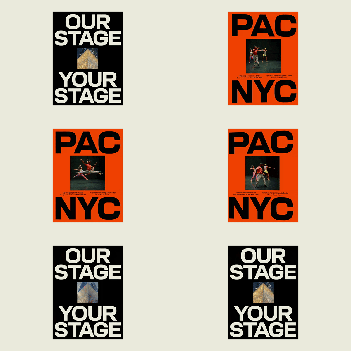
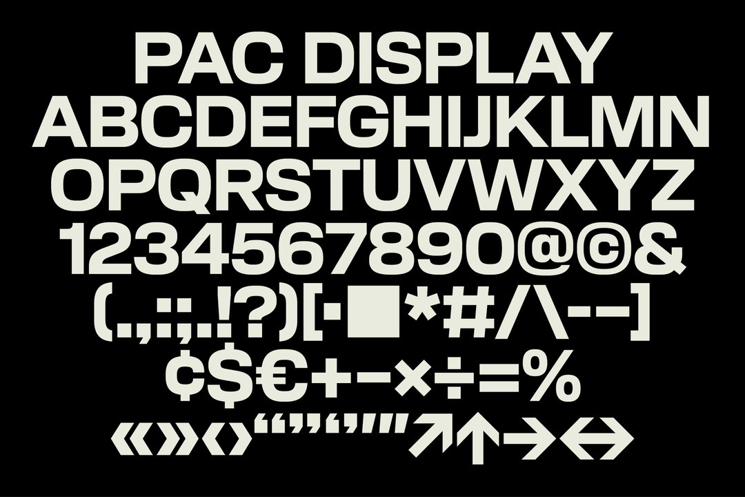
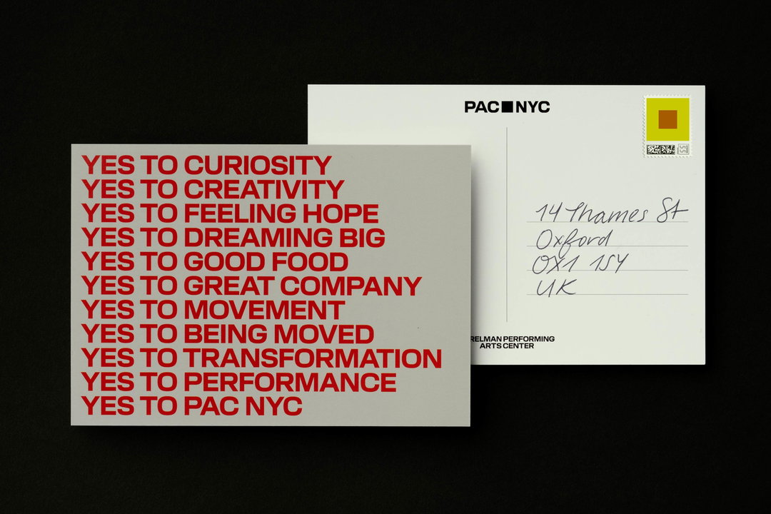
There is order and space in the visual identity for PAC too, but Porto Rocha is more on-the-nose in its attempts to welcome in visitors. Design lead Joseph Lebus compares the typeface, inspired by 19th Century American Gothic, to an “invitation from New York”. And while there are sharp square ratios everywhere, inspired by the PAC building when viewed from above, Porto Rocha consciously sought to make the site less intimidating.
“We needed to invite people into the space, to break through the imposing marble cube and want to step inside. Taking that same square, we imbued it with the vibrancy and dynamism of the building’s interior, completely modular to various performance and stage configurations.” The square logo expands into a framing device for other content like films and videos, similar to Porto Rocha’s work for Sundance Film Festival last year, which featured a graphic window shaped like a cinema screen. The studio has spoken about the benefits of this technique in breaking up “monotonous” brand assets before.
In comparison to the all-encompassing building, the branding has a softer impact. But perhaps this is necessary. “Performing arts had historically excluded many,” says Joseph; to welcome in new audiences in the Lower Manhattan spot, more marble wouldn’t be right.
GalleryPorto Rocha: Perelman Performing Arts Center (Copyright © Porto Rocha, 2024)
Hero Header
Porto Rocha: Perelman Performing Arts Center (Copyright © Porto Rocha, 2024)
Share Article
Further Info
About the Author
—
Liz (she/they) is the senior editor at Insights, a research-driven department within It’s Nice That. They previously ran the news section of the website. Get in contact with them for potential Insights collaborations or to discuss Insights’ public-facing reports.