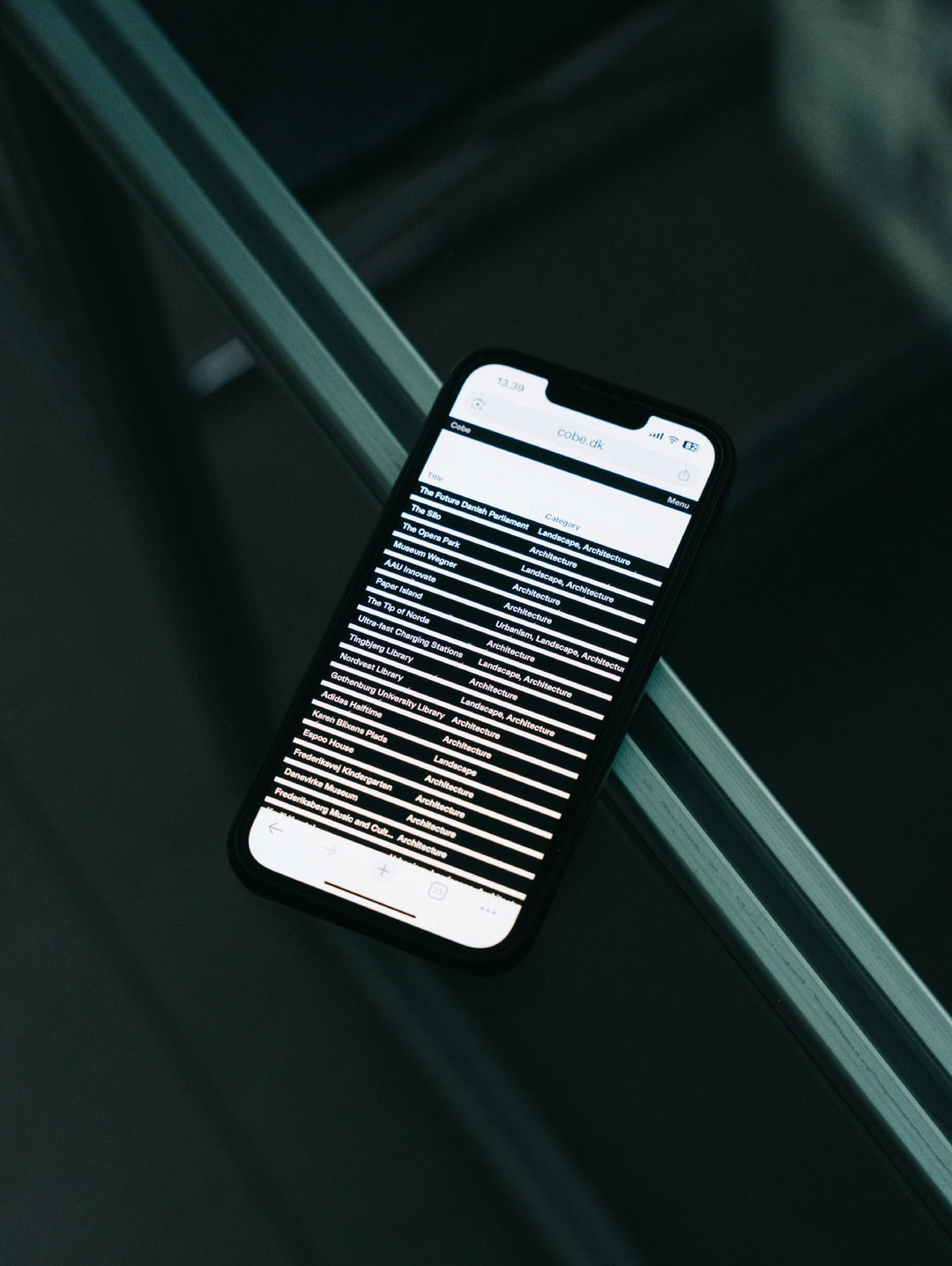
This collaged architect’s identity from Alexis Mark drew from departure boards and timetables
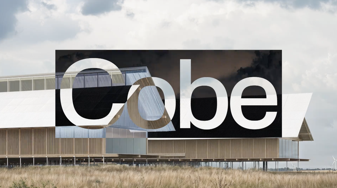
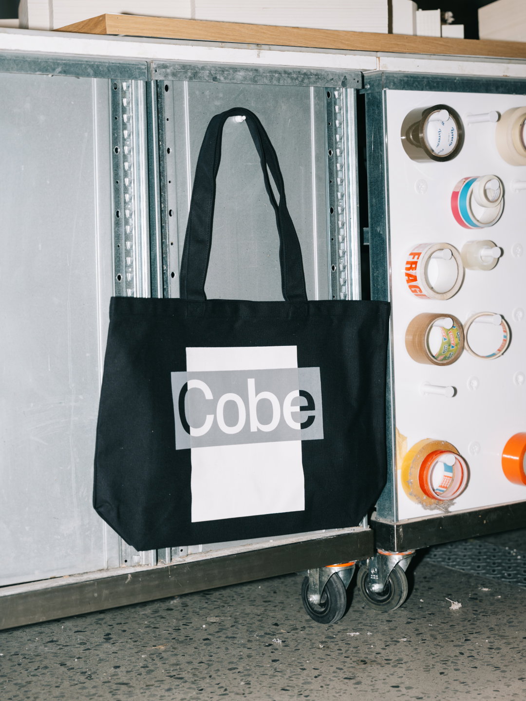
Layered and utilitarian, the approach to this visual system embodies Cobe’s sustainable, no need to start from scratch approach.
Both Copenhagen-based practices, architecture office Cobe and design studio Alexis Mark crossed paths on an ambitious book project that grew into something more: a full rebrand of Cobe Office’s identity, with an overhaul of the architecture studio’s website. “It all started with a really focused brief to update parts of their overall look, building on some of the existing elements but this expanded as time went on,” Alexis Mark co-founder Marie Grønkær says – “what we see as a sign of a good collaboration.”
From its first insight into Cobe’s practice, the team at Alexis Mark were drawn to “the combination of urgency and responsibility that runs through their work”, says Marie. In an industry where there’s a growing recognition of both landscaping and architecture’s impact on the climate, and a push to move toward more sustainable methods than starting from scratch when designing buildings, Cobe’s practice stood out as having this ethos embedded into its foundations. The studio’s environmental impact is “central to how it thinks”, Marie tells us, “so we wanted the identity to carry that same conviction.” The challenge was to create a visual identity that would express the urgency of Cobe’s approach whilst still emphasising the architecture offices sense of creativity and play. For this, Alexis Mark turned to collage.
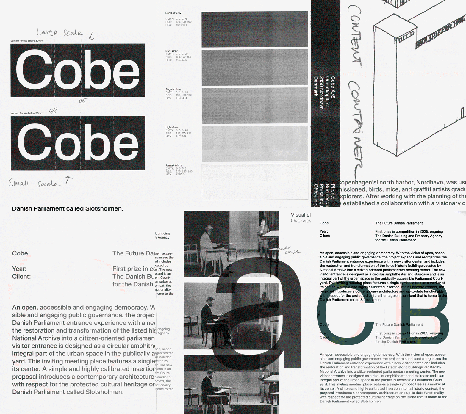
Alexis Mark: Cobe (Copyright © Alexis Mark, 2026)
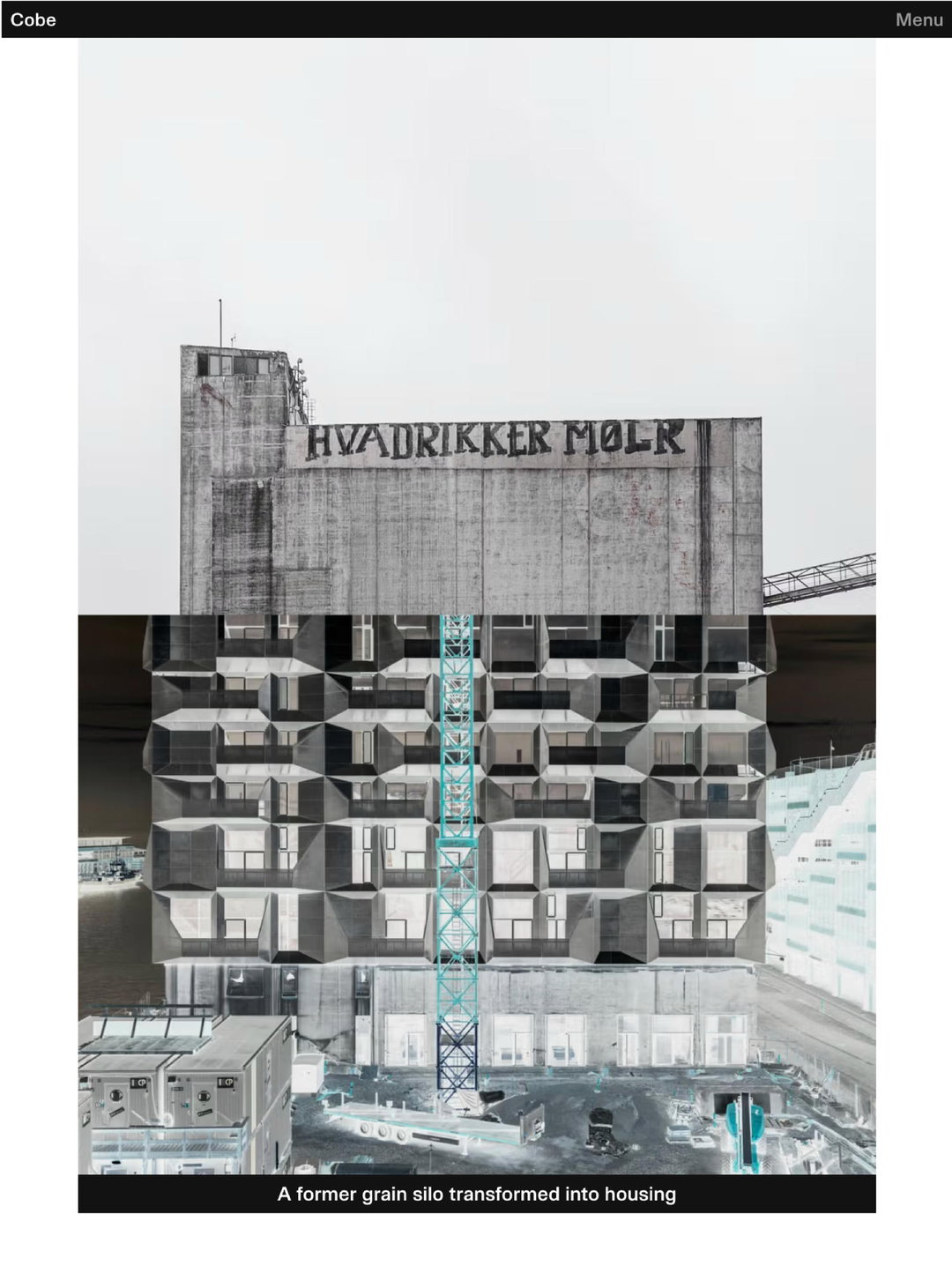
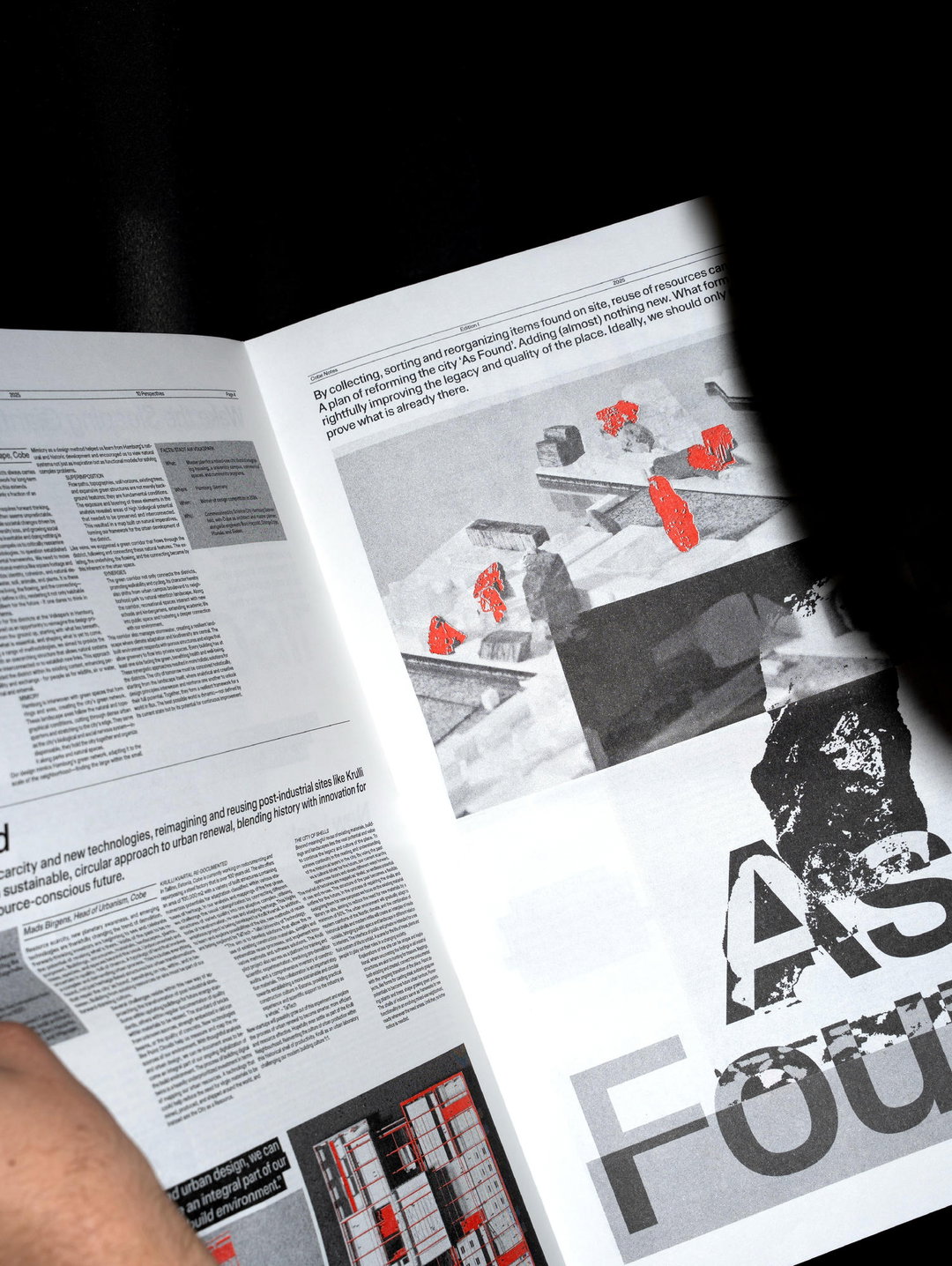
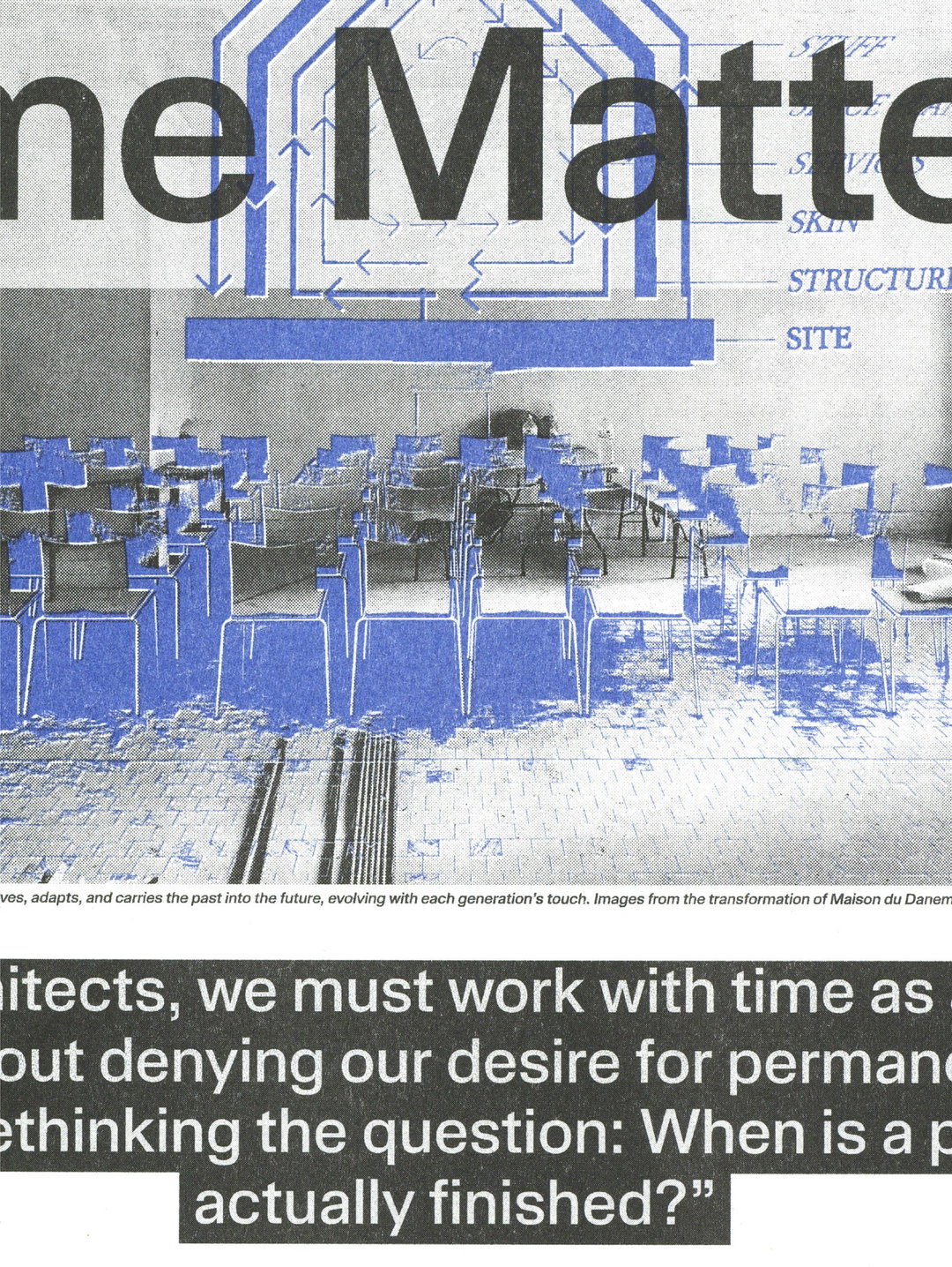
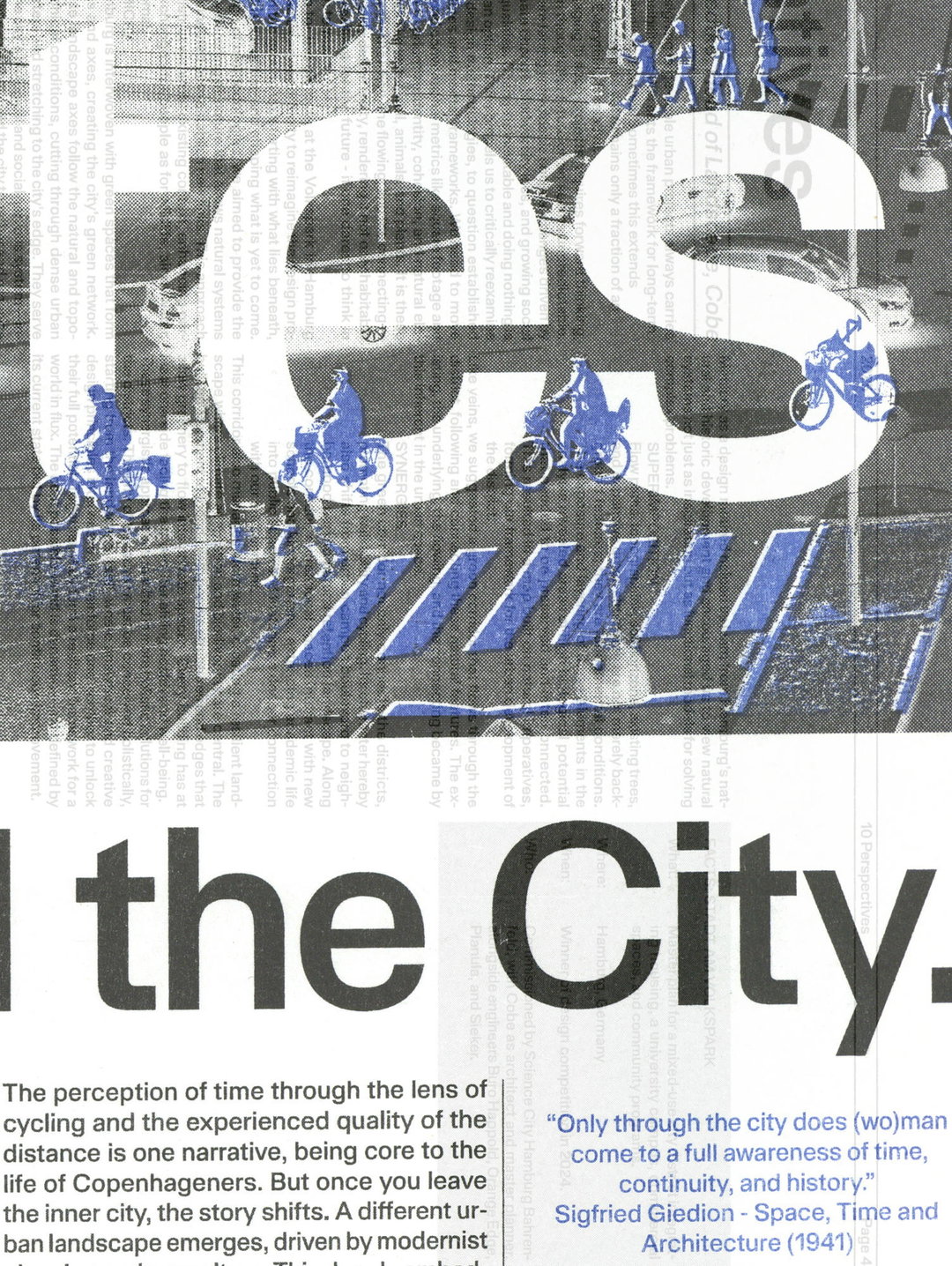
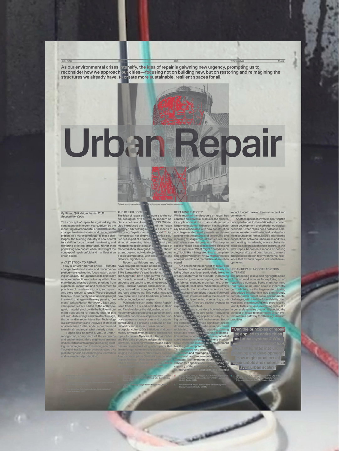
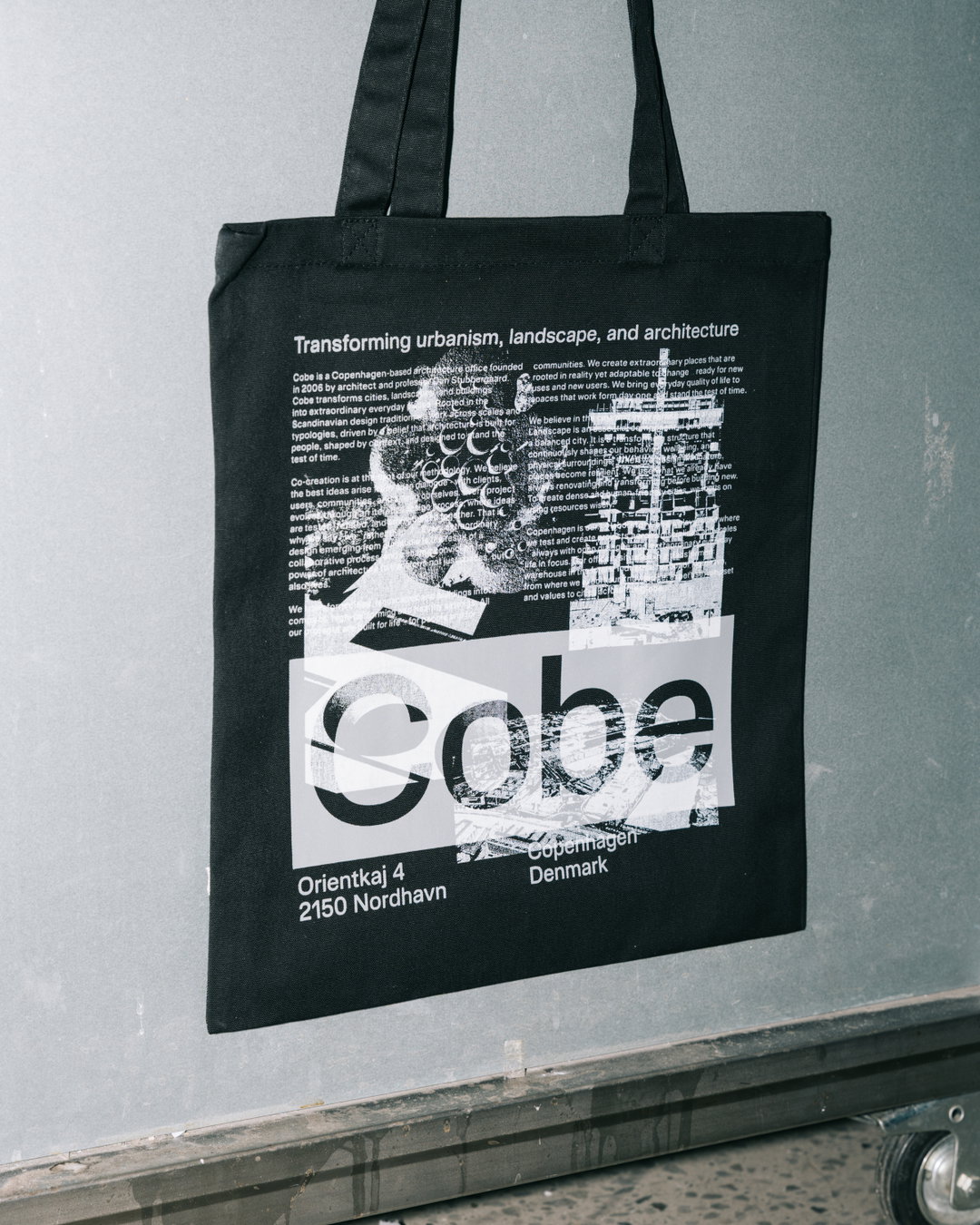
“Collage was central to this identity – as both a medium and a symbol,” says studio co-founder Kristoffer Li. The idea of taking existing fragments of spaces and structures to build something new was a methodology of Cobe’s that was neatly adopted through this technique, but the studio also enjoyed how collage left room for a more playful tone of voice. Print and web assets are layered up like blue prints or delicate architectural plans on layout paper, letting drawings, textures and images of the office’s work float over each other.
Whilst these compositions make your eyes dart all over the page, they still remain systematic. For their inspiration, Alexis Mark was drawn to the graphic language of “large transit terminals”, Kristoffer tells us. Think departure boards, timetables and clipboards at bus stops and train stations. “There’s something compelling about how those systems communicate – practical, urgent, precise, yet strangely rhythmically poetic when you sit with them,” he says.
The animated elements that set the pace of the identity were inspired by breaking news tickers and are very much in the spirit of all of the studio’s urgent, utilitarian signage. Alexis Mark’s references have seeped into a visual system that aims to feel “alive and present”, Kristoffer shares. “Finding references like these that are adjacent to the client’s world – rather than within it – is something we think about a lot. It’s often how you avoid landing in a space that already feels occupied,” he says.
Type design has become an increasingly central part of the studio’s design work over the years and this came through in this design system for Cobe. Central to the architectural identity was AM Kosmos, a typeface that the studio had been tinkering away on for quite some time. “The earliest iterations go back to when Martin was studying at Yale,” Marie says. “We’ve always thought of it as our house sans-serif: inspired by the classics, Helvetica, Folio, Akzidenz Grotesk, Univers – hence the name. The temperament is slightly industrial, with squarish counters in the round forms, a high x-height for tight setting.” The lean but expressive letterforms in this “sourdough starter” of a font, as the studio calls it, took on a new shape for Cobe when this project arised.
“It gave us the opportunity to properly invest in the typeface – bringing in font engineers, refining the cuts, and developing new weights and character sets,” shares fellow studio co-founder Martin Bek. This custom typeface gave Cobe a unique expression that was exclusive to the architecture firm. Beyond this rebrand, the studio are developing several commissioned typefaces at present for both small and large clients and are working on bringing its first retail fonts to market very soon. This expansion into a foundry as well as a design studio will be key in Alexis Mark forming future visual identities for brands and businesses that stray away from the mainstream: “Type is one of the most persistent carriers of a brand’s character, and having something that is genuinely yours, that no competitor can pick off a shelf, is a real strategic asset,” Kristoffer ends.
GalleryAlexis Mark: Cobe (Copyright © Alexis Mark, 2026)
Hero Header
Alexis Mark: Cobe (Copyright © Alexis Mark, 2026)
Share Article
Further Info
About the Author
—
Ellis Tree (she/her) is a staff writer at It’s Nice That. She joined as a junior writer in April 2024 after graduating from Kingston School of Art with a degree in Graphic Design. Across her research, writing and visual work she has a particular interest in printmaking, self-publishing and expanded approaches to photography. ert@itsnicethat.com
To submit your work to be featured on the site, see our Submissions Guide.