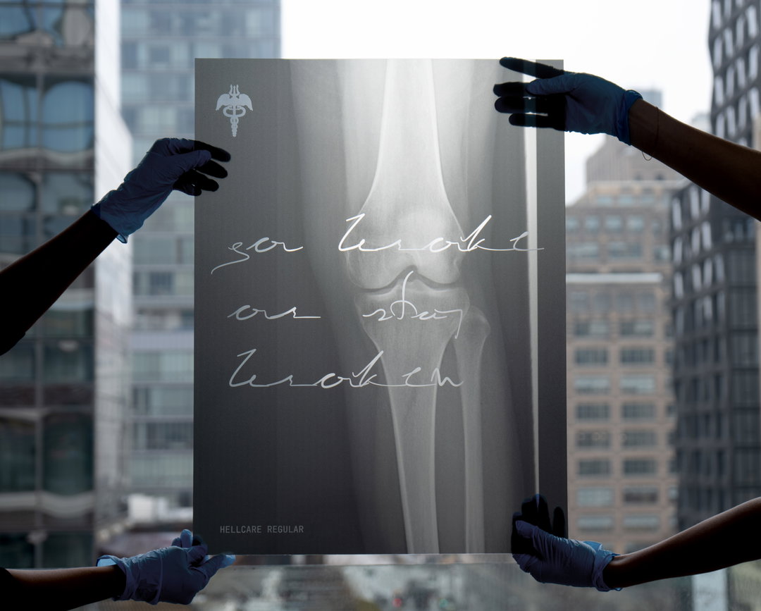
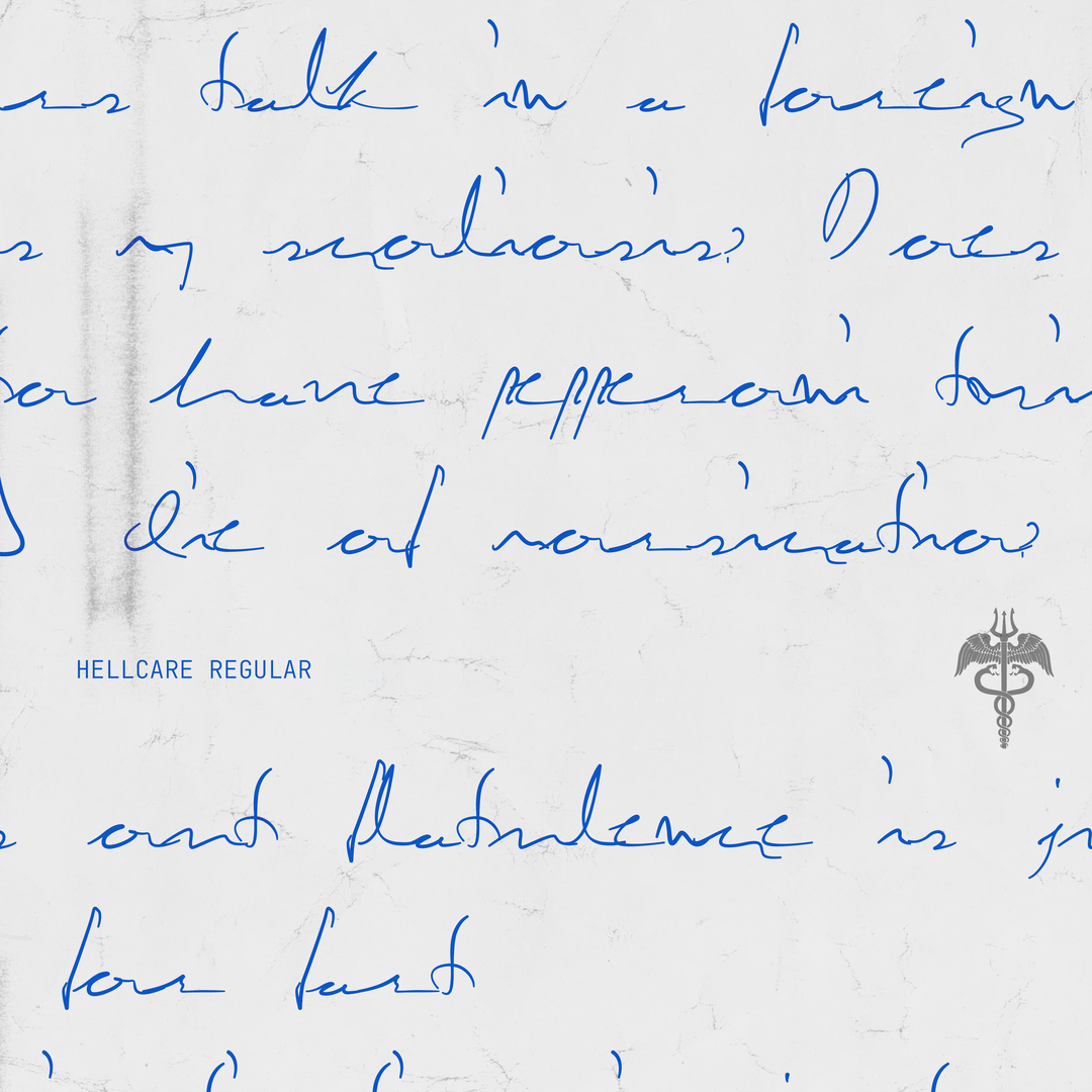
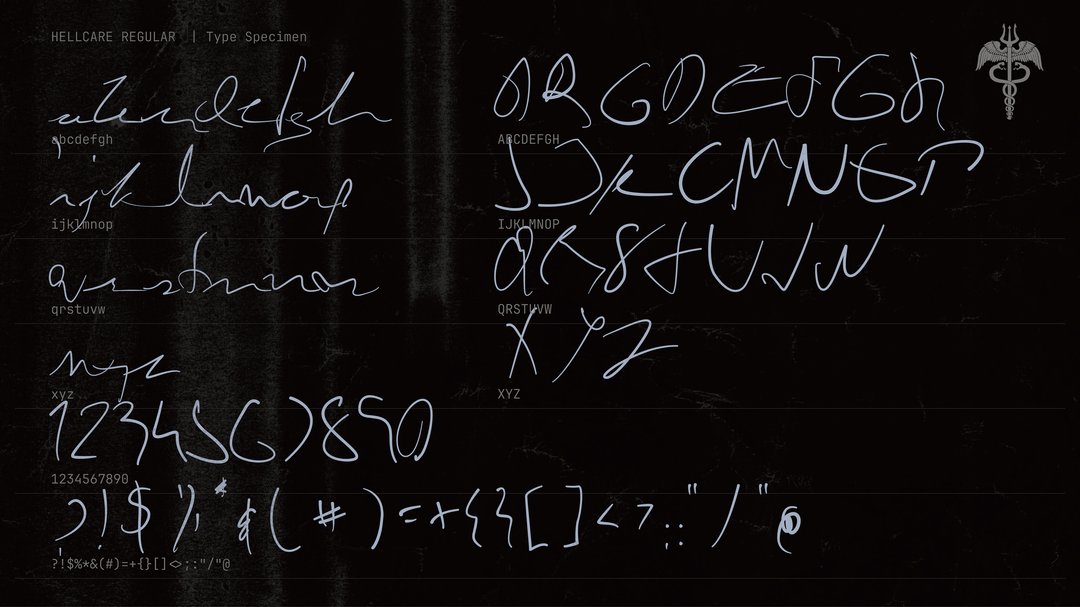
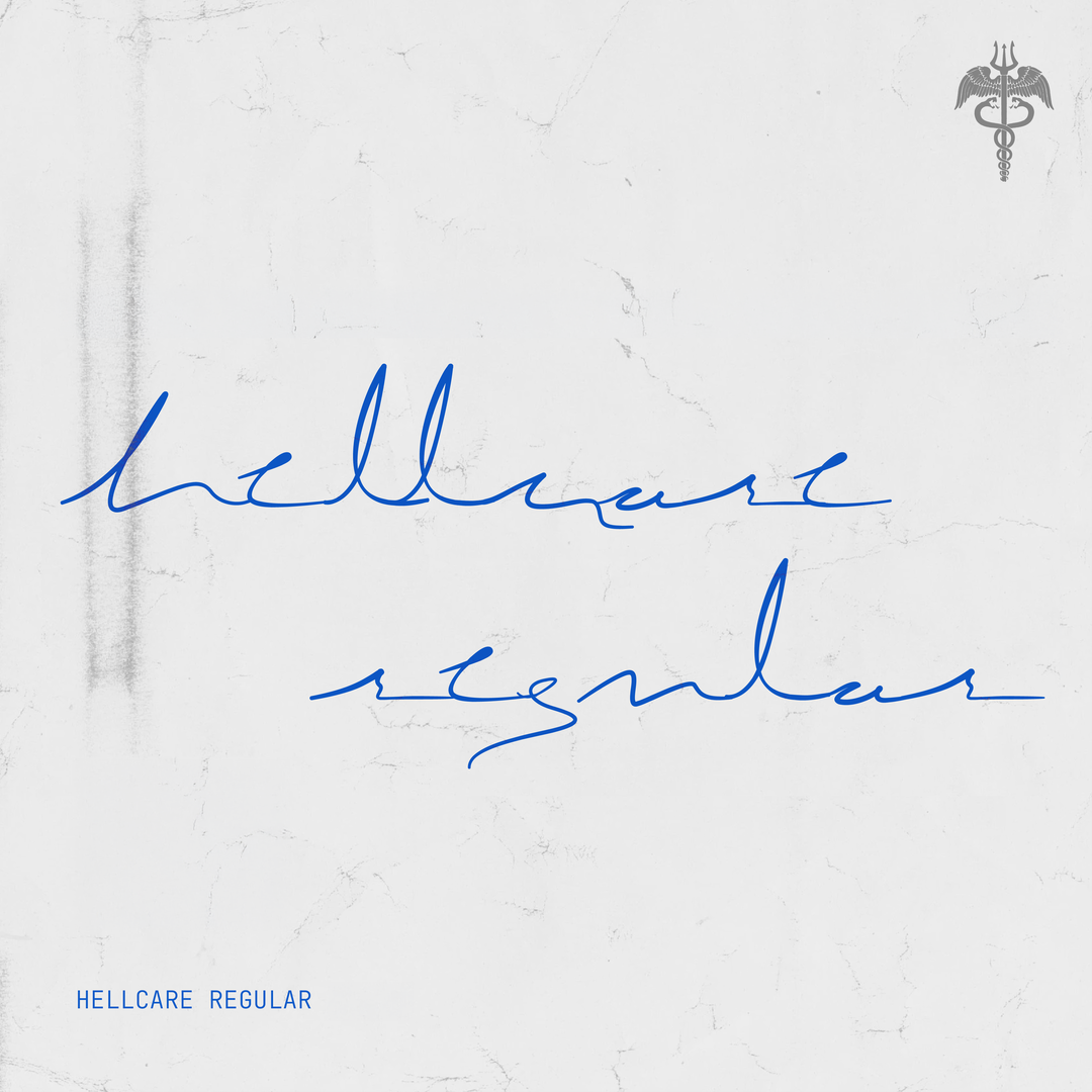
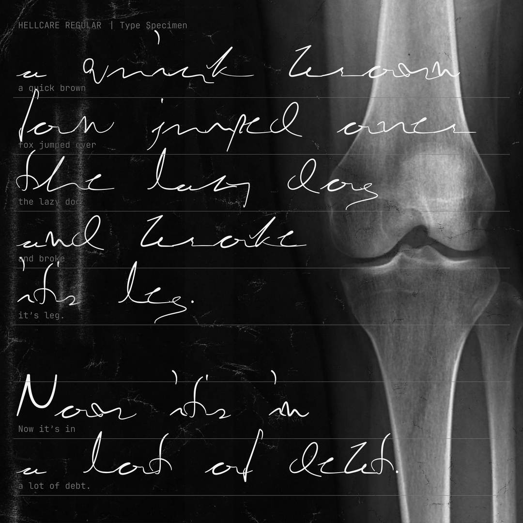
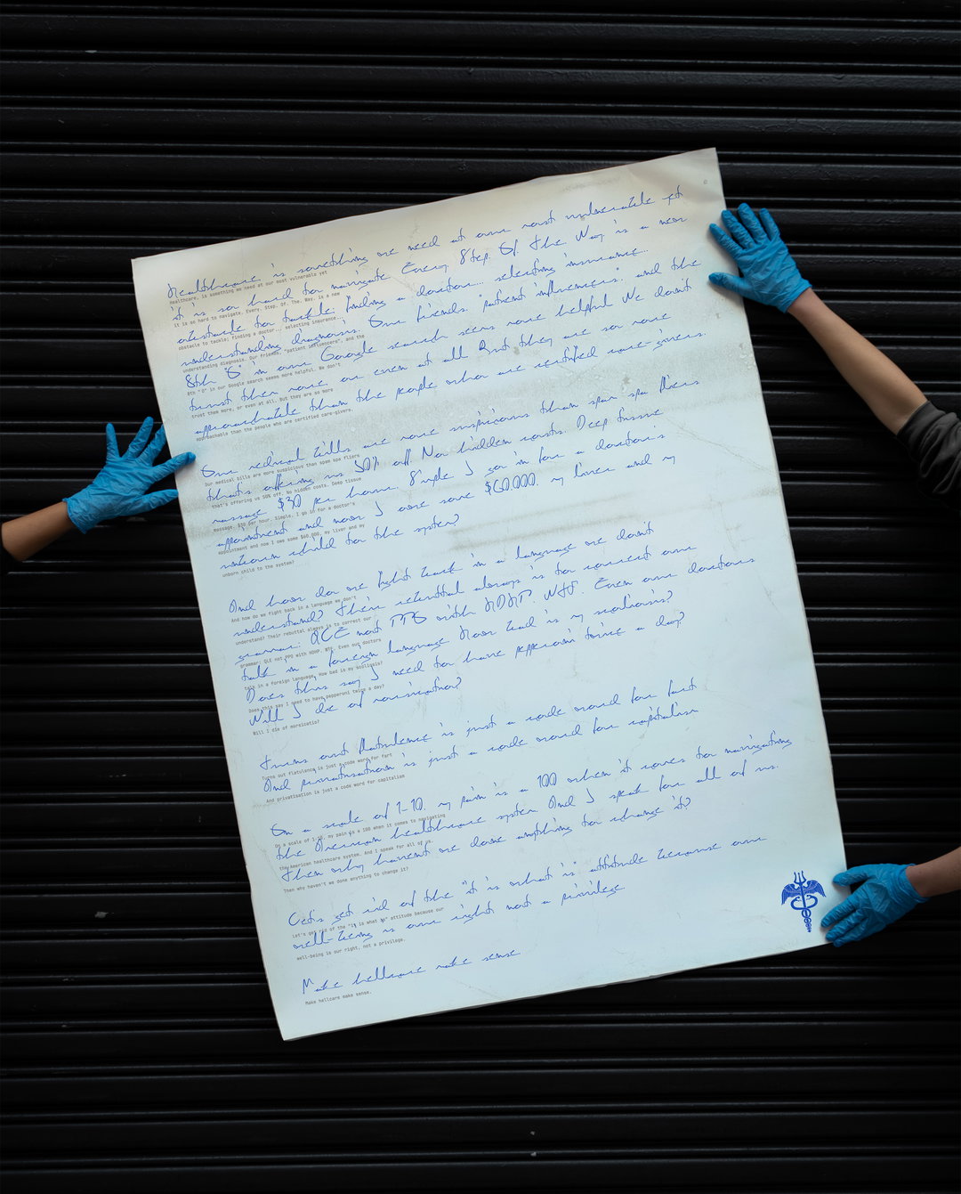
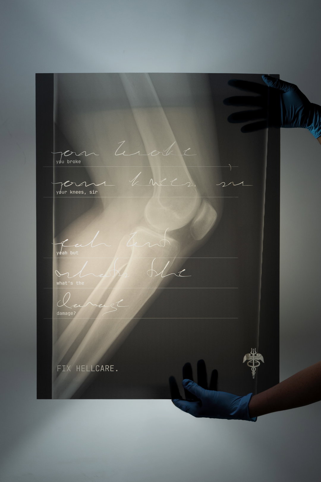
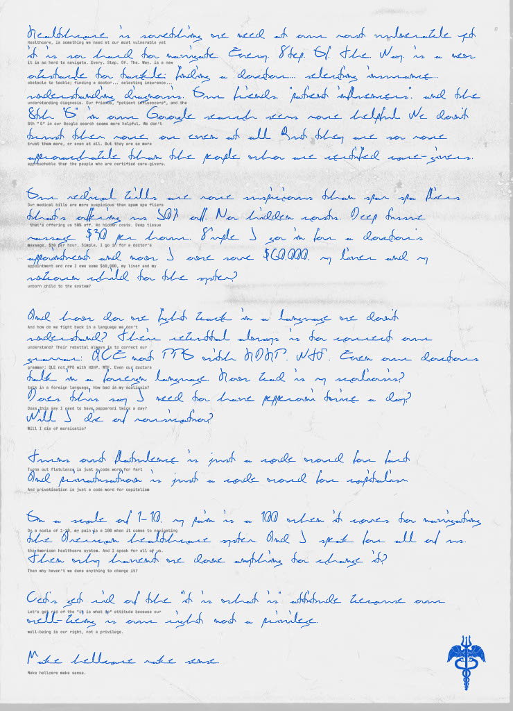
Hellcare Regular is a typeface that parodies the cryptic chicken-scratch of doctor’s handwriting
The American health care system is mind-bogglingly cruel and cryptic. When Parker Jones found herself trying to read countless medical documents, she teamed up with Rajshree Saraf to reverse-engineer the infamous illegibility of doctor’s handwriting.
Many will know the feeling of being handed a doctor’s note and not being able to tell what the heck it says. It may as well be ancient Sanskrit. It’s pretty much accepted at this point that doctors have their own language, their own written ways of communication only readable by pharmacists. Well now, Parker Jones and Rajshree Saraf, art directors at Wieden+Kennedy in New York, have the typographical know-how in order to reverse engineer the ultimate medical typeface and catch it in a bottle. Because, especially in places like the United States where healthcare comes at a large cost, that doctor’s note means more than just a slip for pills or nasal spray. It’s can be the threat of financial collapse.
“We became close while collaborating on a series of projects together. Around that time, Parker’s father was diagnosed with stage four cancer. Through long conversations, we kept circling the same feeling – how overwhelming, exhausting and isolating the healthcare system can be to navigate,” says Rajshree. “We wanted to channel that experience into something meaningful, something that could help others feel a little less alone.” In Parker’s experience, sorting through and reading countless of her father’s documents, constantly trying to decipher the handwriting was a huge hurdle. “The font felt like the most clear way to capture that frustration and transform it into something visible and shared, and Rajshree loves a fun experiment in type,” says Parker.

Parker Jones & Rajshree Saraf: Hellcare Regular (Copyright © Parker Jones, Rajshree Saraf, 2026)
The duo then began to analyse doctors’ scratches and studied how the forms blurred into each other, losing all context, where an ‘e’ could easily become an ‘o’. Parker and Rajshree experimented in writing as fast as possible, over and over again, with the goal being complete illegibility – an interesting concept in typeface design where clarity and readability are often prioritised. Ironically, one would think that doctor’s notes would be ultra-readable. Nevertheless, Parker and Rajshree didn’t want it to be random scribbles, there needed to be “some underlying structure that actually resembled the alphabet” – of course. “Achieving that balance between the alphabets was the hardest part – where each letter had to feel chaotic and rushed, yet still work as a system with consistent line weight, rhythm and x-height,” says Parker. The result was Hellcare Regular.
Doctor’s handwriting is infamously known as ‘chicken scratch’, a metaphor for how hellish it is to navigate the American healthcare system. The goal was “to highlight the absurdity of how we’ve collectively accepted something that is so inaccessible as normal”. Obviously, this isn’t a jab at doctors, but uses typeface design as a way to politically commentate on how health care seeps into every moment of life. “A system that should be clear and easy to understand is instead purposely made cryptic and hostile,” says Rajshree.
Hellcare Regular goes to show how typography is an important tool for activism – the fashions in which it can communicate on subconscious levels, convey meaning just as much as the words it spells. “Rajshree introduced me to the world of typography. Working with her opened my eyes to the fact that type can be a medium to express an idea,” says Parker. “We often think typography should be clear and legible because it’s meant to communicate a message, but when you start to push those boundaries, I realised it can communicate in other ways too, through emotion, tension and experience.” For Rajshree, typography is about asking “what if it weren’t?” – meaning: how can we invert, remix and mess around with our commonly accepted language? In breaking these traditions of visual communication, it opens the gates for wider discussions on what else can be broken open and examined. Health care is most surely at the top of the list of things that need to be reformed.
GalleryParker Jones & Rajshree Saraf: Hellcare Regular (Copyright © Parker Jones, Rajshree Saraf, 2026)
Hero Header
Parker Jones & Rajshree Saraf: Hellcare Regular (Copyright © Parker Jones, Rajshree Saraf, 2026)
Share Article
About the Author
—
Paul M (He/Him) is a Junior Writer at It’s Nice That since May 2025. He has a strong interest in graphic design, digital kitsch, multimedia painting, collage, nostalgia, analogue technology and all matters of strange stuff. pcm@itsnicethat.com
To submit your work to be featured on the site, see our Submissions Guide.