Is this font peak? Pangram Pangram’s Neue Gstaad is a mountainous homage to Swiss excellence
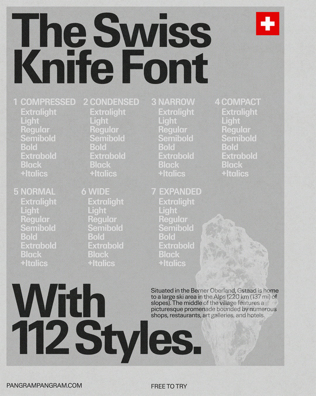
With a total 112 styles, this extremely flexible typeface really is Pangram Pangram’s Swiss army knife, joining an impressive, geographically-inspired portfolio.
When you hear Swiss, do you think of the Alps or the army knife? Montreal-based type foundry Pangram Pangram, known for modern, trend-conscious and flexible typefaces, are tapping into a distinctly Swiss sense of refinement and precision with its newest type family Neue Gstaad, named after an upscale alpine resort village in southwestern Switzerland, known for inviting celebrities and royalty. However, the typeface here is the royalty, showing off real class and clarity.
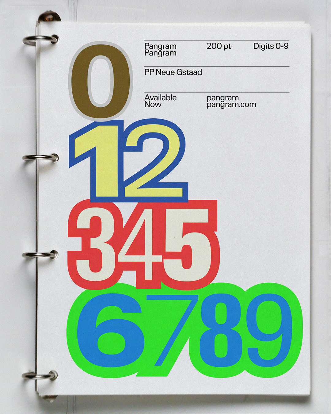
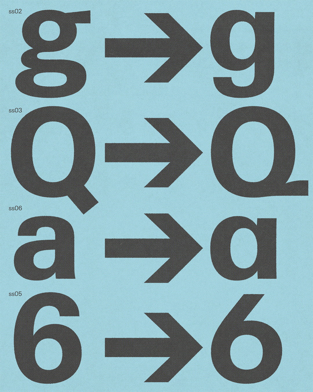
Designed by Ian Party, type designer, founder and CEO of New Glyph, Neue Gstaad is in part a homage to the Swiss army knife with its ultra-versatility, including 112 styles and seven subfamilies across Grotesk, Italics and Sans Serif font categories – it’s built as a future-facing typographic system that is fit for any job, rich in OpenType features and supports a wide range of Latin-based languages. Pangram Pangram’s previous works have included other geographical homages, such as Neue York, a layered gothic rooted in the city’s rich designs, PP Kyoto, born from Japanese writing systems and Neue Montreal, creating more of a passport than a portfolio.
Like the foundry’s website reads for Neue Montreal, the typeface was “never designed to sit still”, much like Neue Gstaad, which fluidly transforms like an athlete expertly traversing long icy slopes. Fast becoming the foundry’s signature aesthetic is its keen interest in the not just the aesthetic of a city or place, but its unique sense of attitude.
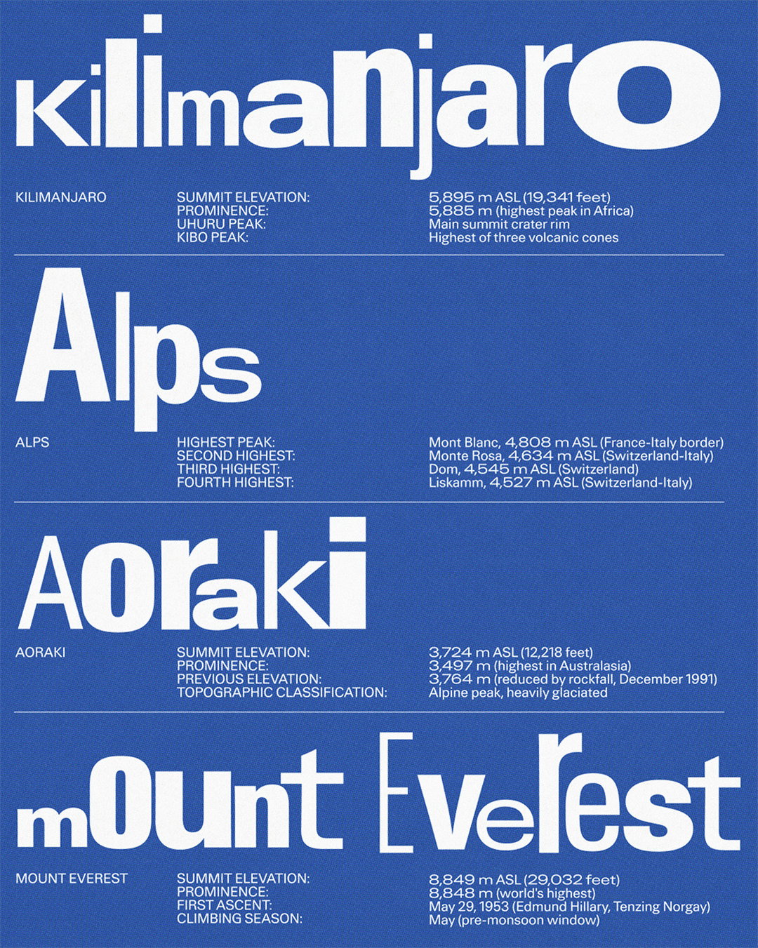
Pangram Pangram: Neue Gstaad (Copyright © Pangram Pangram, 2026)
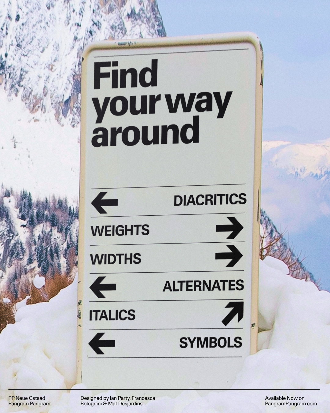
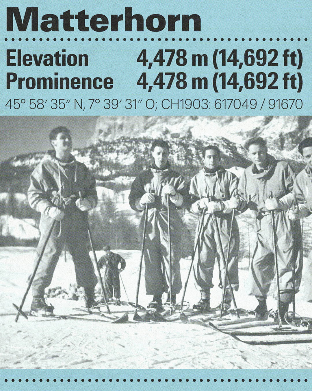
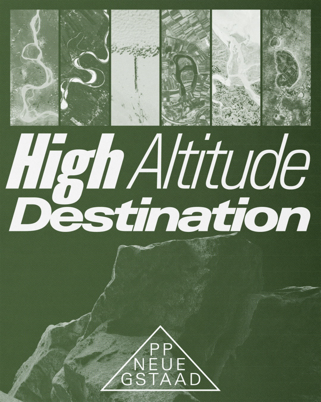
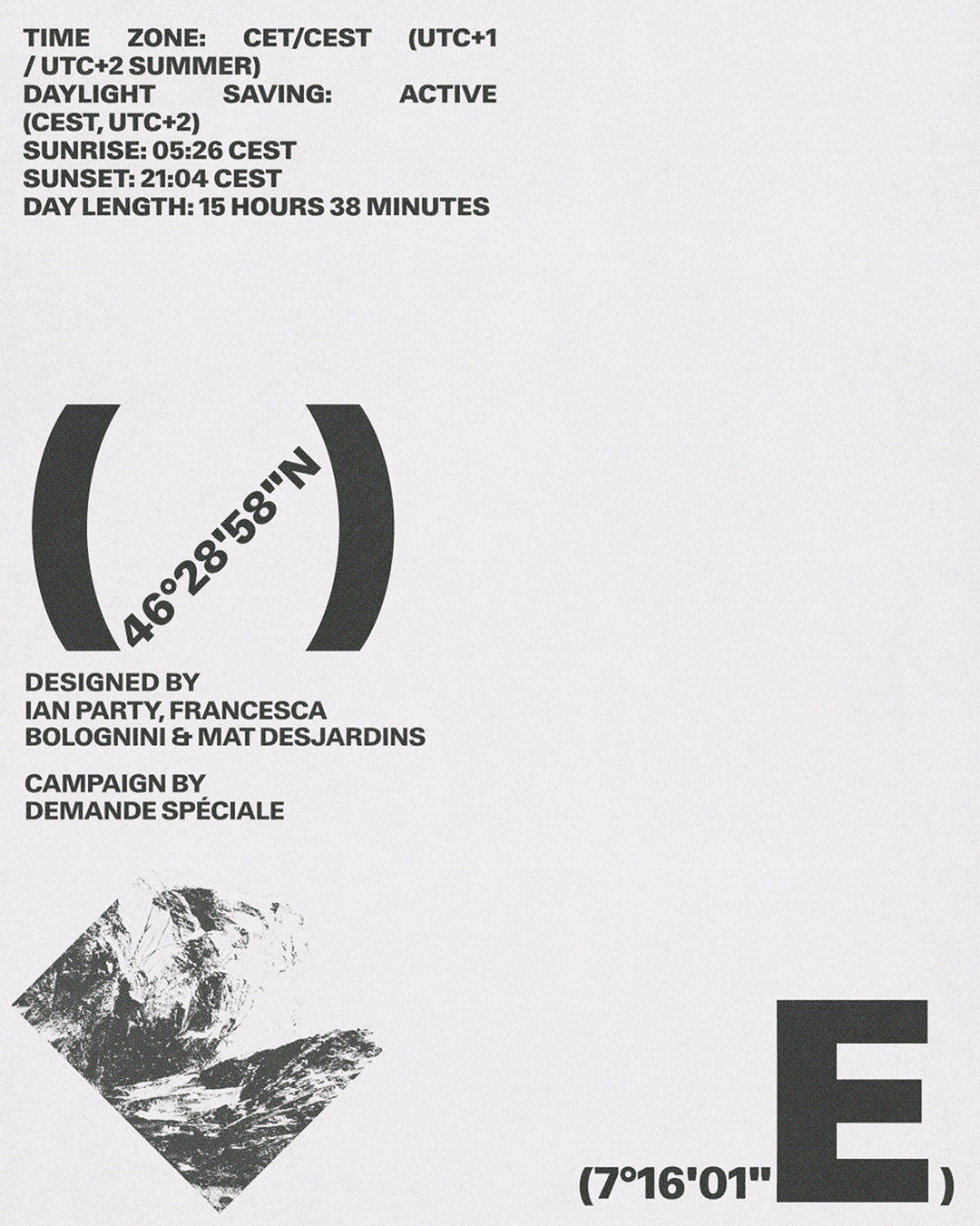
Taking inspiration from mountains, the font offers altitude through its flexibility from expand to compressed type weights – Office of Demande Spéciale’s excellent motion assets for the project prove as much, comparing the font to giant peaks and stretched and squeezed imagery that doesn’t break under pressure, allowing for a fluid range of voices from compact editorial settings to expansive, architectural compositions. There’s no escaping how luxurious the font feels, with the campaign imagery winking at the high-class of skiing and the formidable reputation of giant mountain ranges, however despite acknowledging regional clichés, Neue Gstaad also unfolds across a more universal expression of Swiss design, one rooted in discretion and quiet sophistication.
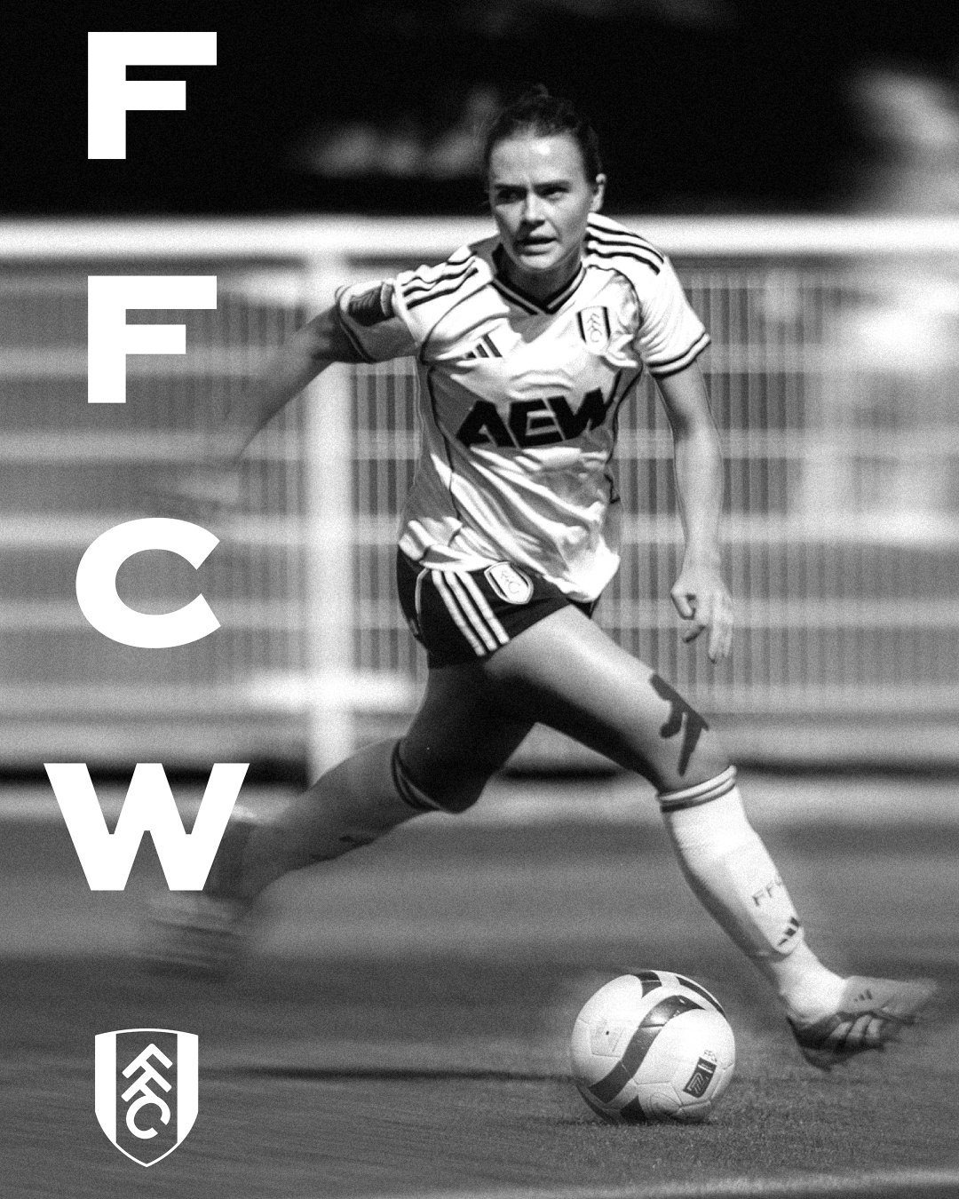
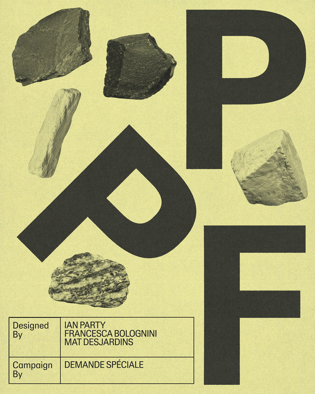
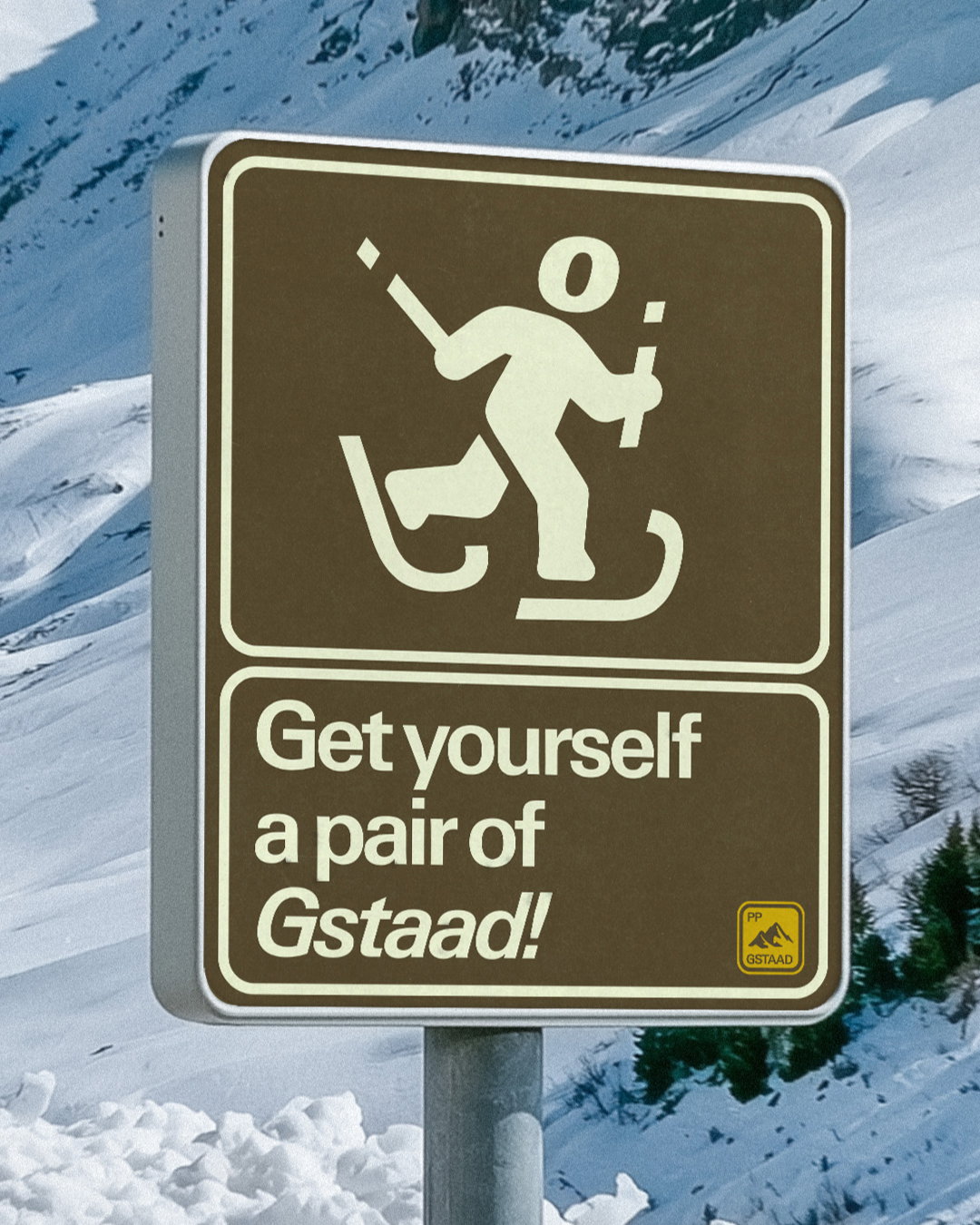
Ian Party’s ongoing exploration of type as a living system helps bring Neue Gstaad to life, with campaign visuals which utilise triangular shapes to mimic mountain peaks, archival imagery of skiers, snowy-grey colour schemes and collages of mineral forms, making the font look like it has been mined out of Switzerland’s precious materials. Most eye-pleasing is a bespoke pictogram of a skier which makes use of the expressiveness of Neue Gstaad, appearing simultaneously authoritative and filled with personality.
GalleryPangram Pangram: Neue Gstaad (Copyright © Pangram Pangram, 2026)
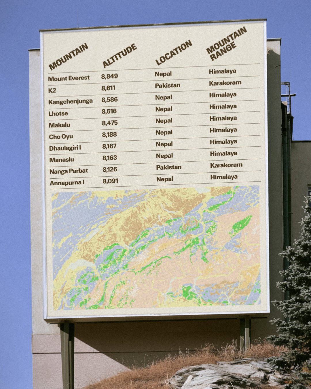
Hero Header
Pangram Pangram: Neue Gstaad (Copyright © Pangram Pangram, 2026)
Share Article
About the Author
—
Paul M (He/Him) is a Junior Writer at It’s Nice That since May 2025. He has a strong interest in graphic design, digital kitsch, multimedia painting, collage, nostalgia, analogue technology and all matters of strange stuff. pcm@itsnicethat.com
To submit your work to be featured on the site, see our Submissions Guide.