Omse rebrands Other Box, a company championing equality in the workplace and beyond
“The brand reflects our evolution from a scrappy startup to the more established, progressive and forward-thinking company we are today,” says Other Box founder Leyya Sattar.
Founded in 2016, Other Box is a company that social entrepreneur Leyya Sattar began as a way of tackling “the power imbalances in the world”. Having grown up in a single-parent, 2nd-generation immigrant, working class household in the north of England, she knew well the barriers to entry that hindered marginalised groups all around the country – in the workplace, as well as life in general. From an early stage in her career, she made it her mission to confront these injustices and contribute towards the growing movement for Diversity, Equality and Inclusion (DEI) in society.
Thus, Other Box was born, an organisation that offers training programmes, a jobs board, community, creative work and consulting, all around the subject of diversity. It has been hugely successful, winning awards, receiving international media coverage, and partnering with an impressive range of clients. However, in 2024, nearly a decade after it all began, Leyya realised that it was time to elevate her beloved brand and turn it into something more visually engaging and consistent.

Omse: Other Box (Copyright © Other Box, 2024)
Earlier this year, she reached out to London-based design studio Omse with the task of rebranding Other Box and taking it to the next level. “At the start of the project, Leyya set out a mission which really struck a chord with us,” recalls OMSE founder James Kape. “How do you create a brand that shouldn’t need to exist?” Well, it turns out that the best way to do this is actually to draw as much attention to the brand as possible, helping it to achieve its goals and, hopefully one day in the future, become redundant – as strange as that sounds.
With this mission in mind, Omse landed on the design concept of “a work in progress”, alluding to the notion that learning is a constant journey that has no real end point. Not only is this a crucial part of what Leyya’s brand teaches, but it also serves as a great jumping off point from a visual perspective. As such, Omse began developing branding that utilises construction signage and graphics to communicate this key message.

OMSE: Other Box (Copyright © Other Box, 2024)
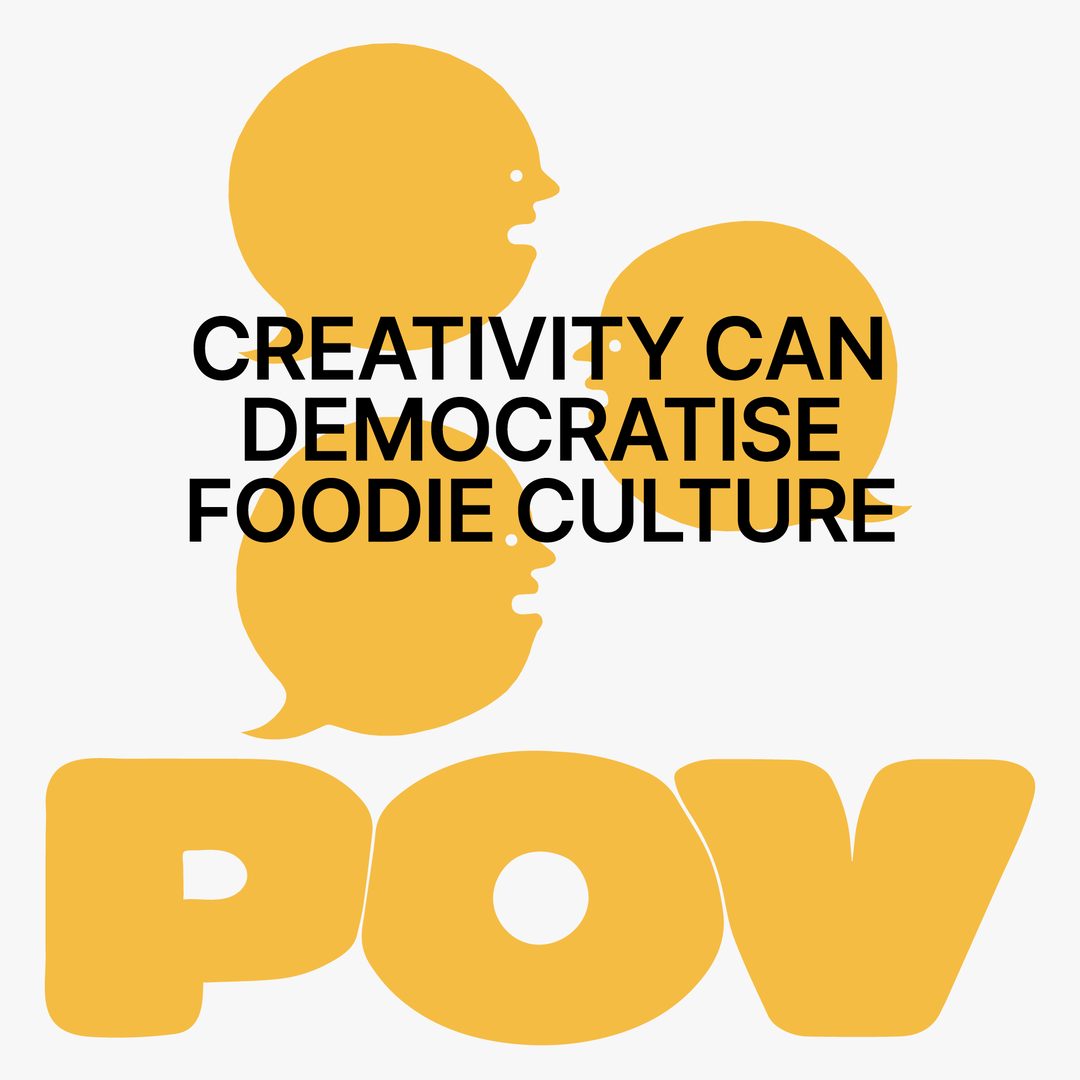
Closely tied to this visual device is the core typeface for the new brand: Gravity by Dinamo. A quirky and bold sans serif, Gravity actually features a square black glyph in the font, so you can type out Other Box’s logo with ease, as well as square punctuation which can be used when talking about other offers like Other.Jobs. “A lot of the shapes within the identity are actually just borrowed from the shapes library in Google slides, so when it comes to implementing or using the brand in presentations there shouldn’t be any major barriers to how it can be used, or by who,” adds James.
Lastly, Omse wanted to introduce some eye-catching patterns into the branding to further the goal of grabbing attention. These are made up of repeated sequences of certain shapes that can be cropped or scaled to bring more or less impact into individual aspects of the branding. “All of this contrasts with the art direction which shows authentic shots of people from all backgrounds,” James notes.
He continues: “The core strategy and purpose behind Other Box is all about how to Make Space For Difference… If we want to make the world a better place to live in, it starts with [this idea]. Small changes can go a long way to having a massive impact, but it won’t happen unless we talk about it and share the knowledge.”
GalleryOmse: Other Box (Copyright © Other Box, 2024) Photography: Handover


Hero Header
Omse: Other Box (Copyright © Other Box, 2024) Photography: Handover
Share Article
Further Info
About the Author
—
Daniel joined It’s Nice That as an editorial assistant in February 2019 and continues to work with us on a freelance basis. He graduated from Kingston University with a degree in Journalism in 2015. He is also co-founder and editor of SWIM, an annual art and photography publication.