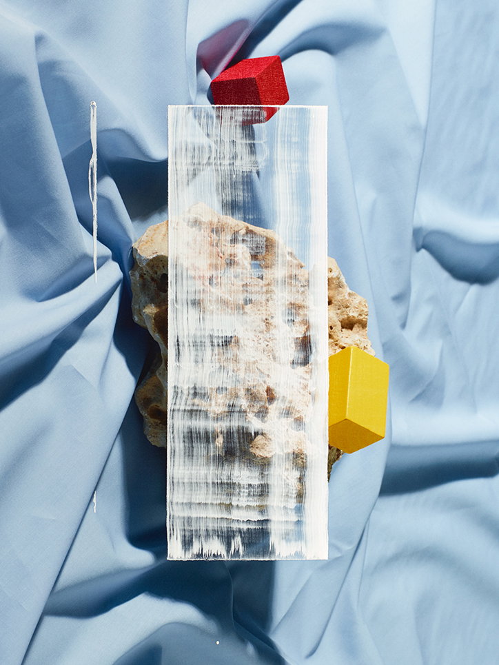
Michael Bodiam and Sarah Parker on translating work from an Instagram grid to the printed page
Photographer Michael Bodiam and set designer Sarah Parker’s collaborative project, Blooms, was inspired by flowers in bloom, through which “a desire to create, deconstruct, re-work and connect images within the confines of an ongoing grid was born”, as their project synopsis describes. They’ve collaborated before, on both personal and commercial projects, and “over the years, the more work you’ve done with someone the more fruitful the collaborative process can be”, Michael tells It’s Nice That. “Your understanding of each other’s aesthetic preferences becomes almost unspoken and this affords you to invest more effort in achieving greater results, as opposed to trying to communicate something that is essentially a half-formed abstract idea in your mind.” While they each brought their own experience to the project – as a photographer and set designer respectively – in reality, the work on the project was much more fluid: “the approach for the camera and lighting was very simple throughout; this allowed us both to channel more time and effort into what was a meandering, exploratory and experimental creative process”, Michael says.
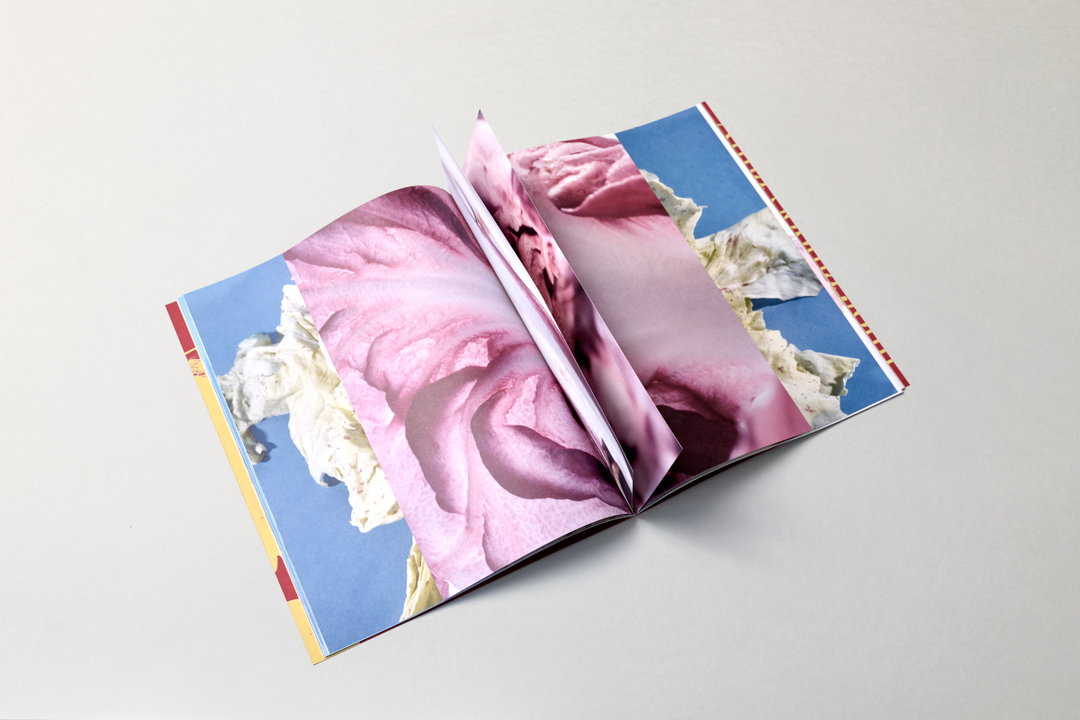
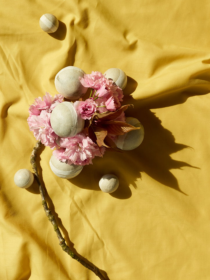
They were initially drawn to working with flowers because of the time of year “when many of London’s streets are filled with trees covered in blossom,” Sarah tells It’s Nice That. “The start of spring and arrival of these flowers for me always invoked a feeling of excitement at what was ahead. We were interested in the idea that these key elements could flow through the grid, connecting adjoining images together in an organic way.” The project was first published as an endless grid on Instagram, before being made into a book: “The restrictions within the process had forced us to make some interesting and unconventional compositional decisions that otherwise would not have been made. When these images were re-appropriated to the context of a book format, it offered the images room to breathe and with this gave them more impact” says Sarah.
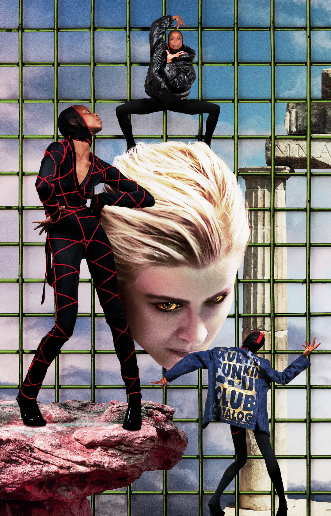
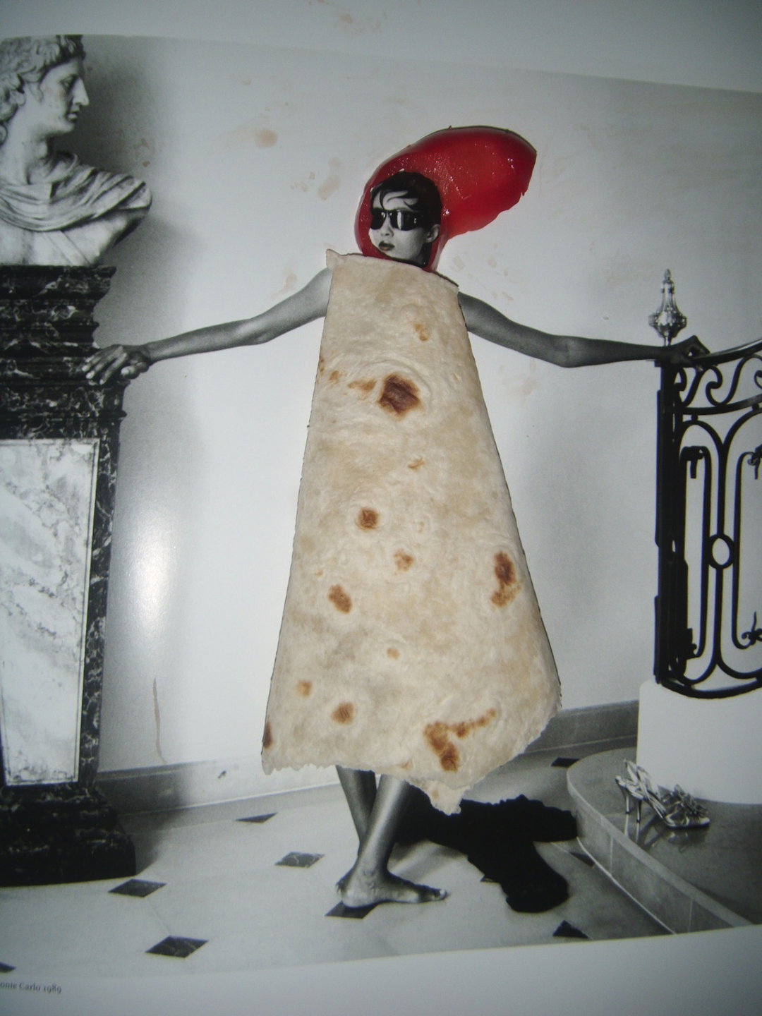
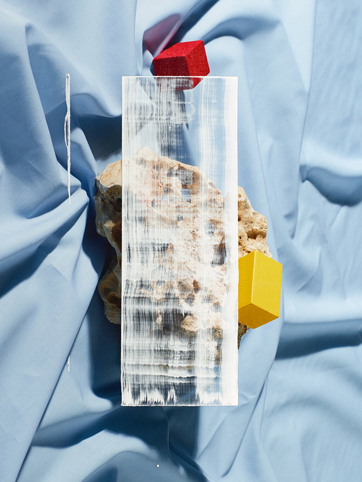
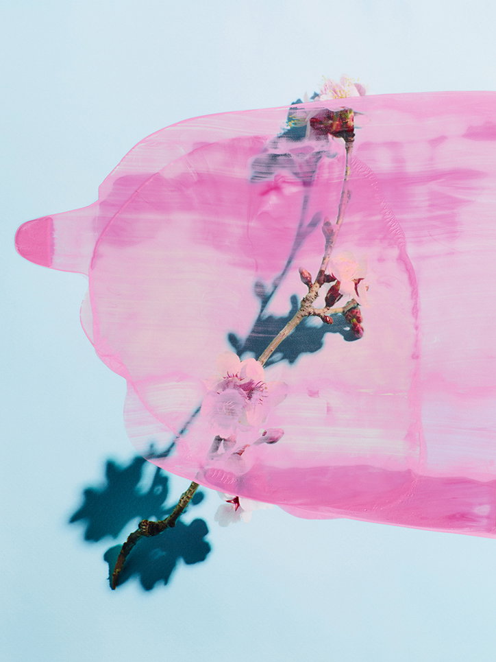
The photographs themselves play with “the potential effects of three-dimensionality and optical illusions” says Michael. “We were keen to incorporate some elements of collage into the image making process – by making physical modifications to images that we had photographed, and then printing it quite naturally created a tension between the two and three dimensions”, he continues. The balance of black and white photography, alongside works in colour, came about in the editing process: “At its most basic level, colours, and how they work together, largely dictated the final edit and running order of the images that feature in the book. For me, to have a continuous flow of colour from beginning to end would have been too much, so to break the colour every now and then with a black and white image reinvigorates your appreciation of colour all over again when it returns”, Michael says.
Taking the project from an Instagram grid to book form was another opportunity to “hone the vision of the project” Michael tells us: “Expanding on what I mentioned about colour and black and white, the narrative of this book is predominantly a journey of colour, texture, light and dark. To try and address this within the confines of an Instagram layout didn’t do it justice, and I’d also like to think that the printed page would always command much more attention than anyone’s phone ever will!”
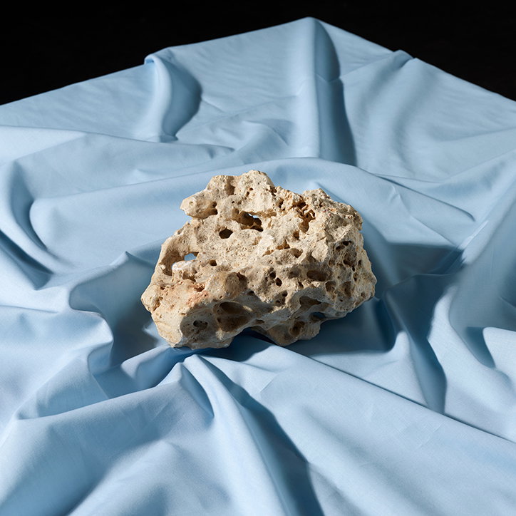
Michael Bodiam & Sarah Parker: Blooms
Michael Bodiam & Sarah Parker: Blooms
Michael Bodiam & Sarah Parker: Blooms
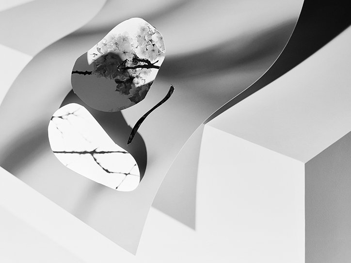
Michael Bodiam & Sarah Parker: Blooms
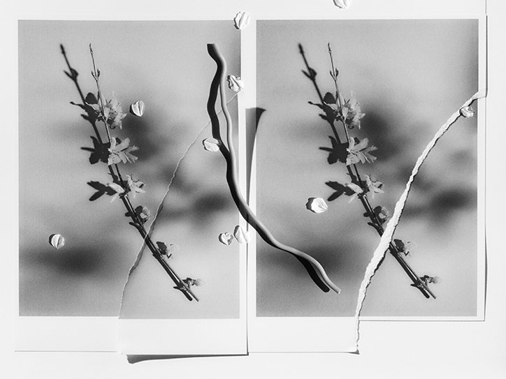
Michael Bodiam & Sarah Parker: Blooms
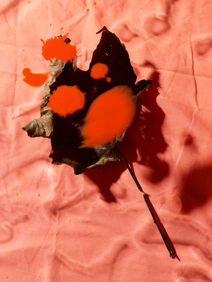
Michael Bodiam & Sarah Parker: Blooms
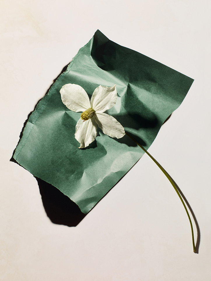
Michael Bodiam & Sarah Parker: Blooms
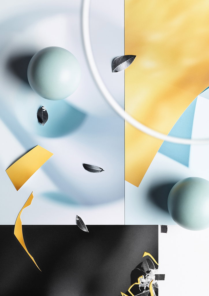
Michael Bodiam & Sarah Parker: Blooms
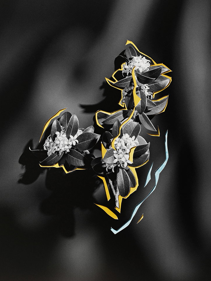
Michael Bodiam & Sarah Parker: Blooms
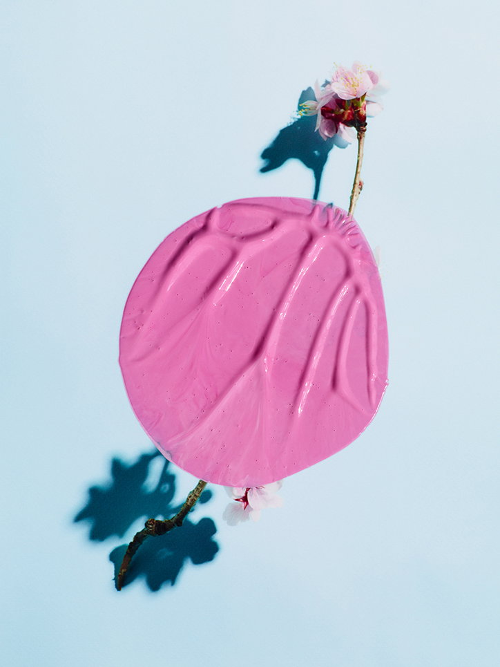
Michael Bodiam & Sarah Parker: Blooms
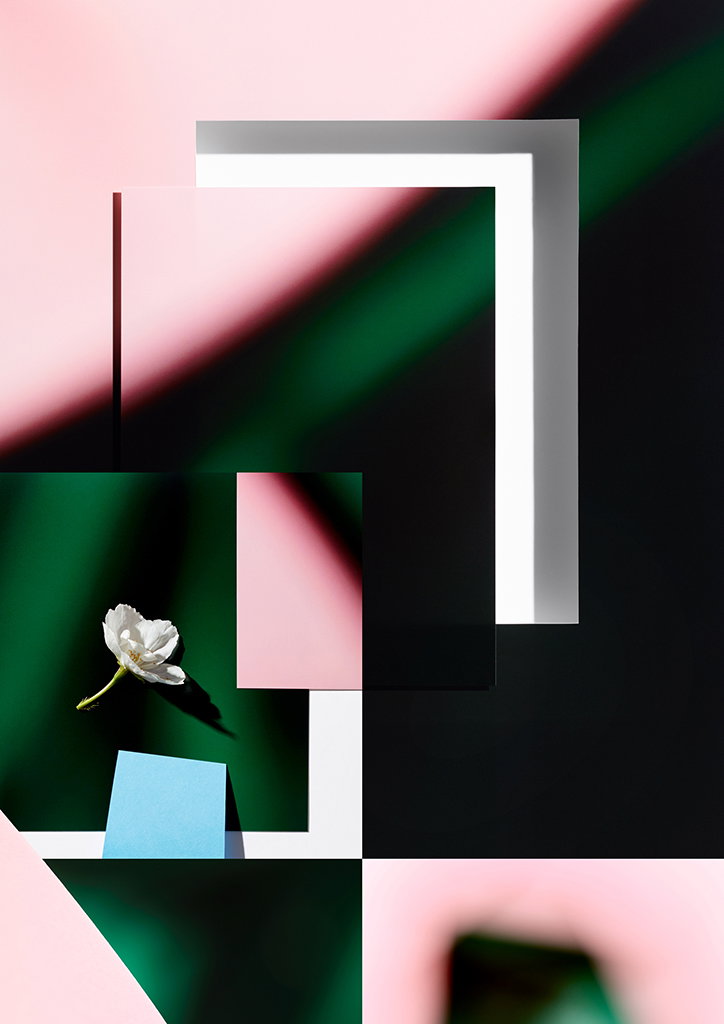
Michael Bodiam & Sarah Parker: Blooms
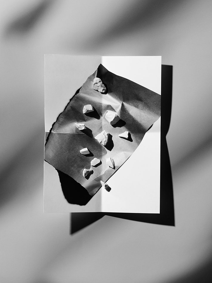
Michael Bodiam & Sarah Parker: Blooms
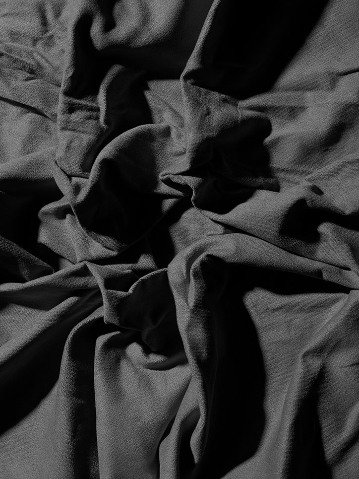
Michael Bodiam & Sarah Parker: Blooms
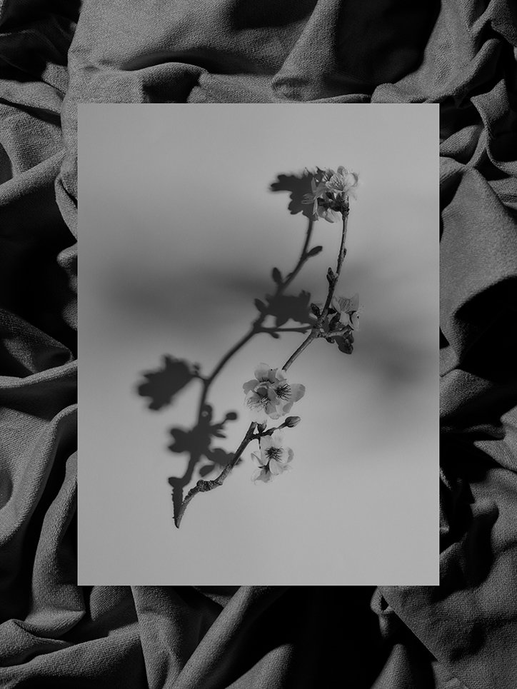
Michael Bodiam & Sarah Parker: Blooms
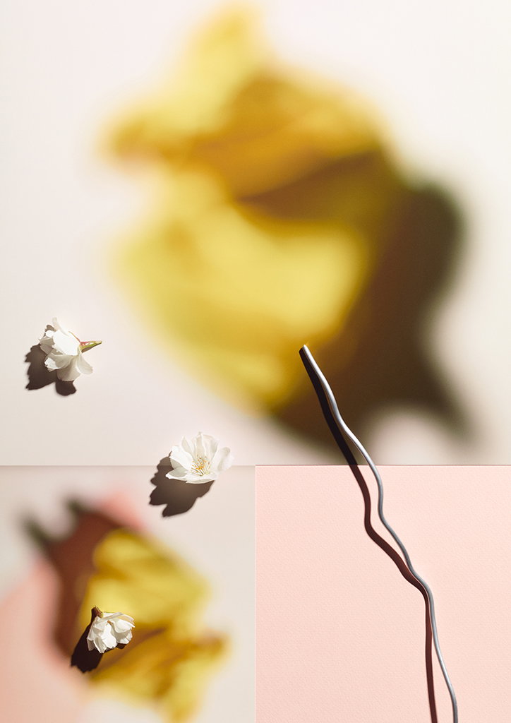
Michael Bodiam & Sarah Parker: Blooms
Share Article
Further Info
About the Author
—
Billie studied illustration at Camberwell College of Art before completing an MA in Visual Communication at the Royal College of Art. She joined It’s Nice That as a Freelance Editorial Assistant back in January 2015 and continues to work with us on a freelance basis.