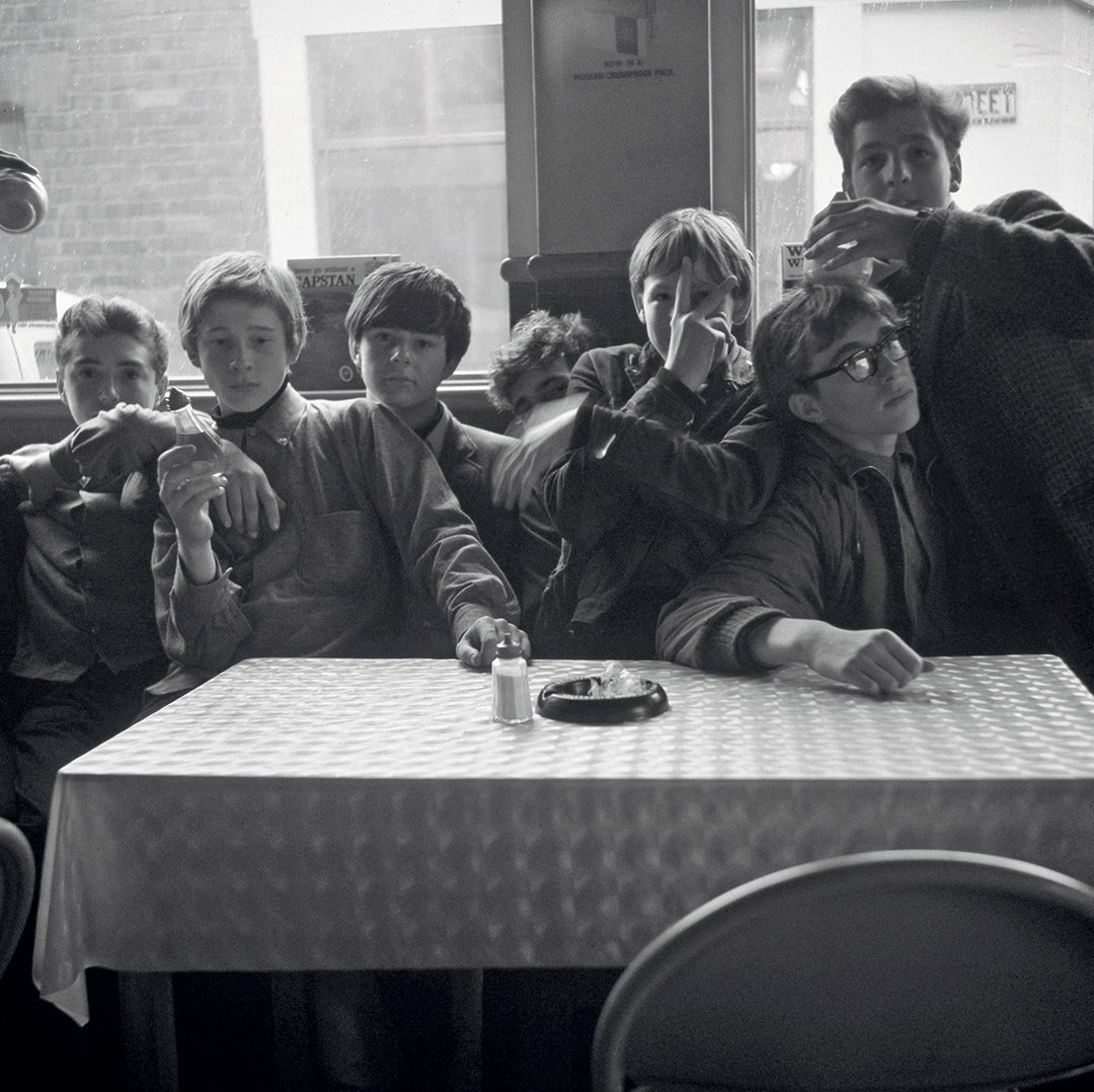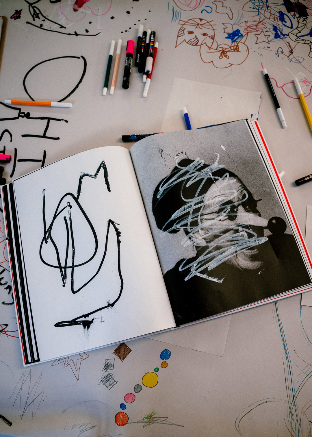
Matt Willey’s Helions brand has a tender intensity in favour of tone rather than concept
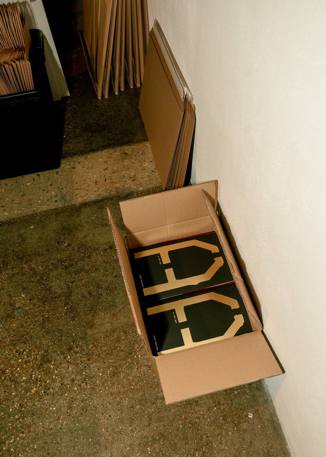
The publishing house from Jack Davison, named after his childhood village, turned to Pentagram’s Matt Willey for a brand, resulting in a provocative, albeit equally pragmatic, identity that references the photographer’s distinctive style.
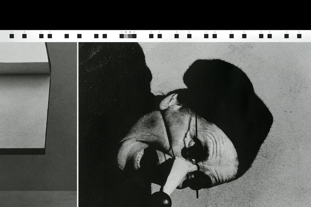
Matt Willey, partner at Pentagram’s New York office, alongside designer Jonny Sikov, have designed the brand identity for renowned photographer Jack Davison’s next venture: Helions, a publishing house named after his childhood village, Helions Bumpstead. Taking inspiration from the distinctive ambient tone of Jack’s practice, Jonny explains how, unlike many of their other brands, there is no overall leading principle behind the identity. “We weren’t aiming for a singular, overarching concept,” Jonny says. “Jack’s work has a strong, atmospheric quality, and the goal was to create a visual language that complements that mood,” crafting a graphic structure that bolsters the brand’s output rather than competing with it. “We were aiming for a quiet intensity,” he continues, “something that could feel bold and deliberate when necessary, but with enough restraint to let the titles and photography speak for themselves.”
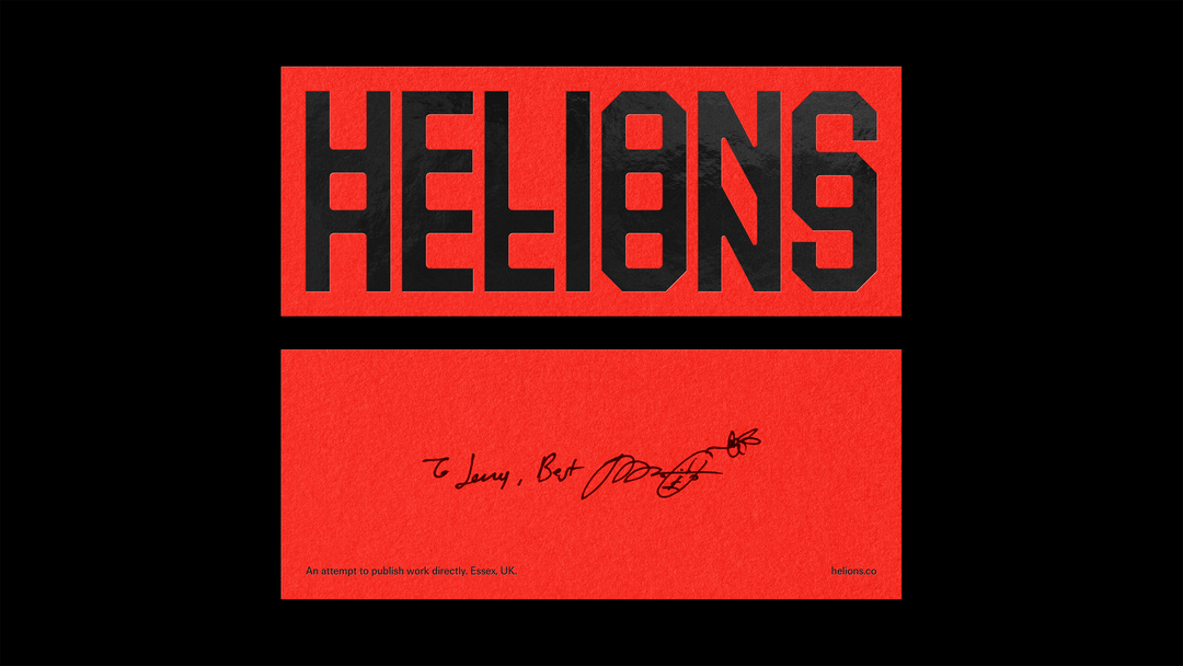
Pentagram: Helions (Copyright © Pentagram, 2024)
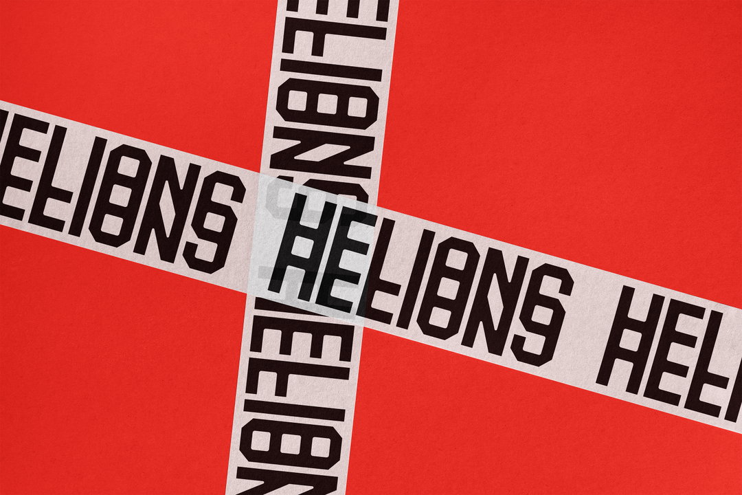
Leading the brand is Helion’s striking wordmark; a stacked, angular repetition of its namesake designed to reflect the experimental, often prismatic style of the photographer’s practice. “Distortion and refraction are recurring motifs in Jack’s photography,” Jonny continues, introducing a profound sense of tension and contortion. “We wanted the typography to reflect that, leaning into a sense of ambiguity rather than perfect clarity,” resulting in the mark that feels practically and poetically appropriate whilst, importantly, undeniably analogue – an element accentuated by the monogram’s filmstrip-like design. “Some people have pointed out the embedded ‘69’ in the ‘S’,” Jonny adds, “as for that... no comment.”
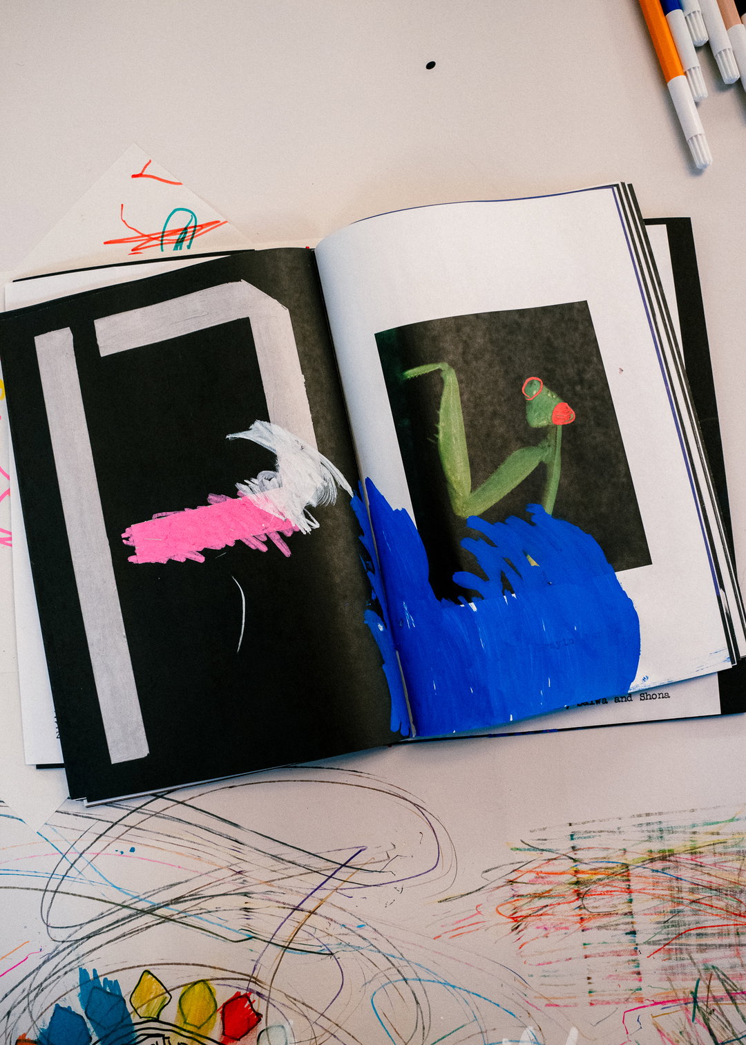
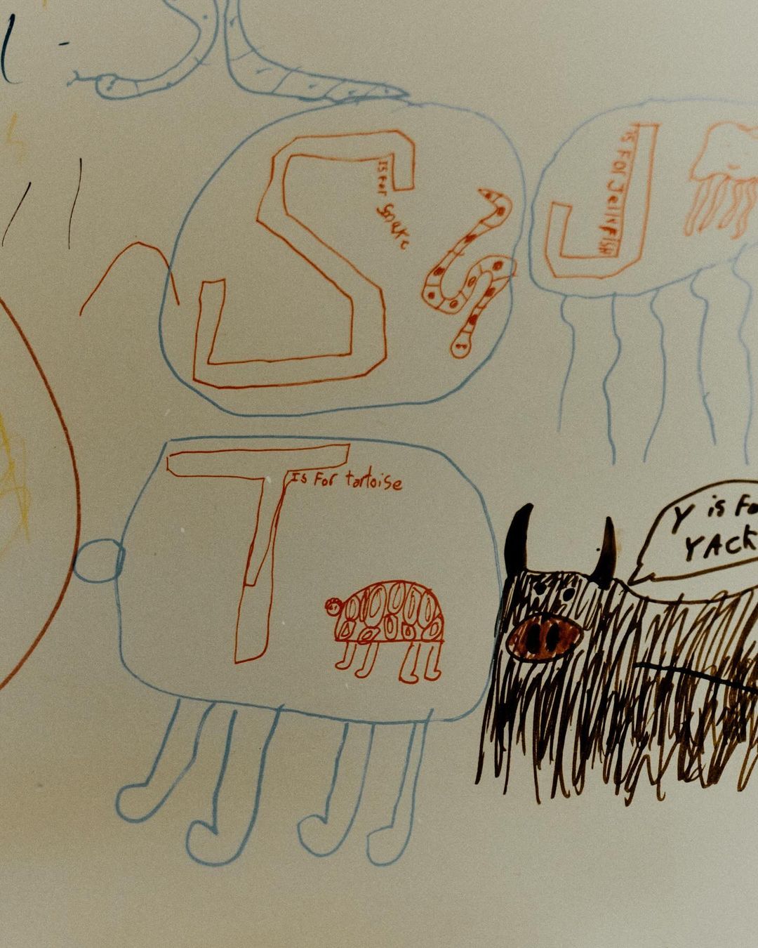
The brand in application is markedly ambient, with concentrated components being considerately applied, such as its charming illustrative scenes sitting alongside a reduced red and black colour palette. Subsequently, the brand feels punchy and provocative but equally tender. “In the end, the identity plays a fairly understated role, Jonny says, “but it’s been a real privilege to create something in service of a larger vision – one that’s been brought to life with so much care.” When asked whether he sees the identity continuing to evolve, the answer, for Jonny, was definite. “Helions is still in its early days, and the identity will need to grow alongside the work,” with projects becoming more and more ambitious in scale. “The system will naturally adapt to support them,” Jonny ends, “we’re looking forward to seeing how it continues to unfold.”
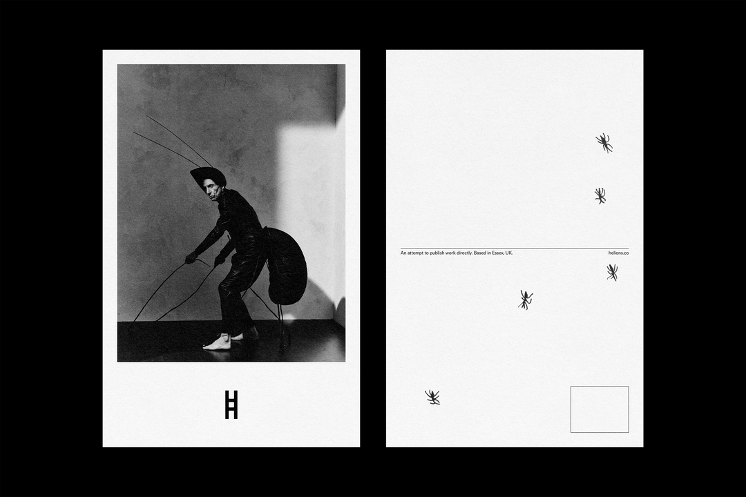
Pentagram: Helions (Copyright © Pentagram, 2024)
Pentagram: Helions (Copyright © Pentagram, 2024)
Brennan Bucannan: A is for Ant Opening (Copyright © Brennan Bucannan, 2024)
Brennan Bucannan: A is for Ant Opening (Copyright © Brennan Bucannan, 2024)
Brennan Bucannan: A is for Ant Opening (Copyright © Brennan Bucannan, 2024)
Pentagram: Helions (Copyright © Pentagram, 2024)
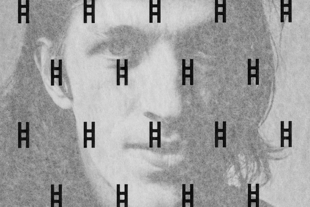
Pentagram: Helions (Copyright © Pentagram, 2024)
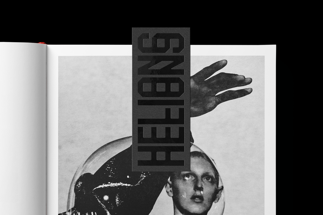
Pentagram: Helions (Copyright © Pentagram, 2024)
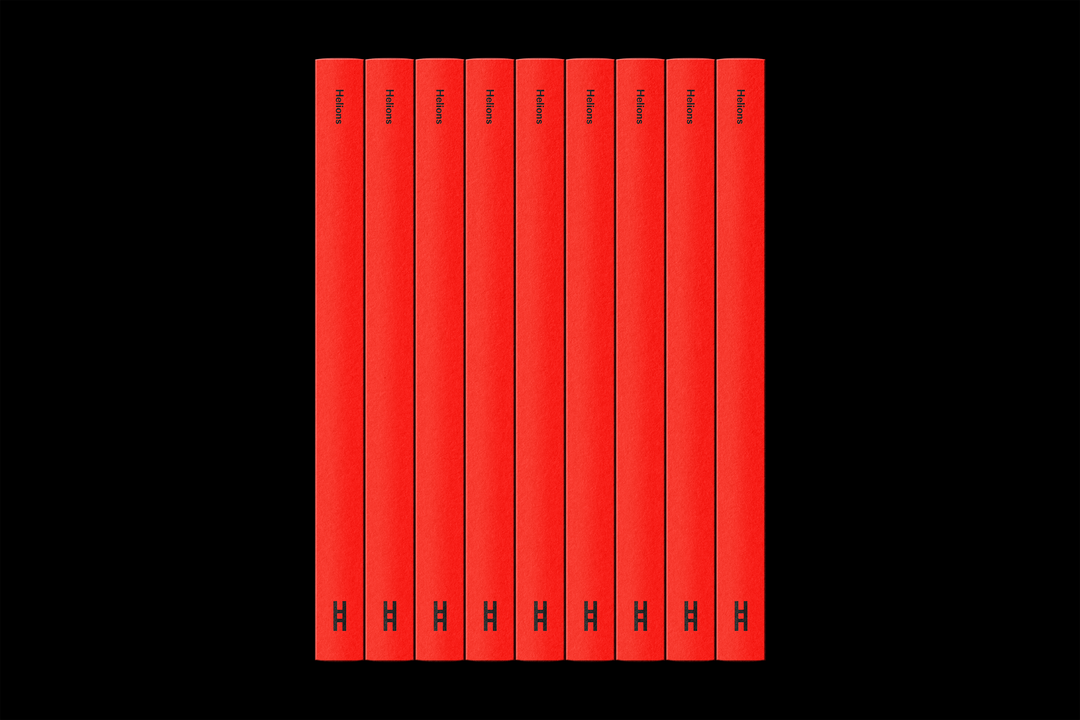
Pentagram: Helions (Copyright © Pentagram, 2024)
Pentagram: Helions (Copyright © Pentagram, 2024)
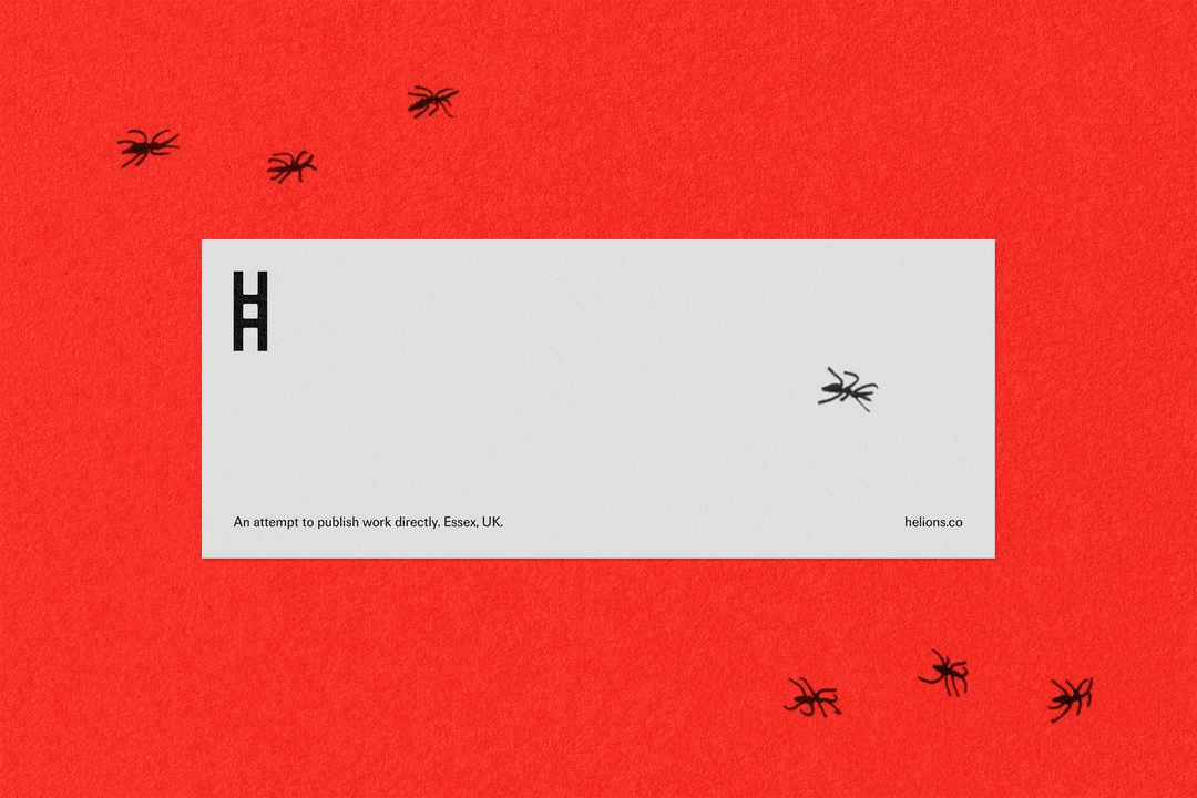
Pentagram: Helions (Copyright © Pentagram, 2024)
Hero Header
Brennan Bucannan: A is for Ant Opening (Copyright © Brennan Bucannan, 2024)
Share Article
Further Info
About the Author
—
Hailing from the West Midlands, and having originally joined It’s Nice That as an editorial assistant in March 2020, Harry is a freelance writer and designer – running his own independent practice, as well as being one-half of the Studio Ground Floor.