




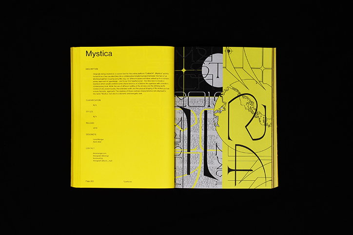
New Aesthetic is a type repository that puts feelings before function
“Typography brings so many things together: it is design, art and architecture all at the same time, and it’s so much more complex than most people think,” says graphic designer Leonhard Laupichier, reflecting on his deep fascination with the power of letterforms. It’s the more expressive capacities of type that interest the Münster-based creative most. As he tells It’s Nice That: “Typography is about communication through forms and that process can be very factual but it can also be very emotional, almost figurative.”
In Leonhard’s latest project, New Aesthetic, the emotive side of type takes centre stage. A printed repository of 98 fonts from 100 influential and up-and-coming designers, the publication takes an alternative look at typography where feelings come before function. “It’s not about looking at typography as a technical tool,” he explains. “It’s about seeing its expressive and artistic value and its ability to visualise emotions.”
The inspiration for the book came from Leonhard’s own practice. “When I was working on my own typeface Arachne, I got to the point where I had to find a way of presenting it, and I started thinking intensively about the character it reflected, the emotions, pictures or colours I would associate with it,” he recalls of the project’s beginnings. “Designers build a special connection to their typefaces through their working process,” he adds. “This tight connection enables them to understand the full character of a typeface and to visually reflect it in an expressive way.” Noticing a certain disjunction between the expressiveness of many typefaces and the clean manner of their presentation, Leonhard started to image an alternative.
Leonhard Laupichler: New Aesthetic
Leonhard Laupichler: New Aesthetic
Leonhard Laupichler: New Aesthetic
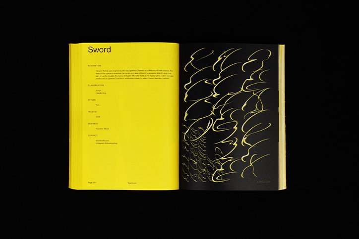
He started to approach independent typographers, asking them to convey – in a single graphic poster – the expressive character of their work. “There is a huge variety of strong visuals and design concepts found in independent typography at the moment,” says Leonhard reflecting on the current typographic landscape and the wide array of work to draw on. In New Aesthetic this diversity comes into its own, as near-undecipherable typefaces like Kazuhiro Aihara’s Sword sit alongside the sleek and crystal clear forms of Nolan Paparelli’s Everett. “At first glance, both typefaces couldn’t be more different but both show a lot of character and that’s what the project is all about,” Leonhard muses.
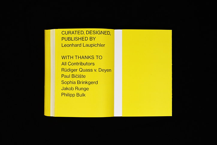
Focussing on emotion, New Aesthetic orders the poster pages first, reserving the latter half of the book for full character sets of each typeface. Reflecting on the conceptual importance of this structuring, Leonhard says: “The impression a typeface leaves when you encounter it for the first time matters; the word it spells seems like a rather secondary piece of information so the book addresses the reader in an emotional way – communicating feelings and expressions.”
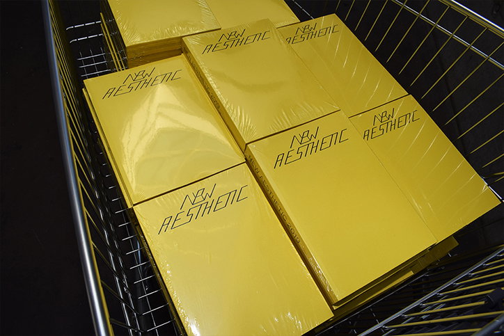
Leonhard’s design of the book further aids in this emphasis on feeling. Simple and minimal, New Aesthetic allows the unique identities of its showcased fonts to shine through without having to fight for attention. Vibrant yellow pages are as bold as the book gets and their presence is both considered and effective. “In some way, my book needed to have the same kind of energy as these typefaces,” Leonhard says, explaining the decision. “The use of colour is the best way to transfer and visualised this energy because everyone understands the impact of colour and associates certain feelings with them.”
Still in contact with many of those involved with New Aesthetic, Leonhard sees the project as a broader reminder “of how inspiring and enriching” collaborations can be. It’s a realisation that makes a second issue of this exciting publication even more likely.
Leonhard Laupichler: New Aesthetic
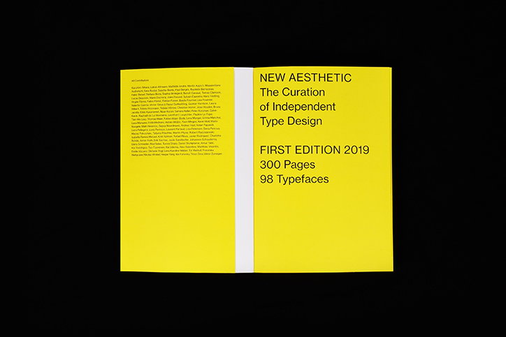
Leonhard Laupichler: New Aesthetic
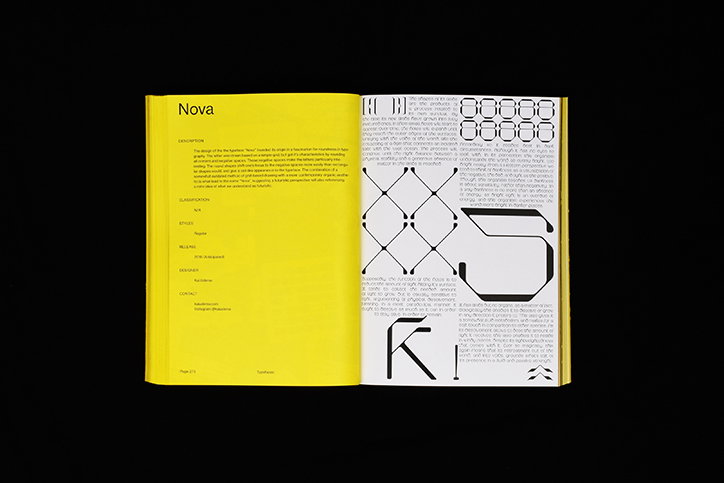
Leonhard Laupichler: New Aesthetic
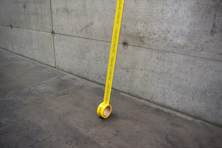
Leonhard Laupichler: New Aesthetic
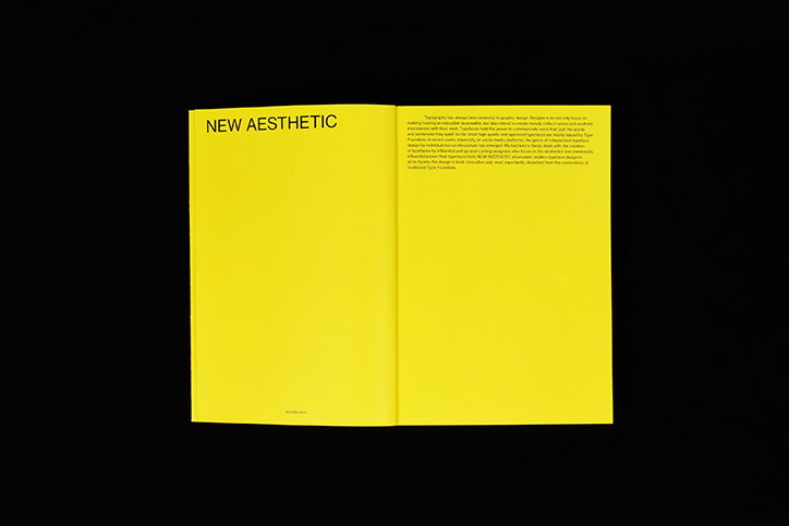
Leonhard Laupichler: New Aesthetic
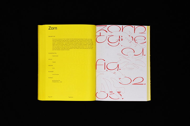
Leonhard Laupichler: New Aesthetic
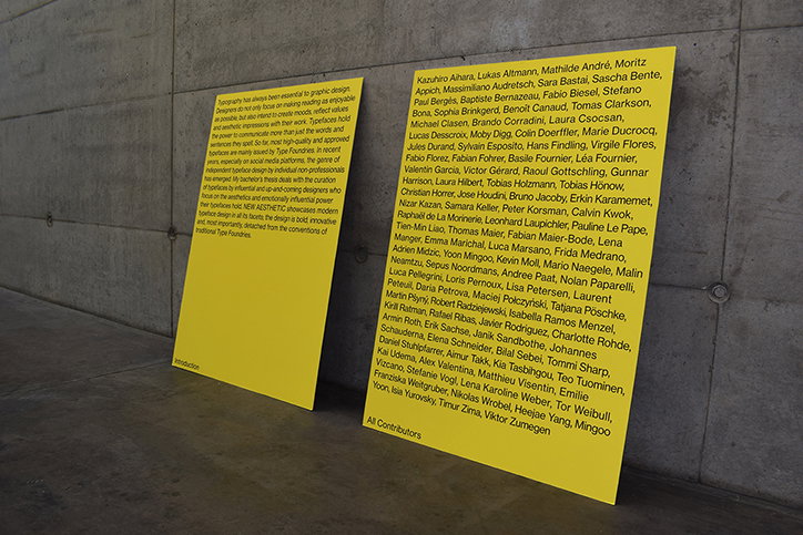
Leonhard Laupichler: New Aesthetic
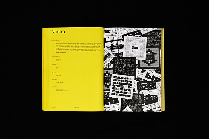
Leonhard Laupichler: New Aesthetic
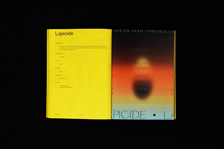
Leonhard Laupichler: New Aesthetic
Share Article
Further Info
About the Author
—
Lorna Pittaway joined us in the summer of 2019 as an editorial assistant. She graduated from Edinburgh College of Art with a degree in graphic design and wrote stories for us on graphic design, film, art and everything in between.