




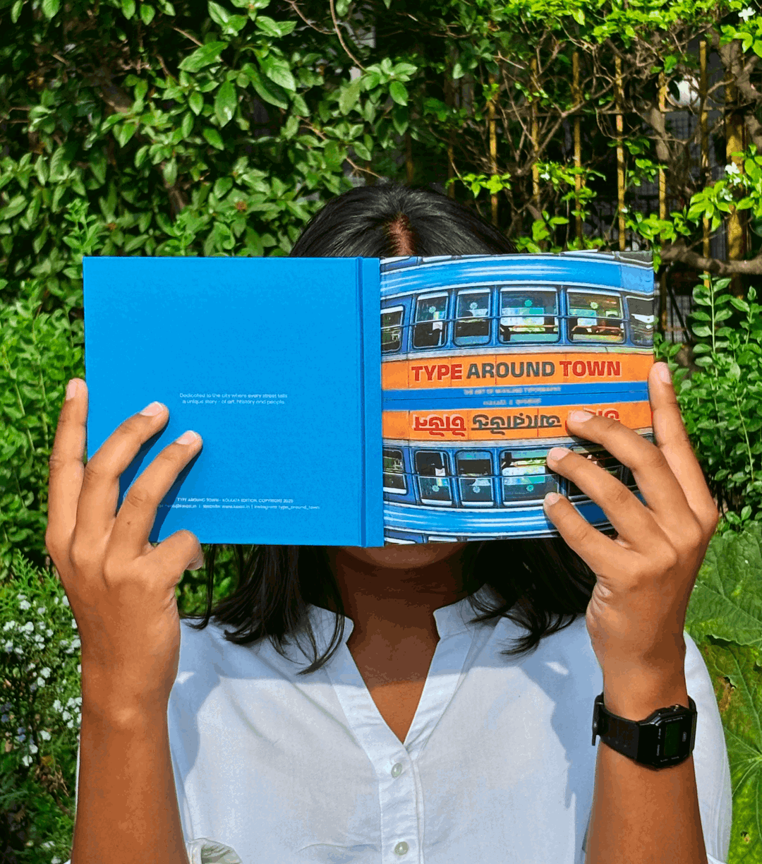
Type Around Town asks us to pay attention to the letterforms that surround us every day
Kwazi Design’s years-long typographic archival project pays homage to the city of Kolkata and reveals the hyper-local and cultural context behind the aesthetic it celebrates.
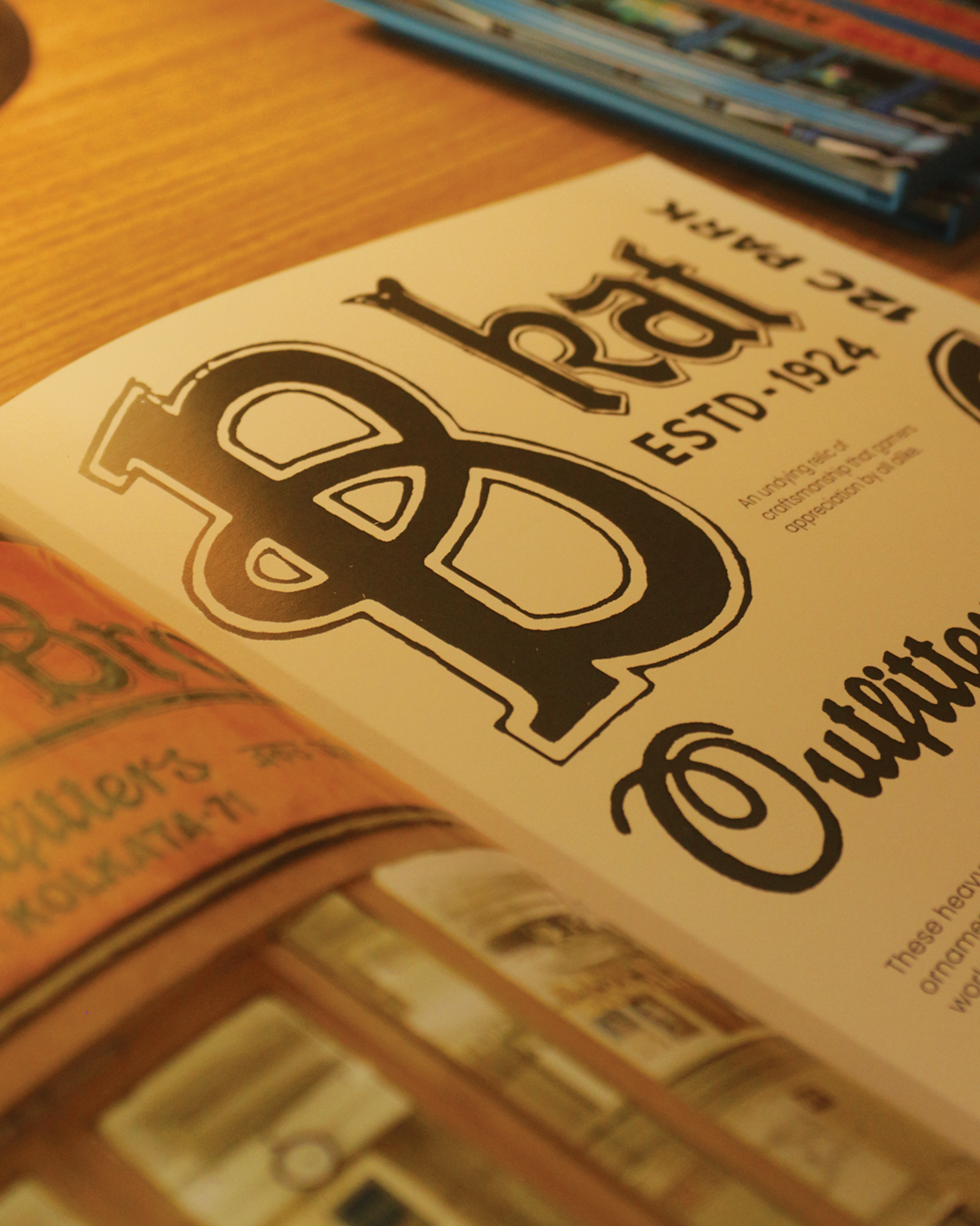
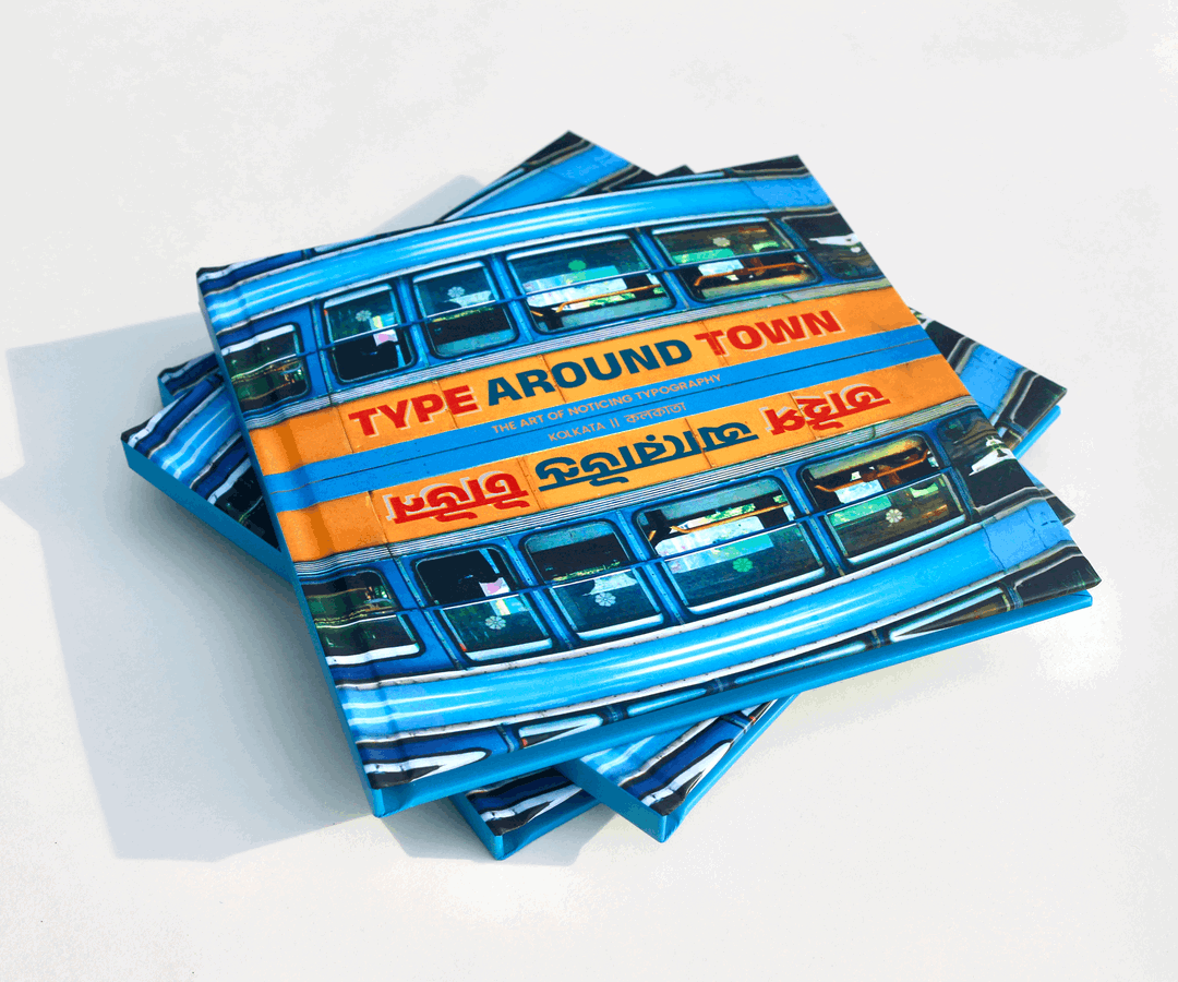
Over the past few years, Kwazi Design, based in New Delhi and Kolkata, have been doing what graphic designers have long loved: archiving. More specifically, however, the design studio has been documenting the city of Kolkata through a typographic lens, culminating in a robust visual archive that celebrates the city’s love of letterforms. Whilst the archive – Type Around Town – marks a slight change from Kwazi Design’s general practice, which revolves around branding and visual design, it stems from the studio’s love of typography and the heritage of its hometown.
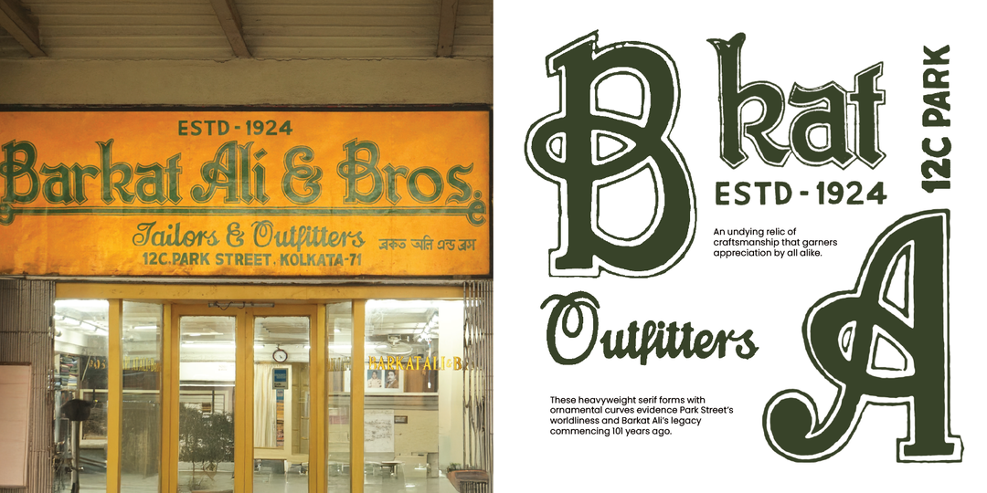
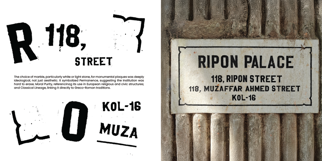
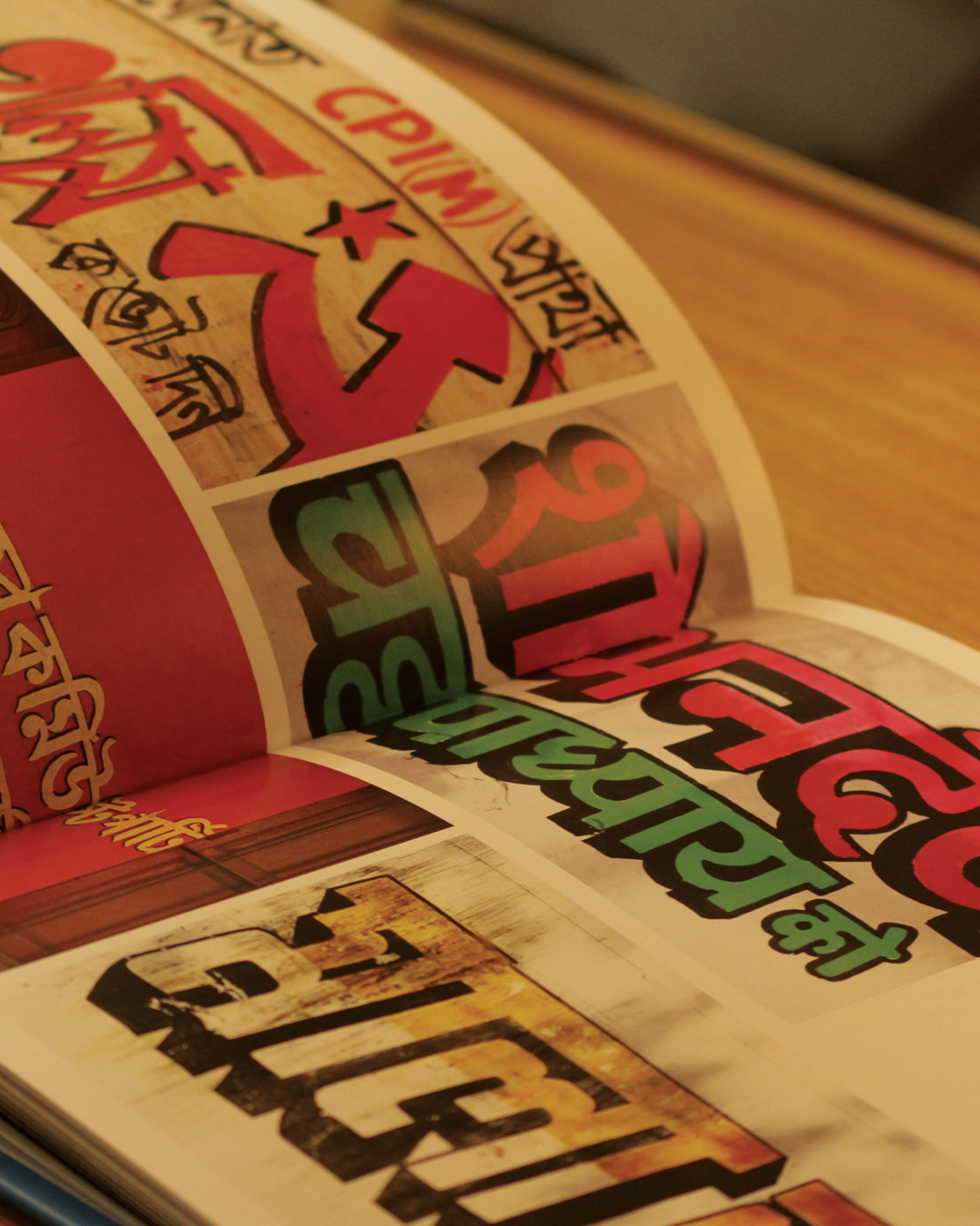
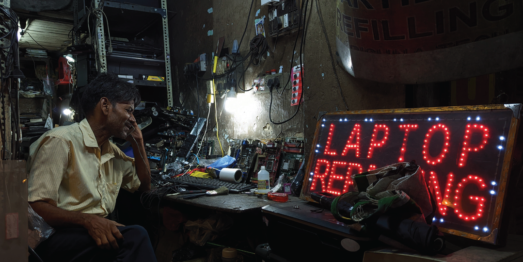
“Growing up in Kolkata, I’ve always been curious about the many cultural influences that shape the city, both regional and colonial,” Arshdeep Singh, founder and creative director of Kwazi Design, says. It was during Covid that Arshdeep found himself more intentionally wandering through the city, discovering the beautiful details he’d previously overlooked. “That’s when I began to see how much typography quietly contributes to Kolkata’s visual identity,” he says. It manifests in lots of different ways through a multitude of mediums – from marble plaques to hand-painted boards. “There was also a growing sense that much of this was fading away or being replaced,” says Arshdeep, which lead him to start documenting Kolkata’s visual landscape; “we began building narratives around them, uncovering stories of craft, context, and changing times.” In doing so, this understanding and pursuit of preservation ended up reframing the city’s aesthetic to the team, “not just as remnants of the past”, Arshdeep says, “but as forms that still hold relevance today.”
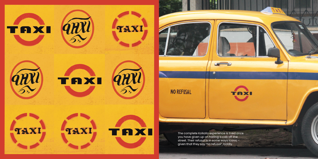
Kwazi Design: Type Around Town (Copyright ©️ Kwazi Design LLP, 2026)
Through the examination of the world around them, and how Kwazi have translated it, it’s clear the practice of observation is core to how the studio approaches design. “It’s about paying attention to the quieter, often overlooked details, the stories being told through the street signs,” he says, “if only we took a moment to listen.”
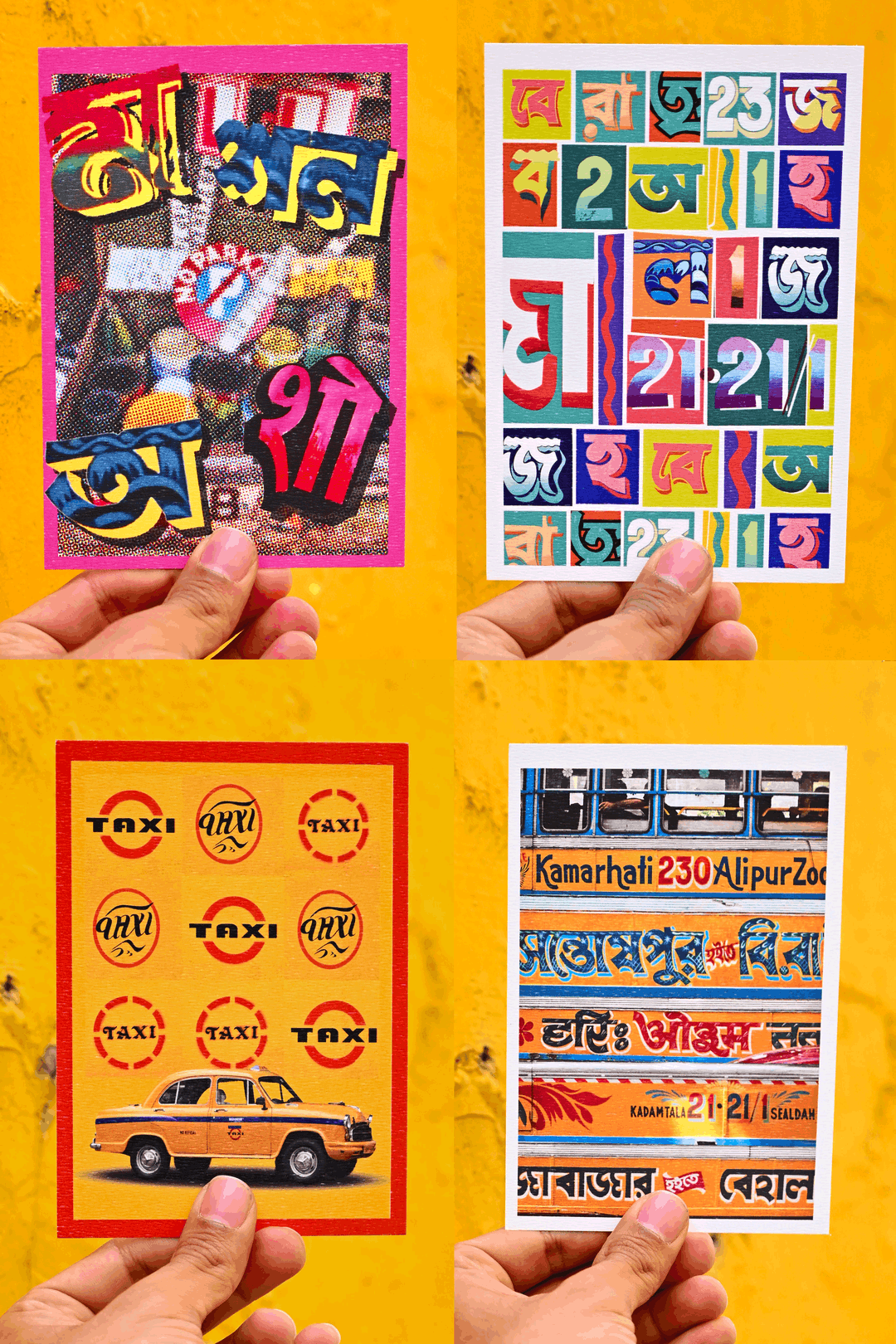
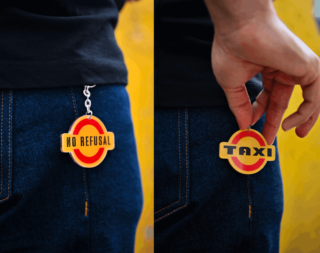
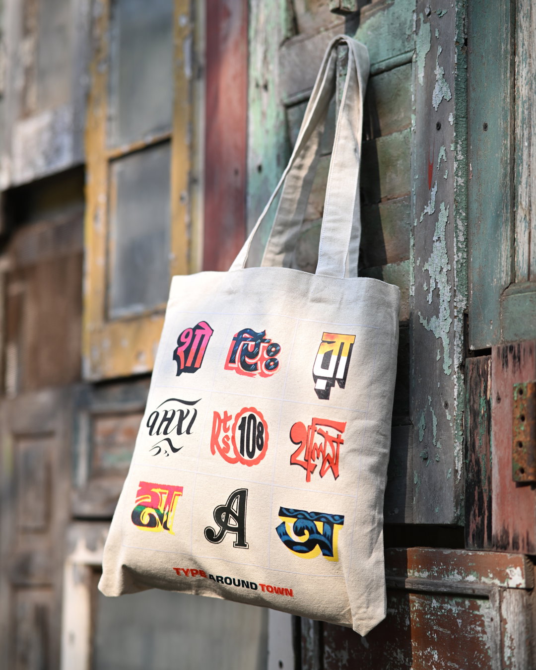
In the making of Type Around Town, Kwazi Design got to both flex and build upon this mindset, understanding the hyper-local and cultural context behind these letterforms and signs, whilst asking us to do so too. “We’re motivated to make this love for typography accessible,” Arshdeep says, noting how this style of archival project is uncommon in India. “While it might exist as visual research in University projects, there is limited availability of projects or design outcomes for the enthusiast to enjoy.” It was this realisation that also led Kwazi Design to create merchandise to accompany the book. “We’re positive this will encourage people to appreciate the little things that surround them,” as Type Around Town did for Arshdeep and his city. “As for the city of Kolkata, the feeling is personal, it’s an homage to what the city gave me growing up.”
GalleryKwazi Design: Type Around Town (Copyright ©️ Kwazi Design LLP, 2026)
Share Article
Further Info
About the Author
—
Hailing from the West Midlands, and having originally joined It’s Nice That as an editorial assistant in March 2020, Harry is a freelance writer and designer – running his own independent practice, as well as being one-half of the Studio Ground Floor.





