




How Jana Traboulsi’s diasporic perspective and a rekindling with land have fuelled her Jameel Prize work
The Lebanese multi-disciplinary artist and creative director originally saw the disconnect with her cultural history as a handicap. Here she discusses how it has in fact enriched her practice and continues to be a point of exploration within her work.
For Jana Traboulsi, using her creativity and talents as an illustrator for advertising and selling was, to say the least, “disappointing.” The artist got her start by studying graphic design at the American University of Beirut, originally wanting to study Fine Arts, but choosing “the closest field which — it seemed then — gave me more chances of financial independence,” Jana tells us. It’s a familiar tale for many artists. “After graduating, I worked for a year in advertising only to confirm how much I did not want to do this, and how much this stood politically and ethically far from what I believed in,” explains Jana. This revelation drove her to pursue a theoretical master's degree at Goldsmiths, where she discovered critical studies “with a bunch of professors issued from the Marxist Frankfurt school,” she continues. “After a second master's in multimedia in France, I came back to Lebanon to teach graphic design.” Now, she teaches regularly in Marrakech at the Ecole Supérieure des Arts Visuels, in the graphic design department, of which she has previously been director.
“For years I suffered from that infamous ‘imposter syndrome’ in the design field,” admits Jana, explaining yet another familiar foe of many artists. The design world she entered, she says, was “very often so trendy and consumeristic.” However, the experiences she had there have today convinced her still “of the power and privilege of working with images and words to communicate, inform, provoke, touch, using media with the potential to reach thousands of people and occupy the public sphere.” She found a way back to her first love, drawing, in 2005, starting at a newspaper and “telling intimate stories that link to larger political events or commenting on various aspects of daily life” in Beirut mainly. “Through illustration I found a way to author my creative work and then was able to incorporate this into my designs,” explains Jana. Then, in 2008, she started a blog called Ayloul: “its diary format gave me many more opportunities to combine the personal with the social, through what was happening to me both personally and on a larger scale.”
As well as her solo work, more work of hers includes collaborations like Sigil, an artist collective she co-founded in 2014 based between Beirut and New York, which produced “a series of representational and site-specific interventions exploring the marvellous and terrifying metamorphosis of the Arab landscape today.” Sigil’s Monuments of the Everyday has been exhibited at the Venice Architecture Biennale, Marrakech Biennale, and Milan Design Triennale. Jana is also the creative director of the pan-Arab quarterly Bidayat: “we are a magazine that publishes on culture, economics, history, politics, and more, in Arabic and for the Arab world. It is born around the Arab revolutions and continues to accompany the path of Arab countries uprisings.” She’s also the art director of Snoubar Bayrout publishing house, which is “a small structure interested in the arts, language, and history. We have a dozen titles up to this day: Samuel Beckett translated to Arabic, a graphic novel, a linguistic research, beginning of last century re-editions, and more.” She’s got plenty of artistic energy and shows no signs of slowing down now.
Interestingly, an important part of what inspired Jana’s current style started as a handicap: “that of having difficulties talking in my own language.” As a Lebanese person who grew up in France during the civil war, she had unlearned Arabic during her childhood and later came back to Beirut as a teenager with a huge identity crisis. “It was a slow journey to reclaim a sense of belonging to a place and its history, and also reconcile the several cultural influences that compose that history with a full awareness of the structures of power inherent to their coexistence.” Trained in the Bauhaus tradition, she later chose to work on publications in Arabic, taking Arabic calligraphy classes, researching old manuscripts, and also surrounding herself with the work of modern and contemporary designers and artists of the region. “My work is a constant search for a voice that tries to find an echo with the place and time it is in dialogue with. My original disconnection from my language, culture and history has been both a drawback and a richness, providing me sometimes with unexpected perspectives. By trying to inscribe my art and design works in the lineage of the region where I practice, I have looked for pertinent propositions outside of alienating global aesthetics or self-exoticising nostalgic imagery.” Artists who have been of great influence to Jana include the Sudanese illustrator Hasan Musa, who writes images and tells folk stories, the Iraqi artist Dia el-Azzawi, “whose lines both write and draw images of the Arabic political landscape,” and Iranian designers and artists like Jana’s colleague and friend Reza Abedini, or “the great satirist” Ardeshir Mohasses.
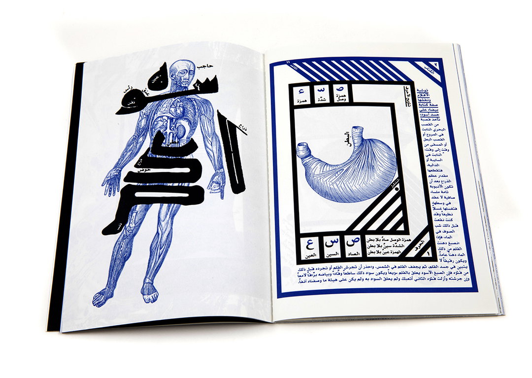
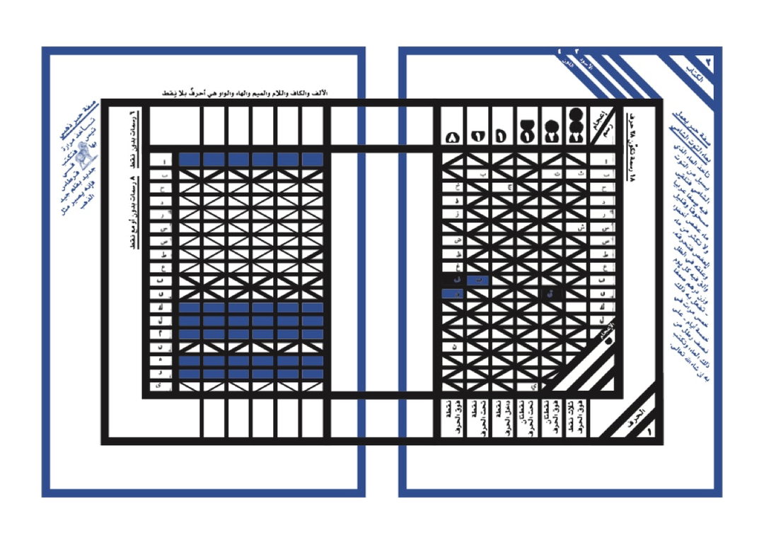
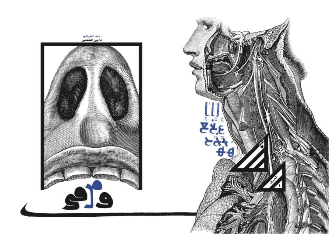
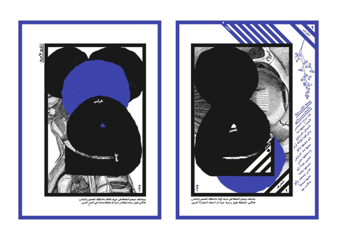
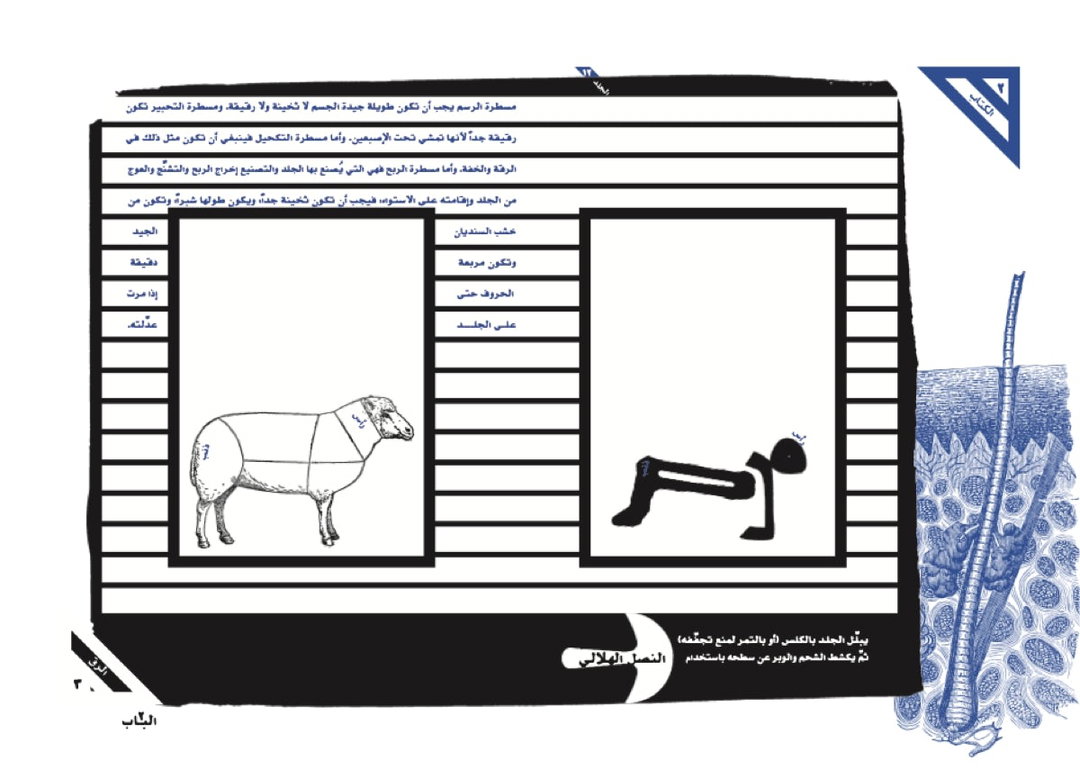
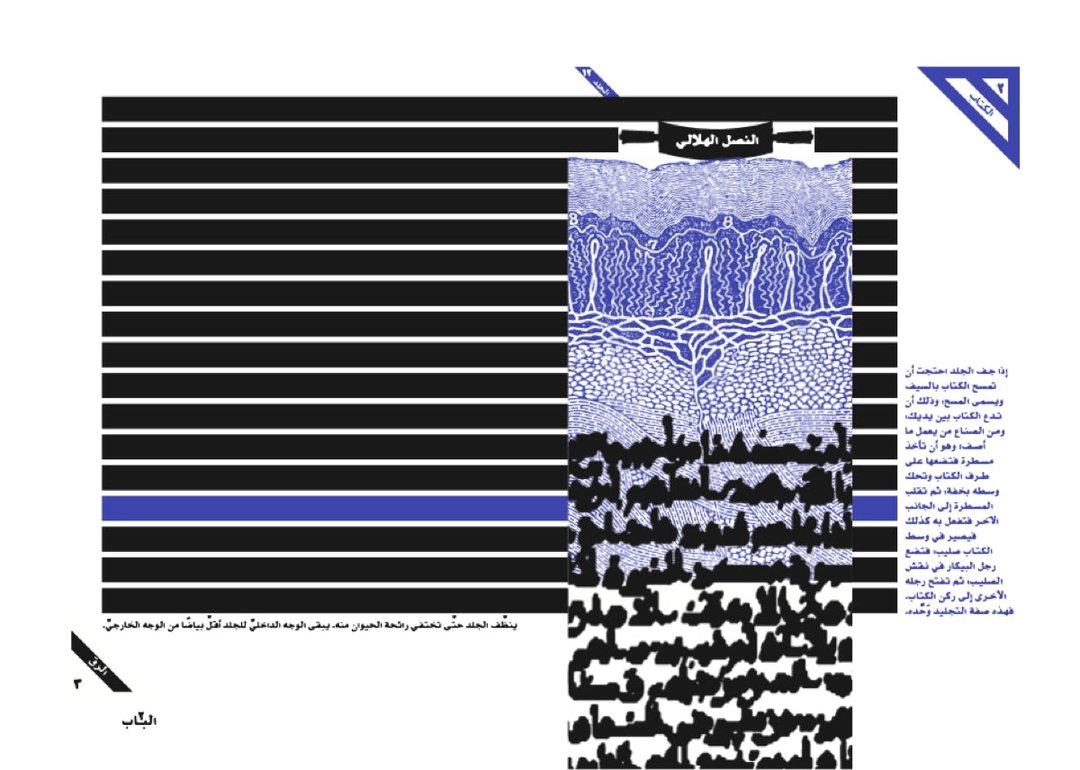
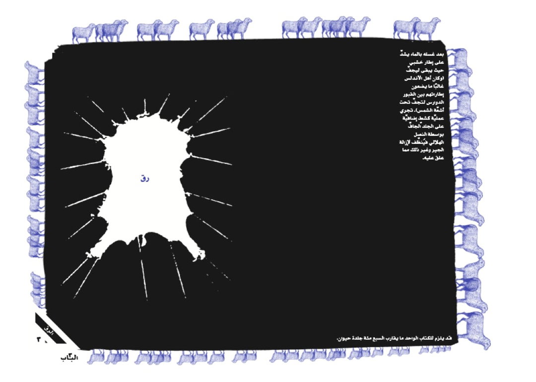
Having work that is so rooted in an exploration of how personal histories inform current identities, historical research plays a key role in informing Jana’s image styles or layout decisions. “In editorial or children’s literature illustrations, in lettering work with Arabic music ensembles, or in Kitab al-Hawamesh an artist book that investigates medieval regional book-making practices,” as well as the book which was shortlisted for the Jameel Prize 2021, Jana reinterprets calligraphy, ornamentation, and layout “from the manuscript tradition into mass-produced artifacts,” she describes. Kitab al-Hawamesh, meaning The Book of Margins, is a project particularly close to the artist’s heart. An ongoing effort to mend a graphic design history interrupted, as she describes it. The book, in short, explores notions of the margin and the marginal in book practices. “A turning point in this process was my invitation, in 2017, to the contemporary commissions of Midād at Dar El-Nimer cultural center in Beirut,” Jana narrates, “the inaugural exhibition of the center’s collection exploring the Arabic script’s development.” The extensive research she was able to conduct into the El-Nimer collection’s art pieces, especially in manuscripts, printed books, and scribal objects, shed light on the “rich regional traditions of book making and layout design, their aesthetics and functionalities,” she says. “At its core, it is a political project,” Jana tells us, “interested in inscribing current design practices within the rich history they belong to.”
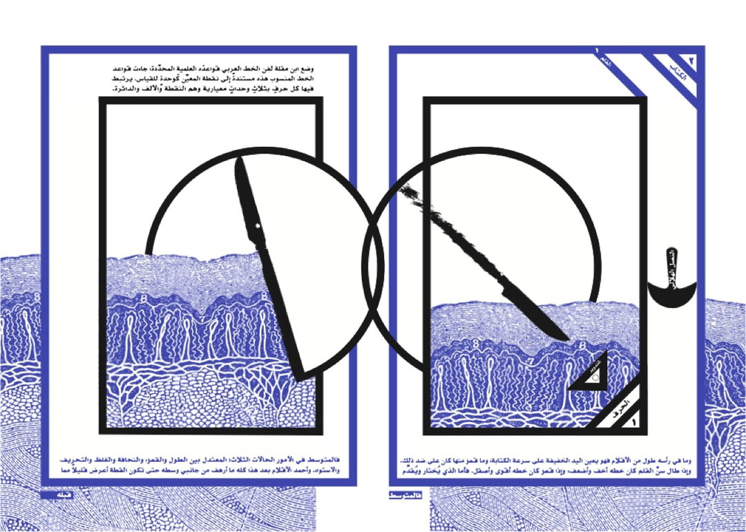
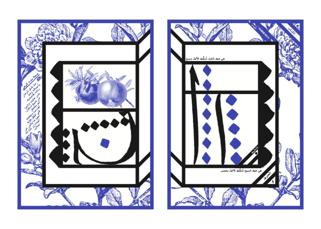
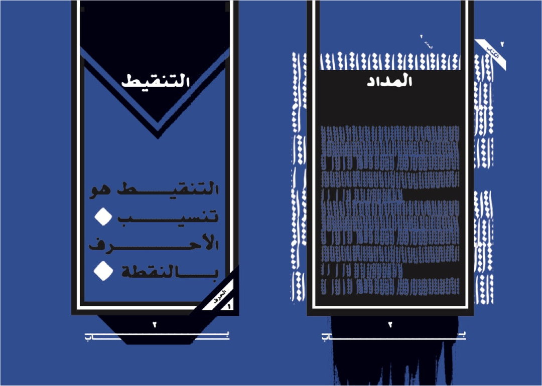
The first chapter examines the fundamentals of the letterform, and explores the relationships between language and the body: “like the naming of Arabic letters in terms of human anatomy. The negative space inside closed letters is referred to as the ‘ain’, or eye, while the curved bowl of the letter ‘saad’ is named in Arabic for the shape it resembles – a human stomach.” The second chapter addresses the practices of the scribe: “This information, taken from an 11th-century handbook for calligraphers called the Umdat al-Kuttab, includes a recipe for red ink made from pomegranate peel.” The third chapter examines parchment and paper as materials, and how they involve animal slaughtering, skin scraping, washing, stretching, and cutting; “I had noticed a ‘scar’ on an ancient piece of parchment, where a rip in the surface had been stitched.” Kitab al-Hawamesh is currently exhibited at the Victoria & Albert Museum in London, as part of the Jameel Prize 6: Poetry to Politics exhibition, showing till 28 November 2021.
GalleryJana Traboulsi: Kitaab el-Hawamesh (Copyright © Jana Traboulsi)
Share Article
Further Info
About the Author
—
Dalia is a freelance writer, producer and editor based in London. She’s currently the digital editor of Azeema, and the editor-in-chief of The Road to Nowhere Magazine. Previously, she was news writer at It’s Nice That, after graduating in English Literature from The University of Edinburgh.


