Graphic designer Hayoung Im brings precision and flair in equal measure
The Seoul-based creative favours clean, classic imagery, and a research-based, ego-less practice.
Share
On the spectrum of graphic design sensibilities, Hayoung Im sits firmly at the pragmatic end. “For me, design is a job, and I don’t want to put my ego on the job,” she says. That’s not to say there’s no room for expression and flair, however, her work delivering both with measured grace. As a designer for Seoul-based studio Workroom since 2018 and an independent visual creator, Hayoung has for the past few years been developing an approach that sees a regimented research process inform precise yet characterful graphic work for publications, identities and more.
“I prefer clean and classic images, but I don’t have my own visual language or concept,” she tells us. “Every time I start a new project, I set up a visual strategy that fits. Rather, I am not persistent in a particular way or concept, so it’s easy to respond flexibly to variables that have occurred during the project. Instead, to design a wide spectrum, I try to learn as many kinds of visual languages as possible so that I can take them out and use them at any time.”
Hayoung says she has “liked pretty things regardless of the medium” since she was young – “an animation with visual beauty, spatial graphics in an art museum, symmetrical hotel lobby spaces,” she lists. So, early on, she knew she wanted to be “producer who made something pretty, vaguely,” and her entry point – as it is for many designers starting out – was printed matter. “[It was] the easiest, cheapest medium to access. I also like the clean and calm texture of the paper itself.”
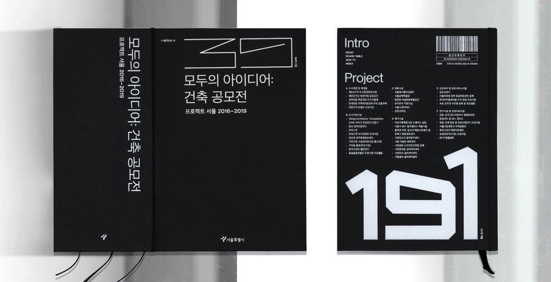
Hayoung Im: Of All Ideas: Architecture Competitions (Copyright © Hayoung Im, 2021)
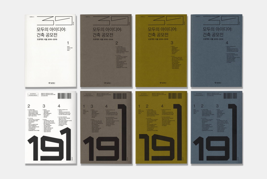
In her portfolio are a number of wonderful printed projects, including a mammoth 2108-page book listing all the architecture competitions held from 2016-2019 in Seoul. Of All Ideas: Architecture Competitions consists of four books, and a special edition hardcover publication that combines all four. The first title features essays and discussions on the topic, as well as a comprehensive set of guidelines for the contests, while the following three volumes introduce 39 projects, reviews and 191 winning works. Needless to say, Hayoung was faced with a huge amount of intricate and complicated information to present in a digestible and engaging way. For inspiration, she turned to a technique found naturally within the content. “I came up with the impression of an architectural drawing tailored to the grid,” she says. Embracing its vastness, the designer chose to place the table of contents on the front cover of the book. Along the way, she also had the unenviable task of tidying up countless architectural images, all provided as jpegs and modified one by one in Photoshop by Hayoung, which she describes poetically as “like building a pyramid with Lego”.
In 2019, the designer also made the catalogue for an exhibition at Culture Station Seoul 284 titled Electric Universe, which reconstructed the history of Korea’s electricity industry from Dangin-ri Power Plant. It’s another rather dense topic brought to life in print by Hayoung, demonstrating her aforementioned research-driven process. As such, the book was designed to look like a manual that would have been used in the power plant, bound with thick spring binding, the index pages used as inside title pages.
Looking forward, Hayoung says she is moving away from her dedication to printed matter, saying she is “more attracted to image than to medium… so no matter what material it goes through, it makes me feel full enough as long as the image is delivered properly”. She adds a caveat that it’s not that she “stopped exploring materiality… quite the opposite”. These days, Hayoung is exploring a broader range of materials, including web, through which to manifest her ideas, and we can’t wait to see how that affects her output.
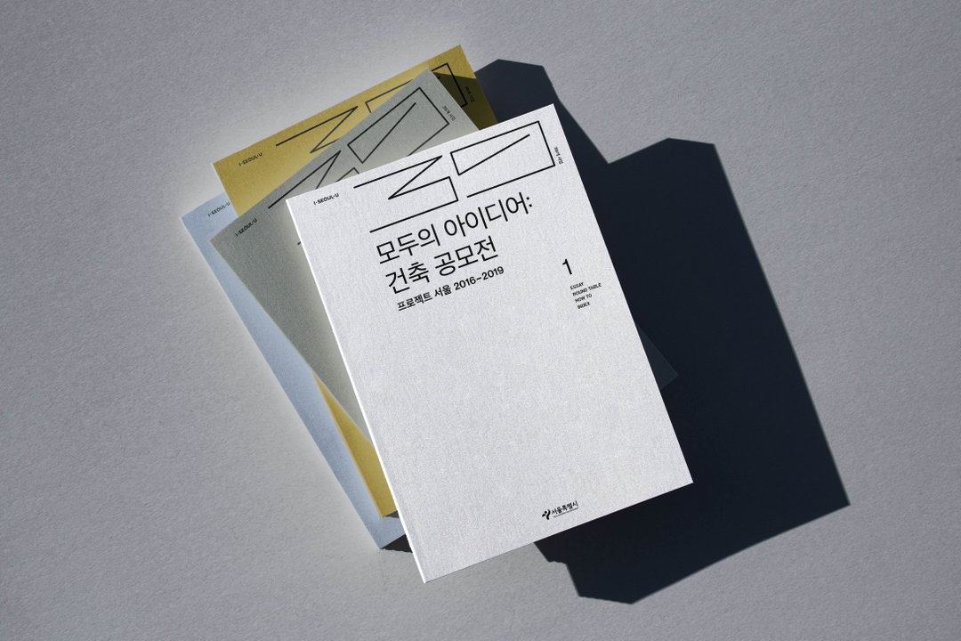
Hayoung Im: Of All Ideas: Architecture Competitions (Copyright © Hayoung Im, 2021)
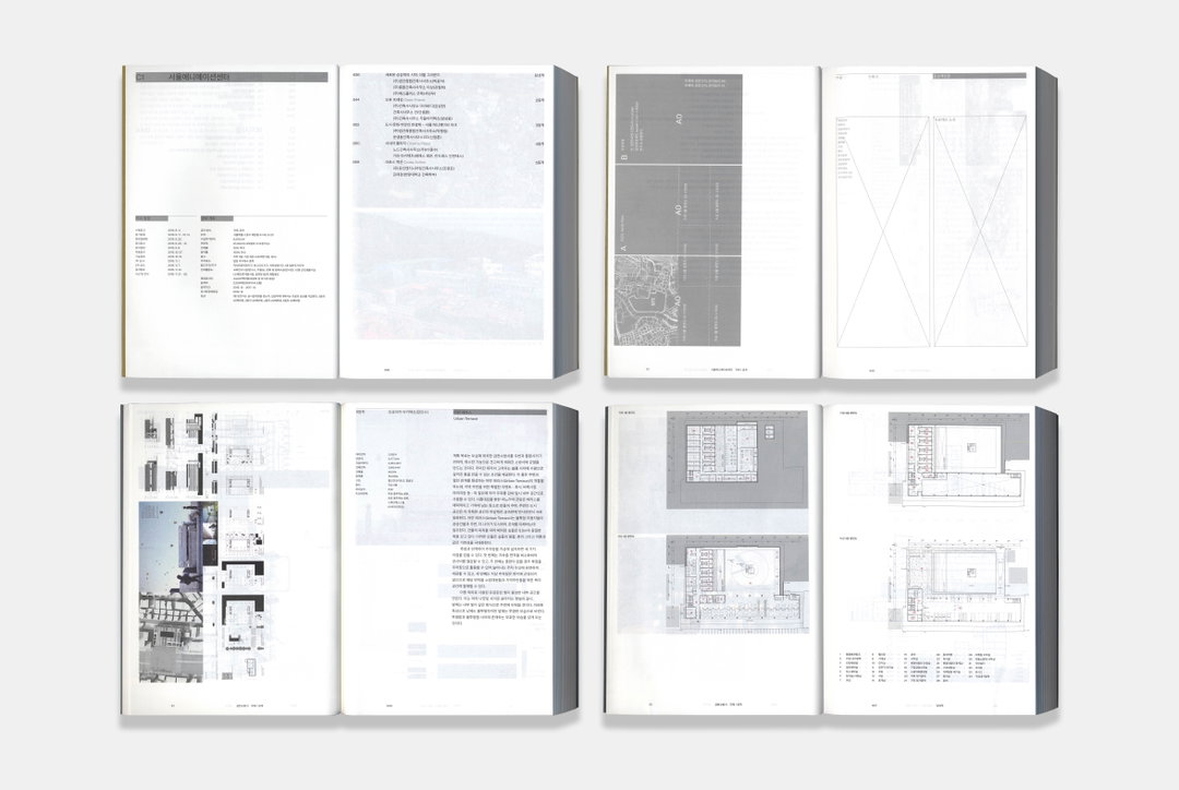
Hayoung Im: Of All Ideas: Architecture Competitions (Copyright © Hayoung Im, 2021)
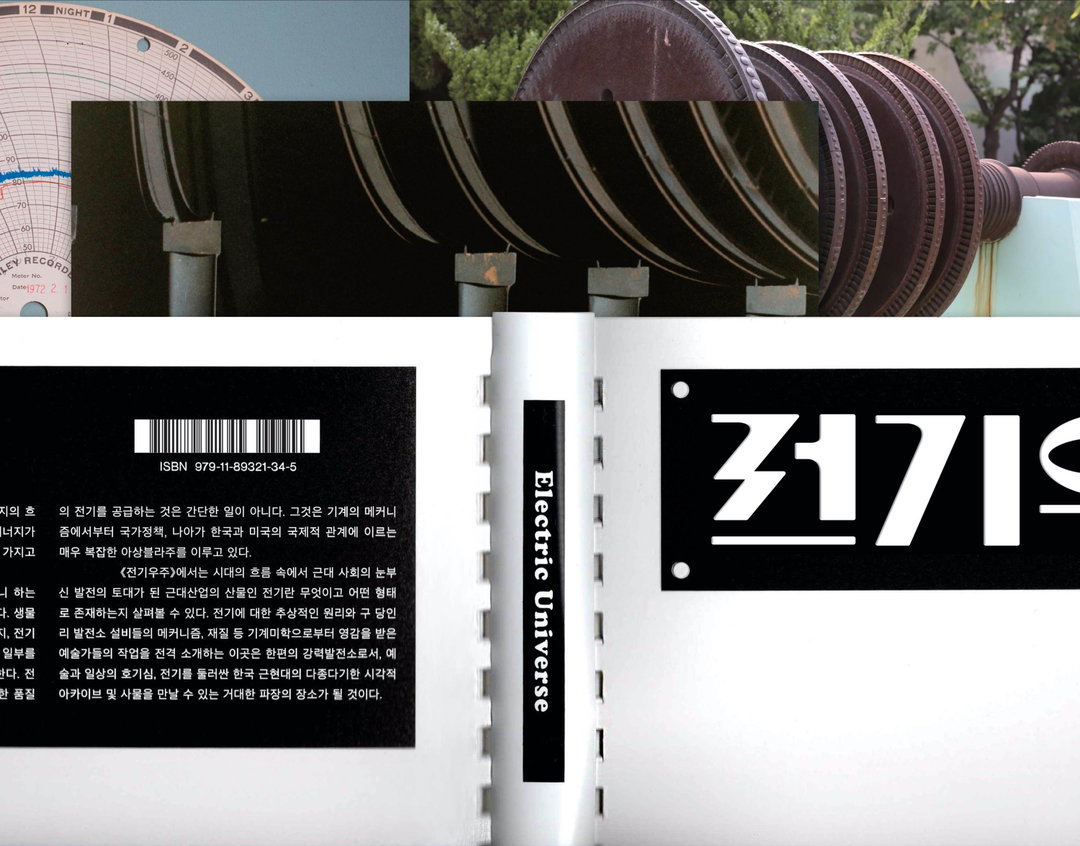
Hayoung Im: Electric Universe (Copyright © Hayoung Im, 2019)
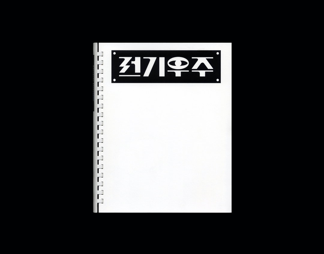
Hayoung Im: Electric Universe (Copyright © Hayoung Im, 2019)
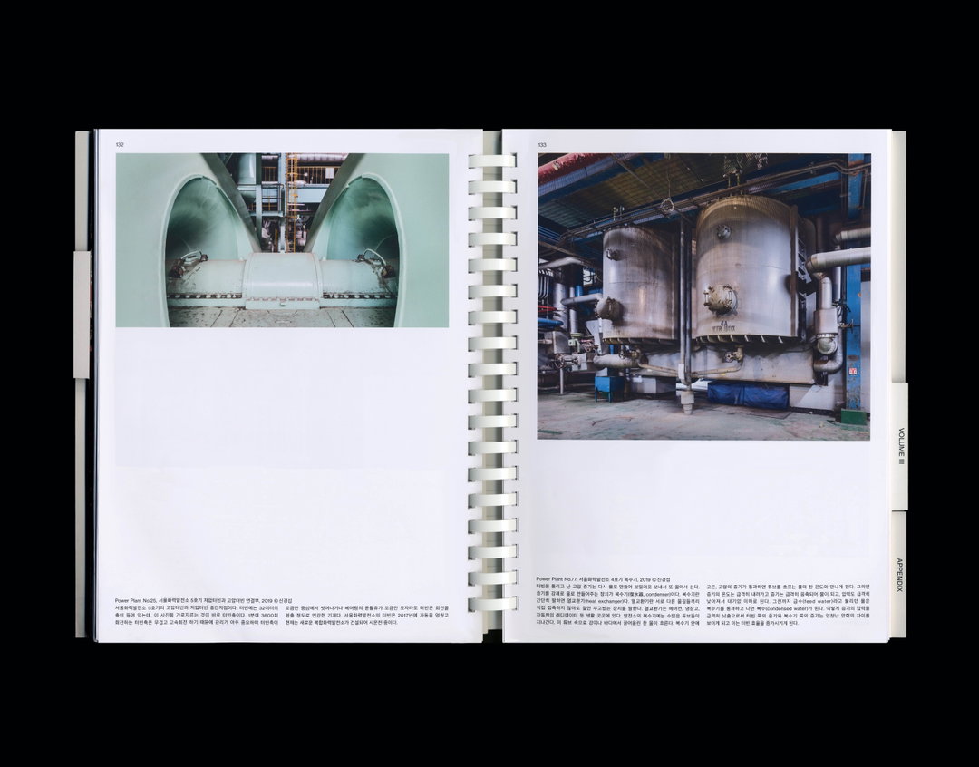
Hayoung Im: Electric Universe (Copyright © Hayoung Im, 2019)
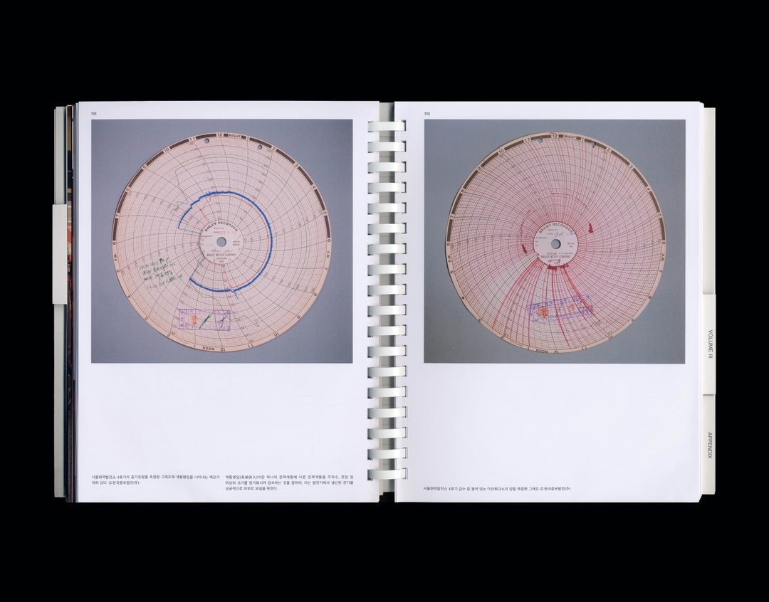
Hayoung Im: Electric Universe (Copyright © Hayoung Im, 2019)
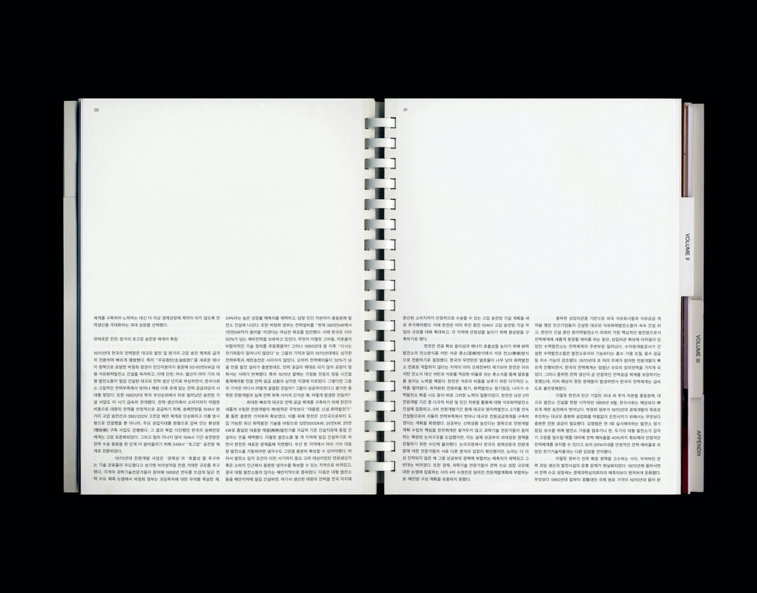
Hayoung Im: Electric Universe (Copyright © Hayoung Im, 2019)
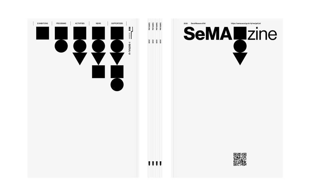
Hayoung Im: SeMA zine (Copyright © Hayoung Im, 2020)
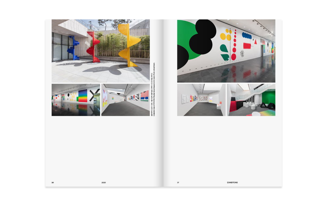
Hayoung Im: SeMA zine (Copyright © Hayoung Im, 2020)

Hayoung Im: 바이러스(Virus) lettering (Copyright © Hayoung Im, 2020)
Hero Header
Hayoung Im: Of All Ideas: Architecture Competitions (Copyright © Hayoung Im, 2021)
Share Article
Further Info
About the Author
—
Jenny oversees editorial output across It’s Nice That. Get in touch with writing pitches for features or opinion pieces, big creative story tips, or questions about all things editorial. jb@itsnicethat.com
To submit your work to be featured on the site, please see our Submissions Guide.