




Havas London and Design Bridge rebrand Durex, with a bespoke typeface by Colophon Foundry
Called One Night Sans, the new typeface underpins the rebrand, which includes a logo refresh and a more inclusive approach to photography.
Share
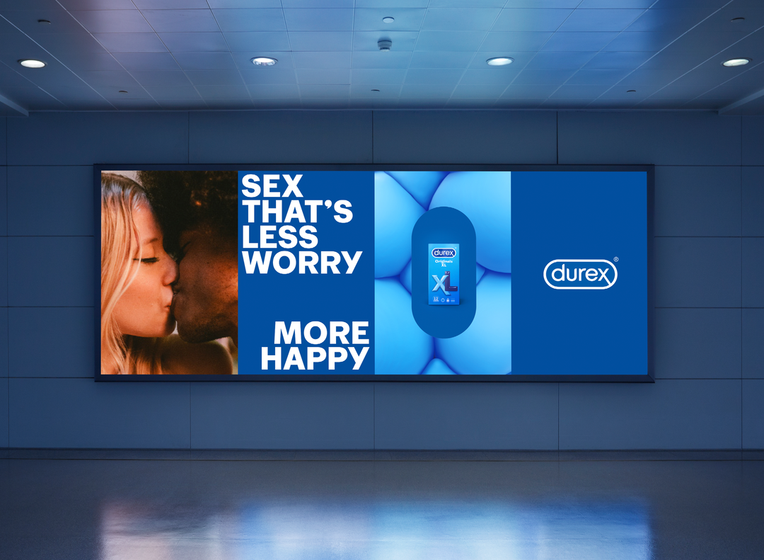
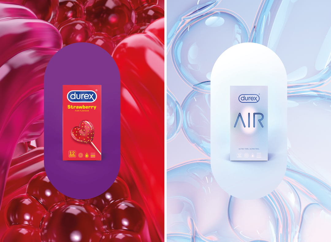
Havas London and Design Bridge have created a new identity and visual positioning for condom brand Durex, aiming to challenge conventional approaches to sexuality with more inclusive imagery. The rebrand features a flattened and tweaked version of the logo and a new typeface developed by Colophon Foundry.
The impetus for the rebrand came from Durex’s 2017 Global Sex Survey, which showed a landscaped of confusion and change regarding sexual attitudes. While the internet has brought openness and access, the survey found an “underlying sexual anxiousness”, which it concluded was largely driven by unrealistic representations of sex throughout culture.
Havas London developed the strategy, visual identity and positioning, while Design Bridge was responsible for creating the new packaging and on-pack logo. “Positionally, we wanted to present a clear and honest brand that needed to talk about some the most sensitive issues in peoples’ lives,” Havas London head of design Lorenzo Fruzza tells It’s Nice That. “We needed a brand mark that behaved like a stamp of authenticity and trust, and the previous glossy, gradient-filled logo felt like the wrong tone for the updated brand.” In terms of application, Havas London wanted to build stronger global consistency across a variety of different markets and channels, making a two-colour flat brand mark particularly well-suited.
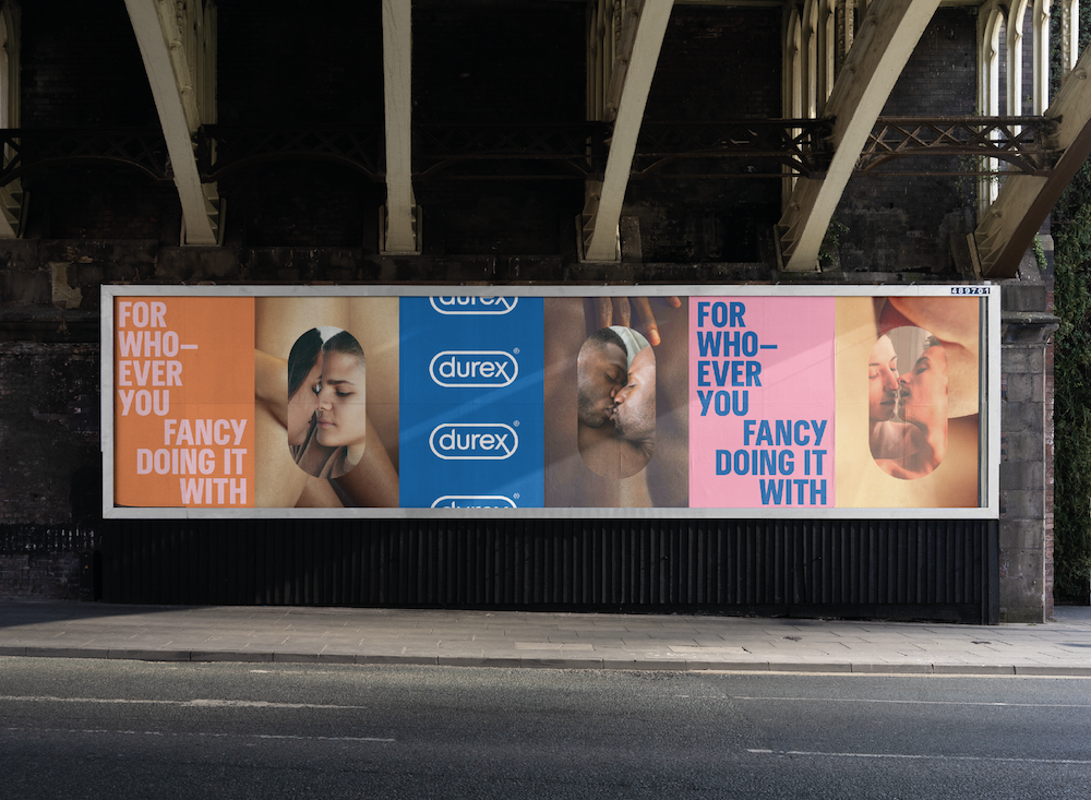
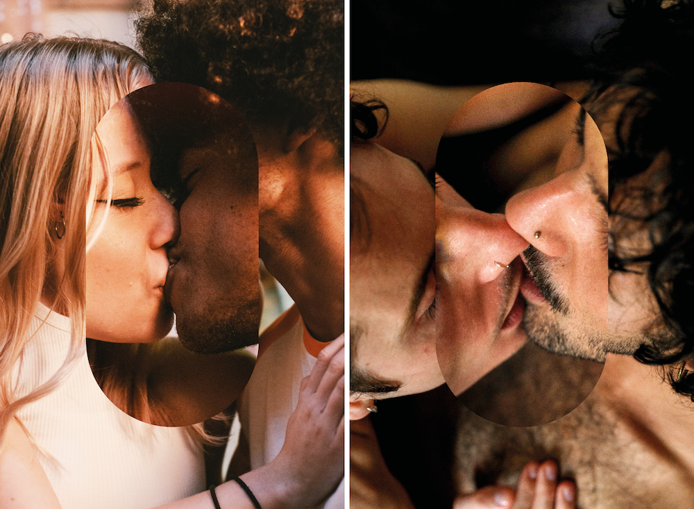
Part of the new identity was making more of the logo’s exciting lozenge shape, using it as an easily recognisable symbol and as a device to frame photography. “The logo and lozenge are two elements from the old world that we wanted to bring forward, both being symbols of product quality and trust,” says Fruzza. Purposefully putting the lozenge at the core of the identity allows us to have a brand signature that evokes that trust, while also becoming a platform that doesn’t get in the way of the messages we need to tell.”
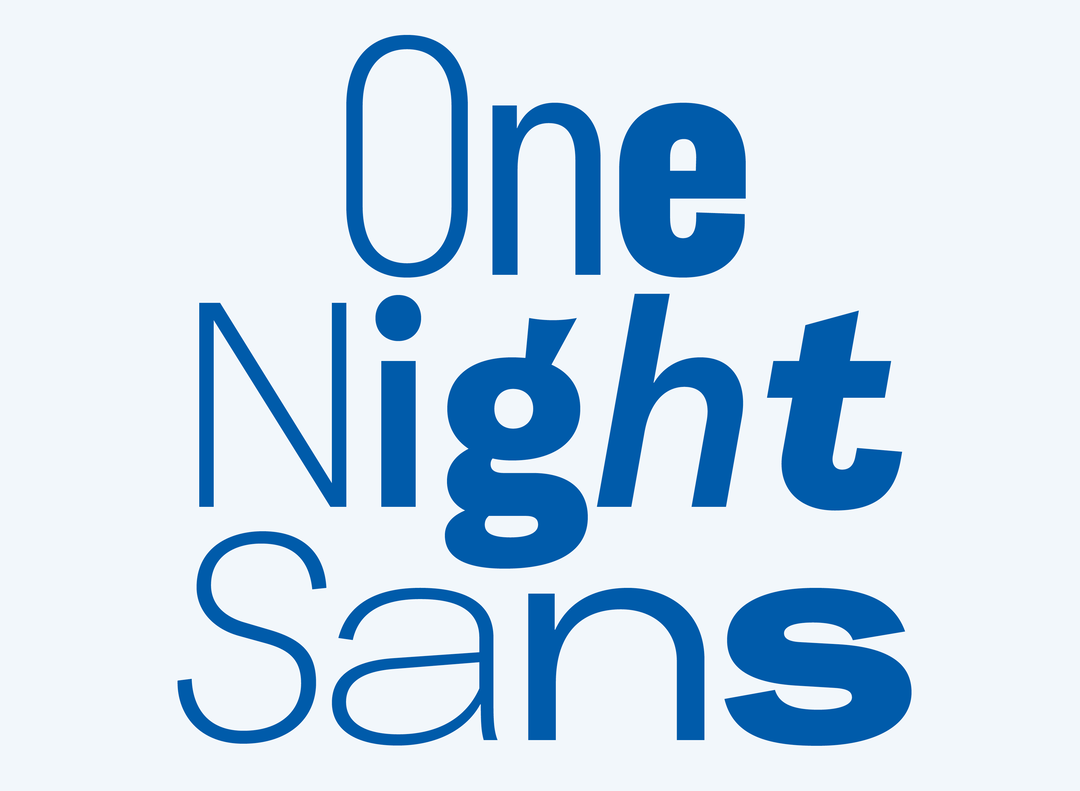
Colophon Foundry: One Night Sans
Havas London worked with Colophon Foundry to design a typeface that could “speak to people everywhere, from NHS waiting rooms to Porn Site MPUs,” says Fruzza. The result, One Night Sans, is a “clear and trustworthy” typeface spanning across nine widths with subtle nods to the lozenge shape throughout. “Beyond the tonal breadth afforded by the widths, contextual alternatives and expressive punctuation, it gives the brand personality even greater amplification wherever and whenever we need to talk with our audience,” says Fruzza.
For the photography Havas London wanted to hold up a mirror to the real world of sex, creating three lenses: “real scenarios”, “real character” and “real feel”. “Real scenarios is about capturing those fly on the wall moments of genuine connection,” explains Fruzza. “Real character is about showing the subject aware, and portrayed confidently, while real feel is about showing the sweat, goosebumps and all the other visceral things that conjure up how sex can feel.” Where they could, Havas London cast real couples, shot in natural light, and held back on any airbrushing, to capture the “beautiful imperfections” of their subjects.
The new identity and campaign launched today (14 February), to coincide with Valentine’s Day. Elliot Harris, RB global executive creative director at Havas, adds, “This new brand purpose will lead to healthier conversations around, and attitudes towards, sex, but also greater inclusion and acceptance for those who might not always experience it. This might be the most important piece of work we ever do.”
GalleryHavas London
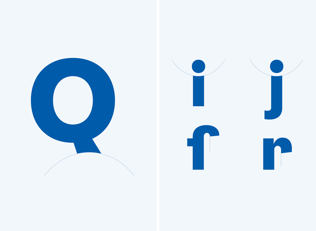
Colophon Foundry: One Night Sans
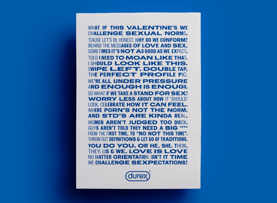
Colophon Foundry: One Night Sans
Durex rebrand
Durex rebrand
Durex rebrand
Durex rebrand
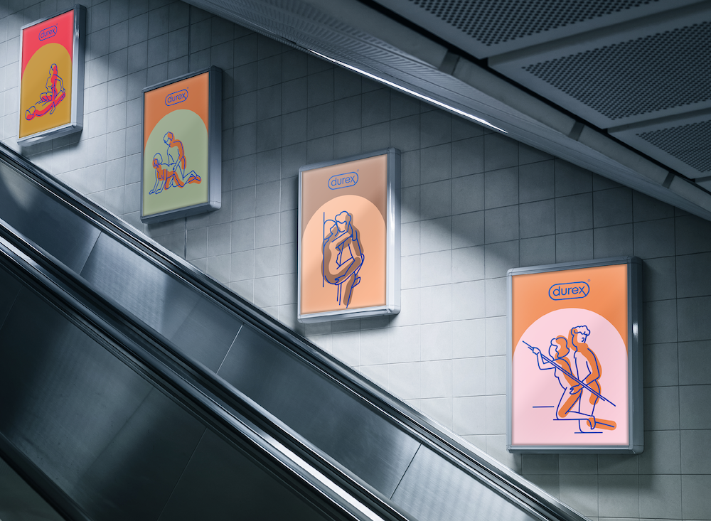
Durex rebrand
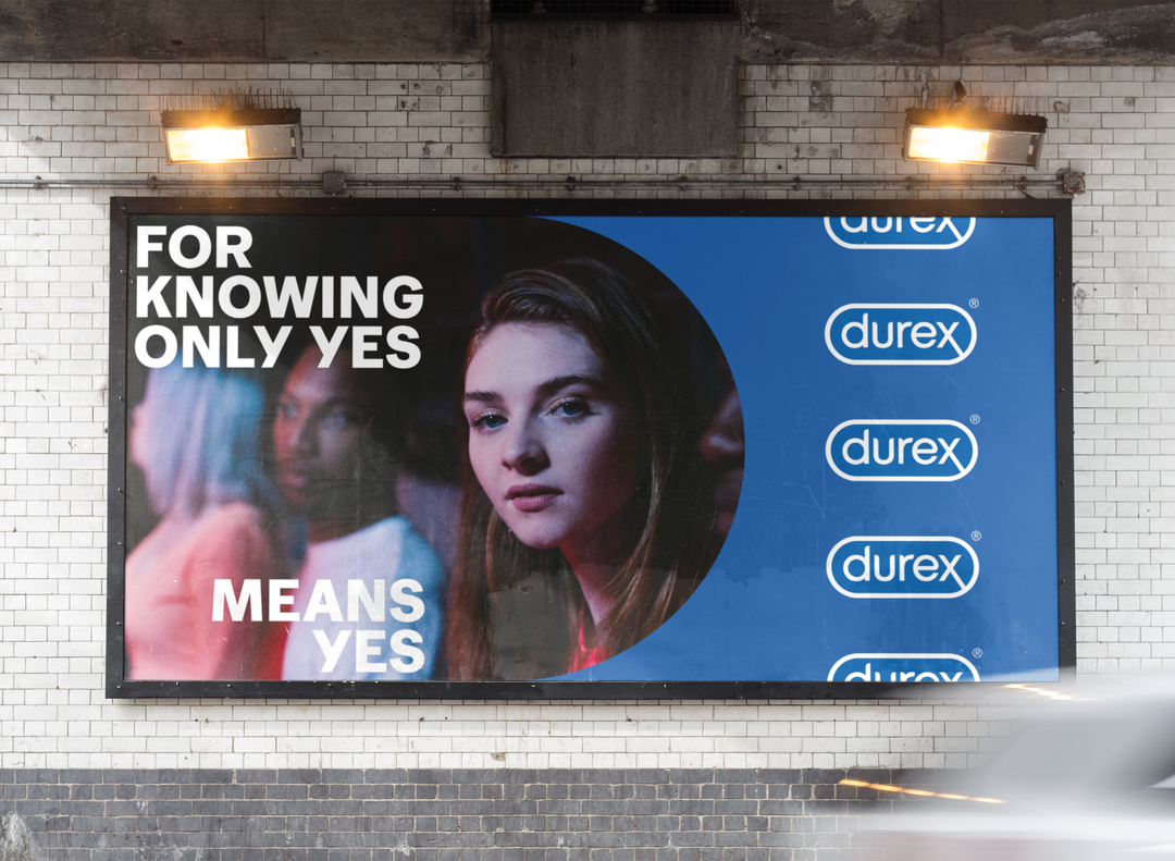
Durex rebrand
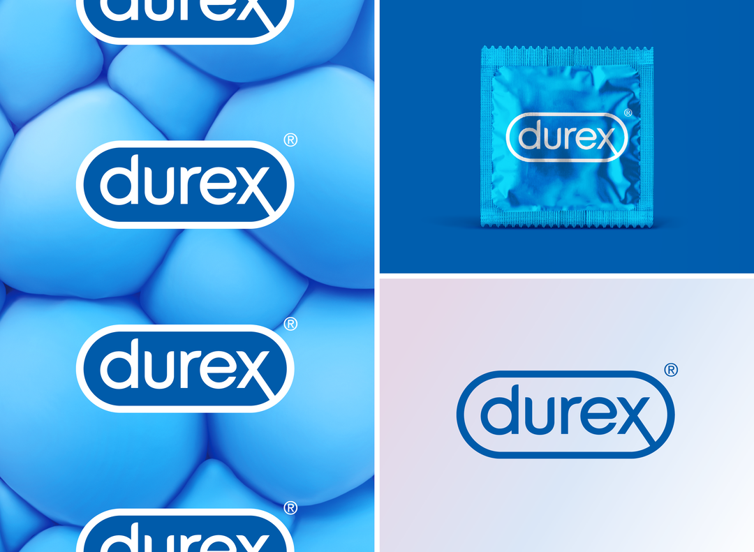
Durex rebrand
Hero Header
Havas London: Durex rebrand
Share Article
About the Author
—
Laura is a London-based arts journalist who has been working for It’s Nice That on a freelance basis since 2016.


