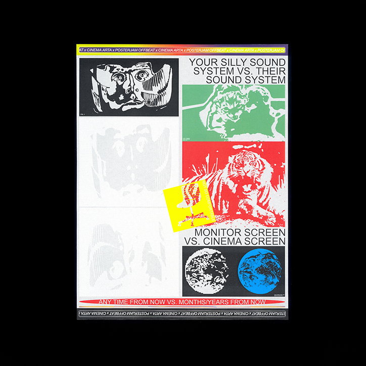
Gabriel Barbu on his experimental portfolio of printed delights
Dominated by assertive type and strong graphic, Gabriel Barbu’s practice sits firmly in the sphere of graphic design, but that wasn’t always the case. “It all started eight years ago in high school, and it actually started with illustration,” the Bucharest-based creative tells It’s Nice That. “I used to sketch and draw a lot and after a while, I started printing them on stickers, t-shirts and posters.”
Soon these drawings, and Gabriel’s love for seeing them displayed on printed media, developed into a curiosity for the more graphic, formal side of this creative space. “I started to play with fonts and dafont.com became my best friend. I would mix the illustrations I did with corny typefaces and get overly excited about it,” he says, recalling these first experiments. “It was really easy to get excited about stuff; I felt like I was always evolving and very small steps seemed like something new and big,” he muses further, adding with a joking affection: “I was so naive.”
From even the quickest glance at Gabriel’s razor-sharp work, it’s clear that he found his stride with graphic design. The bold, experimental pieces which comprises this wicked portfolio tell the story of a designer still very much enamoured with the potentials of his craft, and constantly looking to explore the new avenues it has to offer. “It’s so multifaceted,” he tells us. “It gives you a lot of space to move around and try out new things: type, editorial, web, visual identity. You just need to understand the principles and the purposes and you will never get bored.”
From record covers for electronic group Sunday Scoop to a research piece capturing the shifting dynamics of Youtube’s trending page in Romance, while the themes manifested in Gabriel’s work are diverse, their resolution always comes back to his fondness of print. “I love editorial projects and I love printed matter,” he gushes. “I’m up for anything that might smell like fresh ink at some point: books, magazines, posters – anything that can take a certain shape.”
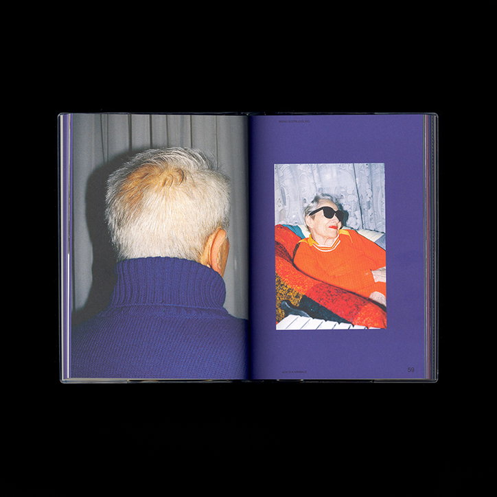
Gabriel Barbu: Kajet Issue 3
Gabriel Barbu: Kajet Issue 3
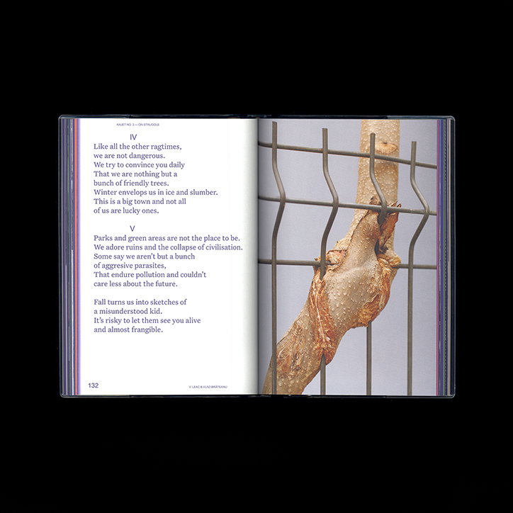
Gabriel Barbu: Kajet Issue 3
The largest of these print-based undertakings, Gabriel’s redesign of Kajet is a standout project in a stunning body of work. Giving a platform to new perspectives and new voices from Eastern Europe, the Bucharest-printed indie mag challenges stereotypes often attributed to the region. Initially meeting the founders Laura and Petrică while working at Fabrik,a printing a bookbinding workshop which produced Kajet’s first issue, after just a couple of conversations Gabriel was soon on board as their new designer. “We understood each other from the start,” he recalls of these first discussions. “We talked the same language and I knew exactly what they were looking for.”
Brought in after their debut issue, Gabriel was tasked not only with designing issue two, but also with setting a new visual tone for the platform as a whole. Operating under very open, almost non-existent creative guidelines Gabriel and collaborator Ana-Maria Dudu embraced the issue’s theme of utopia, using it to push their work both conceptually and creatively. “We sought to visually convey the ideas of a reformed future and devise a way to conjure radical imaginations. Ultimately we took it upon ourselves to visualise alternative interventions and imaginary worlds inside Eastern Europe,” he muses. “We also tried to create a system in which all graphic and written components sustain each other, and when you think about it, that’s kind of utopian in itself.”
Establishing a symbiotic relationship between his designs and the publication’s images, writing and ideas, Gabriel carried this approach over to his work for Kajet’s third issue. “I believe that a magazine shouldn’t reshape the projects they chose to publish, and instead be reshaped by them,” he muses, reflecting on the importance of this dialogue between elements. “Just like we did in the second issue, I mostly focused on enhancing and empowering the projects; I told myself that this is not about me, this is not my art, it’s the author that should shine,” Gabriel recalls. “And it worked,” he adds. “It helped me focus a lot on what the author would like his article to look like, I didn’t want my fingerprints all over the magazine.”
With a number of projects in the pipeline – of which an exhibition identity and a plan for an alternative design school are just two – Gabriel’s plate is full of projects large and small. “I like to a have at least three projects that I can work on at one same time,” he says, contemplating his busy schedule, concluding: “I like taking a ‘zig-zag’ approach to finding and developing new work; it helps me to find new spaces. You’ll never have the room to do that if you work too linearly.”
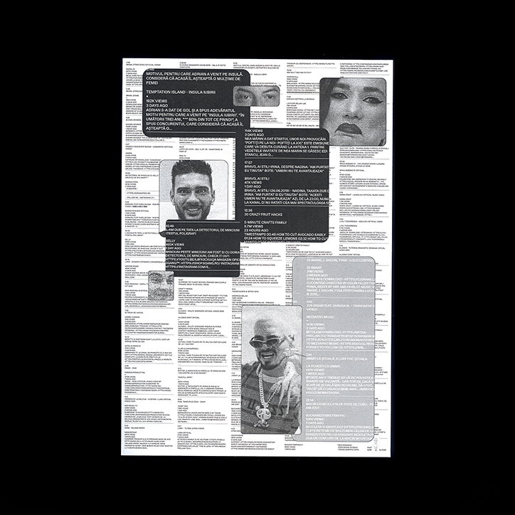
Gabriel Barbu: Posterjam x Torino Graphic Days
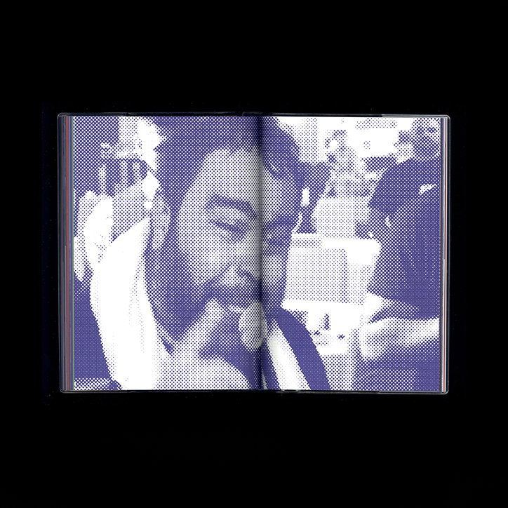
Gabriel Barbu: Kajet Issue 3
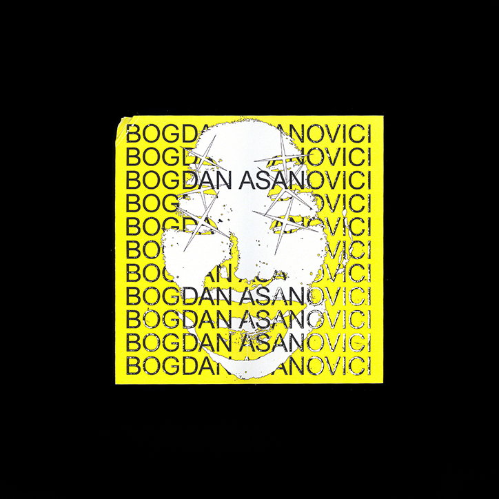
Gabriel Barbu: Sunday Scoop
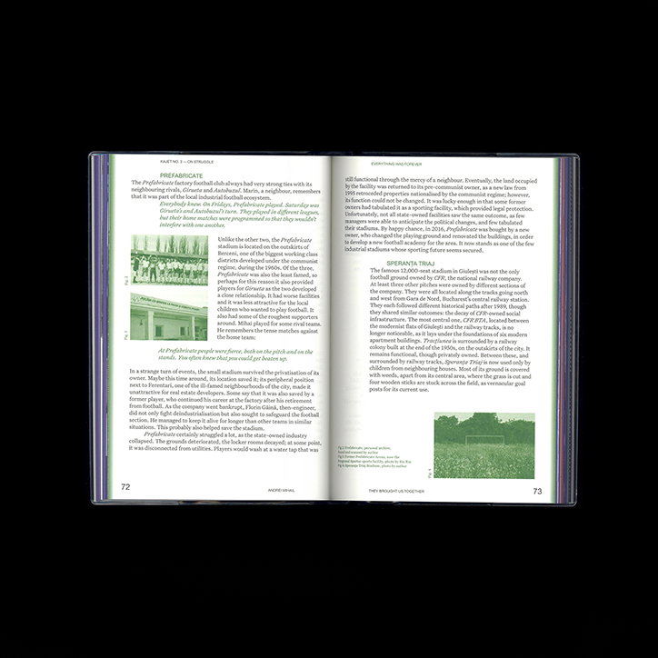
Gabriel Barbu: Kajet Issue 3
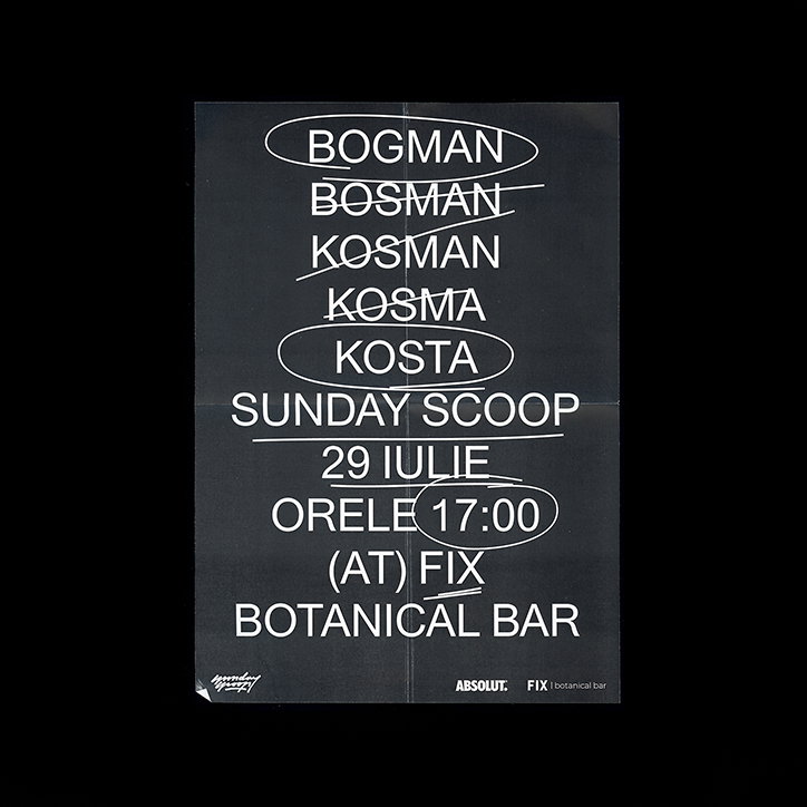
Gabriel Barbu: Sunday Scoop
Share Article
Further Info
About the Author
—
Lorna Pittaway joined us in the summer of 2019 as an editorial assistant. She graduated from Edinburgh College of Art with a degree in graphic design and wrote stories for us on graphic design, film, art and everything in between.