Fold7Design’s Stop the Traffik rebrand uses smart graphic devices to reflect its mission
The new visual identity plays with the ubiquitous arrow symbol and pairs it with bold typography and distinctive collage-style illustrations.
Share
Fold7Design has rebranded human trafficking charity Stop the Traffik, replacing its hand print logo and overhauling its entire visual identity to better reflect its current mission. Ahead of celebrating its 20th anniversary next year, the charity wanted to redesign to bring itself into the spotlight and convey its focus on prevention, rather than dealing so heavily in the aftermath. “If you can break the chain of human trafficking right before it starts, the issue will deflate in scale more rapidly,” explains Tom Munckton, creative director at Fold7Design. The charity’s use of technology, data and partnerships, to stop trafficking before it starts, was an inspiration to the design team. “‘Prevention focused, intelligence-led’ became a brand idea that encompassed this,” Tom adds.
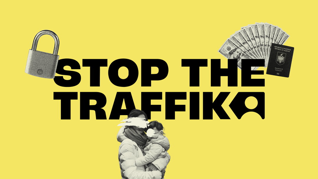
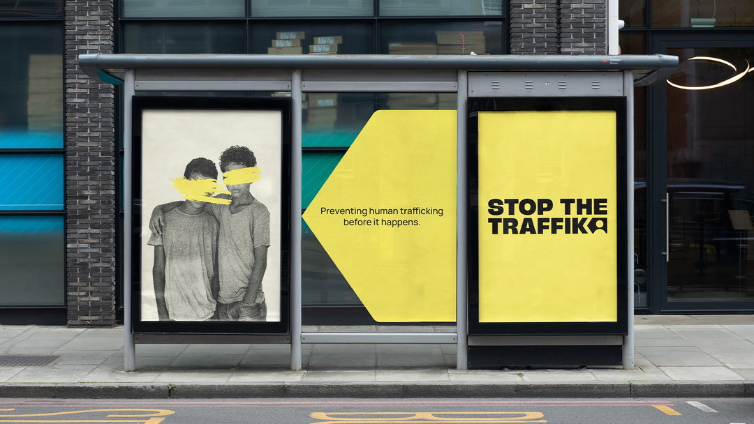
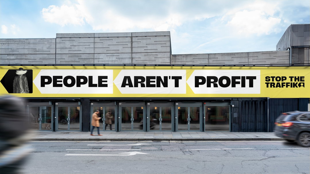
The rebrand centres around the “stop arrow” symbol, an arrow that – significantly – points backwards, playing with a ubiquitous icon in a simple but recognisable way. “We’re used to seeing arrows used in branding everywhere – having us reach for the skies or pushing us positively forwards,” Tom continues. Here, instead, it speaks to the charity’s focus on prevention. “It’s quite arresting to turn it around and face backwards – re-focusing us on the ‘before’, not the ‘after’.” The logo is used in all sorts of ways: nestled into the word mark, uniting illustrations, providing a canvas for important taglines, or a container for partner brands, its adaptable form becoming a useful graphic device for the identity. More widely, the new logo alludes to the charity’s data-driven approach to tackling trafficking.
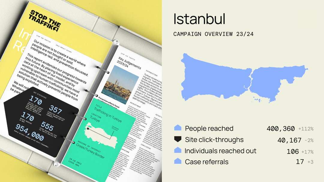
Fold7Design: Stop the Traffik rebrand (Copyright © Fold7, 2024)
Working coherently with the new logo is an “impactful” new typographic approach, using Bunch Extra Bold by Type Everything for the word mark. The typeface is the ideal choice here, finding that careful intersection between seriousness and personality, attention-grabbing and sophisticated.
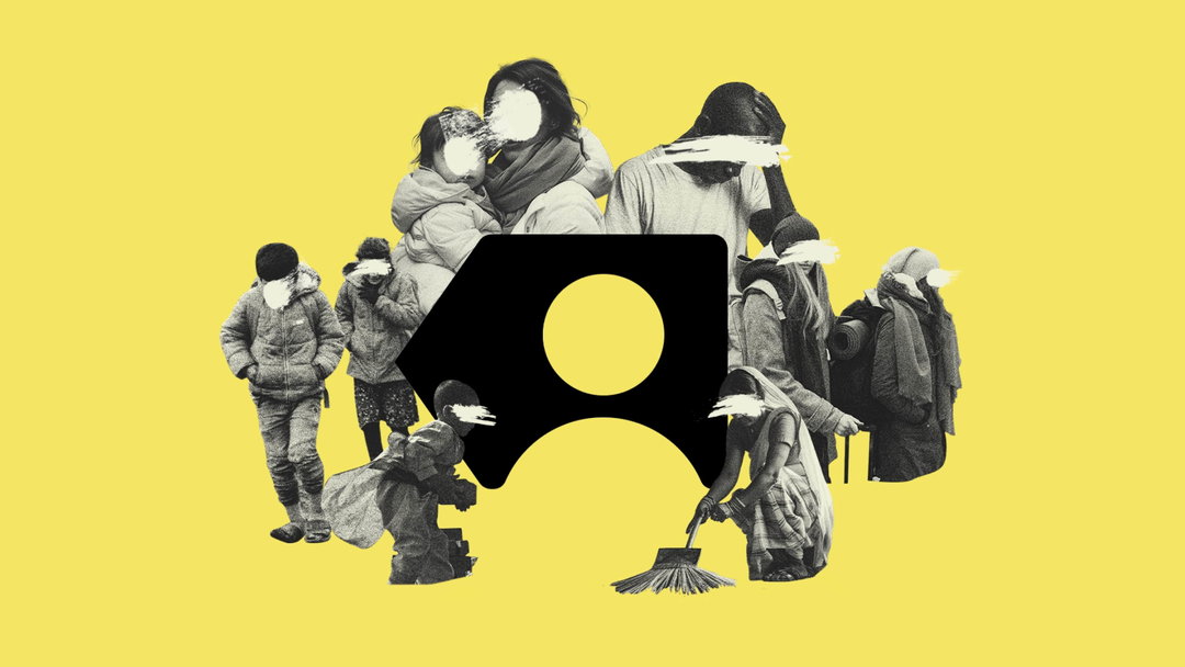
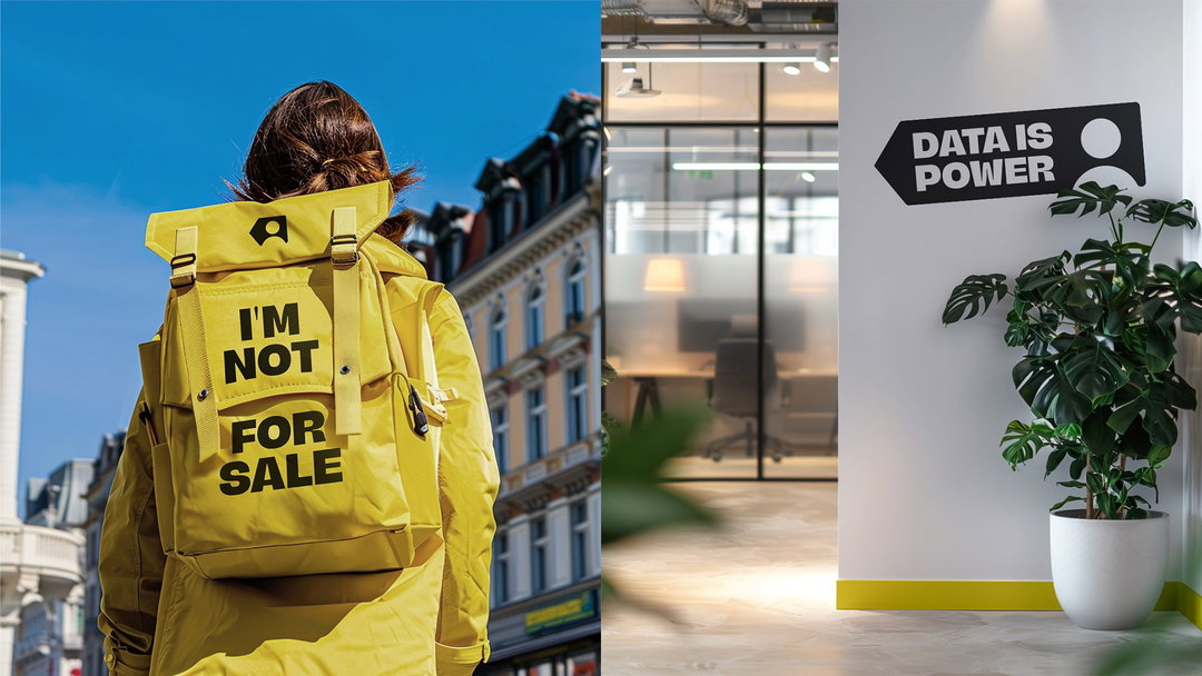
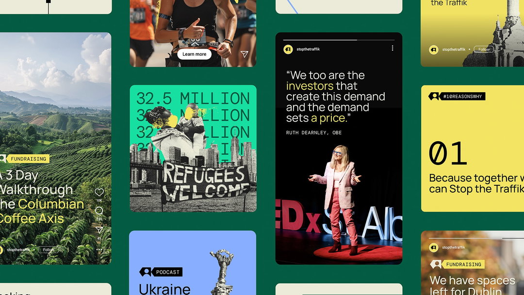
The bold typographic feel, and the vivid colour palette, are complementary to the suite of illustrations, which use a grey-scale photographic collage style with the people’s faces smudged out. This “human-centred” illustration approach is striking but also delicate, allowing the organisation to tackle “even the most complicated or sensitive subject matter in a distinctive way”, Tom describes.
The rebrand encompasses a brand toolkit including a sub-branding system for infographics and other elements, and a motion identity for digital roll out. It’s being used in marketing, and the Stop app, which allows anyone with a smartphone to report suspected human trafficking, including video and images, from anywhere in the world. Fold7, the wider agency within which the brand design studio Fold7Design exists, is currently working on a creative campaign going live later this year.
GalleryFold7Design: Stop the Traffik rebrand (Copyright © Fold7, 2024)
Hero Header
Fold7Design: Stop the Traffik rebrand (Copyright © Fold7, 2024)
Share Article
Further Info
About the Author
—
Jenny oversees editorial output across It’s Nice That. Get in touch with writing pitches for features or opinion pieces, big creative story tips, or questions about all things editorial. jb@itsnicethat.com
To submit your work to be featured on the site, please see our Submissions Guide.