Launch Recite Me assistive technology
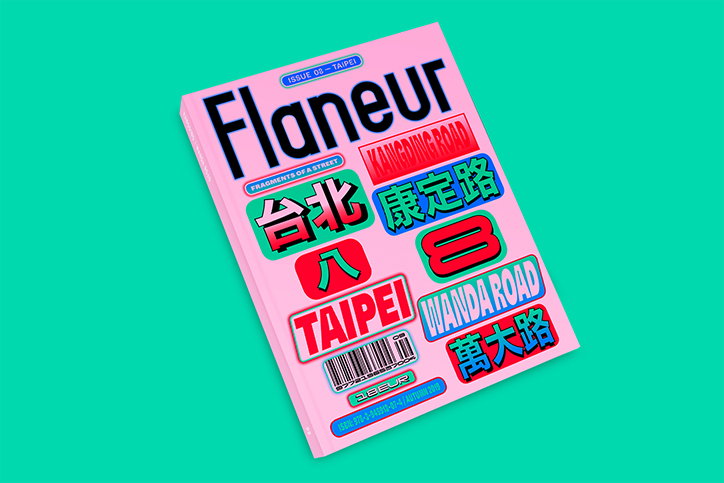
A pink magazine cover titled “Flaneur” against a bright green background. The cover features a collage of colourful street signs and labels, including the words “Taipei”, “Kangding Road” and “Wanda Road”.

Flaneur's latest issue shows off Studio Yukiko's typographic excellence

—
Date
25 September 2019

It’s Nice That’s Ones to Watch shines a light on 12 emerging talents who we think will conquer the creative world in the coming year. Over the coming months, we’ll be catching up with creatives from our 2019 selection to see what they’ve been up to. Ones to Watch 2019 is supported by Uniqlo.

Flaneur is a Berlin-based but globally-minded magazine that fills its 200 plus pages with the discoveries found on one sole street. Always dedicating two months to creating the issue in this chosen locale, the eighth edition of the nomadic magazine saw its team jet off to Taipei, once again with designers and It’s Nice That favourites, Studio Yukiko, in tow.

Following on from its storytelling on Treze de Maio in Sao Paulo, Boulevard Ring in Moscow and Fokionos Negri in Athens, this latest issue depicts the world of Kangding / Wanda Road in Taipei. It’s a unique road that “runs through one of the oldest parts of the city, an area that can be both understood as the centre and the periphery of Taiwan’s capital,” Studio Yukiko founders Johannes and Michelle tell It’s Nice That. This latest issue “embraces the street’s complexity, its layers and fragmented nature with a literary approach.”

“Wherever we went, we were struck by the amount of street signage and the forms they took,” say Johannes and Michelle. “They work in all directions, vertically, horizontally, protruding and parallel to the street, anchored onto buildings with equally graphic constructions. And colour! They seem so much braver with colour on the streets than what we are used to.”
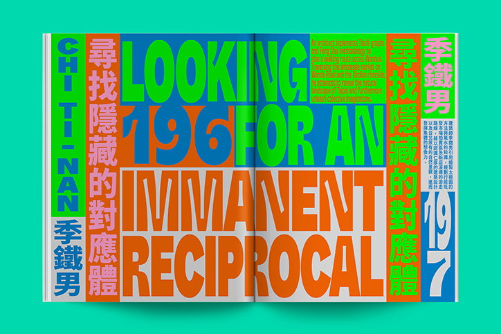
An open book features a bold, typographic layout in green, orange, and blue. Large text reads “LOOKING FOR AN IMMANENT RECIPROCAL”, with the numbers “196” and “197” marking the pages.
Above

Flaneur: Issue Eight, Taipei

This level of bravery is translated into the publication’s format, where details can be read in all directions. Thankful to Zhang Xu-Zhan, a collaborator on this issue who sent the studio a collection of Taiwanese newspapers to be inspired by, Johannes and Michelle began by thinking of a whole new way of organising information. “We loved how every piece of information was organised into its own box and how compact and efficient they were with space,” encouraging their design to credit both the editorial aesthetic of the island’s newspapers, the Chinese language and the street’s signage too.

The result is an issue which is incredibly diverse in its content and design, despite only being sourced from one street in Taipei. It proves how the rich design of a community half way across the world from these designers can be documented thoughtfully, as well as vibrantly. From its commissioning of photography, documenting local stories, to the various colour palettes which jump from page to page, it’s also an issue that allows a reader to gain an entry way into the world the Flaneur team experienced. Credit is also due to Meng Jiin Hsieh, a Taiwanese designer the studio worked with. Meng Jiin Hsieh grew up on Kanging / Wanda Road and “brought some local designs style and traditional Chinese typesetting knowledge with him.”

The issue launched at a 20.5-hour-long festival Flaneur held at Berlin’s prestigious Haus Der Kulturen Der Welt a few weeks ago, and is now available to buy here.
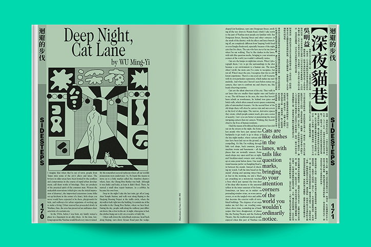
An open magazine spread featuring the story “Deep Night, Cat Lane” by Wu Ming-Yi. A stylised illustration shows a person walking through a narrow alleyway alongside a cat.
Above

Flaneur: Issue Eight, Taipei

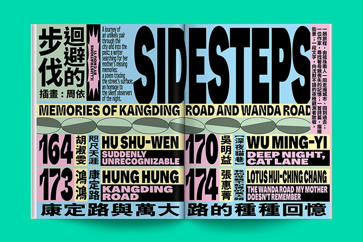
An open book with a bold, typographic layout on a bright green background. The title “SIDESTEPS” spans across both pages in large, black sans-serif type. Below the title, a banner reads “MEMORIES OF KANGDING ROAD AND WANDA ROAD”. The pages feature a grid of names and titles, including “HU SHU-WEN”, “WU MING-YI”, “HUNG HUNG” and “LOTUS HUI-CHING CHANG”, alongside Chinese characters.
Above

Flaneur: Issue Eight, Taipei

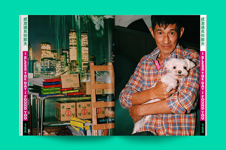
An open book shows two contrasting images. On the left, a city skyline is seen through a window, with cardboard boxes and supplies stacked in the foreground. On the right, a person in a checked shirt smiles while holding a small white dog.
Above

Flaneur: Issue Eight, Taipei

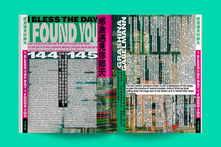
An open book with a bold, experimental layout. The left page features the headline “I BLESS THE DAY I FOUND YOU” in large, overlapping typography, while the right page contains dense columns of text and vertical imagery.
Above

Flaneur: Issue Eight, Taipei

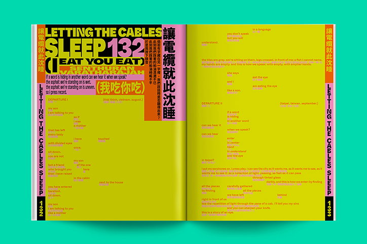
An open book with bright yellow pages and bold, multi-coloured typography. The left page features the large title “LETTING THE CABLES SLEEP 132” and the phrase “EAT YOU EAT” in a red box.
Above

Flaneur: Issue Eight, Taipei

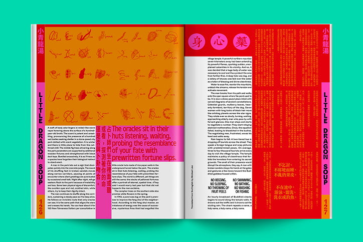
An open book with a bright pink and orange layout. The left page features orange abstract shapes and the text “The oracles sit in their huts listening, waiting, probing the resemblance of your fate with prewritten fortune slips.”
Above

Flaneur: Issue Eight, Taipei

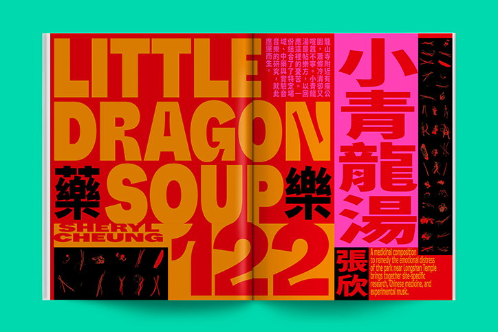
A bold typographic spread in red, orange and pink. Large text reads “LITTLE DRAGON SOUP 122” and “SHERYL CHEUNG”, alongside Chinese characters and a short descriptive paragraph.
Above

Flaneur: Issue Eight, Taipei

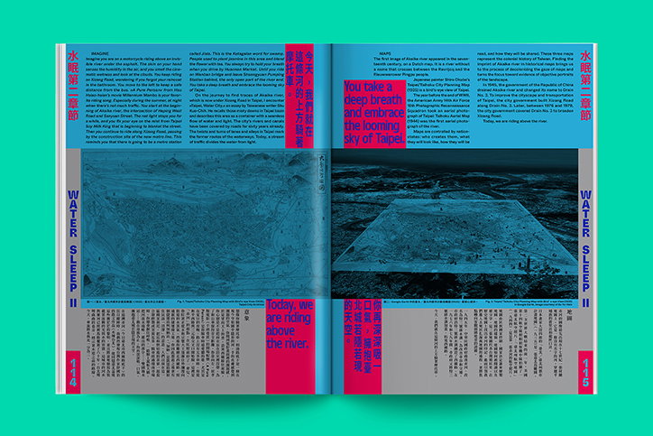
An open magazine spread with a bright turquoise background and red accent blocks. The pages feature a mix of English and Chinese text, alongside two dark, atmospheric aerial photographs of water and land.
Above

Flaneur: Issue Eight, Taipei

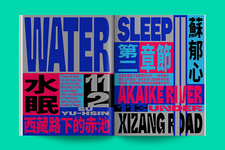
An open book featuring a bold, typographic layout in blue, red, and grey. Large text reads “WATER”, “SLEEP”, “AKAIKE RIVER” and “XIZANG ROAD” alongside Chinese characters and the name “SU YU-HSIN”.
Above

Flaneur: Issue Eight, Taipei

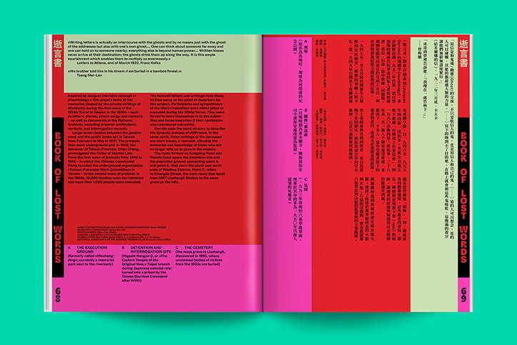
An open book with a red and pink layout. The left page features English text and a vertical title that reads “Book of Lost Words”, while the right page contains vertical columns of Chinese text.
Above

Flaneur: Issue Eight, Taipei

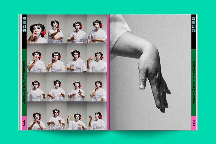
An open magazine spread. The left page features a grid of 16 photos of a person in a white garment with a red flower in their hair, posing in various ways. The right page shows a close-up, black and white photo of a hand hanging limp. Vertical text on the outer edges reads “Double Fantasy”.
Above

Flaneur: Issue Eight, Taipei

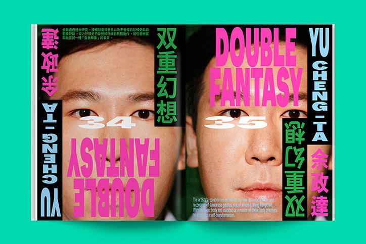
A two-page magazine spread featuring a close-up portrait of a person, split across the center fold. Bold pink typography reads “Double Fantasy” in English and Chinese, with the name “Yu Cheng-ta” running vertically along the edges. The page numbers “34” and “35” are laid over the person’s eyes.
Above

Flaneur: Issue Eight, Taipei

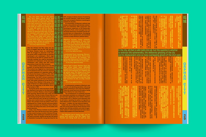
An open magazine spread with a bright orange and green colour palette. The left page features columns of text and the vertical title “Orphan City”, while the right page contains a large block of text over a solid orange background.
Above

Flaneur: Issue Eight, Taipei

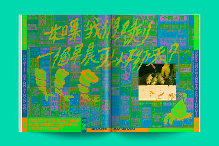
An open book featuring a vibrant green and blue collage of Chinese text and imagery. Large, neon green handwritten characters are layered over a grid of smaller text, with the English translation “WHAT IF WE ONLY HAD ONE MORE MORNING TO CHITCHAT?” printed along the edges.

Share Article

About the Author

Lucy Bourton

—

Lucy (she/her) was part of the It’s Nice That team from 2016–2025, first joining as a staff writer after graduating from Chelsea College of Art with a degree in Graphic Design Communication, eventually becoming a senior editor on our editorial team, and most recently at Insights, a research-driven department with It’s Nice That.
It's Nice That Newsletters

Fancy a bit of It's Nice That in your inbox? Sign up to our newsletters and we'll keep you in the loop with everything good going on in the creative world.