




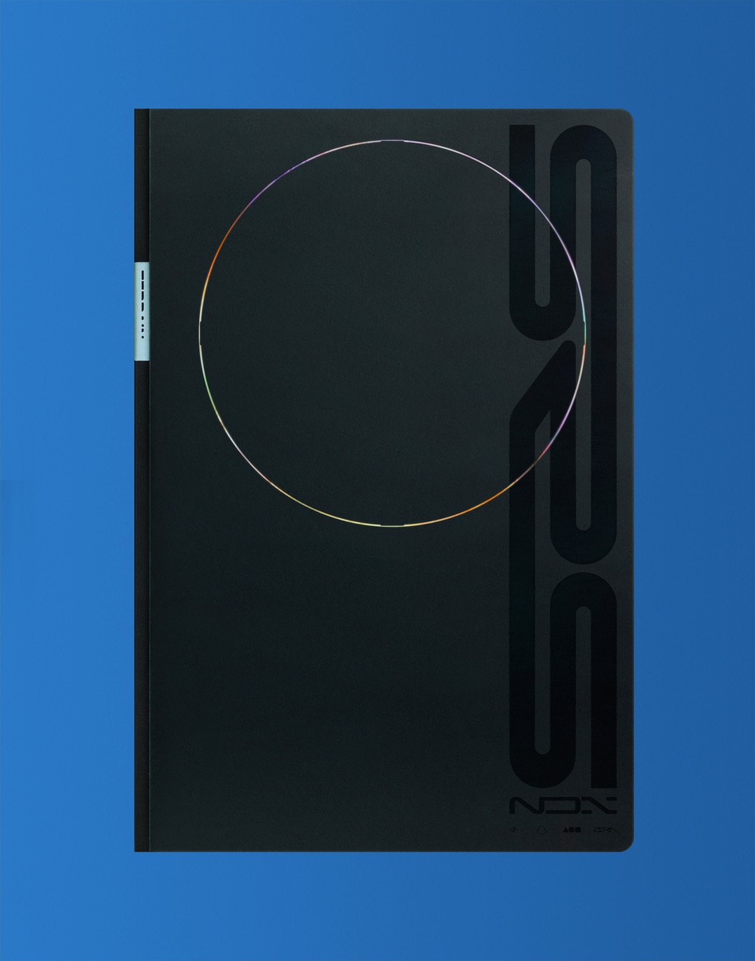
David Rudnick takes us behind the scenes of his most compelling work to date
The designer shares the intricate thought behind his ever growing latest body of work, Tomb Series.
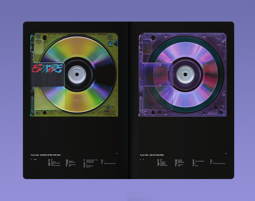
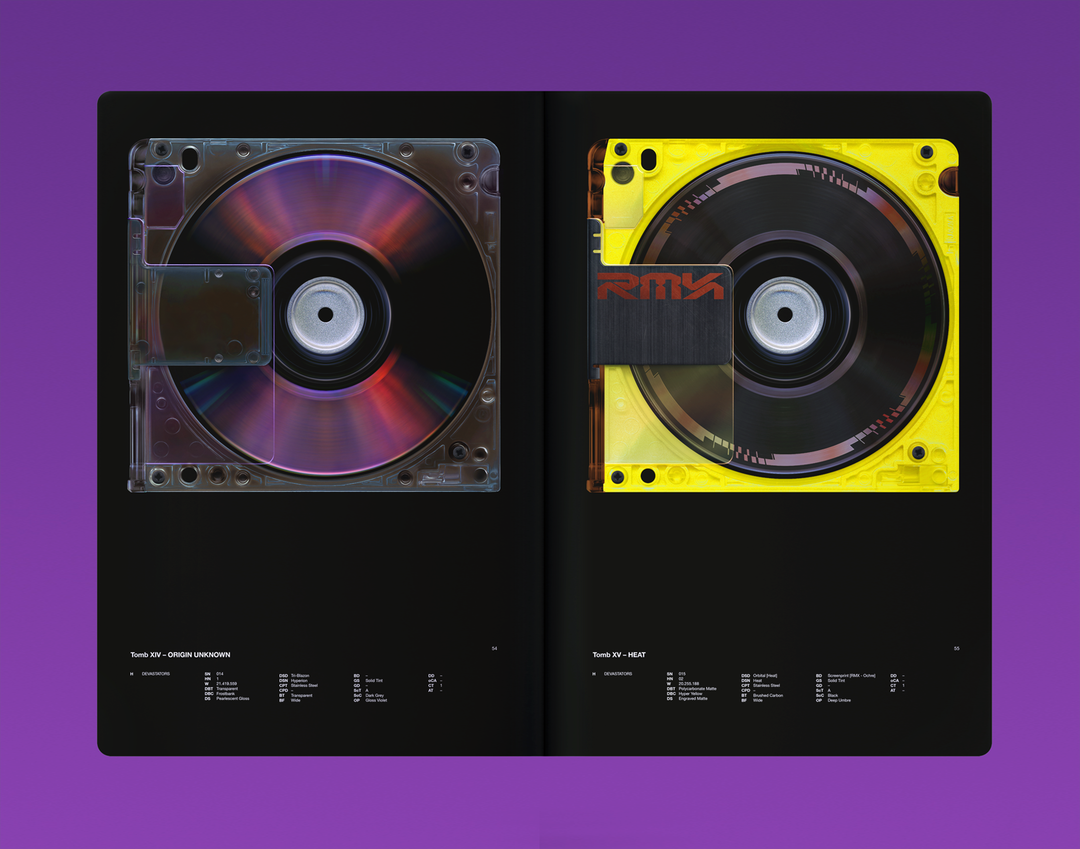
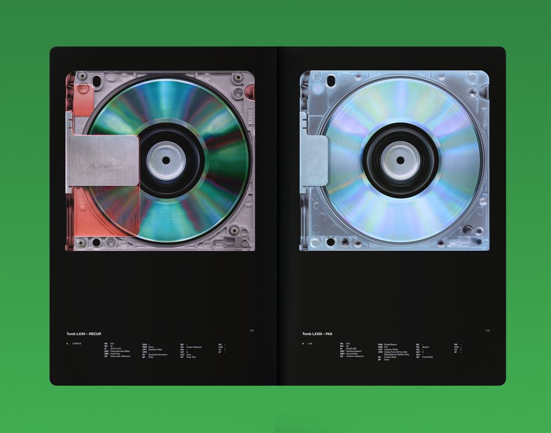
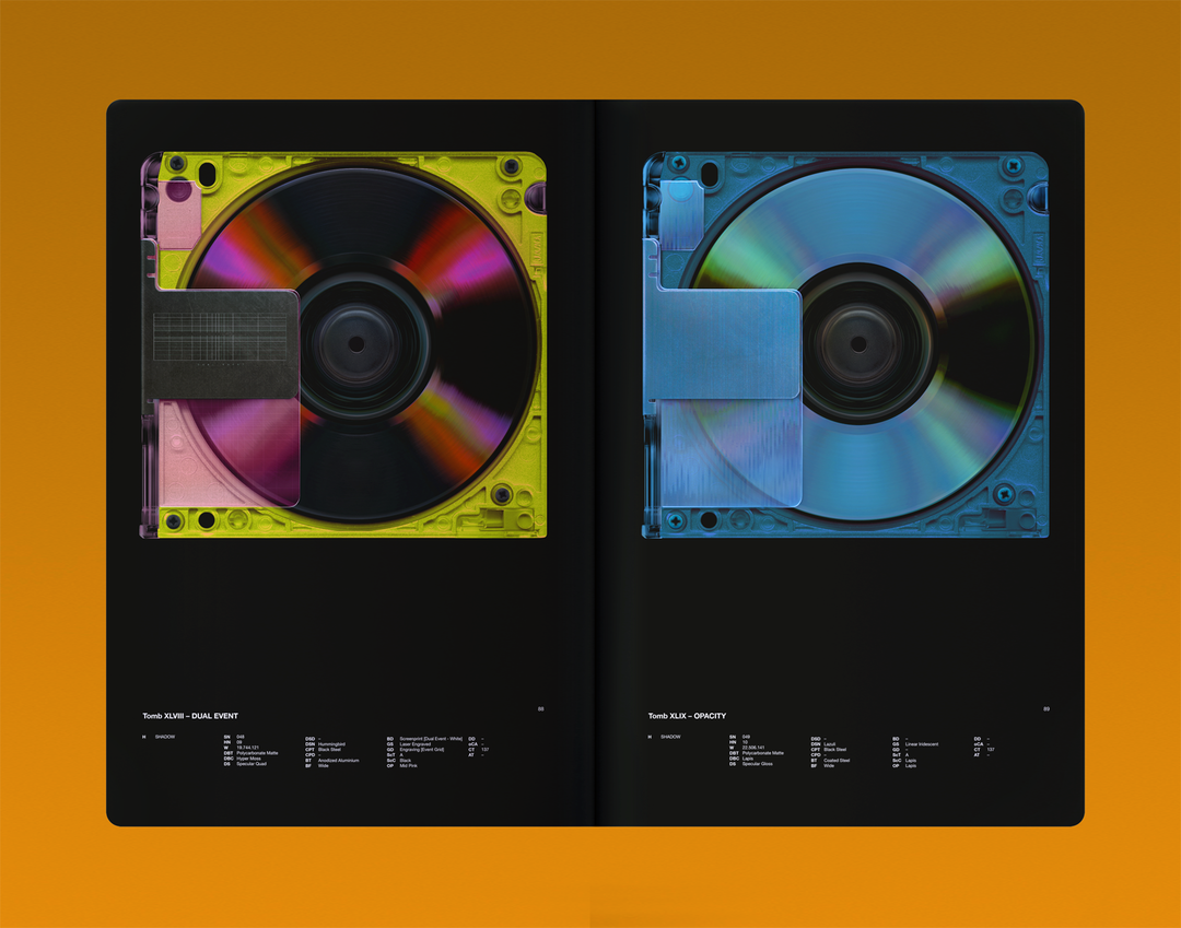
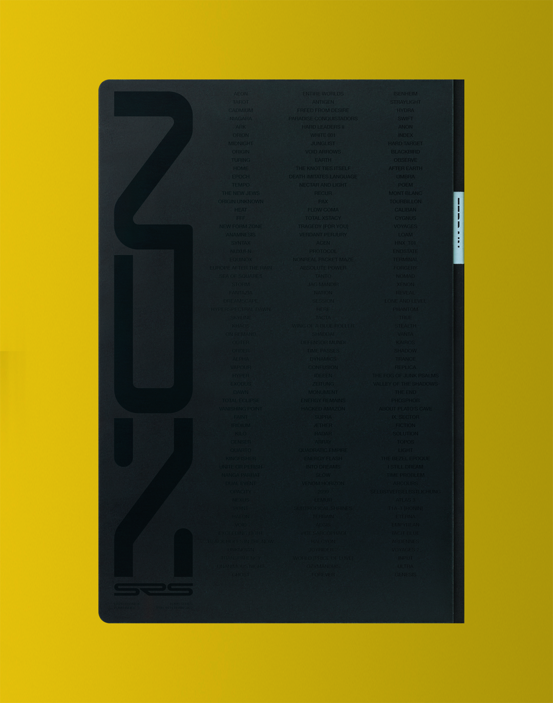
The graphic designer David Rudnick has this week opened preorders for a highly anticipated, multi-format work known widely as his Tomb Series. At the core of this release, created by David’s Ghent-based studio Terrain, are 177 drawings described as “Tombs”. These works will take on various forms throughout 2022, but are first published in a new book, Tomb Index.
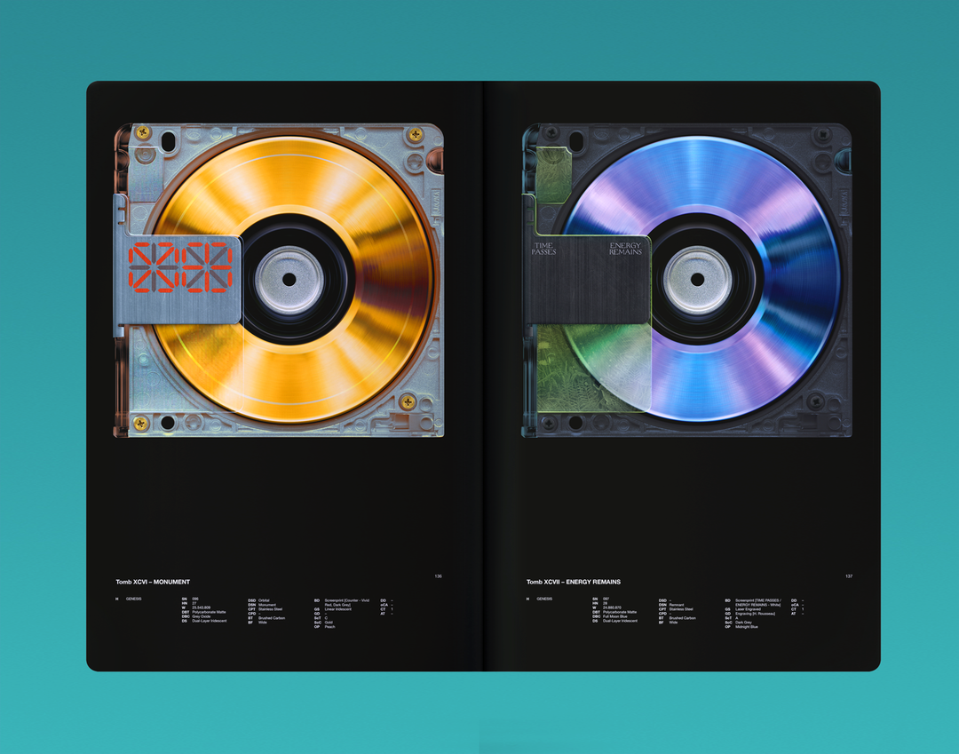
First created as part of the designer’s 2016 MFA thesis project Atlas, each Tomb is a drawing of a physical data storage format, from optical discs to phone hardware. Drawn by only using the trackpad of a 2012 Apple MacBook Pro within Photoshop and Illustrator CS3, these Tombs reoccured throughout the designer’s thesis book “like ghosts at the feast,” as David tells It’s Nice That. Within Atlas these initial Tombs lived alongside David’s then “concerns about design’s future” later framed as “Primacy” – a term the designer uses to describe “the struggle for whether a viewer believes the primary value in the world they observe derives from virtual or physical sources, what I call Digital Prime and Physical Prime”.
Six years later Tomb Series continues this line of thought, particularly reflecting the emergence of NFTs, as well as “the normalisation of a digital repository of value for virtual assets that had no value in the physical world,” describes David. The first seven of the 177 Tombs now created were the initial examples of the designer entering this space, minted and auctioned on the NFT platform Foundation in 2021. However, the next development in the Tomb Series sees these artworks move into a physical space, explored in a book format.
Switching between the digital and physical within one wider body of work is creatively purposeful for the designer, who sees how physical items – “Books, physical databases, language that resides within communities, local conventions, infrastructure” – could be under threat “if the future directs to building systems that can only recognise digital source value,” he describes. Consistently working across digital and physical formats is a practice the designer now calls “Primacist”, in which he identifies “strategies or structures which created value in both digital and physical formats simultaneously, rejecting the idea that the future should either be entirely in service to virtual value, or entirely in opposition to it”.
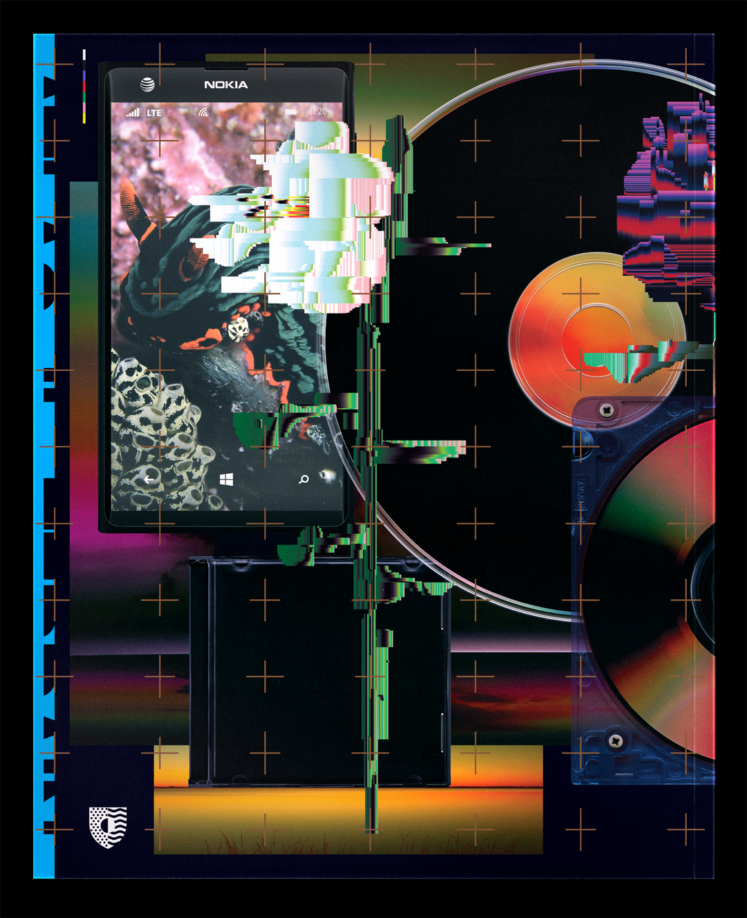
David Rudnick: Atlas (Yale Thesis Book 2016) (Copyright © David Rudnick, 2021)
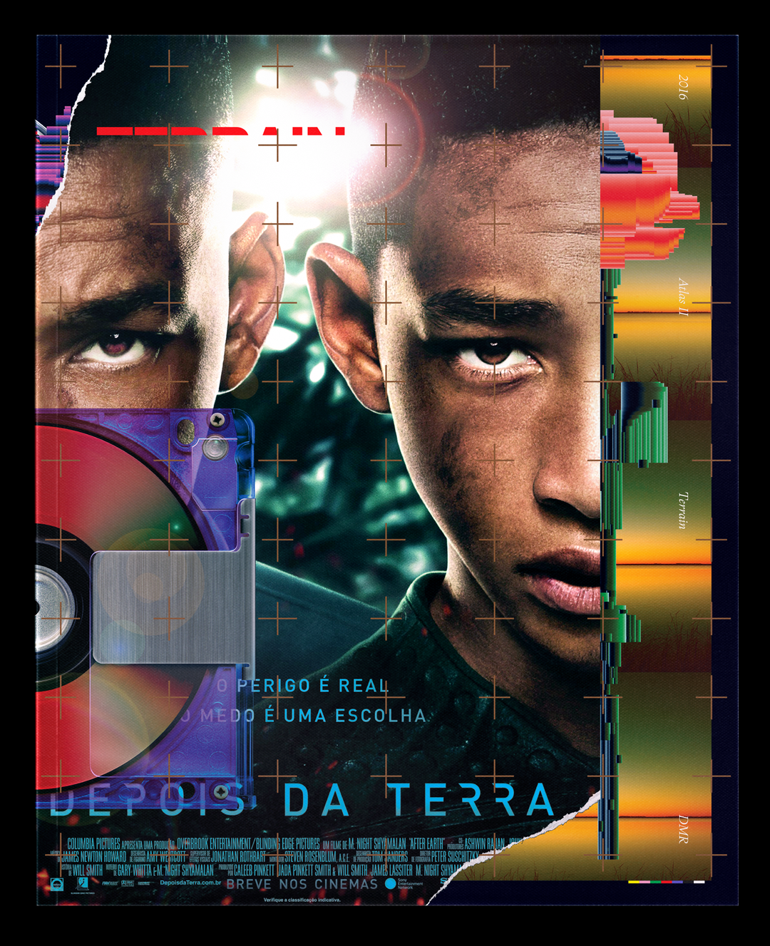
David Rudnick: Atlas (Yale Thesis Book 2016) (Copyright © David Rudnick, 2021)
There will only be one print run of the currently available Tomb Index and while it’s the more traditional format of the project’s development, David’s studio have hardly held back on ensuring the book features experimentation. “I wanted to see if, by offering a project that collectors in the NFT space found exciting or compelling, and then channelling that interest into a format that many of them would otherwise have no interest in – a printed book – could we try to do something with the book and its content that might feel advanced,” describes David of his thinking. “I think that’s an interesting thing to do,” he adds, “to go into a community that are very committed to a certain idea of progress, and almost shock them with something that feels advanced, but from outside the narrow dogmatic space where works on-chain usually innovate – with purely virtual functions.”
Primarily Tomb Index presents this thinking with “a few quite extreme production techniques at its core”. For example, over several months the designer’s studio have been calibrating a seven colour colourspace to be used when printing the images inside the book. Then, the book itself will be printed eight by eight, with eight colours on the internal pages “as we’re using a special matte black UV ink for the page tone,” he says. However, the imagery of each Tomb drawing will remain in the aforementioned seven colour. “There used to exist a Pantone expanded gamut default that was very rare, very hard to use, that utilises CMYKOGV,” explains David. “But, its peak gamut performance was only slightly outside that of a well calibrated CMYK spectrum. We’ve tried to pioneer a different seven colour colourspace for this book that can push the peak performance further.”
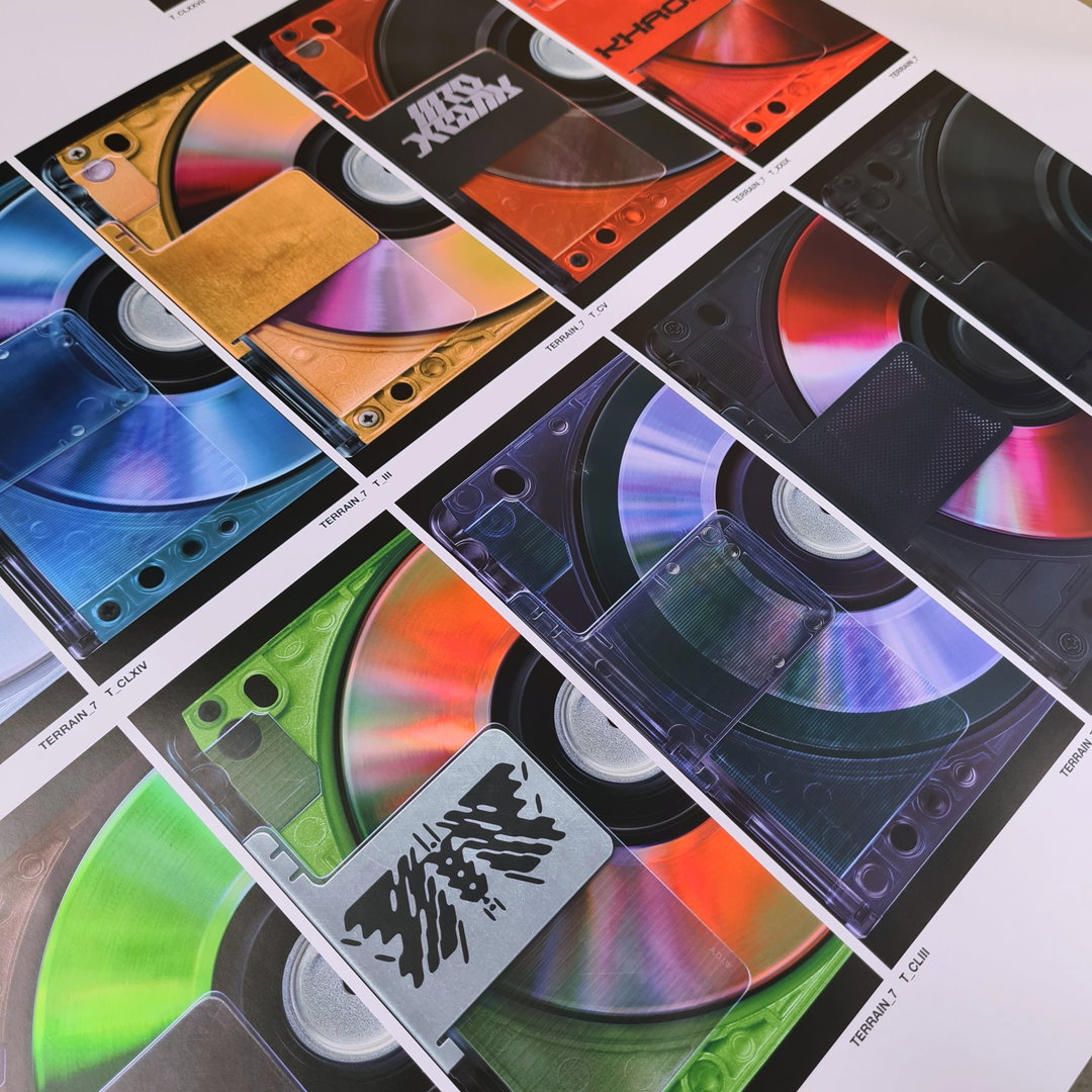
David Rudnick: Tomb Index, taken on site by David at Musumeci SPA, Aosta, Italy (Copyright © David Rudnick, 2021)
David Rudnick: Tomb Index, taken on site by David at Musumeci SPA, Aosta, Italy (Copyright © David Rudnick, 2021)
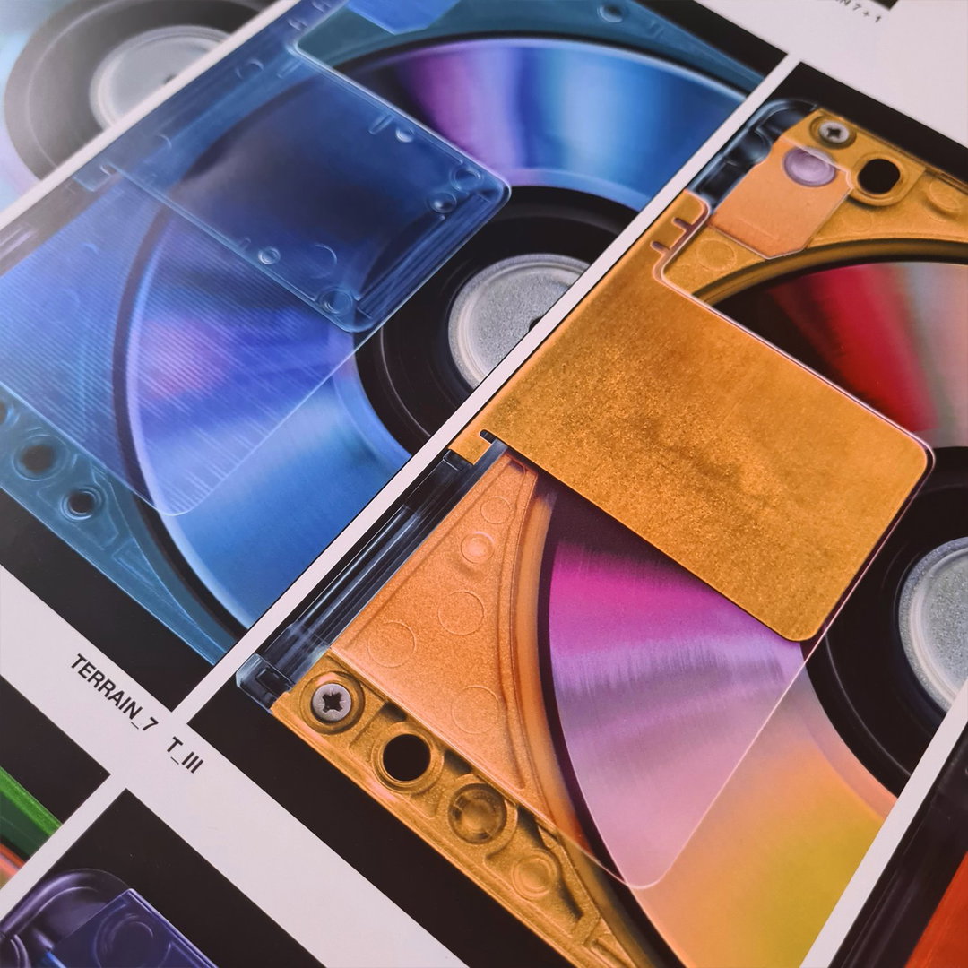
David Rudnick: Tomb Index, taken on site by David at Musumeci SPA, Aosta, Italy (Copyright © David Rudnick, 2021)
Such attention to detail within the printing of each Tomb reflects the fact that “On-chain, online, on this web page for example, the images are in RBG colourspace of course”. The studio’s emphasis on printing aspects is therefore out of respect for those more interested in digital presentations of artwork, ensuring “that the book didn’t feel like an admission that the image in the physical space is inferior,” explains the designer. “In this sense, the print approach kind of follows Primacist principles. Try to respect both medium’s defaults when operating within one. Even if it requires, as it did on this book, grinding hard at moving what’s possible mechanically in production.”
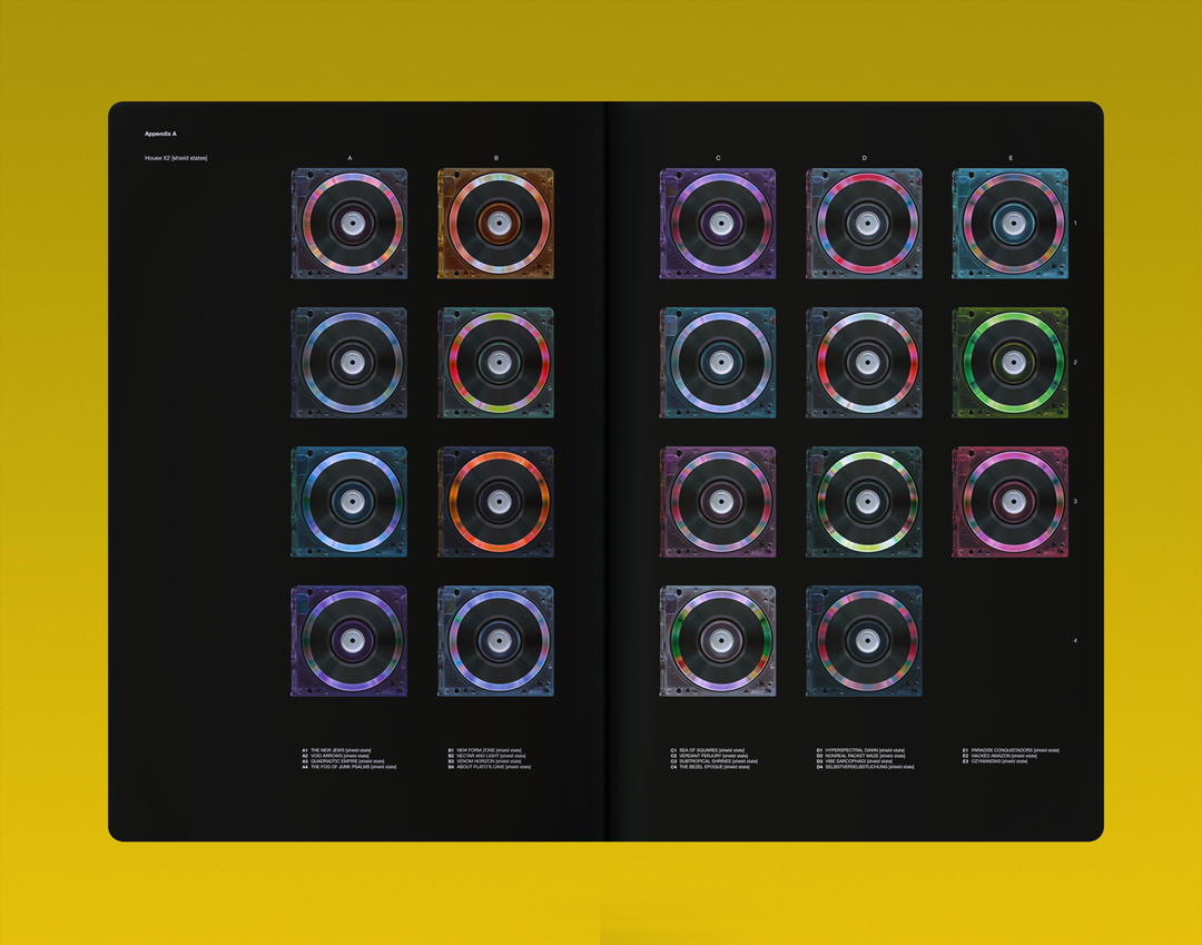
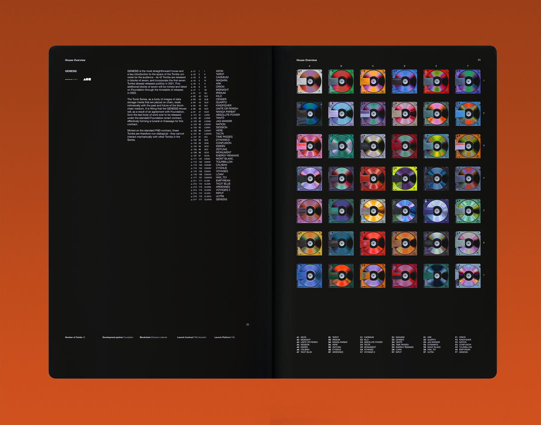
Outside of Tomb Index as a book format, the 177 drawings are additionally organised into eight houses each with their own unique on-chain structure. In the coming months, in partnership with Foundation, Zora, Folia and Avant Arte, the eight houses “will find their way to the chain and into people’s virtual lives”. For now however, Tomb Index will ground the project by offering “the deepest and most satisfying possible insight into its components and the Tombs themselves”. This is especially true considering how little of the book's contents is online, “so that opening the Index for the first time is a genuine moment of discovery,” adds David.
Ahead of the release of a body of work the designer has described as “probably the hardest, but most satisfying thing I have done in my practice,” he adds: “On the first, most basic level, I hope people like the Tombs, the drawings. I think it’s for the work to convey its content and for the viewer who spends time with it to then build their own meaning of that, but I wanted to build a project that it was really worth a viewer spending time with, that respected the idea of that fundamentally. A book that would last a long time, and be unique, really valuable and worthwhile to those who owned it.”
Preorders for Tomb Index close tomorrow, Friday 25 February. You can listen in more detail to David’s thoughts on “Digital Prime” and “Physical Prime” in this episode of Holly Herndon and Mat Dryhurst’s podcast, Interdependence.
GalleryDavid Rudnick: Tomb Index (Copyright © David Rudnick, 2021)
Hero Header
David Rudnick: Tomb Index (Copyright © David Rudnick, 2021)
Share Article
Further Info
About the Author
—
Lucy (she/her) was part of the It’s Nice That team from 2016–2025, first joining as a staff writer after graduating from Chelsea College of Art with a degree in Graphic Design Communication, eventually becoming a senior editor on our editorial team, and most recently at Insights, a research-driven department with It’s Nice That.



