New Channel 4 identity by creative dream team of 4Creative, Jonathan Glazer, Neville Brody and DBLG
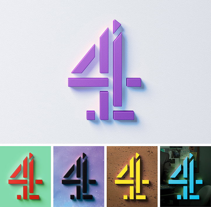
It’s a bit of a creative dream team that’s realised the new Channel 4 brand, with 4Creative working alongside Neville Brody and director Jonathan Glazer, as well as agency DBLG. The project sees the “deconstruction” of Lambie Nairn’s classic “4” brand mark, which has remained in its current form for more than a decade.
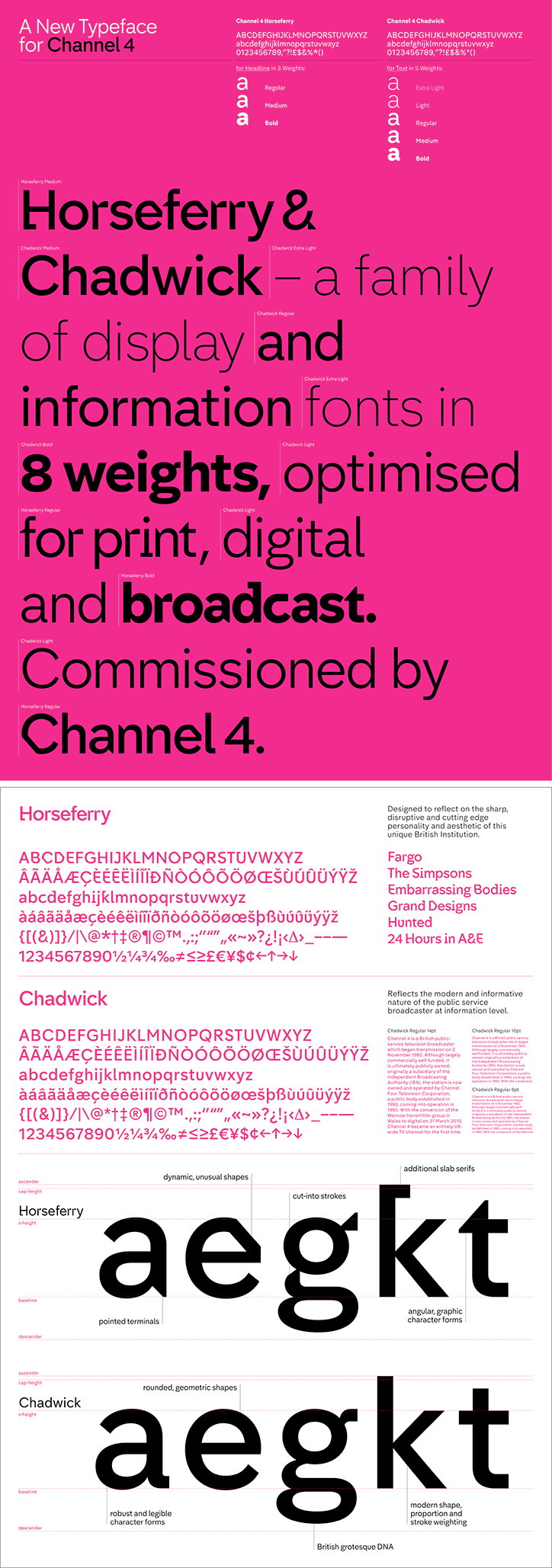
Neville created two new bespoke typefaces for the channel – Horseferry and Chadwick – which are used for display and information text respectively. The new designs are used on on-screen graphics including stings, menus and programme titles, as well as off-screen posters and other collateral. The redesigned graphics are accompanied with newly commissioned ident music from Micachu and the Shapes’ Mica Levi, who worked with Jonathan Glazer on his film Under the Skin.
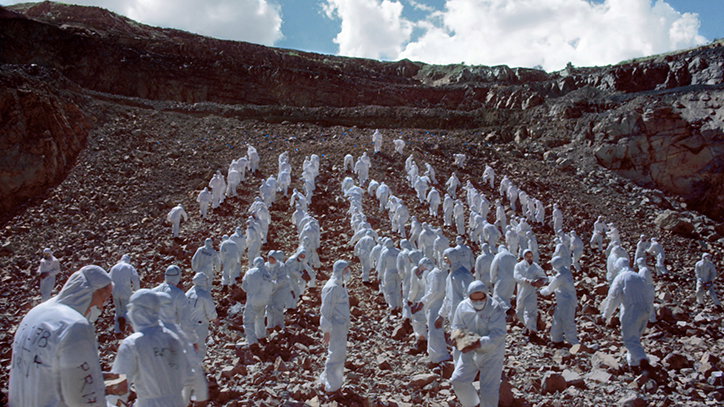
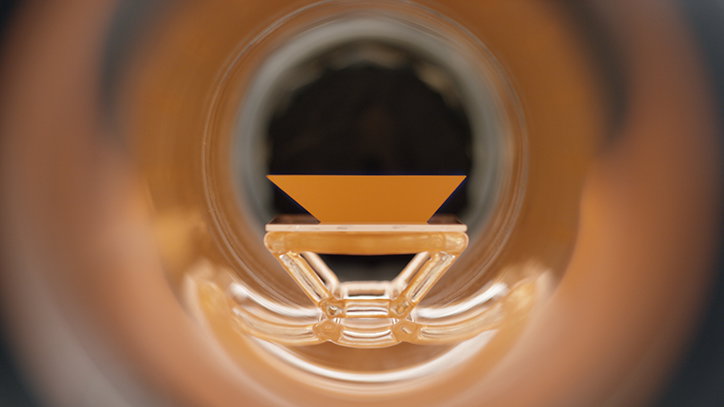
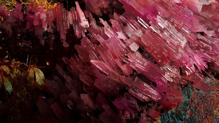
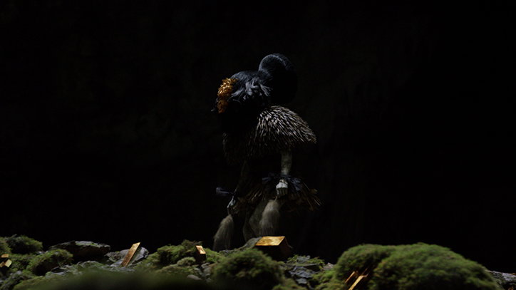
“Most TV branding these days is like watching wallpaper. It’s pleasant but gets boring very quickly,” say 4Creative heads Chris Bovill and John Allison. “We started with the original, iconic Lambie Nairn 4 logo and broke it down into its constituent parts; the nine blocks. The blocks represent Channel 4’s incredibly diverse qualities. The blocks are free to demonstrate our remit; to be irreverent, innovative, alternative and challenging. They are free to flow through everything on the channel: our typeface, on-screen menus, on-screen graphics, off-air logo, Channel 4 News, Channel 4 Racing, all the way through to the idents.”They add: “The idents present the blocks as kryptonite-like. They tell the story of their origin and how they have a powerful impact on the world around them. Just as Channel 4 does. It is a story that we shall build on.”
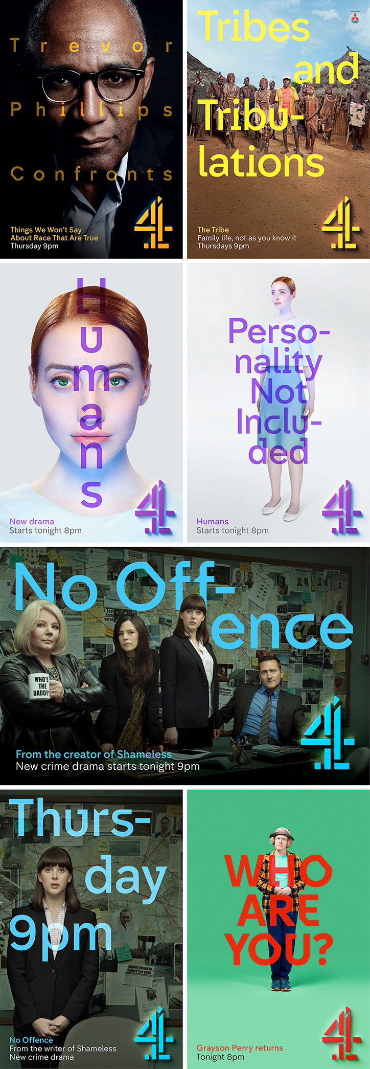
Neville Brody: Channel 4 typeface
Share Article
Further Info
About the Author
—
Emily joined It’s Nice That as Online Editor in the summer of 2014 after four years at Design Week. She is particularly interested in graphic design, branding and music. After working It's Nice That as both Online Editor and Deputy Editor, Emily left the company in 2016.