Designers and programmers Carla and Karlis create “dynamic design systems”
As a designer, the ability to create things which adapt over time can inject an energy and longevity to your work like nothing else. It’s an approach which graphic design and programming duo – and couple – Carla Peer and Karlis Krecers endeavour to bring to every project under their pseudonym Carla and Karlis. Having met while studying at Gerrit Rietveld Academie in Amsterdam, the pair are now based in Zürich and are “drawn towards structures and bringing order to things”.
Largely working with clients in the cultural fields, Carla and Karlis tend to allow conceptual editorial decisions to lead their designs. “We are interested in the direct handling of content," they point out, but the pair also looks for “dynamic content leading to dynamic design systems that can adapt to new circumstances.” By working in a hands-on way with an artist or institution’s material, the duo is then able to expand conceptually on whatever they discover in the original work: “We are enabled to reconsider media formats and their purpose and develop non-conventional solutions,” they add.
For example, in their recent work with Kunsthalle Amsterdam (KHA), the duo exploited the fact that the institution exists solely online until its new physical space is unveiled in 2020. Creating a space which collates the KHA’s entire online presence in one “space”, the website automatically updates itself anytime anything is posted on the gallery’s Facebook, Instagram or Twitter and displays it as a timeline. The KHA’s logo is a placeholder in the form of a square, a circle and a rounded square – the shapes of the respective social media platforms’ profile picture shapes.
“Before each new commission or takeover, the identity’s fonts and colours are updated to support the upcoming project,” Carla and Karlis tell It’s Nice That of the project’s details. “In order to embrace and represent every temporal development of KHA, the new style applies only to new content, so that the styling of each post in the timeline corresponds with the style of its time.”
Alongside their commissioned work, the pair spends considerable time on self-initiated work, which provides a framework for them to assess their current approaches and reconsider how they are working. “There’s a clear tie between our autonomous work and what we end up doing for clients,” they point out.
The duo’s website – a project which initially caught our attention – is a testament to this attitude. It functions as an archive in the form of images, videos and buttons which “instead of being grouped thematically by project, are treated each as a separate entity”. Each item is ascribed specific tags which range from the objective, such as a material, a date or a colour, to the more subjective, such as “hands, marketing, shadow”. These tags are accessible via the search bar in the centre of the screen, doing away with a traditional menu and in turn flipping the usual navigation of a website, particularly a portfolio site, on its head.
Although wide-ranging in their output, Carla and Karlis’ projects are recognisable thanks to their unexpected means of handling content and information. Whether it’s the use of a certain material for a book cover or a range of “personality hats”, there is always more than meets the eye with a Carla and Karlis project.
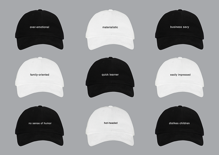
Carla and Karlis: Personality hats, 2018
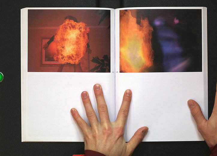
Carla and Karlis: In order of vanquish, spread, 2018
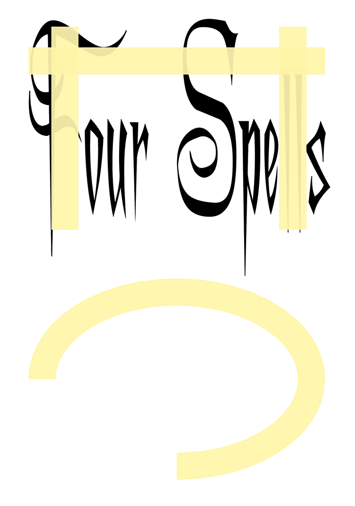
Carla and Karlis: Four Spells, cover, 2018
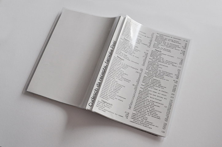
Carla and Karlis: Cudesch da recepts, cover, 2017
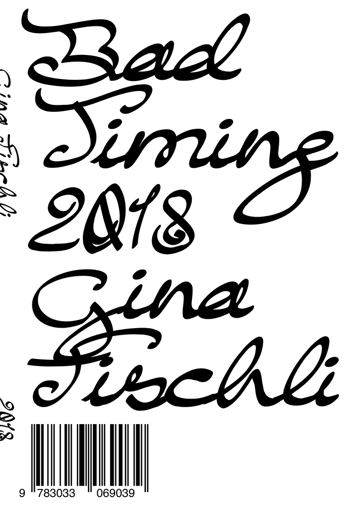
Carla and Karlis: Bad Timing, Gina Fischli, dust jacket cover, 2018
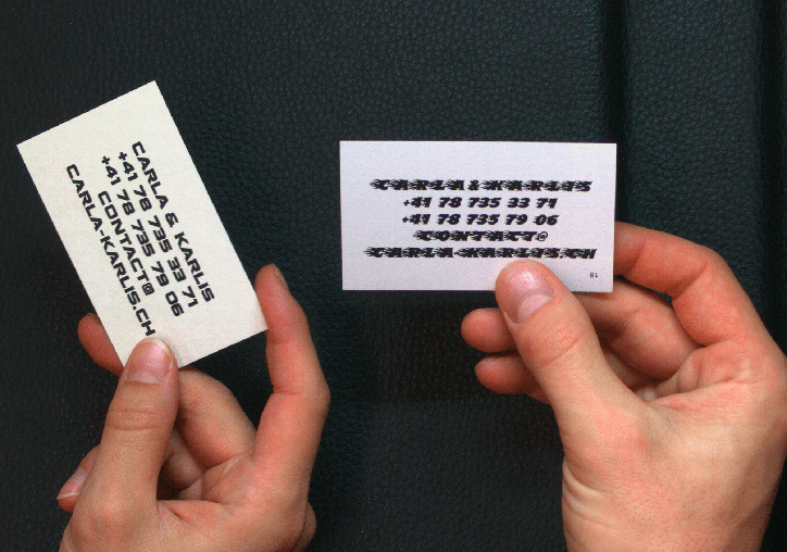
Carla and Karlis: Carla + Karlis, business cards, 2018
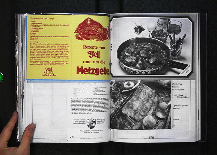
Carla and Karlis: Cudesch da recepts, spread, 2017
Share Article
Further Info
About the Author
—
Ruby is Senior Creative at It's Nice That, overseeing our visual output across platforms and projects. Before that, she was associate editor on the editorial team, after joining in September 2017 following graduation from Central Saint Martins.