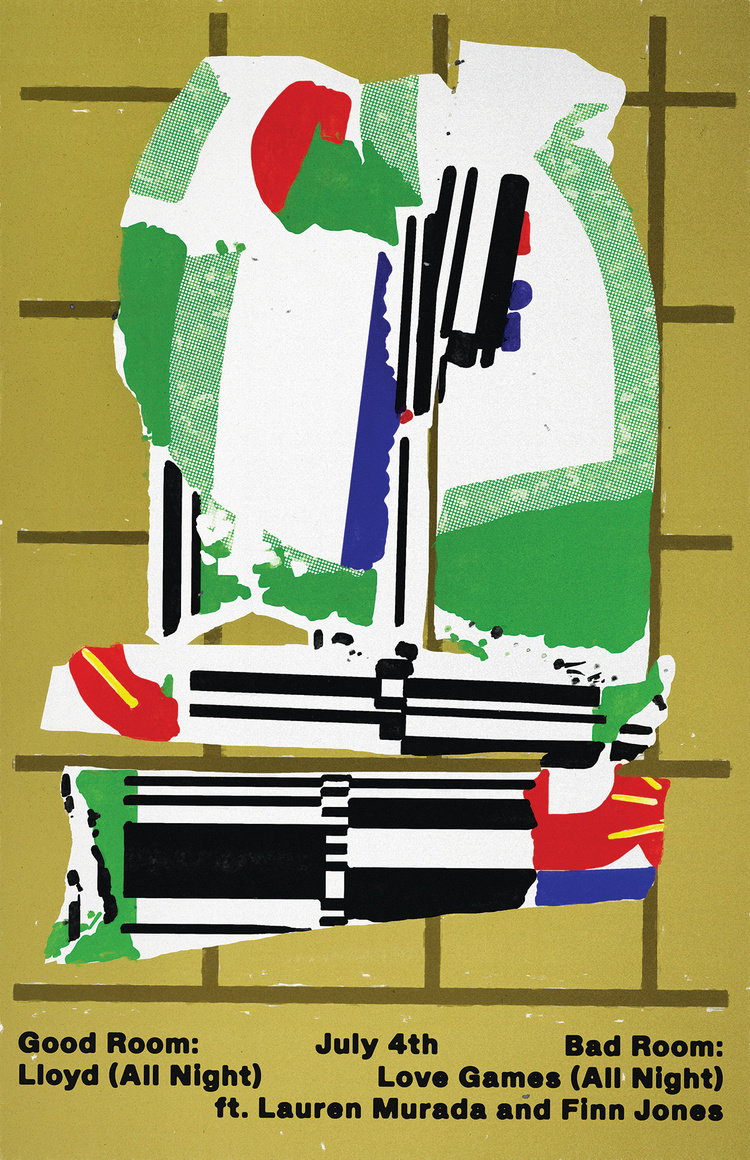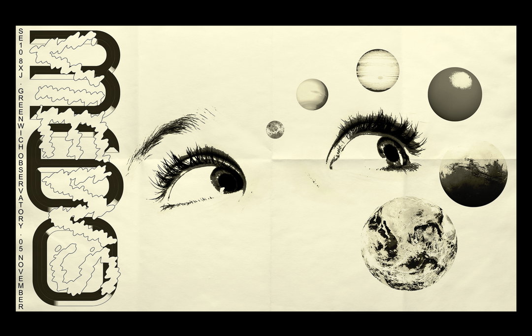
The equally harsh and delicate work of graphic designer Ben Arfur continues to please
Catching up with the Welsh graphic designer after a few years, we learn how changing processes has kept Ben in love with design.
Share
Although graphic designer Ben Arfur thinks he’s found a definitive style within the medium, “my perception of what that is exactly seems to change daily…” he tells It’s Nice That.
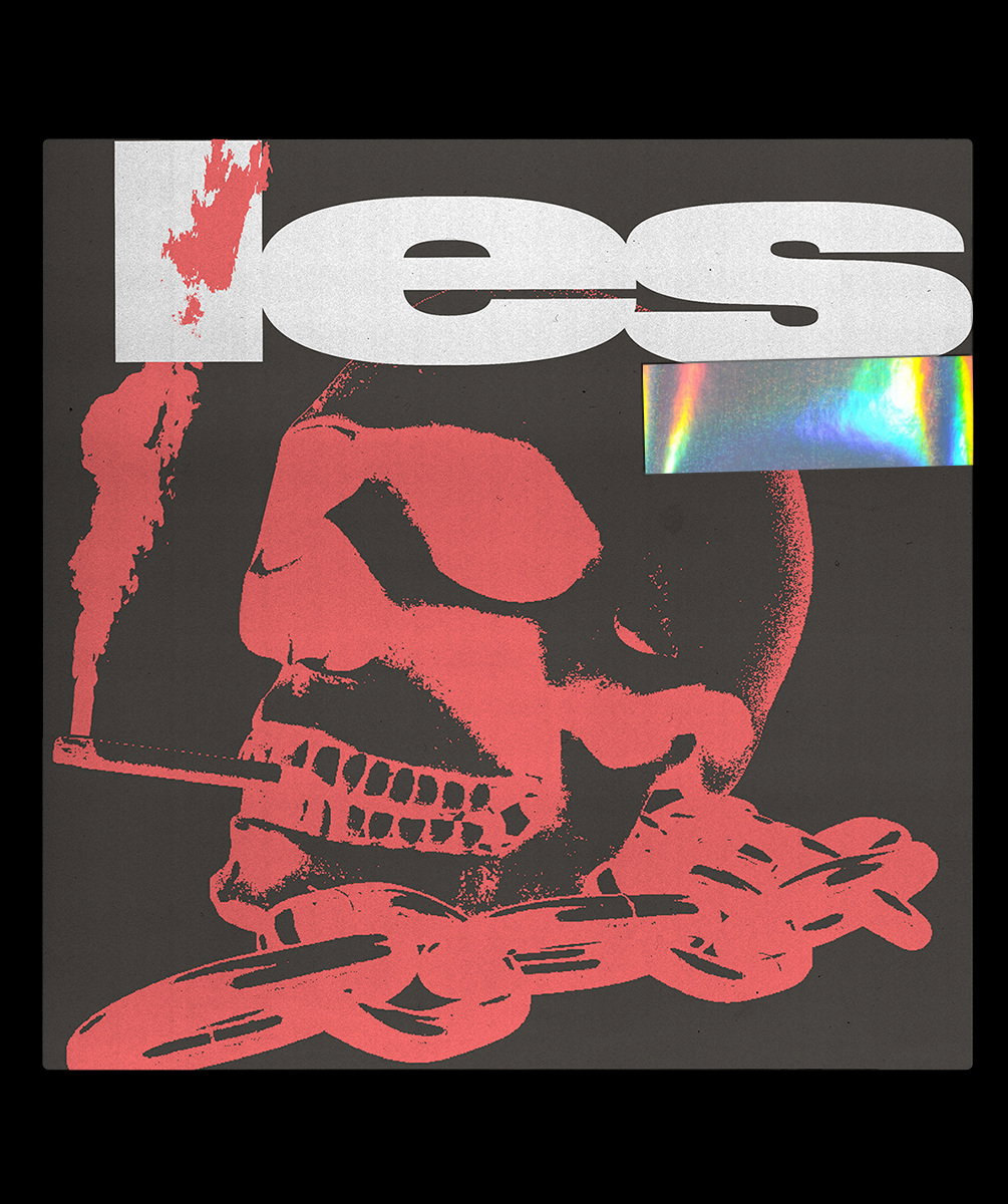
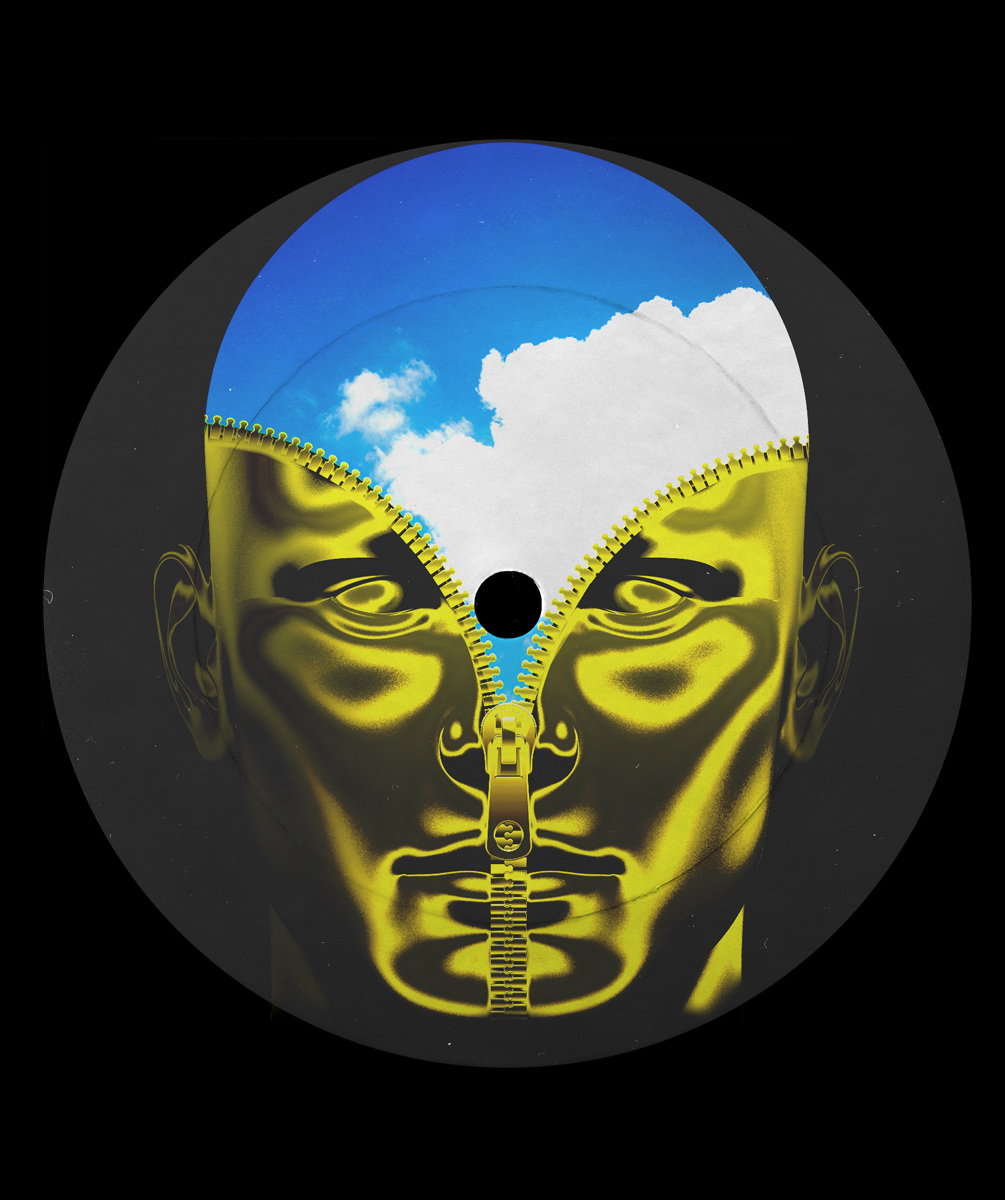
It’s been a very busy few years for Ben who, somehow, we haven’t caught up with since 2018. The last year, in particular, has been a bit of juggling act, one “of posters, sleeves, releases and merchandise,” he says. A particular highlight has been his work for the label Time Capsule, working on a reissue of Yomi Toriyama’s. “The opportunity to reimagine that was pretty mind blowing,” says the designer, “and the result was pretty solid.”
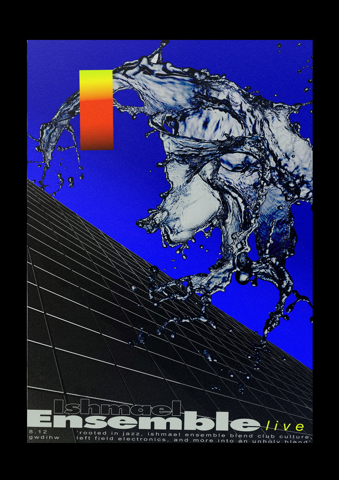
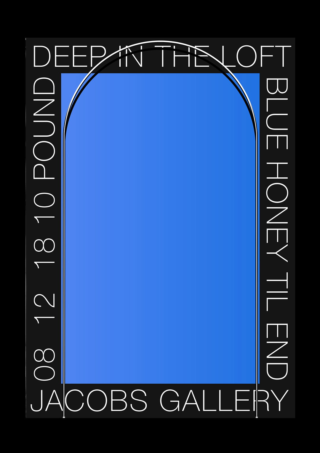
It’s because of this juggling that Ben’s work has been able to develop, finding that although he’d usually “approach a project with an existing idea, adapting it where necessary to fit whatever the brief,” his method has begun to change. “As you can imagine this wasn’t the best method, and as a result, I have multiple strewn folders of ideas that never were.” Gradually learning the error of his ways, Ben has begun following these ideas for personal experiments, rather than having to strip them back to answer a brief. “I’ve started taking the time out to rehash them into posters where I can experiment with structure, palette, type etc,” he says. “It keeps the love for it, and reminds me why I do it.”
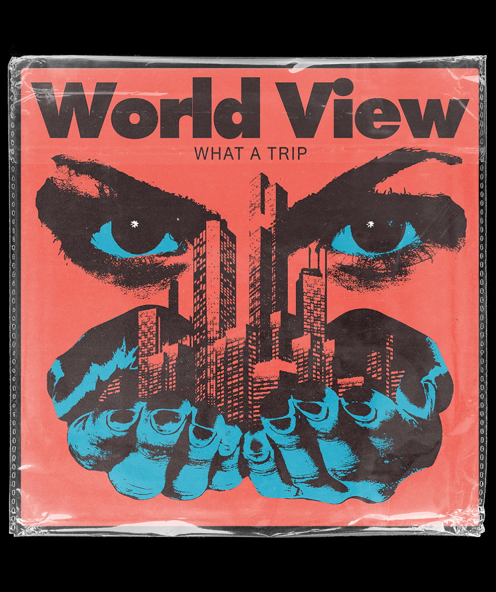
Ben Arfur
Within this approach, music appears to still be the ideal habitat for Ben’s design output, describing it as “an interesting way of working,” despite working in the space for a lengthy period of time now. “Music is pretty powerful and you can gauge an entire aesthetic from it,” he adds. Aside from working on these pieces as the vital design counterpart of a release, “I’m also a big fan of the relationship you form with the artist, in a sense it kind of removes that fourth wall,” says Ben. “There’s also the responsibility and collaborative element that comes with it,” he adds. “It’s sometimes pretty overwhelming to be trusted with something so delicate,” after all, it is another artist’s output too.
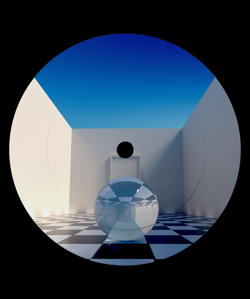
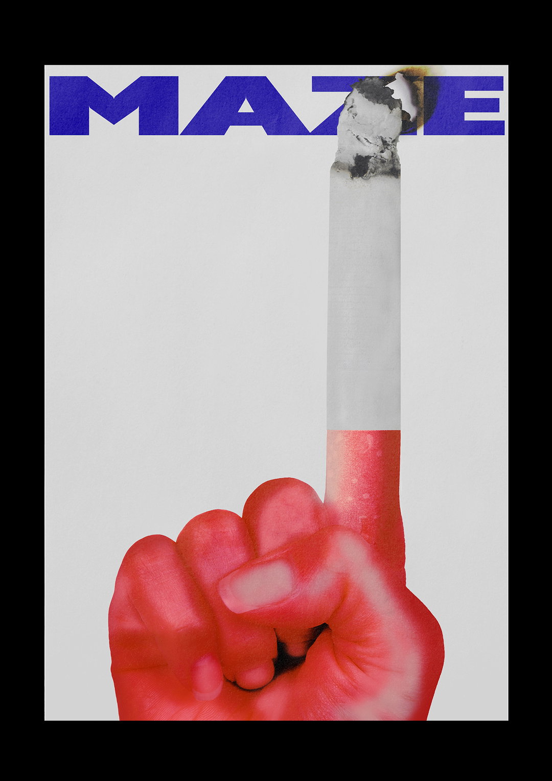
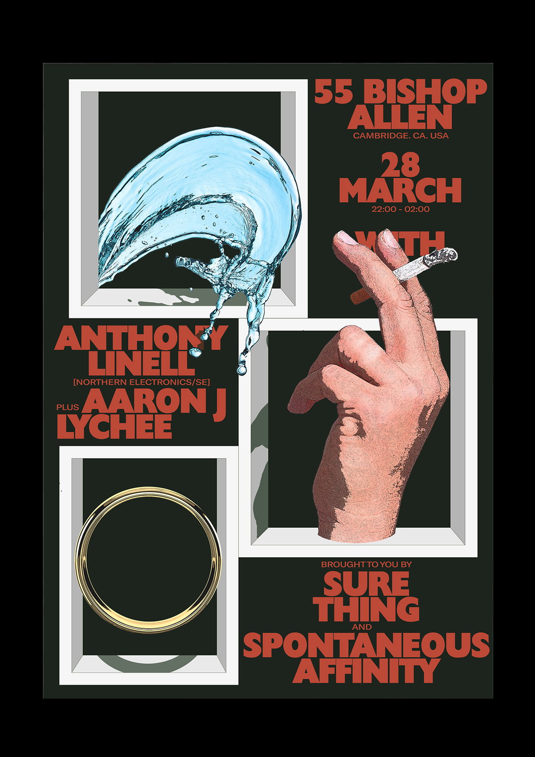
This care can be seen simply in how each piece of his differs in style. For example, in one piece bolder typographic marks make up the large sum of the work, before he then offsets it with an illustrative approach in the next instance. In fact, it could be this ability to balance harsh and delicate aesthetics which makes Ben’s work so successful overall, and a large part of his growing appeal as a designer.
Looking to the future, it’s displaying works (and not just his own) which Ben hopes to achieve next, hopefully working with fellow designer Yasseen Faik to create a show “featuring a tonne of our favourite designers and illustrators, surrounding some pretty interesting themes.” Determined to get the show off the ground, “I’d like to do some more editorial work,” he concludes, hinting at how we may see his work pop up in some new areas soon.
GalleryBen Arfur
Share Article
Further Info
About the Author
—
Lucy (she/her) was part of the It’s Nice That team from 2016–2025, first joining as a staff writer after graduating from Chelsea College of Art with a degree in Graphic Design Communication, eventually becoming a senior editor on our editorial team, and most recently at Insights, a research-driven department with It’s Nice That.