




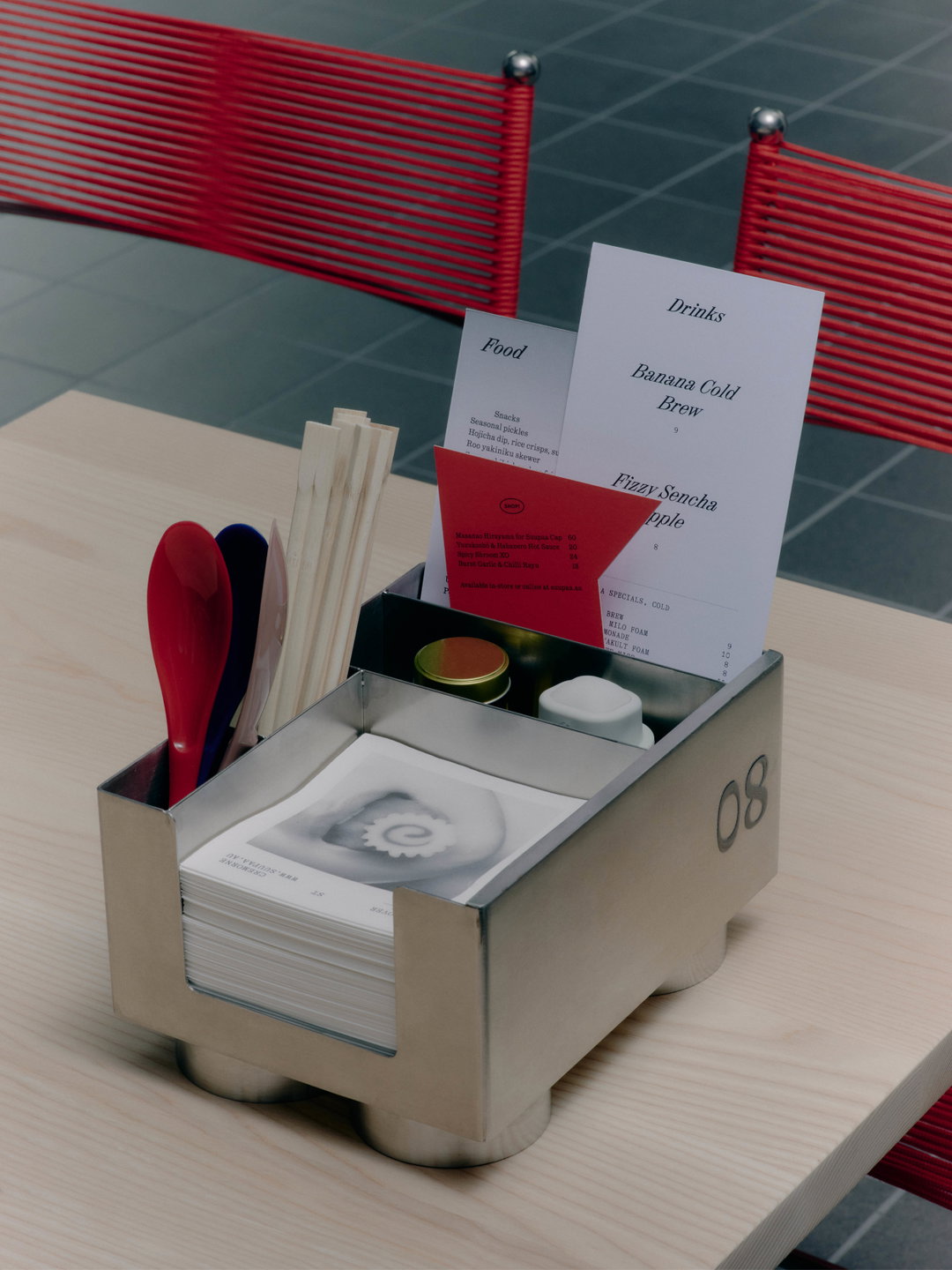
A Friend of Mine’s brand for Suupaa is a masterclass in eclectic yet restrained typography
A creative cavalcade of type, tactility, illustration and interiors, the brand’s whimsical yet temperate identity shows the impact of restraint.
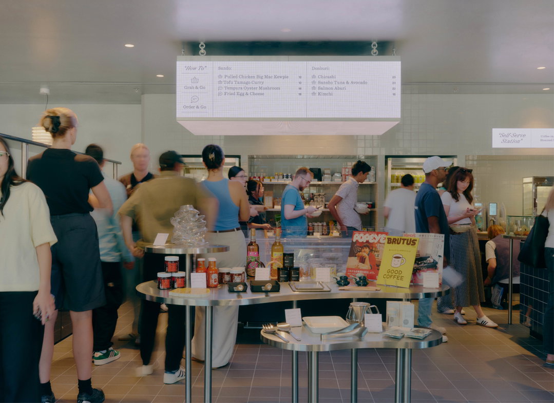
Marking another chapter in the design studio’s long-term collaboration with Japanese restaurant Future Future, A Friend of Mine has branded the eatery’s newest venue: Suupaa. Half casual Japanese dining and half convenience store, the contemporary Australian approach to Japanese classics offers curated objects and homewares alongside tasty food. “We were tasked with creating a brand identity that captures the essence of Japanese konbini culture,” A Friend of Mine’s founder, Suzy Tuxen, says, “while elevating it to a more refined level, and recontextualising it for an Australian audience.” In doing so, the studio (with Henry Tuck as design lead) combines the whimsy of Japanese konbini culture and Suupaa’s distinctive presentation with an ultra-refined and polished aesthetic.
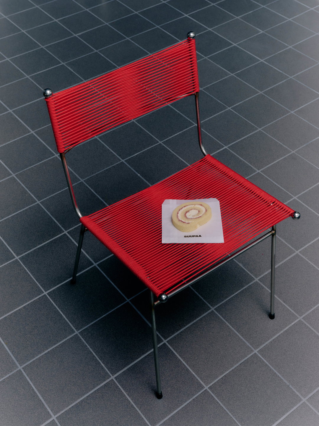
The brand applications are considered, mirroring the materials used in the physical space. IF Architecture developed Suupaa’s interiors in tandem with A Friend of Mine, culminating in a profoundly tangible tone of voice. “Tactility predominantly came into play for us through the signage, tabletop caddies (which we custom designed) and greaseproof paper,” Suzy says. At Suupaa you’ll find Memphis-meets-bento-box-inspired tabletop caddies, a konbini-esque signature, and 1980s train upholstery-influenced patterns.
And, let’s not forget, a giant white puffer fish. A Friend of Mine worked on the initial buoyant illustration, which was then further refined by More Studio and 3D2D, the latter of whom animated the fish to live on the website and digital menu screen (also made in collaboration with IF Architecture), somewhat transforming it into a large fish tank. “We evoked this sense of elevated playfulness through the signage,” Suzy continues. “These unique touchpoints and more eccentric elements are offset by the minimal use of colour and the fairly restrained typographic system, creating this atmosphere of refined whimsy.”
GalleryA Friend of Mine: Suupaa, Photography: Pier Carthew (Copyright © A Friend of Mine, 2025)
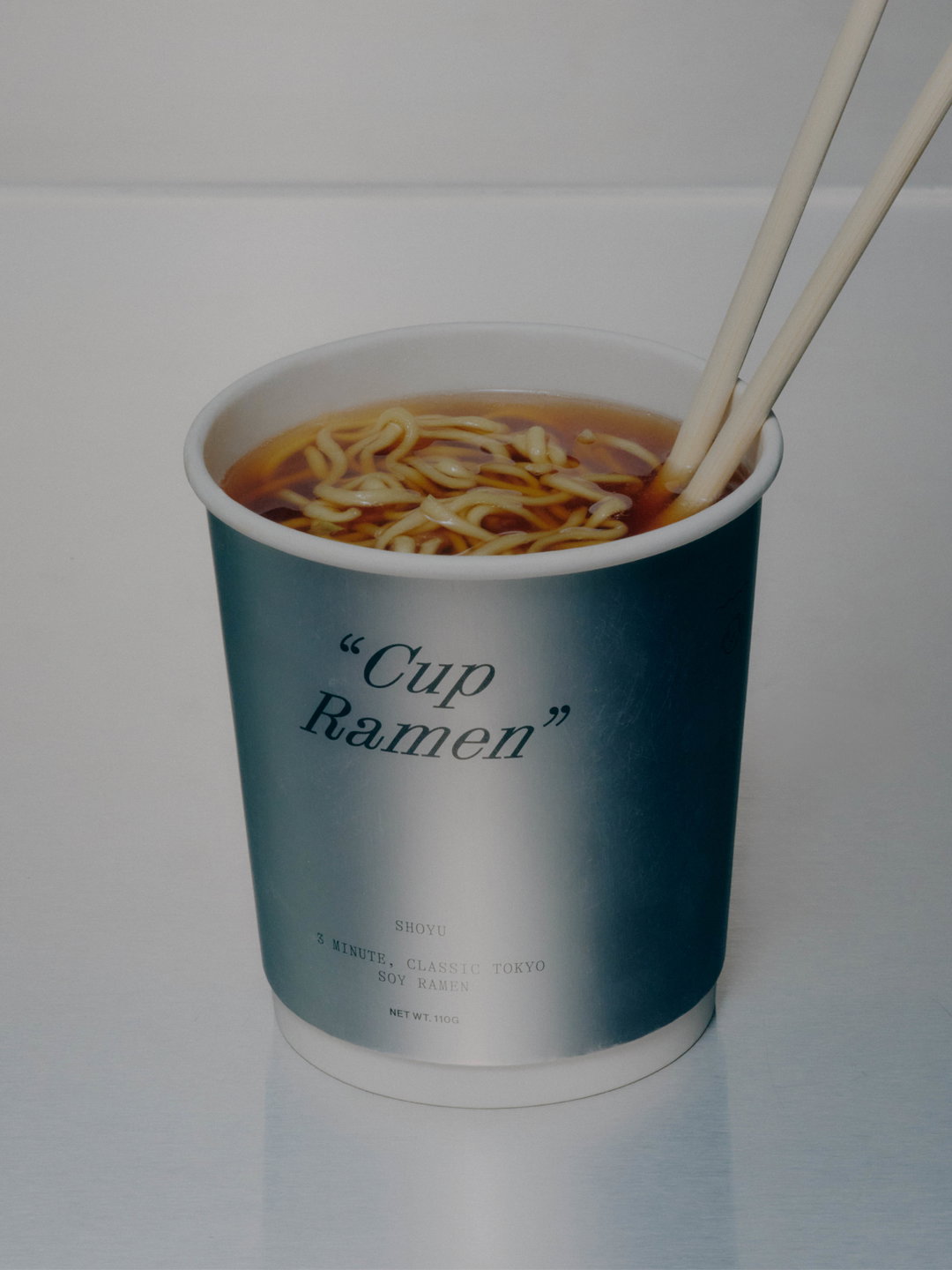
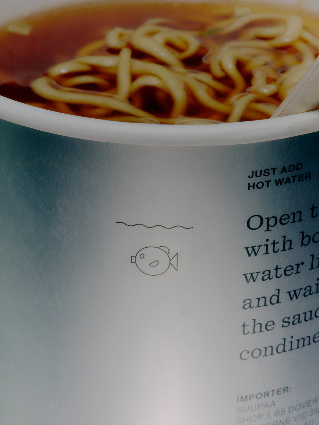
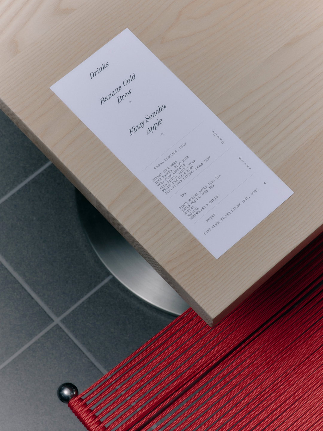
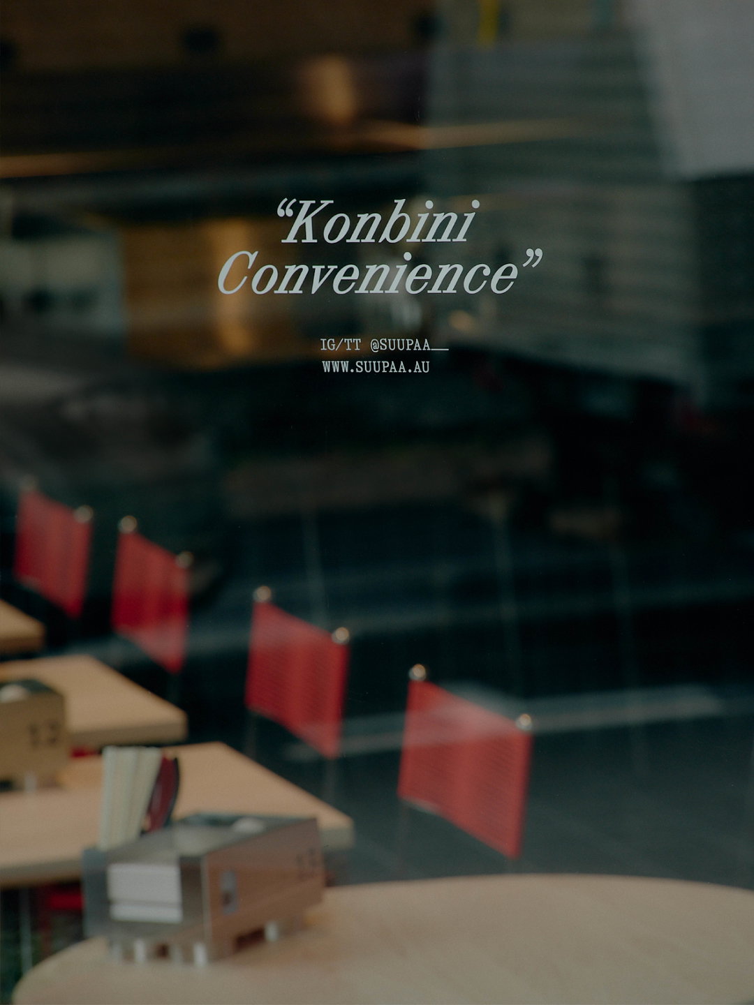
The typographic system in question is led by Dinamo’s Synt, the clean yet turbo-charged forms of which neatly balance the brand’s sense of play and practicality. “Our hero tagline ‘Konbini Convenience’ is used in Synt which brings a modern, edgy vibe to the classic slogan style,” Suzy explains, “reflecting the dynamic, youthful energy of the brand.” Meanwhile, GT Alpina Typewriter from Grilli Type, and Matter of Sort’s Quadrant are the brand’s workhorse typefaces. “Japanese culture is such a rich source of inspiration and we ended up spending some time looking into the idea of a salaryman,” she says. “Inspired by the idea of a corporate lunch at Suupaa, we brought Quadrant into the palette as a slightly more serious (yet still approachable) touch.”
Likewise, the use of PP Right Grotesk for Suupaa’s wordmark adds a warm yet impactful element. “It feels at home in both the world of convenience stores and more contemporary, design-forward spaces,” says Suzy. It feels like the cherry on top of an electric, colliding and complementary combination of typographic forms – perfectly encapsulating the brand’s colourful offering. “Our philosophy for the brand’s typography was to select typefaces that felt like they could exist both in the world of a convenience store,” Suzy says, “but also within more elevated and contemporary spaces.”
“When we began the branding process it was important to us that Suupaa’s unique offering could be communicated as quickly as possible,” she continues. This intention resulted the alliterative tagline Konbini Convenience to embody this. “When it came to styling this tagline, we opted to include punctuation,” used across the brand within quotation marks, “for us, this speaks to the blending of languages.” This idea was drawn from the brand’s name, Suupaa, a wasei-eigo term, meaning a Japanese word derived from an English one. “Throughout the brand we continued our use of quotation marks on headlines and packaging titles,” Suzy ends, “building on this unique hybrid vernacular.”
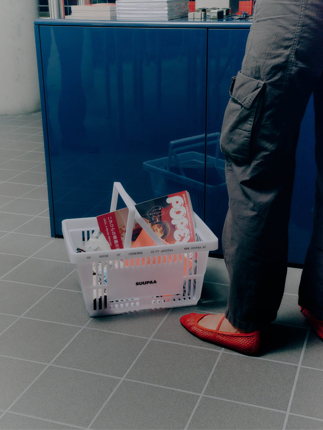
A Friend of Mine: Suupaa, Photography: Pier Carthew (Copyright © A Friend of Mine, 2025)
A Friend of Mine: Suupaa, Photography: Pier Carthew (Copyright © A Friend of Mine, 2025)
A Friend of Mine: Suupaa, Photography: Pier Carthew (Copyright © A Friend of Mine, 2025)
A Friend of Mine: Suupaa, Photography: Pier Carthew (Copyright © A Friend of Mine, 2025)
A Friend of Mine: Suupaa, Photography: Pier Carthew (Copyright © A Friend of Mine, 2025)
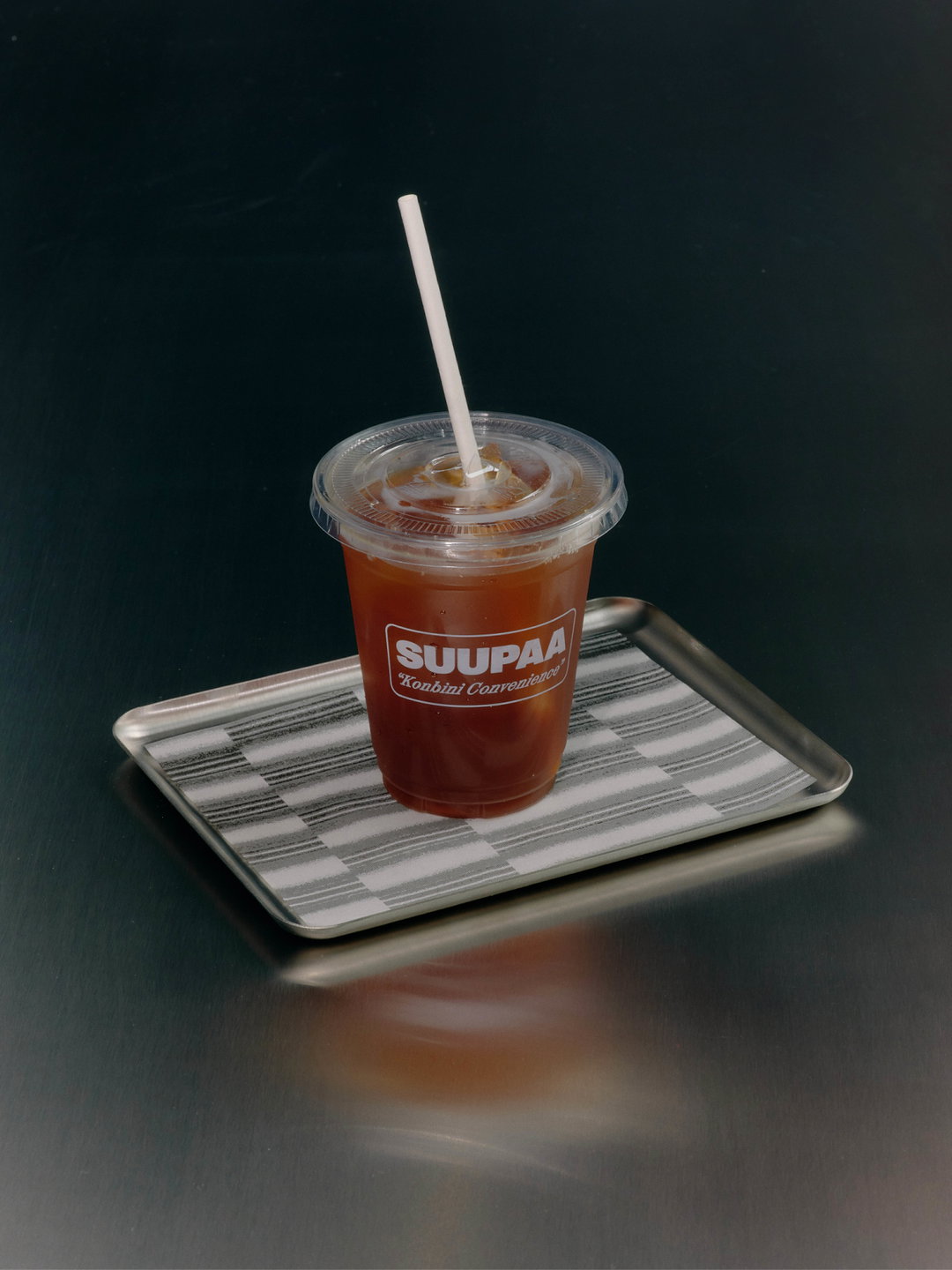
A Friend of Mine: Suupaa, Photography: Pier Carthew (Copyright © A Friend of Mine, 2025)
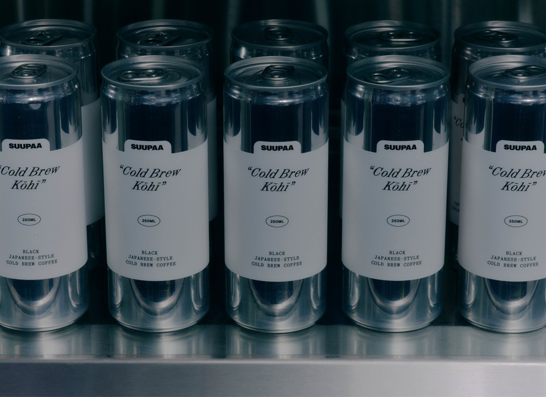
A Friend of Mine: Suupaa, Photography: Pier Carthew (Copyright © A Friend of Mine, 2025)
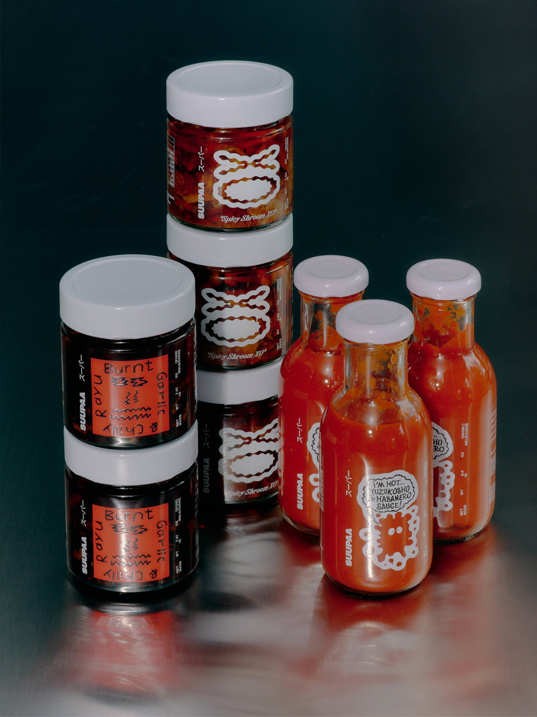
A Friend of Mine: Suupaa, Photography: Pier Carthew, Packaging featuring illustration by Benoît François (Copyright © A Friend of Mine, 2025)
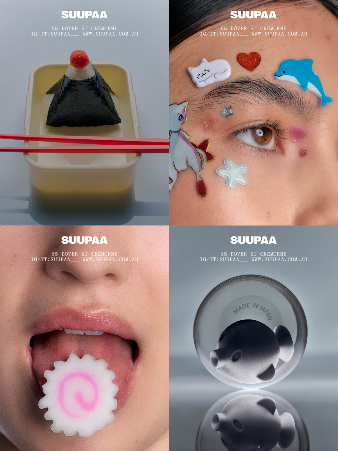
A Friend of Mine: Suupaa, Photography: Lauren Bamford (Copyright © A Friend of Mine, 2025)
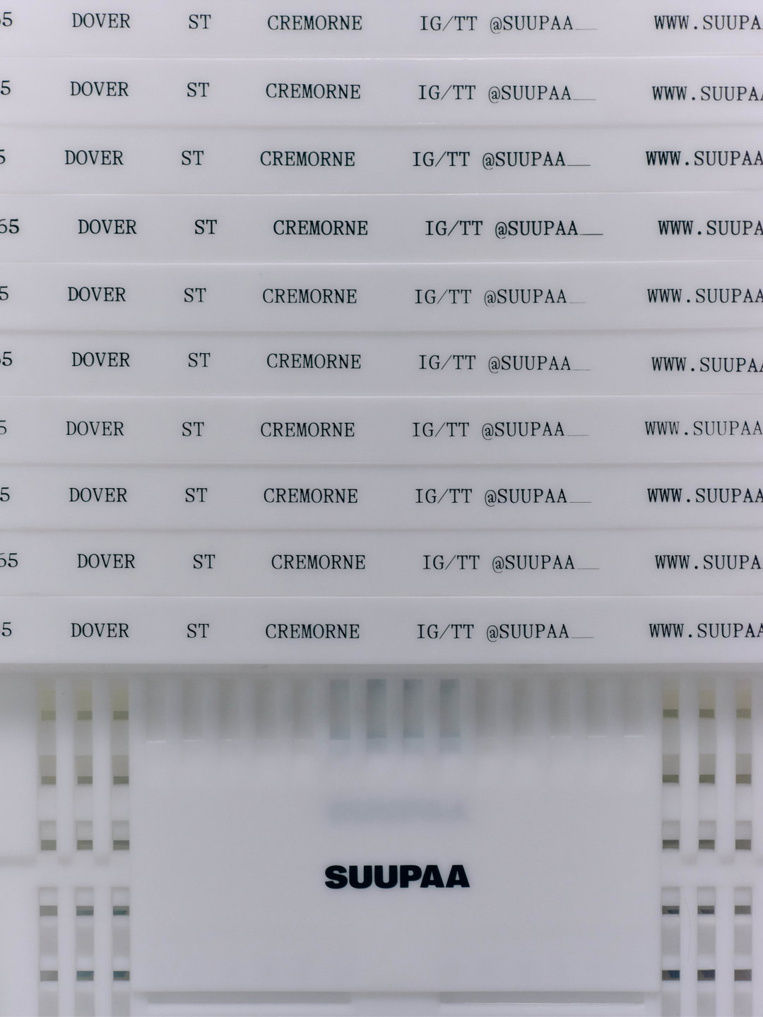
A Friend of Mine: Suupaa, Photography: Pier Carthew (Copyright © A Friend of Mine, 2025)
Hero Header
A Friend of Mine: Suupaa, Photography: Pier Carthew (Copyright © A Friend of Mine, 2025)
Share Article
Further Info
About the Author
—
Hailing from the West Midlands, and having originally joined It’s Nice That as an editorial assistant in March 2020, Harry is a freelance writer and designer – running his own independent practice, as well as being one-half of the Studio Ground Floor.





