Snøhetta's Norwegian State Railways rebrand is an ode to whizzing past fjords on the train

Snøhetta: Vy identity
Design and architecture studio Snøhetta has created a new name and visual identity for the Norwegian State Railways, now called Vy.
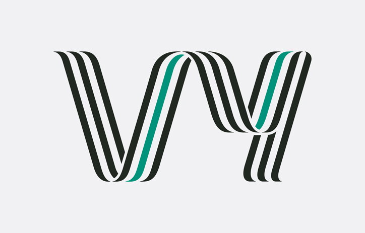
The ribbon-like logo traces the letters ‘v’ and ‘y’ in a “continuous line that brings associations of railway tracks, the motorway, tyre tracks or an open road, or even to the staves that govern movement and pitch in musical notation,” writes Snøhetta on its website.
The new name riffs on an old Scandinavian word meaning ‘to see’ that is not widely used in modern language. “The name brings associations to the fundamentals of travelling – to see new things, to get new perspectives and to broaden one’s horizon,” Snøhetta continues. “It’s reminiscent of childhood memories, of looking out of a train window and seeing the landscape pass by at terrific speed.” Its plural ‘vyer’ means to have visions, or vistas, which the studio thought was particularly appropriate given the environmental ambitions of the company. Crucially it has a similar meaning in both Swedish and Norwegian, Vy’s two main markets.
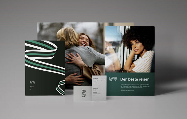
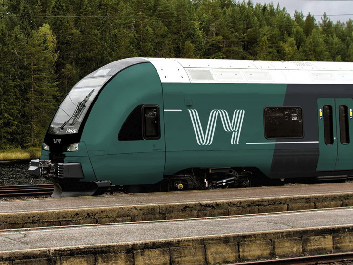
The new identity features a pine green and anthracite grey palette, inspired by the natural and urban landscapes. “They’re the colours you see and experience when you move through cities, fjords and mountains,” the studio adds.
Snøhetta collaborated with type designer Göran Söderström from Letters from Sweden to create a new type family for Vy. The family is based on letters from Sweden’s Lab Grotesque but includes extra features inspired by grotesque and gothic typefaces from 1883 when Norwegian State Railways was first founded. The family includes “crisp and modern” Vy Sans as well as three weights of Vy Display, which share the same skeleton of Vy Sans but echoes the logo’s pen strokes.
The new identity will be applied to the exterior of new trains, buses and electric cars, on uniforms, signage, business cards, website and on Vy’s app.
Snøhetta: Vy identity
Snøhetta: Vy identity
Snøhetta: Vy identity
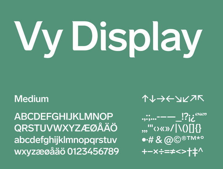
Snøhetta and Göran Söderström: Vy Display
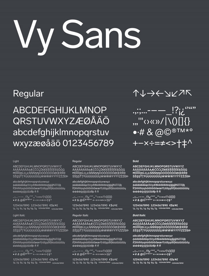
Snøhetta and Göran Söderström: Vy Sans
Share Article
Further Info
About the Author
—
Laura is a London-based arts journalist who has been working for It’s Nice That on a freelance basis since 2016.