Heinz gets first ever global masterbrand, served up by JKR
Bringing the condiment king’s iconic “keystone” shape to the forefront, the agency has tweaked the logo, identity, packaging and more to better convey its “simple greatness”.
Share
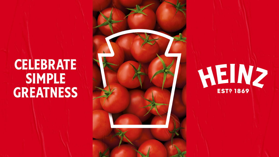
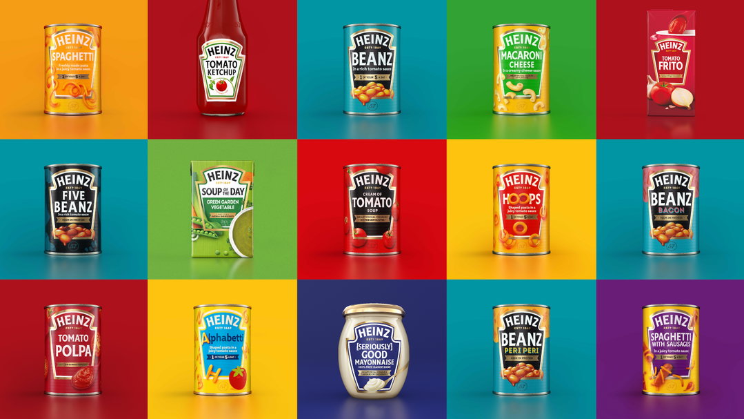
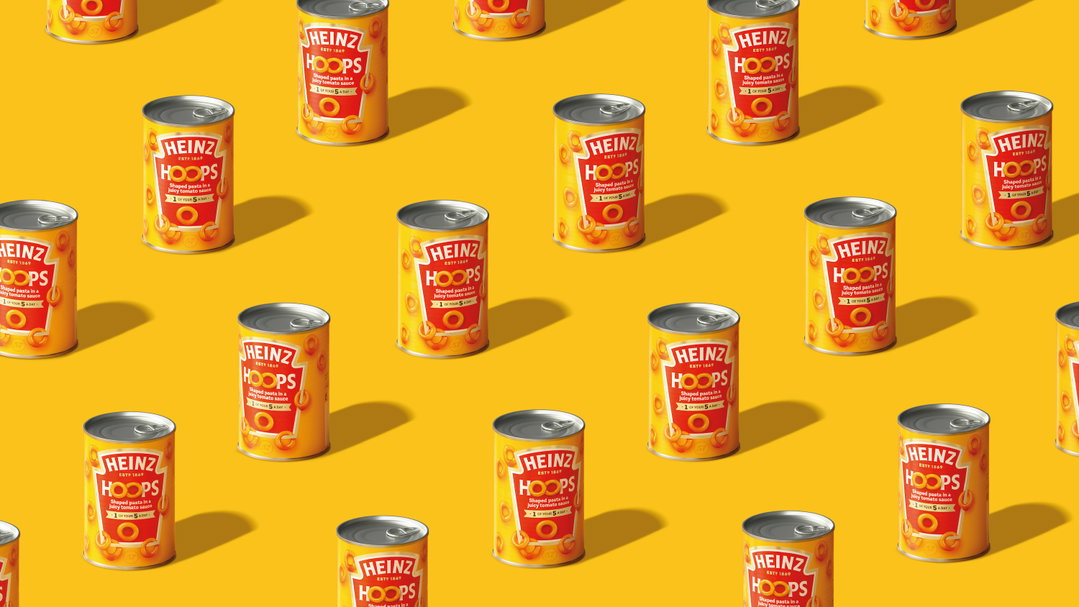
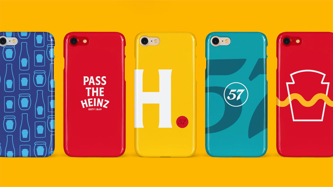
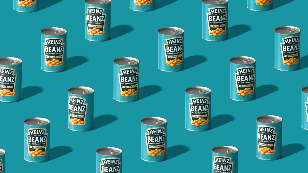
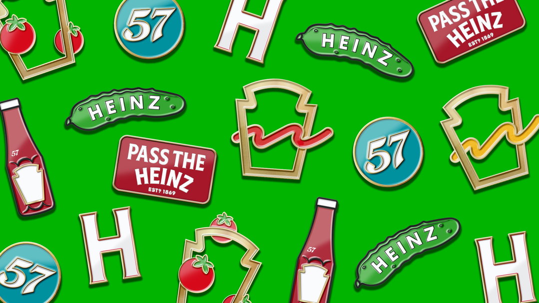
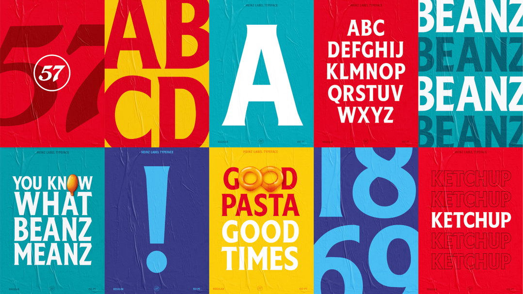
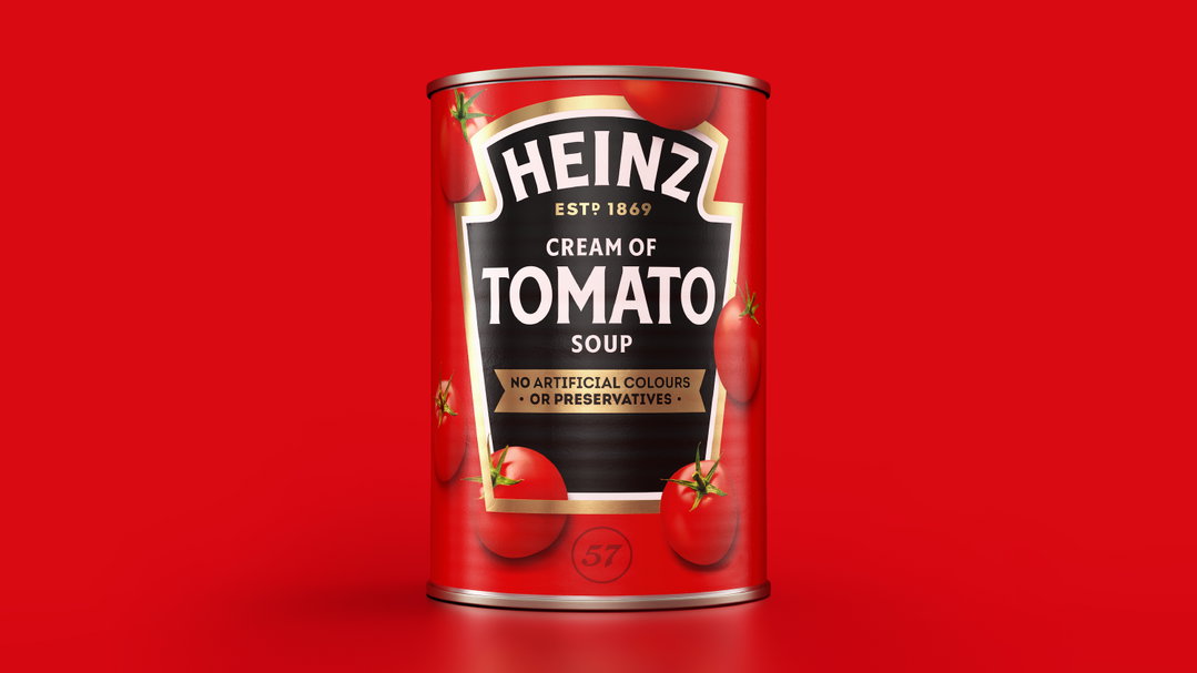
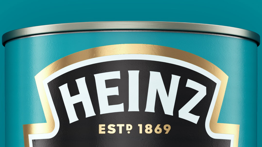
Jones Knowles Ritchie has unveiled its work with Heinz to unify its branding for the first time in 150 years. Creating its global “masterbrand” has involved tweaking the logo and the visual identity – which includes brand typeface Heinz Label – as well as the brand strategy, packaging and tone of voice. This new comprehensive toolkit, such as a definitive list of brand Pantones (plus the company’s trademarked Heinz Beanz Blue) and the use of the brand’s iconic “keystone” shape as a frame for product photography, will be rolled out to all 20 product categories internationally.
One of the drivers behind the revamp appears to be unifying and promoting the brand in a modern marketing landscape. “We know that iconic, distinctive assets are key to enhancing the effectiveness of your brand through all channels – whether that be paid, earned or owned,” says Kraft Heinz’ Victoria Sjardin. JKR says the new “visual unity” is underpinned by “unique personality traits, a strong brand idea and a set of creative principles,” that were perhaps diluted and varying across the brand previously.
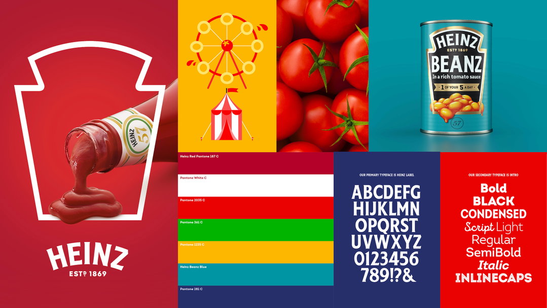
JKR: Heinz masterbrand
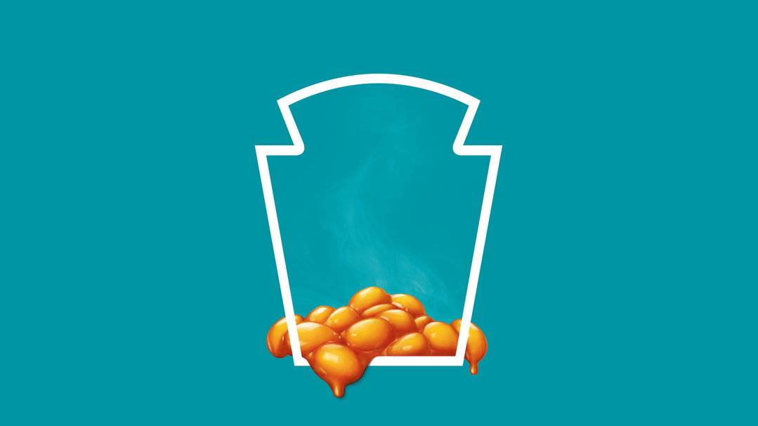
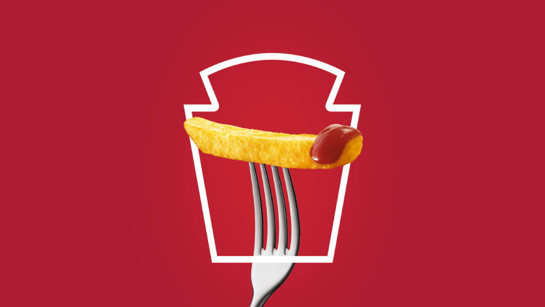
“Our primary ambitions were to distinctively connect each element of the brand’s design ecosystem and to utilise iconic assets, like the Heinz keystone, in new and interesting ways,” said Jonny Spindler, managing director at JKR. In adverts for ketchup, for example, the keystone becomes a window where sauce is being poured in a satisfying dollop onto the frame. Overall, the visual messaging is cleaner, more pared back with graphics to allow the rich use of colour, not to mention the product itself, to come to the forefront.
“Heinz is a brand for everyone, loved by everyone. You can find it in Michelin-starred restaurants through to roadside cafes around the world,” Spindler says. “With that in mind, we wanted to create brand unification across categories, geographies and brand experience touchpoints so that no matter how or where you experience Heinz, you’re able to celebrate its simple greatness.”
In 2017 JKR marked 50 years of the Beanz Meanz Heinz slogan by creating limited edition tins replacing the brand name with various other terms such as “Chipz” “Famz” and “Dripz”. Earlier this year the agency also rebranded Debbie Milman’s master’s in branding course at the School of Visual Arts – a project not without its potential for scrutiny, given its audience. Last year, it also rebranded the UK’s National Lottery.
GalleryJKR: Heinz masterbrand

Share Article
Further Info
About the Author
—
Jenny oversees editorial output across It’s Nice That. Get in touch with writing pitches for features or opinion pieces, big creative story tips, or questions about all things editorial. jb@itsnicethat.com
To submit your work to be featured on the site, please see our Submissions Guide.