




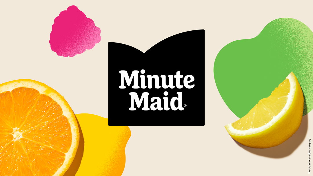
The Minute Maid rebrand reflects growing taste for friendly, flat and retro
Household brands are moving away from corporate minimalism and giving a soft, chummy nod to the past – Minute Maid is the latest to jump on the bandwagon.
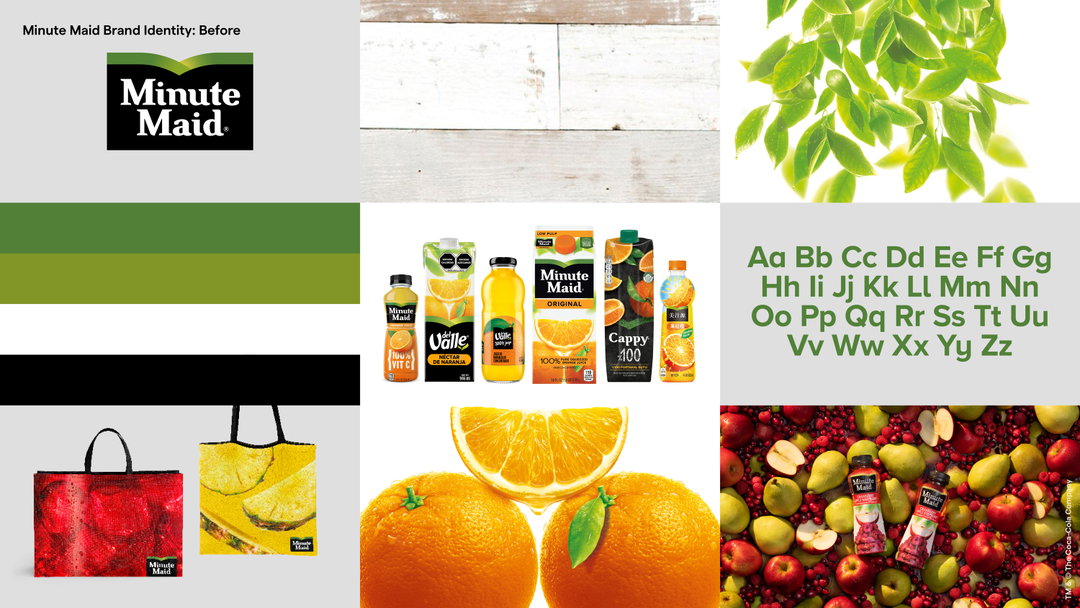
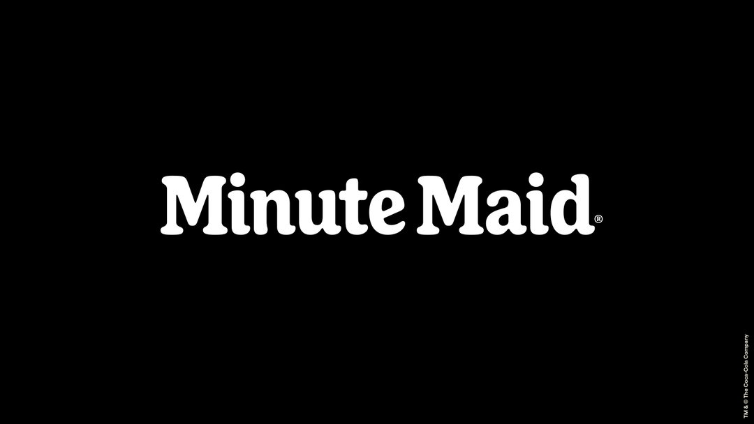
Minute Maid, the 77-year old juice brand, has shed its previous identity for a more approachable image, merging retro signatures and flat graphics with a cheeky vibe. The refreshed logo swaps a harsher serif that appeared throughout Minute Maid’s brand history – at some points with cut-out highlights – for a fuller curved wordmark with soft terminals. Grey, VMLY&R and Landor & Fitch worked in collaboration with Jones Knowles Ritchie (JKR) on the identity and accompanying campaign, hot off the heels of JKR’s 70s-style identity for Nordstrom Rack in April.
The logo has been flattened and the final effect is more similar to Minute Maid’s first logo, established in 1945. Additional dimension provided by a green ribbon-like stripe has also been traded for two curved lines, playfully suggesting splashing juice. Multiple beverage brands have a 2D approach this year, including Fanta and 7Up.
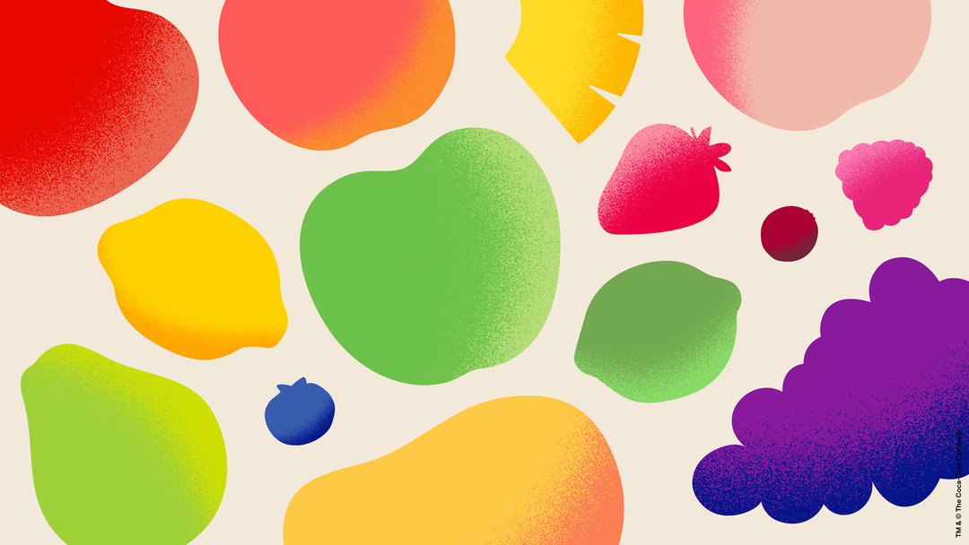
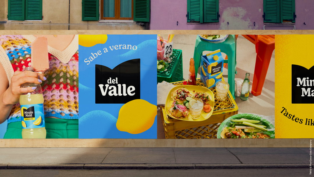
Unlike Burberry’s embrace of serifs to suggest a serious heritage persona, the Minute Maid refresh shows how brands are harnessing more subtle retro forms to suggest a fun-loving persona. In the case of Minute Maid, the logo is paired with colourful, abstract fruit illustrations, accompanied by a grainy overlay texture. The aim of the new identity, according to a release, is to “evoke the feeling of enjoyment”.
Katalin Czigler, global brand strategy director at Minute Maid, expresses this feel-good quality further: “The experience people get from drinking Minute Maid makes them feel good. Minute Maid wanted to bring that to life visually and in our communications worldwide. This perfectly reflects our brand mission to help anyone, anywhere and at any time, feel alive, which is needed now more than ever. ”
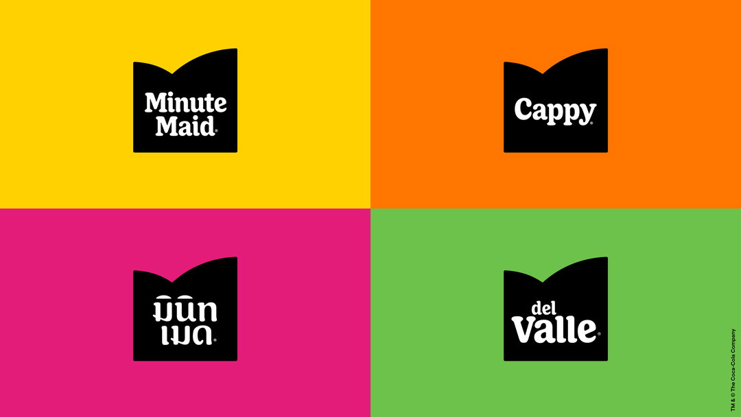
Minute Maid goes by a variety of different names across its 100 global markets; the new identity unites them into a singular brand experience. It debuts with a campaign called Filled with Life, pushing the idea of enjoyment in everyday life further still.
GalleryJKR / Grey / VMLY&R / Landor&Fitch: Minute Maid (Copyright © The Coca-Cola Company / Jones Knowles Ritchie, 2023)
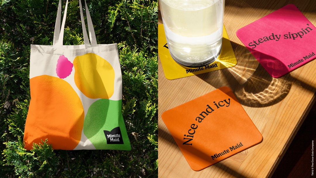
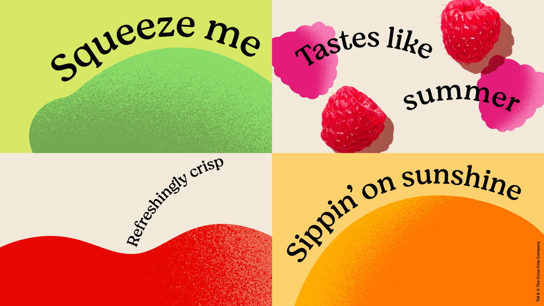
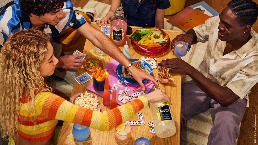
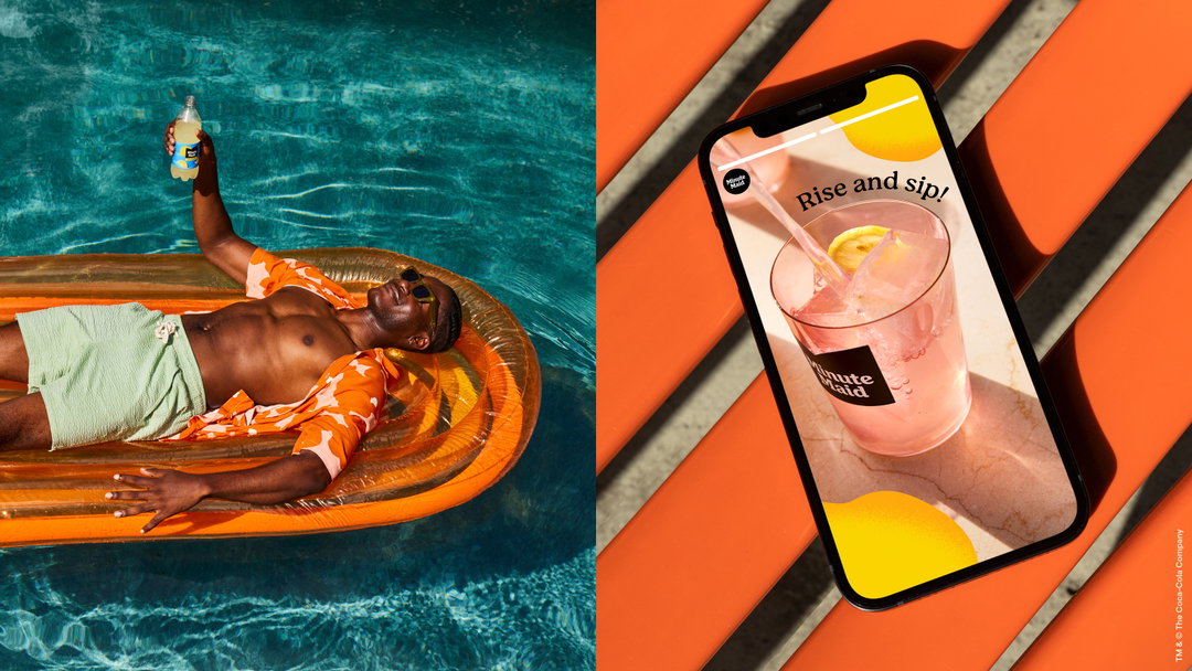
Hero Header
JKR / Grey / VMLY&R / Landor&Fitch: Minute Maid (Copyright © The Coca-Cola Company / Jones Knowles Ritchie, 2023)
Share Article
About the Author
—
Liz (she/they) is the senior editor at Insights, a research-driven department within It’s Nice That. They previously ran the news section of the website. Get in contact with them for potential Insights collaborations or to discuss Insights’ public-facing reports.




