Apple, Adidas and Netflix logos get Bauhaus makeover to celebrate the school's centenary
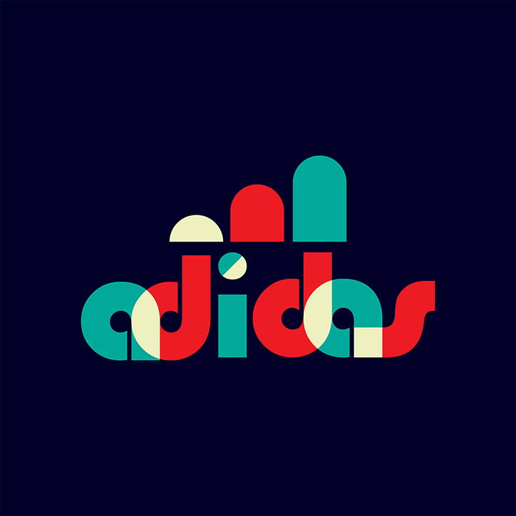
Jaseng99: Adidas, courtesy of 99designs
A group of international designers have redesigned famous logos in the style of the Bauhaus to celebrate 100 years of the influential art school. Identities for Apple, Adidas, Burger King, BBC and Netflix have each been given the Bauhaus treatment following a competition set by creative platform 99designs.
The 99designs community was briefed to consider Bauhaus principles when reimagining top logos. Radical at the time, the school rejected ornamentation in favour of a pared-back approach where form was inspired by function. Colour theory, the veneration of craft, experimental image-making and typography were integral to the Bauhaus’s output.
The school was founded in 1919 by architect Walter Gropius in the German city of Weimar before moving to Dessau in 1925 and then again to Berlin in 1932. Just a year later it was closed by director Ludwig Mies van der Rohe following pressure from the Nazi government. Numerous talents of the interwar period studied and taught at the school including artists Paul Klee and Wassily Kandinsky, typography master Herbert Bayer, designer László Moholy-Nagy, weaver Anni Albers, and furniture designer Joseph Albers. Its legacy has been vast and wide-reaching, influencing Dieter Rams’s “Less is More” mantra as well as numerous creatives from Jonathan Barnbrook and Margaret Howell to Kanye West.
“When the Bauhaus movement began, it was at a time when the world was on the brink of massive technological change,” explains 99designs CEO Patrick Llewellyn in a statement about the competition. “While many artists were worried that mainstream adoption of electricity and mass production would be the end of art as we knew it, the Bauhaus group were instead inspired by the change and progress they saw happening around them.”
“It’s easy to draw parallels with people’s anxiety around things like automation and artificial intelligence today, but it’s inspiring to see how technology can bring together a global community of creative talent and demonstrate how the timeless principles of Bauhaus design still resonates today.”
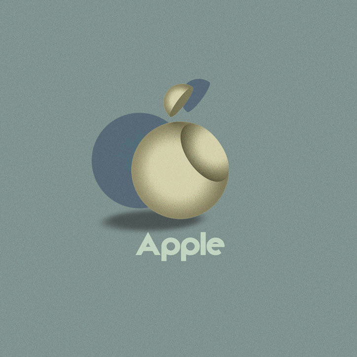
Vladimir Nikolic: Apple, courtesy of 99designs
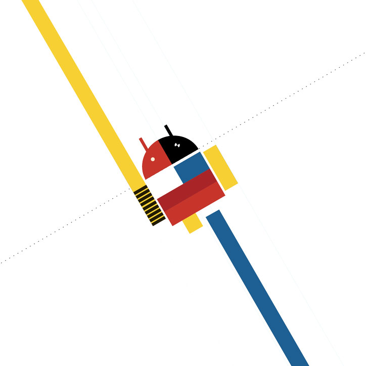
SSUK: Android, courtesy of 99designs
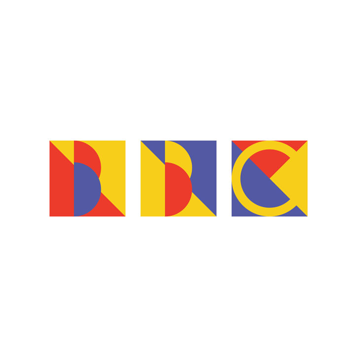
Luciy: BBC, courtesy of 99designs

Enrique Arredondo: BMW, courtesy of 99designs
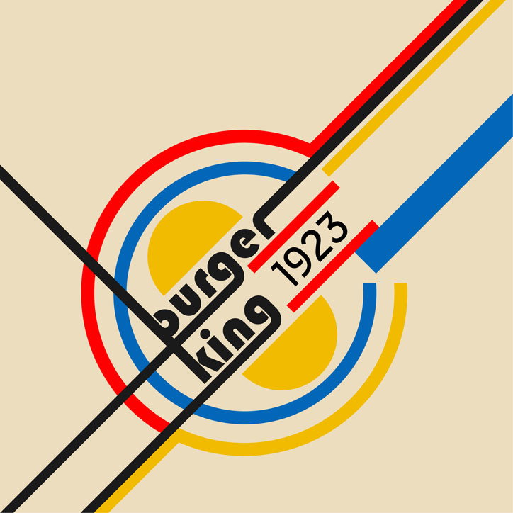
Black Logo: Burger King, courtesy of 99designs
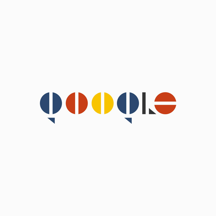
Artopelago: Google, courtesy of 99designs

Enrique Arredondo: Netflix, courtesy of 99designs

Dellfi: Starbucks, courtesy of 99designs
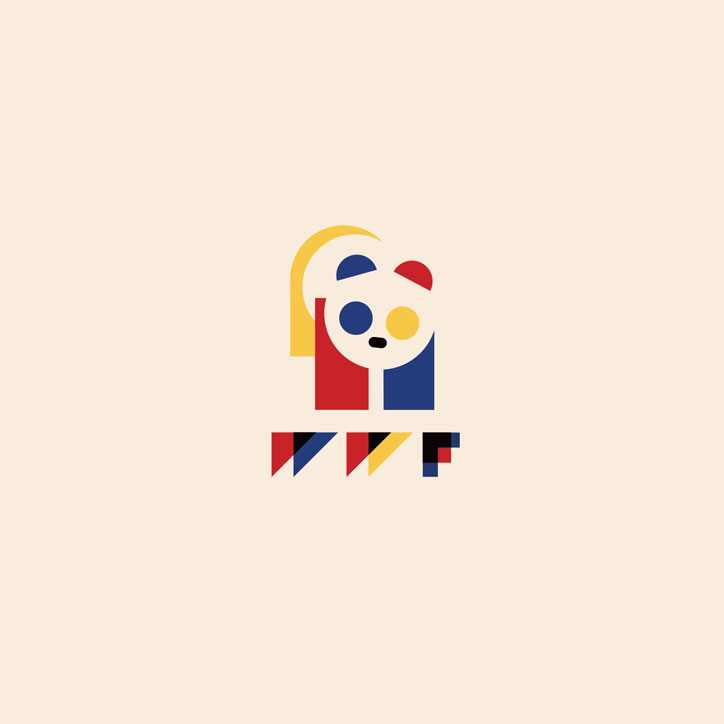
Ross!e: WWF, courtesy of 99designs
Share Article
Further Info
About the Author
—
Laura is a London-based arts journalist who has been working for It’s Nice That on a freelance basis since 2016.