TwoPoints.Net builds mix-and-match fonts for Donut Shop furniture
Rather than pouring focus into ad campaigns, TwoPoints.Net suggests simple editorial design is all that’s necessary.
TwoPoints.Net’s latest Detroit-based client gave them carte blanche on its identity – thanks to a pre-existing relationship built up over an ice cream parlour brand branding project. The client is Donut Shop, an interior design studio that makes custom furniture, interior spaces and lighting, and it’s these products the TwoPoints.Net finds its inspiration.
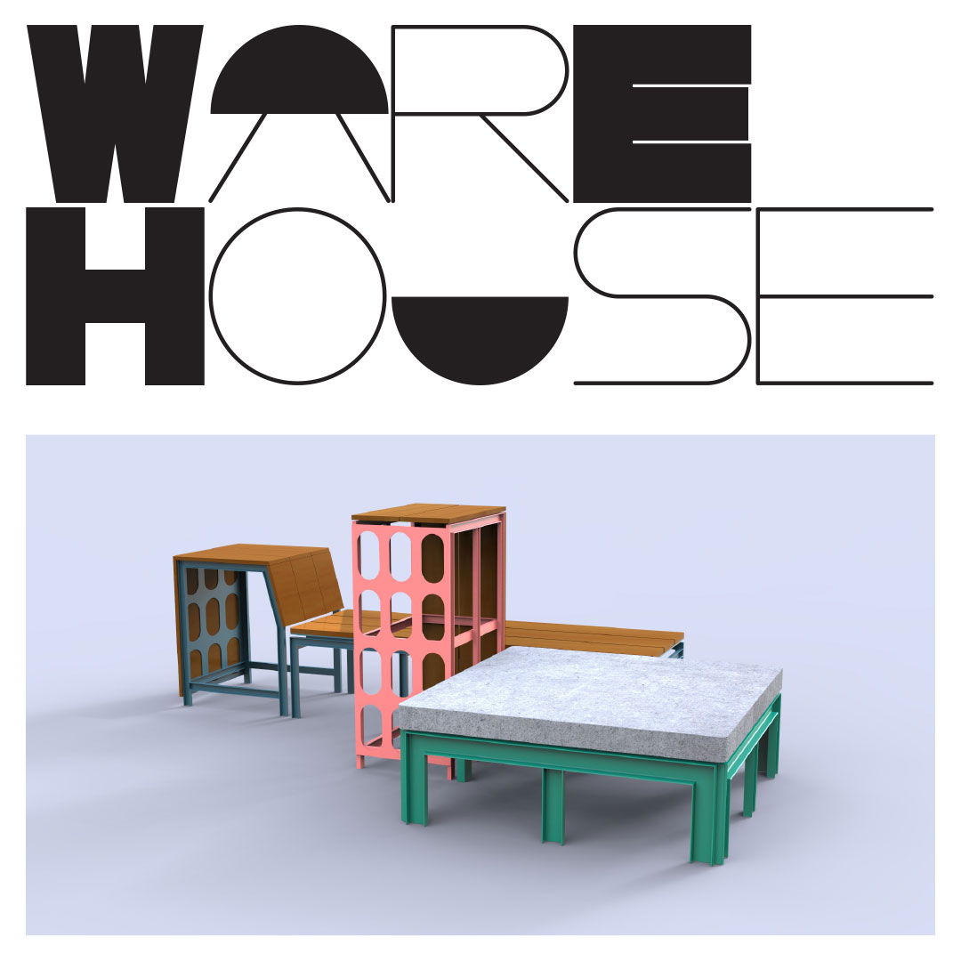
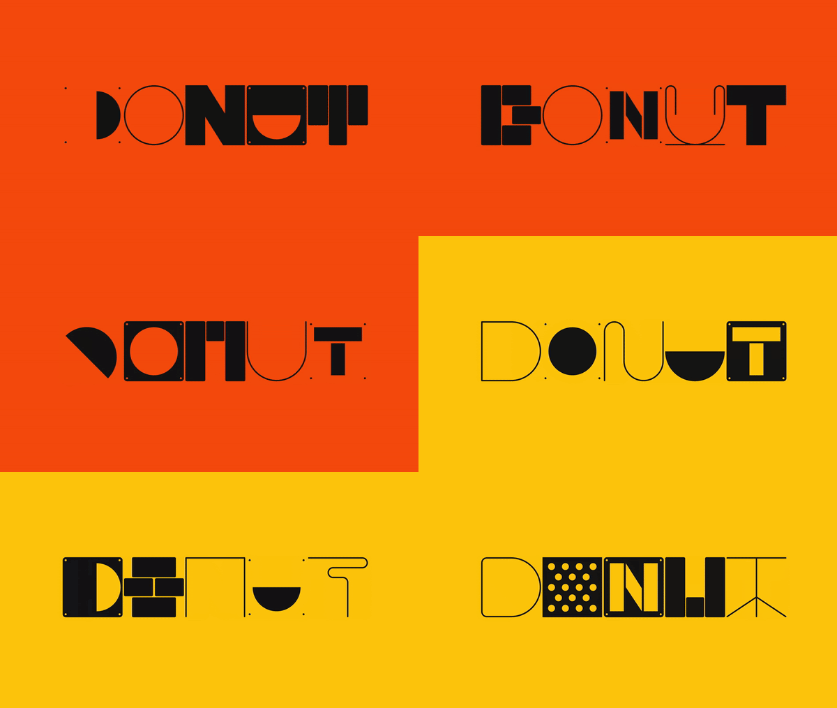
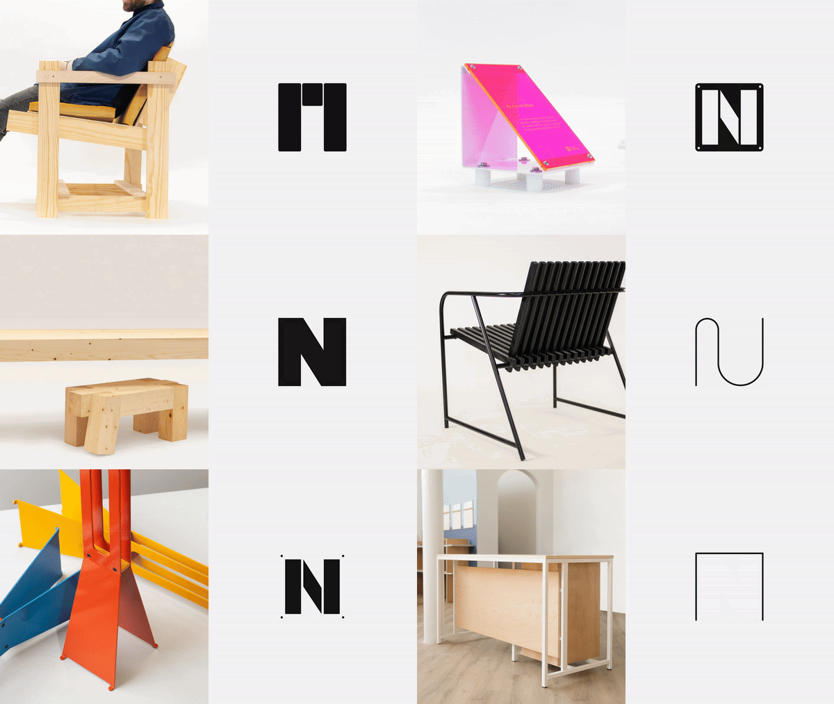
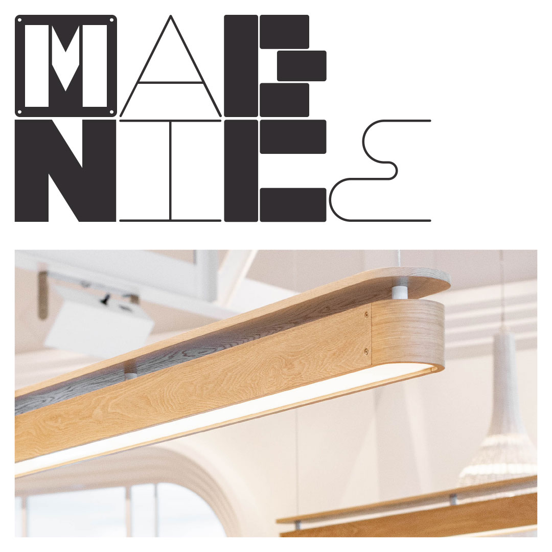
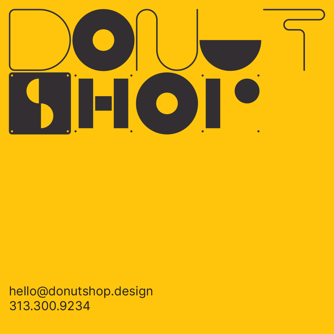
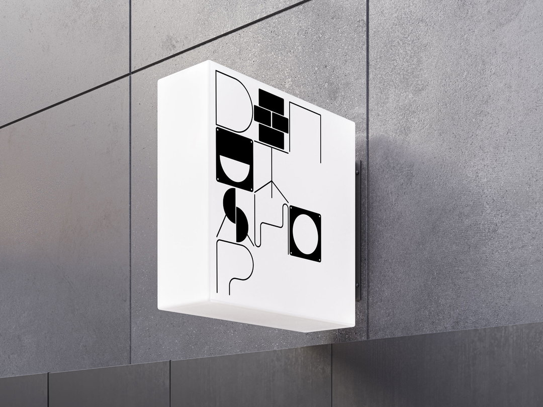
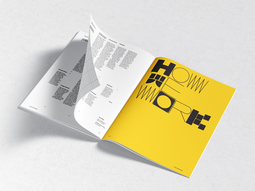
The studio has created six mono-spaced fonts that pay homage to different Donut Shop projects. There are a few interior-focused projects that have taken similar approaches over the years, like this typeface made from tiles, or this made from stacking beds. But TwoPoints.Net’s Martin Lorenz says it was about more than just drawing parts of the furniture and turning it into lettering. It required looking for abstract elements that worked as part of a whole system.
“It wasn’t just a lettering for their logo or wordmark, but six fonts in which each letter had to work with each other, there had to be a system that allowed for that kind of flexibility,” says Martin. The mix-and-match fonts aren’t too closely tied to furniture forms, they’re more gestural. But when paired with Donut Shop product photography, they do reflect their essence.
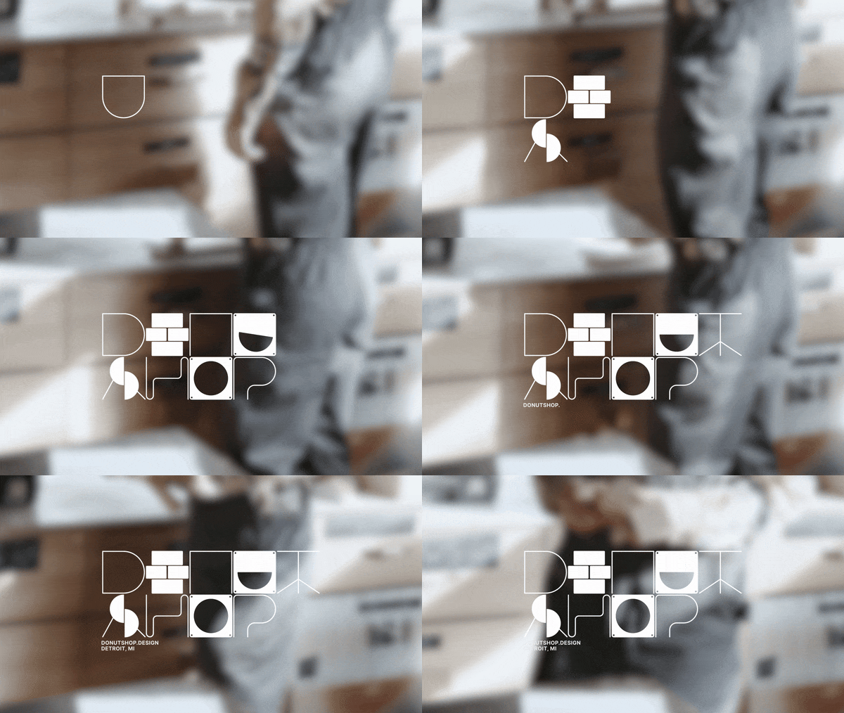
TwoPoints.Net: Donut Shop (Copyright © TwoPoints.Net)
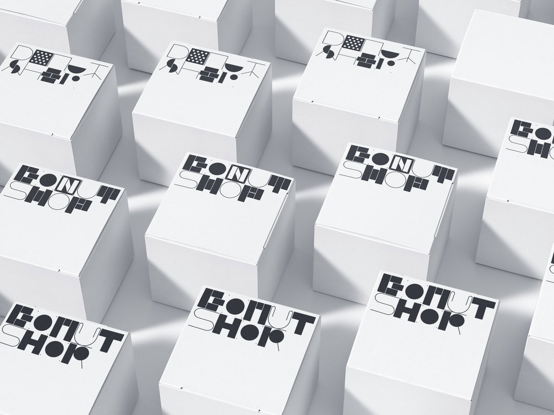
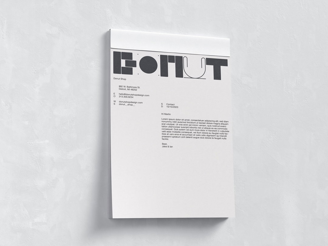
The idea is to give Donut Shop a different kind of identity, where the founders can create new assets just by typing. It also moves the logo down in the hierarchy, as any headline becomes a moment where the Donut Shop branding can come into play. This works best and is at its most balanced when the typography has a visual partner in the furniture.
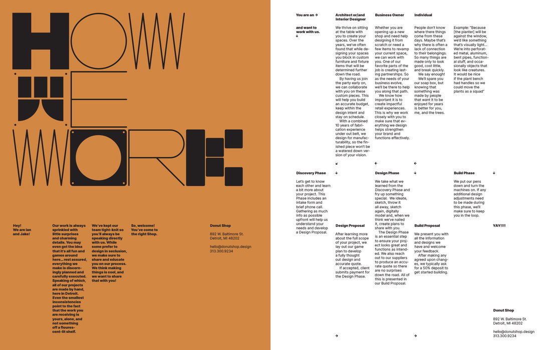
Martin says each one of Donut Shop’s interior projects consists of a hidden narrative (the brief, the workings out and references etc.). TwoPoints.Net says the focus was to bring this to life. “Displaying Donut Shop’s work requires nothing more to convey these stories – campaigns or ads are unnecessary,” says Martin. “Simple yet engaging editorial design proves to be far more efficient.”
GalleryTwoPoints.Net: Donut Shop (Copyright © TwoPoints.Net)
Hero Header
TwoPoints.Net: Donut Shop (Copyright © TwoPoints.Net)
Share Article
Further Info
About the Author
—
Liz (she/they) is the senior editor at Insights, a research-driven department within It’s Nice That. They previously ran the news section of the website. Get in contact with them for potential Insights collaborations or to discuss Insights’ public-facing reports.