




- —
- Date
- 18 July 2017
- Tags
Design, Revolt, Rainbow: the pioneering work of graphic designer Willy Fleckhaus
Share
- —
- Date
- 18 July 2017
Share
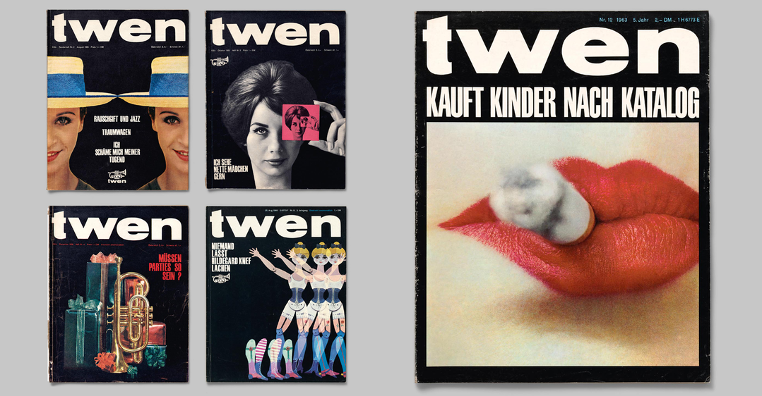
Willy Fleckhaus (1925–1983) was one of the most innovative, creative and influential graphic designers in postwar Germany. He became internationally known for his ground-breaking work on the lifestyle magazine twen , which attracted generations of readers with its generous layouts, modern typography and distinctive choice of house photographers such as Will McBride, Charlotte March, Guido Mangold, and Reinhart Wolf.
He invented the position of the “art director”, when this job description did not yet exist in Germany and earned himself the nickname of “Germany’s most expensive pencil”. A new book Design, Revolt, Rainbow published by Hartman Books, is the first comprehensive monograph on Willy Fleckhaus in an international edition. It includes texts by Michael Koetzle and Carsten Wolff (who also designed the book), both long-time collectors of Fleckhaus work samples. Here, we publish the introduction by Koetzle and Wolff and share images of Fleckhaus’ timeless work.
Does literature have a colour? Do authors and their writings work to a particular pigment? Those questions sound rather absurd: the mind has no colour. If anything, it is bright, dedicated to the beacon of enlightenment. And yet we seem to think of particular colours in connection with poets, writers or philosophers. Wasn’t Peter Szondi’s Theory of Modern Drama wrapped in bright yellow? Didn’t Walter Benjamin, or at least his famous artwork essay, appear in some shade of light green? Weren’t Günter Eich’s Rain Messages purple? Beckett and his Godot signal red? And Max Frisch’s Fire Raisers (which literally all students had to read) an inky blue? This much is certain: Herbert Marcuse’s Essay on Liberation – something like an entrance ticket into the intellectual world of the 1960s – was blue, dark blue, in fact. Not that you would have understood what he said, but the slim book was easy to carry around and you would have it on you often enough to remember its colour. Marcuse was “cult”, the printed antithesis of having tea at your aunt’s.
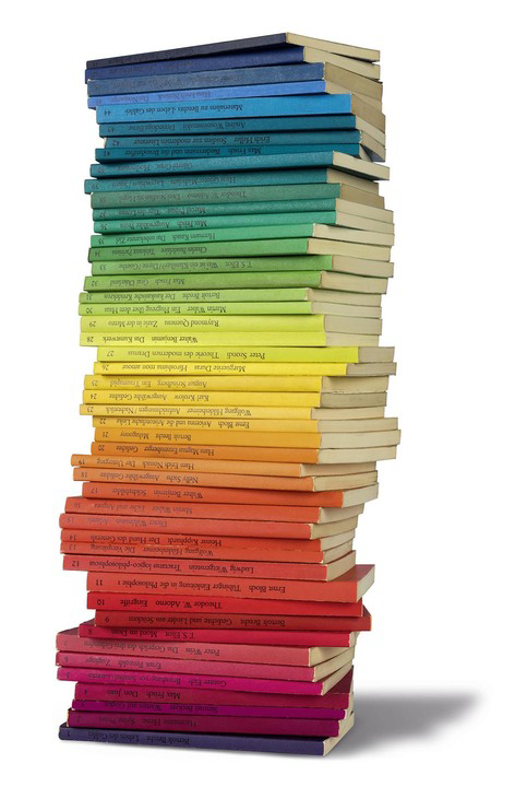
Edition Suhrkamp, 1963, The first 48 titles
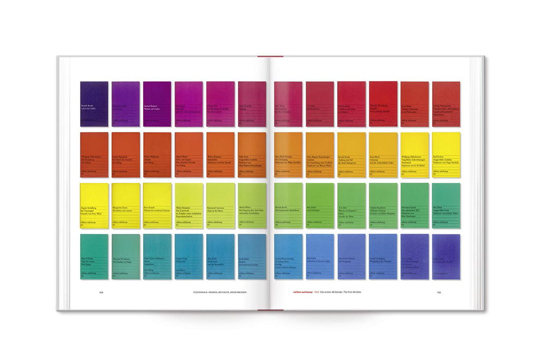
48 titles as shown in Design, Revolt, Rainbow
It does not happen often that a designer has an instinctive feel for the forms that adequately express the zeitgeist. That does not mean popular styling. Rather, it means a consciously selected solution to support content. In this sense, graphic designer Willy Fleckhaus, who was born in 1925 and died far too young, put his mark on the late 1950s, the 1960s and 70s. In his pursuit of the zeitgeist, he contributed to shaping the spirit of his time. What Otl Aicher achieved with his concept for the Olympics – the translation of an idea into powerful visuals – Willy Fleckhaus accomplished in the field of book and magazine design.
His design for Bibliothek Suhrkamp was an aesthetic bombshell in the book market. The subsequent rainbow series was a revelation where sense and sensibility came together in a rarely seen alliance. It’s no coincidence that we remember the edition suhrkamp writings by their distinctive colours. And let’s not forget twen, the legendary youth magazine, which would define the ways of thinking and seeing for more than just one generation. With twen, Willy Fleckhaus’s work was as style-defining as it was with his last major project, the Frankfurter Allgemeine Magazin.
Hardly anyone talks about Willy Fleckhaus today. You could say that he is as good as forgotten. This is due to his early death and to the fact that, at least in Germany, typography or graphic design are not exactly at the centre of public interest. Given the rich tradition of graphic design and typography, this is somewhat surprising. Just think of the Bauhaus Dessau or of names like Max Burchartz, Paul Renner, Jan Tschichold or El Lissitzky. But here, too, the barbarism of the Nazi regime had created a tabula rasa. After the war, Fleckhaus had to start from scratch when he turned his back on cultural journalism and started to concern himself with the design of printed matter. But at least there was Swiss graphic design and the bold, imaginative and often stunning US American design. Bringing those two threads together is also one of the great achievements of German designer and art director Willy Fleckhaus.
When Fleckhaus started to design, the layout of magazines were created by setters or copy editors whose names would appear somewhere at the bottom of the imprint. When he died, “art direction” had become both an established concept and a senior position in the concert of production. Fleckhaus significantly contributed to bringing about this paradigm shift. He imported and popularised the role of the art director, he filled it with life and thus established – not only in the field of print design – the model of someone responsible for all visual matters.
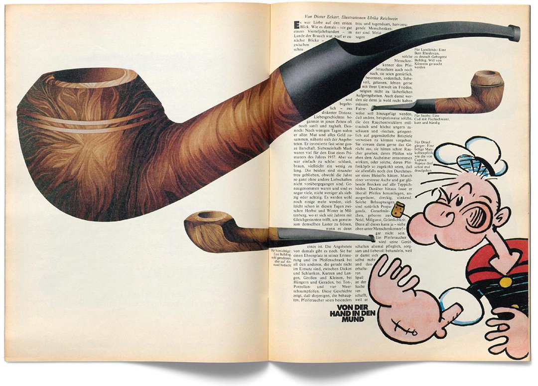
Frankfurter Allgemeine Magazin 143, 1982
Illustration: Ulrike Reichwein
Text: Dieter Eckart
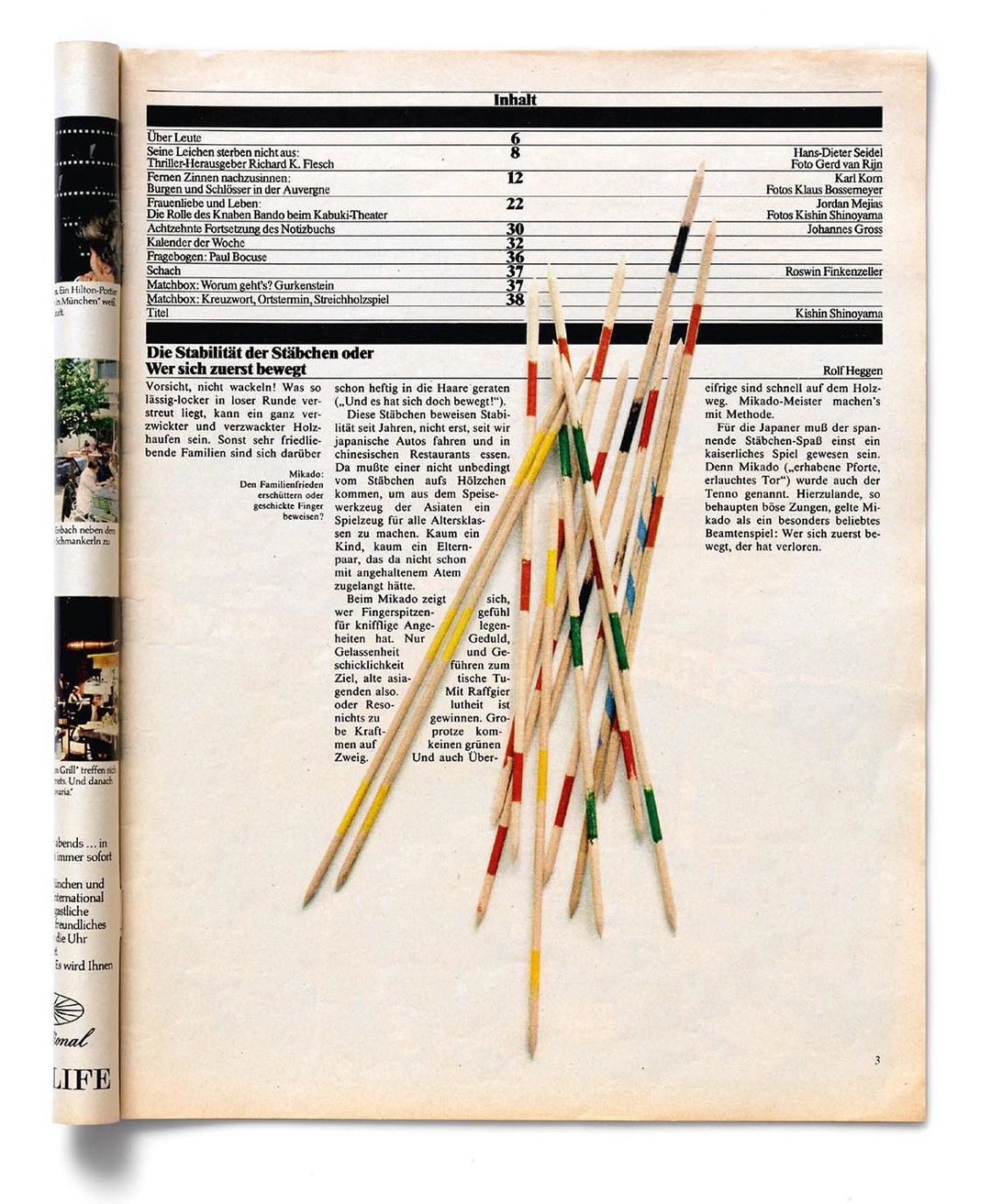
Frankfurter Allgemeine Magazin 84, 1981
Fleckhaus wanted to effect something, to reach a large audience. Not without pride, he later repeatedly pointed out that the books he designed sold millions of copies. Hence, his “art” was, in the best sense of the word, popular. But it was not just the print run and circulation of the titles on which he collaborated that made him an important, yet often overlooked, personality of recent cultural history. It was also the content, the photographs and the articles, which, through his work, would, time and again, be staged in stunning arrangements.
We have been researching Fleckhaus’ work for more than two decades. We did not know him personally. What has inspired and driven us to trace this creative life was the quality of his work, the originality of his designs and the ethically underpinned modernity of his thinking and design practice. Contemporary witnesses are not particularly appreciated in academic research.
We have deliberately chosen to talk to family, friends, publishers, photographers, students and assistants. They have supported us in many different ways and we would like, first of all, to extend our thanks to them.
We wanted to create both a book and an exhibition. The fact that the latter will now become reality, first in Cologne and later in Munich, is a dream come true and, at the same time, the exhibition will return a creative personality to the places where he worked. In other words, the Fleckhaus we know would not have been possible without Cologne. A devout Catholic, his spiritual roots were in Cologne. Cologne and the Rhineland art scene were an inspiration to him as was the Cologne-based photokina exhibition. Published in Cologne, Aufwärts was the magazine where Fleckhaus transformed himself from being a writer and journalist to being a designer. In his early years he also worked for DuMont Schauberg and, eventually, for twen, the legendary magazine, which also first saw light in Cologne. And Munich? Around 1900, Jugend had a style-defining influence in Munich, a magazine that Fleckhaus valued very much. After being sold to Martens & Co., twen was published in Munich. For the Quick illustrated magazine, also published by Martens&Co., Fleckhaus created an attractive redesign. He had close contacts at the Munich-based Abendzeitung and, during the last years of his life, he also worked for the Munich-based Piper Verlag.
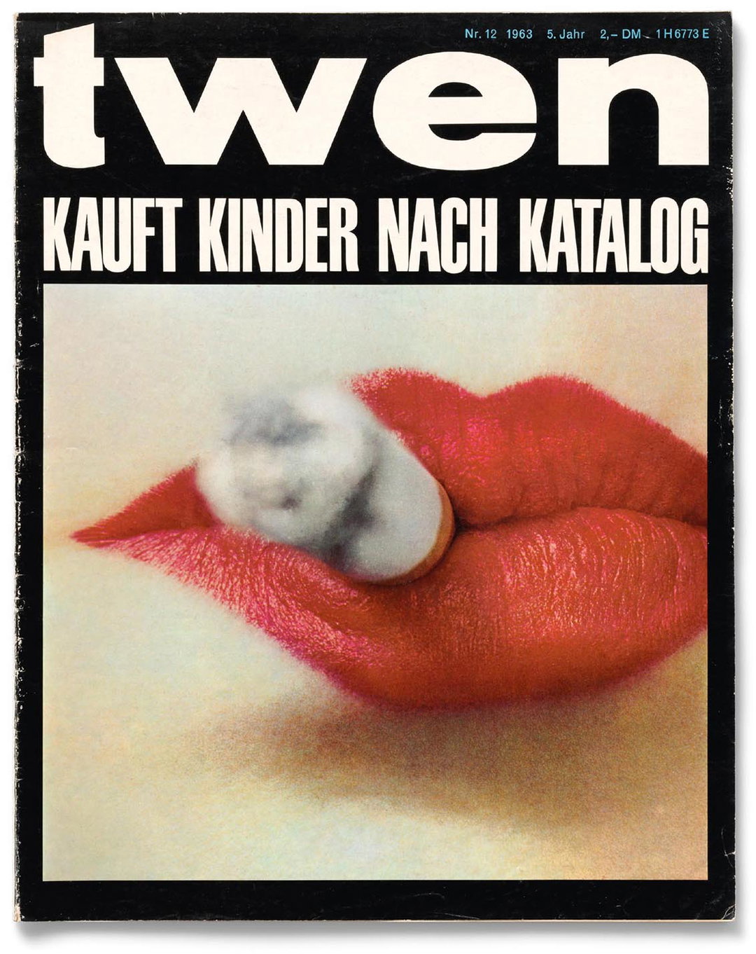
twen 12, 1963
Photography: Irving Penn
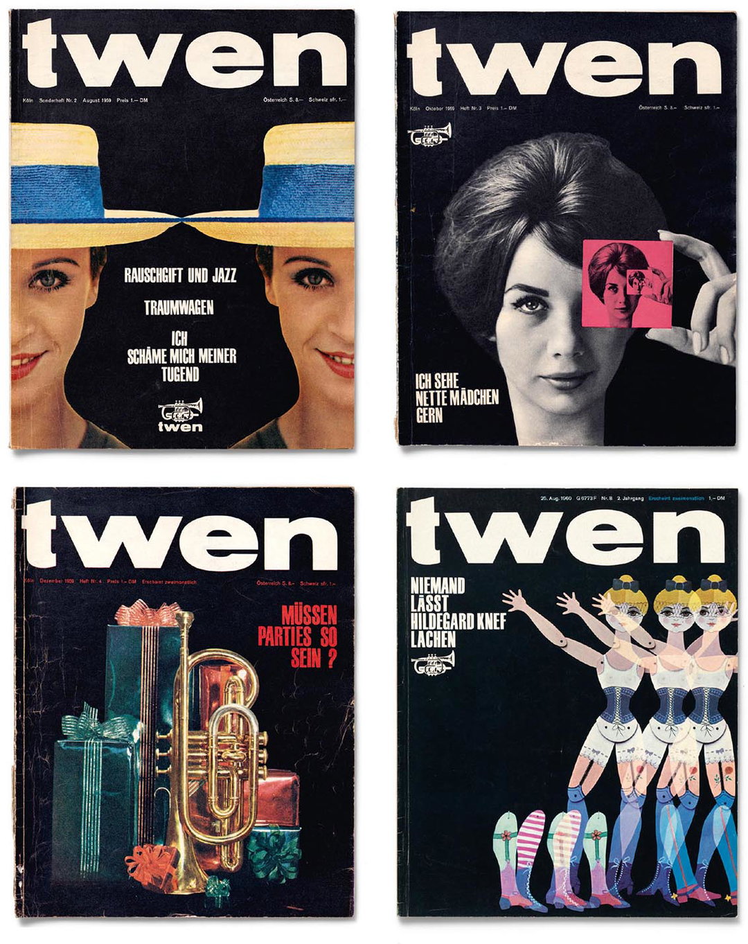
twen 6, 1962, photography: Nicolas Tikhomiroff
twen 9,1964, photography: Willy Rizzo
twen 11, 1962, photography: Jeanloup Sieff
twen 4,1965, photography: Roger Fritz
twen 7, 1962, photography: Charlotte March
twen 5, 1961
Exhibitions must have – quite literally – a roof. Petra Hesse (Cologne Museum of Applied Arts) and Michael Buhrs (Villa Stuck, Munich) are providing a temporary home for our idea.
With their spontaneous enthusiasm for our plans, their dedication and their support, they have not only helped a great designer to the late, yet well-deserved, honour of being represented in a museum: they have also written a piece of design history. With the exhibition and the accompanying bilingual book, Willy Fleckhaus finally finds his place next to international greats such as Alexey Brodovitch, Alexander Liberman or Henry Wolf. Therefore, special thanks are due to Petra Hesse and Michael Buhrs and to the teams around Tobias Wüstenbecker (Cologne) and Roland Wenninger (Munich). In times of tight budgets, implementing such a major project is not a matter of course.
"His ideas on paper may have become a bit yellowed over time, but they remain timeless nonetheless, with their finesse and subliminal ethics."
– Michael Koetzle and Carsten Wolff
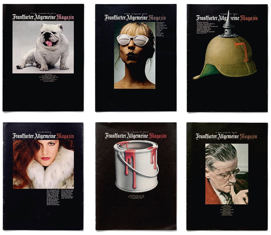
Frankfurter Allgemeine Magazin 133, 1959, Photography:Pete Dine
Frankfurter Allgemeine Magazin 38, 1980, Photography:Tassilo Trost
Frankfurter Allgemeine Magazin 129, 1982, Photography: Detlef Odenhausen
Frankfurter Allgemeine Magazin 132, 1982, Illustration: Peter Krämer
Frankfurter Allgemeine Magazin 81, 1981, Illustration: Bernd Speckin
Frankfurter Allgemeine Magazin 120, 1982 Photography: Gisèle Freund
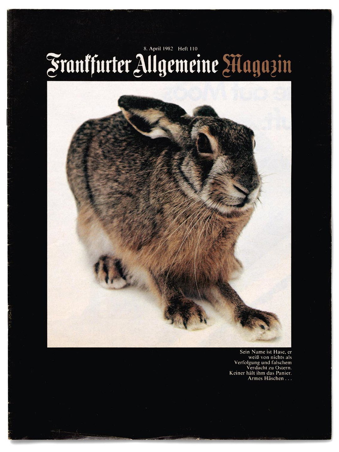
Frankfurter Allgemeine Magazin 110, 1982
Photography: Pete Dine
The “morality of objects” is a phrase regularly cited in the context of Ulm or the Ulm School of Design. A devout Catholic, dedicated pacifist and European, Willy Fleckhaus was also guided by morality. While still alive, he was regarded as “Germany’s most expensive pencil”. But this does not preclude that the books, book series and the magazines he designed wanted to be more than just particularly beautiful, unique or modern – eye-catching designs defined by a craft that loves to break rules. There were always values, too: enlightenment, humanism, peace and European understanding were important to Fleckhaus (just read his early articles), running, not always visible but certainly perceptible, like a common thread through the decades of his work.
Doubtless, these values were the echo of a war that had deprived Fleckhaus – just like it had Otl Aicher – of his youth and that had fundamentally shaped his thinking and acting. Therefore, messages were important to him and he wanted to see them mirrored in a design that was as attractive as it was clear and bold. His ideas on paper may have become a bit yellowed over time, but they remain timeless nonetheless, with their finesse and subliminal ethics.
The book Design, Revolt, Rainbow can be purchased here. The exhibition at Villa Stuck, Munich runs until 10 September 2017.
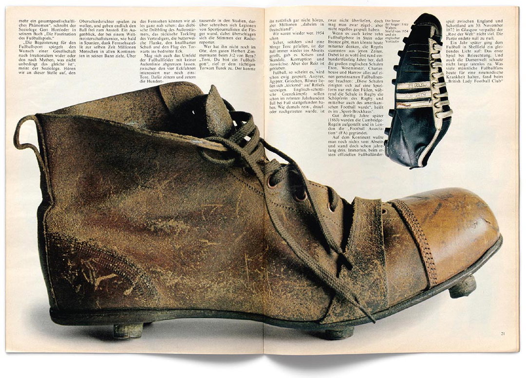
Frankfurter Allgemeine Magazin 118, 1982
Photography: Hans-Georg Pospischil
Text: Rolf Heggen
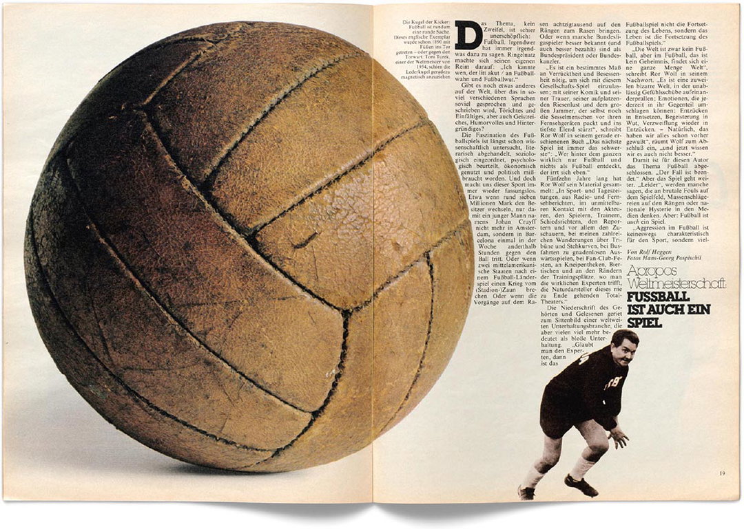
Frankfurter Allgemeine Magazin 118, 1982
Photography: Hans-Georg Pospischil
Text: Rolf Heggen
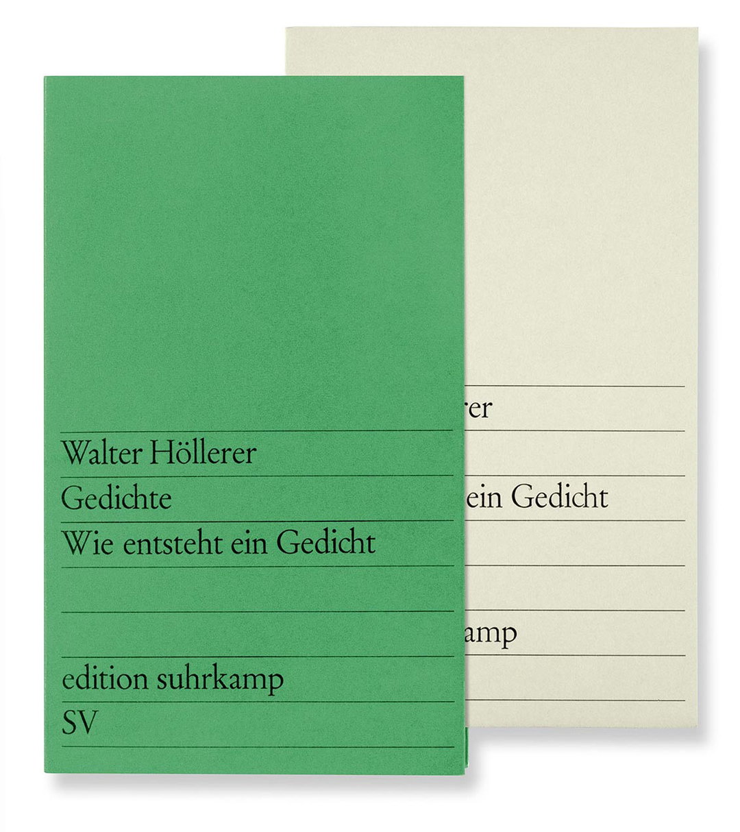
Edition Suhrkamp, 1964
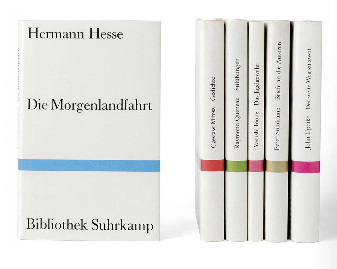
Bibliothek Suhrkamp, 1959
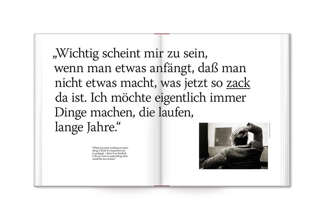
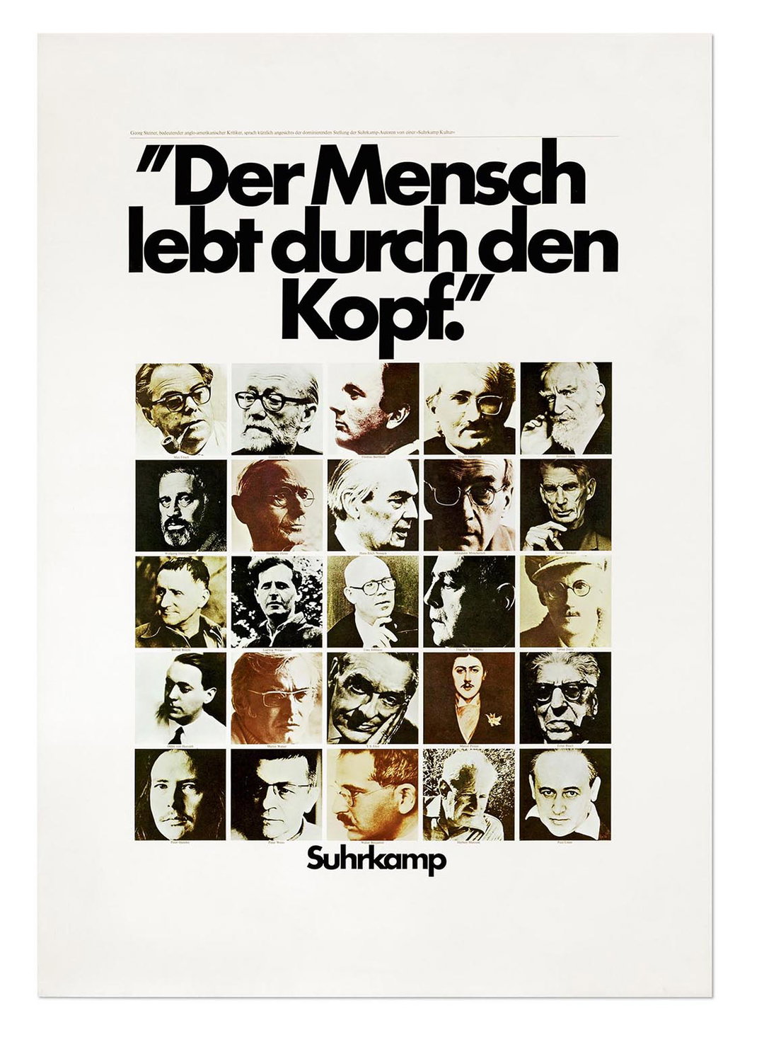
Suhrkamp Poster, 1973
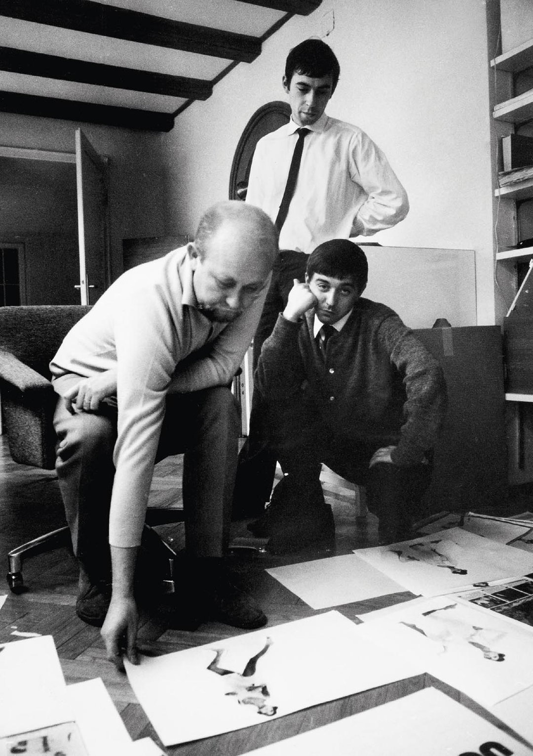
Willy Fleckhaus, Hersteller Scharlemann and Christian Diener about 1964


