- Words
- Rebecca Fulleylove
- —
- Date
- 7 July 2016
- Tags
Ben Leonard celebrates the digital and the analogue throughout his design work
Share
Share
London-based graphic designer Ben Leonard has just graduated from London College of Communication and is interested in print, digital, identity and type design. His work has a clean, fresh aesthetic and his in-depth approach to each project really impressed us.

Tim Bowditch: Ben Leonard
A stand-out project is his digital typeface Fraction Mono, his final year project in which he developed the face into three different weights and then translated the whole thing into 270 letterpress letters to print with. It’s one of Ben’s favourite projects too: “I went from research to prototypes in a few days, spent a few weeks refining, moved onto producing the letter blocks, then actually printed with them. I rarely get sentimental about anything I work on, but the physical artefacts feel precious to me,” he says.
Ben initially wanted to study photography but ended up switching while on his foundation year. “That’s one thing this foundation is really good for: testing out your interests in quick succession.” The designer’s time at LCC didn’t start off as smoothly as possible: “I didn’t really push myself in first year and was a bit too lazy. There was no dedicated studio space either meaning everyone worked independently, so you never saw anyone else’s work prior to hand-in day,” he explains. Yet after a year of interning and being surrounded by working designers, it sparked Ben’s drive and he was ready to work on his own design again in third year. “I felt a clarity in direction that I was missing prior to the year in industry.”
This clarity is something his tutors encouraged him to work on with regards to the accessibility of his projects. “I learned the work should speak for itself – things that make sense in my own head don’t necessarily do so to other people,” says Ben. Working with his fellow students brought about friendly competition between them all but his peers also provided guidance: “It was really nice to have a core group of people who I trusted to give me honest advice.”
Ben describes his style and approach as a blend of the digital and traditional and he’s constantly trying to balance the two in ways that are more interesting that just focusing on one. “I’m inspired by designers like Eric Hu, who isn’t just designing for web as an afterthought but treating it like its own medium, with its own virtues,” he says. “He described the web as being in its adolescence and that ‘with every new website or digital product that gets produced, a foundation of not only aesthetics but also value is being laid out for the next generation’ – that’s an exciting premise and something I’d like to to be a part of.” Ben hopes to explore this further now he’s graduated and thanks to his time at LCC he’s leaving with a renewed appreciation for core graphic design skills from his final year.
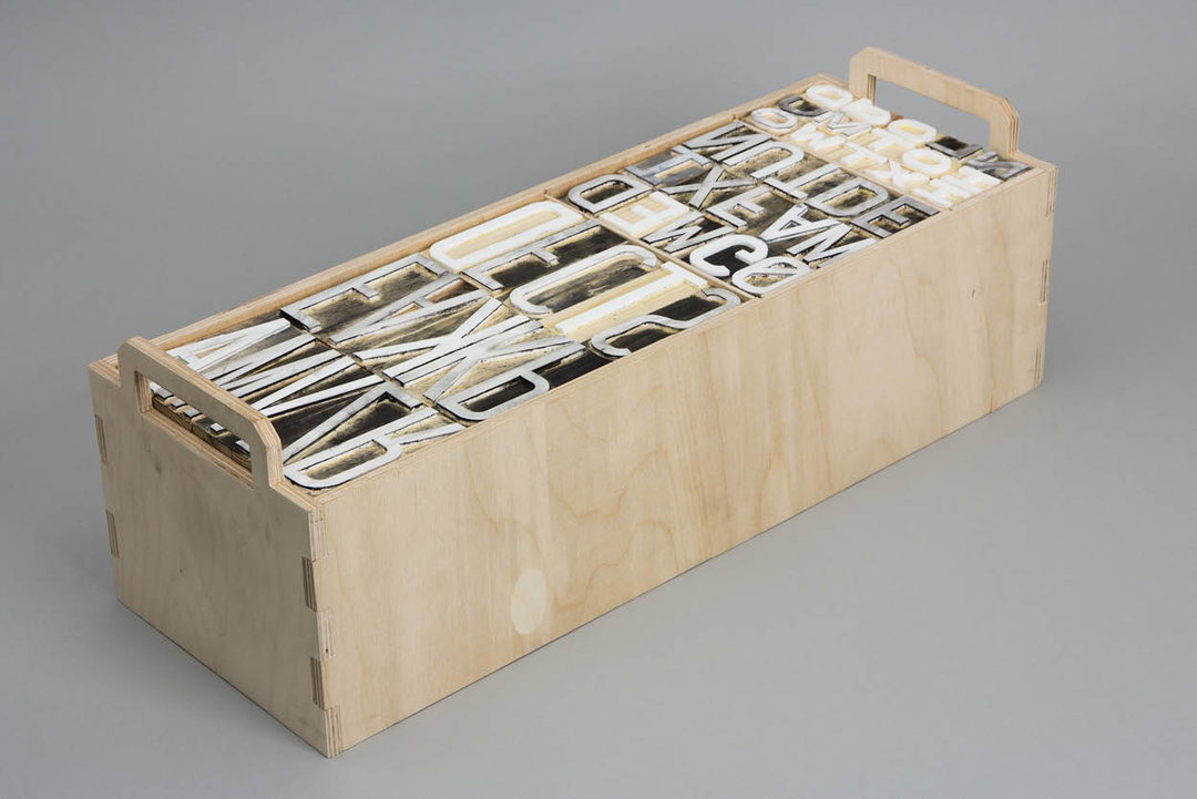
Ben Leonard: Fraction Mono
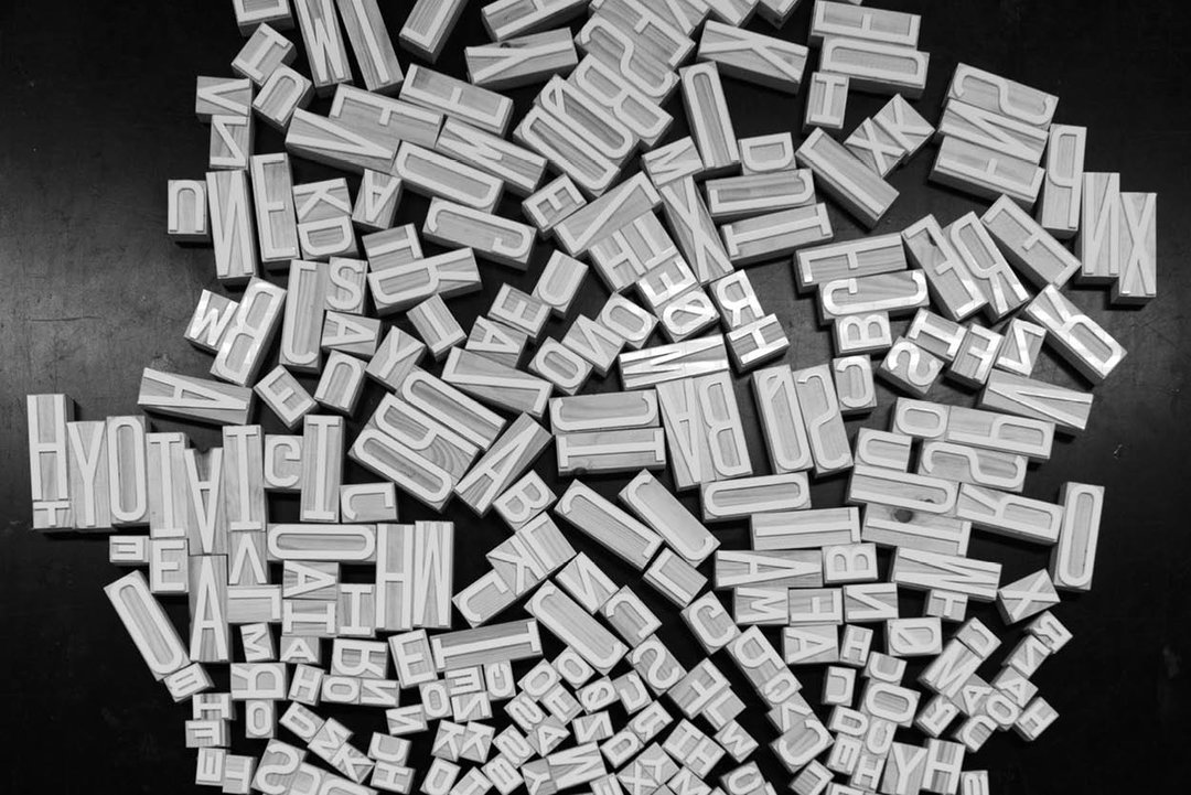
Ben Leonard: Fraction Mono
Ben Leonard: Fraction Mono
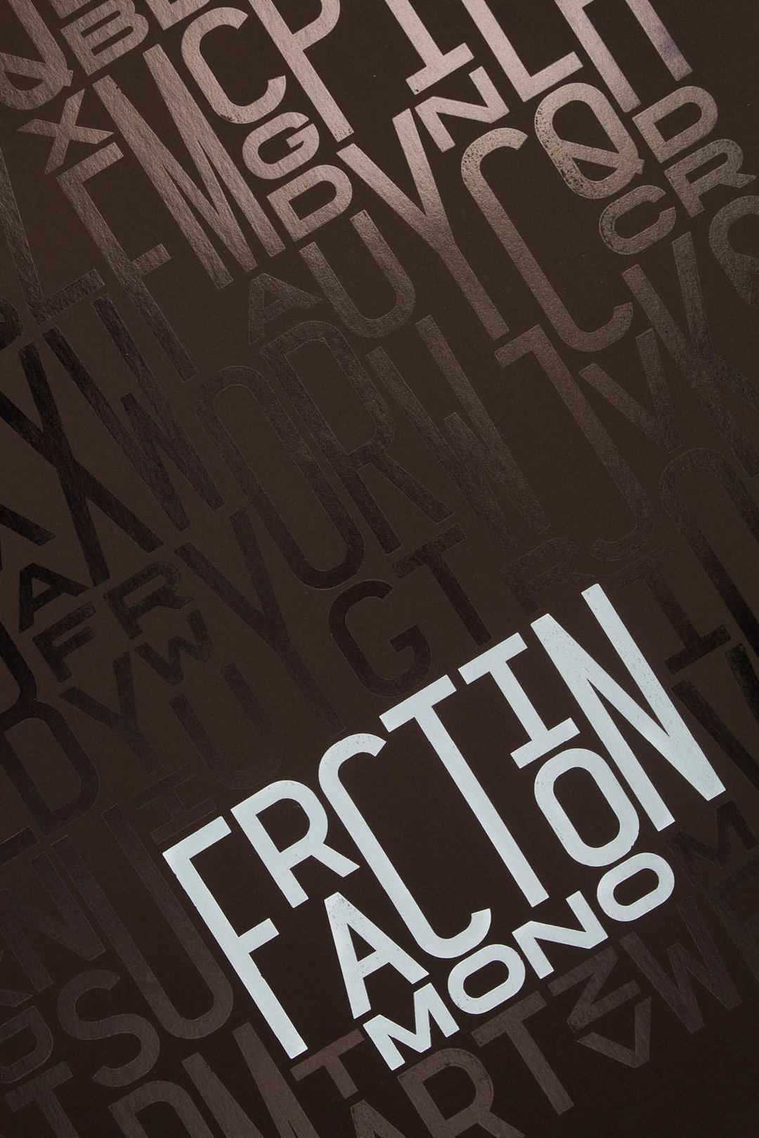
Ben Leonard: Fraction Mono
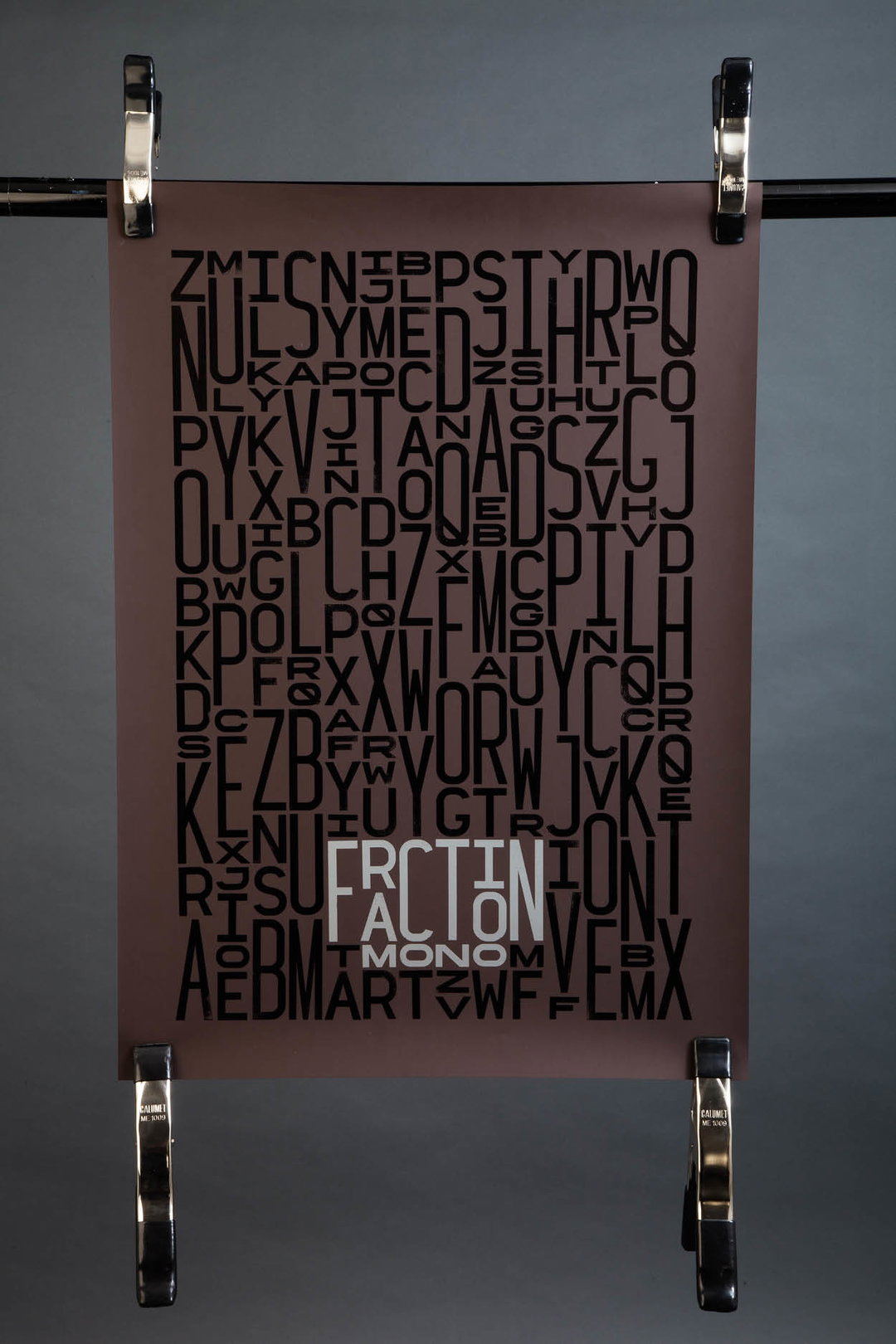
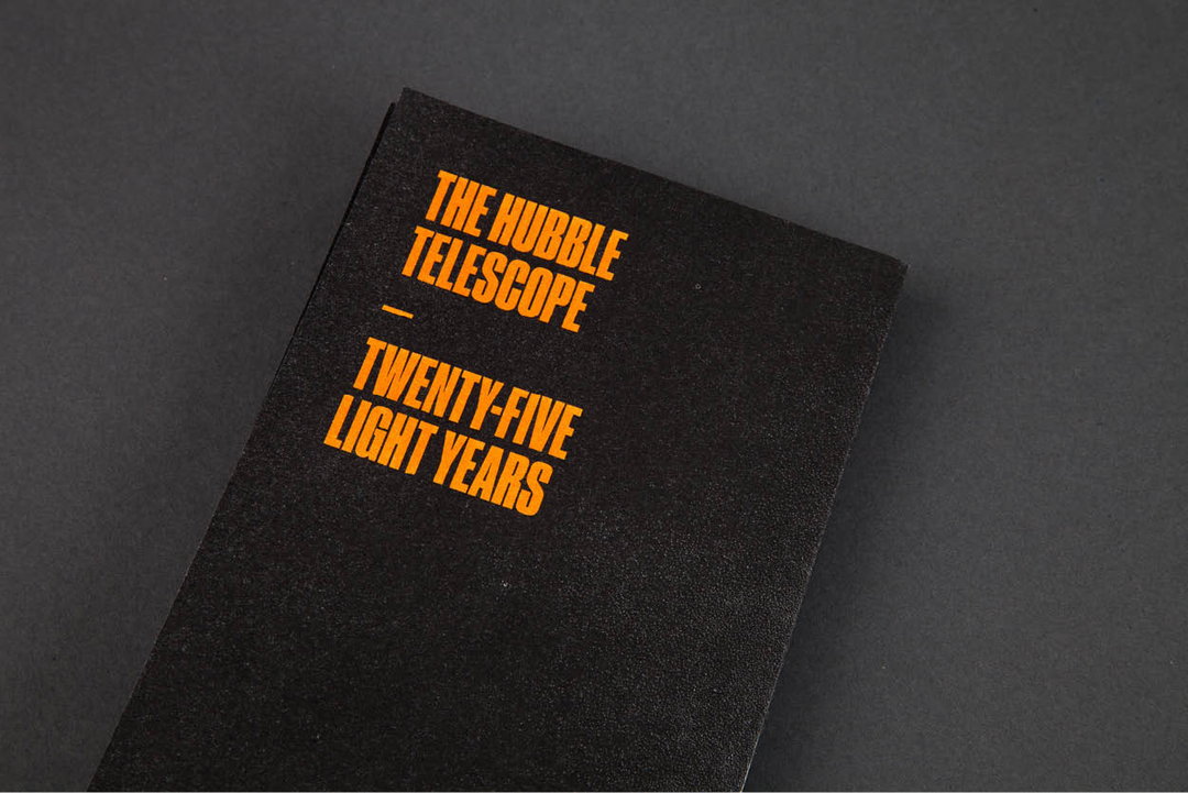
Ben Leonard: Hubble Telescope: 25 Light Years
Ben Leonard: Hubble Telescope: 25 Light Years
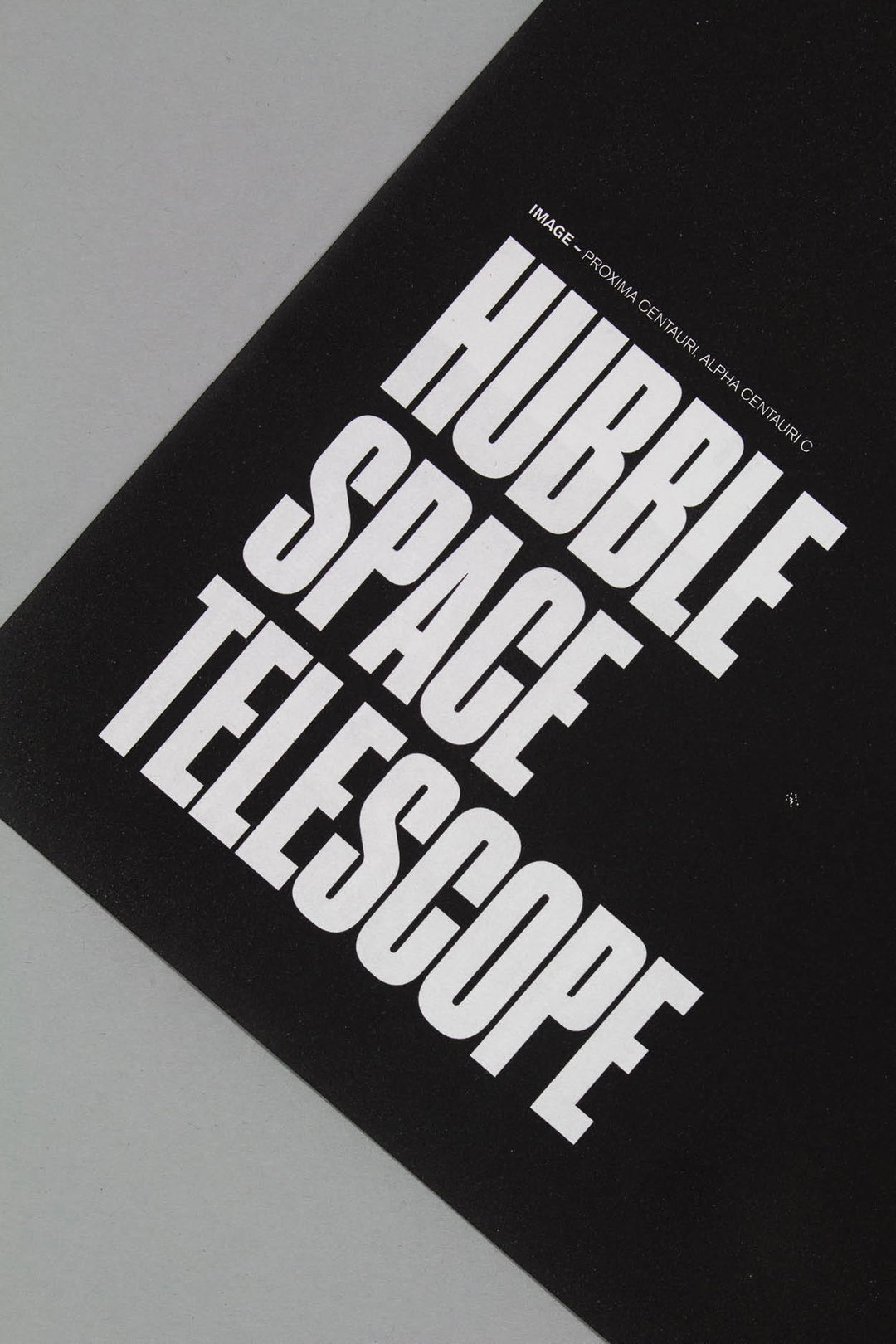
Ben Leonard: Hubble Telescope: 25 Light Years
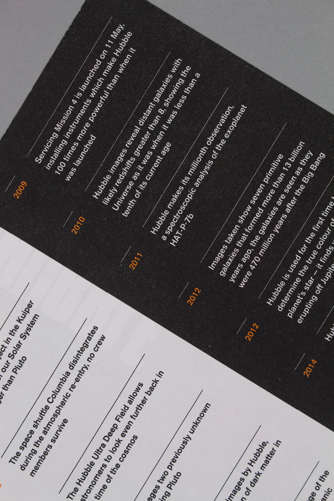
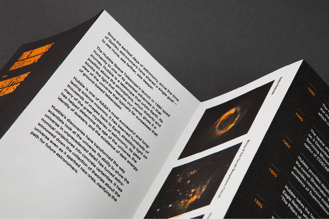
Ben Leonard: Hubble Telescope: 25 Light Years
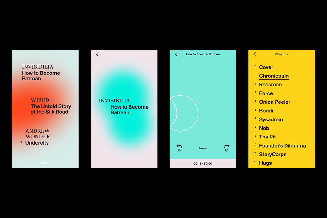
Ben Leonard: Unseen
G . F Smith
It’s Nice That’s Graduates 2016 is kindly supported by G . F Smith, whose gorgeous range of papers and services can be just the thing for new and soon-to-be creative grads. The 130-year-old paper company has a long history of working with designers and artists at all stages of their careers, with its high-quality and innovative paper products offering a huge range of creative possibilities.
Share Article
Further Info
About the Author
—
Rebecca Fulleylove is a freelance writer and editor specialising in art, design and culture. She is also senior writer at Creative Review, having previously worked at Elephant, Google Arts & Culture, and It’s Nice That.