- Words
- Lucy Bourton
- —
- Date
- 13 December 2018
- Tags
Sophy Hollington on learning to be creatively fulfilled while earning a living in 2018
Share
Share
In partnership with

Google Design’s goal is to connect, support, and inspire designers and design technologists.
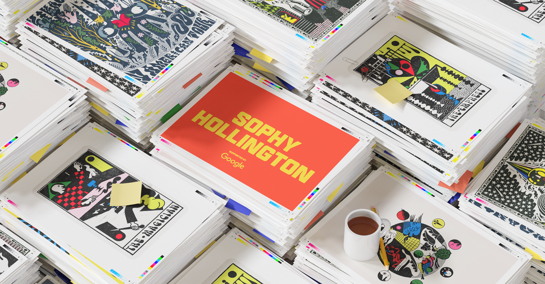
During parts of 2018 it almost felt like you couldn’t look at a magazine, bookshelf or website without spotting the work of illustrator Sophy Hollington. Her body of work — one that’s elevated the art of linocutting beyond hazy memories of art classes into a sought after stylistic medium — has the ability to transform any written piece it often seems to accompany. This is down to Sophy’s illustrative talents of course, but also her consideration of the task at hand, steeping her process in research, thematic influences and a genuine interest of exploring what visual imagery can do.
As a result it’s no wonder that Sophy’s growing list of collaborators includes The New Yorker, The New York Times, The Wall Street Journal, Migrant Journal, Rough Trade Books and bands too, creating work for The National, Kikagaku Moyo, Django Django and the brilliantly named Pigs Pigs Pigs Pigs Pigs Pigs Pigs.
It’s a year that’s seen Sophy be incredibly busy, move to the seaside, learn what projects she should put her heart into and understand her own practice too. Below, we chat to the illustrator about her 2018.
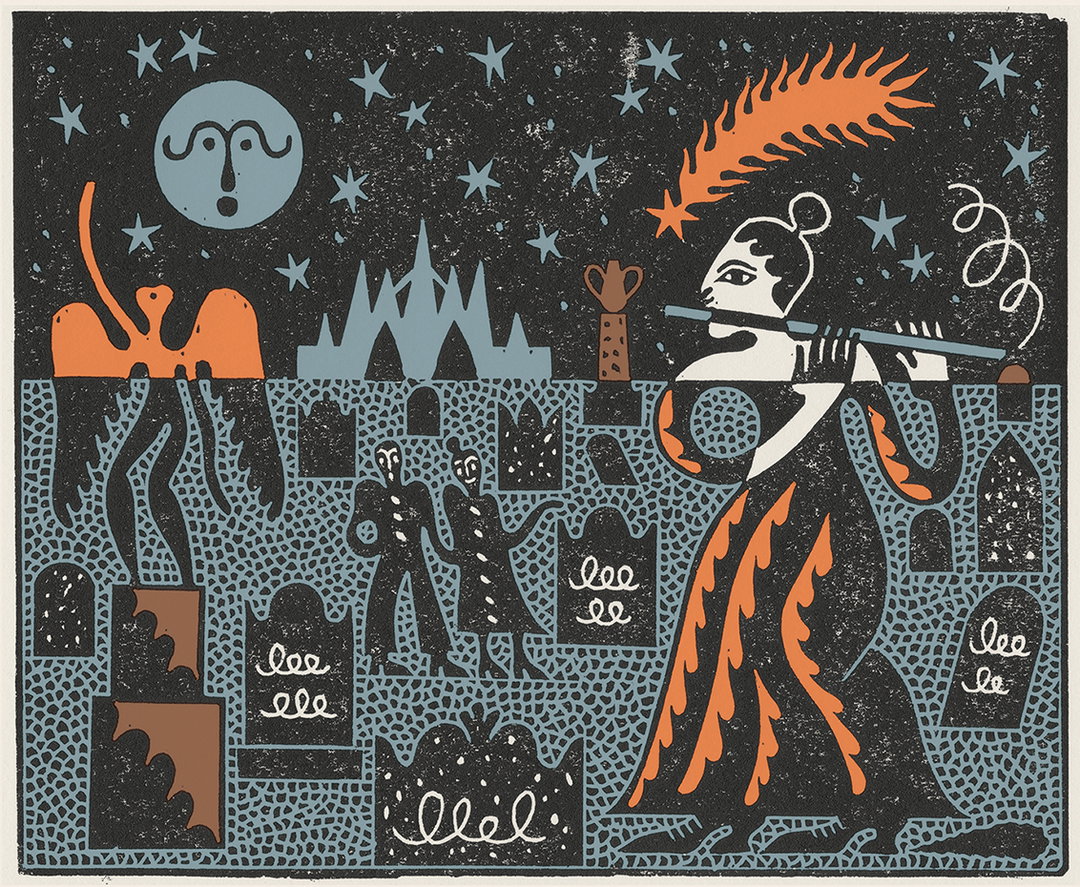
Sophy Hollington and David Keenan: Green Wood for The New Yorker
It’s Nice That: What is your personal creative highlight of the year?
Sophy Hollington: Working on the tarot deck I created with the writer David Keenan.
INT: Can you tell us a little about that process and how the reaction has been?
SH: David wrote an experimental novella; To Run Wild In It (also published by Rough Trade Books) which was loosely structured around the cards of a tarot deck, with each chapter being named after one. I then used these chapters as a genesis for the artwork of their namesake card and the result was the Autonomic Tarot. David used Alistair Crowley’s Thoth deck as his main point of reference when writing his book, so I immersed myself in the multitude of historic meanings of each card as well as David’s text to conjure up my own artwork. Every time I finished a card I’d send it to David and he’d come back with a really in-depth interpretation of the art, picking out things I’d not even realised were there. It felt so heavy and totally enlightened me to the numinous power of the image.
I wasn’t clued up about tarot or it’s users before starting this, so it’s been wonderful to see our deck embraced by that community. I’ve heard it really works.
Sophy Hollington and David Keenan: The Run Wild In It: A Handbook of Automatic Tarot
Sophy Hollington and David Keenan: The Run Wild In It: A Handbook of Automatic Tarot
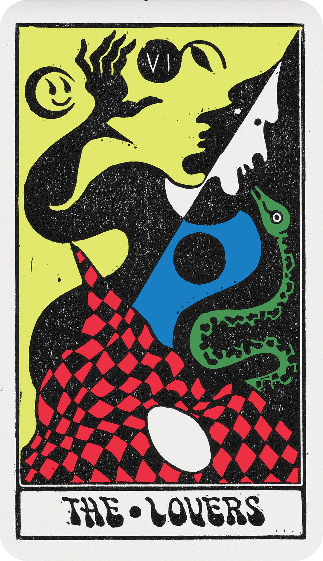
Sophy Hollington and David Keenan: The Run Wild In It: A Handbook of Automatic Tarot
Sophy Hollington and David Keenan: The Run Wild In It: A Handbook of Automatic Tarot
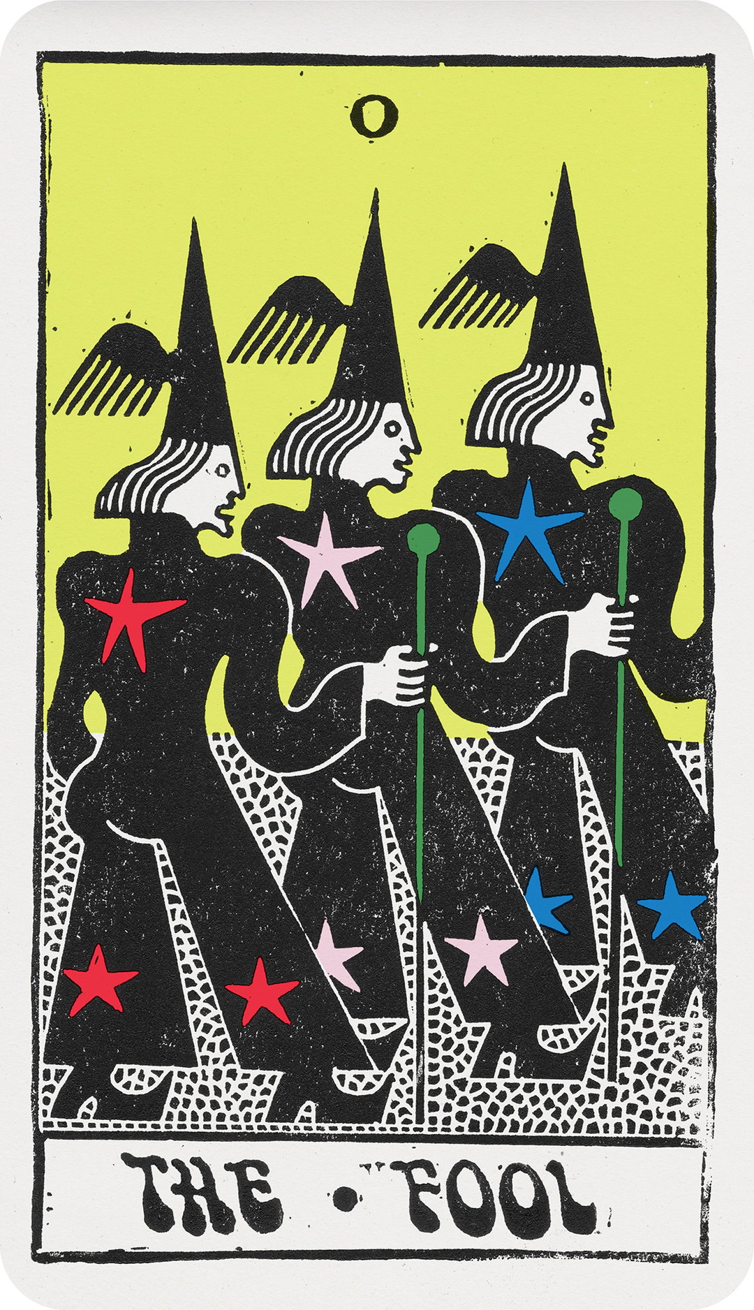
Sophy Hollington and David Keenan: The Run Wild In It: A Handbook of Automatic Tarot
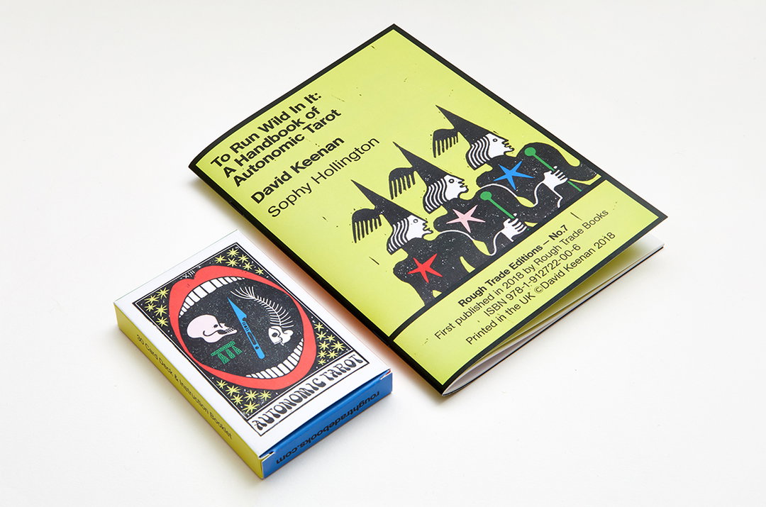
Sophy Hollington and David Keenan: The Run Wild In It: A Handbook of Automatic Tarot
INT: You also recently moved to Brighton from London this year — has the move to the seaside had an effect on your practice?
SH: It’s made life in general so much easier and enjoyable that I suppose it’s only natural this would effect my work positively. I find I’m more productive and perhaps efficient, so I also have more time to enjoy some other things. I got a puppy as soon as I moved and she doesn’t let me stay in the studio past 7pm.
INT: What was your global lowlight of the year?
SH: Finding out about autonomous killer drones.
INT: How do you define a successful creative year?
SH: I think if I’m able to make a living and remain creatively fulfilled, that’s just perfect.
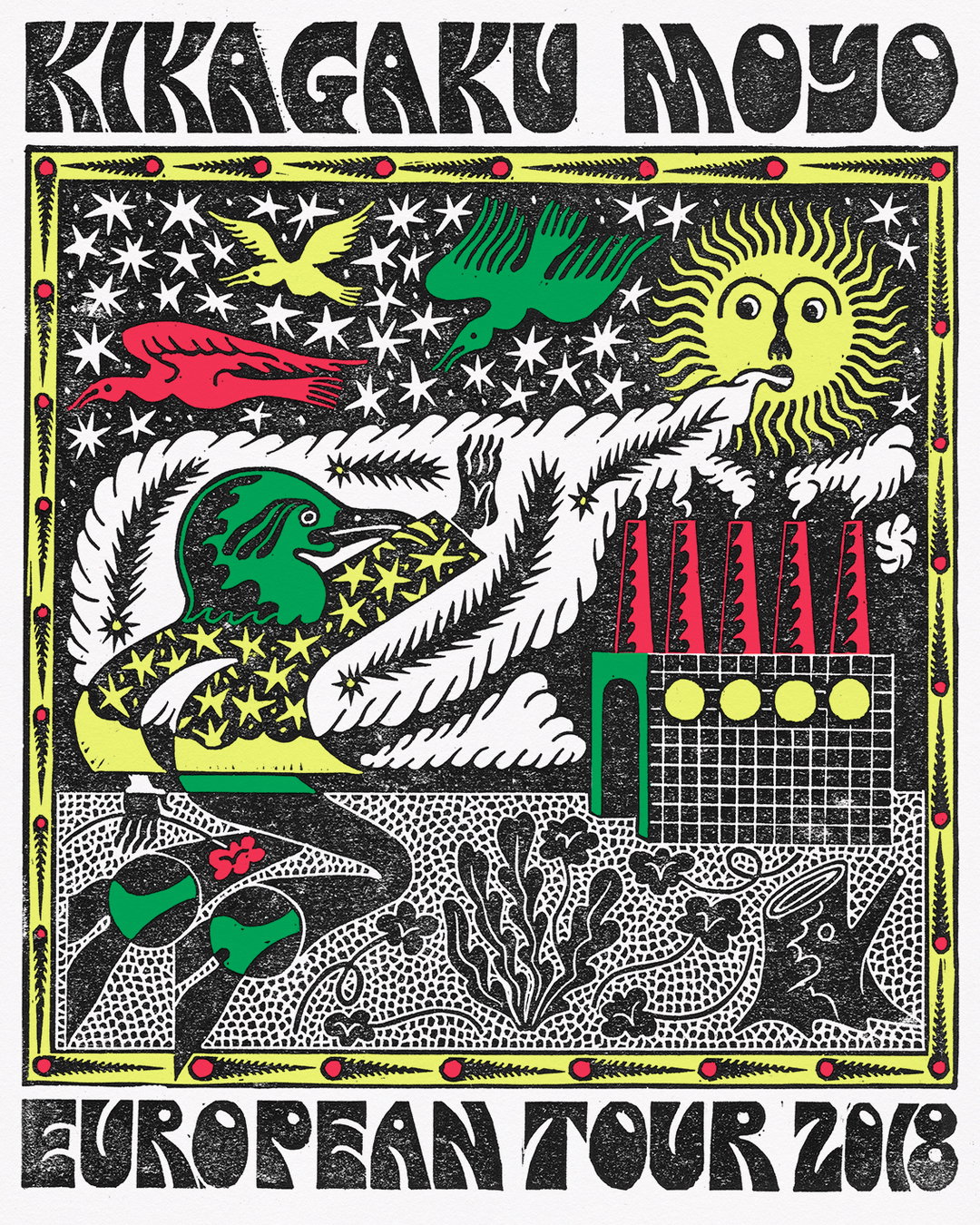
Sophy Hollington: Kikagaku Moyo
INT: Your illustration process is a delicate one that must take time. As things appear to have been really busy for you this year, how have you juggled it all!?
The linocutting process does take time, in the sense that there are tangible steps you have to go through to make a finished image, but! I think the parameters that I work with actually help focus my decision making, which can be the most time-consuming part of making work. My clients are usually really sympathetic to the process I’m using too, so don’t demand lots of revisions to finals which can be the case with those who work digitally. I’m kind of amazed it’s turned out to be an efficient way of working myself, to be honest!
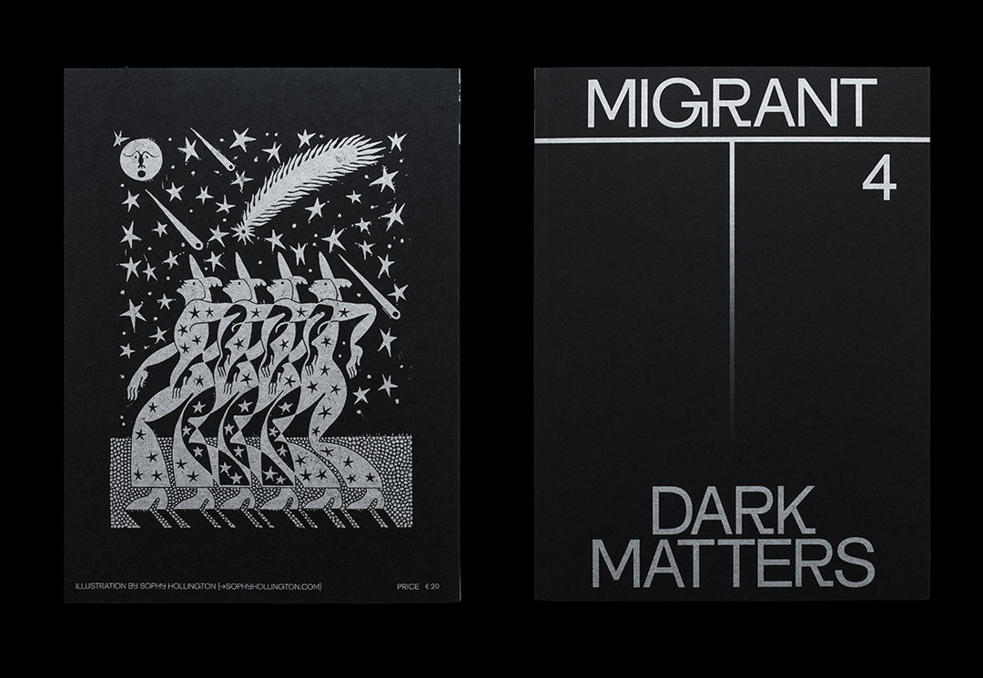
Sophy Hollington: Migrant Journal
INT: The majority of your work seems to be commissioned work. What do you think makes a really good brief and what have some of your favourites been this year?
SH: I don’t think there’s a template for a good brief but, from my perspective, there are some which are particularly fun to work through. Those with themes that I find interesting and are perhaps a bit more open to interpretation are always appreciated. Saying that, a recent piece I really enjoyed making for The New York Times’ kid’s section was quite specific visually, but open in terms of content. They asked for a typographic ‘comic’ about the scariest thing that happened to me as a child.
INT: What’s the most important thing you’ve learned in 2018?
SH: That work that feels like “personal work” and is made on your terms can be an end in itself, not just a way of getting future commissions. I’d like to spend a good chunk of 2019 exploring this and investing in my own self-lead projects.
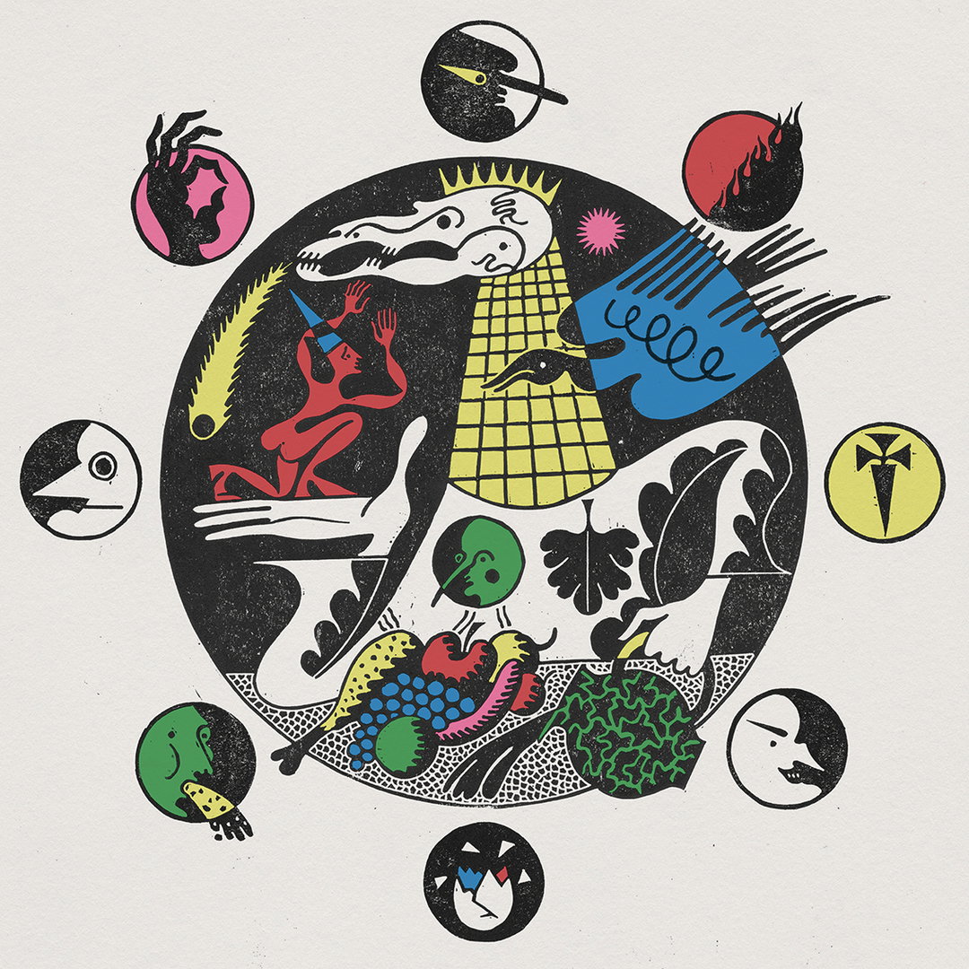
Sophy Hollington: King of Cowards
Sophy Hollington: The Future of Everything for The Wall Street Journal
Sophy Hollington: Kikagaku Moyo
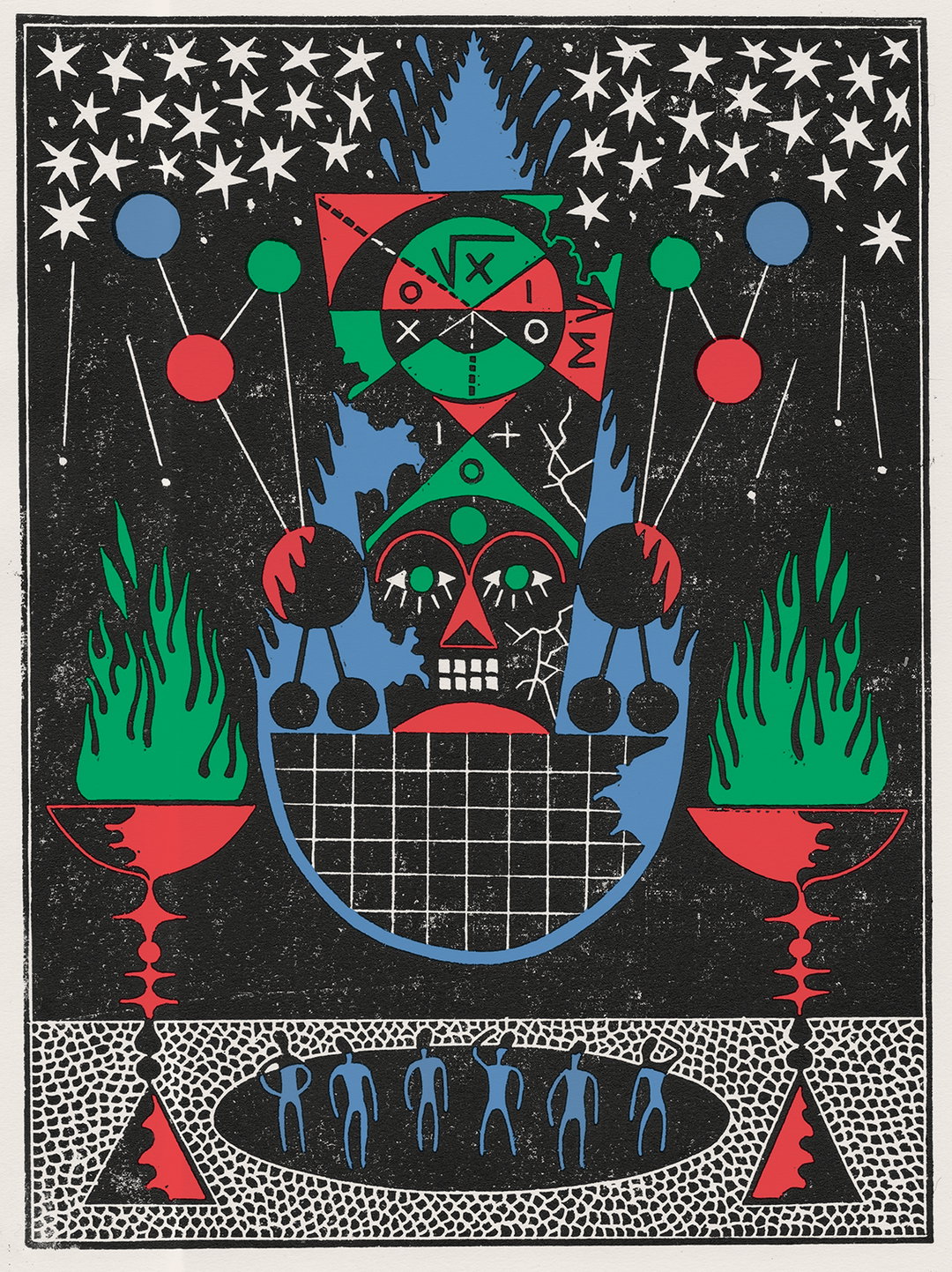
Sophy Hollington: The Future of Everything for The Wall Street Journal
Sophy Hollington: Kikagaku Moyo
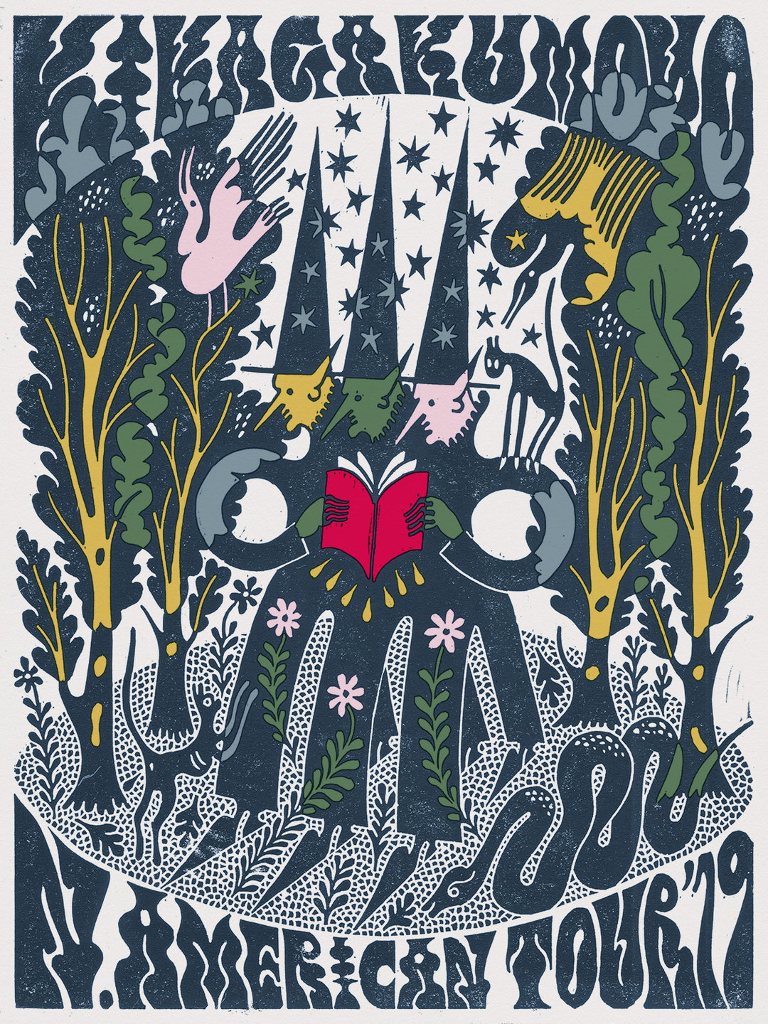
Sophy Hollington: Kikagaku Moyo
INT: October, and particularly Halloween, was a hectic period for you! Why do you think your work resonates with that time of year?
SH: Linocutting invites darkness and duality into a piece by its nature. Couple that with my own interest in symbolism, archetypes and the occult and I suppose it makes sense that this is a busy time for me. There’s also something archaic about the process which is in line with the way we traditionally reminisce at this time of year.
INT: What are you looking forward to leaving behind in 2018?
SH: For a long time now I’ve said yes to pretty much everything that’s come my way. I’ve finally learnt that this isn’t conducive to making your best work so I’ll try to be a bit more selective in 2019.
Sophy Hollington: The National
Sophy Hollington: Django Django
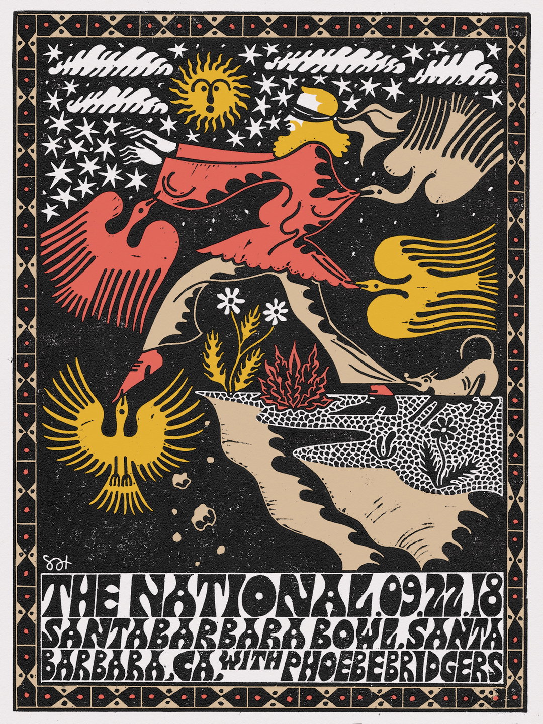
Sophy Hollington: The National
Sophy Hollington: Django Django
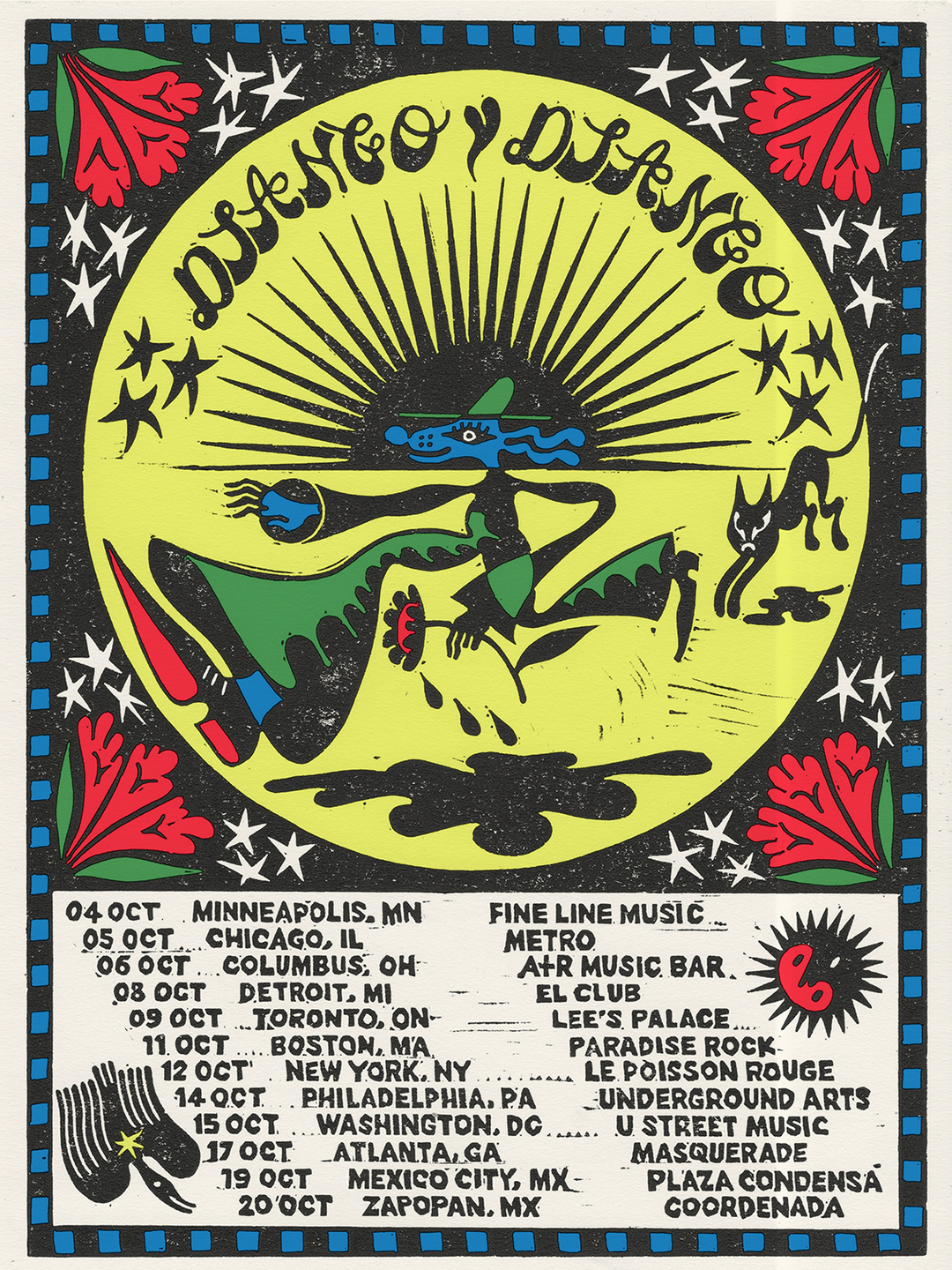
Sophy Hollington: Django Django
Sophy Hollington: Authorship
Sophy Hollington
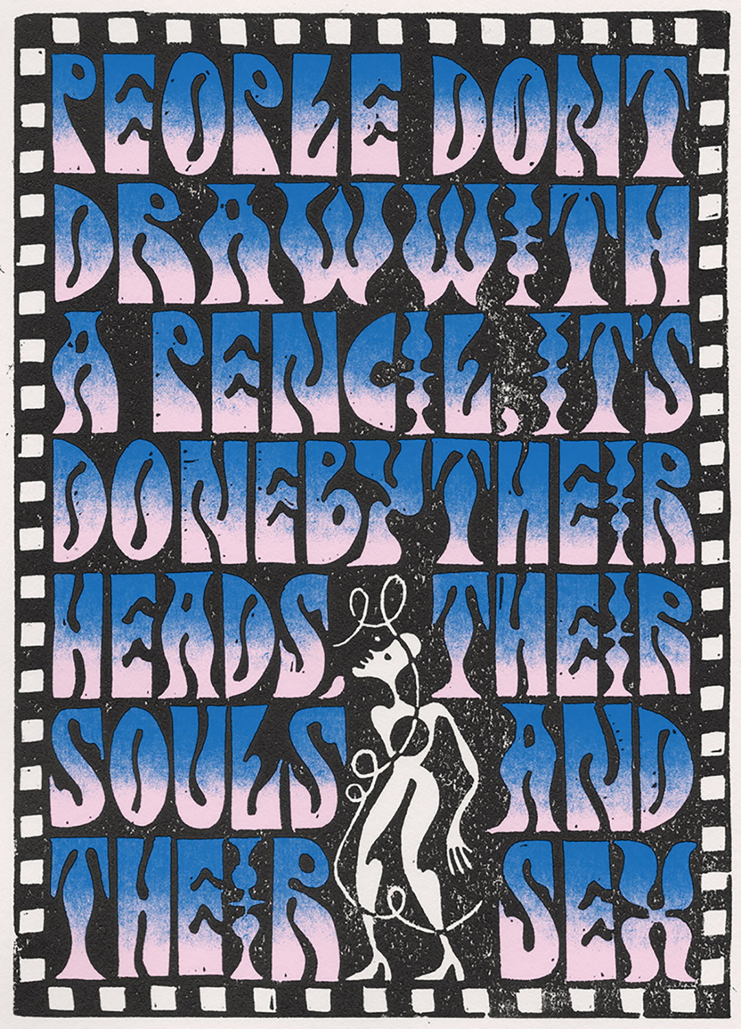
Sophy Hollington: Authorship
Sophy Hollington
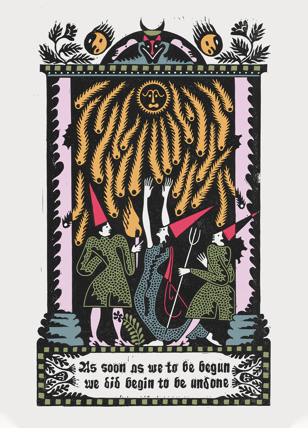
Sophy Hollington
Supported by Google
At Google, we believe that design is critical to product excellence. That’s why we’re proud to support It’s Nice That in its effort to champion a broad and inclusive community of creative makers and thinkers with the annual Review of the Year.
We also believe in fostering design through Material Design, a unified system combining theory, resources, and tools to help designers and engineers craft digital experiences, and through Google Design, a cooperative effort whose mission is to support design and engineering excellence by producing original articles, videos, events, as well as creative and educational partnerships. Sign up for the Google Design Newsletter.
Share Article
Further Info
About the Author
—
Lucy (she/her) was part of the It’s Nice That team from 2016–2025, first joining as a staff writer after graduating from Chelsea College of Art with a degree in Graphic Design Communication, eventually becoming a senior editor on our editorial team, and most recently at Insights, a research-driven department with It’s Nice That.