- Words
- Owen Pritchard
- —
- Date
- 4 January 2016
- Tags
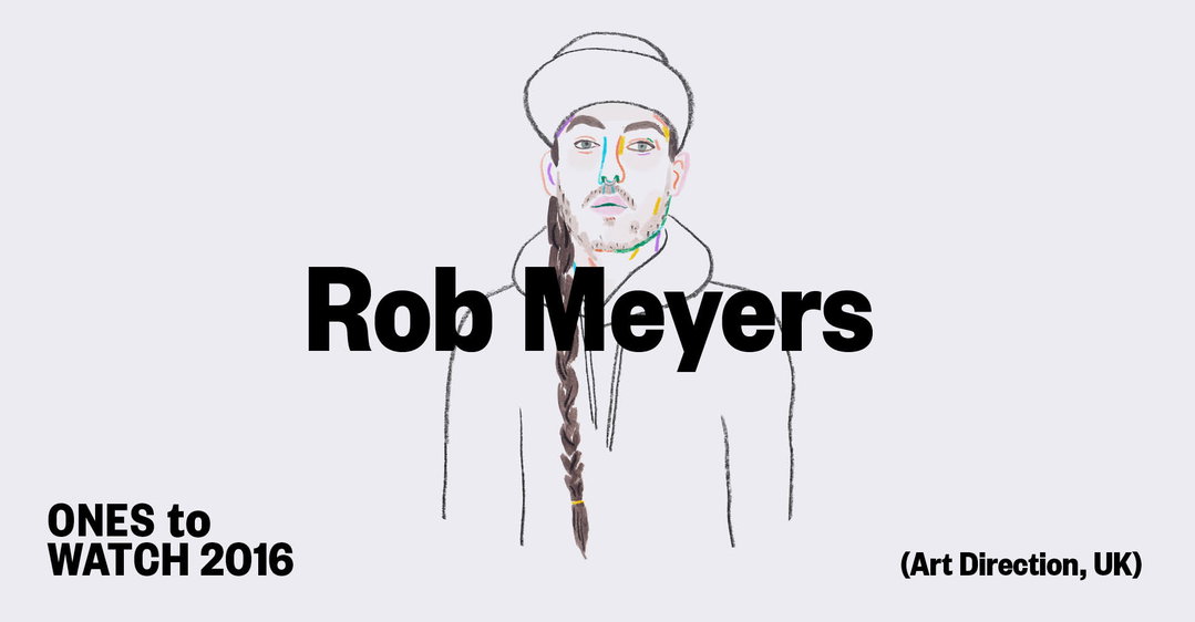
Ones to Watch 2016: Editor of Johnson Magazine, Rob Meyers
Share
Share
Rob Meyers had a sabbatical from his day job as art director of Clash magazine last year while the magazine went on hiatus as it moved publisher. The Yorkshire born art director/creative consultant took the opportunity to launch a project that had been percolating for years in his brain: Johnson – a publication of men’s culture. “It’s about high and low culture and how we really live,” he says.
2016 will see the Clash relaunch with issue 100 and then continue with a bimonthly run. In April issue two of Johnson will be published. “I think the biggest challenge of 2016 will be fitting everything in,” he says. “I am obsessed with learning and print culture. It never stops.”
Alongside the publications Rob will be delivering a number of projects that he has consulted on with “some very commercial clients.” As ever, he is unable to say which ones, but early next year we can expect a Saul Bass-inspired campaign with French hair product company Kérastase and a special project with MCQ.
Rob Meyers: Johnson
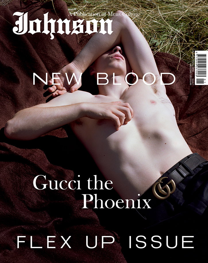
Rob Meyers: Johnson
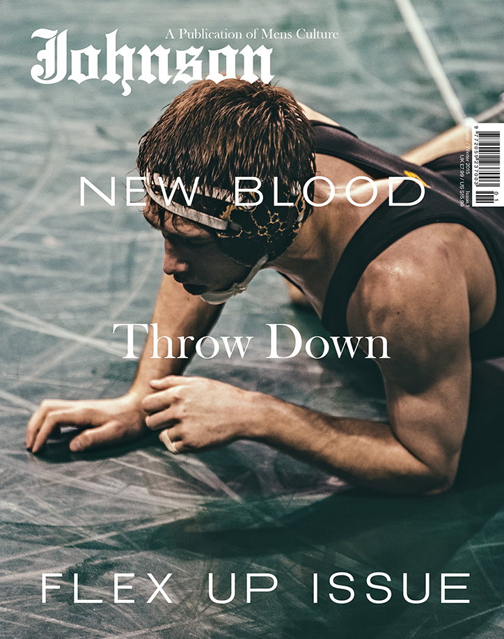
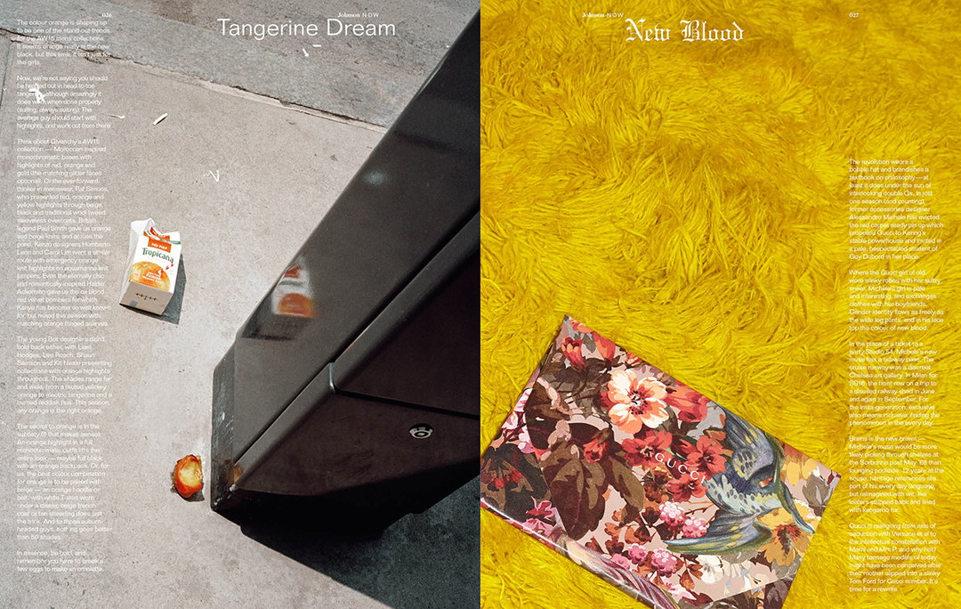
Rob Meyers: Johnson
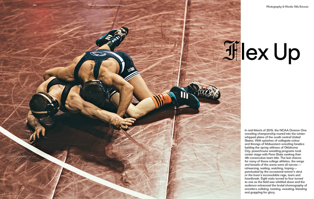
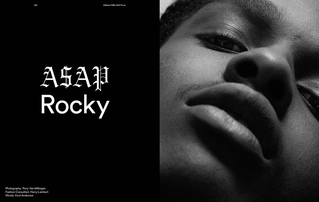
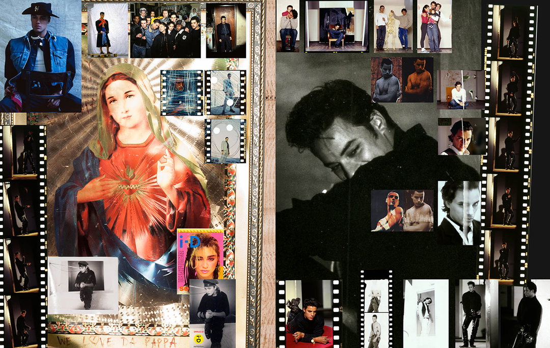
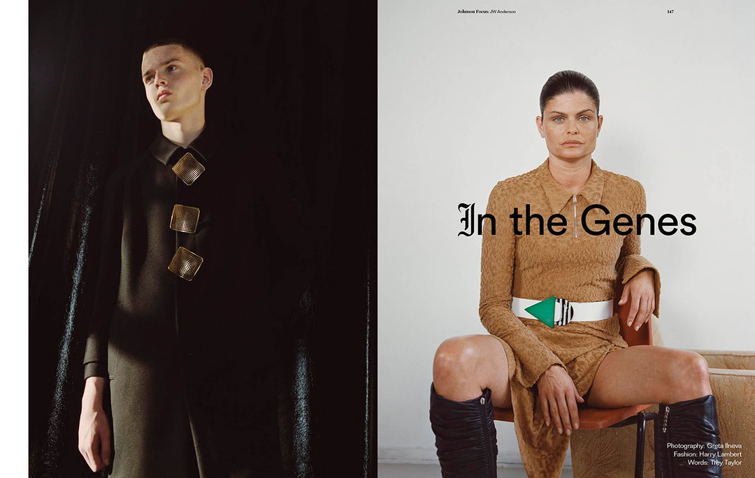
To get inside the mind of the designer you only need to flick through the pages of Johnson. His fascination with drawing parallels between music, fashion, consumer and youth culture is apparent throughout. The design falls somewhere between a fashion magazine and a zine, but there is a tight colour palette and grid that ensures every page communicates clearly and concisely.
“The human connection is key,” he says. “I’m not doing this for any particular scene. I am doing it for the awkward kid like me growing up in Birmingham or Leeds. I want to make a connection with that audience and create something that is a document and a social comment on a particular moment.” A conversation with Rob meanders but never gets dull. He thrives on deconstructing the relationships that have happened in creative scenes throughout history, and with his work he is making those connections in the present, for readers to deconstruct themselves: “This is what I want to do. I bring together things that might appear to be disparate in an honest way.“
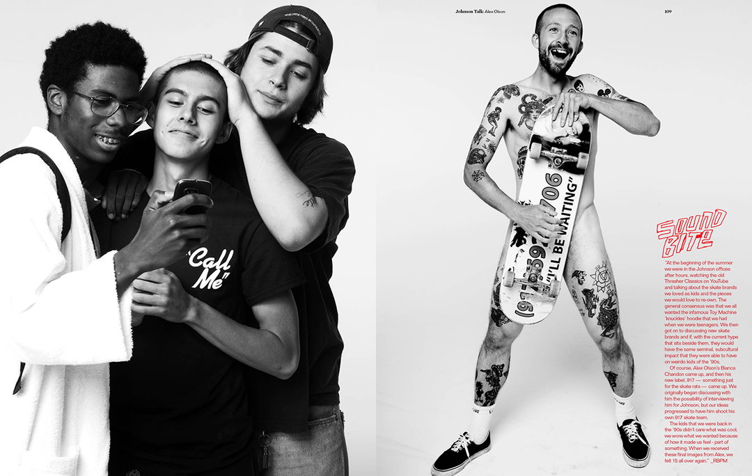
Rob Meyers: Johnson
Rob Meyers: Johnson
Rob Meyers: Johnson
Rob Meyers: Johnson
Rob Meyers: Johnson
Share Article
Further Info
About the Author
—
Owen joined It’s Nice That as Editor in November of 2015 leading and overseeing all editorial content across online, print and the events programme, before leaving in early 2018.