




- Words
- Emily Gosling
- —
- Date
- 4 January 2016
- Tags
Ones to Watch 2016: Design studio Commission
Share
Share
Commission Studio only formed around two years ago, founded by creative directors David McFarline and Christopher Moorby. The pair’s background working for design industry big guns like Spin and Made Thought mean the small studio based in Peckham, south London, has a fine pedigree and an affinity working for fashion clients. This year saw its most high profile project yet: rebranding fashion brand DKNY.
As such, the studio has seen some huge changes. “We’ve doubled in size this year, from three to six, but we don’t want to grow much more for a little while,” says Chris. “David and myself have a good balance between directing and working hands-on on projects ourselves. It’s also a good amount for our project director Grace to manage too. Apart from a few crazy spells this year we’ve managed to produce work we’re really happy with and get out of the door on time!”
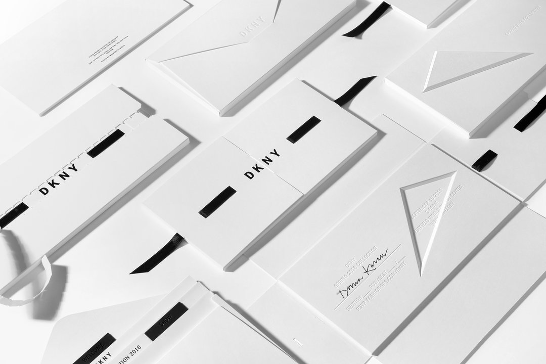
Commission: DKNY
2016 will see the still modest team continue the DKNY work and starting a number of new projects, including a self-initiated number. Chris explains: “We’re launching a ‘publishing’ company of our own very early next year called The Rolling Thunder of Change. We publish items of creative interest, the first being a British-made tote bag, made here in London, and the second, an art monograph with Luke Evans about his Xero project. More products will be launching next year too – next up we’re planning a small range of ceramic homewares.”
Commission: DKNY
Commission: DKNY
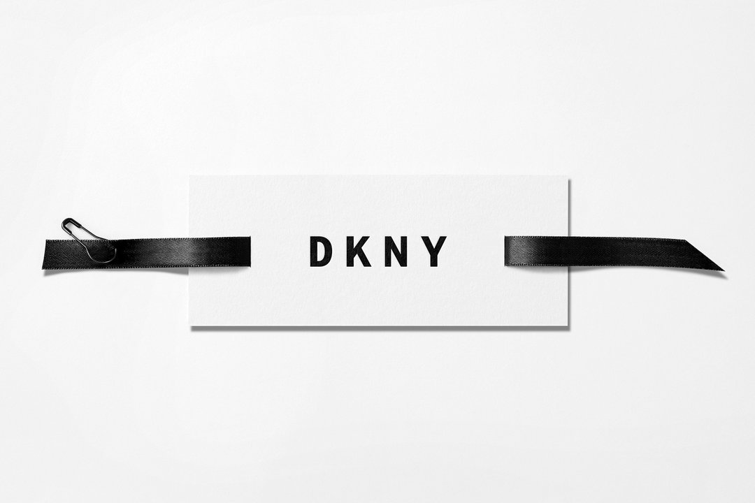
Commission: DKNY
Commission: DKNY
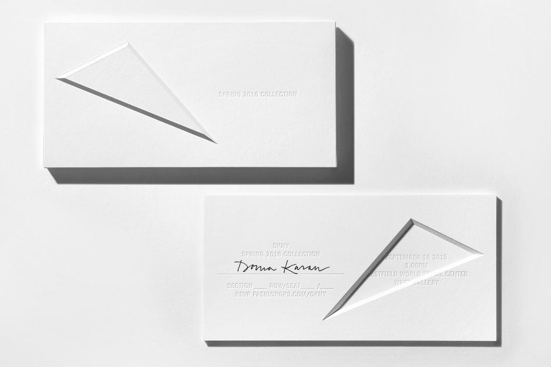
Commission: DKNY
It’s a lot to plan. We speak at the tail end of 2015, a year that’s seen the team’s projects take them to places around the world including Stockholm, New York, and Berlin. Israel and Hungary are on the list for 2016, so it’s a testament to Commissions’s passion for what they do that they make the time for their own creative endeavours on top of client work.
Is there anything these Peckham-based folk can’t do? Well, every studio faces its challenges. Commission reckons that its biggest for 2016 will be "trying to keep everyone happy. And ourselves.” Chin up, Commission, we reckon everything is going to be just fine.
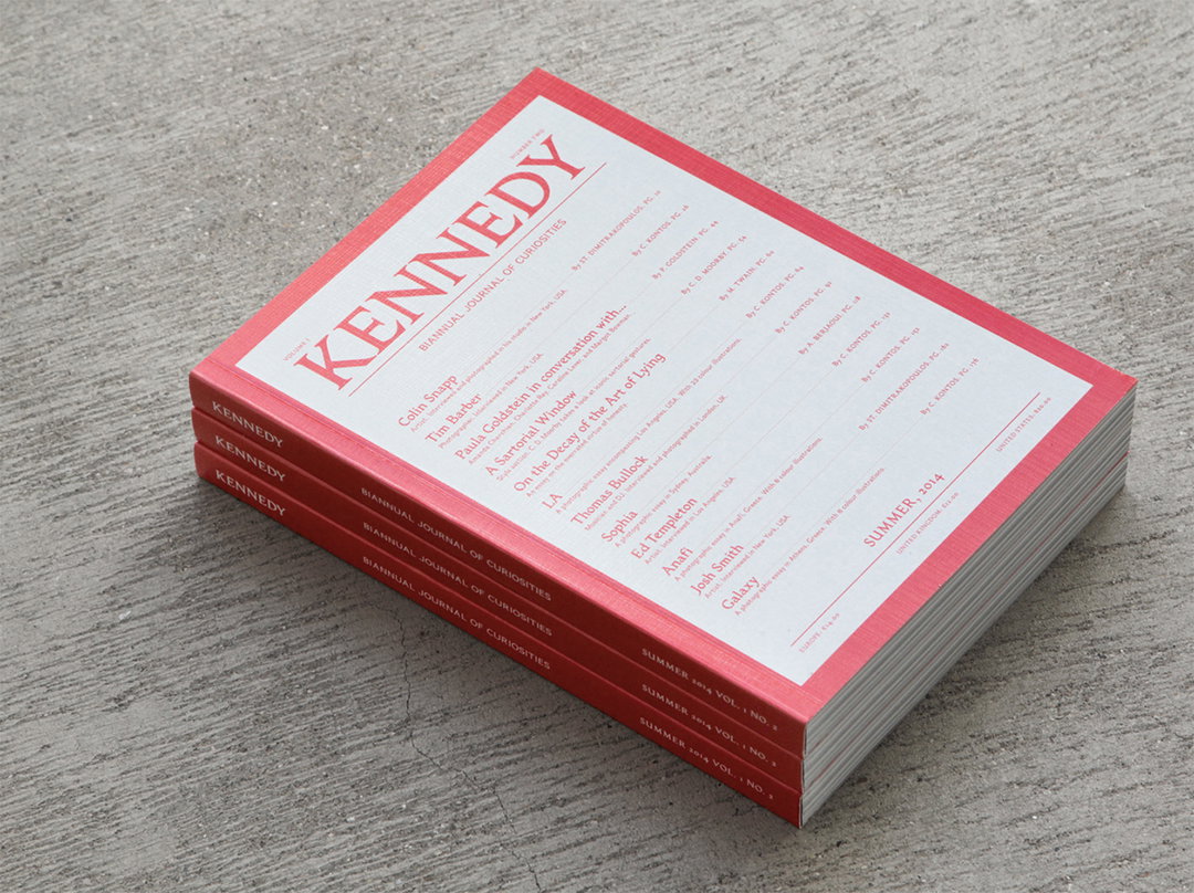
Commission: Kennedy
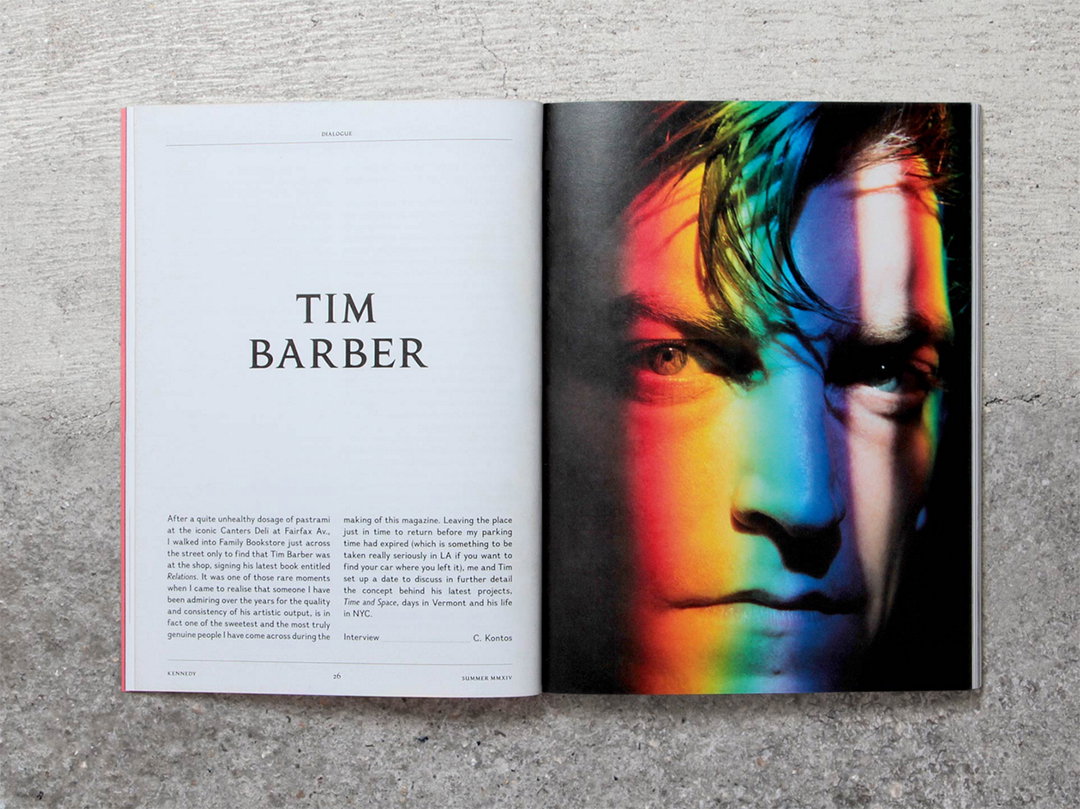
Commission: Kennedy
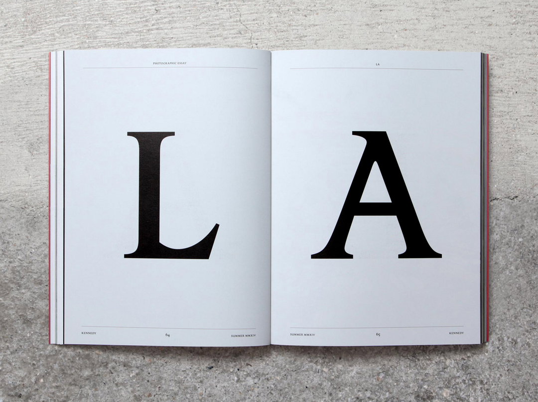
Commission: Kennedy
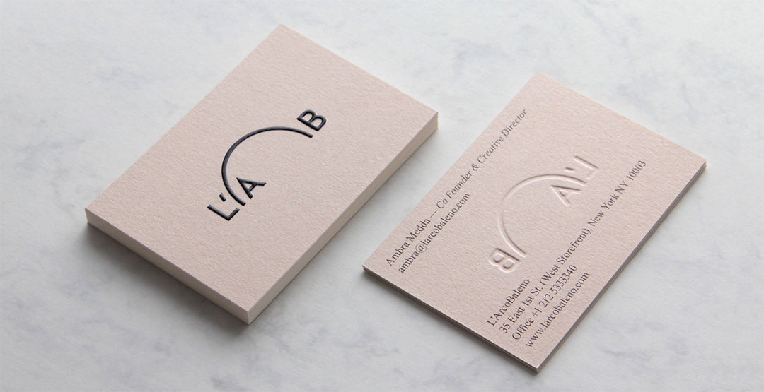
Commission: L’Arco Baleno
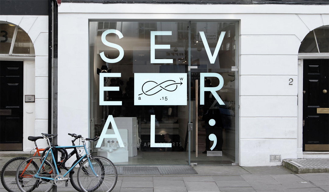
Commission: Several
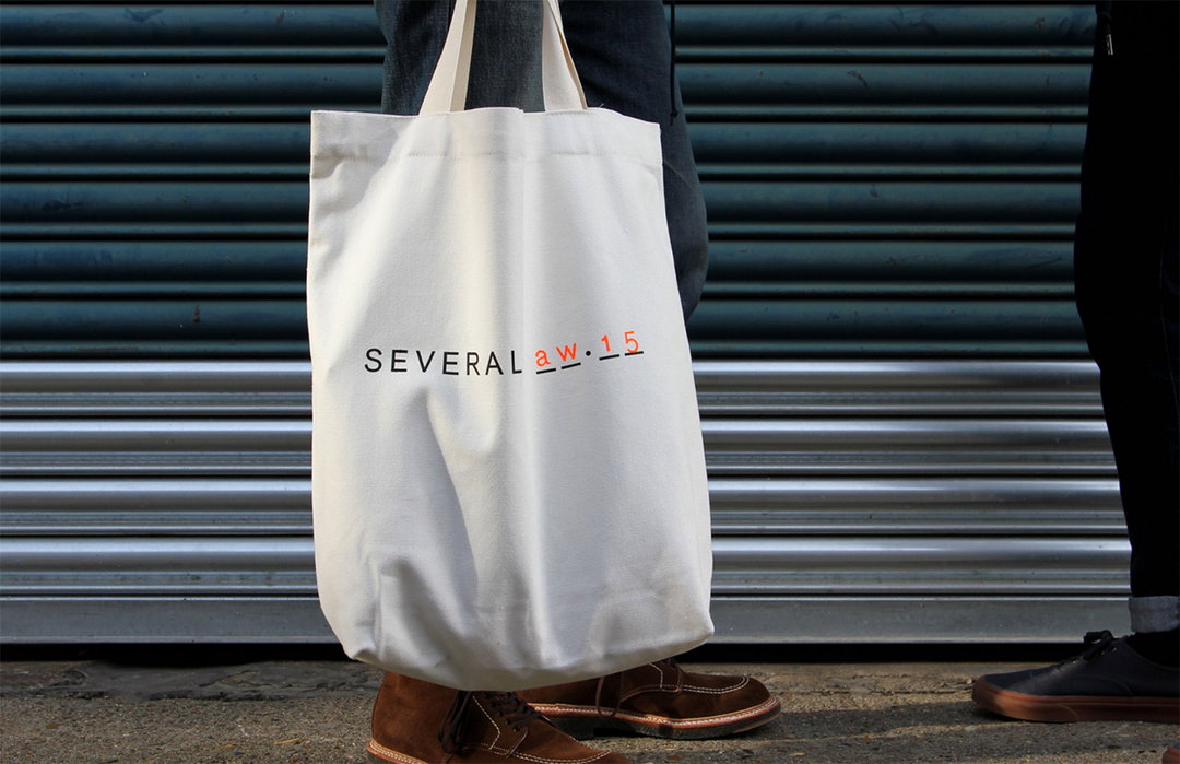
Commission: Several
Share Article
Further Info
About the Author
—
Emily joined It’s Nice That as Online Editor in the summer of 2014 after four years at Design Week. She is particularly interested in graphic design, branding and music. After working It's Nice That as both Online Editor and Deputy Editor, Emily left the company in 2016.


