- Words
- Rebecca Fulleylove
- —
- Date
- 6 July 2017
- Tags
Illustrator Jamie Edler approaches complex topics with lightness and humour
Share
Share
Born in Bristol, illustrator Jamie Edler wasn’t set on going to university but a tutor at A level eventually persuaded him to apply. “I applied to five different universities and decided not to do an art foundation,” says Jamie. “I made the choice to study at Falmouth, deferred a year and moved to China for a bit to teach English.” For Jamie that break gave him time to be ready to get back into education and became an experience that “inspired and motivated” him. “I always knew if I were to study at uni, I would study illustration. It was something I’d always pursued – apart from a few weeks where I thought I might study music!”
The supportive network of Jamie’s tutors at Falmouth became integral to his experience, especially with his initial trepidation of going into further education. “The most valuable thing that I’ve been taught by my tutors is to have faith and confidence in your work. Be proud of the work you’re creating. I think it’s very easy on any creative course (or even just in life) to compare yourself to other people’s work,” he says.
“What my tutors made me realise is that there isn’t any reason to. Everyone’s work is different and that’s what makes it great! I took on the idea that until I liked my work, it didn’t matter because other people liked it. I think as a creative, it’s very difficult to love your work because you can see the process you did to create it, whereas others, the audience, merely see the finished image/outcome.”

In the third year at Falmouth all of the students’ projects are self-initiated and Jamie’s favourite is a book he’s still working on. Based on a man’s relationship and obsession with the sea, it’s a project that felt personal to Jamie. “I also really like a book I created in my Erasmus term in Germany on mental illness for much the same reason,” he says.
These self-initiated projects provided Jamie with the freedom he felt was beyond the editorial briefs where he had to interpret a prescribed theme or topic. “I’m dyslexic and find the articles difficult to read. However in third year, I found a way to tackle them and really started enjoying them,” he explains. “Now Ironically I’ve been doing a lot of editorial work and really enjoy the challenge of taking an article and representing it as an image.”
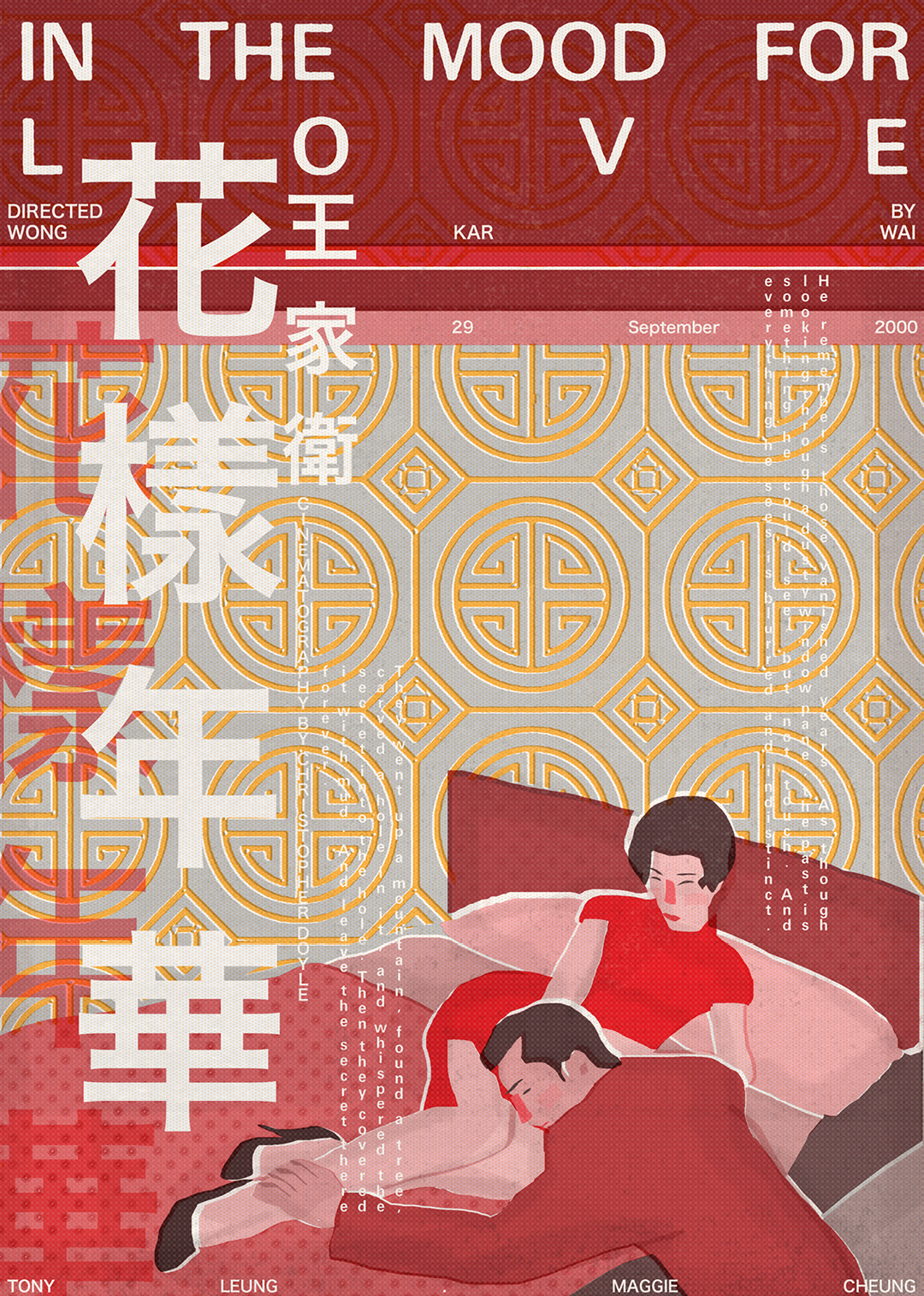
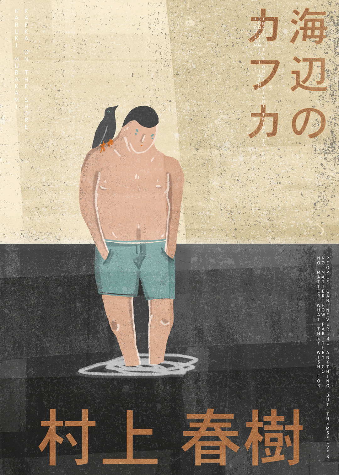
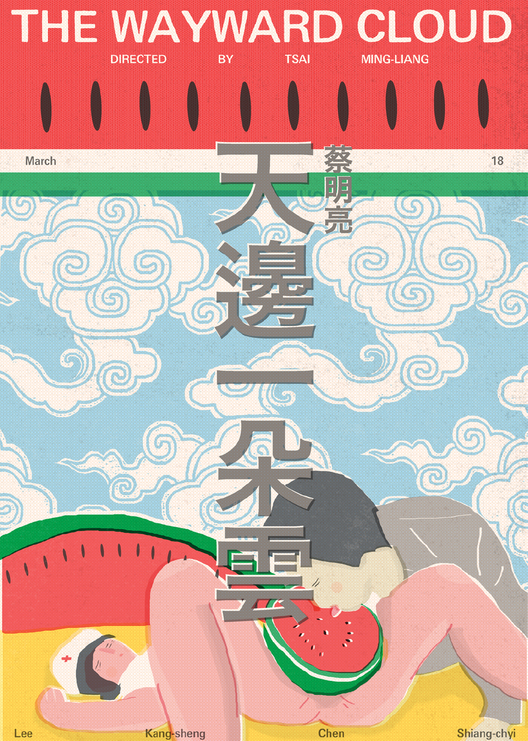
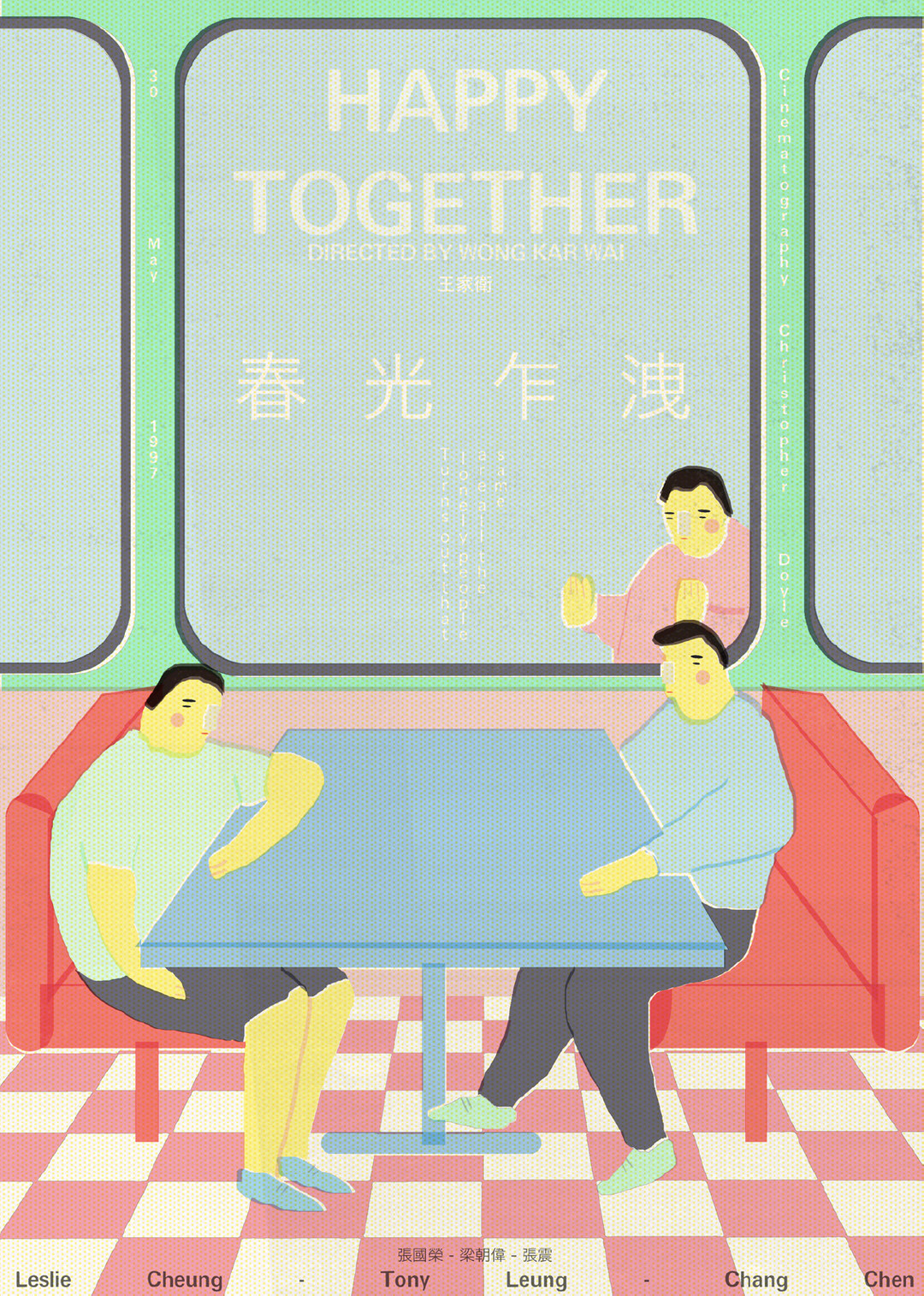
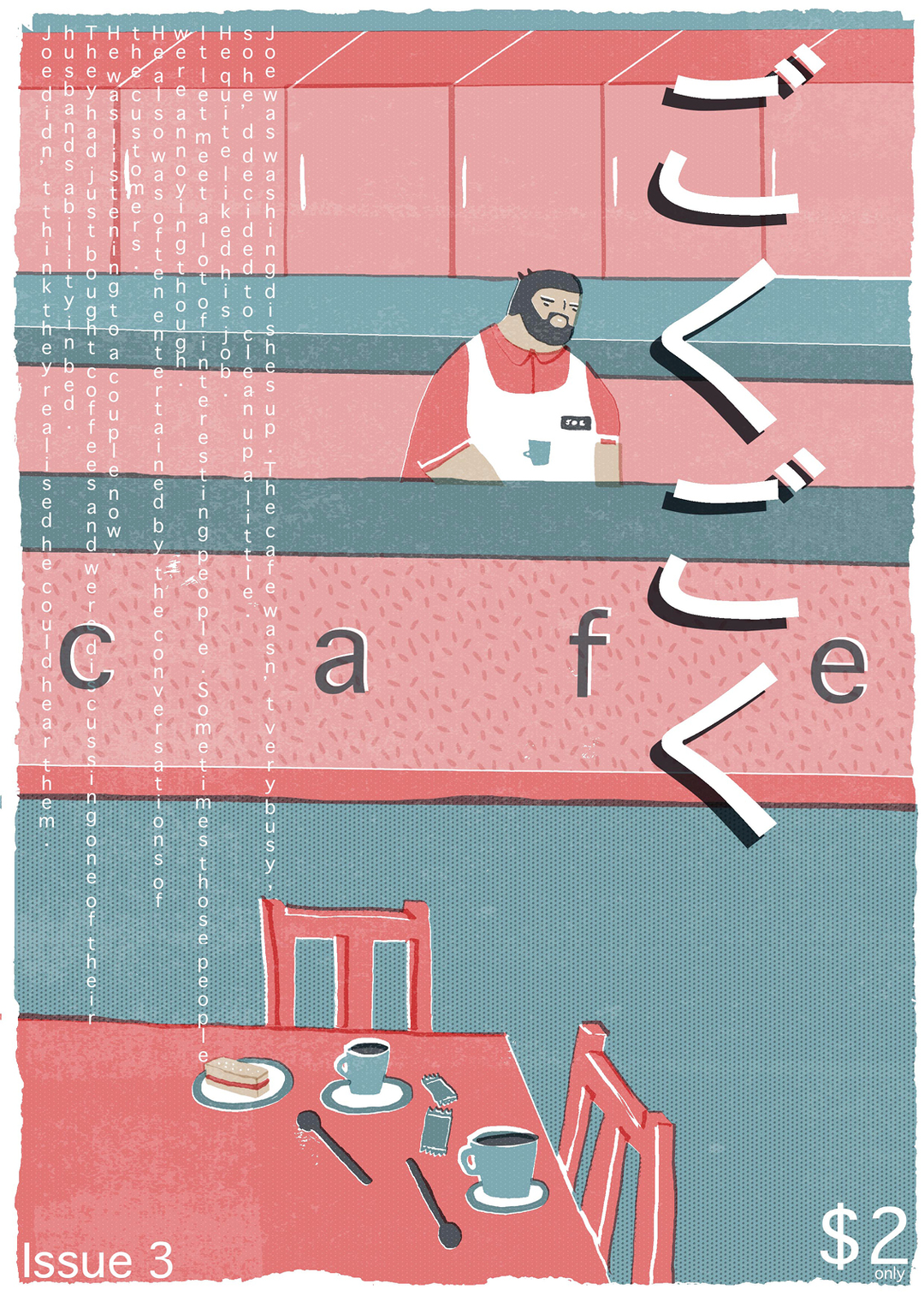
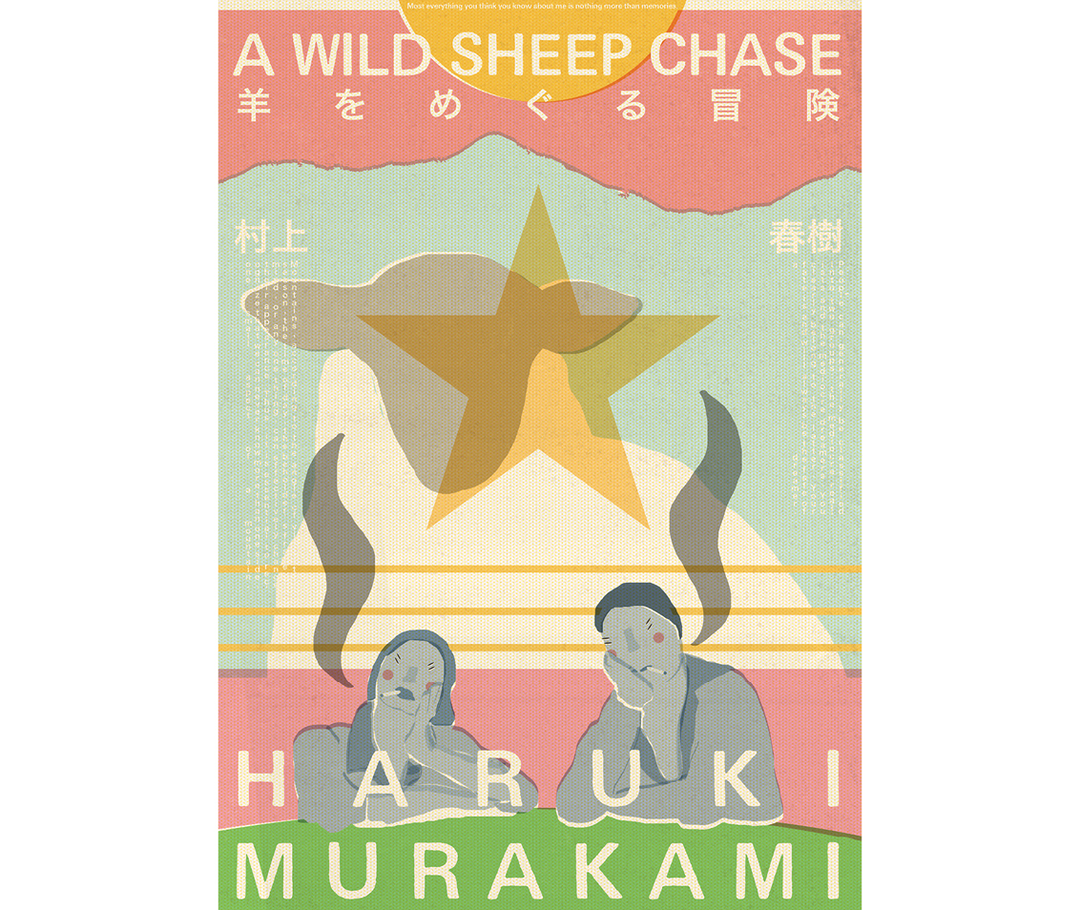
A project that caught our eye were Jamie’s film posters, created as final project before a deadline. “I’d created some film posters previously in the year and enjoyed them, but wanted to make some that had more of my current style and personality in,” says the illustrator. “I had three days before my final deadline and had pretty much finished everything so I thought I’d challenge myself to do a poster a day. I chose to do Asian cinema because I think a lot of it is beautiful and slow moving, and I wanted to give it more of representation in the UK.”
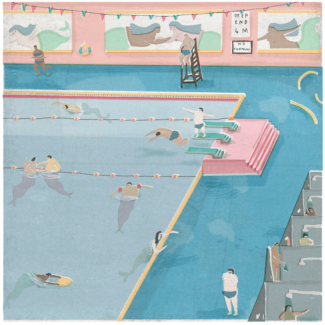

This approach is indicative of Jamie’s process as a whole where he works quickly but keeps a cool head. “I love working under pressure but I figure if you’re stressed, then how are you going to enjoy the process? If you don’t enjoy it, you probably won’t get a good outcome from it,” he says. “I tend to work pretty intuitively unless it’s for a client who needs to see roughs and prep.”
Style-wise the illustrator sees himself as fairly consistent and tries to take topical issues that are close to him and make them approachable through lightness and humour, without taking away form the seriousness of what he’s illustrating. “I do think university gave me the opportunity and drive to develop [my style] further. I’ve become less nervous to try different things in my work, whether it be composition or colour, both of which play a key part in my illustration work,” explains Jamie. “It’s really interesting for me to look at old work and then new work to see how far I’ve developed and improved.”
Supported by A/D/O
Founded by MINI, A/D/O is a creative space in Greenpoint, Brooklyn dedicated to exploring new boundaries in design. At its heart is the Design Academy, which offers a range of programming to professional designers, intended to provoke and invigorate their creative practice.
Share Article
Further Info
About the Author
—
Rebecca Fulleylove is a freelance writer and editor specialising in art, design and culture. She is also senior writer at Creative Review, having previously worked at Elephant, Google Arts & Culture, and It’s Nice That.