- Words
- Jenny Brewer
- —
- Date
- 17 August 2020
- Tags
Illustrator Gvidas Pakarklis creates meticulous hand-drawn worlds merging infographics with magical realism
The Lithuania-born Falmouth grad looks to a fascinating pool of visual references to create his singular aesthetic; a narrative-packed feast for the eyes.
Share
Share
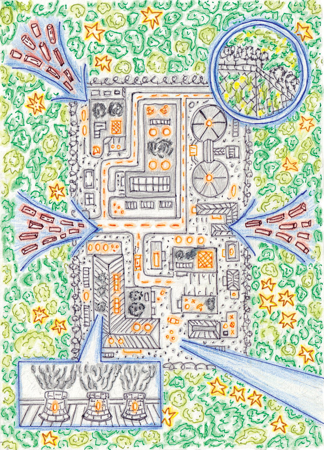
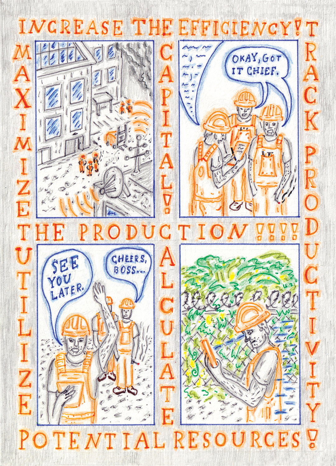
On a first glance, Gvidas Pakarklis’ intricate illustrations look like embroidery, with their minuscule line markings and absorbing details. In fact, the Lithuanian illustrator makes them using coloured pens and pencils, applied to common compositional devices – but in ways you’ve probably not seen before. Some of his images are diagrammatic and akin to infographics, but aesthetically far from the clean vectors that are typical of that type of imagery. Instead he brings a fresh, naive style and energy to maps, plan views of buildings, and cross-sectional views of landscapes. He also employs comic-style box-outs to zoom in on important parts of an image which can be so packed with busy goings-ons that they become Where’s Wally-like, full of discoveries and hidden pockets along the way.
Influenced by the work of Suzanne Treister and Paul Laffoley, as well as medieval religious iconography, 17th Century alchemy emblems, magical realism, plus many more bizarre rabbit holes of visual culture, Gvidas’ influences produce a truly unique Venn diagram that define his practice. Having almost gone into biochemistry, the draw of printmaking and illustration was just too strong for the recent Falmouth grad (lucky for us). Here, he explains how his drawings come together and reveals the stories behind some of his best pieces so far. Plus he shares visions for his near future – from experimenting with an airbrush to starting a publishing press.
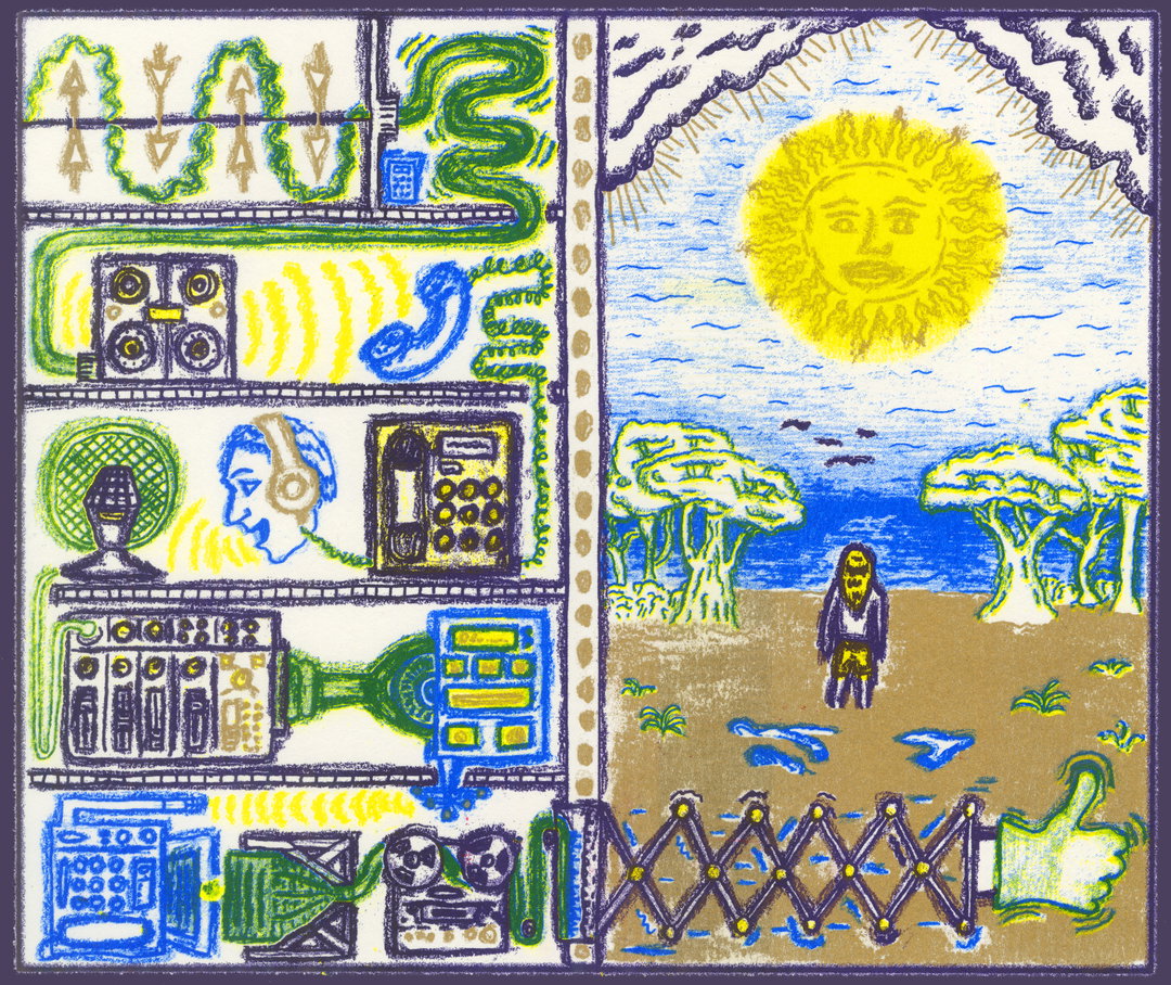
Gvidas Pakarklis: Riso print for Palanga Street Radio
“I strive to mythologise issues, implement the ideas through creating a speculative world and telling a story about it”
Gvidas Pakarklis
It’s Nice That:
How did you find your way to illustration?
Gvidas Pakarklis:
I was born in Lithuania, Kaunas city, then grew up in Vilnius. It is the city where I’m currently based as well, since I’ve finished my degree in Falmouth. The initial interest to study art probably sparked whilst taking an extra-curriculum four year course at J. Vienožinskis art school, where I was introduced to the main fine art practices, such as painting, sculpture, etc. The one I embraced the most was printmaking. I can’t recall whether it was the technical process that charmed me or the grainy textures that would appear on the printed drawing, but it seemed like a magical way to produce artwork.
What’s funny is that when I graduated from the art school, I still wasn’t sure whether to commit to art more seriously and was actually thinking of studying biochemistry as a more ‘perspective’ profession.
Luckily, during the last year, encouraged by some good friends, I made up my mind to go abroad and study art. The first thought was to choose fine art and specialise in printmaking, but then illustration seemed a more applicable practice. When surfing through lists of universities in the UK, some of Falmouth University’s alumni work caught my eye, as well as the impression of the facilities they offer. A large studio space for example where you can have your own desk space. It was an amazing experience to study there.
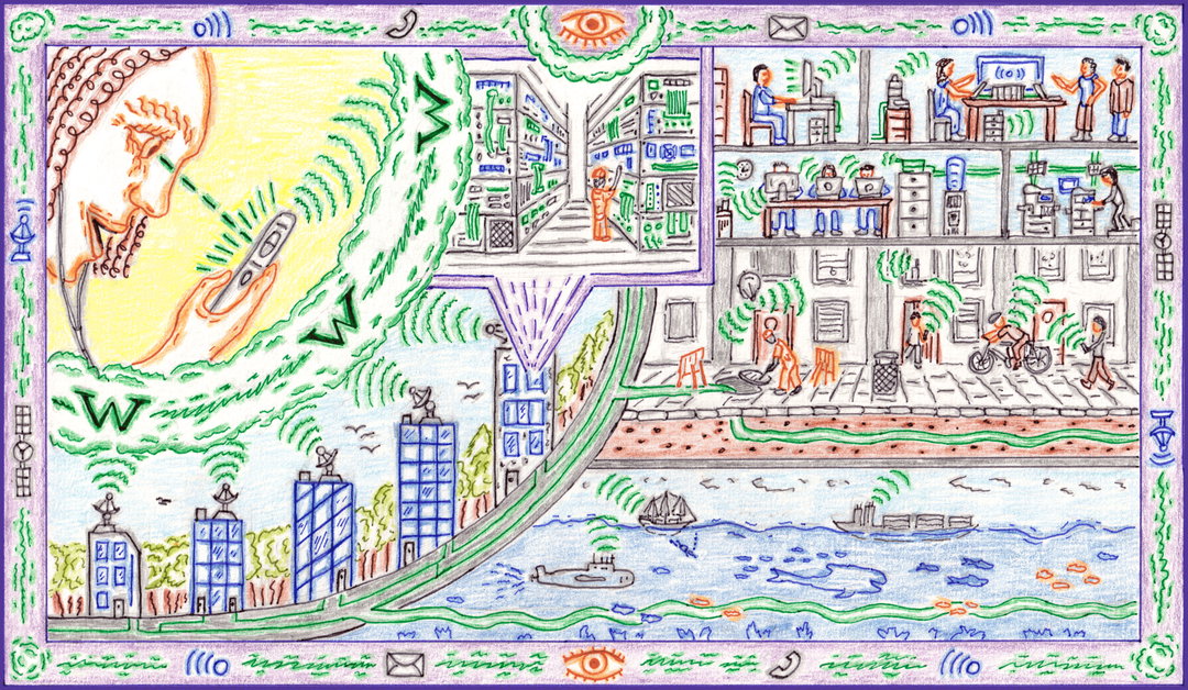
Gvidas Pakarklis: New Ways of Seeing – Invisible Networks
INT:
Where do you look for ideas and inspiration? How do you start a piece and how does it develop?
GP:
It really depends on the brief that is either set by someone or me. I see the starting point of a project as a balance between being inspired actively and passively. It’s largely images I notice and analyse when looking for references, but sometimes, an idea can spring up from an ordinary happening on a street or a conversation with a friend. There are certain themes or aesthetics I am interested in, which open up a vast pool of imagery to be researched. One of them is the expression of early medieval religious icons – the flattened figures you find in the compositions are just amazing.
Usually my drawings have a few sections, so I tend to sketch them out first, then start building the total composition of the whole. After experimenting with colour palettes, I separate the elements of the final graphite sketch into colour groups, keeping in mind that colour plays a strong role in composition as well. After all the planning is done, the execution process is quite simple: drawing with various colour pens and highlighting the lines with colour pencils. Occasionally I transform the final artwork into Riso prints – that machine is a wizard of bright, funky colours and unpredictable outcomes, which I admire!
I’d like to experiment with new techniques – for example an airbrush! I’ve been interested in that machine for a while now and I think it would encourage some funky experiments that I could later embed within my visual style. A few tutors mentioned that I could work on stylising my figures more, so I am spending some time drawing various limbs and faces. In the long run, I have a vision of owning a small publishing press in the future and building a like-minded community around it which shares similar values towards art and culture.
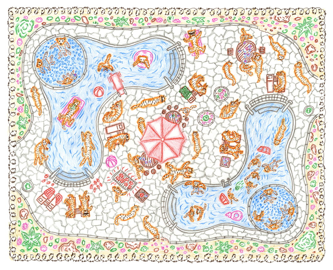
Gvidas Pakarklis: The Tiger Next Door
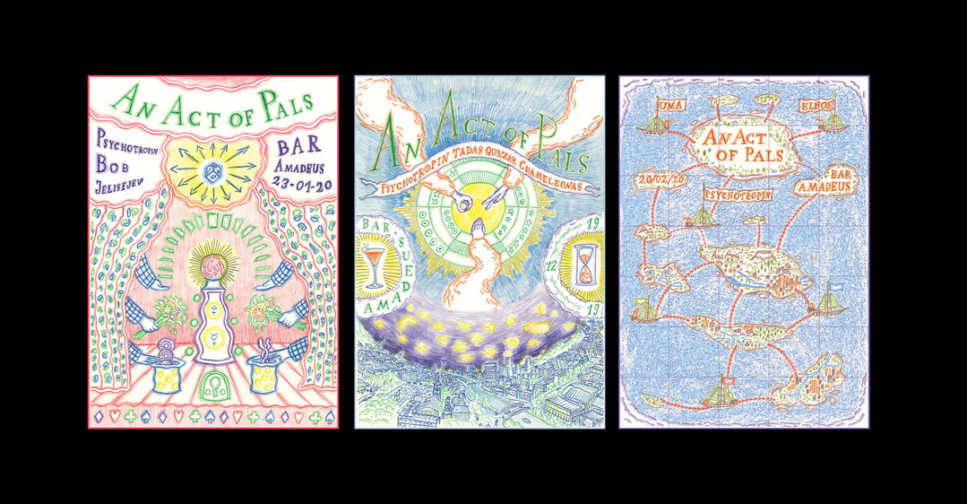
Gvidas Pakarklis: Posters for an Act of Pals, (left to right) Magic; Rock, Paper, Scissors; Map
“The density and intricacy of 17th-18th century alchemist hermetic emblems have fascinated me and pushed my visual language in that direction.”
Gvidas Pakarklis
INT:
What subjects are you most fascinated with?
GP:
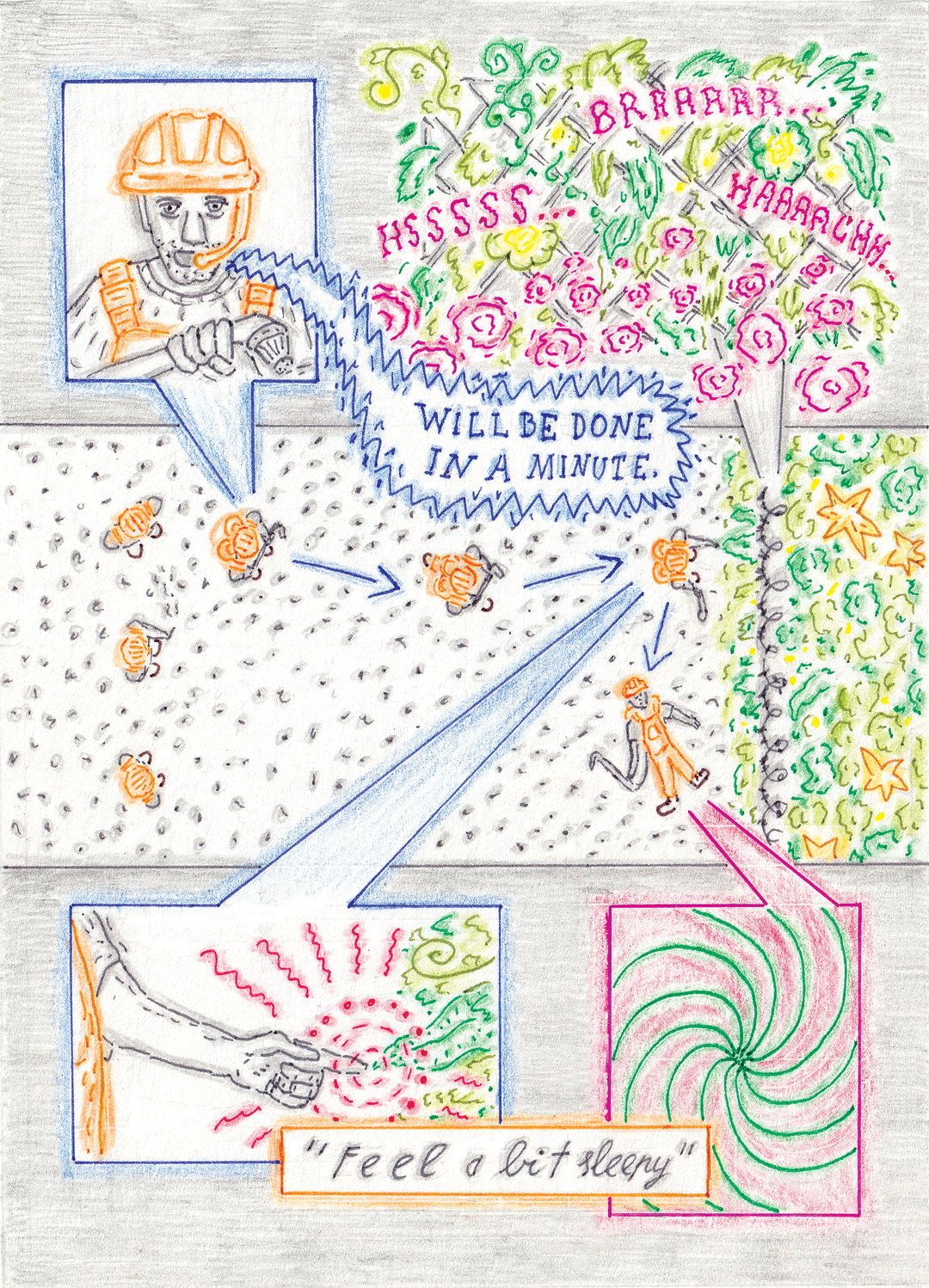
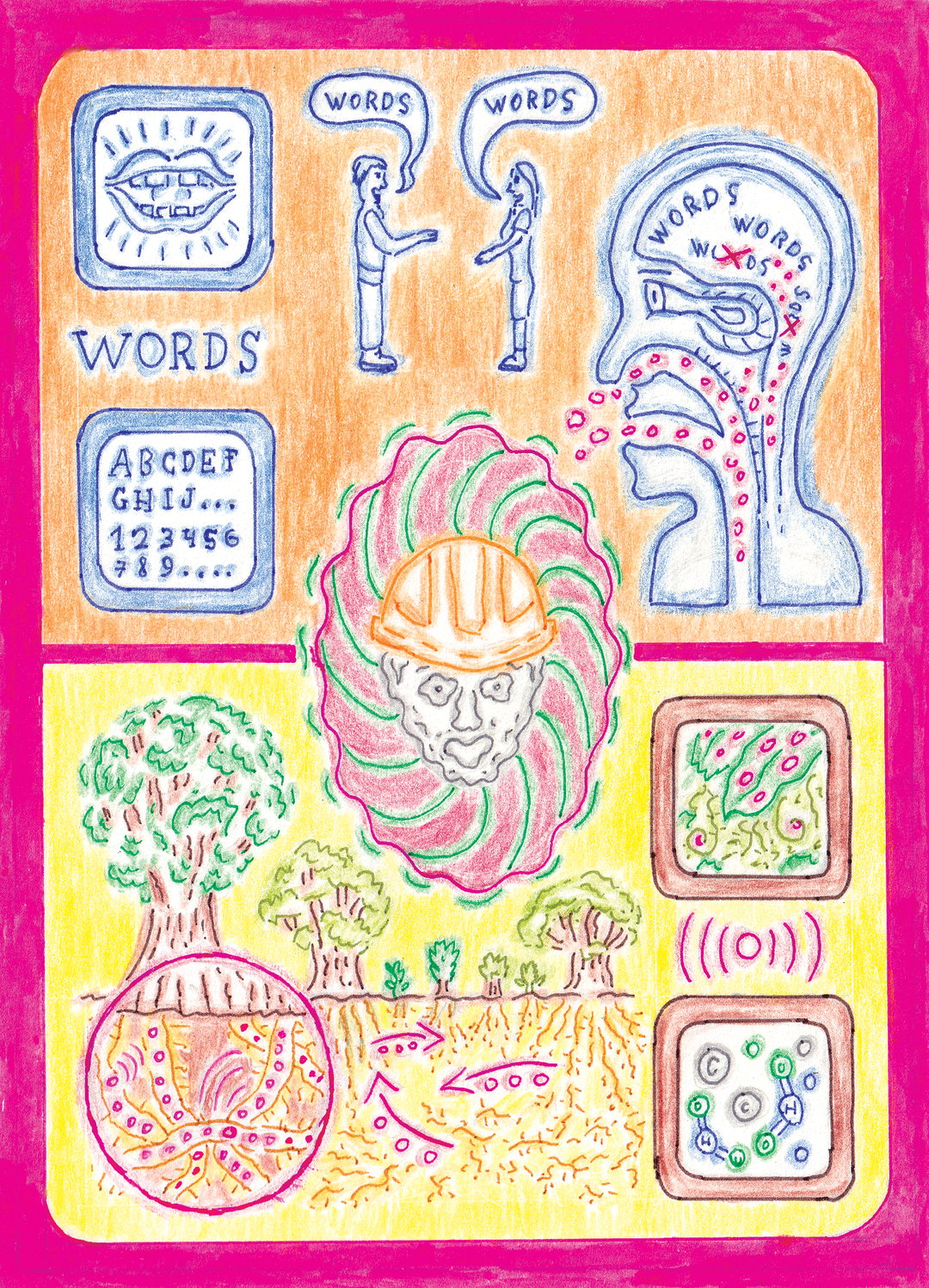
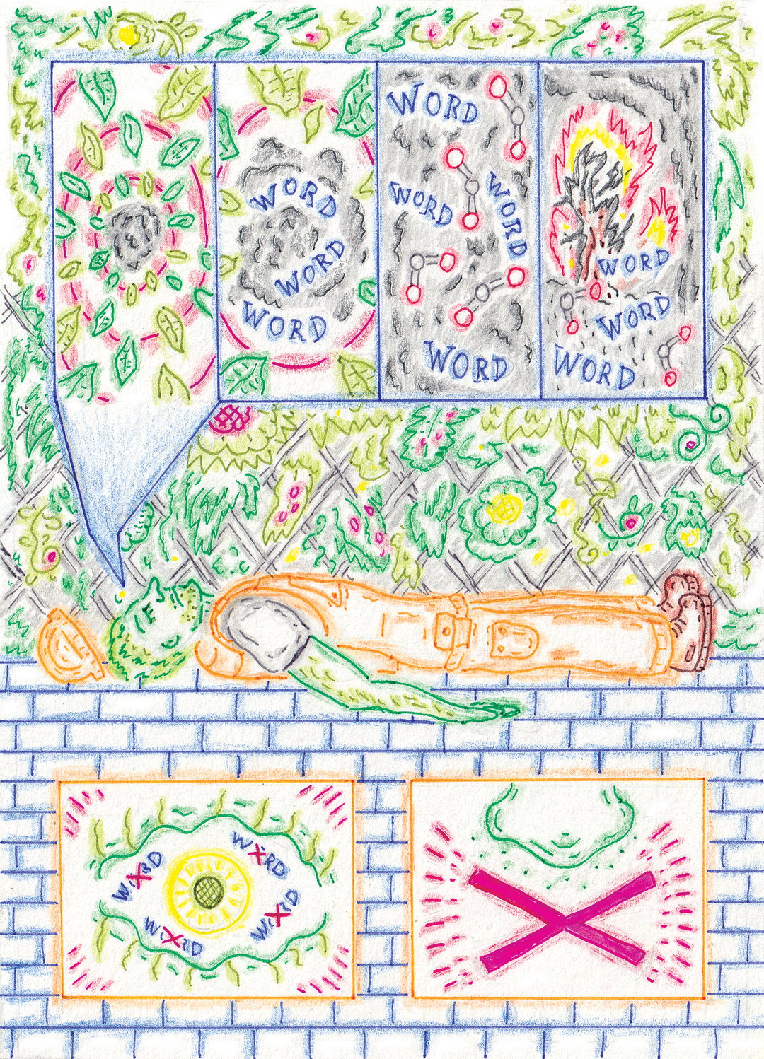
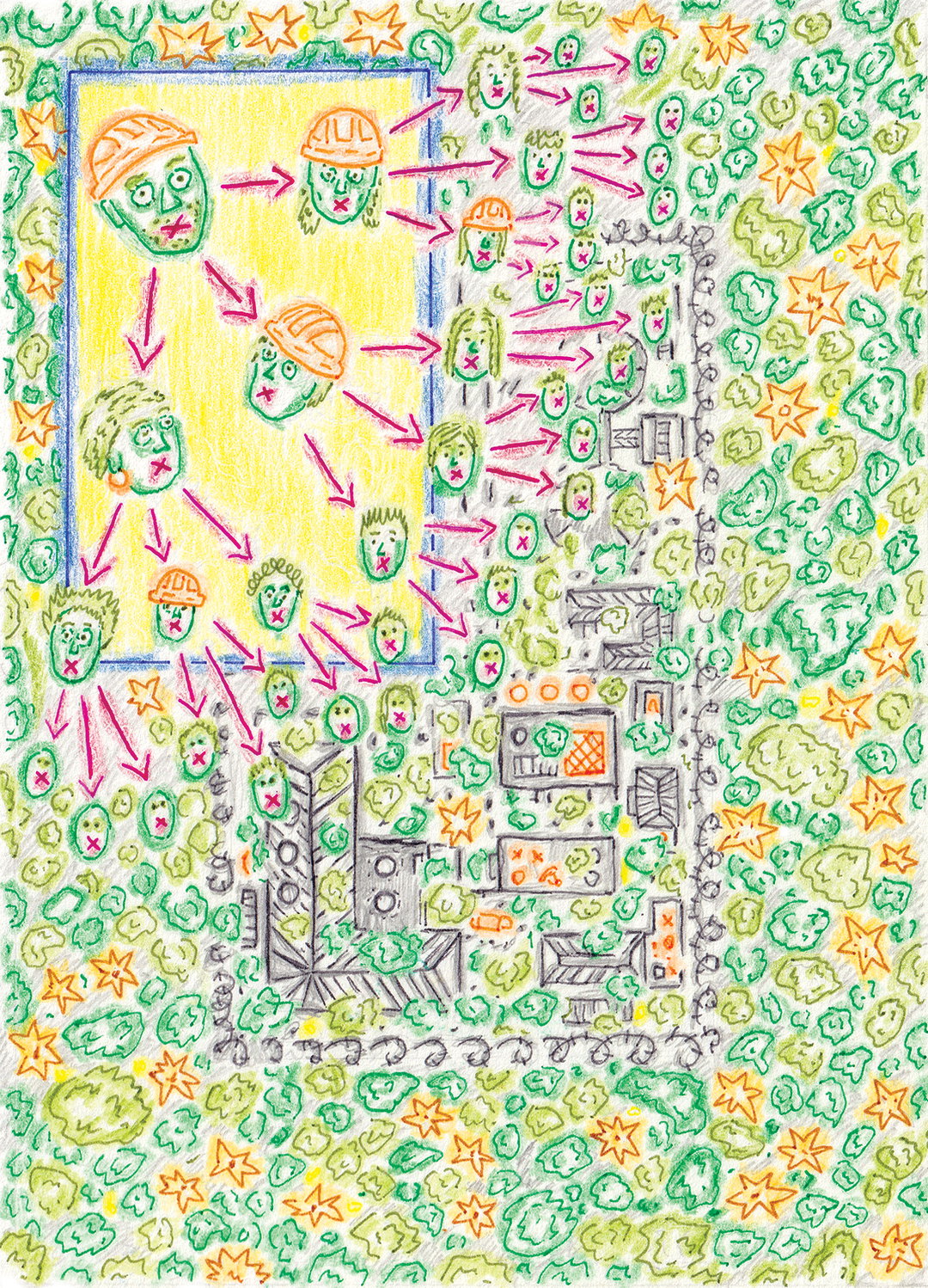
Recently, socio-technological and environmental issues have been a driving force for me to create artwork. I strive to ‘mythologise’ these issues – implement the ideas through creating a speculative world and telling a story about it. A good example of this process would be the story behind two pieces I made this year: Mundum de Oxygeni and the May Chloris Bless You webcomic. The former was made for Falmouth illustration’s Wunderkammer magazine on the theme of curiosity. I chose to illustrate oxygen as an entity, which in the near future, could be institutionally exploited and monetised, if global warming keeps rapidly intensifying.
This idea was inspired by a company called Vitality Air, which sells Canadian canned air to the Chinese makret because the of the high air pollution in industrial areas. Surreal isn’t it? I was really glad how the piece turned out so I decided to extend it into a graphic novel, which was published in a webcomic platform – The Promise. In May Chloris Bless You, the story is set in the same world but the narrative happens on a smaller scale – a temple, where trees are worshipped as a miracle that produces organic oxygen. The temple is led by a priest, who is later revealed to be unholy. I will keep the intrigue by not saying what happens next…
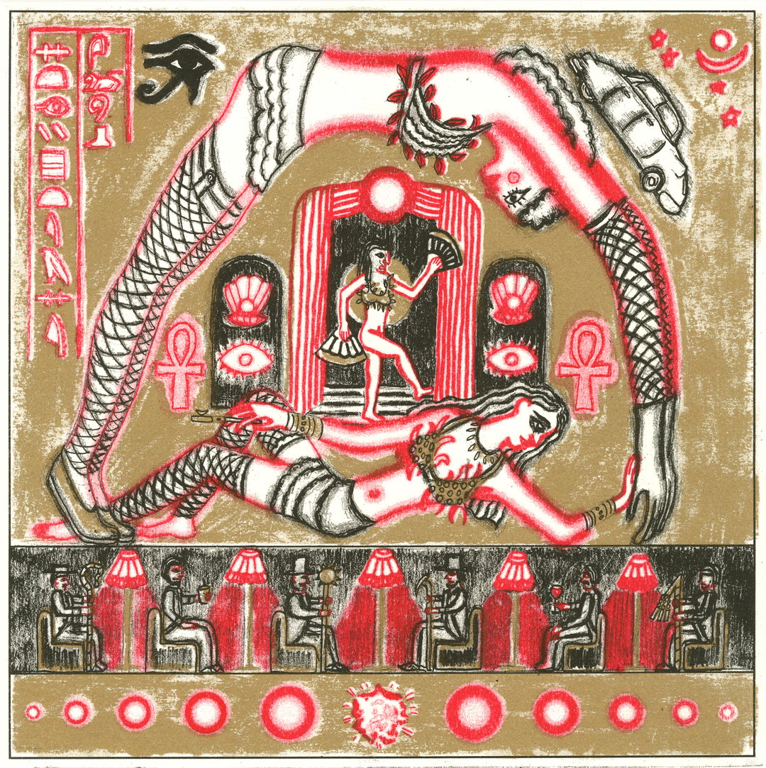
Gvidas Pakarklis: Mythologies Striptease
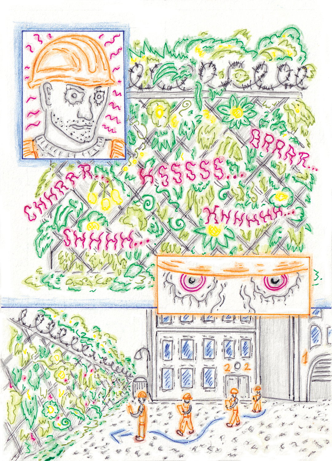
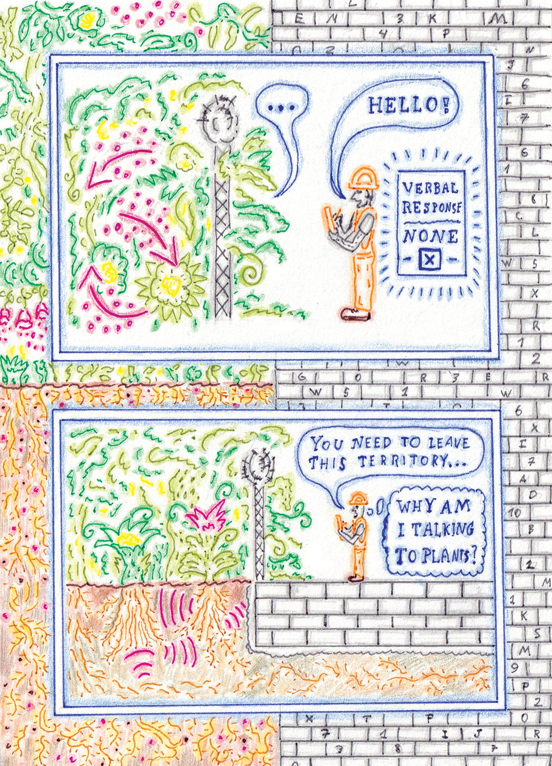
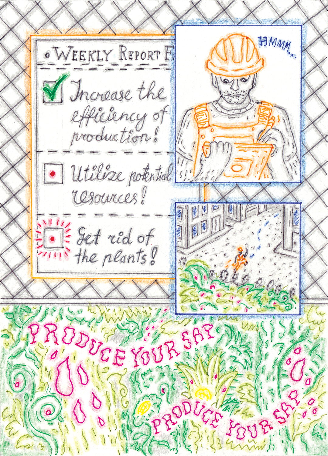
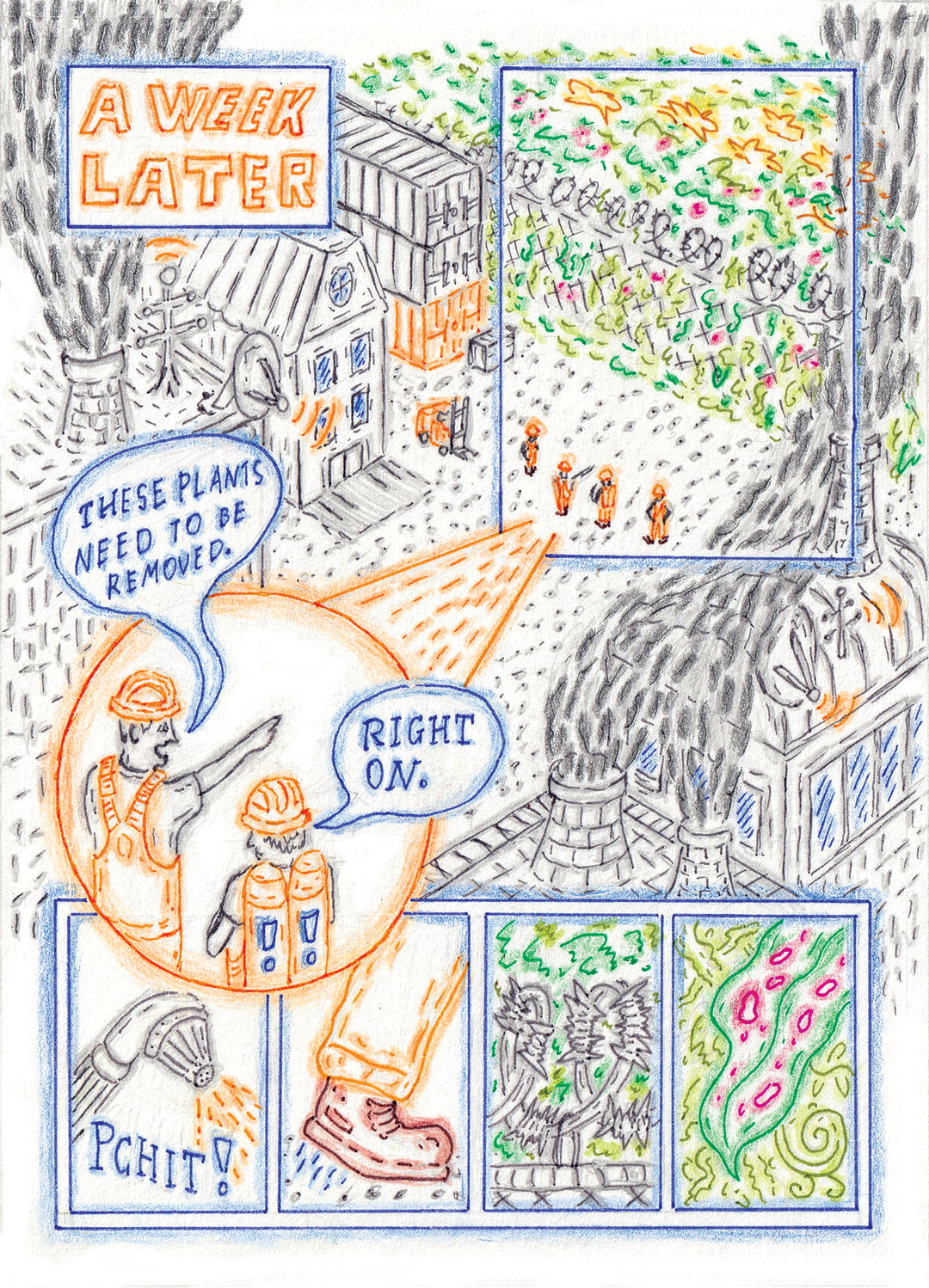
1 of 10
Gvidas Pakarklis: Comic for an Open Call
1 of 10
Gvidas Pakarklis: Comic for an Open Call
INT:
Are there any creatives and/or specific visual references that have made a big impact on your aesthetic?
GP:
Whilst researching for my BA dissertation, I came across Suzanne Treister, whose work had a massive influence on me both aesthetically and subject-wise. Thanks to her I discovered the beauty of alchemist hermetic emblems from 17th–18th century, which I would count as early examples of magical realism. Their density and intricacy of symbolic details have truly fascinated me and pushed my visual language in that direction. Alchemy as a theoretical practice has also inspired me to look at objects and subjects holistically, to find interconnected aspects. There is another, really interesting artist – Paul Laffoley, a true mastermind of schematic drawings, whom I discovered through the same dissertational research. He is often called an outsider artist because of his utopian, esoteric ideas he implements in large technical blueprints. Their complexity truly influenced me to dig deeper when composing a drawing.
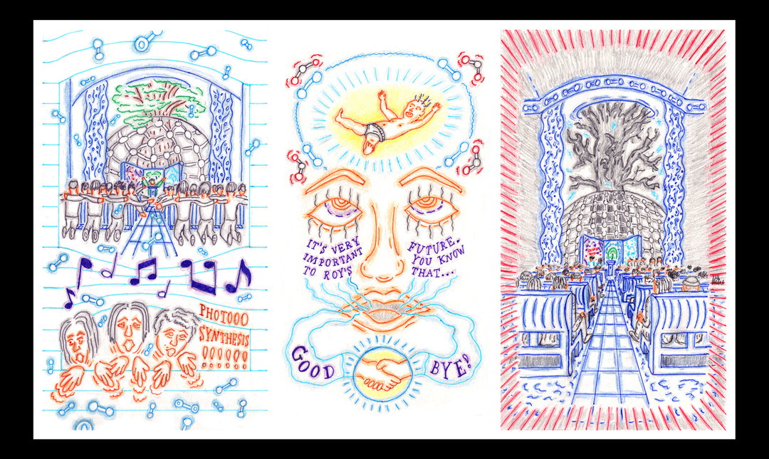
Gvidas Pakarklis: The Promise, May Chloris Bless You
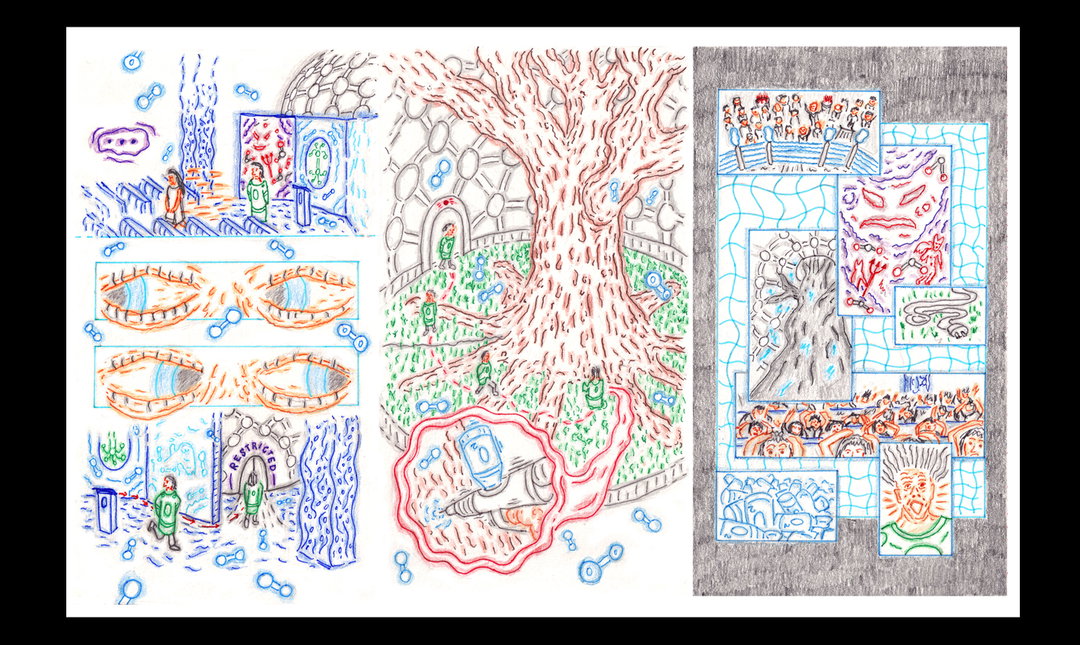
“After all the planning is done, the execution process is quite simple: drawing with various colour pens and highlighting the lines with colour pencils.”
Gvidas Pakarklis
INT:
What's the most important thing you learnt during your time at university?
GP:
In first year, during a study trip to London, me and some good friends from the course met an amazing illustrator called David Foldvari. Despite many great tips and suggestions he shared with us, David said these words, which I can quote as the most valuable lesson: “The thing is to stay together, to have a collective, there is strength in numbers. You can create a cool scene wherever you are. If you don’t keep that university thing going it gets depressing. It’s less important as you become established, but definitely for the first five years.”
That collective of people, whether formal or informal, is really important, especially in these crazy post-quarantine times. I am really thankful that I was a part of such a motivated, supportive collective from the course, where we organised our own group crits and collaborative projects. I would like to particularly mention Bart D’Angelo, Helen Trevaskis, Loui Hewett, Nikki Nikolaeva, Stella Skenderova, Claudia Pezzini, Regina Jambor and Jade Newlin because of their criticism, support and excitement that would be brought when discussing ideas and projects. They’re all unique and great artists, I have learnt a lot from them!
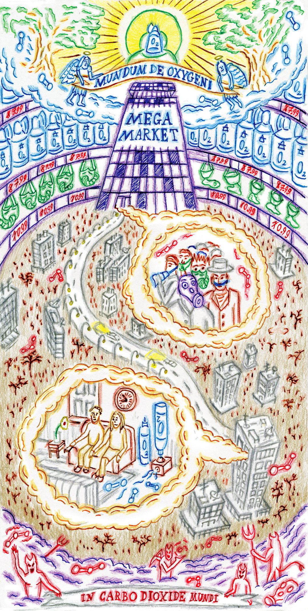
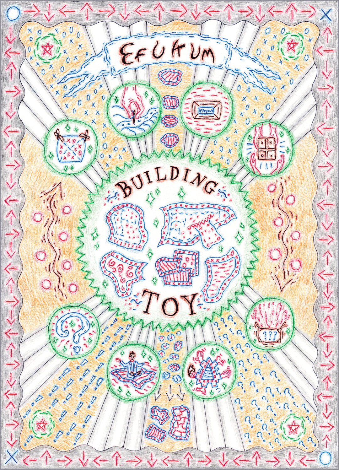
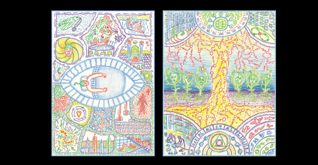
Gvidas Pakarklis: Left: The alchemy of sleeping; Right: Diagramming Hyperobjects, From the Enlightenment to Today
Share Article
Further Info
About the Author
—
Jenny oversees editorial output across It’s Nice That. Get in touch with writing pitches for features or opinion pieces, big creative story tips, or questions about all things editorial. jb@itsnicethat.com
To submit your work to be featured on the site, please see our Submissions Guide.