- Words
- Lucy Bourton
- —
- Date
- 8 March 2018
- Tags
“The grandmother of socially active art”: the generous work of Sister Corita Kent
Share
Share
There are many ways I could begin to explain the life and work of Corita Kent, from an artist and educator to a nun and social activist. But what describes her best and most valuably, is the way that people who knew her tend to: “An A+ person,” for instance, and the fact "she saw possibilities in you you didn’t know about yet”. Or simply in their description of her kind attention, because “when she talked to you she made you feel like you were the only person there”.
Born Frances Elizabeth Kent, Corita became a nun aged 18 joining the Immaculate Heart of Mary order in 1936, a Catholic teaching institute where she was also educated. She embarked on a career of unique teaching techniques, becoming the chair of the art department in 1964. Her classes were all-encompassing. School trips would vary from visiting Charles Eames’ studio, to going to the local supermarket to observe people and packaging. Students from other departments would see their peers outside blindfolded, drawing, and upon asking what they were up to, the response was “homework”.
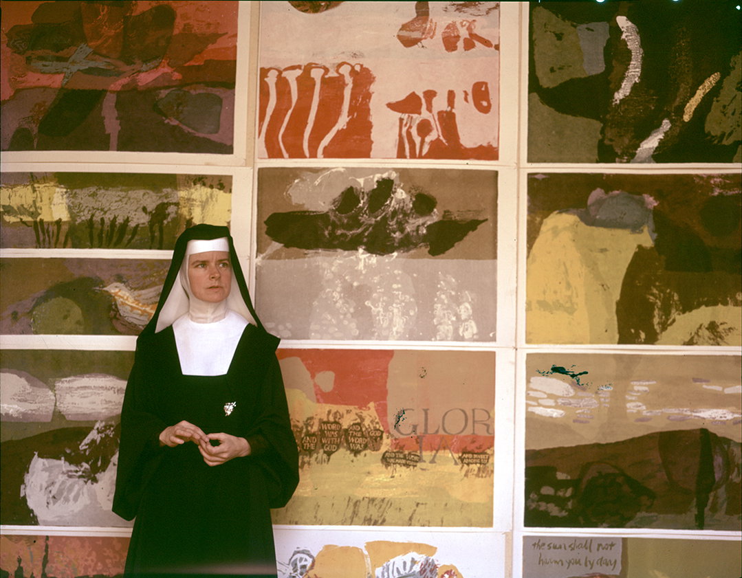
Sister Corita Kent: Copyright of Corita Art Centre
Fame soon followed, first within the church as clergy members were sent from across the US to be taught by her. As the world grew increasingly turbulent during the 1960s Corita’s work leaned towards the political, growing her audience but irritating the archdiocese. Exhausted from a schedule longer than hours in the day, she took a sabbatical in 1968 and decided to renounce her vows with the Immaculate Heart of Mary. At this point Corita was aged 50 and had to start afresh, she couldn’t drive, couldn’t cook and had never lived out of the schedule of religious life. A career as a prolific artist filled the last 18 years of her life.
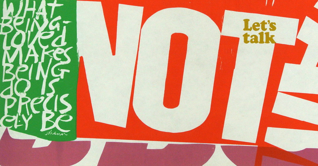
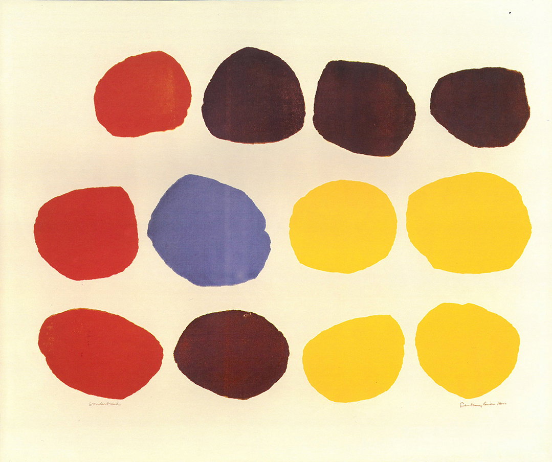
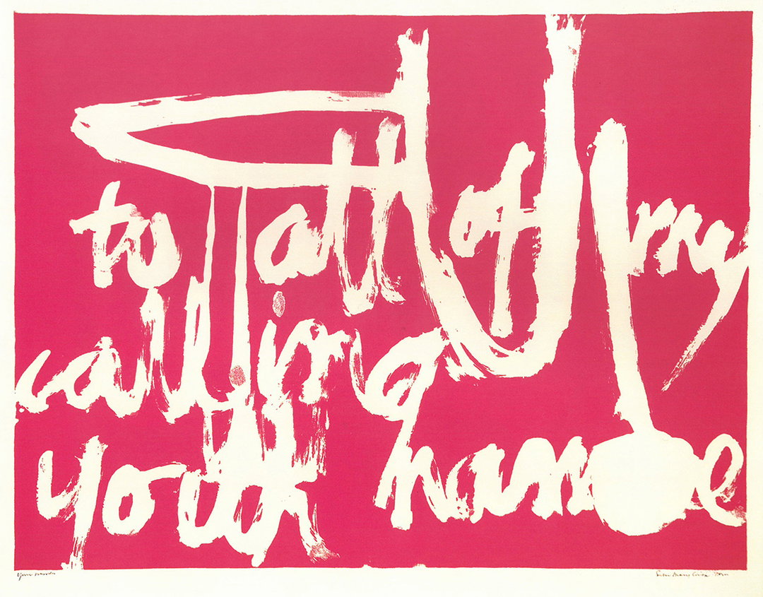
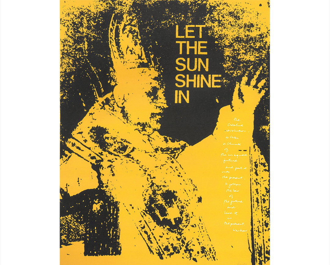
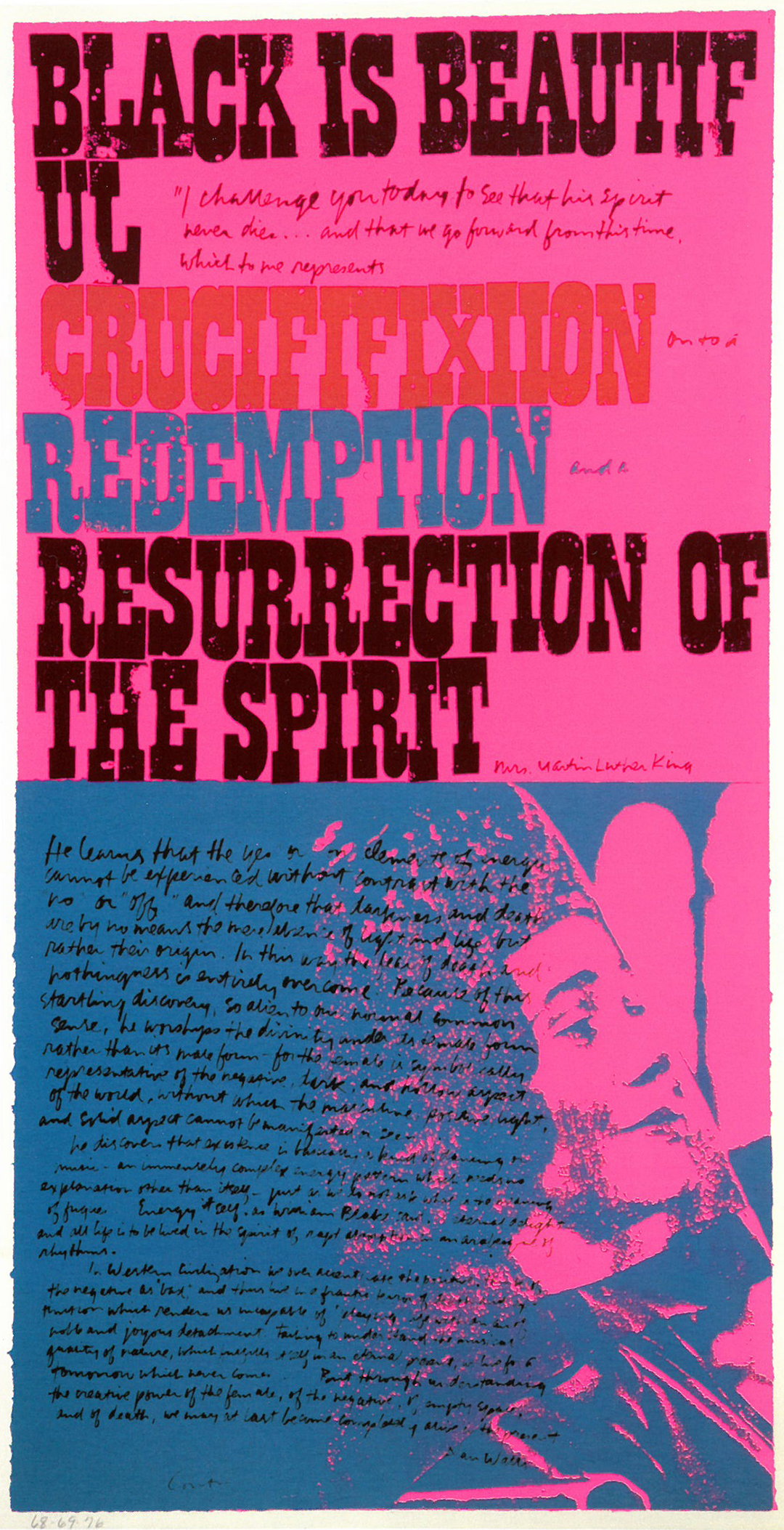
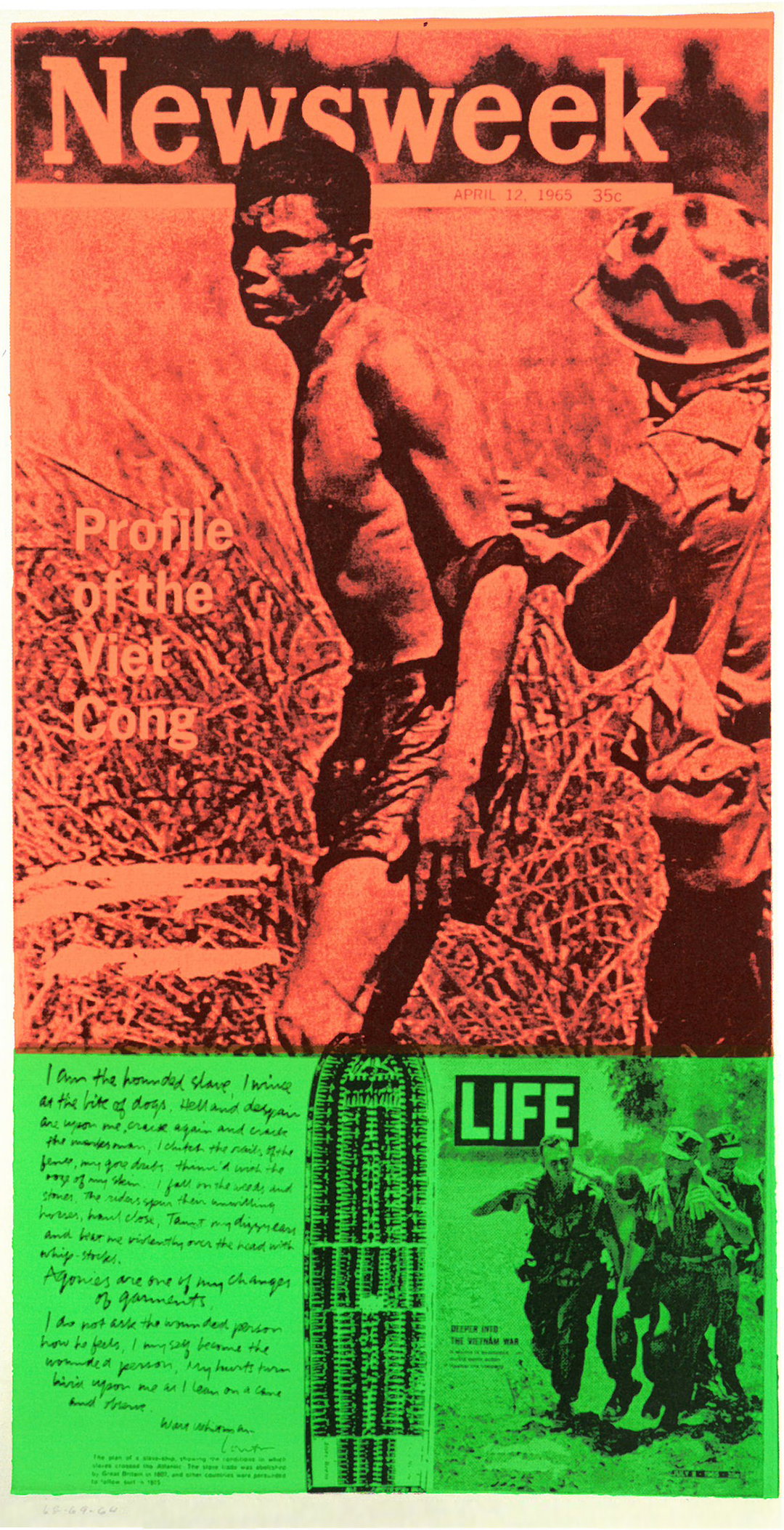
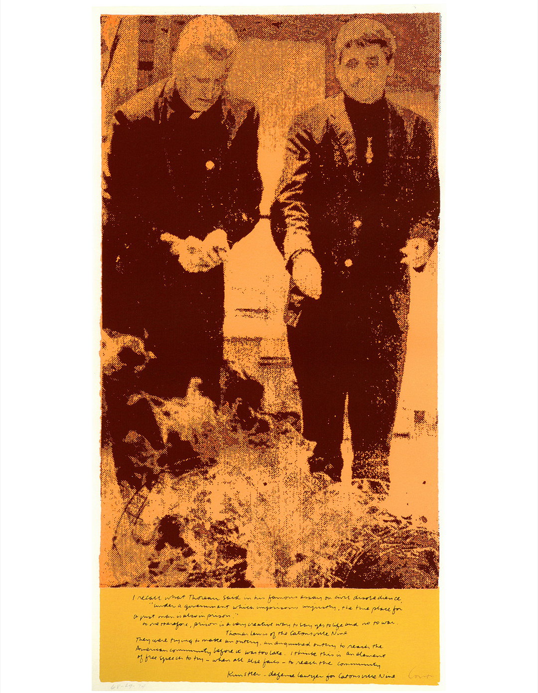
Corita’s artwork has a profound effect on people. Its vibrancy, enthusiasm and hopefulness has the ability to touch anyone, art lover or not. By using screen printing her work appeals to both the art world, graphic designers and literary fanatics in its use of text, re-contextualising snippets of popular culture such as “wonder bread” or lyrics like “I get by with a little help from my friends”. The texts expand to her own musings, particularly: “Love is hard work”, her most recognised piece designed for a postage stamp. Corita’s work has the ability to hit you instantly and over time in a way that Dr. Ray Smith, the director of Corita Art Centre, describes as “a Magic 8-Ball quality”. Ray admits she herself has walked past pieces hundreds of times a day, “and then for some reason a part of it will just pop out at you, it has this almost mystical ability to reach people,” she says. “I’ve never seen an artist that people have connected to so really intensely and enthusiastically.”
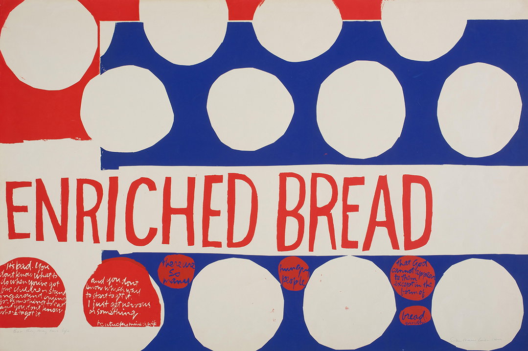
Sister Corita Kent: Copyright of Corita Art Centre
Sister Corita Kent: Copyright of Corita Art Centre
Sister Corita Kent: Copyright of Corita Art Centre
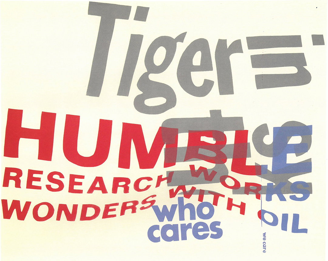
Sister Corita Kent: Copyright of Corita Art Centre
Sister Corita Kent: Copyright of Corita Art Centre
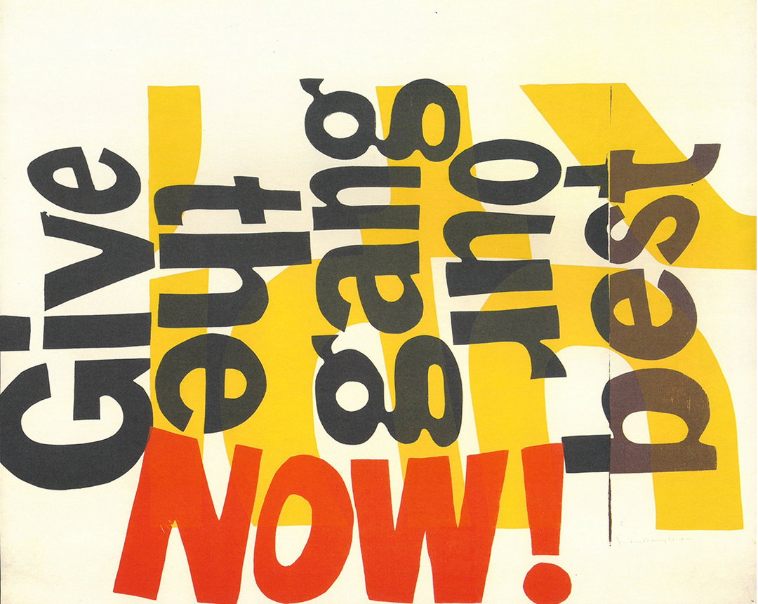
Sister Corita Kent: Copyright of Corita Art Centre
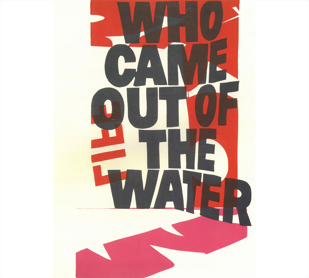
Sister Corita Kent: Copyright of Corita Art Centre
Despite this, in her career Corita Kent never really managed to settle under one artistic description or group. Even now, Ray still thinks of her as “on the periphery in a lot of ways,” she tells It’s Nice That. “Even though it didn’t look like what religious art was at the time — it looked more like pop art — she really thought of it as religious. It was about conveying spiritual messages, she thought of it as the same as the psalms, it was about reaching people and connecting with them deeply. That made it difficult because pop art was exactly the opposite of that, so even though her work looked similar it didn’t fit contextually in the critical or vapid consumer way that pop art was critiquing.”
Corita first saw a piece by Andy Warhol in 1962 and created her first “pop” print that year. However due to her belief, “that art enhances people’s lives and that people needed to be able to see it, own it and possess it,” her pieces took shape as screen prints, affordable ones too. In turn, her work wasn’t high art, it wasn’t religious in aesthetics and it wasn’t pop in context. Corita’s place at the edge of the art world is also arguably because of her gender, as Ray points out: “Even now we still have a lot of challenges in recognising women artists for their contribution, in the mid 20th Century it was ten times that. I think even if she hadn’t been a nun in habit, or her art hadn’t been necessarily spiritual, she still of would have been under-recognised in my opinion.”
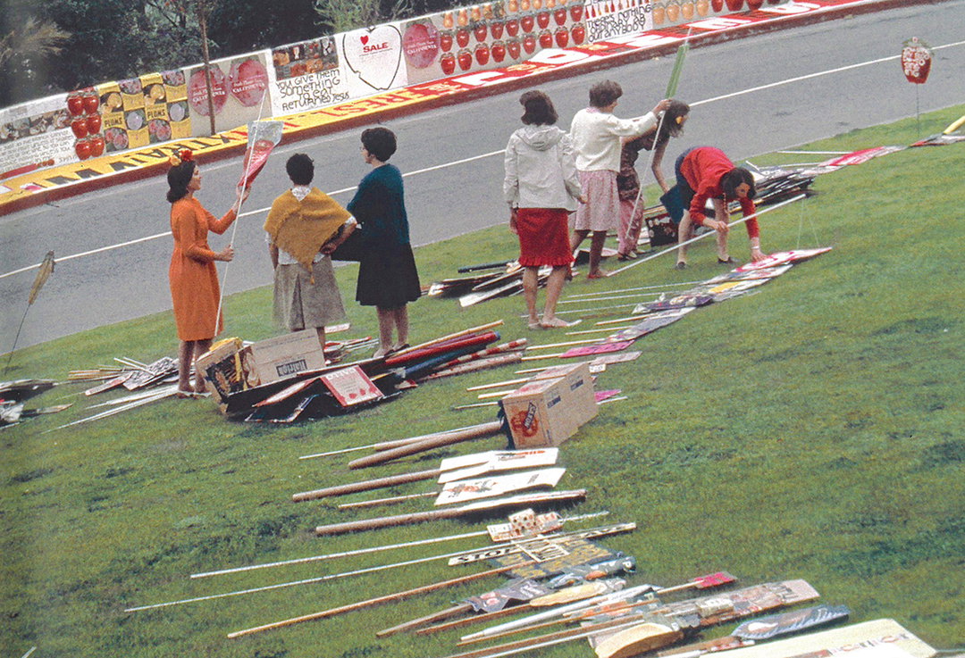
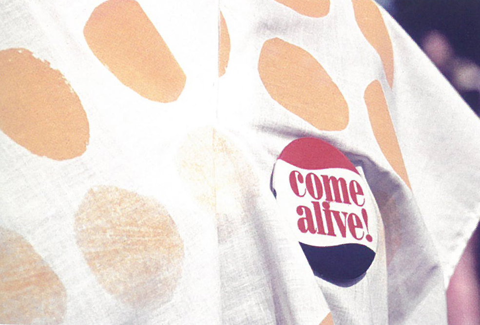
As a nun, sisterhood was undoubtedly a large part of Corita’s everyday life. Taught by nuns herself, two of her siblings additionally joined the church and the Catholic community was “such an ingrained part of her life that I don’t know how fully she articulated that,” Ray describes. “It seems as if, even after she left the order, she was close with the community and never really broke those ties. I think also when things were really difficult for her when she was still in habit, her community was a real source of support that she was drawing from.” While she may not have spoken about it openly, the way the order shaped her life is evident in her work’s liberality. An example of this is her ‘happenings,’ events where everyone was included, welcomed and given different gifts. “There would be confetti, balloons and a poem you would have to whisper in someone’s ear,” Ray explains. “Everyone would get one of these bags and she’d make people stand up, tell you to turn around and look the person behind you in the eye, put a crown on their head, all of this stuff. It was her art in person. Loud, joyful and colourful things happened.”
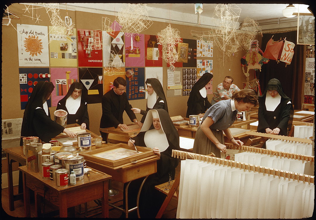
Sister Corita Kent: Copyright of Corita Art Centre
Sister Corita Kent: Copyright of Corita Art Centre
Sister Corita Kent: Copyright of Corita Art Centre
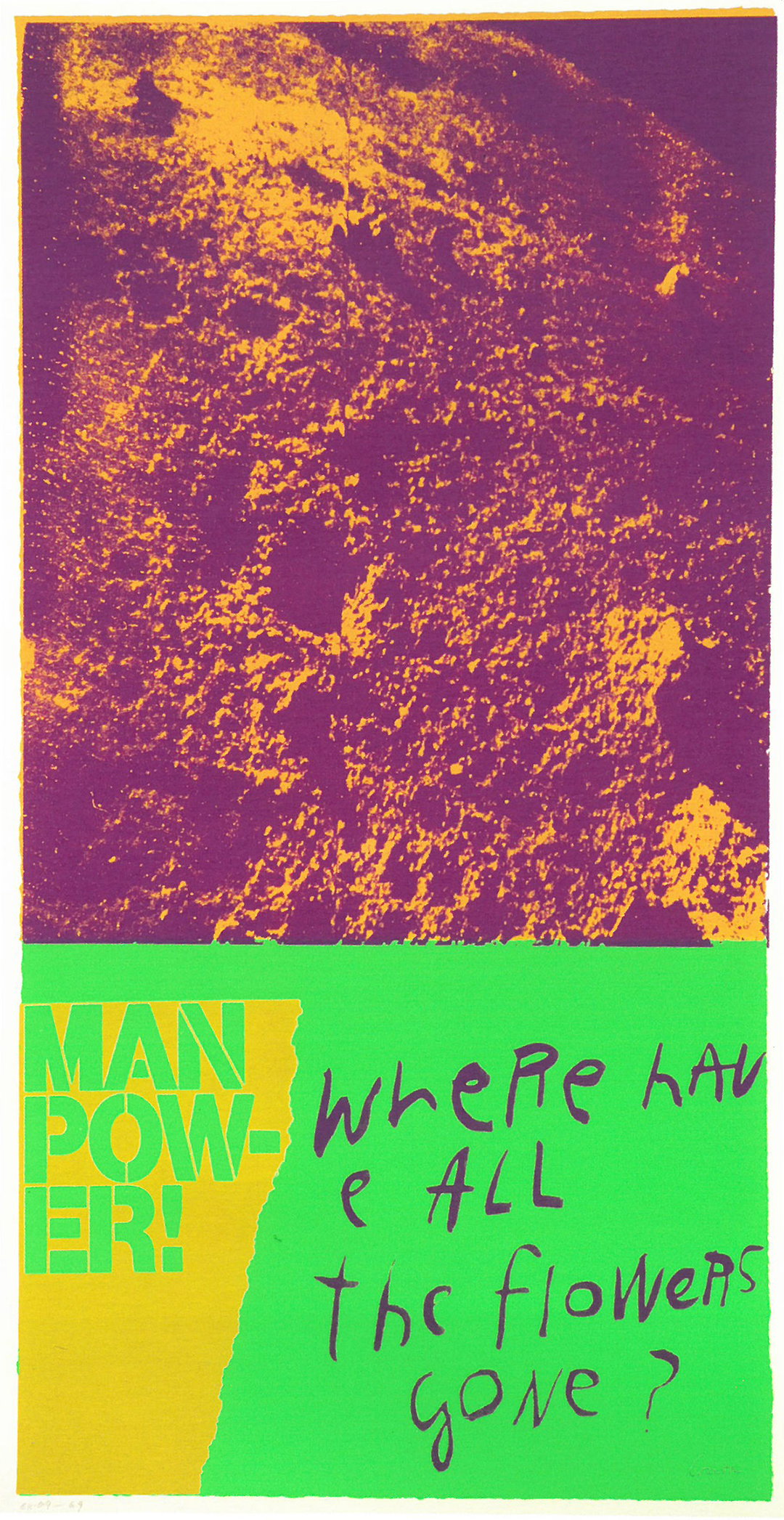
Sister Corita Kent: Copyright of Corita Art Centre
Sister Corita Kent: Copyright of Corita Art Centre
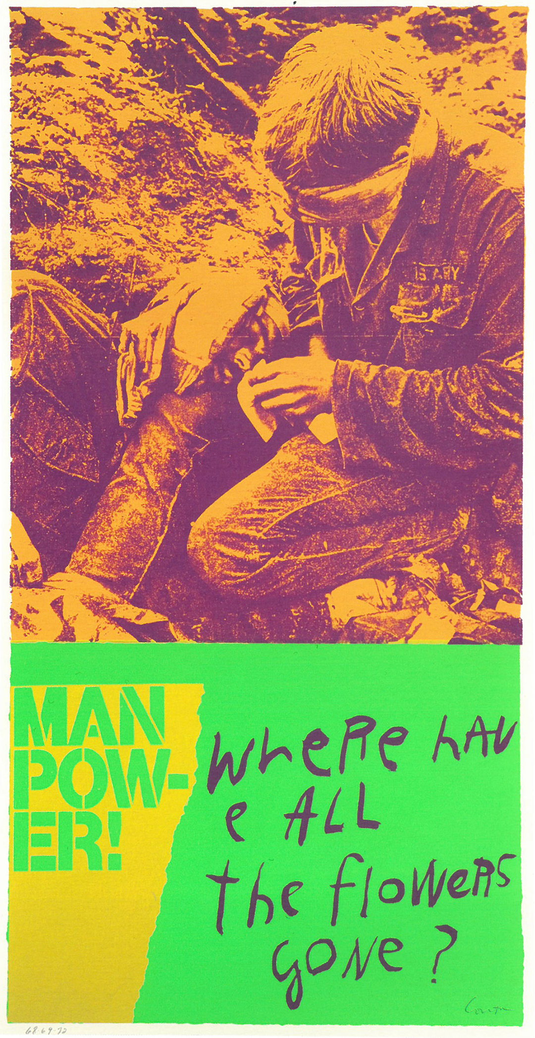
Sister Corita Kent: Copyright of Corita Art Centre
The artist’s generosity is the key element the Corita Art Centre now tries to preserve. Describing her as “the grandmother of socially activated art,” Ray’s directorship sees it implement a socialist attitude whereas other similar foundations shut their doors. The centre prides itself on being an open lender so that Corita’s pieces can be seen by all, working hard “to preserve the integrity of the collection, but we also see it is as fulfilling Corita’s wishes that it’s widely available,” she explains. “Corita didn’t really see a difference between craft and art, high art and low art, it’s apparent in her work to some extent, but also in the way she managed her career as an artist. You might find her prints in a church basement bookstore or one of the big galleries in New York City.”
The centre is also small because due to only being fully an artist in the later years of her life, Corita “left a really rich artistic estate, but not a very large monetary one, so there are some challenges around that,” Ray explains. Impressively, through just the work of two and a half people, the centre works at promoting and preserving Corita’s work and attempting to elevate it to “the place we feel she should be held in”.
Over the past five years Ray’s working life has been dedicated to Corita’s cause. Looking towards the future, in the year that would celebrate the 100th birthday of the artist, the centre’s big dream is “to have a proper gallery space, and a classroom really,” says Ray. “The thing on the horizon that I would really like to make happen is to develop a programme, an educational programme, that uses her teaching methods with kids or adults. That’s what we’re eyeing in the far-off distance. That’s the dream.”
Sister Corita Kent: Copyright of Corita Art Centre
Sister Corita Kent: Copyright of Corita Art Centre
Understandably, in working so closely with just one artist’s collection Ray feels like she almost knows Corita personally. Of course there are also many questions she wishes she could ask, from pieces of work that keep cropping up, to reading archived letters Corita received but never being able to read her responses, or just a longing to enquire about the real meaning of a piece of work. I ask Ray if there’s anything Corita has taught her through her work and she points me in the direction of her ‘rules’ titled, Learning by Heart: Teachings to Free Creative Spirit. Although intended to be advice for her students at Immaculate Heart College, the rules also offer valuable life encouragement: “Find a place you trust and then try trusting it for a while,” for instance, or “Be happy whenever you can manage it. Enjoy yourself. It’s lighter than you think”. Helpful hints follow suit as an add on at the end of her rules, and are quotes you can’t forget once hearing: “Always be around. Come or go to everything. Always go to classes. Read anything you can get your hands on. Look at movies carefully, often. Save everything — it might come in handy later.”
Corita’s inclusiveness, her willingness and want to help displayed in these rules, Ray describes as “breaking down any kind of barrier. It’s about being flexible, acceptable…That’s the biggest thing for me, flexibility that comes from not being so rigid about what things are, or what they have to be, or how they have to work. Corita rolled with the punches, and I try to think like that.”
Come Alive! The Spirited Art of Sister Corita is available via Four Corner Books and an exhibition of her work will open at Ditching Museum of Art and Craft from 5 May — 14 October 2018.
Sister Corita Kent: Copyright of Corita Art Centre
Sister Corita Kent: Copyright of Corita Art Centre
Sister Corita Kent: Copyright of Corita Art Centre
Sister Corita Kent: Copyright of Corita Art Centre
Sister Corita Kent: Copyright of Corita Art Centre
Sister Corita Kent: Copyright of Corita Art Centre
Sister Corita Kent: Copyright of Corita Art Centre
Sister Corita Kent: Copyright of Corita Art Centre
Sister Corita Kent: Copyright of Corita Art Centre
Sister Corita Kent: Copyright of Corita Art Centre
Sister Corita Kent: Copyright of Corita Art Centre
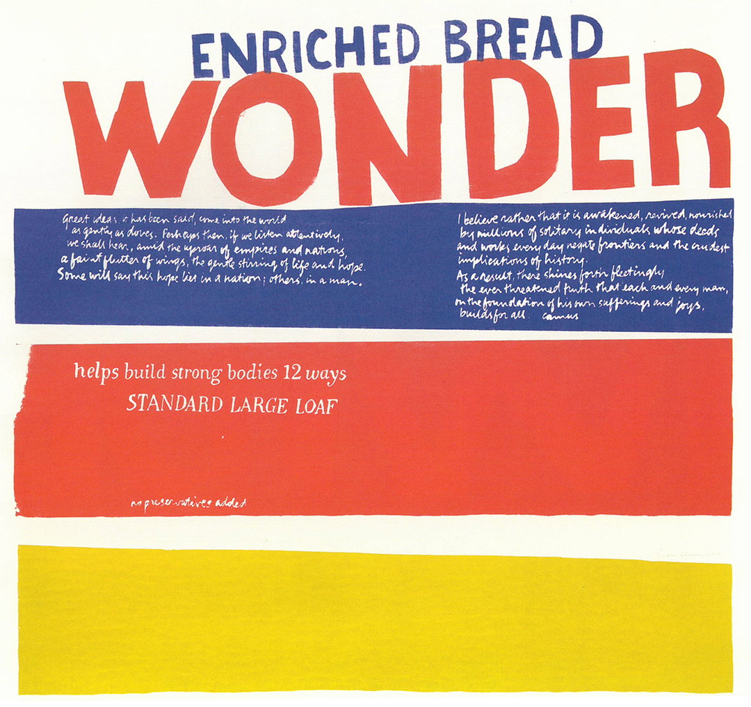
Sister Corita Kent: Copyright of Corita Art Centre
Sister Corita Kent: Copyright of Corita Art Centre
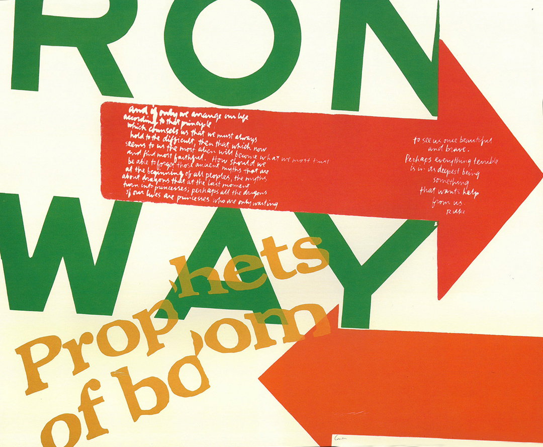
Sister Corita Kent: Copyright of Corita Art Centre
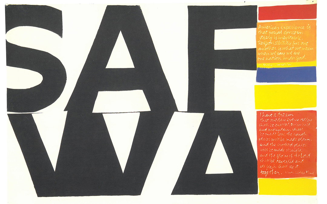
Sister Corita Kent: Copyright of Corita Art Centre
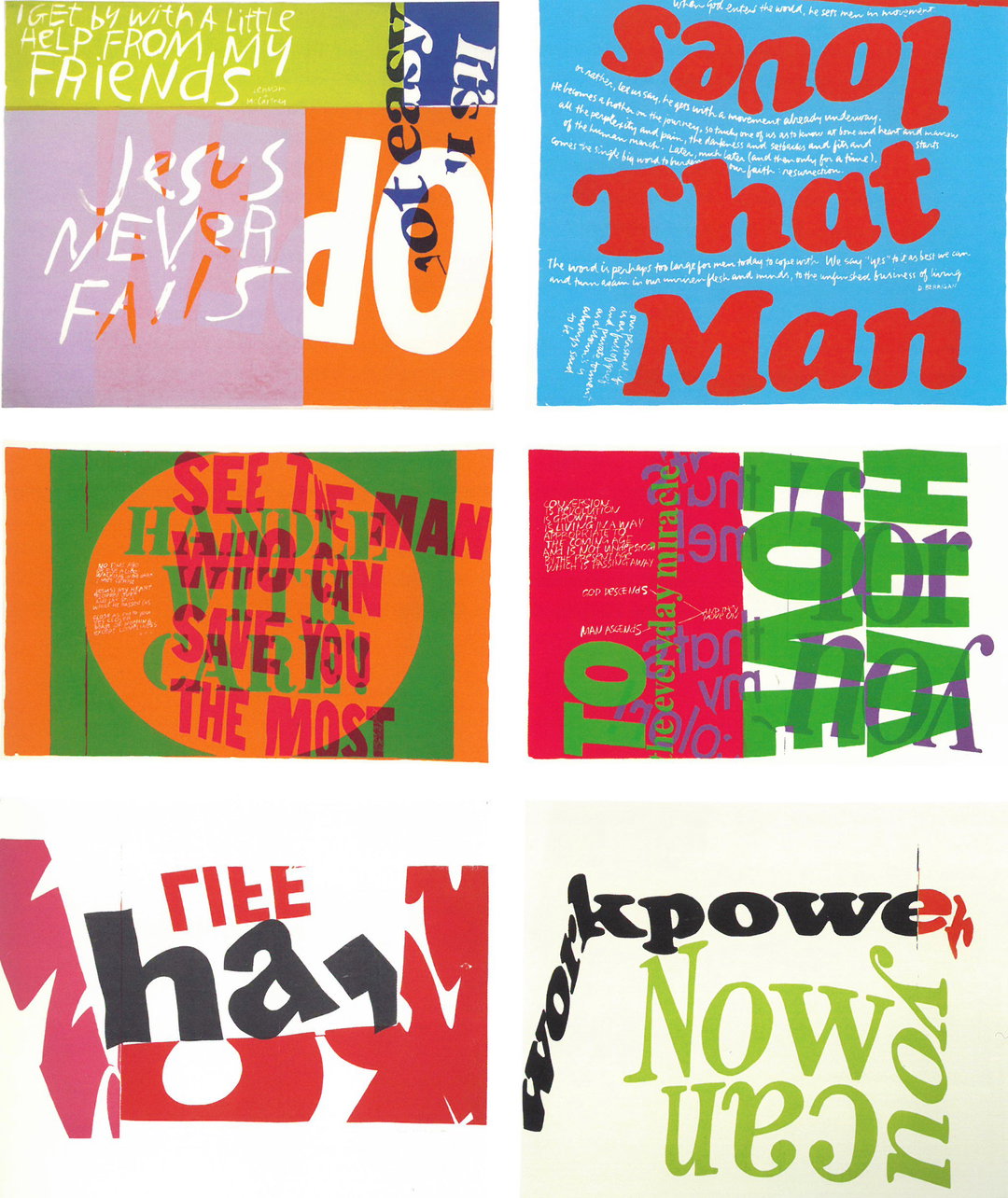
Sister Corita Kent: Copyright of Corita Art Centre
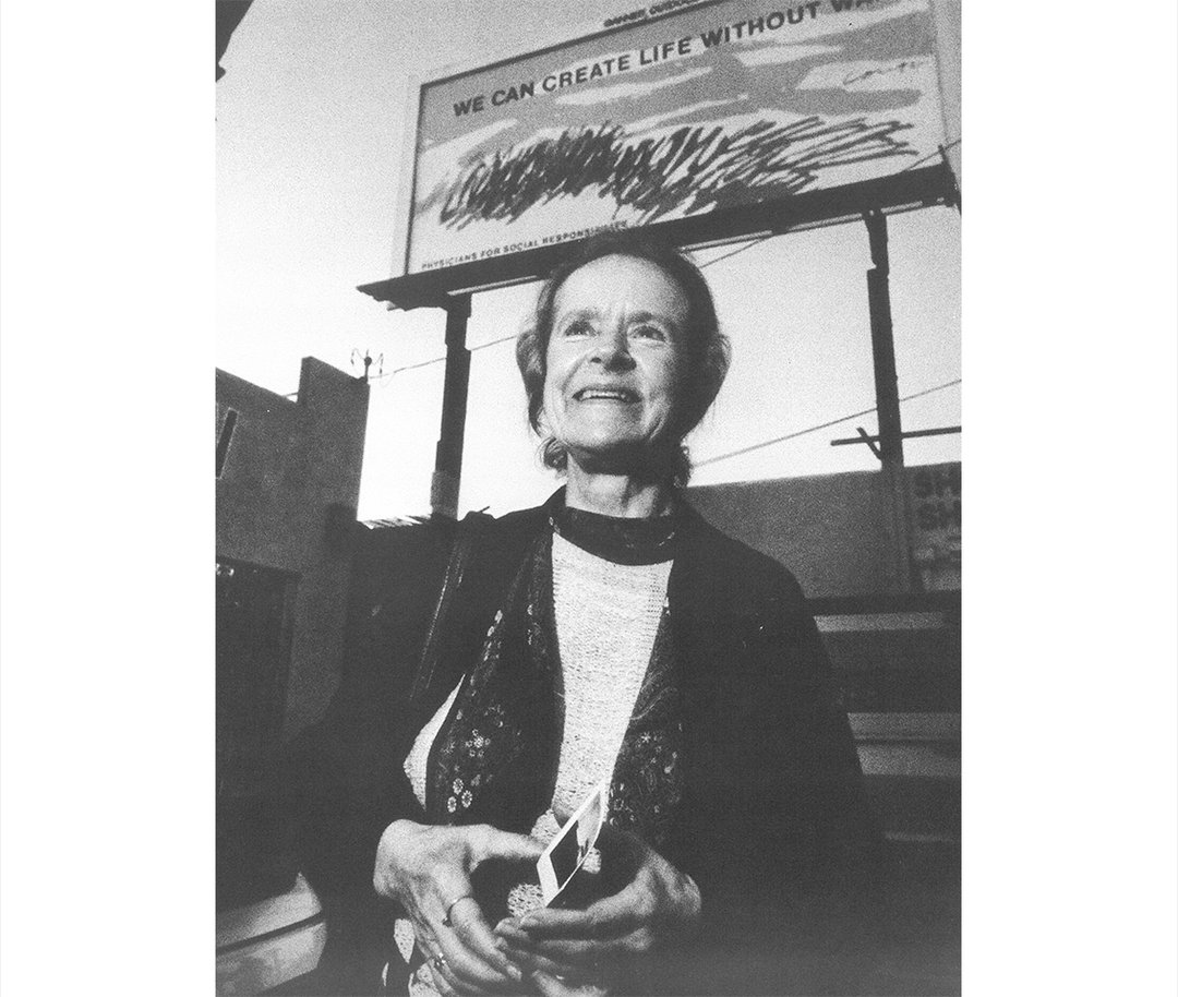
Sister Corita Kent: Copyright of Corita Art Centre
Share Article
Further Info
About the Author
—
Lucy (she/her) was part of the It’s Nice That team from 2016–2025, first joining as a staff writer after graduating from Chelsea College of Art with a degree in Graphic Design Communication, eventually becoming a senior editor on our editorial team, and most recently at Insights, a research-driven department with It’s Nice That.