- Words
- Ellie Robertson
- —
- Date
- 13 August 2018
- Tags
Illustration graduate Alva Skog's energetic practice is rooted in female empowerment
Share
Share
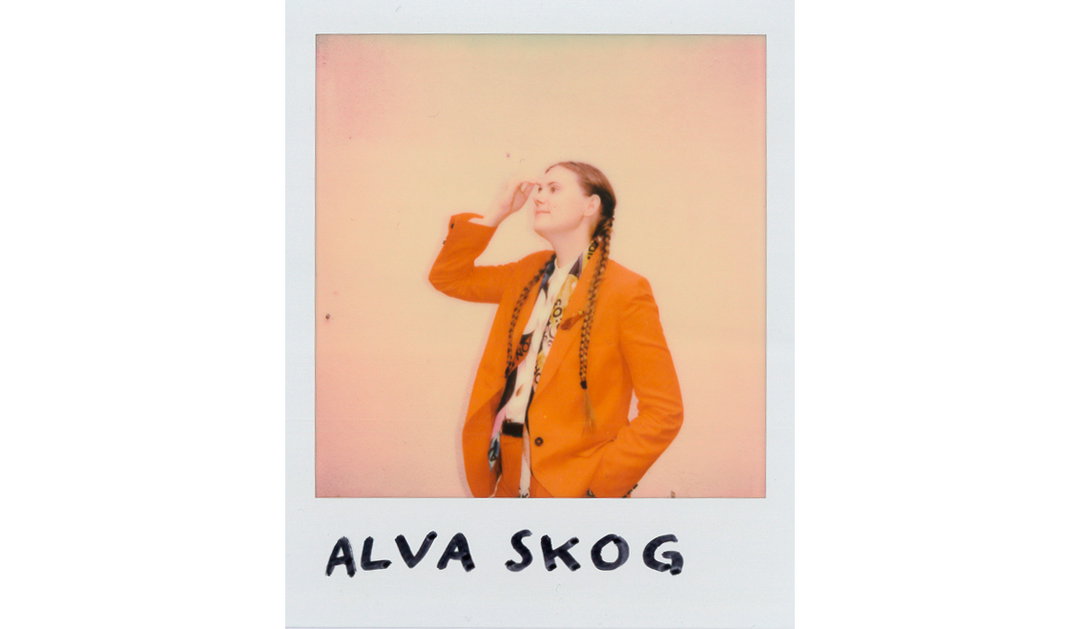
Illustration has always been a way for Alva Skog to communicate and express herself, “I can’t remember a time when I didn’t draw” they tell It’s Nice That. “Whenever someone had a birthday in my family, I drew a family portrait. I still do.” After a two-year art course in Sweden (where the illustrator is originally from), Alva headed to Central Saint Martins where, despite studying Graphic Design, they kept coming back to illustration, along with a brief interlude into animation.
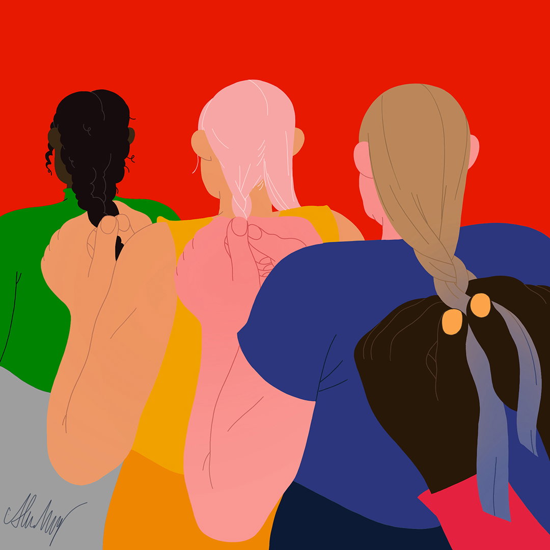
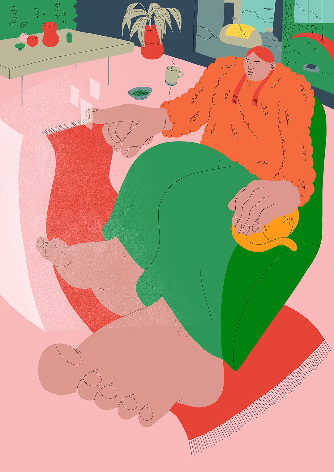
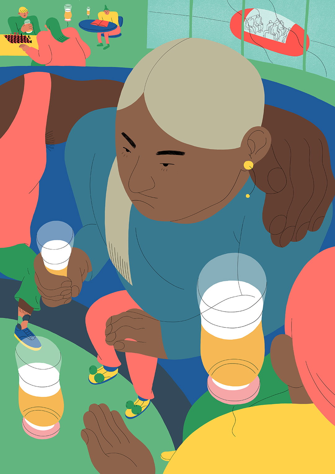
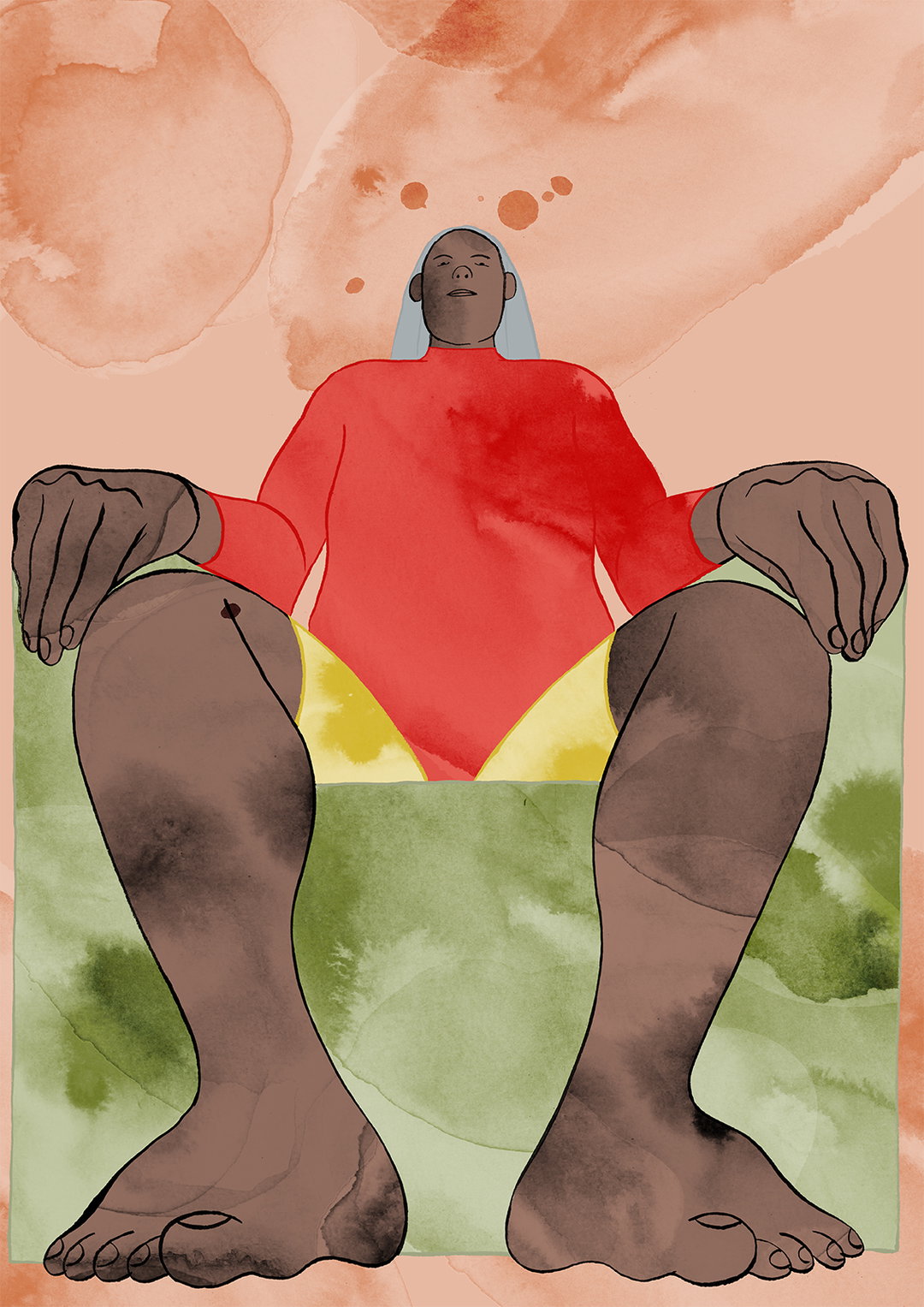
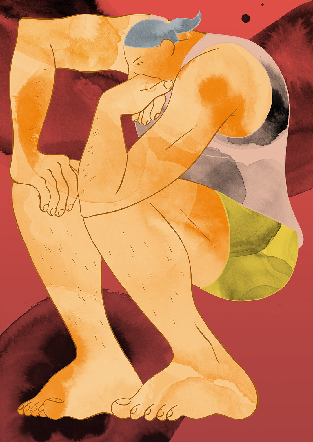
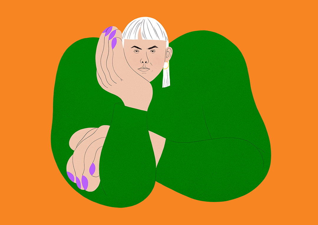
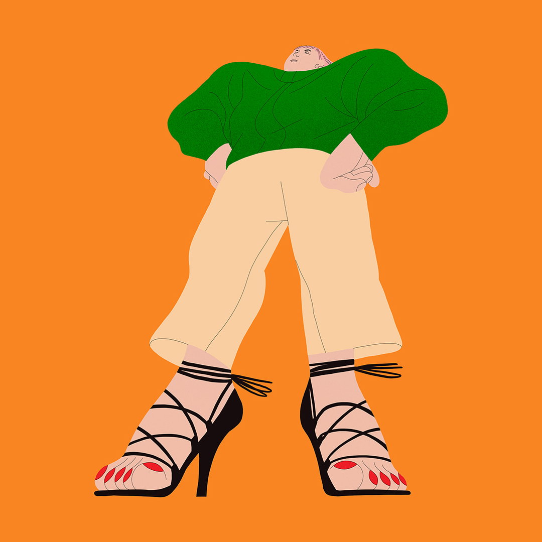
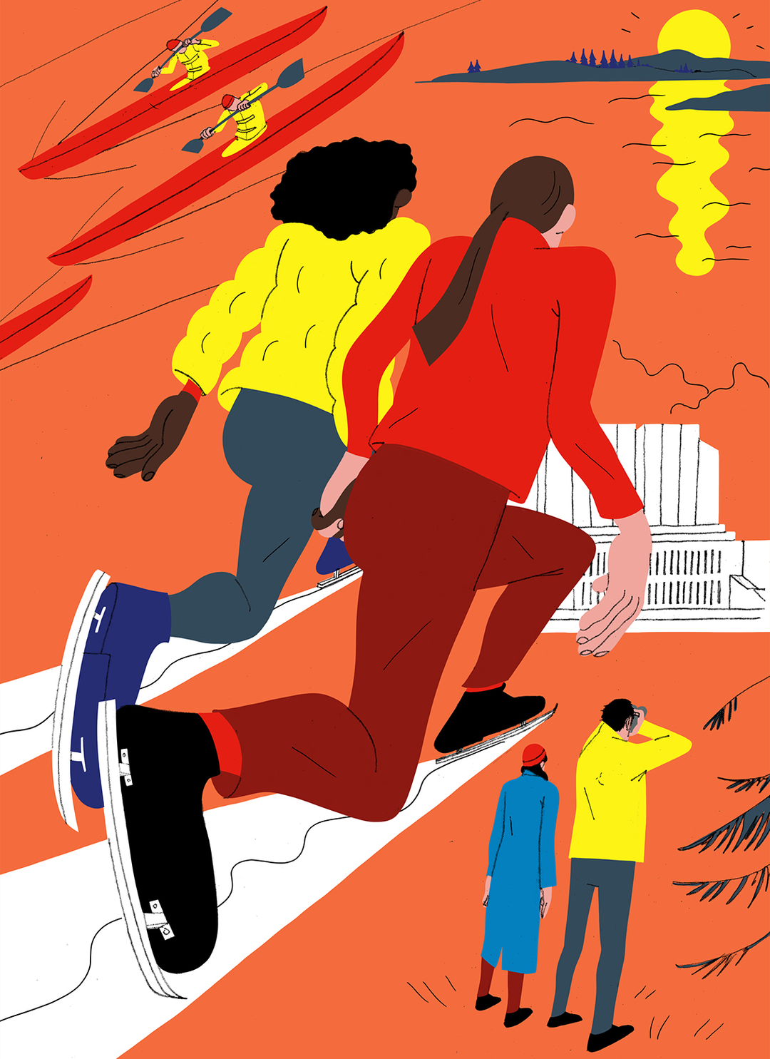
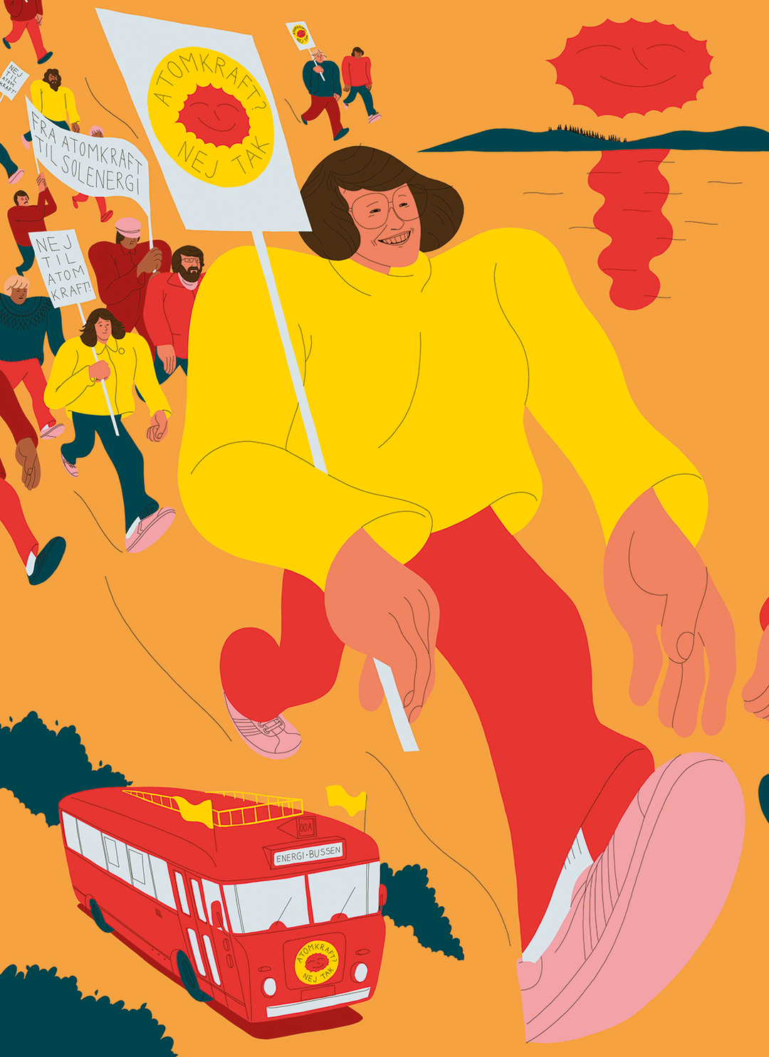
Their distinctive style is characterised by bright, vivacious colours, oversized hands, shrunken heads and always strong, powerful female or genderless characters. The latter might be explained by their creative influences, which include “my younger sister’s view on life, my mother’s knowledge of feminism”, as well as “feminist science fiction, graphic novels, and women and non-binary people who stretch the boundaries of gender identity”.
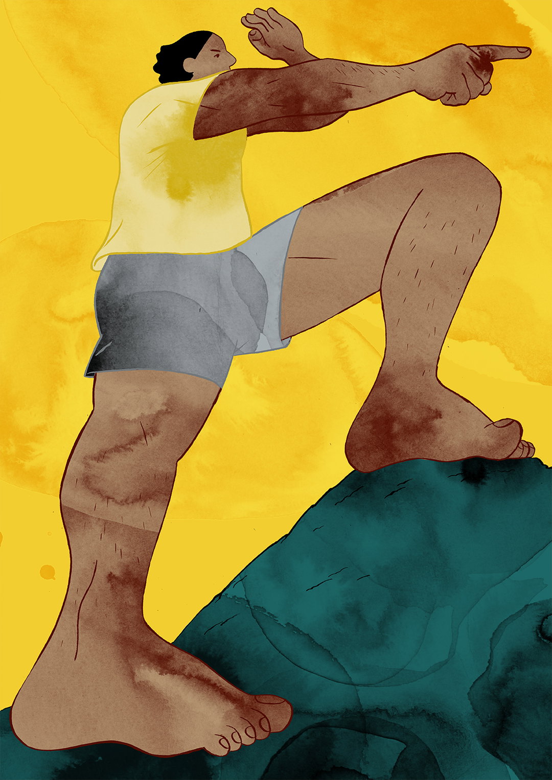
Alva’s unusual use of perspective and playful interpretation of body parts is equally rooted in female empowerment, specifically their anxiety that women are too often depicted “looking happy, pretty and heteronormatively sexy.” To combat this, Alva uses “a low perspective so that you look up at the characters which makes them seem powerful”. Likewise, the women are often pictured taking big leaps “so it looks like they are heading somewhere with confidence”, in order to “draw attention to the power dynamics of contemporary society,” says the artist. The result is energetic, expressive and often touching illustrations bursting with life and colour.
It’s Nice That: Why did you decide to study graphic design at Central Saint Martins?
Alva Skog: When I was applying for university I couldn’t decide between fine art and graphic design. I chose graphic design because I believed it was more to do with working on projects with people and for a client, and I felt this suited me better. But, when I studied the course, I realised that the borders between graphic design and fine art are blurred and sometimes it is the same thing. This is what I think is so great about Central Saint Martins. What I learned there is that graphic design is so many things. It can be filmmaking, illustration, photography, installation, furniture or VR. It’s about how you best communicate your idea and message.
I’d heard about Central Saint Martins and its good reputation. I applied, wasn’t too sure if I would get in but I did and I said I’d try it for a year because it is very expensive. I liked it so much that I finished my bachelor and now I’m going to miss it like crazy!
INT: Can you describe a project you’re most proud of and why?
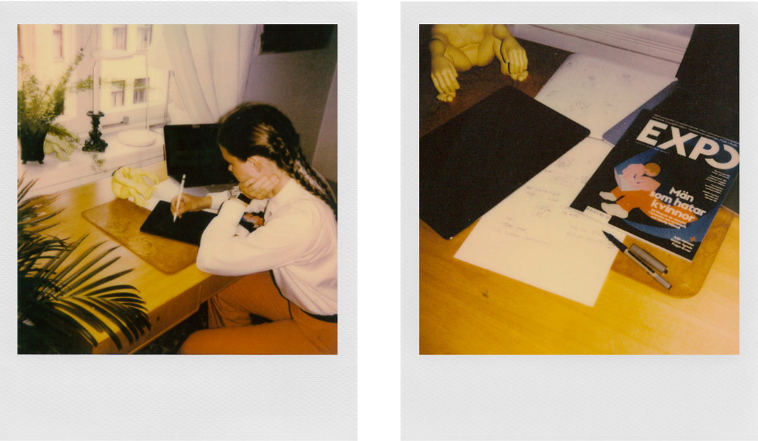
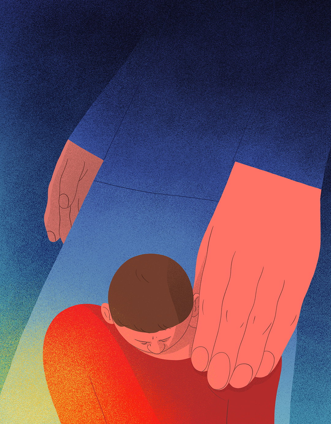
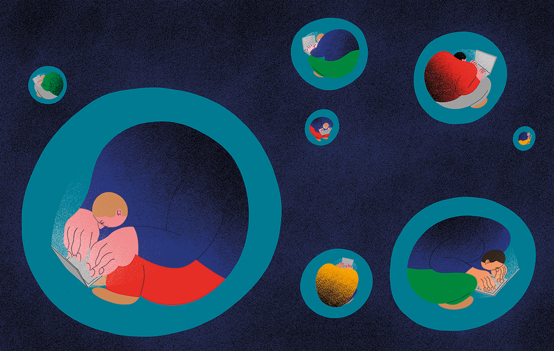
AS: That’s a hard question. I am proud of a lot of projects I have done recently, such as work for The Guardian and the Swedish magazine Expo where I illustrated articles on important issues. The Guardian article was about child abuse and the Expo article was about incels (involuntary celibates).
Another project I’m proud of is my highly commended entry for this year’s V&A Illustration Awards. For this, I made three illustrations called The Thinker, The Explorer and The Leader where I explored female identity positions. Each poster is based on a stereotypically male identity position that is not usually associated with women.
INT: What was the best bit about your time at university? And the worst?
AS: The best bit was being surrounded by all these motivated and creative people from all around the world and being able to inspire and learn from each other.
The worst time at university was the last couple of weeks — to have to say goodbye to everyone.
INT: Is there a particular person who has shaped your university experience or creative outlook?
AS: My classmates.
INT: Why did you decide to apply to The Graduates?
AS: I found out about it last year and I’m a big fan of It’s Nice That and all the incredible designers and illustrators featured there.
INT: If you could create your dream project, what would it be?
AS: My dream project is not necessarily about a specific project, but rather who I dream of working with. I would like to work with inspiring people on important issues such as anti-racism, equality and norm criticism.

Supported by Polaroid
Polaroid Originals is the new brand from Polaroid, dedicated to original format Polaroid analog instant photography. Find out more about their new and vintage cameras, plus film and accessories, on polaroidoriginals.com
The It’s Nice That Graduates 2018 is supported by Lecture in Progress and Polaroid Originals.
Share Article
Further Info
About the Author
—
Ellie joined It’s Nice That as managing editor from June to September 2018.