




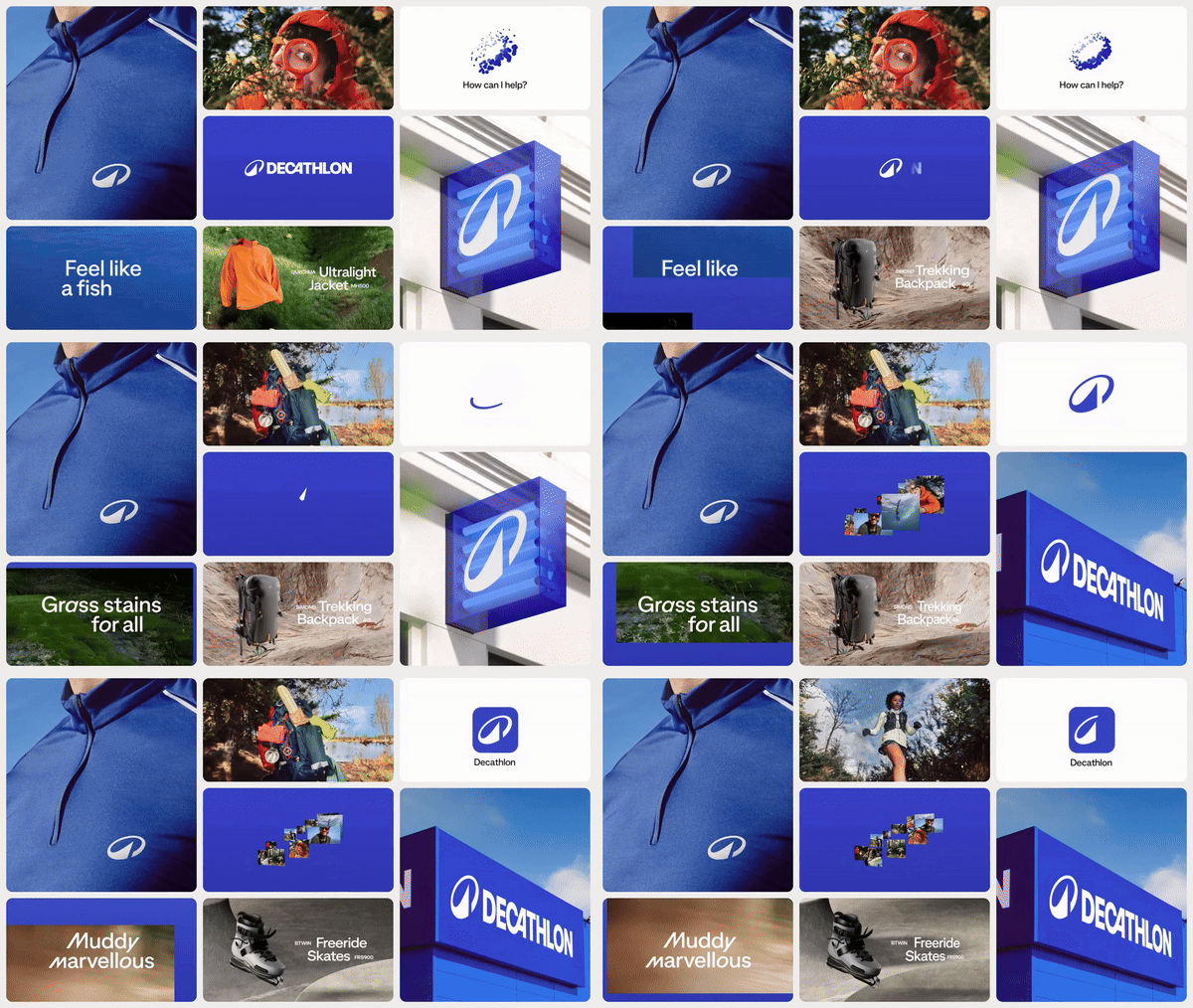
Wolff Olins’ rebrand of Decathlon gives the company its first ever logo
How do you create an identity for a brand that’s gone 48 years, having only a wordmark?
Share
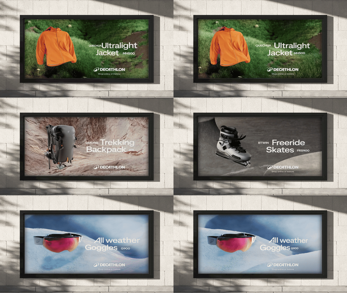
Wolff Olins has rebranded of one of the world’s biggest sports brands, Decathlon. The French sporting retailer’s new visual identity boasts a fresh icon – referred to as L’Orbit – reflecting the brand’s new mission to “move people through the wonders of sport”. It’s presented alongside a global creative campaign by Wolff Olins’ sister company and advertising agency AMV BBDO.
One of the major reasons behind the rebrand was Decathlon’s previous lack of a logo. Not only did Wolff Olins see a logo as being paramount, but they wanted to instil one that would fit across its range of products, no matter the size; one that amplified its position as a leading sports brand, and cultivated a sense of pride in its employees. “A mark that was shorthand for what the brand essentially stands for,” Emma Barratt, global executive creative director at Wolff Olins, tells us.
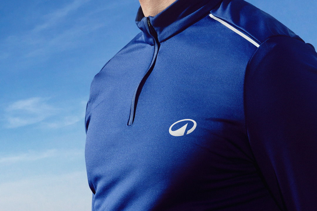
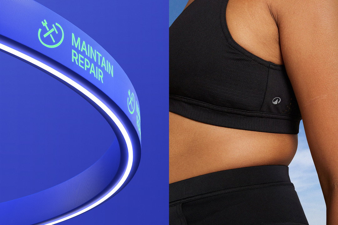
Central to the new logo was the need to symbolise the outdoors: the symbol boasts a mountain and wave reflecting a plethora of sports. Being a brand that has emphasised its care for the planet – through its circular models including its mission to extend its products lifespan through improving its product recyclability, its buyback system and developing a product hire service – Wolff Olins wanted to ensure that L’Orbit wasn’t merely an identifier, but a shorthand. “You’re meant to feel something when you see it. Like when you see the Apple logo, for example, you know that you’re buying into this rebellious tech club,” Emma shares. “People have grown up with Decathlon but not exactly desired Decathlon, so this is about becoming a mark of desire too.”

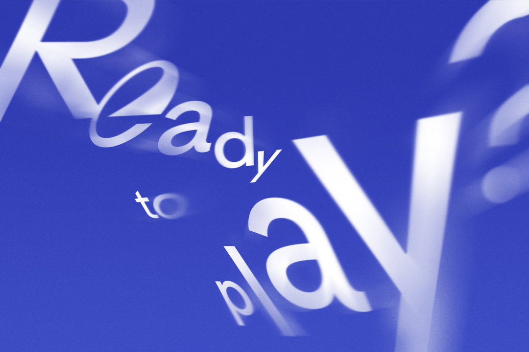
The bespoke typeface for the rebrand was created by Swizz foundry Grilli Type. When briefing the Grilli team, Wolff Olins wanted to convey a sense of the brand going beyond the logo. “There are certain things that come through in a distinct typeface – it’s the handwriting of the brand,” Emma says. The mission for the type was to lean into the playful, while highlighting the performance side of the sport. “We wanted it to have characters that felt joyful and wondrous,” she adds. There’s the curvature which makes its nod to L’Orbit (in the O), and also slants that nod to the performance (in the M and Y), deliberately chosen to flex both sides of the brand.
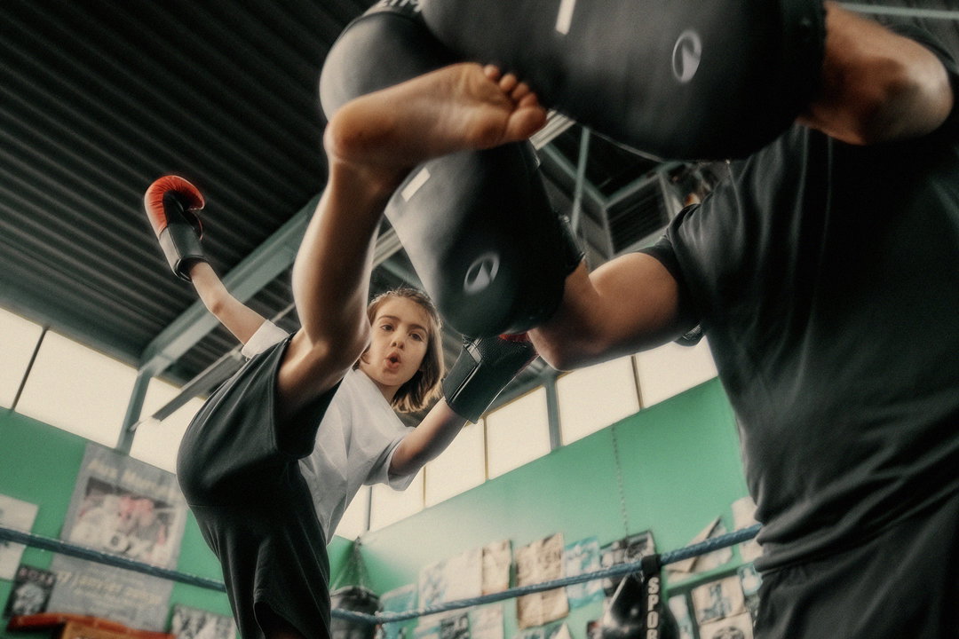
For Wolff Olins, when creating the brand identity, it immediately set Decathlon apart from the rest of the industry by focusing on more than performance or winning. “The brand appeals to all levels, entry through to experts, with a clear focus on the emotions of the participant,” Emma tells us. “The sheer joy of movement, the fun behind play, the dedication to practice and improvement, the reward of progress,” she adds.
Decathlon is 48 years old this year and is receiving its first logo and identity that explores its dedication to the world of competition, the outdoors, nature and the planet, and the wonders of growth through sport. The team of all these elements in the imagery, tone of voice, and new logo may well be the face of the brand 48 years into the future.
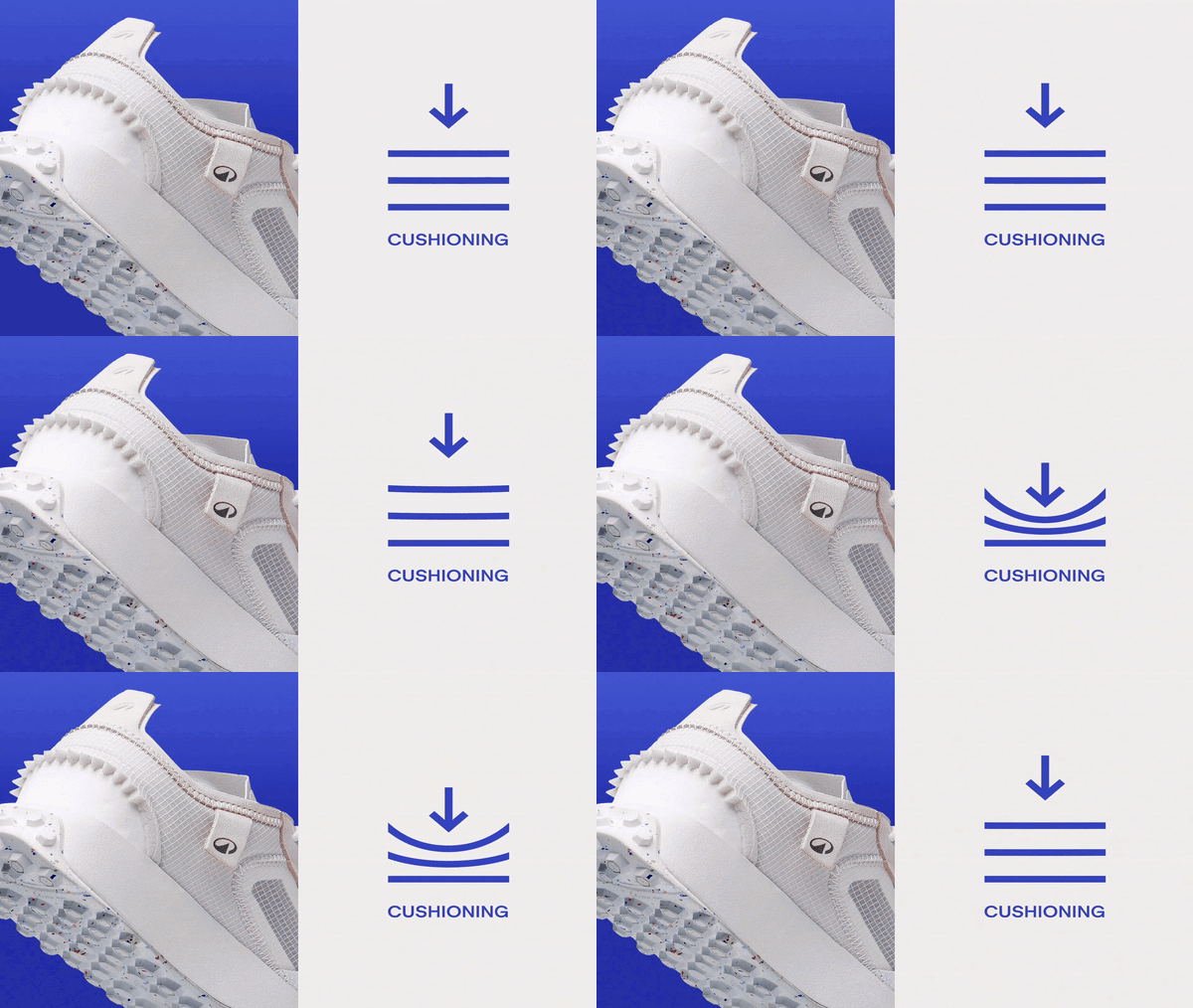
GalleryWolff Olins: Decathlon rebrand, campaign by AMV BBDO (Copyright © Wolff Olins, 2024)
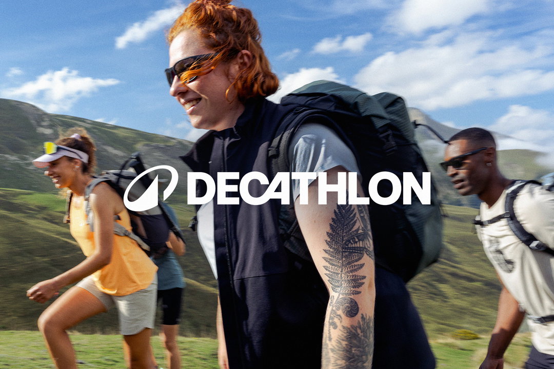

Hero Header
Wolff Olins: Decathlon rebrand, campaign by AMV BBDO (Copyright © Wolff Olins, 2024)
Share Article
Further Info
About the Author
—
Yaya (they/them) was previously a staff writer at It’s Nice That. With a particular interest in Black visual culture, they have previously written for publications such as WePresent, alongside work as a researcher and facilitator for Barbican and Dulwich Picture Gallery.




