




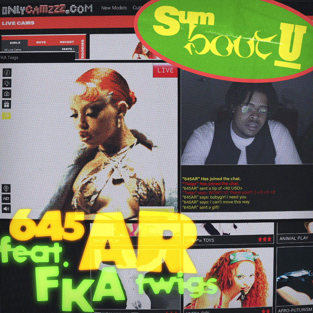
Wei Prior’s multifaceted creative practice is likened to the art of cooking
We chat with the designer on utilising creativity to form your own community, and ensuring your practice does the same for others.
Wei Prior can trace his love for graphic design all the way back to growing up in the British coastal town of Bournemouth. Having studied the medium from the age of 14 at GSCE, Wei recalls endless days at school where he and his best mate Ethan Major would chill in classrooms, drawing posters or making ode-like music videos for their favourite metal songs. “There was a time I purposefully got sent to isolation (all day detention) and took all the art supplies with me to make art all day – definitely a flaw in their system,” he tells It’s Nice That. “That was my first experience of a ‘design community’ and I’ve loved that aspect of design ever since”.
Today, Wei works as a creative across multiple outputs, both in his own work and as part of his own wider studio, ChaChaanTeng. Already bagging clients such as Paul Smith and Puma, as well as music artists such as Kali Uchis, FKA Twigs and 645AR, when discussing his approach to design Wei often uses a cooking analogy: “I’d describe it as trying to make the most interesting dish out of the ingredients supplied by the client!”
This tendency to mix and match, or delve deeper into a range of references, is a quality Wei thanks to growing up with different cultures from his Chinese and Egyptian heritage. In fact, ChaChaanTeng represents this wholeheartedly, a newly founded studio “that focuses on building communities and is inspired by my upbringing in my dad’s takeaways and restaurants,” he explains. “At CCT, we’re a family. I’m the head chef and handle the design and business side of things, and sous chef José Soares leads creative innovation and tools. Together, we make up the bread and butter. Then we have our team of amazing talented chefs, who each bring a different flavour to the kitchen.”
These flavours often translate to mediums, with Wei furthering the analogy by adding: “Some days someone might order an animation, or some branding or printed matter, and switching between projects keeps things interesting and stops your plate from getting stale.” What drives this work behind the scenes, however, is the people involved in the projects, from the individual supplying the brief, the wider pool of creatives who jump on board as freelance, and of course the final viewer. “I’ve found that we’re taught a lot about briefs, but there is rarely a focus on the clients themselves, which may lead to big designer egos,” elaborates Wei. “So I try to get to know the people behind the brief because sometimes, there are subtle details to their character that can inspire the process." He likens this attention to detail as a director’s approach to film, where minor details “add depth to the story and the universe it lives in.”
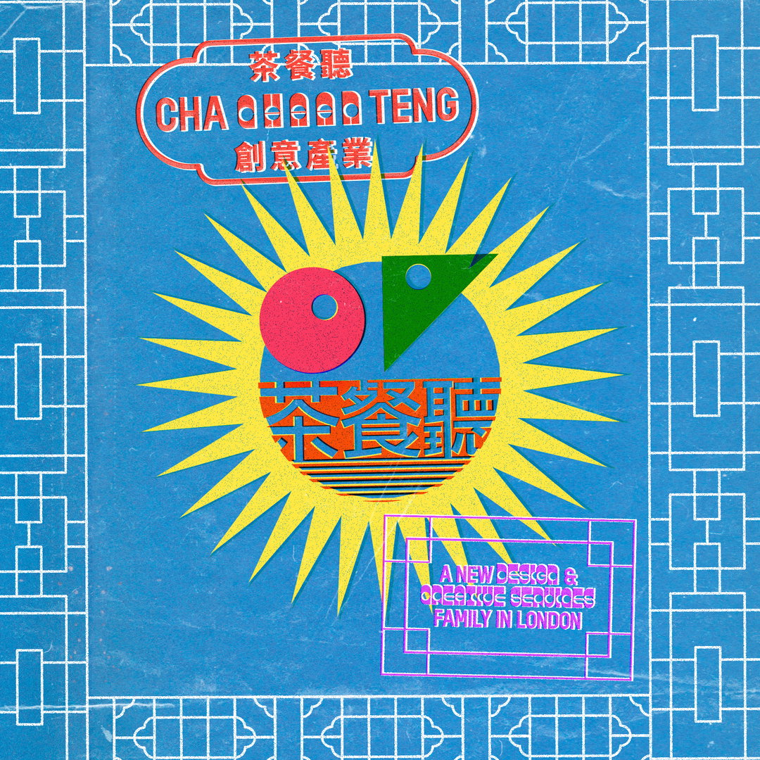
ChaChaanTeng (Copyright © ChaChaanTeng, 2021)
Wei points us towards a visual example of his work with Theo White and Sage Wickings on magazine9 6FT, where “the main design reference was Theo’s energy, spirit and passion,” says the designer. Resulting in bold uses of “colour, composition and expressive shapes” that lead a reader through the narrative experience of the publication, “6FT was really a turning point when I realised how powerful it can be to successfully capture the personality behind the project.”
More specifically as a designer, Wei has an amazing ability to imbue typography with personality, especially in details like his work for Paul Smith’s 50th Anniversary, or his pieces for Kali Uchis. He only started to experiment with his own approach to typography last year while working with Play Nice, “and now for some insanely talented artists like Kali Uchis – who would have thought?”
Admitting that drawing is his “least competent skill”, Wei finds enjoyment in trial and error, also finding that “having fun with a project really makes a difference that people can tell!” Purposefully leaving imperfect typographic details or little flairs, as well as reintroducing risk to his practice, Wei recommends first “trying to get to know your own handwriting, even if it’s awful like mine and where it can be positioned within work,” he says. “It may not always be appropriate, but it’s another tool to add to the kit.”
In recent months the designer has also been busy working on a pro-bono project as part of ChaChaanTeng, adding that the studio makes time for self-initiated projects “especially in times like these where we’re more isolated.” Currently working with Dr. Missagh Fini MBBC MSc MRCGP, the studio have created “an apparel brand to raise money and awareness for mental health disorders called IAWA (I Am, We Are),” a process that’s not only been a great outlet for experimentation, but “it helps remind us that we do what we do because we love it and are privileged to do so.”
Hoping to focus this ethos as ChaChaanTeng further this year, Wei and the team are currently experimenting on how its ethos of building community can “help emphasise design as a service,” looking at how they can best aid small business all towards making “high quality design more accessible”.
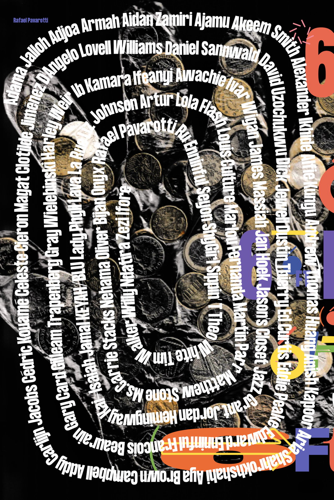
Wei Prior: 6FT (Copyright © Wei Prior / 6FT, 2020)
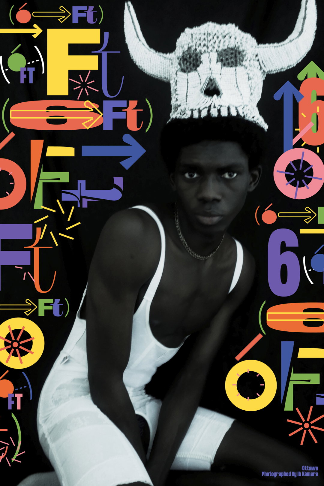
Wei Prior: 6FT (Copyright © Wei Prior / 6FT, 2020)
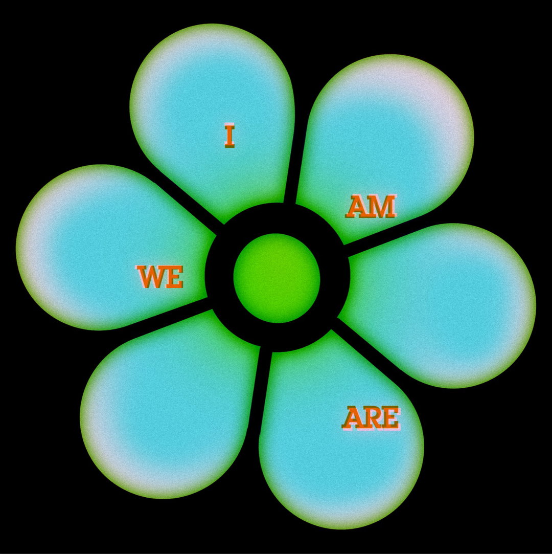
ChaChaanTeng: IAWA (Copyright © ChaChaanTeng, 2021)
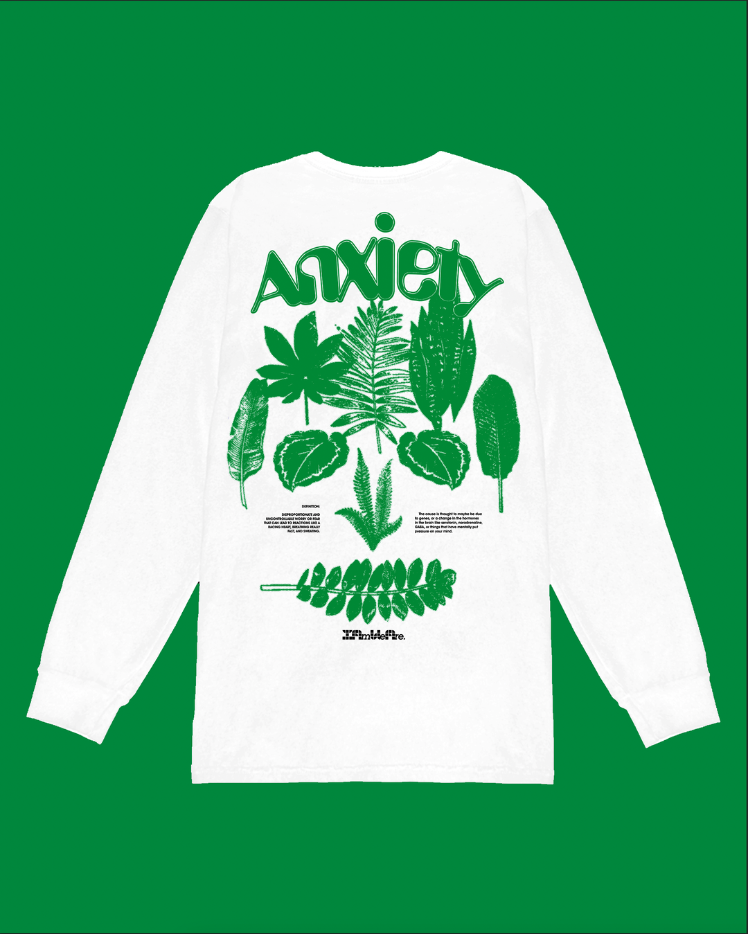
ChaChaanTeng: IAWA (Copyright © ChaChaanTeng, 2021)
ChaChaanTeng: IAWA (Copyright © ChaChaanTeng, 2021)
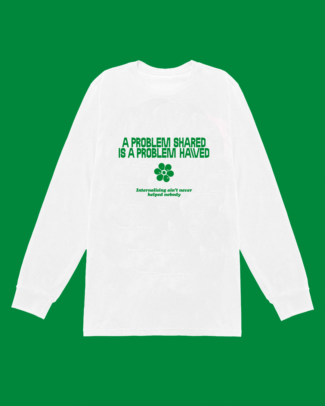
ChaChaanTeng: IAWA (Copyright © ChaChaanTeng, 2021)
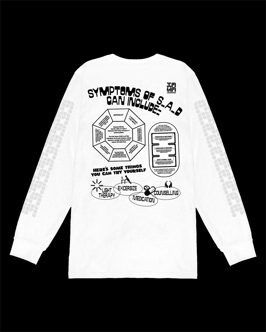
ChaChaanTeng: IAWA (Copyright © ChaChaanTeng, 2021)
ChaChaanTeng: IAWA (Copyright © ChaChaanTeng, 2021)
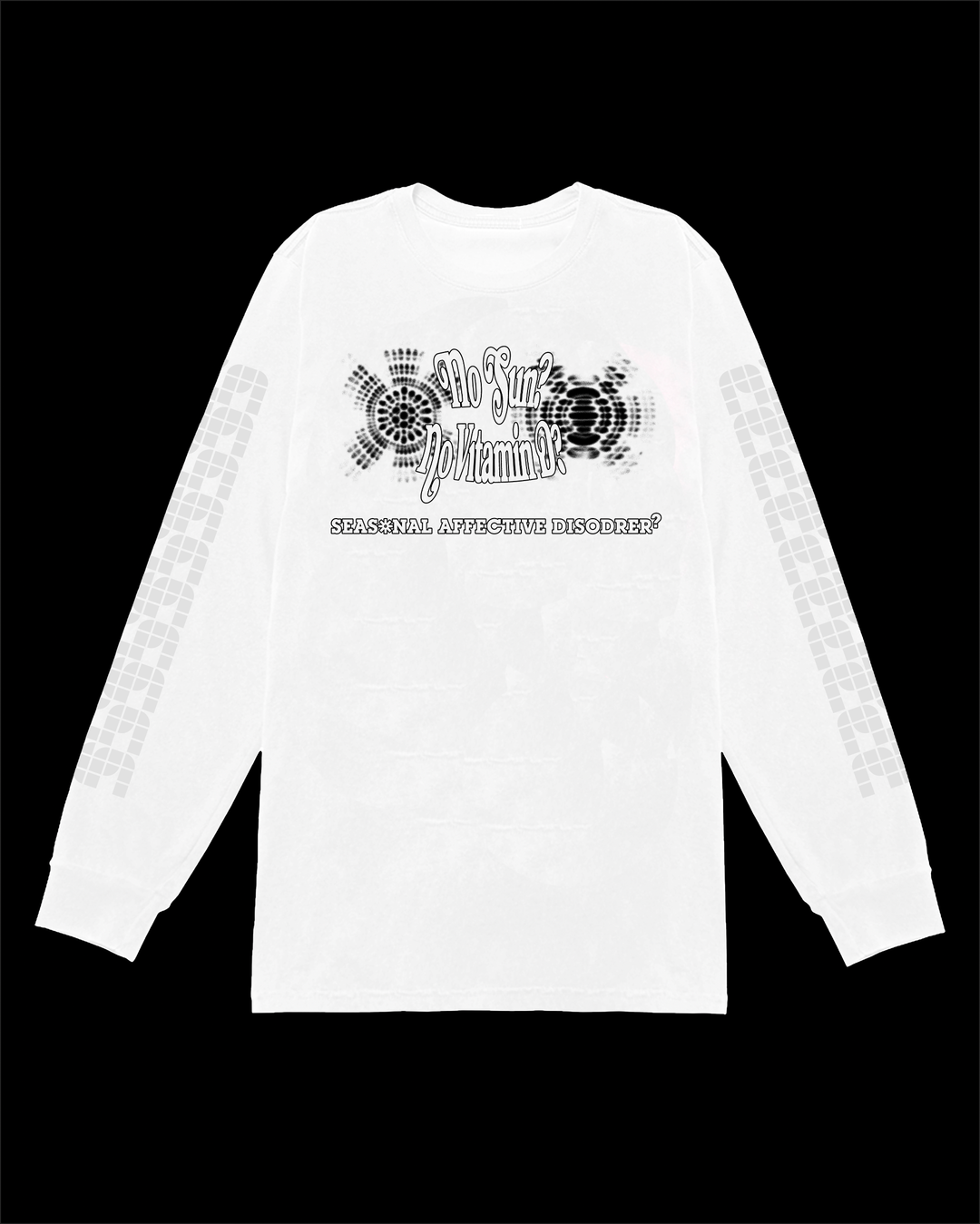
ChaChaanTeng: IAWA (Copyright © ChaChaanTeng, 2021)
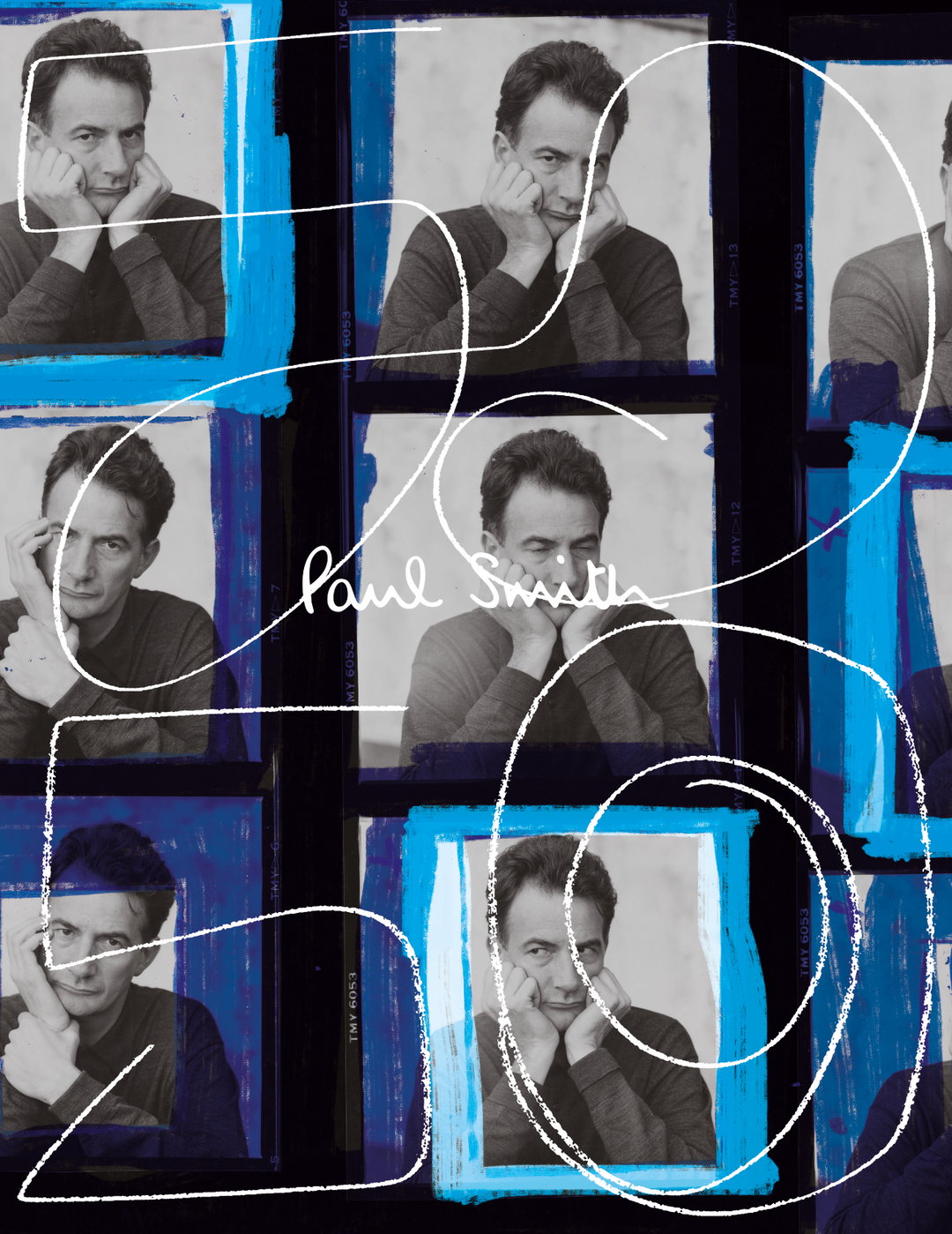
Wei Prior: Paul Smith 50th Anniversary (Copyright © Wei Prior / Paul Smith 2021)
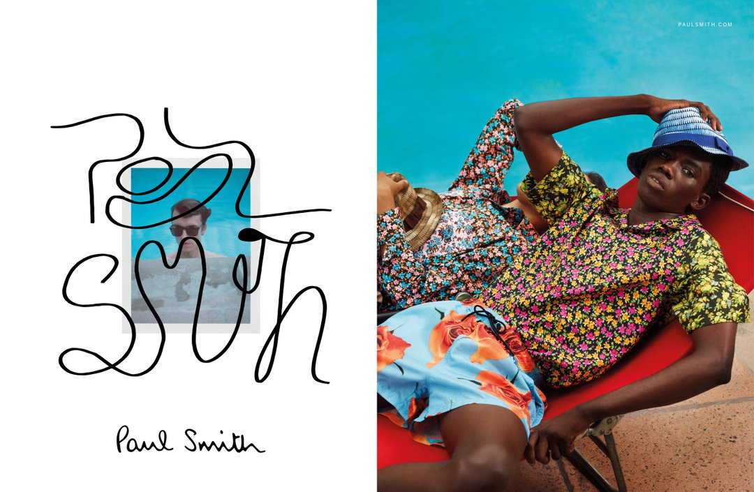
Wei Prior: Paul Smith SS21 (Copyright © Wei Prior / Paul Smith 2021)
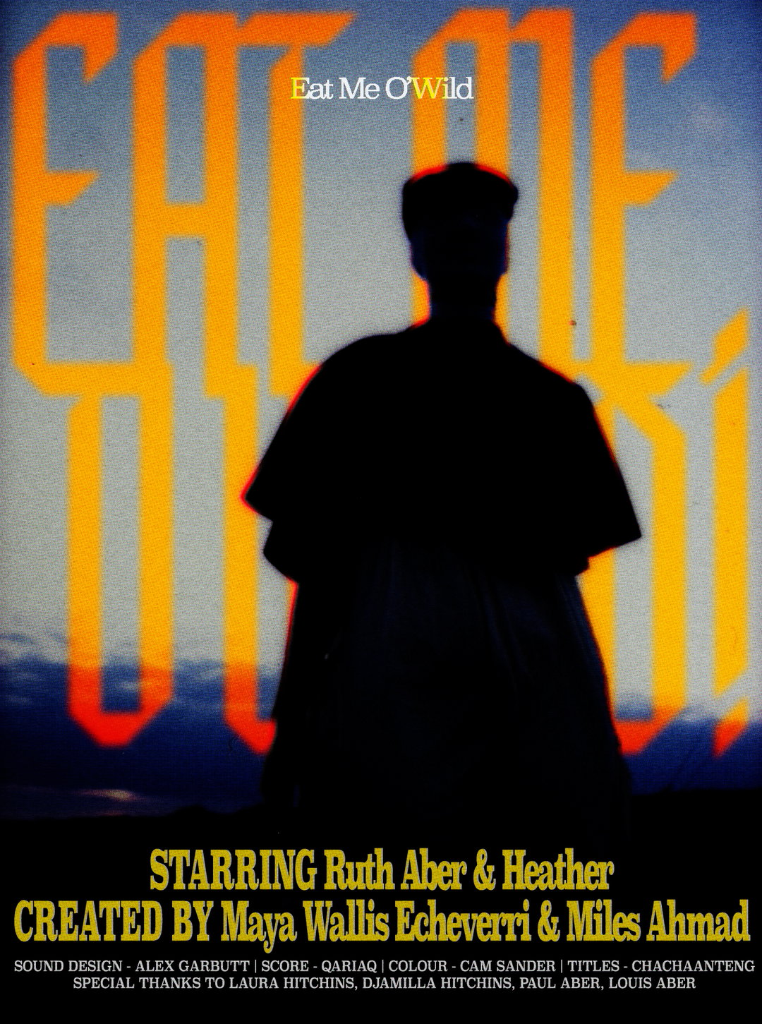
ChaChaanTeng: Eat Me O'Wild (Copyright © ChaChaanTeng 2021)
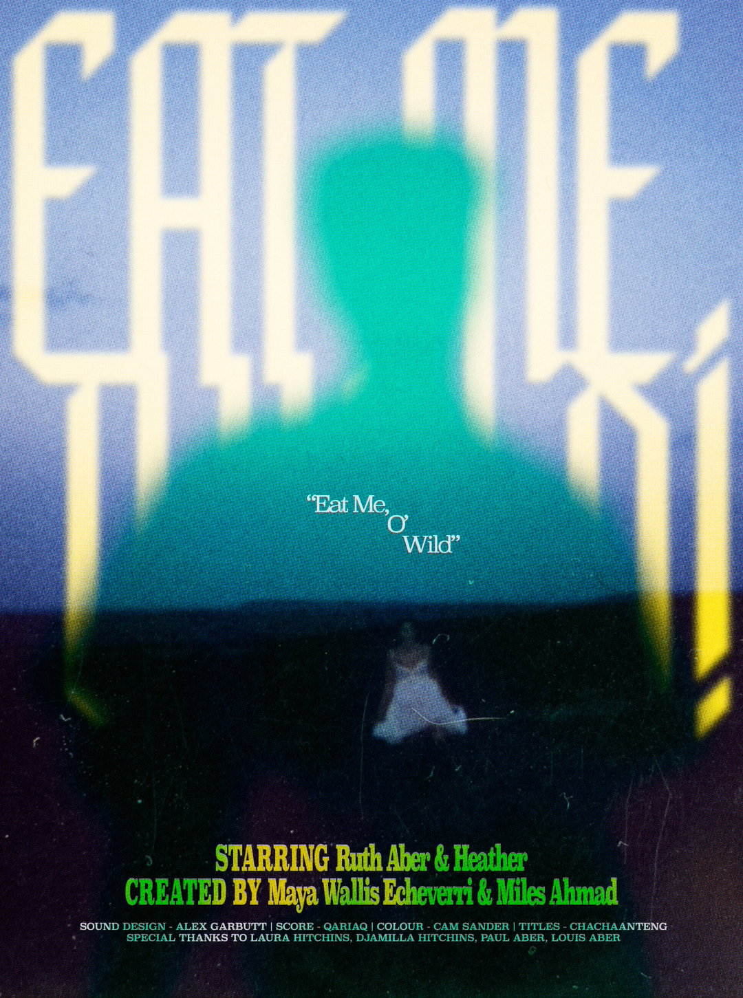
ChaChaanTeng: Eat Me O'Wild (Copyright © ChaChaanTeng 2021)
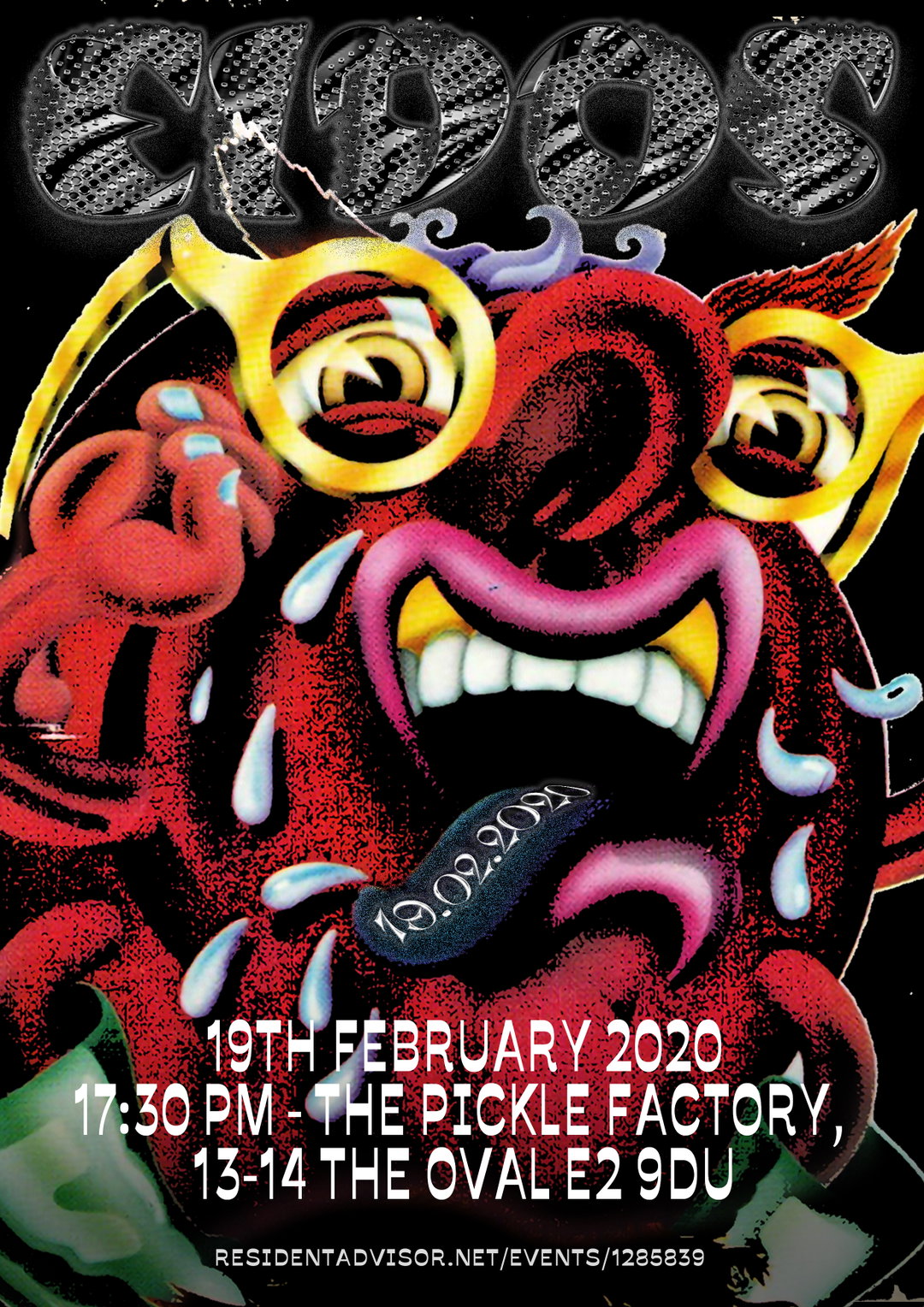
Wei Prior (Copyright © Wei Prior 2021)
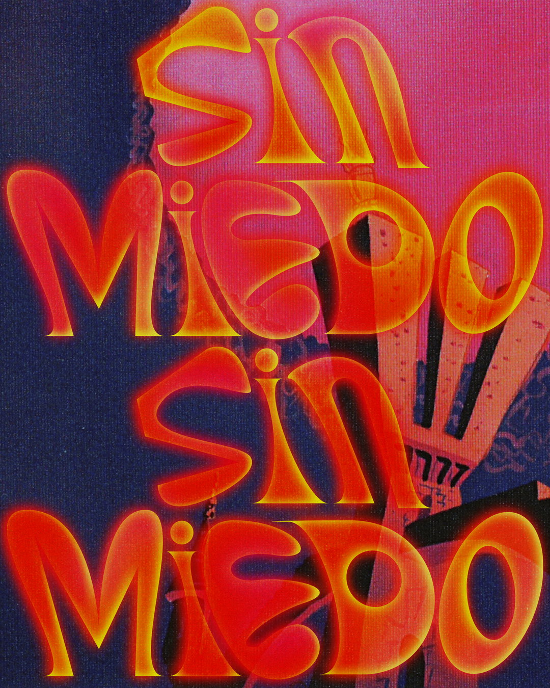
Wei Prior: Kali Uchis (Copyright © Wei Prior 2021)
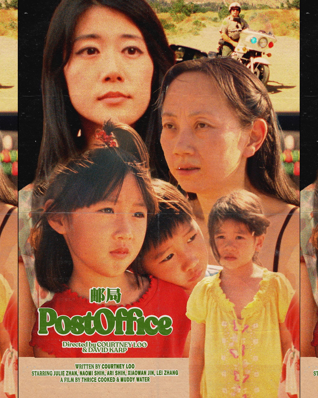
Wei Prior: Post Office (Copyright © Wei Prior 2021)
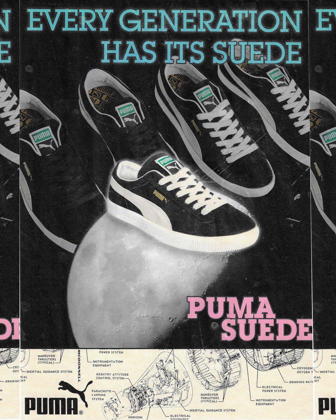
Wei Prior: Puma (Copyright © Wei Prior 2021)
Become an Extra Nice Supporter
Unlock an inspiring new way to explore It’s Nice That, get your hands on exclusive perks, and help bring meaningful creative projects to life.
Share Article
About the Author
—
Lucy (she/her) was part of the It’s Nice That team from 2016–2025, first joining as a staff writer after graduating from Chelsea College of Art with a degree in Graphic Design Communication, eventually becoming a senior editor on our editorial team, and most recently at Insights, a research-driven department with It’s Nice That.


