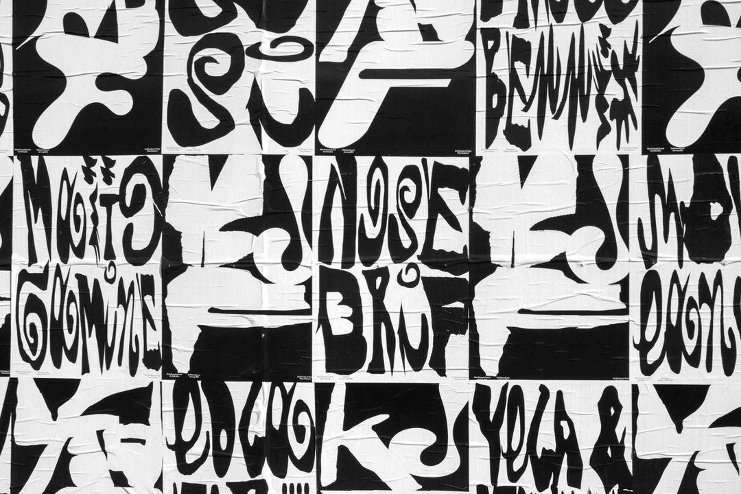
Vrints-Kolsteren’s design practice is ever-evolving
The Antwerp-based studio has moved beyond graphic design, embracing storytelling, brand strategy, and multi-sensory creative experiences.
Share
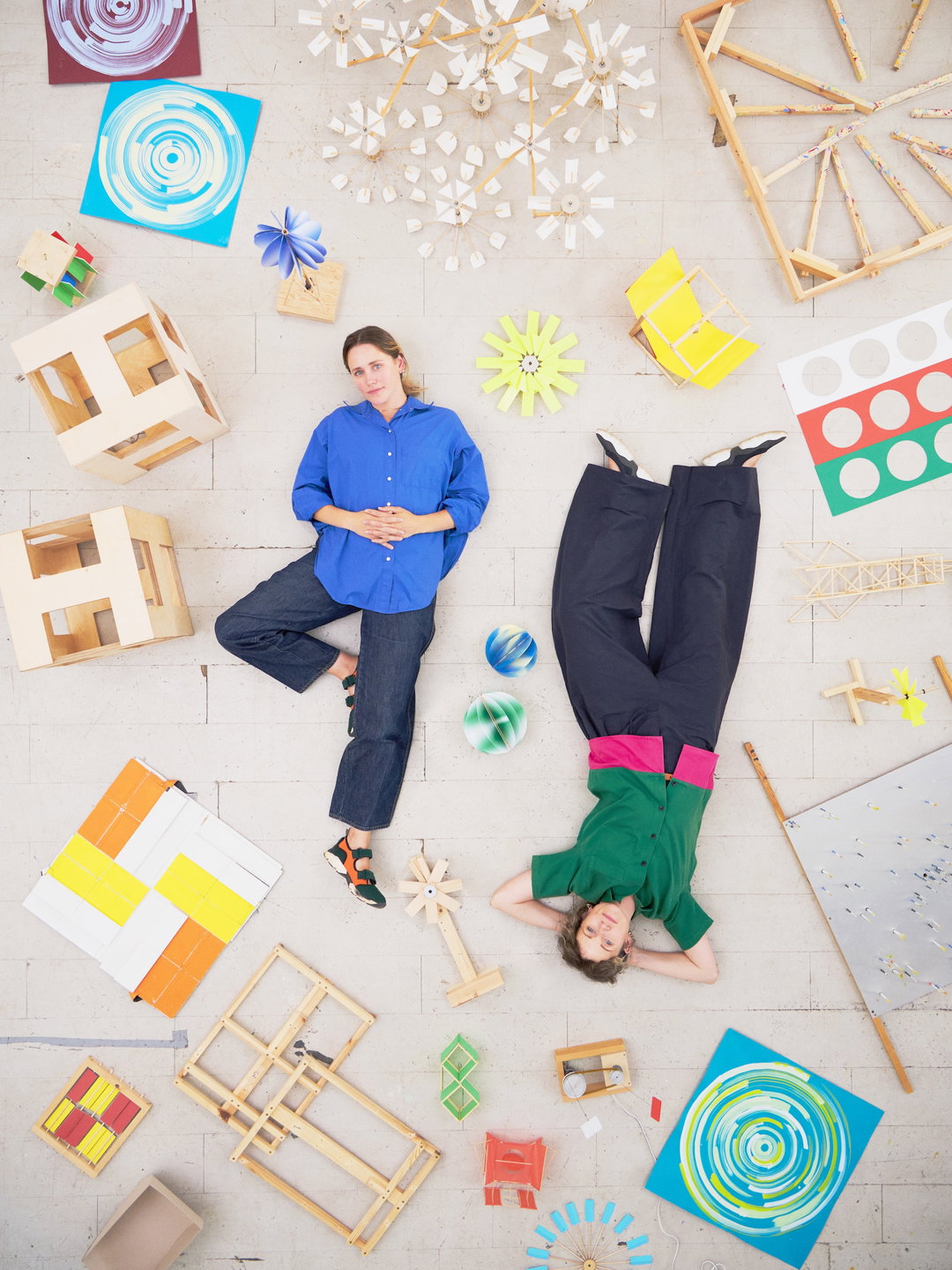
It’s been almost five years since we last spoke to Antwerp-based design studio Vrints-Kolsteren, during which time its practice has certainly grown and developed. “We’ve become much more versatile, and we now offer a complete, well-rounded creative service,” says its founders, Naomi Kolsteren and Vincent Vrints. Going beyond pure graphic design into art direction, the studio has expanded to include creative coders, motion designers, and sound designers, pushing its previously page-based portfolio into multi-disciplinary directions to transcend straightforward creative assets. “Our interests have naturally evolved with that,” Naomi and Vincent say, “leaning more into storytelling, brand strategy, and creating cohesive visual experiences.”
One such project that marks this progression is its now decade-long collaboration with Antwerp Art, which has seen the duo craft and evolve the festival’s identity year-on-year. “The very first identity we created was based on an architectural map, and ever since, we’ve challenged ourselves to reinvent the visual language each year,” they say. The team are perpetually reimagining its existing forms. “After ten years, it felt like the right moment to introduce a new, more organic layer to the system,” they explain. They built the new system on a map of the city’s streets, shaping a more fluid, naturally inconsistent structure in the process. “It’s been incredibly satisfying, both creatively and personally, to develop something over such a long period and explore how it can keep evolving without losing its core,” Naomi and Vincent reflect.
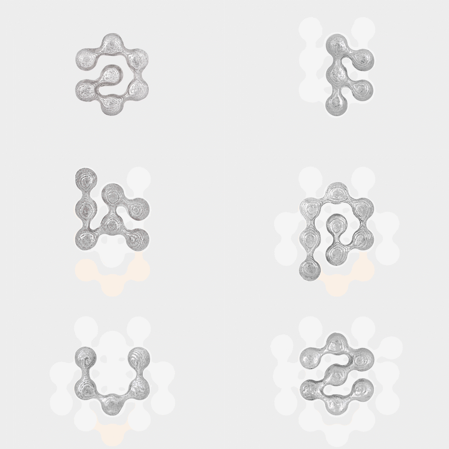
Vrints-Kolsteren: Atom (Copyright © Vrints-Kolsteren, 2024)
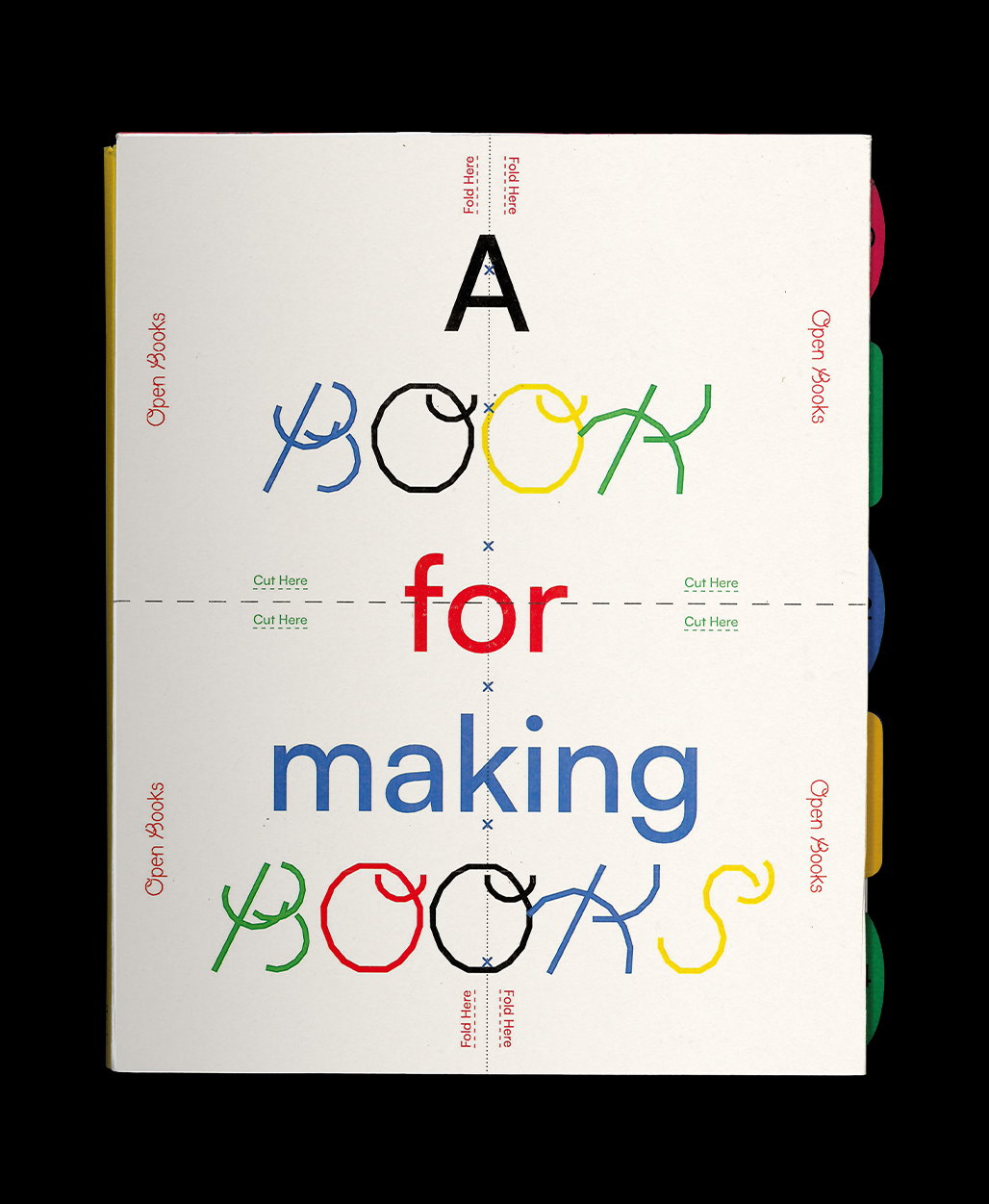
This creative philosophy is indicative of the studio’s contemporary practice. Renowned for its meticulous print projects, Vrints-Kolsteren went further in its pursuit of tactility with jewellery design. The collaboration with friend and jeweller Jente Fleerackers was “a really special project for us”, they say. “We approached it just like we would a graphic design project. The process began with the design of a bespoke typeface, before haptically translating those letterforms into three-dimensional shapes. The duo are interested in how “basic design principles can be translated into different forms of expression” – be that a book, a brand or, in this case, jewellery. “It’s exciting to see how core ideas of form, rhythm, and composition can take on a new life in other mediums.”
Having developed a reputation in the culture sector, the studio has since expanded into the industries it straddles – such as music and fashion – due to the continued challenges arts and culture face. “With less government funding and a general sense of struggle in terms of resources, its made it even more important to branch out and explore different industries,” they say. “Each industry has its own rhythm and energy.” Ultimately, the studio’s new adaptations are incredibly exciting; “That kind of variety keeps things fresh and pushes us to keep evolving creatively."
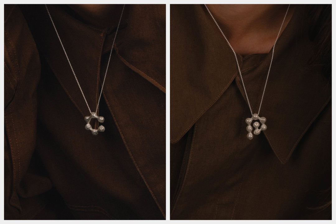
Vrints-Kolsteren: Atom (Copyright © Vrints-Kolsteren, 2024)
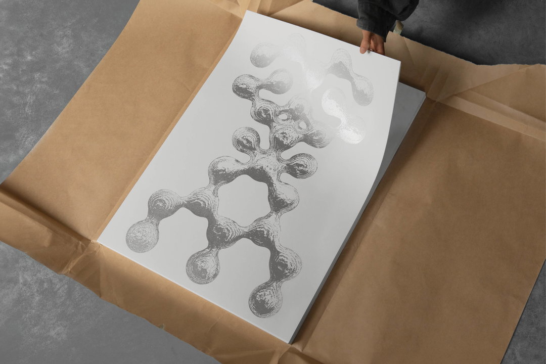
Vrints-Kolsteren: Atom Poster (Copyright © Vrints-Kolsteren, 2024)
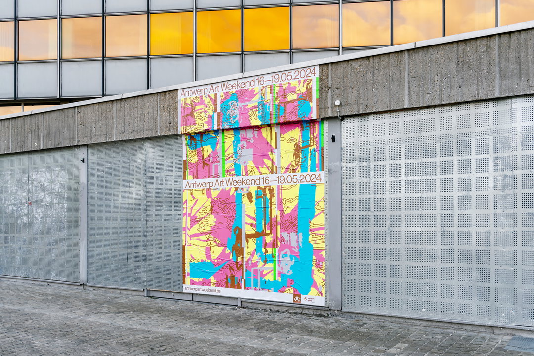
Vrints-Kolsteren: Antwerp Art Weekend 2024 (Copyright © Vrints-Kolsteren, 2024)
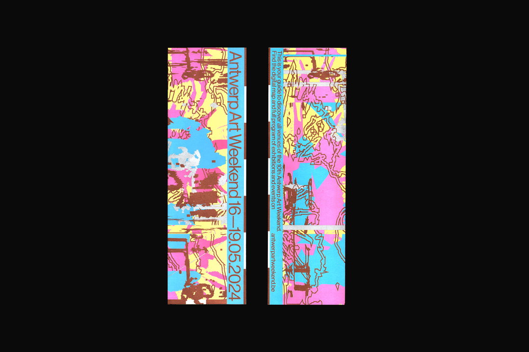
Vrints-Kolsteren: Antwerp Art Weekend 2024 (Copyright © Vrints-Kolsteren, 2024)
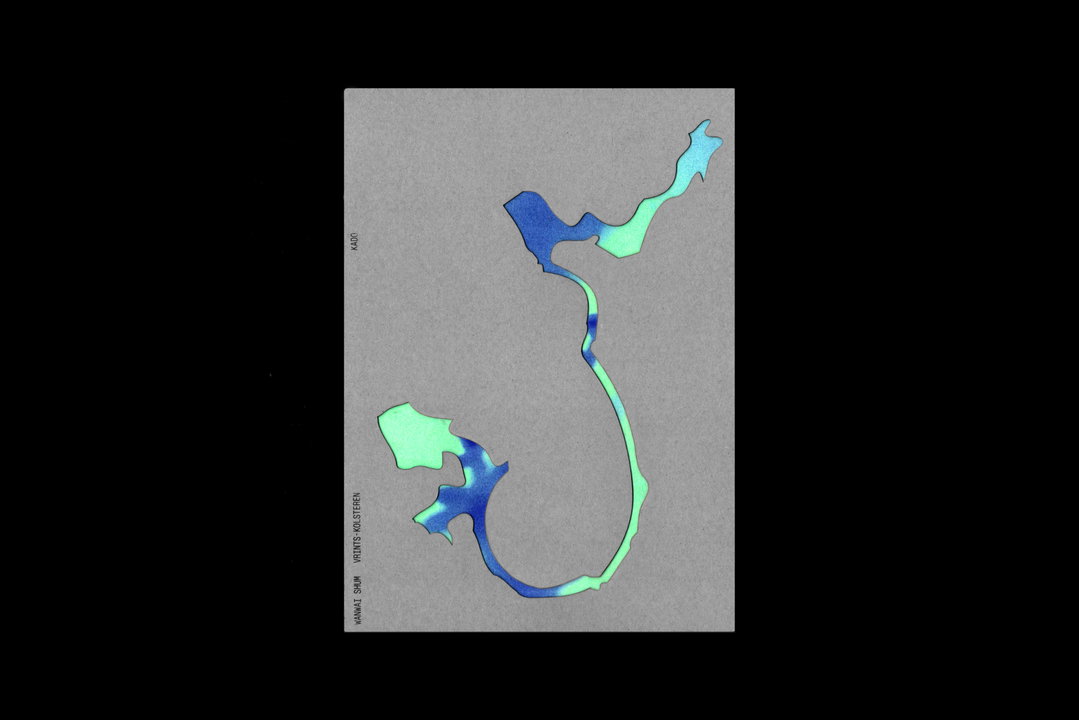
Vrints-Kolsteren: Kado (Copyright © Vrints-Kolsteren, 2024)
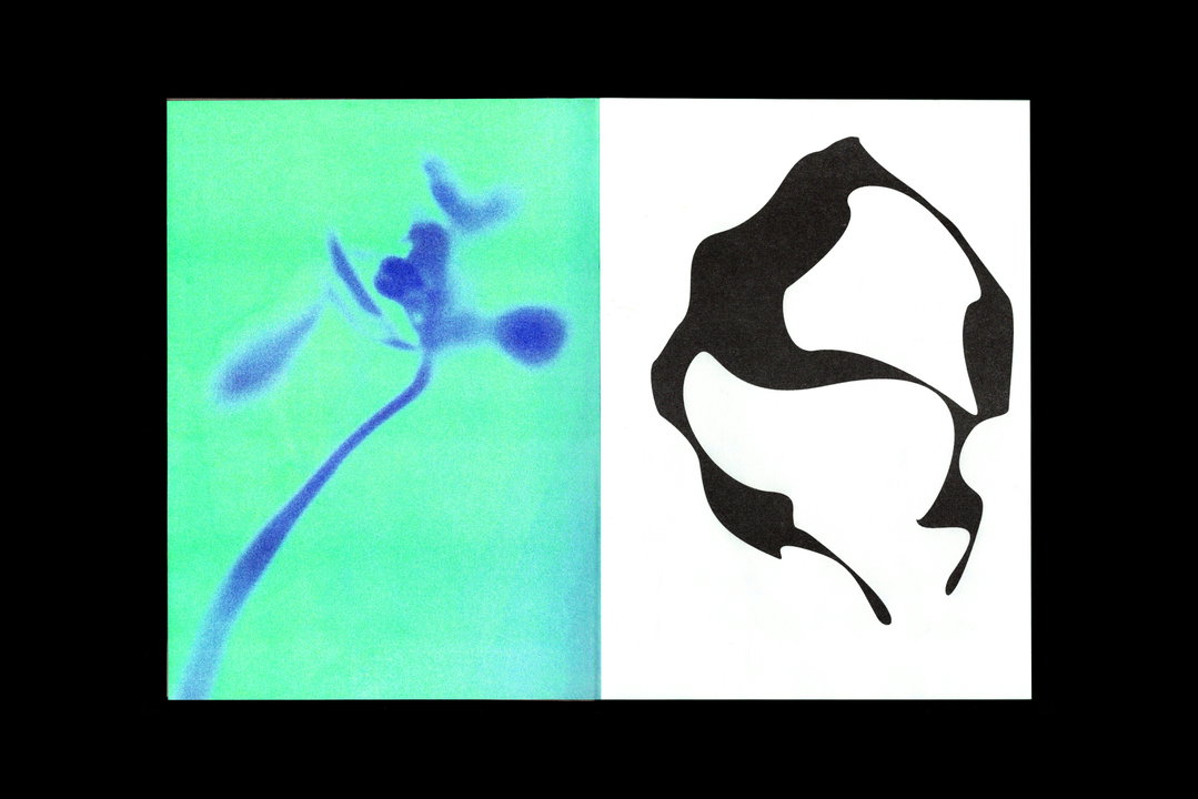
Vrints-Kolsteren: Kado (Copyright © Vrints-Kolsteren, 2024)
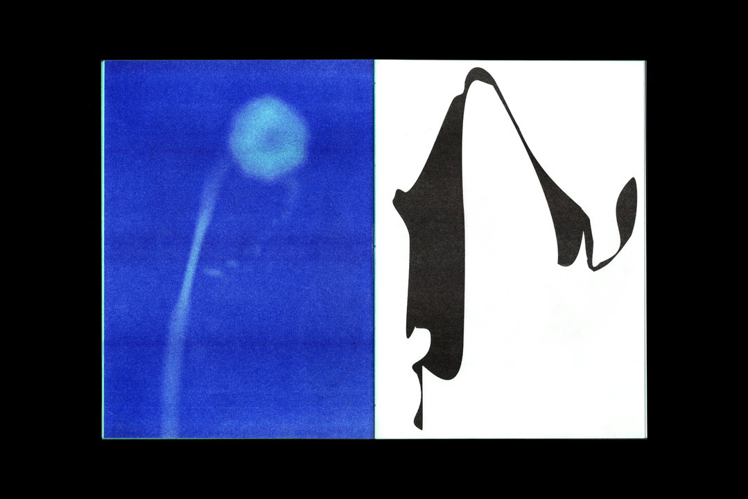
Vrints-Kolsteren: Kado (Copyright © Vrints-Kolsteren, 2024)
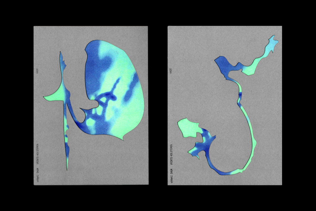
Vrints-Kolsteren: Kado (Copyright © Vrints-Kolsteren, 2024)
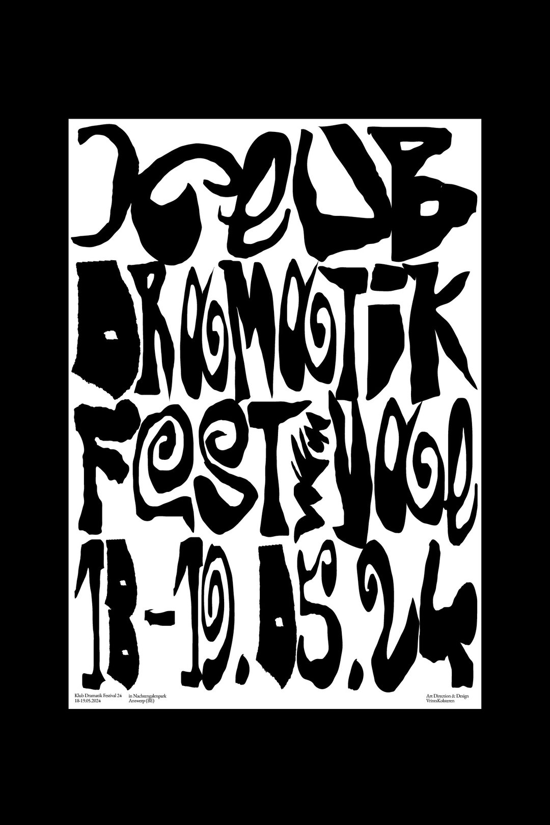
Vrints-Kolsteren: Klub Dramatik Festival (Copyright © Vrints-Kolsteren, 2024)
Hero Header
Vrints-Kolsteren: Klub Dramatik Festival (Copyright © Vrints-Kolsteren, 2024)
Share Article
Further Info
About the Author
—
Hailing from the West Midlands, and having originally joined It’s Nice That as an editorial assistant in March 2020, Harry is a freelance writer and designer – running his own independent practice, as well as being one-half of the Studio Ground Floor.