Launch Recite Me assistive technology
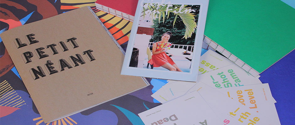
A brown book with the title “LE PETIT NÉANT” sits beside a framed photograph of a person in a red dress. A green notebook and several white cards with colourful text are scattered around them.

Things brings us giant posters, zines, postcards, drawings and some stunning binding.. oooh!!

—
Date
20 October 2012

It’s that time of the week again – Things has come out to play, turning heads everywhere she goes oooh isn’t she dazzling?! With a photography zine, some catalogues with some binding to die for, some lovely drawings, a GIANT poster and some seriously tasty postcards, belt up, it’s going to be a good’un…
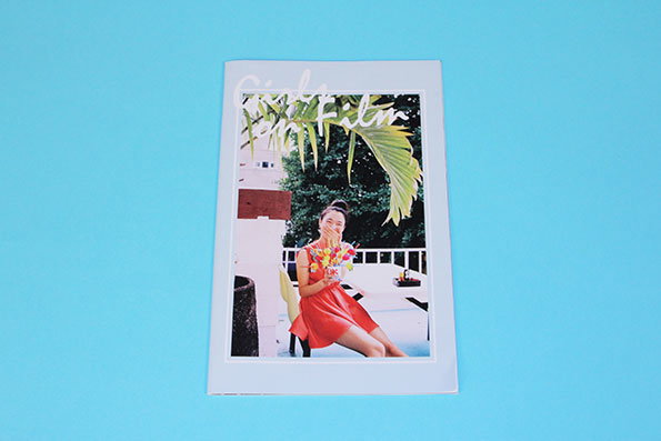
A magazine cover featuring a person in a red dress sitting outdoors and holding a bouquet of flowers. Cursive white text at the top reads “Girls in film”.
Above

Igor Termenon : Girls on Film Zine

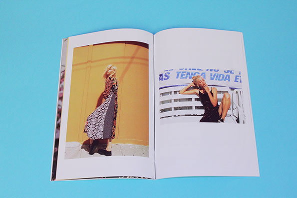
An open book displays two photographs against a bright blue background. On the left, a person in a patterned dress stands against a yellow wall. On the right, a person in a black dress leans back against a white railing under a banner with Spanish text.
Above

Igor Termenon : Girls on Film Zine

An open magazine lies on a bright blue background. A photograph across the spread shows a person with their eyes closed, leaning back against a backdrop of pink blossoms.
Above

Igor Termenon : Girls on Film Zine

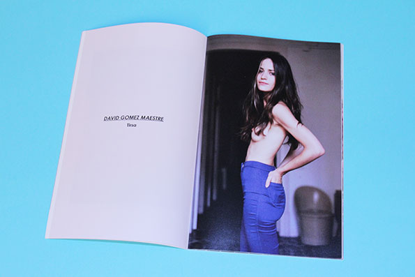
An open magazine shows a portrait of a person with long dark hair, wearing blue trousers and no top. The opposite page features the text “David Gomez Maestre” and “Tirso”.
Above

Igor Termenon : Girls on Film Zine

Igor Termenon : Girls on Film Zine
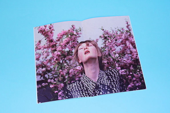
Simple but beautiful things are sometimes the best things in life so when the Girls on Film zine came through our door – doing pretty much exactly what it says on the tin, a little zine packed with a beautiful array of portraits of girls taken with film cameras – we instantly loved it. Started by Igor Termenon back in 2011 when he was studying for his masters as a way to keep in touch with his love for photography, it’s still going now and with a cover to make anybody sitting in the cold wildly jealous, we think it is great.
www.girlsonfilmzine.blogspot.com
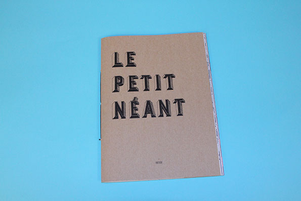
A brown cardboard booklet rests on a bright blue background. The cover features bold, black 3D typography that reads “LE PETIT NÉANT”.
Above

Miguel Angel Valdivia/Giulia Garbin: Le Petit Néant
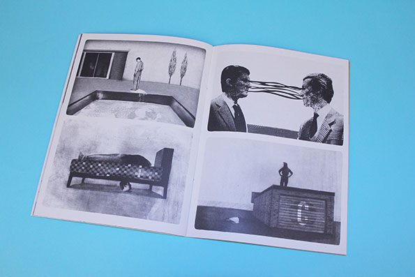
An open book displays four black and white photographs. The images show surreal scenes, including two people with lines connecting their eyes and a figure standing on a large wooden box.
Above

Miguel Angel Valdivia/Giulia Garbin: Le Petit Néant

An open book features a black and white illustration of a person wearing boots, sitting atop a small Eiffel Tower. Handwritten text in French is scattered across the pages, with a large heading that reads “à Paris début”.
Above

Miguel Angel Valdivia/Giulia Garbin: Le Petit Néant

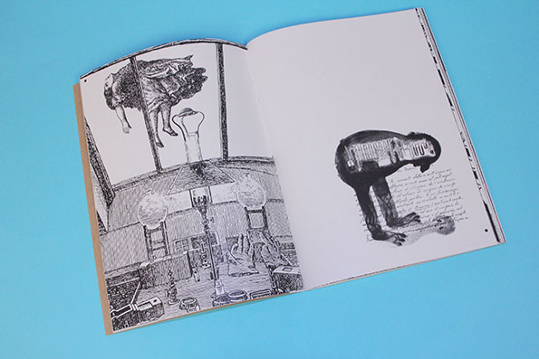
An open book featuring black and white illustrations on a blue background. The left page shows a detailed interior scene with a figure suspended from the ceiling, while the right page depicts a dark, surreal creature beside handwritten text.
Above

Miguel Angel Valdivia/Giulia Garbin: Le Petit Néant

Miguel Angel Valdivia/Giulia Garbin: Le Petit Néant
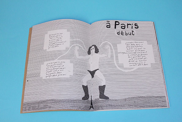
There’s something rather nice about brown paper book covers and the cover of Le Petit Néant – made truly complete with its beautiful typography – is no different. Covering the art of drawing by showcasing a beautifully diverse collection of, yes you’ve guessed it, drawings and being the magazine’s debut issue things are looking good for Le Petit Néant!
www.lepetitneant
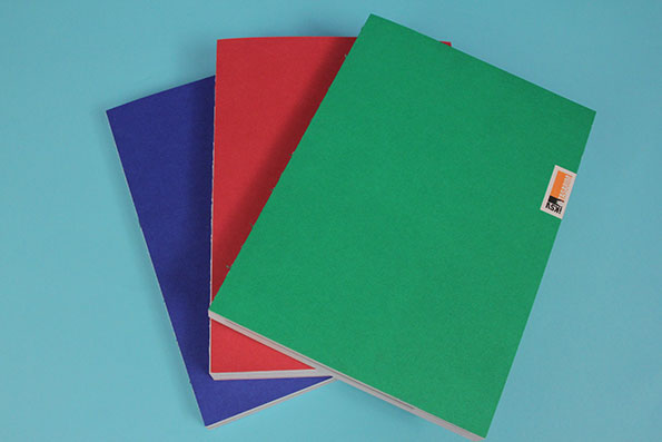
Three notebooks in blue, red and green are stacked diagonally on a light blue background. A small white label with orange and black text is attached to the side of the green notebook.
Above

Istanbul Design Biennial Catalogue

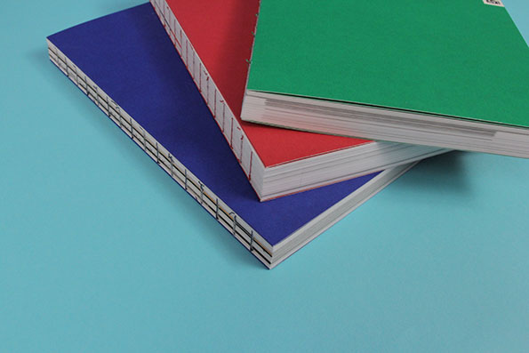
Three notebooks in blue, red and green are stacked diagonally on a light blue surface. The books feature exposed bindings with visible white stitching along the spines.
Above

Istanbul Design Biennial Catalogue

An open magazine spread featuring a profile of designer Enzo Mari. A large headline reads “MERDA PURA!”, accompanied by photos of Mari and sketches of furniture.
Above

Istanbul Design Biennial Catalogue

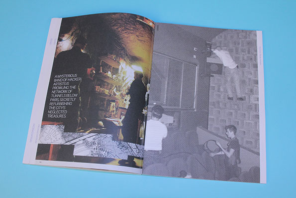
An open magazine spread on a blue background. The left page shows a dimly lit underground space with a person standing by a workbench, while the right page features a black and white photo of people in a cinema.
Above

Istanbul Design Biennial Catalogue

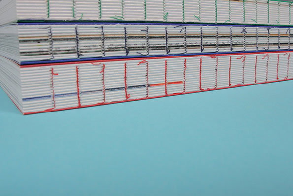
Three stacked books are shown from the side, revealing their exposed bindings. Each spine features a different coloured thread – green, blue and red – stitched in a grid pattern.
Above

Istanbul Design Biennial Catalogue

Istanbul Design Biennial Catalogue
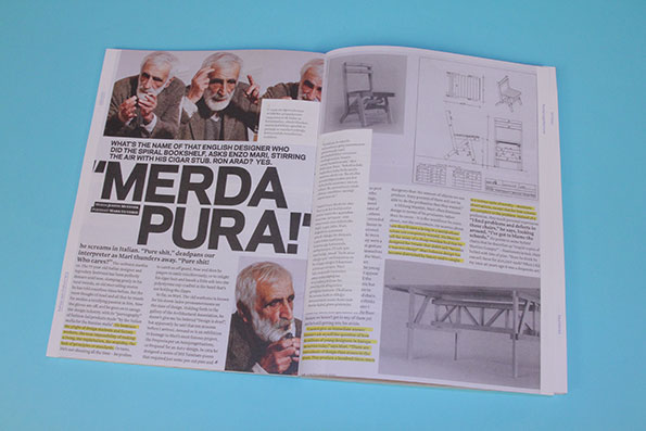
We are suckers for beautiful binding so when we got our hands on this mighty trio of catalogues from this year’s Istanbul Design Biennial we got a bit excited. Featuring an undoubtedly comprehensive (just look at all those pages…) guide though the many exhibitions within the show, they well and truly may sure that any visitor won’t be short of information. And with their beautiful covers in come bright red, blue and green it certainly sets a good precedent for the show.
www.istanbuldesignbiennial.iksv.org
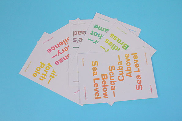
A pile of white cards with colourful text scattered across a bright blue background. One card in the foreground reads “Cuba – Above Sea Level” and “Scuba – Below Sea Level”.
Above

Patrick Fry: TwoSomes

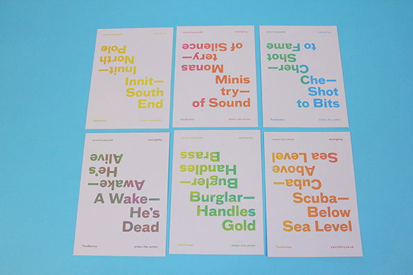
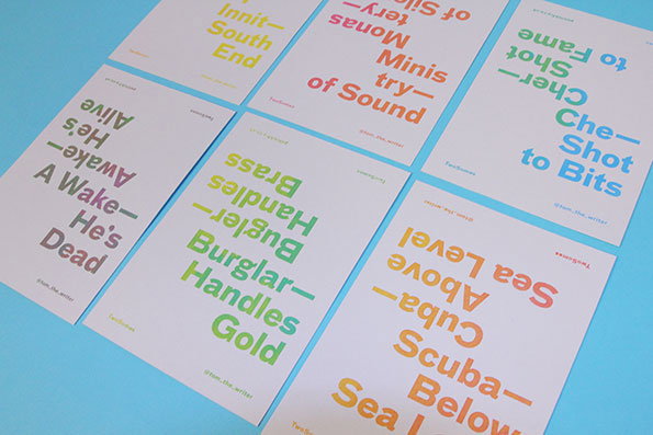
Six typographic posters are arranged in two rows of three against a blue background. Each poster features bold, colourful text using wordplay and puns, such as “Scuba—Below Sea Level” and “Ministry of Sound”.
Above

Patrick Fry: TwoSomes

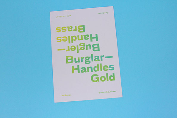
A typographic poster on a light blue background. The text reads “Burglar—Handles Gold” in green, mirrored above the phrase “Bugler—Handles Brass” in yellow.
Above

Patrick Fry: TwoSomes

Six typographic posters with bold, colourful text are laid out on a light blue surface. The posters feature wordplay and puns, including phrases such as “A Wake – He’s Dead” and “Burglar – Handles Gold”.
Above

TwoSomes: Patrick Fry

Patrick Fry: TwoSomes

Words can be so similar in sound but worlds apart in meaning as many non anglophones have undoubtedly found out so step forward designer Patrick Fry. He has outlined the differences between burglars and buglers, awake and a wake and scuba and cuba in a series of beautifully-designed postcards which brim with tasty, brightly coloured typography so we’ll never get our words mixed up again!
www.patrickfry.co.uk
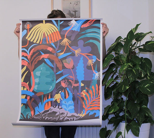
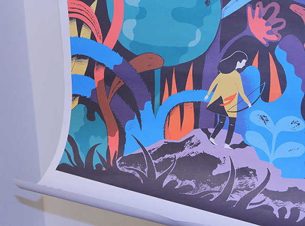
A person holds up a colourful illustration of a dense, surreal jungle. Stylised plants in shades of blue, orange and yellow surround a small figure standing on a rocky outcrop.
Above

Rob Hunter: Young Colossus poster

An illustration of a figure in a yellow coat walking across a rocky landscape. They are surrounded by oversized, colourful plants in shades of blue, purple and red.
Above

Rob Hunter: Young Colossus poster

A close-up of a poster featuring the words “YOUNG COLOSSUS” in large, blue sans-serif type. A block of smaller red and blue text sits to the right, beginning with the words “PRANKY” and “IMPRESSIONIST”.
Above

Rob Hunter: Young Colossus poster

Rob Hunter: Young Colossus poster
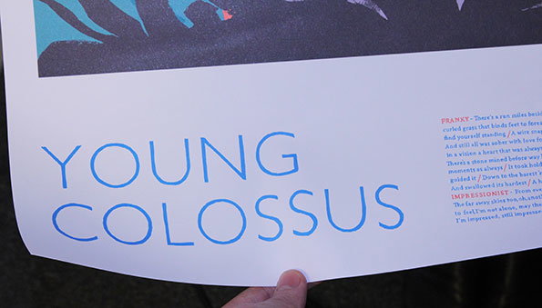
Wow would you look at that illustration on that! Our jaws all dropped in delight when we received this beauty of a poster through our door this week. But what is it all about? As part of his new side-project Young Colossus Orlando Weeks – front man of The Maccabees – has commissioned Rob Hunter to create a beautiful illustrative storybook to accompany his new six track EP. With the poster teaser brimming with colour and illustrative greatness and being so giant we really had to stretch ourselves when it came to photographing, we love it!
www.youngcolossus.bigcartel.com
www.rob-hunter.co.uk


Share Article

Further Info

About the Author

Anya Lawrence

—

It's Nice That Newsletters

Fancy a bit of It's Nice That in your inbox? Sign up to our newsletters and we'll keep you in the loop with everything good going on in the creative world.