The View From Tokyo: embracing imperfection and humour with heta-uma
In his first column, our Tokyo correspondent Ray Masaki dissects the Japanese concept of heta-uma – which creatives are using to infuse their work with playful defiance and humanity.
Share
The View From... is a new column on It’s Nice That written by a team of international correspondents in major creative cities around the world. Every two weeks we’ll report on the design scene in these cities, exploring the topics that are making an impact on the local creative community there. This week, Ray Masaki is reporting from Tokyo.
It feels like once a week I’ll come across social media content that lists Japanese words or phrases as if they’re a source of ancient wisdom that can be extracted and imparted into their readership’s lives. Things like mottainai, the idea of not wasting. Or shōganai, the idea of letting go because it can’t be helped. These words perhaps have added gravitas simply for being a foreign language and not necessarily because they are revered terms among Japanese people. For example, a Japanese dude will say, “Ah, mottainai… shōganai yo!” to his friend whose corn dog slipped out of his hand onto the street outside a Lawson convenience store. At the top of many of these lists is wabi-sabi. Wabi-sabi, as a term, has a connection to the Buddhist philosophy of appreciating impermanence and imperfection as a part of Japanese culture, but I would argue that the application isn’t as broad or part of the everyday as these content creators can make it seem.
These romantic portrayals often oversimplify and exoticise the true complexities of life in Japan. As much as I wish it were true, Japanese people are not uniquely inclined to take better care of their belongings or have a more profound understanding of impermanence – the country is one of the most advanced consumerist cultures, filled with the same Ikeas, fast fashion brands, and single-use plastics as the rest of the world. Beyond the romanticised depictions of wabi-sabi often found on social media, another lesser-known concept, heta-uma, offers a more contemporary and relatable lens to understand the Japanese appreciation of imperfection. This concept emphasises not just acceptance of flaws but also the playful defiance of established norms. Heta-uma is a slangy colloquial abbreviation of 一見ヘタのようだが実はウマい (ikken heta no yōdaga jitsuwa uma i), which means “Looks bad at first glance but is actually good” or “unskillfully good” as a more direct translation.
Heta-uma emerged as a counterpoint to the rigid perfectionism prevalent in mainstream manga, with publications like Seirindo’s Garo and illustrators like Sadao Shoji in the 1970s paving the way for a more diverse visual language that is attractive despite, or perhaps because of, its perceived lack of sophistication.
Heta-uma manifests in various forms across contemporary Japanese art and design. Artists like Ken Kagami push boundaries through their work – his art is often meta and pokes fun at the performance of making art itself. He will frequently employ quick handwriting with a marker that tells what the art is precisely about rather than being abstract or evocative. But it is his prolific commitment to the bit that transcends. With products, he will often create artwork that makes fun of what it is, like in the case of his 並んで買いました hoodie, which means “I stood in line and bought this,” creating an absurd display of hype culture while also invoking it.
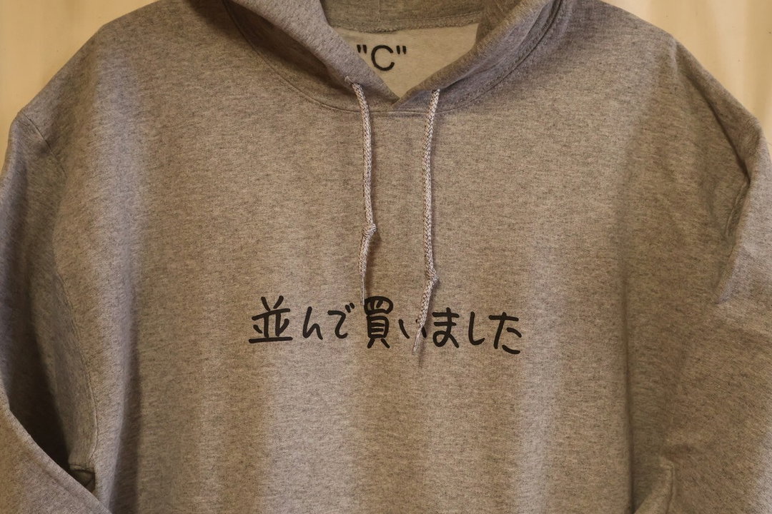
Ken Kagami: 並んで買いました (Narande kaimashita) (Copyright © Ken Kagami, 2023)
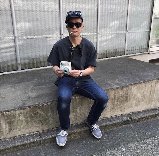
Ken Kagami: Fake photographer Ken Kagami uses a Polaroid camera to photograph you, Ken Kagami (Copyright © Ken Kagami, 2019)
Ken Kagami: Oil on Canvas (Copyright © Ken Kagami, 2023)
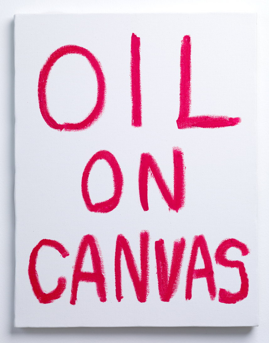
Ken Kagami: Oil on Canvas (Copyright © Ken Kagami, 2023)
Like Kagami’s works, the handling of the comic One Punch Man is another unique example of heta-uma. One Punch Man started as a webcomic by author One and was later adapted into a popular manga and anime series. While some aspects of his draftsmanship may appear naive at first glance, One is a clear student of the craft, and his compositions and storytelling are exceptionally sophisticated – using the tropes and stylings of shonen manga (one of the most mainstream editorial categories of Japanese comics) as a basis for satire. Beyond One’s storytelling, another part of the humour is that there is a temporal heta-uma, so to speak, for those who have read the webcomic – the original was adapted into manga form by the absurdly technical Yusuke Murata, which creates such an extreme comparative contrast that the conversion becomes a meta aspect of the heta-uma joke.
In graphic design, one of my favorite contemporary designers, Aiko Koike, challenges branding conventions with playful irreverence with her identity for Kyoto Experiment, an international performing arts festival in Japan. Similar to what Garo did in relation to mainstream manga, Koike defies the aesthetic expectations of the cultural sector that can often feel exclusive and elite. She selected the disarming and well-known font Comic Sans for the logotype and paired it with a one-of-a-kind brand mark that can only be created by physical act. The final impression of the visual identity is one of accessibility and the freedom of performance.

Aiko Koike: Kyoto Experiment identity (Copyright © Kyoto Experiment)
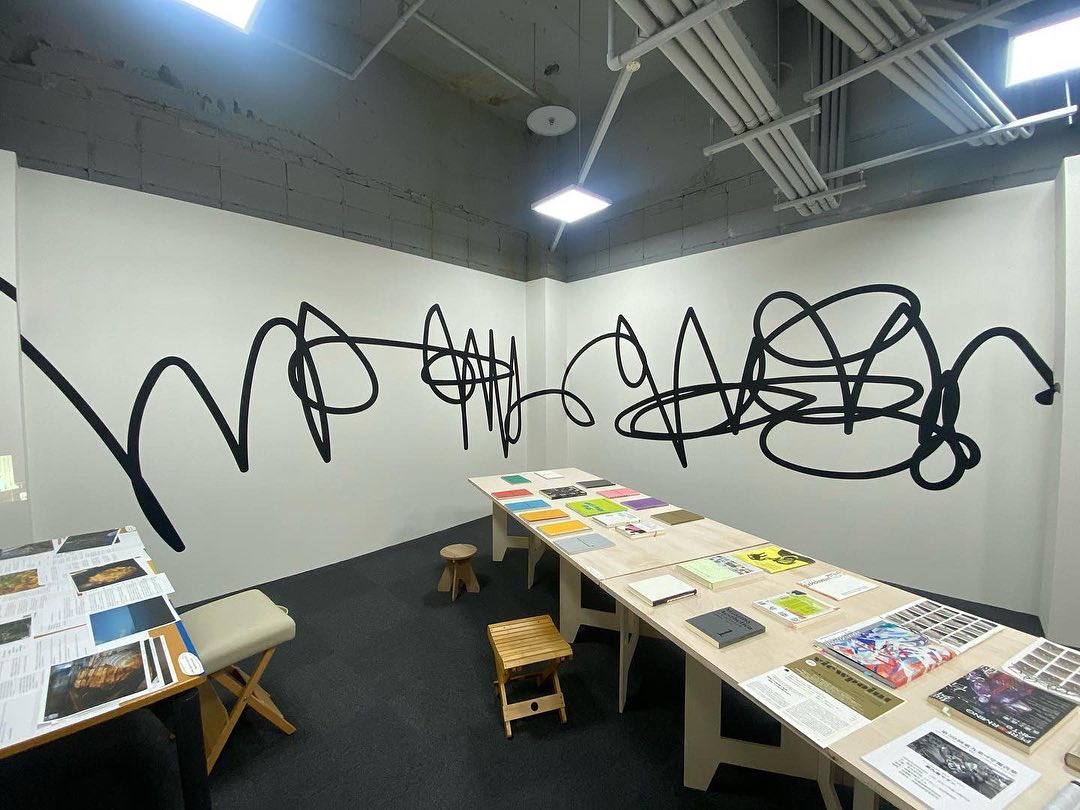
Aiko Koike: Kyoto Experiment identity (Copyright © Kyoto Experiment)
Aiko Koike: Kyoto Experiment identity (Copyright © Kyoto Experiment)
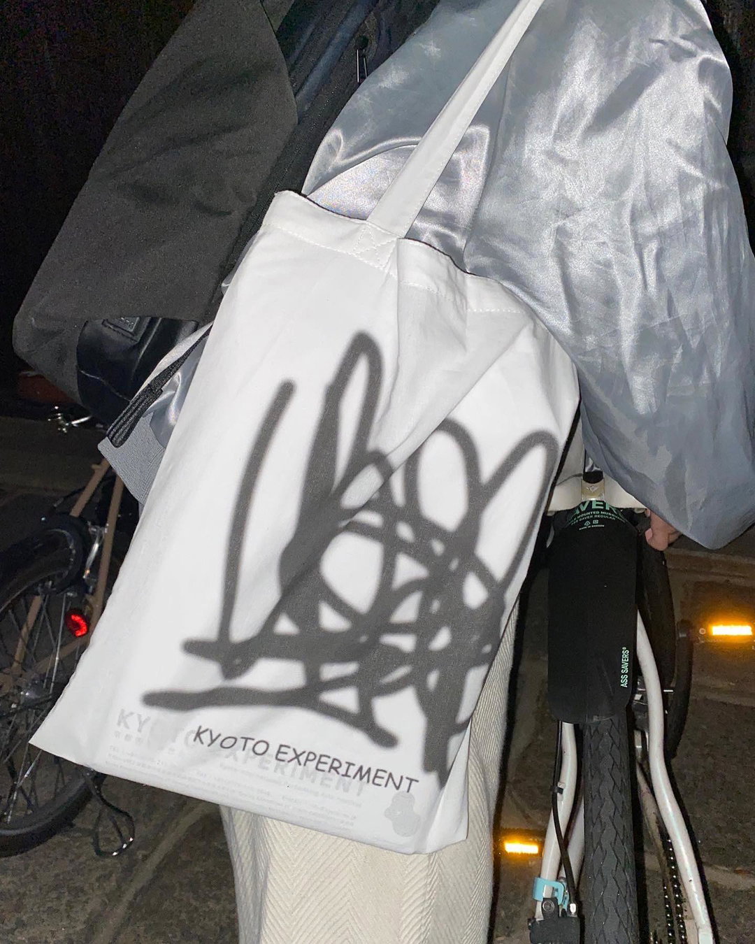
Aiko Koike: Kyoto Experiment identity (Copyright © Kyoto Experiment)
These examples showcase the intentionality behind heta-uma, emphasising the skill required to develop “unskillfully good” art that transcends mere amateurishness, and it is the deliberate contrast that can expand an audience’s preconceived images of perfection and beauty. To be clear, I’m the one applying the heta-uma label to those listed above. These designers and artists would likely not self-identify as heta-uma. When I interviewed Koike for a project in 2023, she spoke about how this process of deliberate play came naturally to her, and she really wasn’t thinking too hard about it. I find that the term itself can be a bit of a misnomer – there is nothing unskillful about their output. Defying aesthetic norms, deliberately or not, is one of the most challenging things to do as an artist.
Wabi-sabi is real and alive in Japanese culture, but not in the exotic ways you may come across online. While it does appear in the spiritual or mystical sense, it also prominently lives on in humour and appreciation of imperfection. Heta-uma encourages a more colorful understanding of Japanese culture, recognising its humour, playfulness, and the skillful embrace of the dirty, imperfect, and ambiguous.

If you’re in Japan, do check out these recommendations from Ray: including the aforementioned Ken Kagami’s must-visit store in Shibuya, and some other creative local events.
- Shokki Ceramic Workshop at Tomonotsu Museum in Fukuyama, Hiroshima. Shokki is one of my favorite ceramic brands that exemplifies the heta-uma ethos. Their pieces are all amusingly imperfect, and in this workshop, you can learn some of the techniques that make their work unique.
- Ken Kagami’s extremely singular store is located in Shibuya and is filled with an extremely eclectic mix of objects and artwork. None of it really makes sense, and the hours are pretty much at the whim of Kagami, so it may or may not be open when you visit!
- Shuto Otsuki, a graphic designer and collaborator of mine, will do exhibitions of his self-publishing project, Non-Sensu. The project incorporates a revolving press that creates one-off prints.
- Pas Tasta, a six-person DJ and producer J-pop supergroup, frequently performs sets in and around the Tokyo area. I may be biased because I help with their graphics, but truly one of the most exciting music collectives out now. This is their biggest song.
Share Article
Further Info
About the Author
—
Ray Masaki is a Japanese-American graphic designer, writer, and educator in Tokyo who runs Studio RAN. He studied illustration at Parsons School of Design, type design at The Cooper Union, and received an MFA in graphic design from the Vermont College of Fine Arts. He teaches at the Professional Institute of International Fashion in Shinjuku, Tokyo. In 2021, Ray published Why is the salaryman carrying a surfboard? — a bilingual book about the history of systemic white supremacy and Westernisation in the Japanese design industry. He is It’s Nice That’s Tokyo correspondent.