Launch Recite Me assistive technology
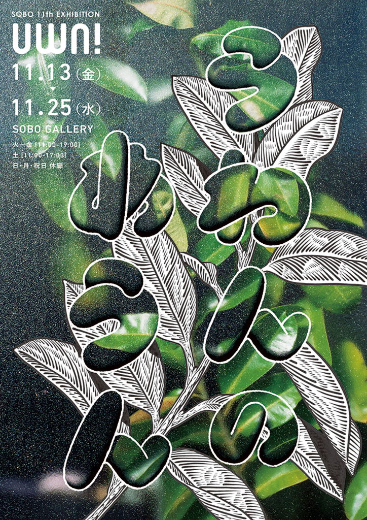
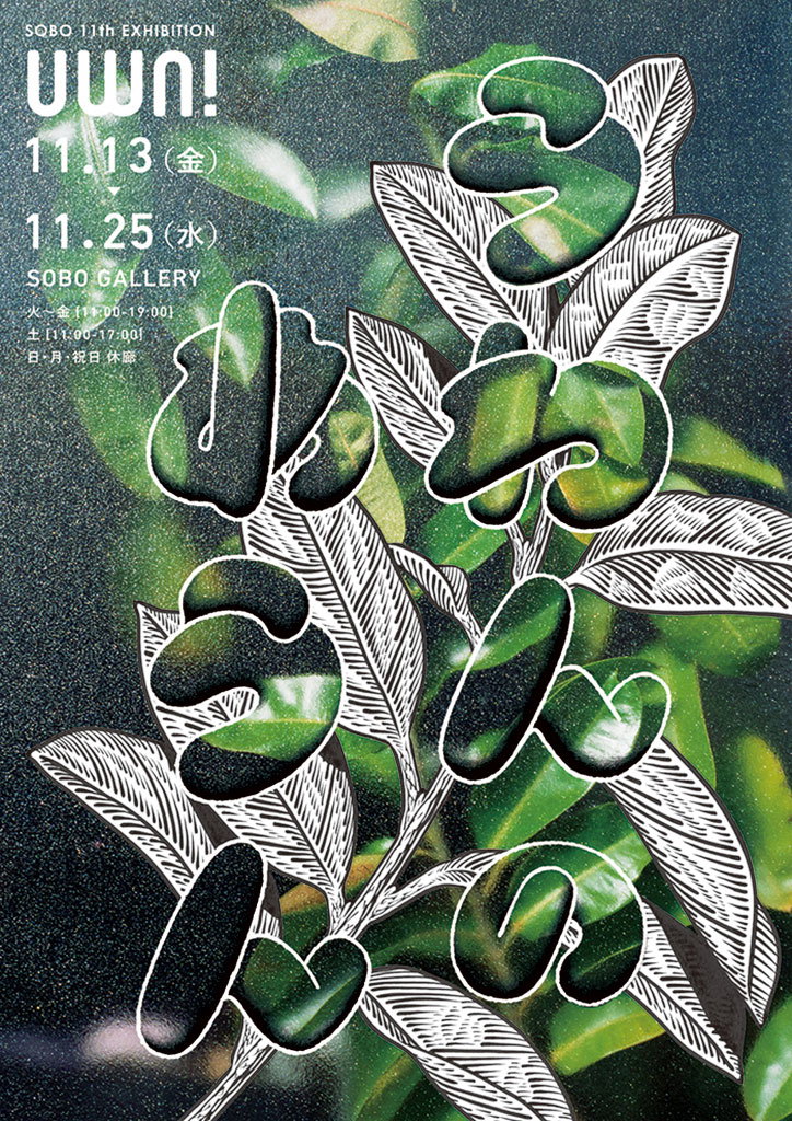
A poster for the “Sobo 11th Exhibition” featuring large, stylised Japanese characters layered over a photo of green leaves. The text in the top left reads “Uwn!” and lists the dates “11.13” to “11.25” at the “Sobo Gallery”.

Japanese graphic designer Ryu Mieno creates type-heavy works fizzing with energy

—
Date
14 February 2017

Ryu Mieno is a Japanese graphic designer whose bold use of typography and lettering shows a confident flair for composition. Used together with illustration, heavy pattern and fluid shapes, the resulting works are fizzing with energy and bustle.

Ryu grew up in the Hyōgo Prefecture of Japan before moving to study graphic design at Kyoto Seika University, and now resides in Kyoto working as a freelance designer. He’s completed poster commissions for art galleries, movie production houses, restaurants and retail, as well as working on logo designs and signage.

One of his projects, Alternative Train, shows train stations from another point of view, combining photography and a busy collection of text. “I made a rubber stamp for the title line and wrote the rest by hand,” he explains. “The layout was irregular to represent the conditions of a noisy or clamorous train station.”

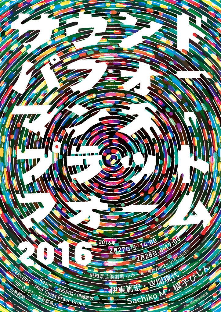
Another, Sound Performance, was made for a music festival and aimed to depict the spirit of the event. “I tried to visualise the physical interaction between the music and people, using the script and the sound swirl.”

Ryu says his practice is inspired by “observation of natural form and shape – the veins of a leaf, wood grain, the skin patterns of a fish,” which he transposes to symbols and typography. “I like that exchange between nature and art."
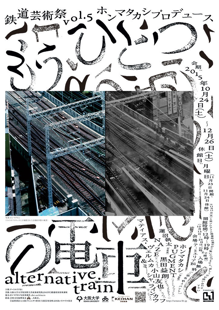
A graphic poster for an art festival featuring a split image of railway tracks. The top and bottom sections are filled with bold, expressive Japanese calligraphy and the English words “alternative train”.
Above

Ryu Mieno: Alternative Train

A vibrant poster featuring concentric circles of multi-coloured dots. Large white Japanese characters are layered over the centre, with the year “2016” and event dates appearing at the bottom.
Above

Ryu Mieno: Sound Performance

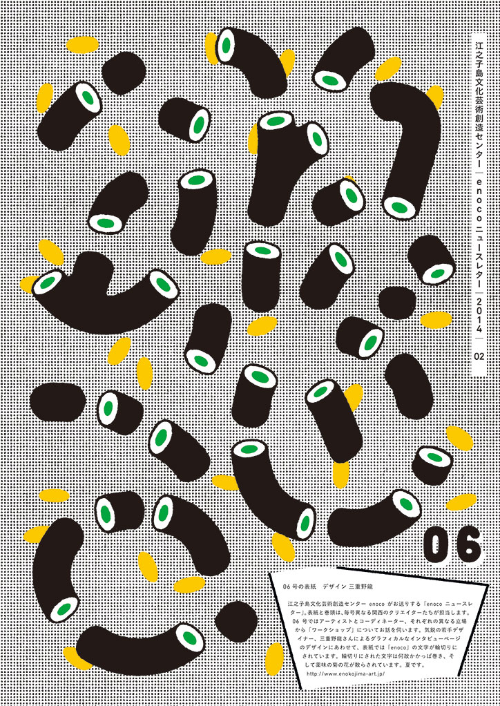
An illustration of black, tube-like shapes with green and white circular ends scattered across a grey grid background. Small yellow oval shapes are interspersed between the tubes. In the bottom right, a large yellow “06” sits above a block of Japanese text and a website URL.
Above

Ryu Mieno

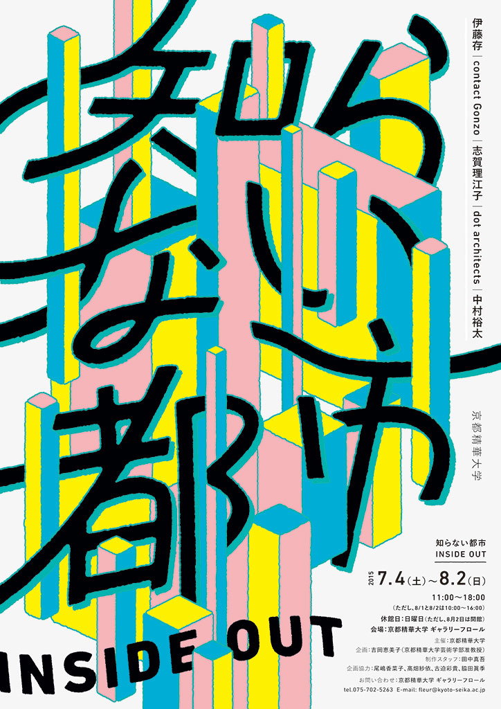
A graphic poster featuring bold, black Japanese calligraphy layered over a 3D architectural landscape of pink, blue and yellow pillars. The words “INSIDE OUT” appear in a bold, black sans-serif typeface at the bottom. Smaller text on the right lists dates from “7.4” to “8.2” and credits for Kyoto University of the Arts.
Above

Ryu Mieno

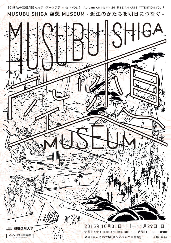
A black and white graphic poster for “Musubu Shiga Museum”. Bold, outlined typography is layered over a line drawing of a landscape with mountains, trees and architectural structures. The top of the poster reads “Autumn Art Month 2015 SEIAN ARTS ATTENTION VOL.7”. Dates at the bottom list the event from 31 October to 29 November 2015.
Above

Ryu Mieno

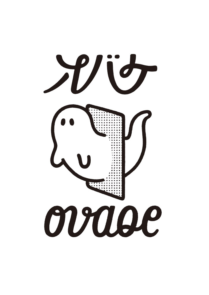
A black and white illustration of a small, smiling ghost partially hidden behind a dotted rectangular panel. Above the figure is a line of Japanese text, and below it is the word “ovaoe” in a rounded script.
Above

Ryu Mieno

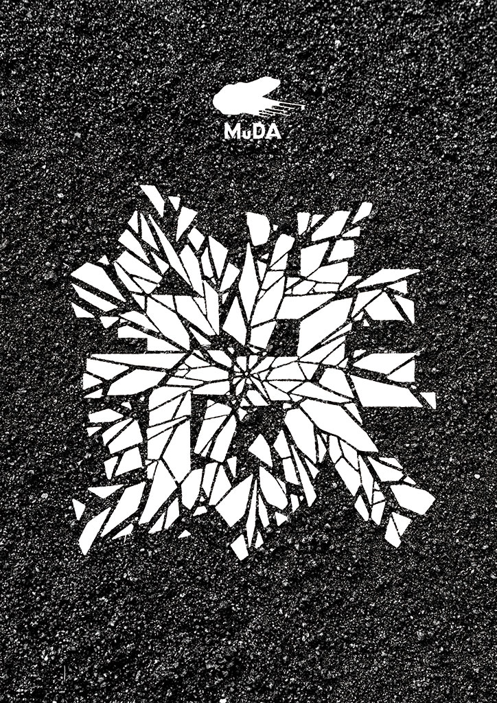
A white, shattered geometric shape is printed on a dark, textured asphalt surface. Above the shape, a small white logo and the word “MuDA” appear.
Above

Ryu Mieno

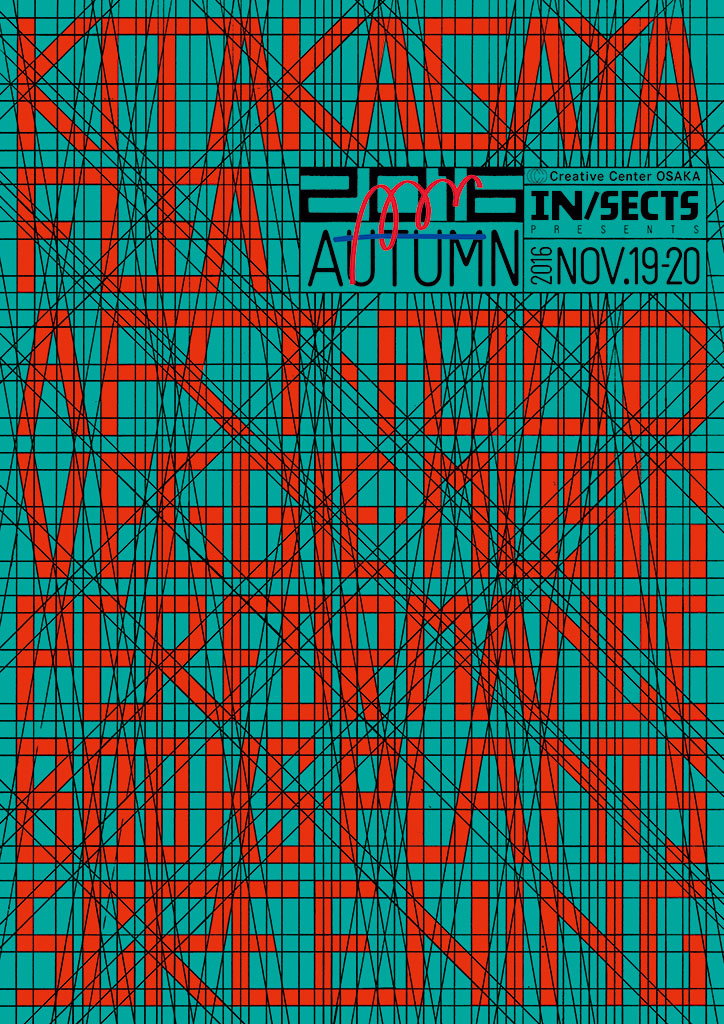
A bold typographic poster in red and teal with a dense grid of intersecting lines. Large red text reads “Kitakagaya Flea Autumn 2016”, with smaller text stating “In/sects presents” and the dates “Nov. 19–20”. Other legible words include “Art”, “Food”, “Veggie”, “Music”, “Performance”, “Houseplants” and “Clothing”.
Above

Ryu Mieno

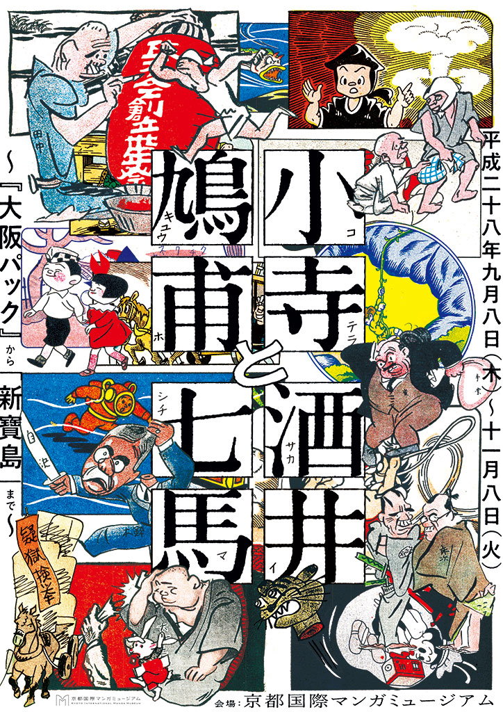
A collage of traditional Japanese woodblock prints featuring various characters in dynamic poses. Large, bold Japanese calligraphy is laid over the centre of the composition.
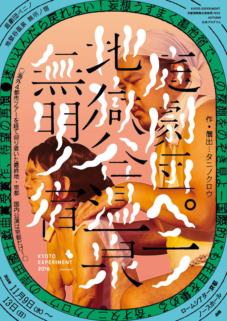
A poster for “Kyoto Experiment 2016 Autumn” featuring a photograph of two people. One person leans over another, their hands resting on the other's shoulder. Bold, black Japanese calligraphy and white abstract shapes are layered over the image.
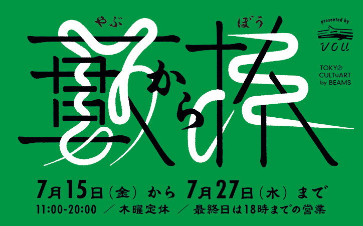
A green poster featuring bold, stylised Japanese calligraphy in black and white. Text at the bottom lists the dates “7月15日 (金) から 7月27日 (水) まで” and the opening hours “11:00-20:00”. Small logos in the top right corner include “presented by VOU” and “TOKYO CULTUART by BEAMS”.
Above

Ryu Mieno

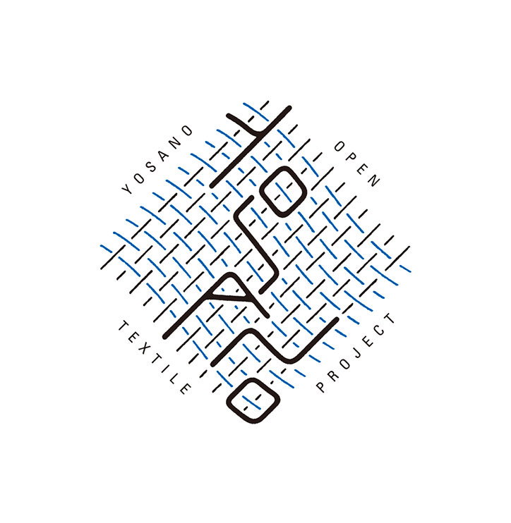
A graphic logo featuring a blue and black woven pattern arranged in a diamond shape. The words “Yosano Open Textile Project” wrap around the edges, with stylised characters integrated into the weave.
Above

Ryu Mieno

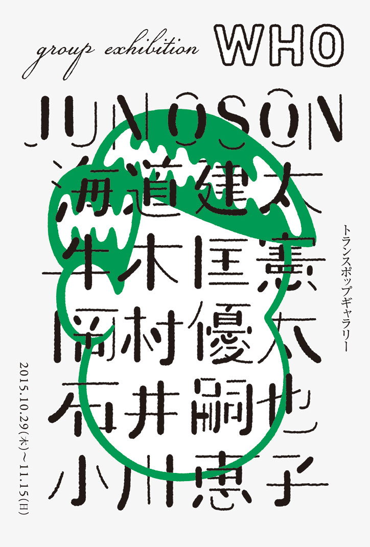
A typographic poster for a group exhibition titled “WHO”. The name “Junoson” and several names in Japanese characters are listed below, partially obscured by a bold, dripping green shape.
Above

Ryu Mieno

Share Article

Further Info

About the Author

Jenny Brewer

—

Jenny oversees editorial output across It’s Nice That. Get in touch with writing pitches for features or opinion pieces, big creative story tips, or questions about all things editorial. jb@itsnicethat.com

To submit your work to be featured on the site, please see our Submissions Guide.

It's Nice That Newsletters

Fancy a bit of It's Nice That in your inbox? Sign up to our newsletters and we'll keep you in the loop with everything good going on in the creative world.