




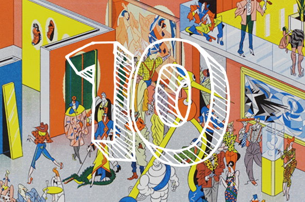
Top Ten: Like illustration? Love our round up of the year's best!
Illustration, more than any other discipline we cover on It’s Nice That, teaches us an awful lot about our audience when aggregated into a top ten list of articles. You’re a weird bunch, it has to be said; dirty-minded and deviant. How else do we explain the creepy comics of Joan Cornella, Laura Callaghan’s tales of Tinder cannibalism and Nimura Daisuke’s gratuitous GIFs? Granted there’s some stunning vintage advertising, an archive of emoji and some wonderfully diverse editorial illustration in there too, but for the most part it’s just smut and violence. Merry Christmas!
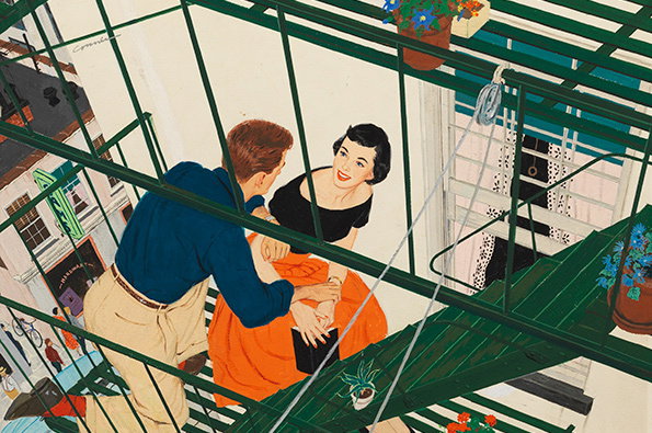
Mac Conner is 100 years old – a whole century. Muse on that for a second while you look at this frankly stunning image from his back catalogue. The American graphic artist forged his career in the 1950s working for the likes of Cosmopolitan and Good Housekeeping, creating illustrations and advertising imagery in an instantly iconic style. To celebrate his centenary The Museum of the City of New York held a retrospective in early September, reigniting the public’s fascination with one of the original Mad Men.
www.itsnicethat.com/articles/mac-conner
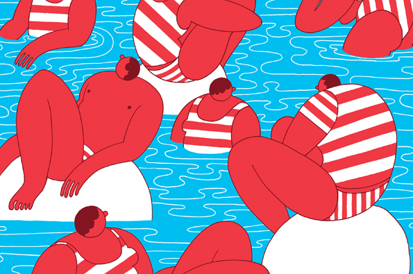
We went on a bit of a binge with Dutch illustrators earlier in the year, profiling a shed-load of creative types all loosely connected to The Hague. Eline Van Dam was one of them (though she’s now based in a small German village instead of the Dutch design capital) and her vibrant poster design won us over for its exemplary use of 1970s-inspired colour palettes and bold iconography. Sadly we’ve still not managed to commission her for anything, but we reckon 2015’s going to be the year for it!
www.itsnicethat.com/articles/zeloot
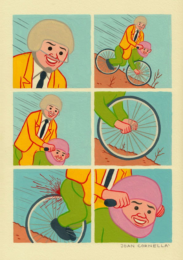
And now to the perverse illustration I mentioned at the start; the dark, dirty work of Joan Cornellà. Perhaps more than any other creative working today, Joan taps into the underbelly of the human psyche, exposing the filth that secretly makes us all smirk. Alongside images of graphic ultraviolence there’s also biting satire that deals with some topical and political issues – but then there’s also a guy with a massive turd on his head, so best not to take it all too seriously.
www.itsnicethat.com/articles/joan-cornella
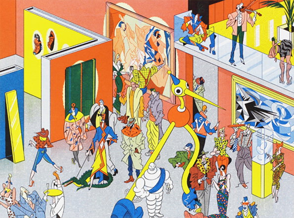
Viktor Hachmang is an illustrator and printmaker par excellence who runs Risographic print studio Vinex Pers as well as maintaining a prolific freelance practice. Earlier in the year I discussed how infuriating it was that Viktor and I are the same age, yet he’s managed to achieve the kind of mastery of subject and composition of which I can only dream. In the same 26 years I’ve managed a few awesome advances in alliteration, but that’s about it. Viktor’s hands down been my favourite illustrator in 2014, with his combination of retro-futuristic visuals, impeccable eye for colour and ever-pleasant email demeanour. What a dude!
www.itsnicethat.com/articles/viktor-hachmang-1
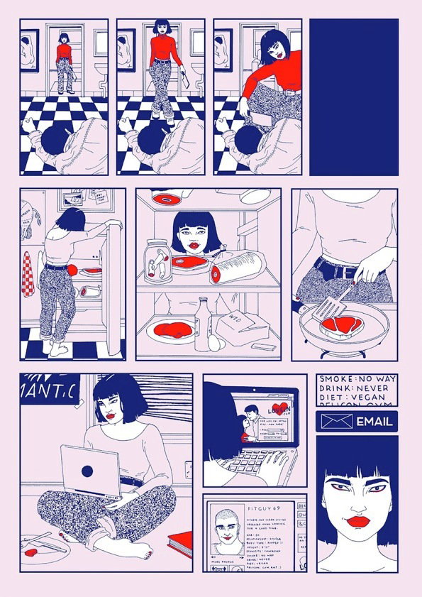
We were big fans of Laura Callaghan’s work already, but in 2014 she upped her game in a big way, blowing our minds with a dark and devious comic strip that detailed a grisly tale of cannibalism. In a discipline often saturated with cutesy imagery and softly-stated mantras written in flowery script, Laura’s work is a breath of fresh air. In the world of comics, her panelled narratives of powerful – even dangerous – female protagonists feel essential.
www.itsnicethat.com/articles/laura-callaghan-1
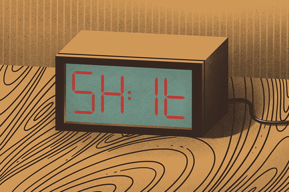
Sure, you’re thinking, that alarm clock that says “Shit” instead of showing the actual time is pretty funny, but I could have come up with that myself. And maybe you’re right, maybe you could, but Karolis Strautniekas shouldn’t be defined by this one image, however hilarious it may be. The fact is Karolis is an extremely talented editorial illustrator; sharp of wit and skilled of hand with an extraordinary ability to make simple imagery captivating and engaging. His layered digital imagery still maintains a tactile feel to it, recalling traditional print techniques but pushing them beyond what would be possible with those old-fashioned print processes.
www.itsnicethat.com/articles/illustration-strautniekas
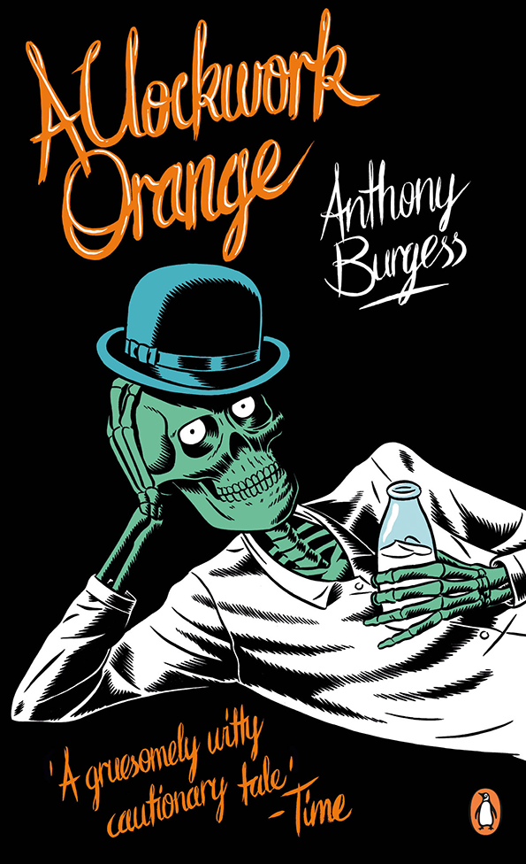
Technically Richard Bravery isn’t an illustrator, though he’s involved with some of the best practitioners around. We’ve included him in this list because of his role as an art director for Penguin, and thus his contribution to some extraordinary commissions in 2014. Richard sent us an enormous box of his recent commissions in late August and then kindly took them time to answer come questions about his background and process working with the likes of Luke Pearson, Cleon Peterson, Kristian Hammerstad and Parra, giving us tremendous insight into one of the bigggest names in publishing. So yeah, we’re cheating slightly, but we promise you’ll enjoy re-reading the interview.
www.itsnicethat.com/articles/behind-the-scenes-penguin-illustrated-covers
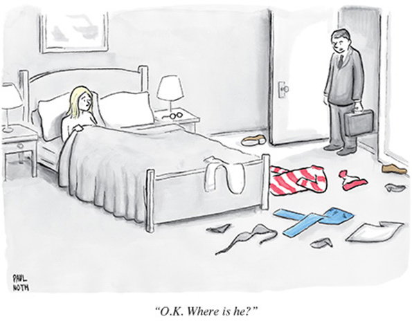
As a bastion of visual and literary excellence it should come as no surprise that The New Yorker employs some of the funniest cartoonists in the world to work on its weekly panels. Paul Noth is probably one of the best, if not for his draughtsmanship then for his lightning-quick wit and unique viewpoint on the complexities of modern life. He’s also insanely prolific, so there’s an endless archive of his past work on his site to keep you entertained for the duration of the festive period.
www.itsnicethat.com/articles/illustration-paul-noth
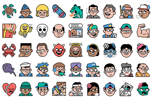
Emoji are so hot right now, having crept over from online messaging services into our daily modes of communication thanks to the wealth of weird smiley faces at our disposal on smartphones. That means they’re becoming increasingly complex; and Line is perhaps the most complex emoji platform to surface this year. In January they put Dan Woodger to work creating over 1000 unique emoji in the first three months of the year. It nearly killed Dan, but the results were magnificent – emotive, engaging and full of iconic imagery that can’t help but add to our digital discussions – and just the first in a series of artist collaborations we’ve been following excitedly.
www.itsnicethat.com/articles/dan-woodger-bts
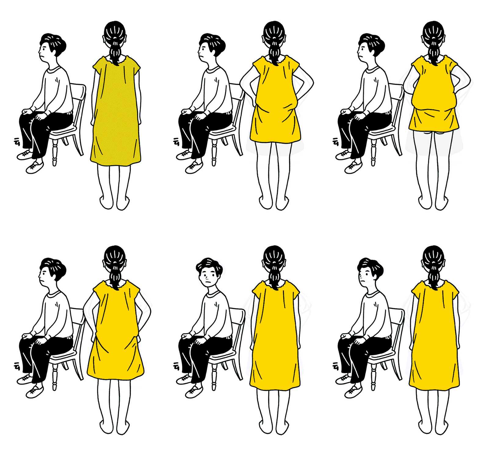
Top of the pops this year however was Japanese illustrator Nimura Daisuke – a latecomer to the party, having only arrived on the site in November, but the firm favourite in this year’s list. Nimura’s not only an excellent illustrator he’s got excellent comic timing, turning his simple, line-based illustrations into humorous GIFs that are by turns charming and cheeky. So there you have it, the year in illustration. Onwards into 2015!
www.itsnicethat.com/articles/nimura-daisuke
Share Article
Further Info
About the Author
—
James started out as an intern in 2011 and came back in summer of 2012 to work online and latterly as Print Editor, before leaving in May 2015.


