




Top Ten: The ten most popular graphic design projects and studios of 2014
There’s been so much superb graphic design this year, from posters to identity projects to cake shop branding. The things that have got you most excited have included work for huge clients like Airbnb, posters showing the innocent victims of gun violence and on a more light-hearted note, some very sweet work for a confectionary shop. All brilliant, smart projects that show the breadth and skill of 2014’s graphic design output.
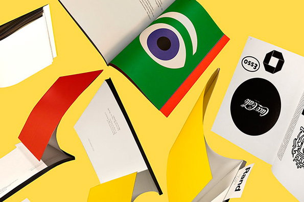
Jessica Svensen: Proposed identity for displaying archival books from the Beinecke Rare Book & Manuscript Library and Haas Arts Library
Back in the cold, dark January o’2014 our lives were made a little bit brighter by the work of Pentagram designer Jessica Svendsen. It’s Nice That’s Liv Siddall reckoned she was “instantly drawn in like horny little bees to a pretty flower” when she happened upon Jessica’s Beinecke Rare Book & Manuscript Library and Haas Arts Library identity with their superb use of colour and icons.
www.itsnicethat.com/articles/graphic-design-jessica-svendsen
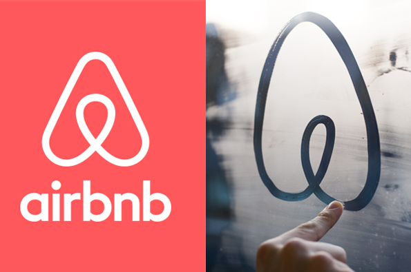
Design Studio: Airbnb rebrand
You may have heard about this project. In fact unless you were, say, on a very long holiday; or lost internet connection throughout the summer, it’s very unlikely you wouldn’t have. From bottoms to vaginas to numerous comparisons with existing logos; Design Studio’s new logo attracted its fair amour of online haterz looking for an easy target. But once these curmudgeons stepped back, it was easy to see what we saw – something “ instantly iconic but easily reproducible”, in the words of our own James Cartwright.
www.itsnicethat.com/articles/airbnb-redesign-design-studio
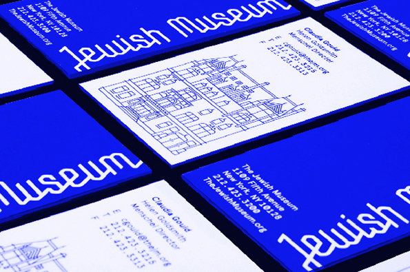
We were wowed by the new identity Sagmeister Walsh created for the Jewish Museum in New York, which used a system founded on sacred geometry, an ancient system from which the Star of David was formed. “It’s intelligent, powerfully communicative and great-looking; in many ways an archetypal Sagmeister & Walsh project.” Nicely put Rob.
www.itsnicethat.com/articles/sagmeister-and-walsh-jewish-museum
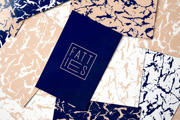
Dot Dash: Fatties identity
“You’re the one for me, Fatties!”, we thought, looking at this great and rather non-bakeryish identity by Dot Dash. Like Anagrama’s baked-goods work, the beauty of the project was in the eschewed of cutesy cake cues in favour of patterns, a slick marque and a smart suggestion of the brand name in the widened “a” and “e”.
www.itsnicethat.com/articles/fatties
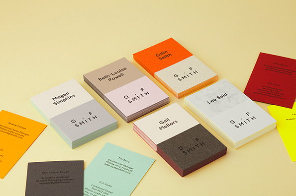
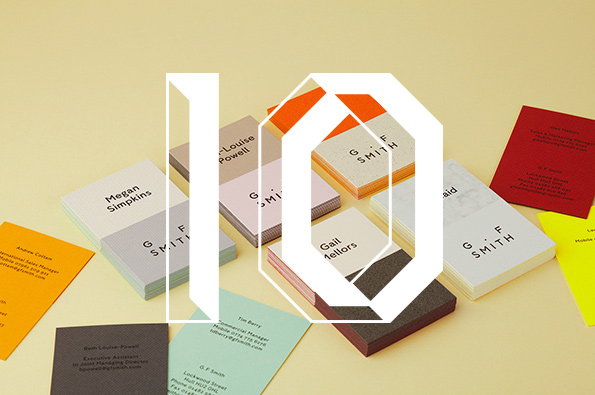
Made Thought: G. F Smith rebrand
A brilliant rebrand project by Made Thought aimed to “better reflect the legacy, stature and future ambitions” of paper company G . F Smith, and boy did it do a good job. New colours and the Humanist Sans typeface were introduced, as well as a “curators symbol” that succinctly moved the brand forward while reminding us of its heritage.
www.itsnicethat.com/articles/made-thought-g-f-smith
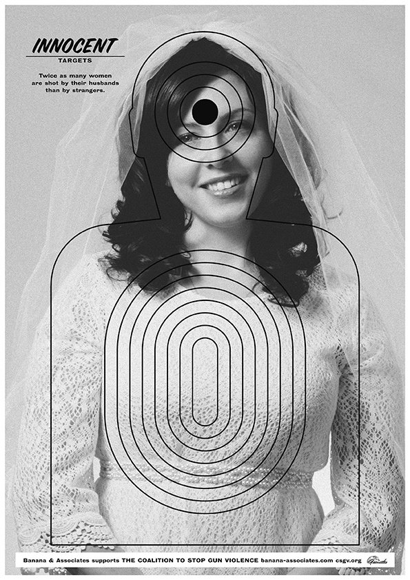
Anthony Burrill: Innocent Targets
We’re all more than familiar with Anthony Burrill’s big-type, bright colour woodblock posters – which are great – but in November we were very excited to see the artist take a new direction in his shocking, sad and very effective poster series Innocent Targets, created with Banana & Associates and showing the innocent victims of gun violence in America.
www.itsnicethat.com/articles/anthony-burrill
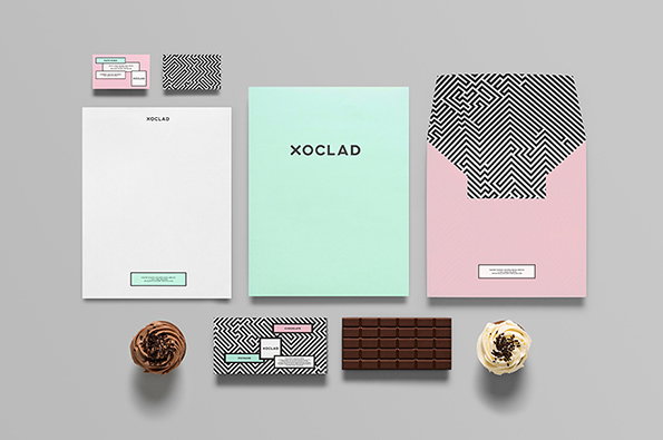
Anagrama: Xoclad identity
Mexican studio Anagrama created this gorgeous identity for Xoclad, which eschewed any tastes of sickliness or cliché in favour of bold typography and pattern. The beauty of the identity, which is inspired by pre-Hispanic typefaces, Mayan art and architecture, is that it works just as brilliantly on a pastry box as on a business card.
www.itsnicethat.com/articles/anagrama-xoclad
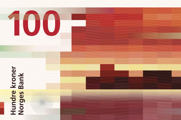
Snøhetta: Norwegian banknote design
You all went nuts for Norway in 2014, with Snøhetta’s designs for the country’s new banknotes proving very popular on account of their imaginatively designed images of costal landscapes translated into pixellated, colour-blocked snapshots.
www.itsnicethat.com/articles/snohetta
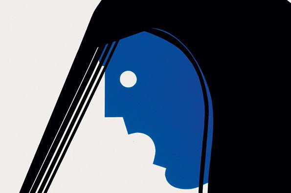
Tom Eckersley: Poster
It’s a bold claim, and one that was made way back at the beginning of the year when London College of Communication showcased 40 posters ranging from the 1940s to the 1980s, by Tom, who set up the UK’s first undergraduate graphic design course at what was then the London College of Printing (LCP). The images were, indeed beautiful, looking as fresh today as they would have more than six decades ago.
www.itsnicethat.com/articles/tom-eckersley-lcc
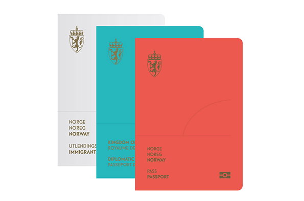
Neue Studio: Norwegian passport designs
You all loved these designs for Norwegian passports as much as we did. It’s little surprise, really, with Neue Studio showing that (as you and we know), graphic design is about much more than simply knocking out a logo. The passports were inspired by Norway’s lakes and mountains, and feature white, red and turquoise covers that are a far cry from the stony-faced designs we might expect from official documents.
www.itsnicethat.com/articles/neue-studio
Share Article
Further Info
About the Author
—
Emily joined It’s Nice That as Online Editor in the summer of 2014 after four years at Design Week. She is particularly interested in graphic design, branding and music. After working It's Nice That as both Online Editor and Deputy Editor, Emily left the company in 2016.


