




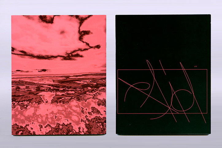
Raid is a new publication that asks designers to imagine a game, and then design its logo
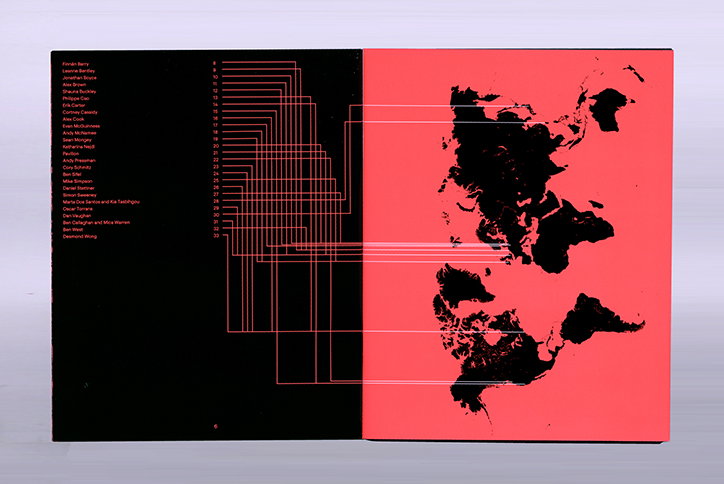
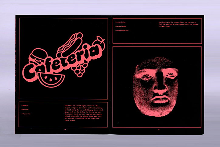
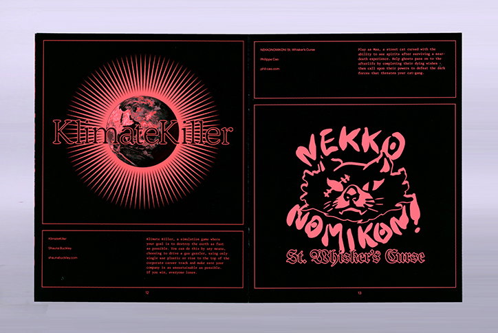
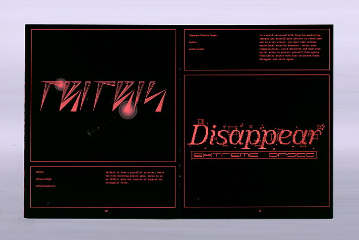
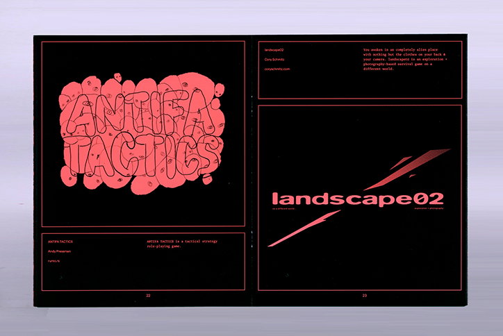
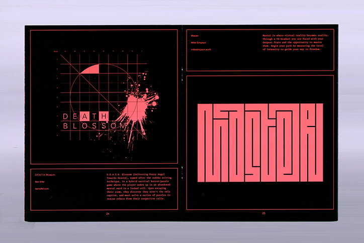
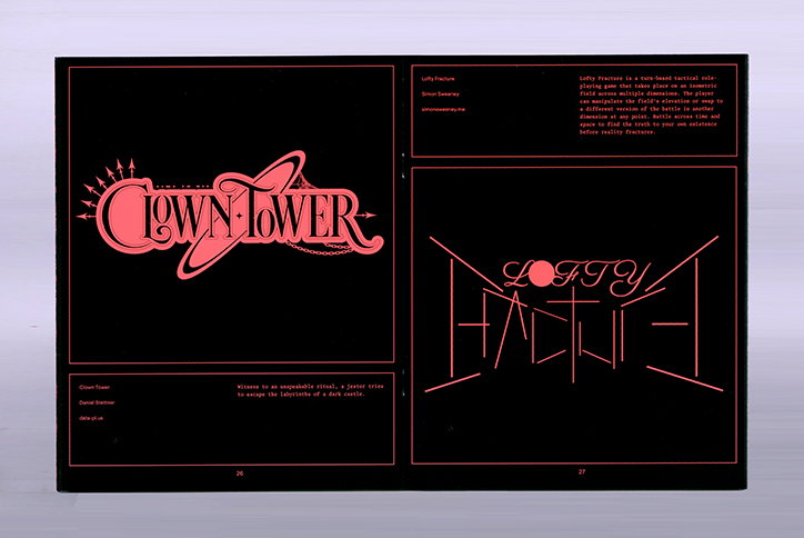
Raid is a new publication by Irish graphic designer and developer Simon Sweeney. Currently based in Munich though “leaving for somewhere else in July” (very mysterious), Raid is a unique magazine as it stemmed from the never-ending stream of potential ideas that is a Slack channel. Featuring a host of exciting designers, Raid asks its contributors to imagine a game, and then design its logo.
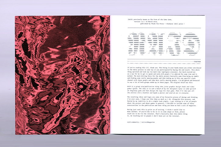
At some point, Simon – who is one half of Bong and It’s Okay – found himself in a Slack channel with who he describes as “some of the best designers in the world”. Dedicated to the discussion of games, Simon proposed a group project around the conversations they were having in order to find a way to work with everyone. The idea was “met with a bunch of enthusiasm and I just ran with it,” he tells us.
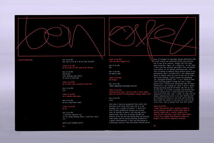
Thanks to its subject, Raid features a suitably low-fi yet nostalgic tech aesthetic; a solid black background is contrasted by a dark pink, in which all type and most of the imagery is set. (Did anyone else play those PC games that came free in cereal? It’s very that…) Featuring interviews as well as graphics, the majority of Raid stems from one brief Simon set all of the contributors. That original brief, he tells us, was:
“Raid is a group zine/publication thing that joins graphic design (bad) and video games (good). The idea is to ask a bunch of my fav designers (you) to come up with a game idea and then design the logo for that game. Then I’ll (me) put all the entries into a booklet and send it out to everyone who participated.”
Raid
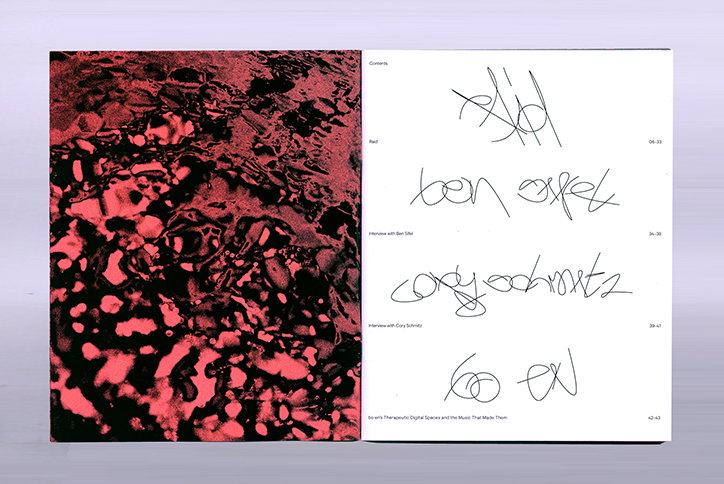
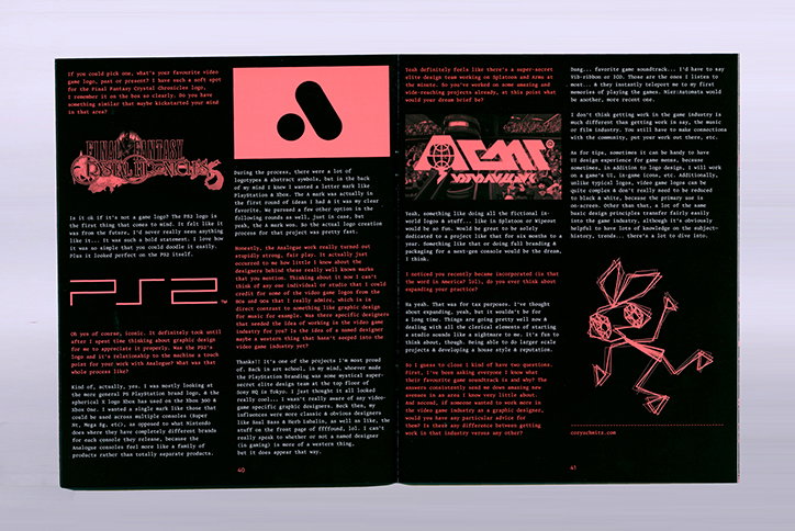
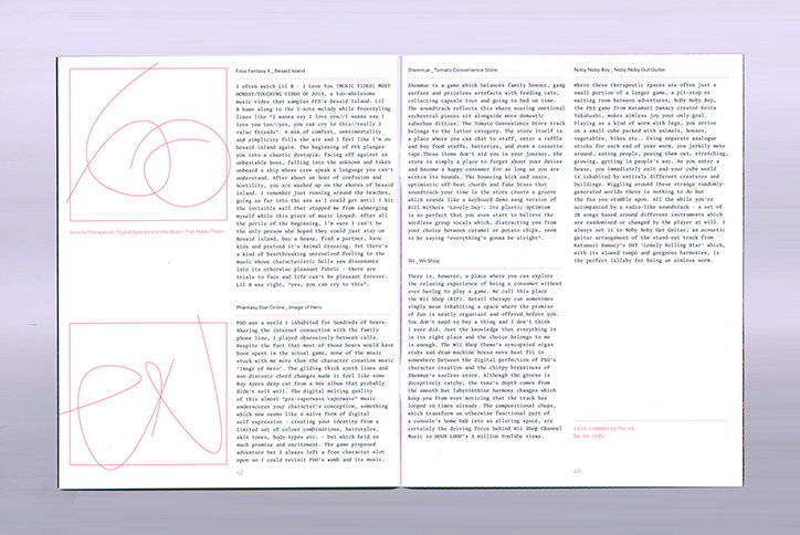
It took Simon around a year to gather all of the submissions and, in that time, he explains, “the discussions I was having with friends and the people taking part spread out a little from the brief and it felt like not including them in the publication would be stupid”. As a result, Raid features an interview with Ben Sifel about “his amazing Tumblr ‘graphic resign’ which alongside Tumblrs like ‘empathy zone’ and ‘data swallow’ were a huge part of why Raid came about.” As a designer who constantly works in the game industry, Simon also included an interview with Cory Schmitz and “was also able to convince musical genius Bo en to contribute a piece. He came back with such a great rumination on digital spaces and the music that makes them so therapeutic,” he continues.
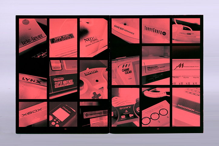
In terms of the publication’s design, Simon explains how it was mostly intuitive, taking in references from the 90s when he first became engaged in gaming. “From the beginning, I really wanted the whole thing to look like it was being shown on an old CRT TV, like the pages might hold a little static in them or something,” Simon explains. “I wanted the pages to be so glossy you could see your own reflection in them. Something that you might have to wipe the dust off of every now and then.”
Ultimately, what Simon has produced is a “ love letter to video game logos and games in general”. Throughout its pages, Simon – and each of the contributor’s – genuine love of gaming is evident. Full of nods to old graphics like GameFAQs and the manual for Mario Kart 64, it’s an indulgent read for anyone who spent one too many hours glued to the screen growing up. With plans to release a second issue, Simon conduces: “Can’t wait to do the next one”.
Raid
Raid
Raid
Raid
Raid
Raid
Raid
Raid
Raid
Raid
Raid
Raid
Share Article
Further Info
About the Author
—
Ruby is Senior Creative at It's Nice That, overseeing our visual output across platforms and projects. Before that, she was associate editor on the editorial team, after joining in September 2017 following graduation from Central Saint Martins.