Design studio Onmi is bringing Spanish flavour to the food and drink industry
Working across branding, illustration, packaging, editorial, and art direction, the studio embraces analogue techniques and vibrant aesthetics.
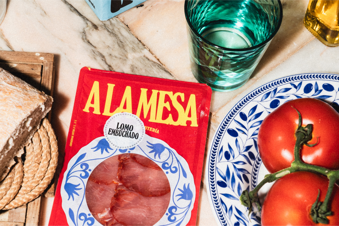
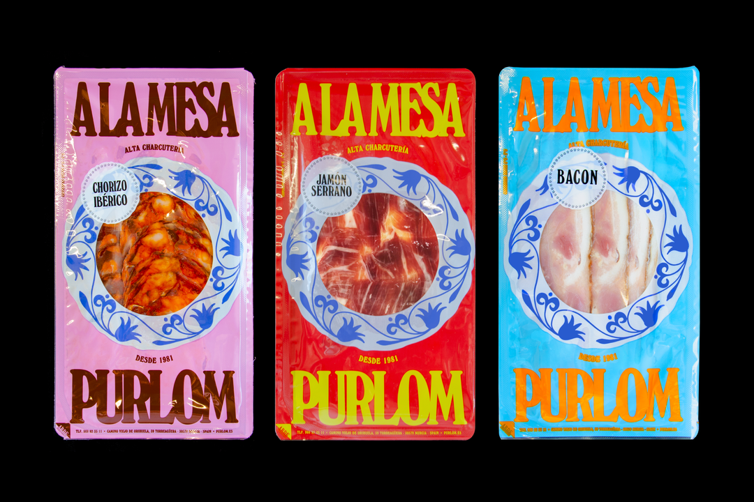
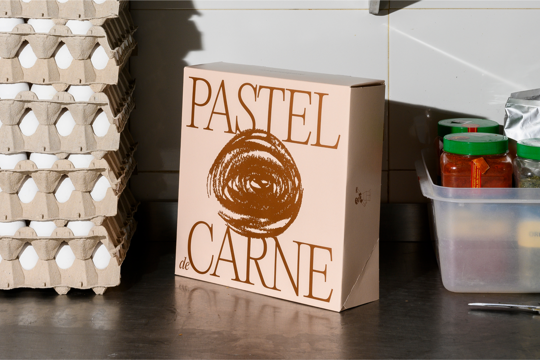
Onmi Design is a graphic design studio founded in Murcia, Spain by Rafa Martínez and Álvaro Mateos. In particular, the studio works in the food and drink sector, collaborating with wine producers, boutique eateries and more. With mostly domestic clients, their work often embodies Spanish culture through its vibrant colours, rustic art direction and focus on quality ingredients and production processes. Nowhere is this more evident than in their recent project for 40-year-old meat brand Purlom, who are a local business in Murcia. Revolving around the core concept of ‘A La Mesa’ (‘At The Table’), Onmi designed a punchy identity that champions their age-old products, and showcases the heritage of the brand while adding a modern touch that opens it up to a new generation of consumers.
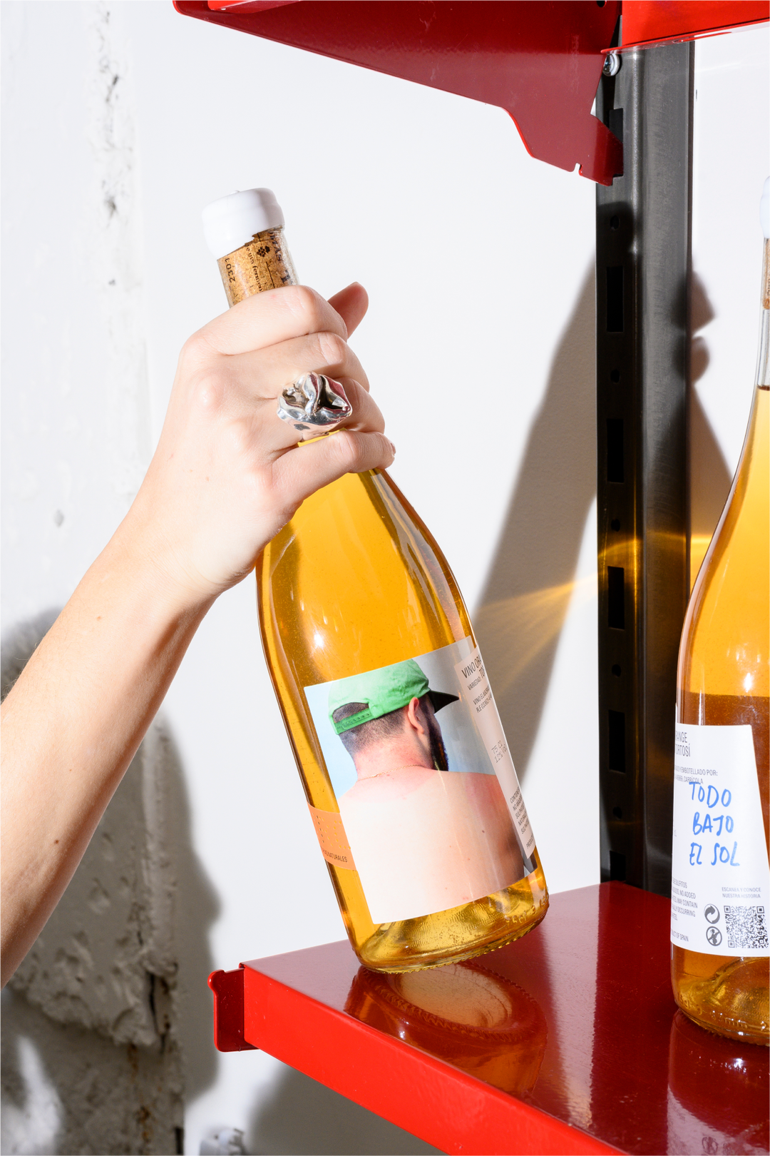
An equally considered approach was taken for their work with experimental Spanish winemaker Suro. Hinging their design concept on the name of the brand, which means ‘cork’ in Catalan, the team developed an identity that celebrates everyday life and the moments that make it up – “like a cork board that holds up memories and fragments of our lives,” says Rafa. These moments are memorialised on the bottle labels, with intimate photography and handcrafted design elements that speak to the concept. “The result is a brand that unites tradition with revelry,” says Rafa. “One that honours Spanish products and gastronomy, its culture and way of sharing life.”
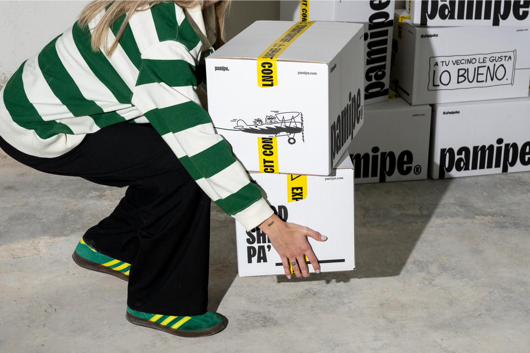
But Onmi don’t just create beautiful identities for food and drinks brands – they’ve even dipped their toes in the world of pet food. Recently, they partnered with Pamipe, a company offering one of the first home delivery subscriptions for pet food in Spain. Determined to break away from the competition, the designers came up with an interesting take on the category, opting to treat pets less like “babies” and more like connoisseurs of good taste. The result is a brand that matches the refinement of gourmet human food brands, with flash-lit lifestyle photography, bold typefaces and a straight-speaking tone of voice. We had to leave the slipstream of the competition, turn the brand upside down,” Álvaro. “Pamipe needed to break with everything established and show [itself] as a leader: safe, authentic and light-hearted.”
GalleryCopyright © Onmi Design, 2024

Hero Header
Copyright © Onmi Design, 2024
Share Article
Further Info
About the Author
—
Daniel joined It’s Nice That as an editorial assistant in February 2019 and continues to work with us on a freelance basis. He graduated from Kingston University with a degree in Journalism in 2015. He is also co-founder and editor of SWIM, an annual art and photography publication.