




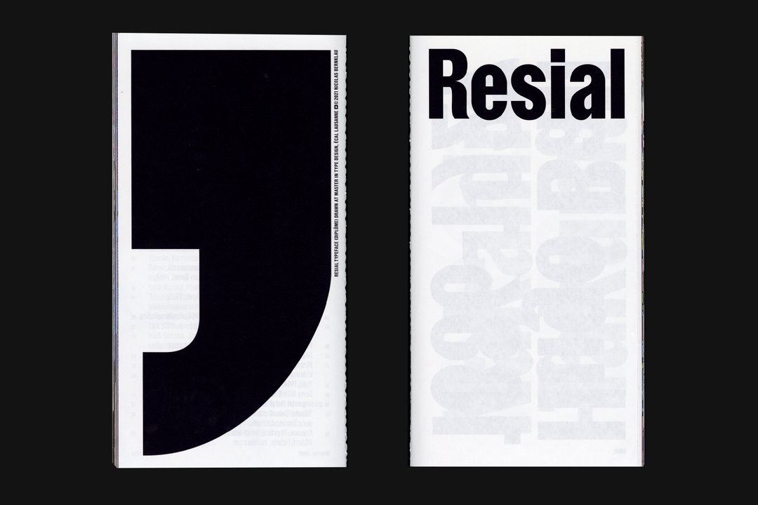
Nicolas Bernklau on the unending life span of typography
The German designer relishes seeing how his work evolves when put into the hands of other designers, which is what draws him to typography.
Share
Having previously worked for ad agency Jung von Matt and design studio Deutsche & Japaner, German-born, Lausanne-based graphic designer Nicolas Bernklau is now working as a teaching assistant on the type design master’s at ECAL, sharing his love for typography, while also running his independent practice. For Nicolas, type is an endlessly inspiring medium due to its role as the building block for other graphic work, and its fundamental responsibility for shaping how we communicate on a daily basis. “Creating typefaces is not just about designing pretty shapes, it is about creating a typographic system, which enables the viewer to read and understand written words,” he says.
It’s also a medium that means your work morphs and evolves through the creations of others: “Contrary to graphic design, where an artwork is finished when you hand it over, in type design, it just starts to live,” Nicolas points out. “It then becomes the tool a graphic designer is working with. For me, this is very rewarding.”
Growing up, Nicolas found he was always “intrigued by the process of selecting, decoding, encoding and translating content into visual messages,” although he did not know this interest could form a predilection for graphic design at the time. That revelation only occurred during his teenage years when he formed a punk band with his brother and best friend which soon needed graphics for concerts, CDs, and merchandise. Somehow, the responsibility for creating flyers and the like fell to Nicolas – and he was hooked.
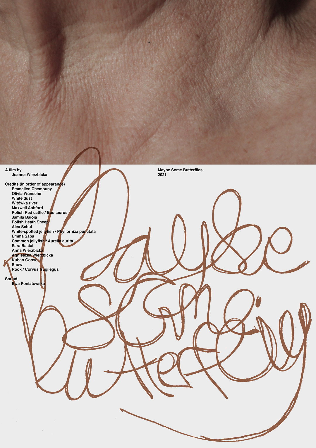
Bureau Bernklau: Maybe Some Butterflies, Joanna Wierzbicka, Poster (Copyright © Nicolas Bernklau and Joanna Wierzbicka, 2021)
His practice, which operates under the title Bureau Bernklau moves between type design (custom typefaces, custom letterings, and logotype drawing), and graphic design and art direction for identities and editorial projects. In reality, though, Nicolas tells us, he’s open to any work as long as he identifies with it in some way. “I am very happy and privileged to be able to work with people I share similar values with. That, for me, is very important to achieve satisfying results,” he explains. As such, his works are varied, switching between aesthetics and outputs although retaining a certain polish and refinement which seems to be what defines Nicolas’ portfolio. This graphic transmutation, Nicolas explains, is a direct result of his perspective on projects: “I always try to see the project through the client’s eyes, filtered with my own lens. What is suitable for the project? How do I imagine its appearance? What are the values of the brand and the person behind it?” In the end, it’s about creating a “common understanding and fulfilling a common goal,” rather than just producing work he loves but which doesn’t serve the client.
On his favourite projects, Nicolas points to a recent visual identity for Ephemera, a fragrance brand based in Los Angeles. “My goal was to create a functional system consisting of a logotype, typography, lettering, colour and layout system,” he says. What he loved most about the project, he continues, was the moment he saw how the other designers had implemented the identity system. “It’s a great feeling to see other designers continue and use your ideas throughout the whole identity,” he says. “When I first looked at their website which is about to be launched, I had a smile on my face. Somehow the developers brought my ideas to another level, which I couldn’t have imagined... It’s an absolutely great feeling to see the project flourish to another dimension!”
When it comes to a project that allowed him the creative freedom to push an aesthetic, Nicolas points to his work for Symplektik, a DJ and music label from Zurich. Striking the balance between trendy and playful, the expressive typography Nicolas has drawn cements the personality of Sympletik. His favourite part of the project, however, has nothing to do with its outcome but rather its process: “This collaboration was so easy-going, a conversation on eye level with the client. Can’t every job be like that?”
Currently, Nicolas is dedicating his time to teaching at ECAL while also focussing on his own type design projects. “I’d like to improve my drawing skills and become a better type designer,” he says. “I’m looking forward to engaging more in the field and collaborating with great designers and foundries. Let’s see what the future brings!”
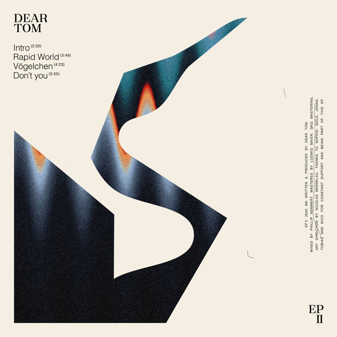
Bureau Bernklau: Dear Tom, Album artwork, Logotype (Copyright © Nicolas Bernklau, 2021)
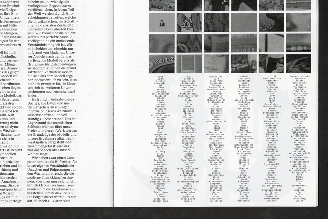
Nicolas Bernklau: Phrase, Typeface, Specimen (Copyright © Nicolas Bernklau, 2021)
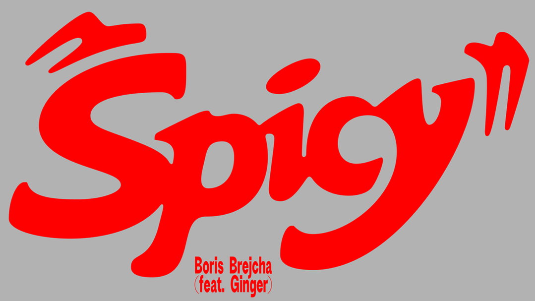
Bureau Bernklau: Spicy, Boris Brejcha, Lettering (Copyright © Nicolas Bernklau, 2021)
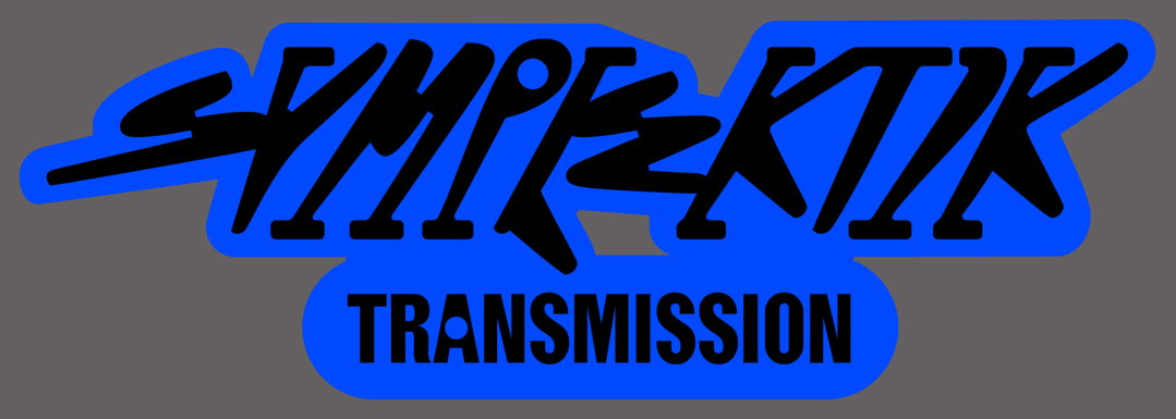
Bureau Bernklau: Symplektik, Lettering (Copyright © Nicolas Bernklau, 2021)
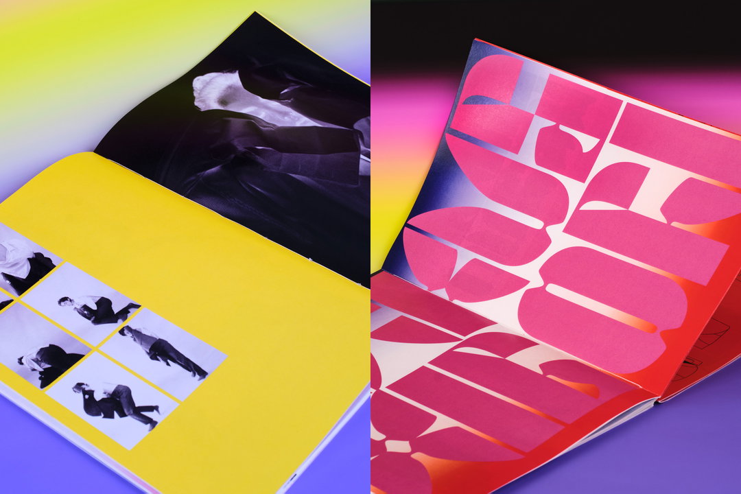
Nicolas Bernklau and Anna Deller-Yee: Kakushibori, Publication (Copyright © Nicolas Bernklau, Anna Deller-Yee and Sara Bastai, 2021)

Nicolas Bernklau: Offkey, Typeface (Copyright © Nicolas Bernklau, 2020)
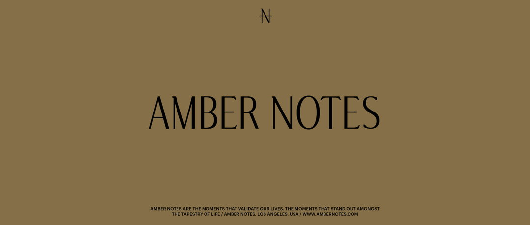
Bureau Bernklau: Amber Notes, Logotype (Copyright © Nicolas Bernklau, 2020)
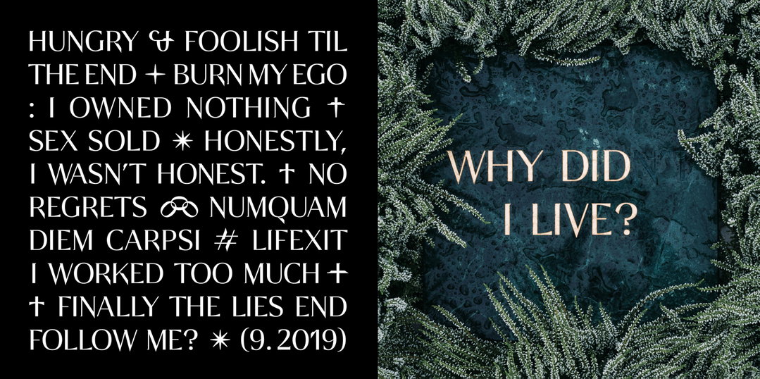
Bureau Bernklau: Bengel, Tim Bengel, Typeface (Copyright © Nicolas Bernklau, 2019)
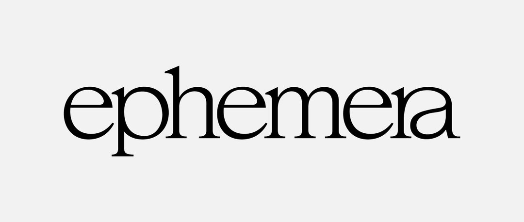
Bureau Bernklau: ephemera Los Angeles, Logotype (Copyright © Nicolas Bernklau, 2021)
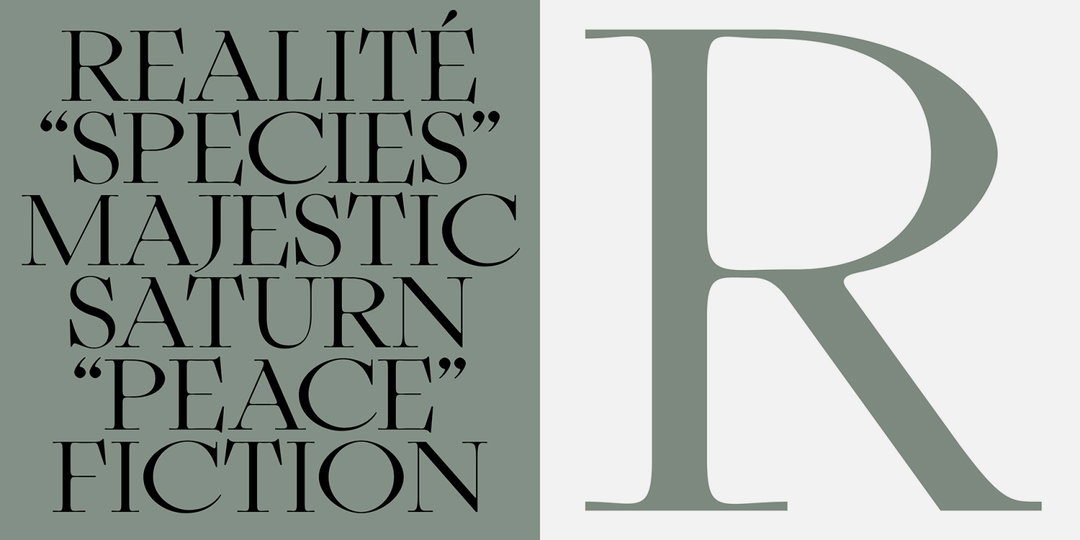
Nicolas Bernklau: Orbitea, Typeface (Copyright © Nicolas Bernklau, 2020)
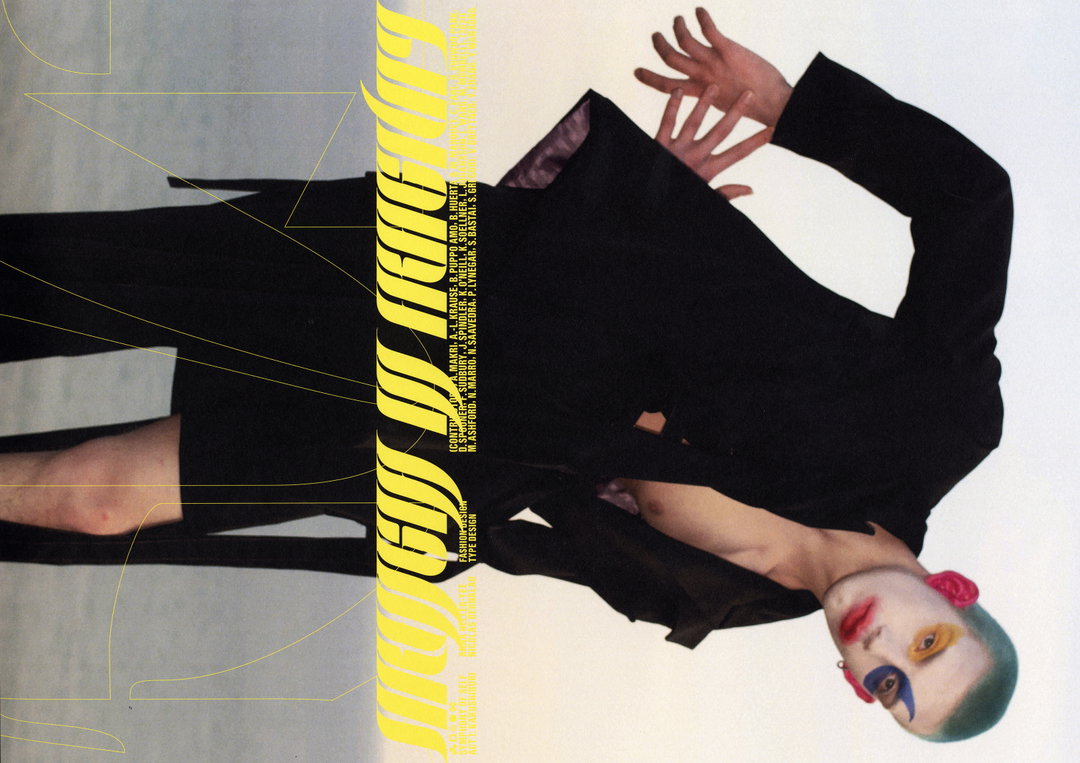
Nicolas Bernklau and Anna Deller-Yee: Strength in Fragility, Publication (Copyright © Nicolas Bernklau and Anna Deller-Yee, 2021)
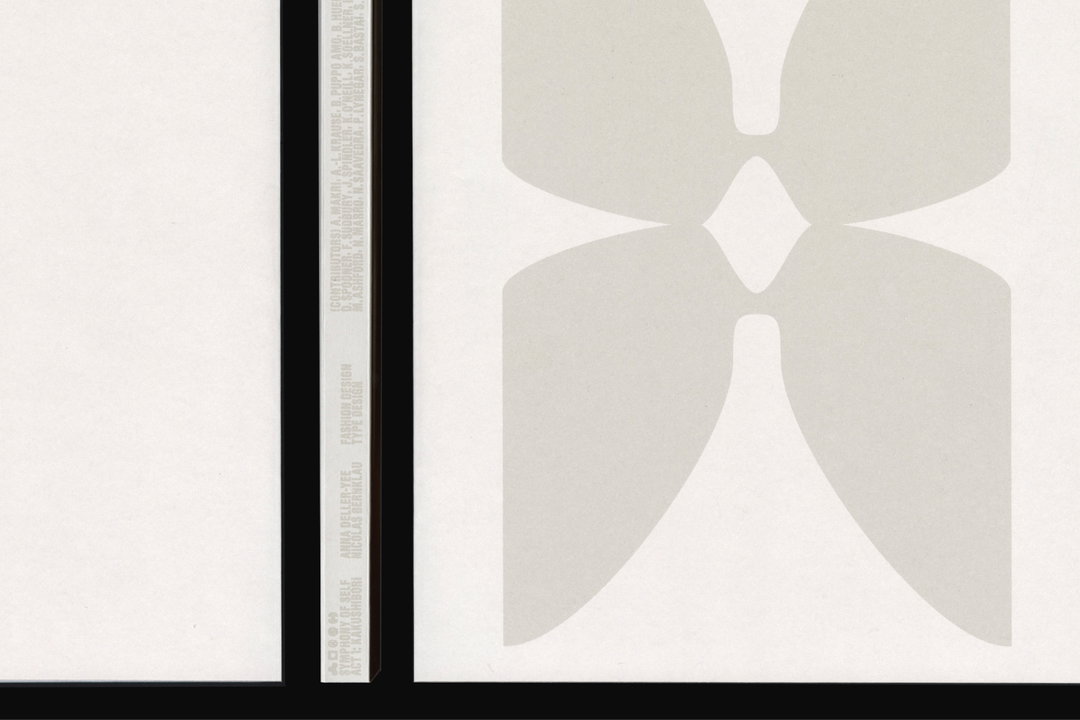
Nicolas Bernklau and Anna Deller-Yee: Strength in Fragility, Publication (Copyright © Nicolas Bernklau and Anna Deller-Yee, 2021)
Hero Header
Nicolas Bernklau: Resial, Typeface, Specimen (Copyright © Nicolas Bernklau, 2021)
Share Article
Further Info
About the Author
—
Ruby is Senior Creative at It's Nice That, overseeing our visual output across platforms and projects. Before that, she was associate editor on the editorial team, after joining in September 2017 following graduation from Central Saint Martins.


